matplotlib Library
Excellent data visualization third-party library, which can draw various forms of graphics 1 , depending on numpy module and tkinter module (for more information, please visit: matplotlib official website)
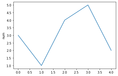
Case: generate a line chart
import matplotlib.pyplot as plt
plt.plot([3,1,4,5,2])
plt.ylabel('number')
plt.savefig('test_1',dpi=600)
plt.show()
Operation results
Canvas and coordinate system
In the above example, we did not define the statement of canvas. The default canvas is used in the form of generated graph. In the program, we can use the figure() function to create a custom canvas object. The syntax format is: fig=plt.figure(num=None,figsize=None,dpi=None,facecolor=None,edgecolor=None,frameon=None)
parameter
| parameter | describe |
|---|---|
| num | Image name or index number |
| figsize | The width and height of the canvas, in inches |
| dpi | Resolution of drawing objects |
| facecolor | background color |
| edgecolor | Edge color |
| frameon | Show side payment |
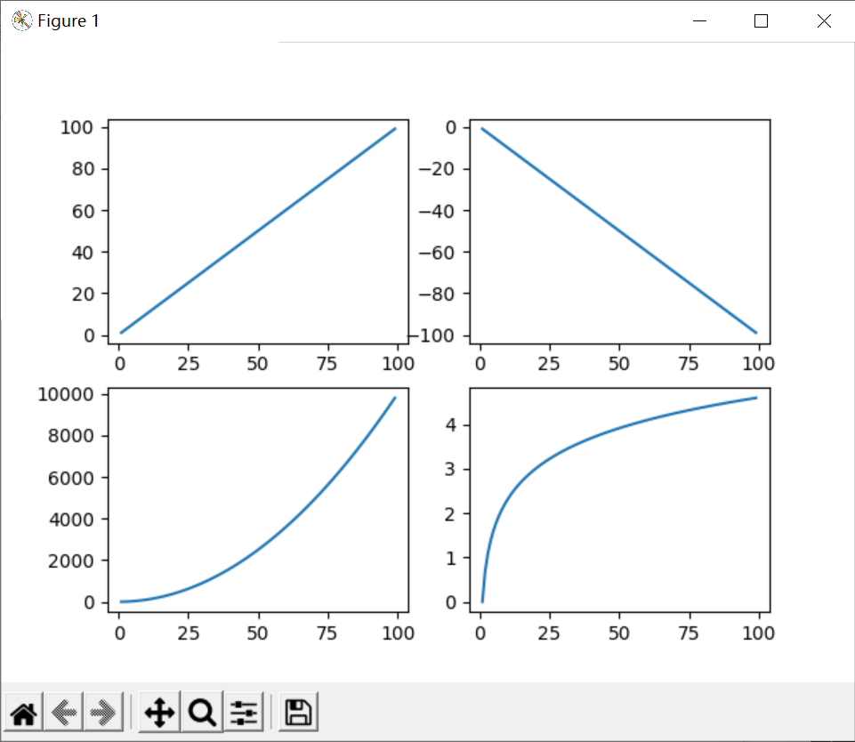
After creating a canvas object, you can further control the drawing of the chart, such as adding a subgraph. The syntax format is: fig.add_subplot(numrows,numcols,fignum). The three parameters respectively represent the number of rows, columns and index numbers of the subgraph. For example, add_subplot(1,1,1) indicates that only one subgraph is set in a canvas
Sub drawing area
Syntax format: plot. Subplot (nrows, ncols, plot_number). The three parameters are row number, column number, and index number 2
Case 1: generate multiple subgraphs
#!/usr/bin/python
#coding: utf-8

import numpy as np
import matplotlib.pyplot as plt

x = np.arange(1, 100)

fig = plt.figure()

ax1 = plt.subplot(221)
ax1.plot(x, x)

ax2 = plt.subplot(222)		# Equivalent to fig.add_subplot(222)
ax2.plot(x, -x)

ax3 = plt.subplot(223)
ax3.plot(x, x ** 2)

ax4 = plt.subplot(224)
ax4.plot(x, np.log(x))

plt.show()
Operation results
Matplotlib common symbols
There are three kinds of strings that control curve format: color character, style character and mark character
Color character
| character | describe |
|---|---|
| 'b' | blue |
| 'g' | green |
| 'r' | red |
| 'c' | Turquoise |
| 'm' | Magenta |
| 'k' | black |
| 'w' | white |
| '#008000' | RGB a color |
Format character
| Character 1 | describe | Character 2 | describe | Character 3 | describe |
|---|---|---|---|---|---|
| '.' | spot | '1' | Lower flower triangle | 'h' | Vertical hexagon |
| ',' | Pixel marker | '2' | Upper flower triangle | 'H' | Transverse hexagon |
| '+' | cross | '3' | Left flower triangle | 'x' | Cross mark |
| '|' | Vertical line | '4' | Right flower triangle | 'd' | Thin diamond |
| '^' | Upper triangle | 's' | Solid square | 'D' | diamond |
| '>' | Right triangle | 'p' | Solid Pentagon | 'v' | Inverted triangle |
| '<' | Left triangle | 'o' | Solid ring | '*' | Star type |
Style string
| character string | describe |
|---|---|
| '-' | Solid line |
| '–' | Broken broken line |
| '-.' | Dotted line |
| ':' | Dotted line |
Let's combine these characters
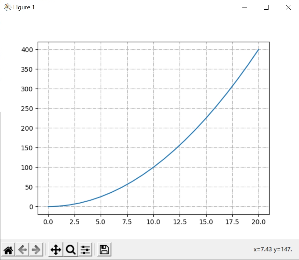
show grid
Syntax format: grid(b=None,axis=None,color=None,linewidth=None,linestyle=None)
parameter
| parameter | describe |
|---|---|
| axis | The values are ('both ',' x ',' y '), indicating which axis is used as the scale to generate the grid |
| color | Represents the grid line color, |
| linewidth | Indicates the width of the grid line |
| linstyle | Display type of gridlines |
Case 2: generate a line chart with grid lines
import matplotlib.pyplot as plt
import numpy as np
x=np.arange(0,21)
plt.plot(x,x**2)
plt.grid(True,linestyle='-.')
plt.show()
Operation results
Show Legend
Syntax format: legend(loc=None,ncol=None), where loc represents the display position of the legend and ncol represents the number of columns of the legend
| loc parameter | meaning | English parameters | loc parameter | meaning | English parameters |
|---|---|---|---|---|---|
| 0 | Display in the best position according to the graphic adaptation | best | 6 | Middle left | center left |
| 1 | Upper right corner of image | upper right | 7 | Middle right | center right |
| 2 | top left corner | upper left | 8 | Lower center | lower center |
| 3 | lower left quarter | lower left | 9 | Upper center | upper center |
| 4 | Lower right corner | lower right | 10 | center of figure | center |
| 5 | Figure right | right |
|The legend(loc)|loc parameter indicates the location of the legend, which can be ('best ',' upper ',' lower right ',' right ',' center left ',' center, right ',' lower center ',' upper center ',' center ')
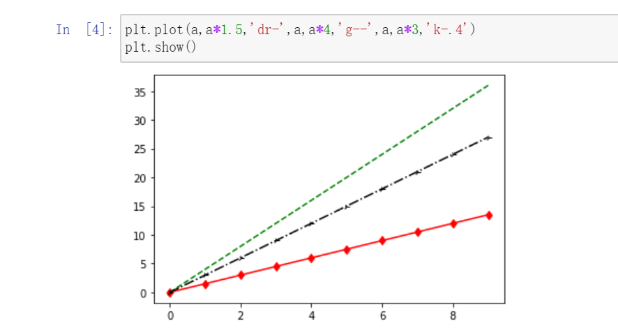
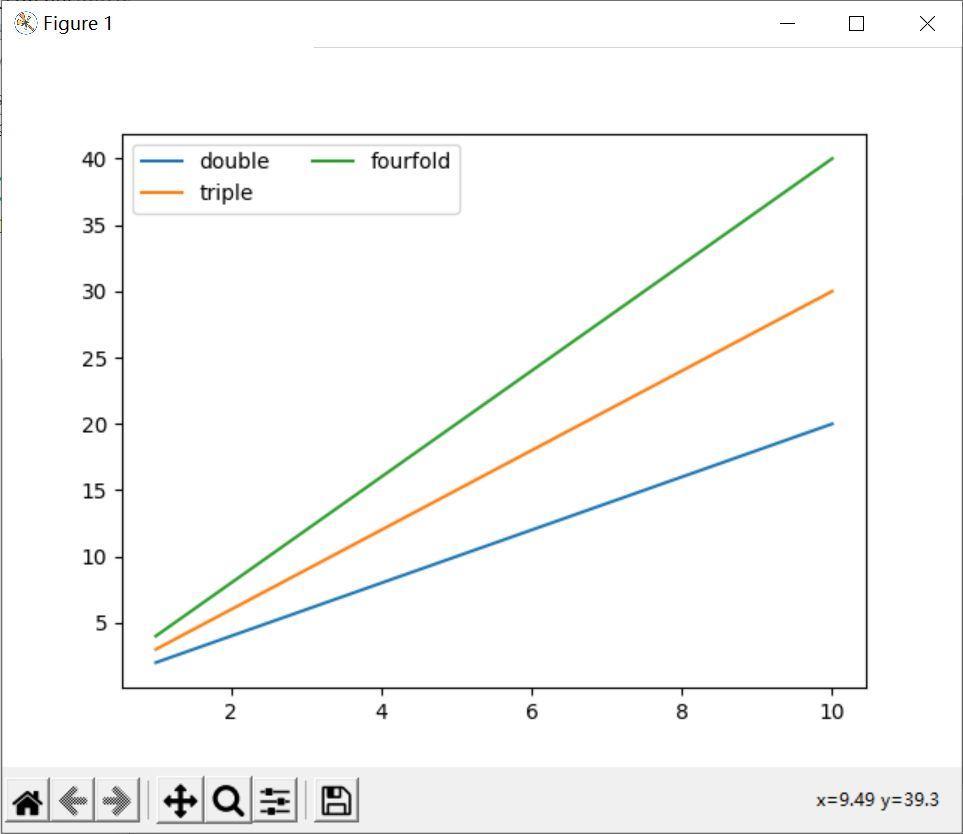
Case 3: generate a line chart with legend
import matplotlib.pyplot as plt
import numpy as np
x=np.arange(1,11,1)
plt.plot(x,x*2,label='double')
plt.plot(x,x*3,label='triple')
plt.plot(x,x*4,label='fourfold')
plt.legend(loc=0,ncol=2)		# Adaptive, two column legend
plt.show()
Display Chinese
pyplot does not support Chinese by default. If it is not declared before use, the program will give a warning
Chinese display method (I)
Modifying fonts using rcParams
rcParams property
| attribute | describe |
|---|---|
| 'font.family' | Used to display the font name |
| 'font.style' | Font style, "normal" normal, "italic" |
| 'font.size' | Font size, integer font size or 'large' |
font.family Chinese font type
| typeface | describe |
|---|---|
| 'SimHei' | Blackbody |
| 'Kaiti' | regular script |
| 'LiSu' | official script |
| 'FangSong' | Imitation Song Dynasty |
| 'STSong' | Chinese Song typeface |
Chinese display method (II)
Add properties where Chinese appears: fontproperties
Show negative sign
matplotlib does not support the display of negative numbers by default. Similarly, we use the rcParams attribute to modify it to display negative numbers
matplotlib.rcParams['axes.unicode_minus'] = False
display comments
Notes in drawings are often used to explain the meaning of drawings
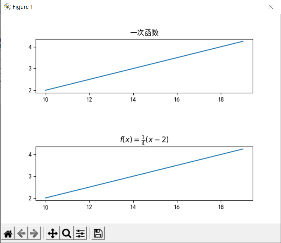
show heading
- When the title is ordinary text, you can directly use the title() function to set the syntax format: title (STR), which is used to realize the title in the coordinate system
- When the title is a mathematical formula, you need to use text in LaTex format to set the title
Case 4: title display function usage
import numpy as np
import matplotlib.pyplot as plt
import matplotlib
matplotlib.rcParams['font.family']='SimHei'
x=np.arange(10,20)

plt.subplot(211)
plt.title('Primary function')
plt.plot(x,0.25*(x-2))

plt.subplot(212)
plt.title(r'$f(x)= \frac{1}{4}(x-2)$')
plt.plot(x,0.25*(x-2))
plt.subplots_adjust(wspace =0, hspace =1)
plt.show()
Operation results
x-axis and y-axis notes
| function | describe |
|---|---|
| xlabel(str) | x-axis notes |
| ylabel(str) | y-axis annotation |
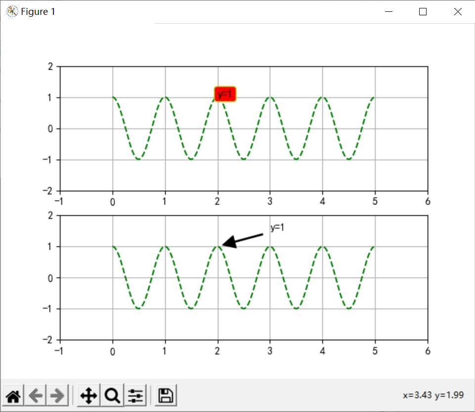
Place notes at the specified location
| function | describe |
|---|---|
| text() | Add comments anywhere |
| annotate() | Add a note with an arrow anywhere, |
Case 5: add an arrow at the specified position
import numpy as np
import matplotlib.pyplot as plt
import matplotlib
matplotlib.rcParams['font.family']='SimHei'
matplotlib.rcParams['axes.unicode_minus'] = False

a=np.arange(0,5,0.02)
plt.xlabel('time',fontproperties='SimHei',fontsize=15)
plt.ylabel('amplitude',fontproperties='Lisu',fontsize=15)
plt.title('title',fontproperties='SimHei',fontsize=20)

# Text Annotation
plt.subplot(211)
plt.plot(a,np.cos(a*np.pi*2),'g--')
plt.text(2,1,'y=1',bbox={'facecolor':'r','edgecolor':'y','boxstyle':'round'}) # The bbox parameter sets the parameters for inserting notes
plt.axis([-1,6,-2,2])	# Sets the width of the xy axis
plt.grid(True)	# Used to generate tables

# Arrow notes
plt.subplot(212)
plt.plot(a,np.cos(a*np.pi*2),'g--')
plt.annotate(r'y=1',xy=(2,1),xytext=(3,1.5),arrowprops=dict(facecolor='black',shrink=0.1,width=1))	# The arrowprops parameter sets the style of the arrow
plt.axis([-1,6,-2,2])
plt.grid(True)

plt.show()
Operation results
Other settings
xy axis range setting
| function | describe |
|---|---|
| axis[xmin,xmax,ymin,ymax] | Set the range of X and Y axes at the same time |
| xlim(xmin,ymin) | Set x-axis range |
| ymin(ymin,ymax) | Set y-axis range |
xy axis scale setting
| function | describe |
|---|---|
| locator_params(axis,nbins=None) | Axis stands for x or y axis, nbins stands for dividing the coordinate axis into several parts |
Display of date scale
| function | describe |
|---|---|
| autofmt_xdate() | Adjust the arrangement of dates adaptively according to the image size |
Save image as picture
| function | describe |
|---|---|
| savefig(path,dpi) | Output the generated graphics as a file. The default png and dpi set the quality of the picture |
There are two ways to draw graphics through programs in the computer: bitmap and vector graph. Bitmap is the graphics drawn by pixels, and vector graph is the graphics connecting multiple points. The drawing method of matploylib belongs to the latter, that is, connecting two adjacent points to form a curve ↩︎
The subplot() function is the same as the add_subplot() function. Both generate several subgraphs. The difference is that the former functions on the pyplot module and the latter functions on the canvas object figure ↩︎