catalogue
(1) IRIS dataset visualization
2. Edit the color and graphics of the visualization
2. Add data labels and earth models
3. Add data labels and 3d Earth models
4. Add data labels and contour dynamic map
1, Plotly introduction
Plotly, founded in 2013, is a data visualization company focused on bringing data science from the laboratory to the business. With plotly, you can easily build, deploy and large-scale interactive analysis applications, graphics and visualization in any programming language.
Plotly is developed based on javascript and provides a large number of API s with other mainstream data analysis languages, such as Python, R, Matlab, etc. Plotly can not only get support from native Python, but also has specially tailored interfaces for matplotlib, pandas and other libraries.
More information can be found on Plotly's official website:
2, Plotly installation
Directly enter "PIP3 install plot" at the command prompt to complete the installation.
3, Plot visualization
(1) IRIS dataset visualization
Iris data set is a commonly used classification experimental data set, which was collected and sorted by Fisher, 1936. Iris, also known as iris flower data set, is a kind of data set for multivariate analysis. The data set contains 150 data samples, which are divided into 3 categories, 50 data in each category, and each data contains 4 attributes. According to the four attributes of calyx length, calyx width, petal length and petal width, which kind of iris flowers belong to (Setosa, versicolor, Virginia) can be predicted.
1. Basic operation
The code is as follows:
import plotly.express as px
#Introducing third-party libraries

df = px.data.iris()
#iris is a pandas DataFrame

fig = px.scatter(df, x="petal_width", y="petal_length")
fig.show()
#Visual presentation
The results are as follows:

2. Edit the color and graphics of the visualization
The code is as follows:
import plotly.express as px
#Introducing third-party libraries

df = px.data.iris()
#iris is a pandas DataFrame

fig = px.scatter(df, x="petal_width",
                     y="petal_length",
                     color="species",
                     size="petal_length",
                     hover_data=["petal_width"])
#Set parameters for visualization

fig.show()
#Rendering visualization
The results are as follows:

It can be seen that the rendering effect has changed greatly compared with the results of the basic operation. The data of different categories of flowers are marked with different colors, and legends are added next to the chart to facilitate data viewing and analysis.
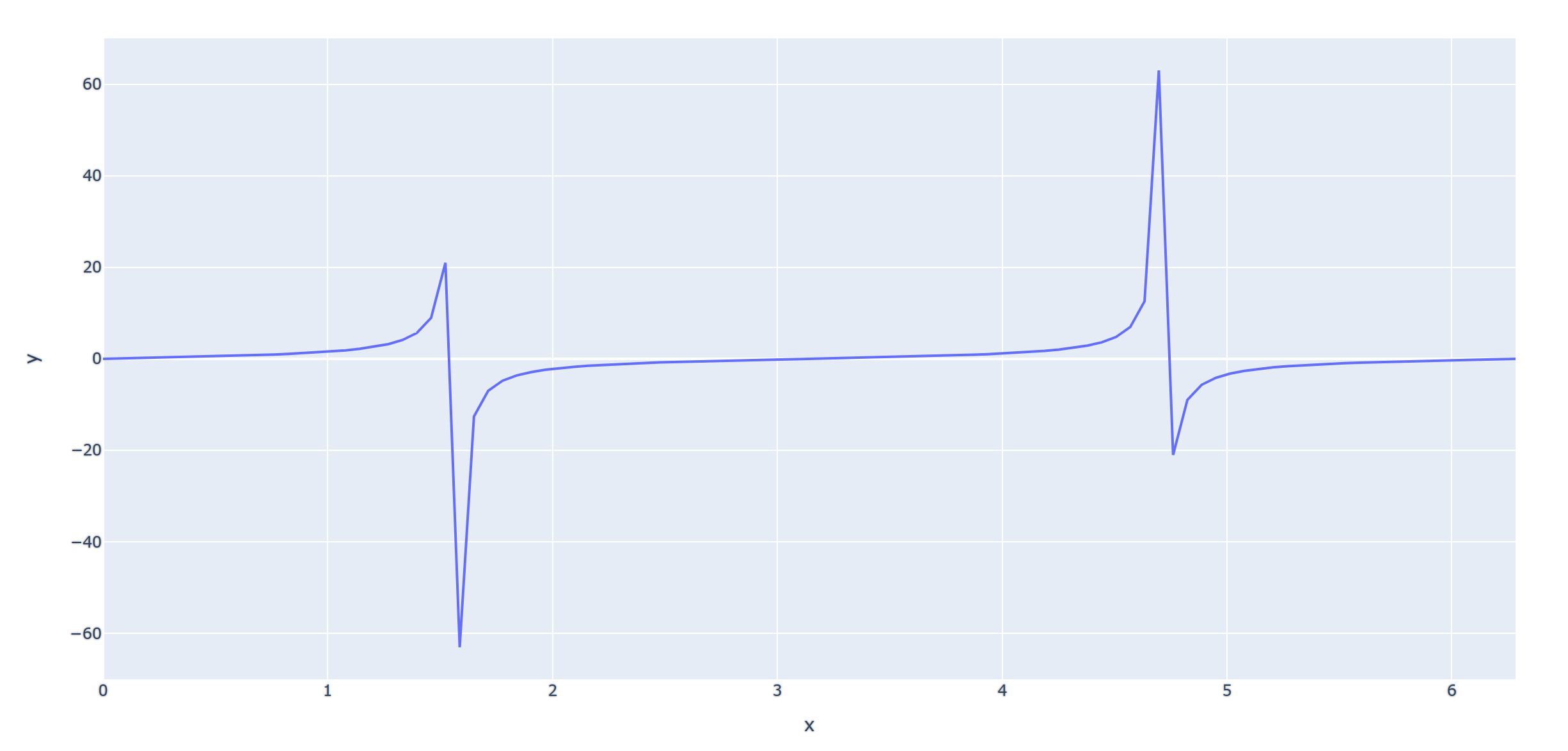
(2) Trigonometric function
Using plot module, draw sine, cosine, tangent, Cotangent and other trigonometric functions. Only cosine function code is shown here, and other trigonometric functions can be visualized by adjusting the function name in the code.
The code is as follows:
import plotly.express as px
import numpy as np
#Import third party libraries

t=np.linspace(0,2*np.pi,100)
#Define the point position of the function
fig=px.line(x=t,y=np.cos(t))
#Define function types, such as cos, sin, tan, etc
fig.show()
#Display image
The results are as follows:

The rendering results of other functions are as follows:

(3) Map visualization
The data used here is Plotly's built-in Gapminder dataset. For more information about this dataset, see Gapminder Website.
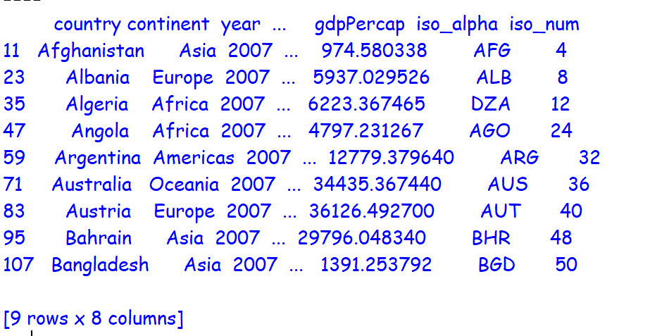
1. Basic presentation
The code is as follows:
import plotly.express as px
#Import third party libraries

df=px.data.gapminder().query("year==2007")
#Import gamender map data

print(df[0:9])
#Output database

fig=px.scatter_geo(df,locations="iso_alpha",size='pop',color="continent")
#Define map rendering data

fig.show()
#Display image
The results are as follows:
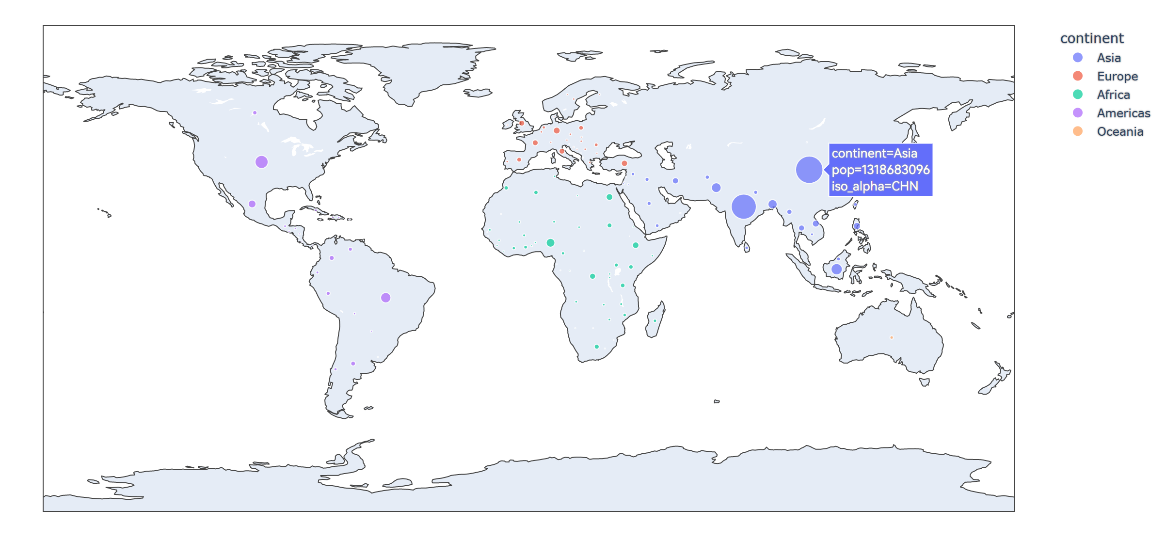
2. Add data labels and earth models
The code is as follows:
import plotly.express as px
#Import third party libraries

df=px.data.gapminder().query("year==2007")
#Import gamender map data

print(df[0:9])
#Output database

fig = px.scatter_geo(
  df,  # data
  locations="iso_alpha",  # Match color display
  color="continent", # colour
  hover_name="country", # Hover data
  size="pop",  # size
  animation_frame="year",  # Selection of data frame
  projection="natural earth"  # Global map
                    )
#Define map rendering data

fig.show()
#Display image
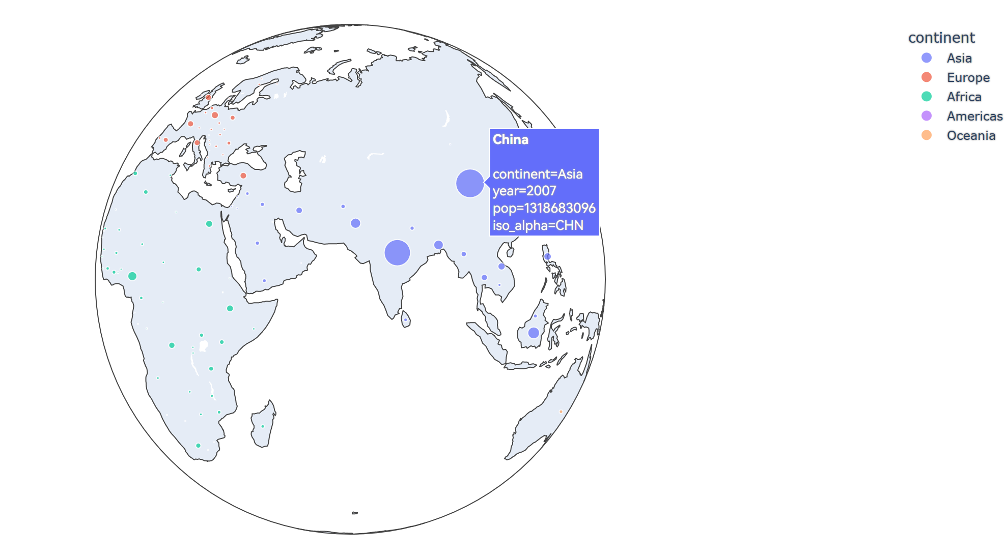
The results are as follows:

It can be seen that the visualization effect is displayed as a flat earth model, and the country name can be displayed when the mouse hovers.
3. Add data labels and 3d Earth models
The code is as follows:
import plotly.express as px
#Import third party libraries
df=px.data.gapminder().query("year==2007")
#Import gamender map data
print(df[0:9])
#Output database
fig = px.scatter_geo(
df, # data
locations="iso_alpha", # Match color display
color="continent", # colour
hover_name="country", # Hover data
size="pop", # size
animation_frame="year", # Selection of data frame
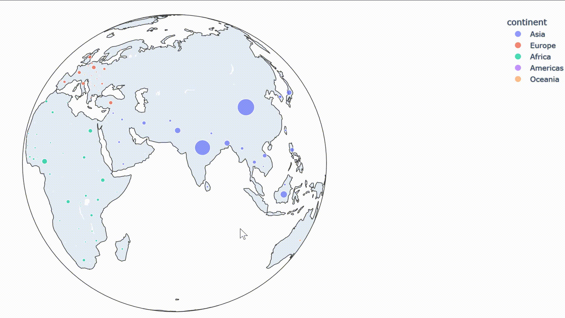
projection="orthographic" # Global map
)
#Define map rendering data
fig.show()
#Display image
The results are as follows:
The dynamic effects are as follows:
4. Add data labels and contour dynamic map
The code is as follows:
import plotly.express as px
#Import third party libraries
df=px.data.gapminder()
#Import gamender map data
print(df[0:9])
#Output database
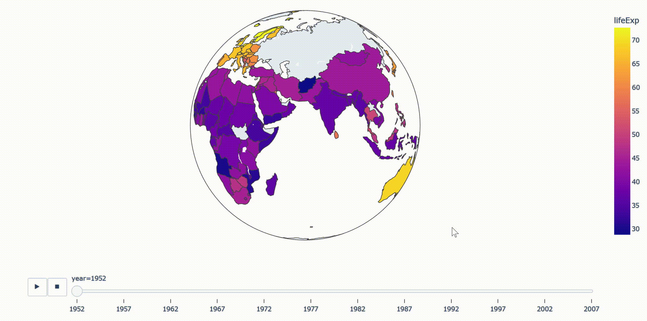
fig=px.choropleth(
df, # data set
locations="iso_alpha", # Match color display
color="lifeExp", # Field selection of color
hover_name="country", # Hover field name
animation_frame="year", # Add animation notes
color_continuous_scale=px.colors.sequential.Plasma, # Color change
#projection="natural earth" # Global map
projection="orthographic"
)
#Define map rendering data
fig.show()
#Display image
The results are as follows:
4, Summary
Plotly provides us with a very convenient data visualization tool. As far as the Python platform is concerned, the personalized visual presentation can be realized only by calling the data and visualization module. With the continuous contact with the content related to data visualization, I also understand that there are many other similar platforms that can provide us with such visualization tools, such as flood, ECharts, etc., which can realize data visualization through simple data upload.