
Chapter 3. Scales, Axes and Lines
(continued: Getting Started with D3: a pit filling journey (V): Chapter 3 (Part 1))
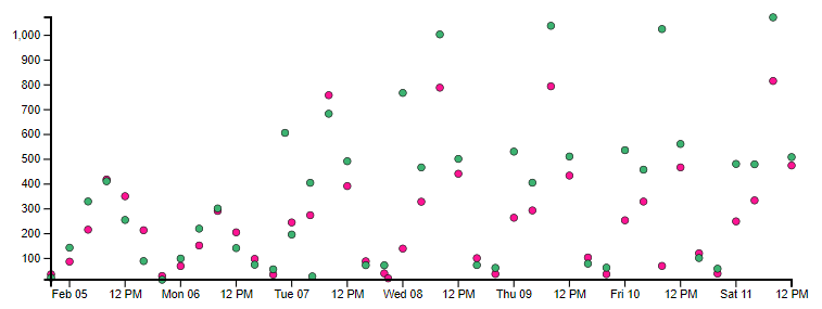
Example 2: draw a comparison diagram of the average daily flow of turnstiles at two locations
The turnstile here refers to the turnstile of the gate in and out of the subway station in New York. If one person passes, the number of turns will be increased by 1. The goal is to compare the average flow (or number of people) in and out of the turnstiles of the two major subway stations in New York - Times Square and Grand Central Square, draw on a time-based scatter chart, and further draw a scatter line chart.
This example is equivalent to adding two knowledge points of timeline and polyline on the basis of the previous case. The operation steps are as follows:
- Value range: since the two groups of data share a drawing area, when calculating the actual value range of x-axis and y-axis, all data points of the two stations should be taken into account D3 extent() ;
- Scale:
- The y-axis of the flow is still a linear scale (old version: d3.scale.linear(); New edition: D3 scaleLinear());
- When calculating the time scale of x-axis, D3 is used in the old version time. Scale (), d3.0 for new version scaleTime();
- Coordinate axis: y-axis is the same as example 1; The x-axis uses the time axis (old version: D3. SVG. Axis() scale(time_scale); New edition: D3 axisBottom(time_scale));
- Coordinate label: no change;
- Basic interface: two circle groups need to be created, representing Times Square and grand central square respectively, and the rest remain unchanged.
- Style setting: set different colors for different site data to distinguish them.
The effect is as follows:
The code is as follows:
<!DOCTYPE html>
<html lang="en">

<head>
    <meta charset="utf-8">
    <link rel="shortcut icon" href="/favicon.ico" type="image/x-icon">
    <title>Ch3 - Example 2 | Getting Started with D3</title>
</head>

<body>
    <h2>Ch3 - Example 2 | Graphing Turnstile Traffic</h2>
    <script src="/demos/js/d3.js"></script>
    <script>
        let json = null;
        function draw(data) {
            "use strict";

            // badass visualization code goes here
            json = data;

            // Viewport setup
            var margin = 40,
                width = 700 - margin,
                height = 300 - margin;

            var chart = d3.select('body')
                .append('svg')
                    .attr('width', width + margin)
                    .attr('height', height + margin)
                .append('g')
                    .attr('class', 'chart');

            chart.selectAll('circle.times_square')
                .data(data.times_square)
                .enter()
                .append('circle')
                    .attr('class', 'times_square');

            chart.selectAll('circle.grand_central')
                .data(data.grand_central)
                .enter()
                .append('circle')
                    .attr('class', 'grand_central');

            // scales
            // y_scale
            var count_extent = d3.extent(
                data.times_square.concat(data.grand_central),
                function(d) { return d.count }
            );
            var count_scale = d3.scale.linear()
                .domain(count_extent)
                .range([height, margin]);
            // x_scale
            var time_extent = d3.extent(
                data.times_square.concat(data.grand_central),
                function(d) { return d.time }
            );
            var time_scale = d3.time.scale()
                .domain(time_extent)
                .range([margin, width]);

            // draw circles
            chart.selectAll('circle')
                .attr('cx', function(d) { return time_scale(d.time) })
                .attr('cy', function(d) { return count_scale(d.count) })
                .attr('r', 3);

            // Axes
            // x
            var time_axis = d3.svg.axis().scale(time_scale);
            chart.append('g')
                .attr('class', 'x axis')
                .attr('transform', 'translate(0, '+height+')')
                .call(time_axis);
            // y
            var count_axis = d3.svg.axis().scale(count_scale).orient('left');
            chart.append('g')
                .attr('class', 'y axis')
                .attr('transform', 'translate('+margin+', 0)')
                .call(count_axis);
        }

        d3.json("/demos/data/turnstile_traffic.json", draw);
    </script>
    <style>
        .axis {
            font-family: Arial;
            font-size: 0.6em;
        }
        path {
            fill: none;
            stroke: black;
            stroke-width: 2px;
        }
        .tick {
            fill: none;
            stroke: black;
        }
        circle {
            stroke: black;
            stroke-width: 0.5px;
        }
        circle.times_square {
            fill: DeepPink;
        }
        circle.grand_central {
            fill: MediumSeaGreen;
        }
    </style>
</body>

</html>
Here is a slight adjustment compared with the example source code in the book. The first is to replace multiple references from D3. 0 with variable references Select() refers to the SVG element. Then, during the actual operation, it is found that the chart group created in line 31 is redundant. In fact, all drawing elements should be put into chart to make it a whole. So there are fine-tuning (L33, L39, L64, L78) starting with the chart variable.
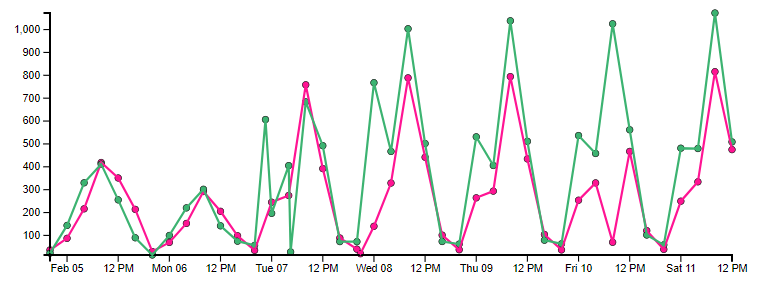
Next, the path element is introduced to connect the points into a line. The key attribute d of path, whose value is a group of drawing instructions, is responsible for connecting multiple points into a broken line according to the instructions. D3 encapsulates a polyline constructor for the value of D attribute. Using this function, you can quickly draw polylines by specifying source data and location information. D3 this powerful function, the old version is D3 svg. Line (), the new version is D3 line(). The returned result function contains an x(fn) and y(fn) method, and the parameters are an access function fn, which is responsible for mapping the data points on the corresponding axis to the drawing area under the scale respectively.
Add the following statement to draw a polyline:
// paths
var line = d3.svg.line()
    .x(function(d) { return time_scale(d.time) })
    .y(function(d) { return count_scale(d.count) });

// make lines
svg.append('path')
    .attr('class', 'times_square')
    .attr('d', line(data.times_square));
svg.append('path')
    .attr('class', 'grand_central')
    .attr('d', line(dat
CSS style with polyline:
path.times_square {
    stroke: DeepPink;
}
path.grand_central {
    stroke: MediumSeaGreen;
}
Get the broken line scatter diagram of the two stations:
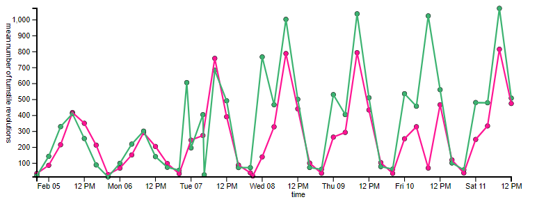
Add a coordinate axis label similar to example 1 to get the final effect:
// axis labels
// y
chart.select('.y.axis')
    .append('text')
        .text('mean number of turnstile revolutions')
        .attr('transform', 'rotate(90, '+ (-margin) +', 0)')
        .attr('x', 20)
        .attr('y', 0);
// x
chart.select('.x.axis')
    .append('text')
        .text('time')
        .attr('x', function(){ return (width / 1.6) - margin })
        .attr('y', margin / 1.5);
With the experience of pit filling in example 1, the pit rewritten in the new version of example 2 is no longer a pit:
- Axis labels are not displayed by default: you need to set the fill color for the text label: attr('fill', 'black');
- Coordinate axis label position offset: the vertical translation amount shall be added after the y-axis label is rotated, which shall be determined according to the actual situation (translate(155) is taken here);
- Axis scale label too thick: comment CSS Style: tick{ stroke: black; }
After connecting points to form a line, we can carry out simple data analysis: the average daily flow of times square lags behind that of Grand Central Square; In terms of the peak flow during the morning peak hours on weekdays, the Grand Central Square is better
Although some legends are missing to identify which line is which station, it is not necessary to be in place in one step at the starting stage, and the subsequent chapters should be expanded.
The complete code of the new D3 is as follows:
<!DOCTYPE html>
<html lang="en">

<head>
    <meta charset="utf-8">
    <link rel="shortcut icon" href="/favicon.ico" type="image/x-icon">
    <title>Ch3 - Example 2 | Getting Started with D3</title>
</head>

<body>
    <h2>Ch3 - Example 2 | Graphing Turnstile Traffic</h2>
    <script src="/demos/js/d3.v6.js"></script>
    <script>
        let json = null;
        function draw(data) {
            "use strict";

            // badass visualization code goes here
            json = data;

            // Viewport setup
            const margin = 40,
                width = 700 - margin,
                height = 300 - margin;

            const chart = d3.select('body')
                .append('svg')
                    .attr('width', width + margin)
                    .attr('height', height + margin)
                .append('g')
                    .attr('class', 'chart');

            chart.selectAll('circle.times_square')
                .data(data.times_square)
                .join(enter => enter.append('circle')
                    .attr('class', 'times_square')
                );

            chart.selectAll('circle.grand_central')
                .data(data.grand_central)
                .join(enter => enter.append('circle')
                    .attr('class', 'grand_central')
                );

            // scales
            // y_scale
            const count_extent = d3.extent(
                data.times_square.concat(data.grand_central),
                d => d.count
            );
            const count_scale = d3.scaleLinear()
                .domain(count_extent)
                .range([height, margin]);
            // x_scale
            const time_extent = d3.extent(
                data.times_square.concat(data.grand_central),
                d => d.time
            );
            const time_scale = d3.scaleTime()
                .domain(time_extent)
                .range([margin, width]);

            // draw circles
            d3.selectAll('circle')
                .attr('cx', d => time_scale(d.time))
                .attr('cy', d => count_scale(d.count))
                .attr('r', 3);

            // Axes
            // x
            const time_axis = d3.axisBottom(time_scale);
            chart.append('g')
                .attr('class', 'x axis')
                .attr('transform', `translate(0, ${height})`)
                .call(time_axis);
            // y
            const count_axis = d3.axisLeft(count_scale);
            chart.append('g')
                .attr('class', 'y axis')
                .attr('transform', `translate(${margin}, 0)`)
                .call(count_axis);

            // paths
            const line = d3.line()
                .x(d => time_scale(d.time) )
                .y(d => count_scale(d.count) );

            // make lines
            chart.append('path')
                .attr('class', 'times_square')
                .attr('d', line(data.times_square));
            chart.append('path')
                .attr('class', 'grand_central')
                .attr('d', line(data.grand_central));

            // axis labels
            // y
            d3.select('.y.axis')
                .append('text')
                    .text('mean number of turnstile revolutions')
                    .attr('fill', 'black')
                    .attr('transform', `rotate(90, ${-margin}, 0) translate(155)`)
                    .attr('x', 20)
                    .attr('y', 0);
            // x
            d3.select('.x.axis')
                .append('text')
                    .text('time')
                    .attr('fill', 'black')
                    .attr('x', (width / 1.6) - margin)
                    .attr('y', margin / 1.5);

        }

        d3.json("/demos/data/turnstile_traffic.json").then(draw)
            .catch(console.error);
    </script>
    <style>
        .axis {
            font-family: Arial;
            font-size: 0.6em;
        }
        path {
            fill: none;
            stroke: black;
            stroke-width: 2px;
        }
        path.times_square {
            stroke: DeepPink;
        }
        path.grand_central {
            stroke: MediumSeaGreen;
        }
        .tick {
            fill: none;
            /* stroke: black; */
        }
        circle {
            stroke: black;
            stroke-width: 0.5px;
        }
        circle.times_square {
            fill: DeepPink;
        }
        circle.grand_central {
            fill: MediumSeaGreen;
        }
    </style>
</body>

</html>