preface
This article actually belongs to: Advanced way of Python [AIoT phase I] This paper introduces Matplotlib data visualization, and will send a separate article on advanced Matplotlib data visualization and advanced Matplotlib data visualization for readers to learn.
In data analysis and machine learning, we often use a lot of visual operations. A beautifully made data picture can show a lot of information. One picture is worth a thousand words.
In visualization, Matplotlib is the most commonly used tool. Matplotlib is the most famous drawing library in python. It provides a complete set of API s, which is very suitable for drawing charts or modifying some attributes of charts, such as font, label, range, etc.
Matplotlib is a Python 2D drawing library that generates publishing quality graphics in an interactive environment. Through the standard class library of Matplotlib, developers only need a few lines of code to generate graphs, line charts, scatter charts, bar charts, pie charts, histograms, combination charts and other data analysis visualization charts.
🌟 Before learning this article, you need to study by yourself: NumPy from beginner to advanced,pandas from beginner to advanced Many operations in this article are NumPy from beginner to advanced ,pandas from beginner to advanced The second article has a detailed introduction, including some software and extension libraries, and the installation and download process of pictures. This article will be used directly.
download M a t p l o t l i b Matplotlib Matplotlib see blog: matplotlib installation tutorial and simple call , I won't repeat it here
1. Basic knowledge
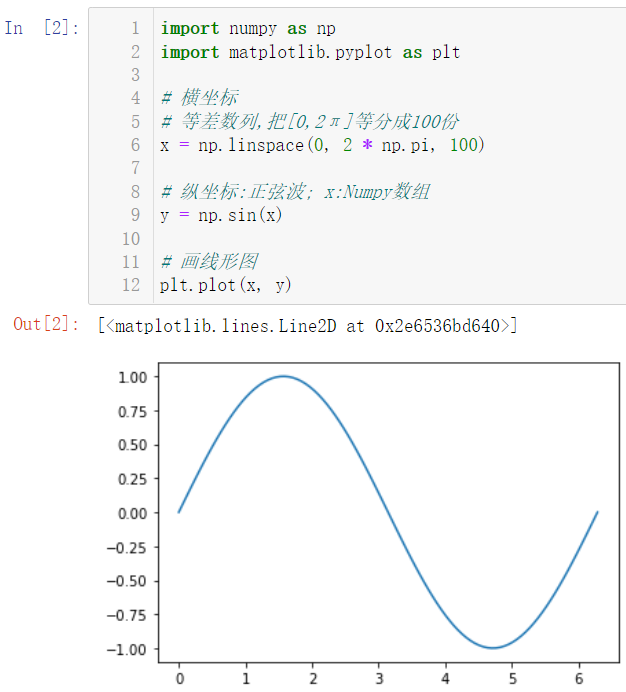
1.1 drawing
🚩 In fact, data visualization is to convert abstract data that is not easy to see the law into pictures that are more acceptable to the human eye. Let's simply draw a graph
import numpy as np
import matplotlib.pyplot as plt

# Abscissa
# Arithmetic sequence, divide [0,2 π] into 100 parts
x = np.linspace(0, 2 * np.pi, 100)

# Ordinate: sine wave; x:Numpy array
y = np.sin(x)

# Draw a line graph
plt.plot(x, y)
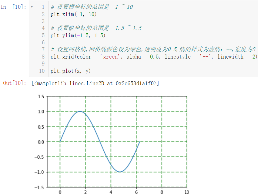
Next, we will simply set the parameters of this diagram:
# The range of abscissa is - 1 ~ 10
plt.xlim(-1, 10)

# The range of vertical coordinates is - 1.5 ~ 1.5
plt.ylim(-1.5, 1.5)

# Set the grid line. The grid line color is set to green, the transparency is 0.5, the line style is dotted line: -, and the width is 2
plt.grid(color = 'green', alpha = 0.5, linestyle = '--', linewidth = 2)

plt.plot(x, y)
1.2 title, label, coordinate axis scale
1.2.1 Title Setting
🚩 The title is actually the name of the picture, that is, what the picture is and what meaning it expresses
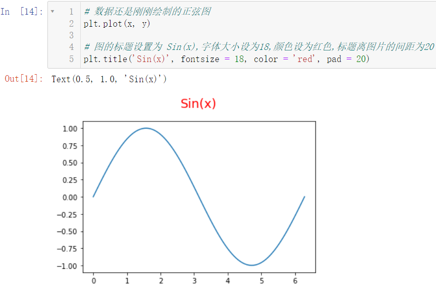
# The data is still the sine diagram just drawn
plt.plot(x, y)

# The title of the picture is set to Sin(x), the font size is set to 18, the color is set to red, and the spacing between the title and the picture is 20
plt.title('Sin(x)', fontsize = 18, color = 'red', pad = 20)
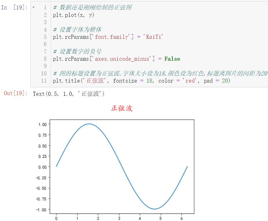
So can we set the title to Chinese?
# The data is still the sine diagram just drawn
plt.plot(x, y)

# The title of the picture is set to sine wave, the font size is set to 18, the color is set to red, and the spacing between the title and the picture is 20
plt.title('sine wave', fontsize = 18, color = 'red', pad = 20)
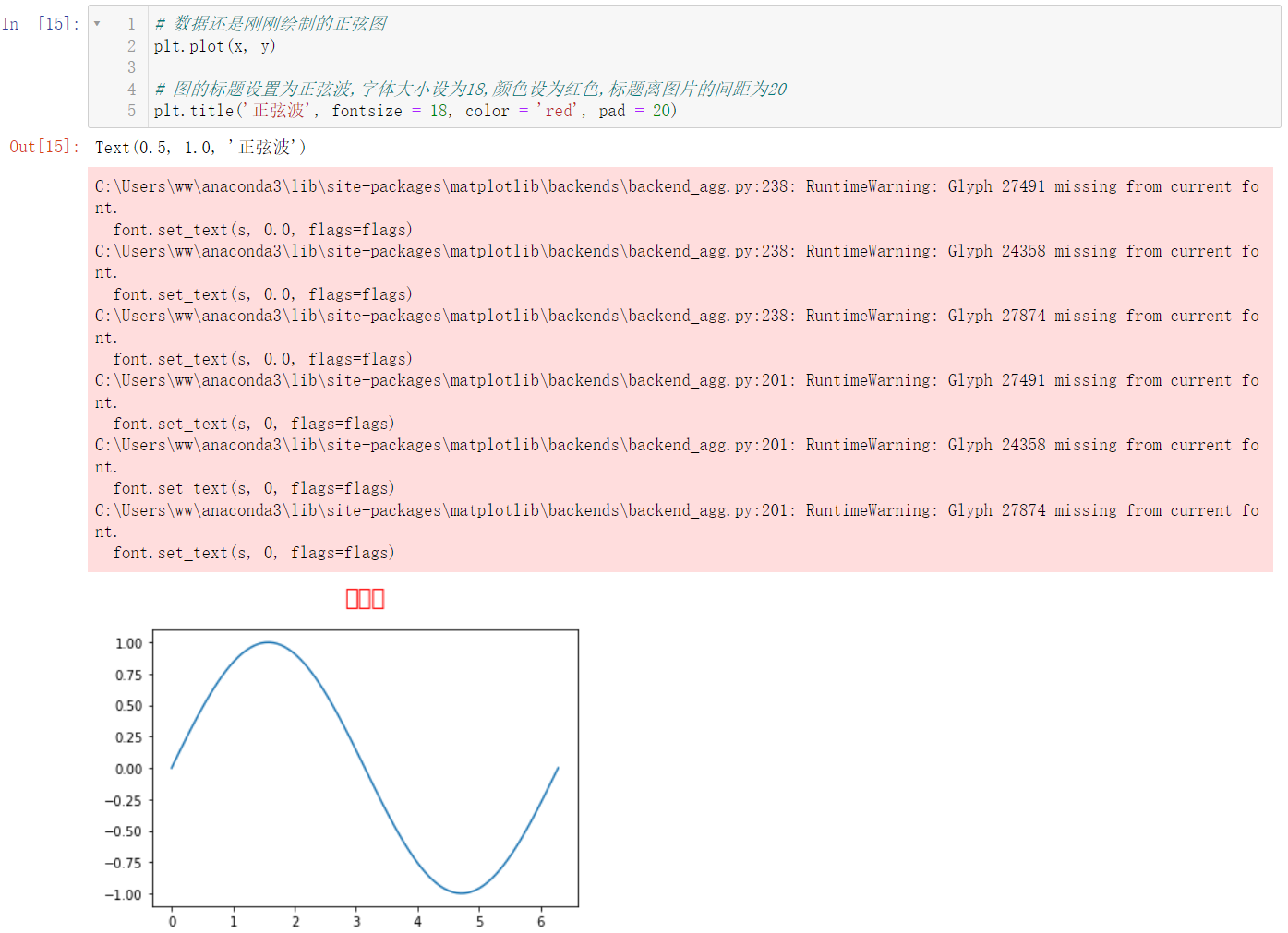
WTF??? It's actually wrong. Let's introduce the solution:
First, let's check what fonts our computers have:
# Find the computer font
from matplotlib import font_manager
fm = font_manager.FontManager()
# Get font with list generation
[font.name for font in fm.ttflist]
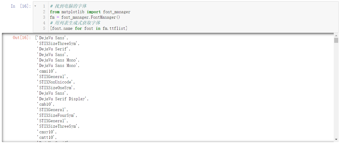
Our computer has many fonts. This screenshot shows only some fonts, including English fonts, Chinese Fonts
We can find out if there's any
K
a
i
T
i
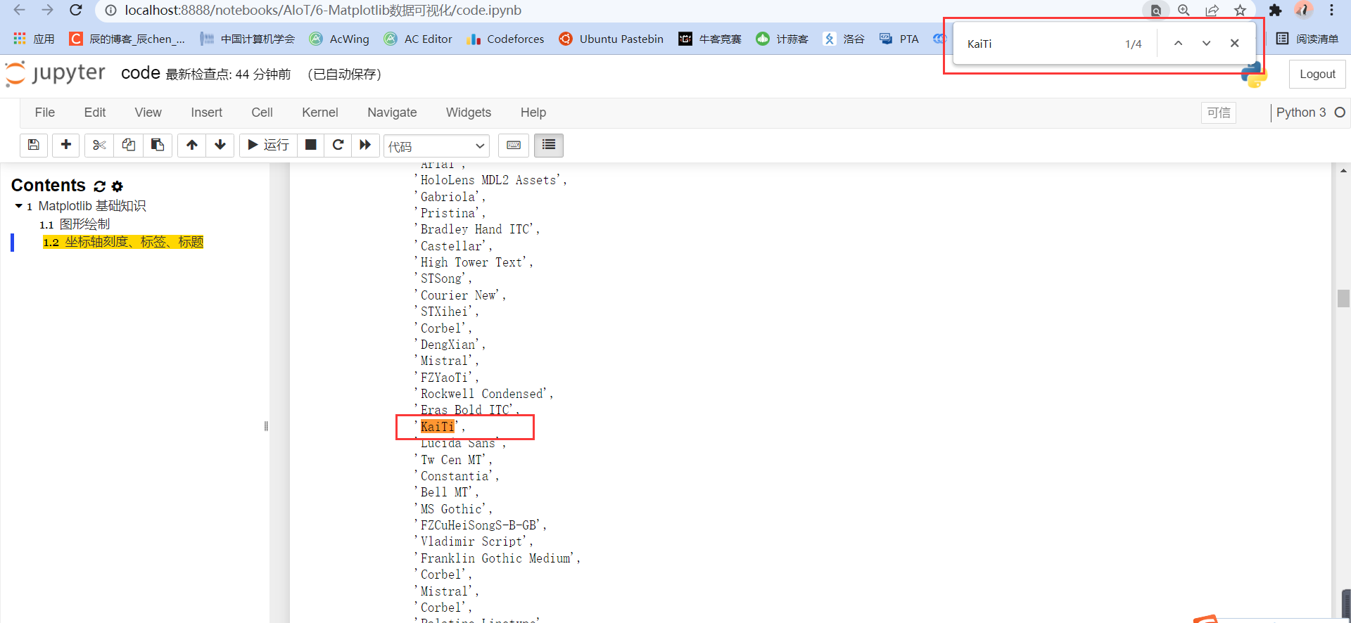
KaiTi
Kaiti (italics)
Browser page search (Google browser), press Ctrl + F and enter KaiTi:
Or you can search Song typeface. Generally, computers will have these fonts. Next, go back to our error code and let's set our font:
# The data is still the sine diagram just drawn
plt.plot(x, y)

# Set font to regular script
plt.rcParams['font.family'] = 'KaiTi'

# The title of the picture is set to sine wave, the font size is set to 18, the color is set to red, and the spacing between the title and the picture is 20
plt.title('sine wave', fontsize = 18, color = 'red', pad = 20)
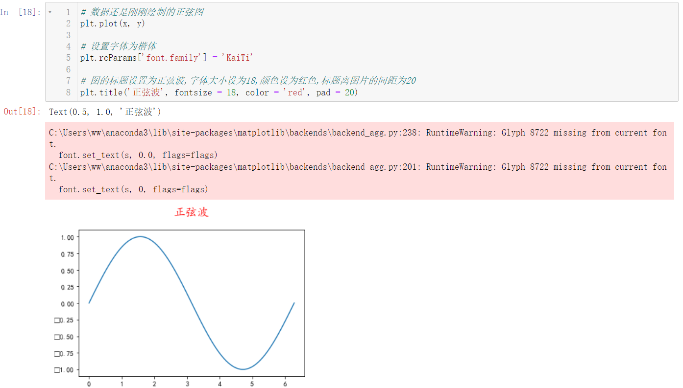
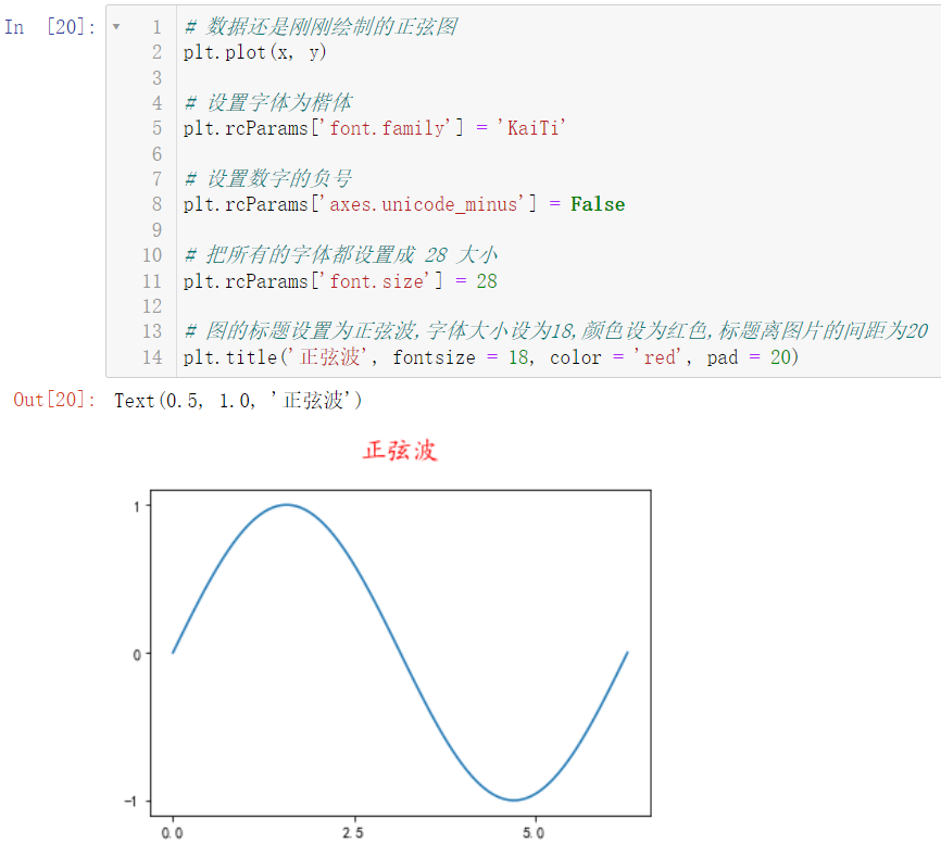
The sine wave is displayed, but there is still an error. This wave ~, this wave is called right, but it is not completely right. We can find that there is a problem with the negative sign by observing the image:
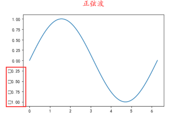
No, what a big deal. If there is a bug, we will continue to correct it:
# The data is still the sine diagram just drawn
plt.plot(x, y)

# Set font to regular script
plt.rcParams['font.family'] = 'KaiTi'

# Sets the minus sign of the number
plt.rcParams['axes.unicode_minus'] = False

# The title of the picture is set to sine wave, the font size is set to 18, the color is set to red, and the spacing between the title and the picture is 20
plt.title('sine wave', fontsize = 18, color = 'red', pad = 20)
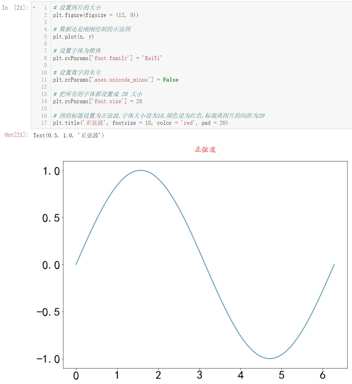
ok, now all the bug s have been solved perfectly, but they are not good enough. The font is a little small, which seems to cost your eyes. Let's make all the fonts bigger:
# The data is still the sine diagram just drawn
plt.plot(x, y)

# Set font to regular script
plt.rcParams['font.family'] = 'KaiTi'

# Sets the minus sign of the number
plt.rcParams['axes.unicode_minus'] = False

# Set all fonts to 28
plt.rcParams['font.size'] = 28

# The title of the picture is set to sine wave, the font size is set to 18, the color is set to red, and the spacing between the title and the picture is 20
plt.title('sine wave', fontsize = 18, color = 'red', pad = 20)
Good guy, there's a problem again. Although our fonts have become larger (the picture is not obvious, and the reader will make obvious changes after executing the code), our corresponding picture has become smaller. Let's set the size of the picture:
# Set the size of the picture
plt.figure(figsize = (12, 9))

# The data is still the sine diagram just drawn
plt.plot(x, y)

# Set font to regular script
plt.rcParams['font.family'] = 'KaiTi'

# Sets the minus sign of the number
plt.rcParams['axes.unicode_minus'] = False

# Set all fonts to 28
plt.rcParams['font.size'] = 28

# The title of the picture is set to sine wave, the font size is set to 18, the color is set to red, and the spacing between the title and the picture is 20
plt.title('sine wave', fontsize = 18, color = 'red', pad = 20)
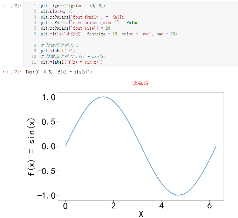
1.2.2 label setting
🚩 The label corresponding to our figure above is actually the abscissa and ordinate
plt.figure(figsize = (9, 6))
plt.plot(x, y)
plt.rcParams['font.family'] = 'KaiTi'
plt.rcParams['axes.unicode_minus'] = False
plt.rcParams['font.size'] = 28
plt.title('sine wave', fontsize = 18, color = 'red', pad = 20)

# Set abscissa to X
plt.xlabel('X')
# Set the ordinate to f(x) = sin(x)
plt.ylabel('f(x) = sin(x)')
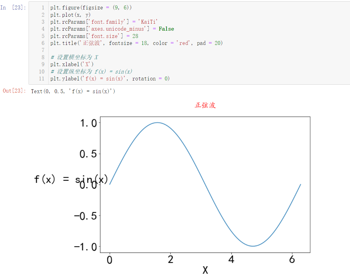
It's uncomfortable to look at the vertical coordinate. Let's turn it horizontally:
plt.figure(figsize = (9, 6))
plt.plot(x, y)
plt.rcParams['font.family'] = 'KaiTi'
plt.rcParams['axes.unicode_minus'] = False
plt.rcParams['font.size'] = 28
plt.title('sine wave', fontsize = 18, color = 'red', pad = 20)

# Set abscissa to X
plt.xlabel('X')
# Set the ordinate to f(x) = sin(x)
plt.ylabel('f(x) = sin(x)', rotation = 0)
Ordinate distance
y
y
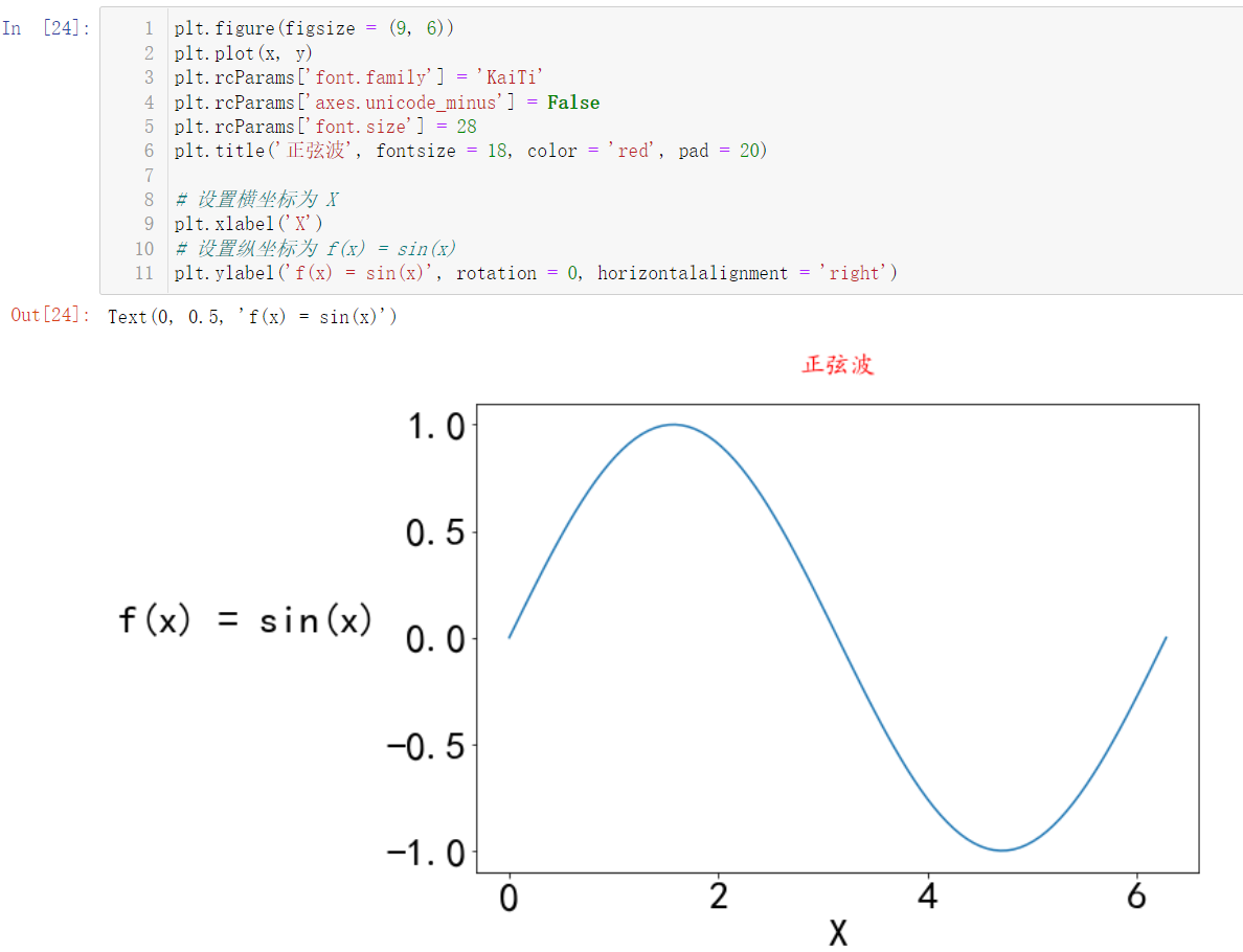
The y-axis is a little close. Let's continue to adjust:
plt.figure(figsize = (9, 6))
plt.plot(x, y)
plt.rcParams['font.family'] = 'KaiTi'
plt.rcParams['axes.unicode_minus'] = False
plt.rcParams['font.size'] = 28
plt.title('sine wave', fontsize = 18, color = 'red', pad = 20)

# Set abscissa to X
plt.xlabel('X')
# Set the ordinate to f(x) = sin(x)
plt.ylabel('f(x) = sin(x)', rotation = 0, horizontalalignment = 'right')
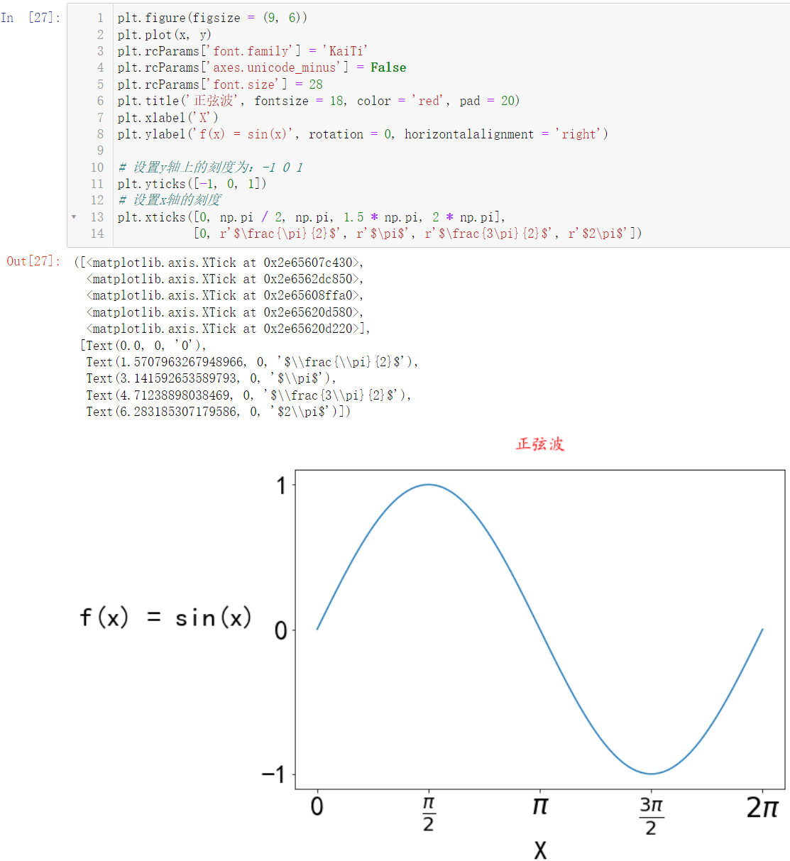
1.2.3 setting of coordinate axis scale
🚩 Next, we set the scale. 0 2 4 6 -1.0 -0.5 0.0 0.5 1.0 in the above figure is actually the scale, because we now depict a sine wave. For a sine wave, we
y
y
The scale on the y-axis is actually - 1 0 1:
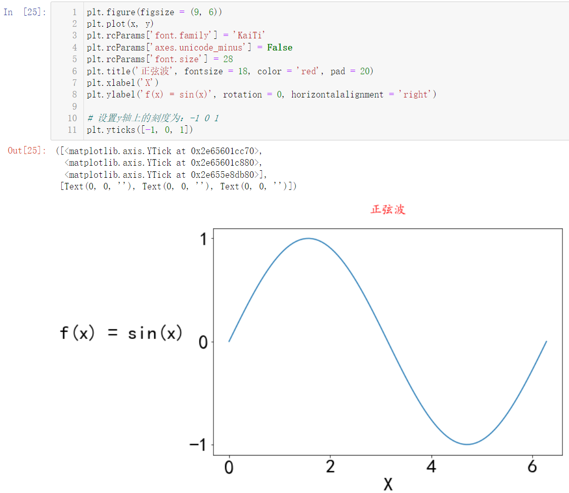
Our abscissa scale is generally zero for sine waves
0
,
π
2
,
π
,
3
π
2
,
2
π
0, \frac{\pi}{2}, \pi,\frac{3\pi}{2},2π
0,2π,π,23π,2π:
plt.figure(figsize = (9, 6))
plt.plot(x, y)
plt.rcParams['font.family'] = 'KaiTi'
plt.rcParams['axes.unicode_minus'] = False
plt.rcParams['font.size'] = 28
plt.title('sine wave', fontsize = 18, color = 'red', pad = 20)
plt.xlabel('X')
plt.ylabel('f(x) = sin(x)', rotation = 0, horizontalalignment = 'right')

# Set the scale on the y axis to: - 1 0 1
plt.yticks([-1, 0, 1])
# Sets the scale of the x-axis
plt.xticks([0, np.pi / 2, np.pi, 1.5 * np.pi, 2 * np.pi])
This seems to be different from what we hope. The compiler is too sincere. Just put
π
\pi
π is brought into the calculation. Obviously, that's not what we want. We want
π
\pi
π is displayed in Greek letters:
plt.figure(figsize = (9, 6))
plt.plot(x, y)
plt.rcParams['font.family'] = 'KaiTi'
plt.rcParams['axes.unicode_minus'] = False
plt.rcParams['font.size'] = 28
plt.title('sine wave', fontsize = 18, color = 'red', pad = 20)
plt.xlabel('X')
plt.ylabel('f(x) = sin(x)', rotation = 0, horizontalalignment = 'right')

# Set the scale on the y axis to: - 1 0 1
plt.yticks([-1, 0, 1])
# Sets the scale of the x-axis
plt.xticks([0, np.pi / 2, np.pi, 1.5 * np.pi, 2 * np.pi],
           [0, r'$\frac{\pi}{2}$', r'$\pi$', r'$\frac{3\pi}{2}$', r'$2\pi$'])
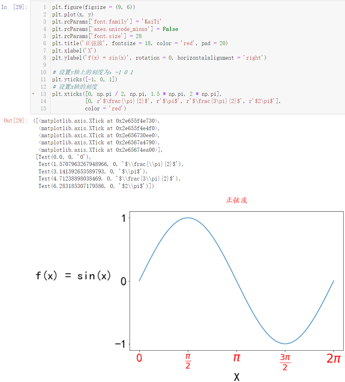
Of course, we can set the color. For example, we can set the abscissa scale to red:
plt.figure(figsize = (9, 6))
plt.plot(x, y)
plt.rcParams['font.family'] = 'KaiTi'
plt.rcParams['axes.unicode_minus'] = False
plt.rcParams['font.size'] = 28
plt.title('sine wave', fontsize = 18, color = 'red', pad = 20)
plt.xlabel('X')
plt.ylabel('f(x) = sin(x)', rotation = 0, horizontalalignment = 'right')

# Set the scale on the y axis to: - 1 0 1
plt.yticks([-1, 0, 1])
# Sets the scale of the x-axis
plt.xticks([0, np.pi / 2, np.pi, 1.5 * np.pi, 2 * np.pi],
           [0, r'$\frac{\pi}{2}$', r'$\pi$', r'$\frac{3\pi}{2}$', r'$2\pi$'],
           color = 'red')
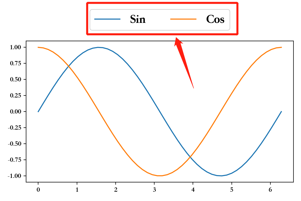
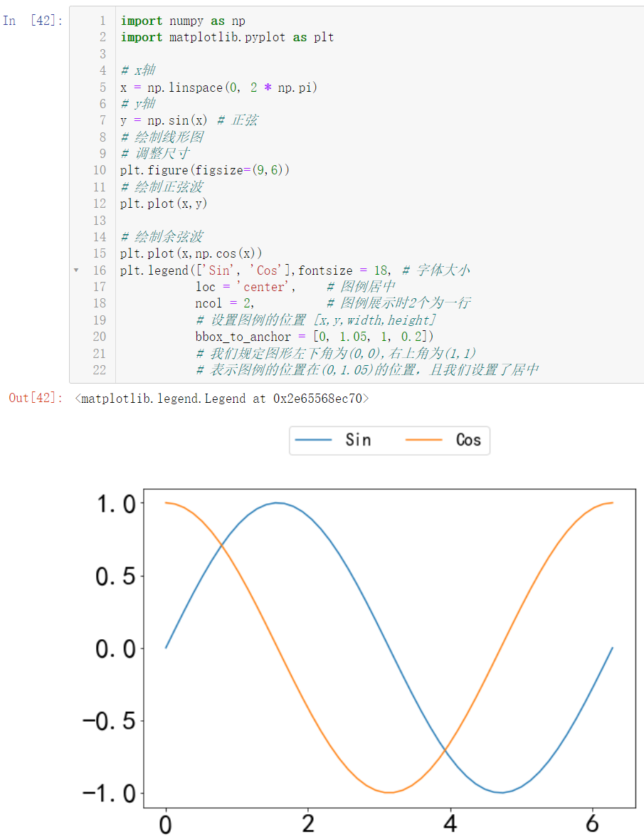
1.3 legend
🚩 Legend is to display multiple diagrams in the same table. We need to distinguish their corresponding small boxes:
import numpy as np
import matplotlib.pyplot as plt

# x axis
x = np.linspace(0, 2 * np.pi)
# y-axis
y = np.sin(x) # sine
# Draw line graph
# Adjust size
plt.figure(figsize=(9,6))
# Draw sine wave
plt.plot(x,y)

# Draw cosine wave
plt.plot(x,np.cos(x))
plt.legend(['Sin', 'Cos'],fontsize = 18, # font size
           loc = 'center',    # Legend centered
           ncol = 2,          # When displaying the legend, 2 are in one line
           # Set the position of the legend [x,y,width,height]
           bbox_to_anchor = [0, 1.05, 1, 0.2])
           # We specify that the lower left corner of the figure is (0,0) and the upper right corner is (1,1)
           # Indicates that the position of the legend is at (0,1.05), and we set the center
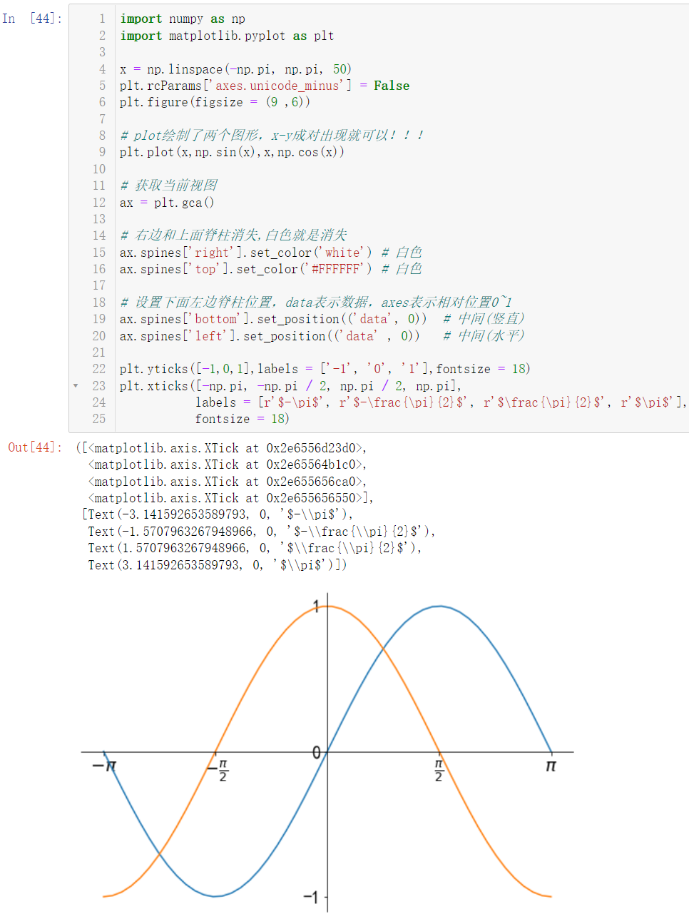
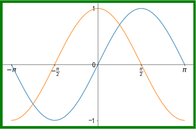
1.4 spine movement
🚩 The movement of the spine translated into vernacular is the movement of the black frame
import numpy as np
import matplotlib.pyplot as plt

x = np.linspace(-np.pi, np.pi, 50)
plt.rcParams['axes.unicode_minus'] = False
plt.figure(figsize = (9 ,6))

# plot draws two graphs, x-y can appear in pairs!!!
plt.plot(x,np.sin(x),x,np.cos(x))

# Get current view
ax = plt.gca()

# The right and upper spine disappear. White is the disappearance
ax.spines['right'].set_color('white') # white
ax.spines['top'].set_color('#FFFFFF') # white

# Set the position of the lower left spine. Data represents the data and axes represents the relative position 0 ~ 1
ax.spines['bottom'].set_position(('data', 0))  # Middle (vertical)
ax.spines['left'].set_position(('data' , 0))   # Middle (horizontal)

plt.yticks([-1,0,1],labels = ['-1', '0', '1'],fontsize = 18)
plt.xticks([-np.pi, -np.pi / 2, np.pi / 2, np.pi],
           labels = [r'$-\pi$', r'$-\frac{\pi}{2}$', r'$\frac{\pi}{2}$', r'$\pi$'],
           fontsize = 18)
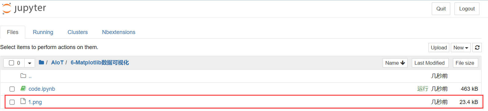
1.5 picture saving
🚩 We can save our drawn graphics:
import numpy as np
import matplotlib.pyplot as plt

x = np.linspace(-np.pi, np.pi, 50)
plt.rcParams['axes.unicode_minus'] = False
plt.figure(figsize = (9 ,6))

# plot draws two graphs, x-y can appear in pairs!!!
plt.plot(x,np.sin(x),x,np.cos(x))

# Get current view
ax = plt.gca()

# The right and upper spine disappear. White is the disappearance
ax.spines['right'].set_color('white') # white
ax.spines['top'].set_color('#FFFFFF') # white

# Set the position of the lower left spine. Data represents data and axes represents the relative position 0 ~ 1
ax.spines['bottom'].set_position(('data', 0))  # Middle (vertical)
ax.spines['left'].set_position(('data' , 0))   # Middle (horizontal)

plt.yticks([-1,0,1],labels = ['-1', '0', '1'],fontsize = 18)
plt.xticks([-np.pi, -np.pi / 2, np.pi / 2, np.pi],
           labels = [r'$-\pi$', r'$-\frac{\pi}{2}$', r'$\frac{\pi}{2}$', r'$\pi$'],
           fontsize = 18)

# Save the picture to the current path and name it 1 png
plt.savefig('./1.png')
When saving, we can modify the screen pixel density:
d
p
i
dpi
dpi(100 by default)
import numpy as np
import matplotlib.pyplot as plt

x = np.linspace(-np.pi, np.pi, 50)
plt.rcParams['axes.unicode_minus'] = False
plt.figure(figsize = (9 ,6))

# plot draws two graphs, x-y can appear in pairs!!!
plt.plot(x,np.sin(x),x,np.cos(x))

# Get current view
ax = plt.gca()

# The right and upper spine disappear, and white is the disappearance
ax.spines['right'].set_color('white') # white
ax.spines['top'].set_color('#FFFFFF') # white

# Set the position of the lower left spine. Data represents the data and axes represents the relative position 0 ~ 1
ax.spines['bottom'].set_position(('data', 0))  # Middle (vertical)
ax.spines['left'].set_position(('data' , 0))   # Middle (horizontal)

plt.yticks([-1,0,1],labels = ['-1', '0', '1'],fontsize = 18)
plt.xticks([-np.pi, -np.pi / 2, np.pi / 2, np.pi],
           labels = [r'$-\pi$', r'$-\frac{\pi}{2}$', r'$\frac{\pi}{2}$', r'$\pi$'],
           fontsize = 18)

# Save the picture to the current path and name it 2 Png, the pixel density is set to 300
plt.savefig('./2.png', dpi = 300)
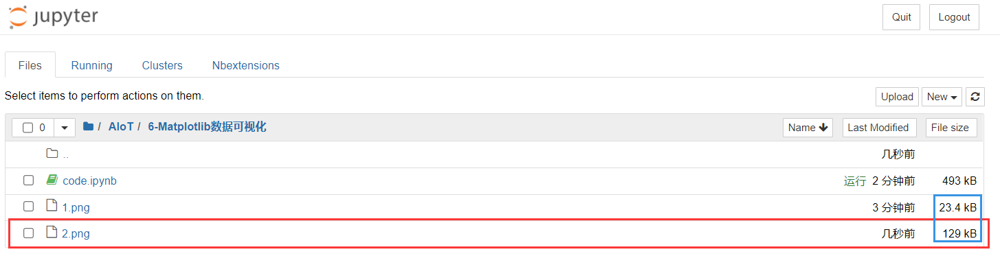
In fact, the clarity can be seen from the size of the two pictures, because the same picture is saved
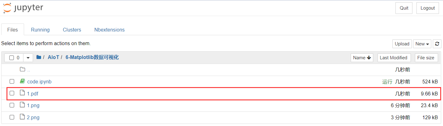
Of course, we can also save it as
p
d
f
pdf
pdf
import numpy as np
import matplotlib.pyplot as plt
x = np.linspace(-np.pi, np.pi, 50)
plt.rcParams['axes.unicode_minus'] = False
plt.figure(figsize = (9 ,6))
# plot draws two graphs, x-y can appear in pairs!!!
plt.plot(x,np.sin(x),x,np.cos(x))
# Get current view
ax = plt.gca()
# The right and upper spine disappear, and white is the disappearance
ax.spines['right'].set_color('white') # white
ax.spines['top'].set_color('#FFFFFF') # white
# Set the position of the lower left spine. Data represents the data and axes represents the relative position 0 ~ 1
ax.spines['bottom'].set_position(('data', 0)) # Middle (vertical)
ax.spines['left'].set_position(('data' , 0)) # Middle (horizontal)
plt.yticks([-1,0,1],labels = ['-1', '0', '1'],fontsize = 18)
plt.xticks([-np.pi, -np.pi / 2, np.pi / 2, np.pi],
labels = [r'$-\pi$', r'$-\frac{\pi}{2}$', r'$\frac{\pi}{2}$', r'$\pi$'],
fontsize = 18)
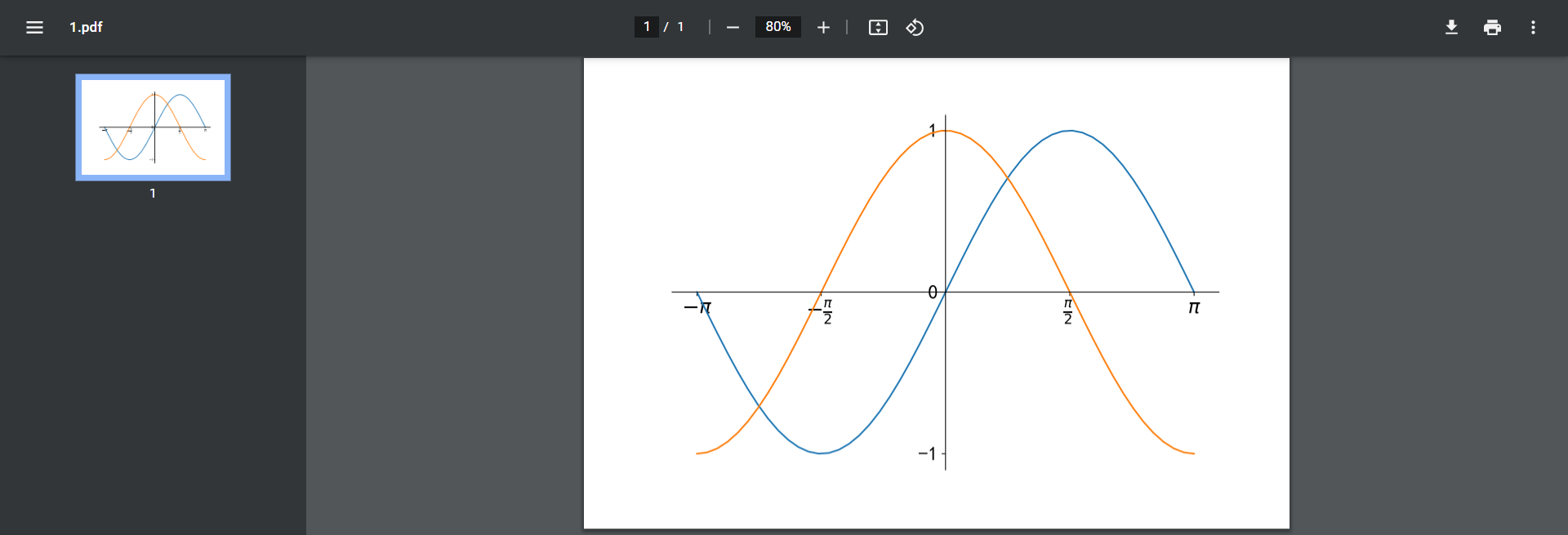
# Save the picture to the current path in PDF format and named 1 pdf
plt.savefig('./1.pdf')
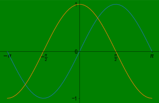
If you think the white background is too monotonous, we can set the color (change the border color) when setting the font size:
# Set a green border
plt.figure(figsize = (9 ,6), facecolor = 'green')
If we want to change the background color, we can change it after obtaining the view:
# Get current view
ax = plt.gca()
# Change the background color to green
ax.set_facecolor('green')
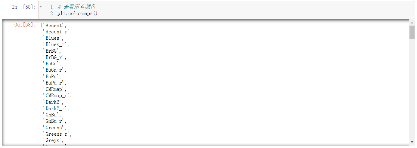
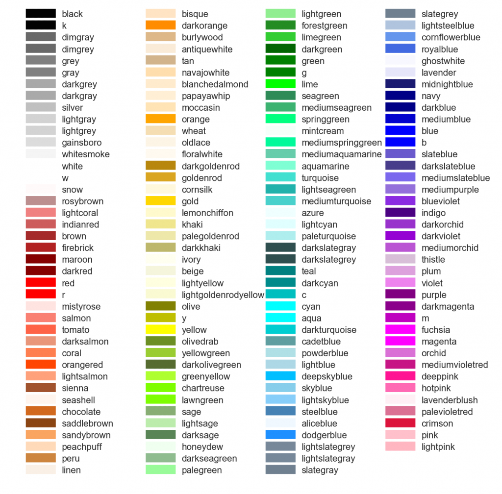
See what colors we can set and write code:
# View all colors
plt.colormaps()
2. Style and style
2.1 color, line shape, dot shape, line width and transparency
🚩 The following figure represents the colors we can use:
Next, let's explain it in combination with the code:
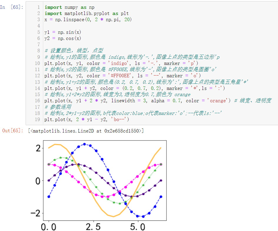
import numpy as np
import matplotlib.pyplot as plt
x = np.linspace(0, 2 * np.pi, 20)

y1 = np.sin(x)
y2 = np.cos(x)

# Set color, linetype, dot
# Draw the graph of X and Y1, the color is indigo, and the line is' -. ', The type of point on the image is pentagonal 'p
plt.plot(x, y1, color = 'indigo', ls = '-.', marker = 'p')
# draw x,y2 Graphics for,The color is #FF00EE, the line is' - ', and the type of point on the image is circle' o '
plt.plot(x, y2, color = '#FF00EE', ls = '--', marker = 'o')
# Draw the graph of x,y1+y2, the color is (0.2, 0.7, 0.2), the line is': ', and the type of point on the image is Pentagram' * '
plt.plot(x, y1 + y2, color = (0.2, 0.7, 0.2), marker = '*',ls = ':')
# Draw a graph of x,y1+2*y2 with line width of 3, transparency of 0.7 and color of orange
plt.plot(x, y1 + 2 * y2, linewidth = 3, alpha = 0.7, color = 'orange') # Lineweight, transparency
# Parameter combination
# Draw the graph of x,2*y1-y2, and b represents color:blue;o stands for marker:'o'-- For ls: '--'
plt.plot(x, 2 * y1 - y2, 'bo--')
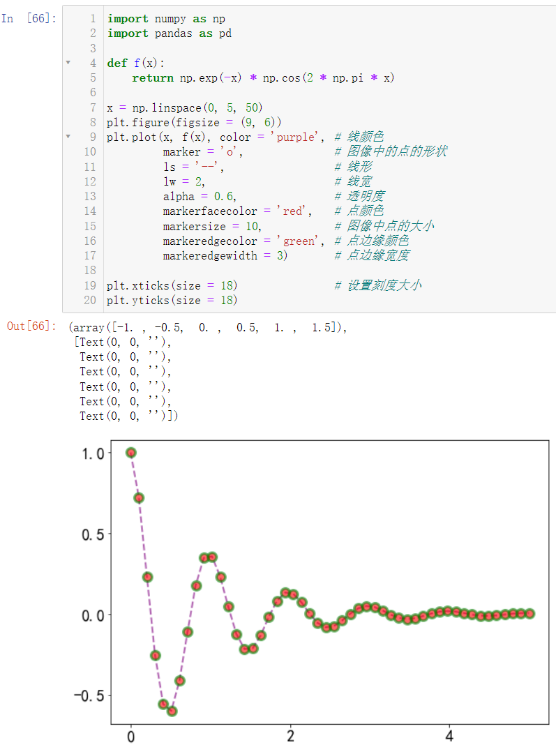
2.2 more attribute settings
import numpy as np
import pandas as pd

def f(x):
    return np.exp(-x) * np.cos(2 * np.pi * x)

x = np.linspace(0, 5, 50)
plt.figure(figsize = (9, 6))
plt.plot(x, f(x), color = 'purple', # Line color
         marker = 'o',              # The shape of the point in the image
         ls = '--',                 # linear
         lw = 2,                    # line width
         alpha = 0.6,               # transparency
         markerfacecolor = 'red',   # Dot color
         markersize = 10,           # The size of the midpoint of the image
         markeredgecolor = 'green', # Point edge color
         markeredgewidth = 3)       # Point edge width

plt.xticks(size = 18)               # Set scale size
plt.yticks(size = 18)
3. Training ground
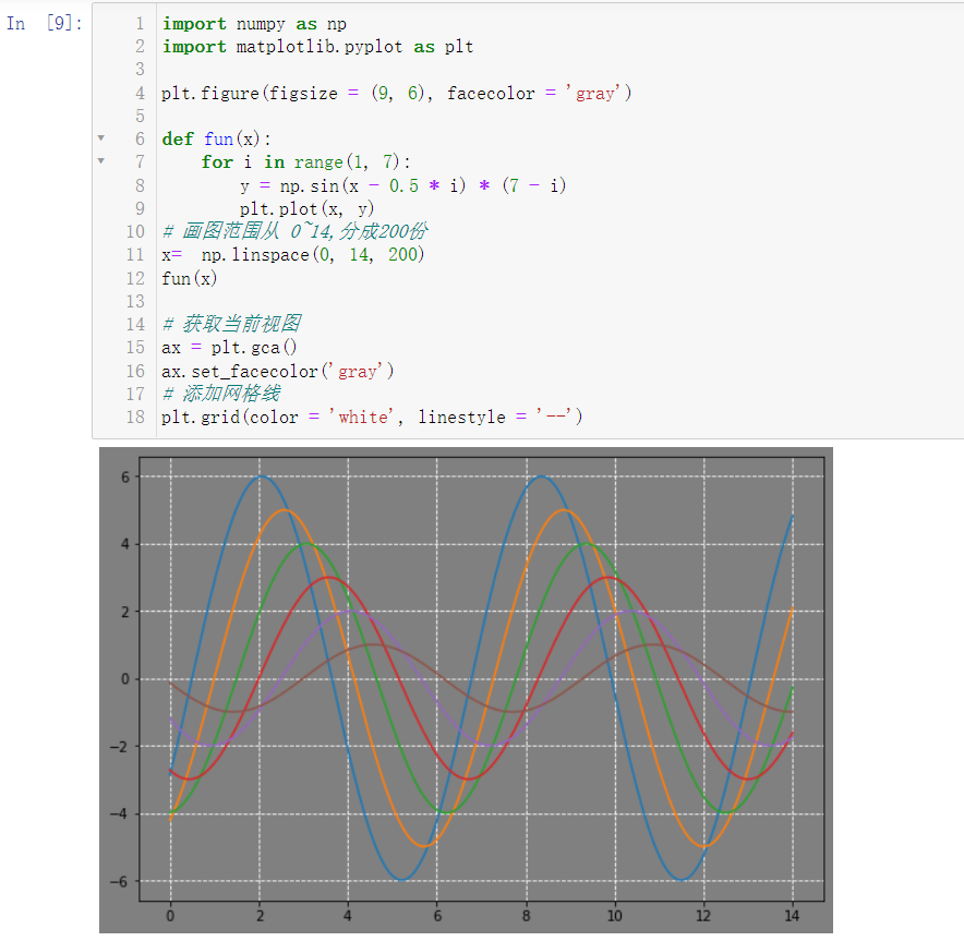
3.1 draw the following figure
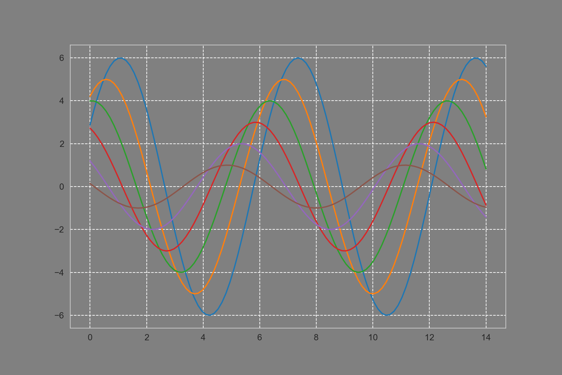
requirement:
- Set the background color to gray
- Set the view color to gray
- Set gridline color: white
- Style gridlines: dashed lines
- The functional relationship is as follows: y = NP sin(x + i * 0.5) * (7 - i)
- i in the equation can be given a range of 1 ~ 6, representing 6 lines in the picture
import numpy as np
import matplotlib.pyplot as plt

plt.figure(figsize = (9, 6), facecolor = 'gray')

def fun(x):
    for i in range(1, 7):
        y = np.sin(x - 0.5 * i) * (7 - i)
        plt.plot(x, y)
# The drawing range is from 0 to 14, divided into 200 parts
x=  np.linspace(0, 14, 200)
fun(x)

# Get current view
ax = plt.gca()
ax.set_facecolor('gray')
# Add gridlines
plt.grid(color = 'white', linestyle = '--')
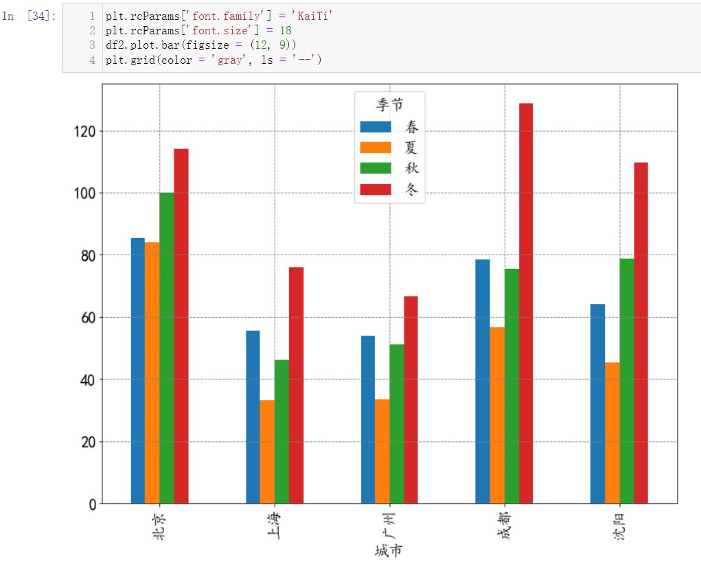
3.2 perform grouping and aggregation operation according to the provided data, and draw the following graphics
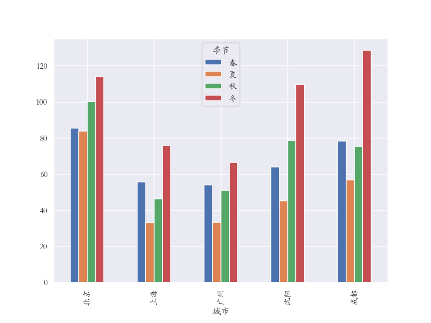
requirement:
- The PM2 of each city in spring, summer, autumn and winter is obtained by grouping and aggregation Average of 5
- Reshape the group aggregation results
- Adjust the row index order according to: Beijing, Shanghai, Guangzhou, Shenyang and Chengdu
- Adjust column index order: spring, summer, autumn and winter
- Draw a bar chart using the DataFrame method
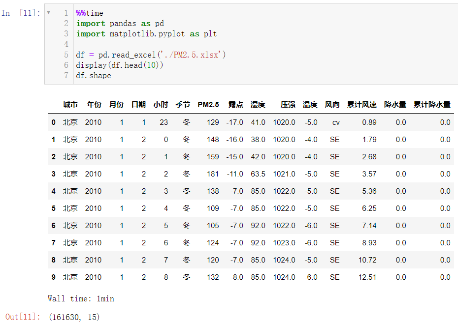
First, we need to download an Excel file:
Link: https://pan.baidu.com/s/1ns8p3xD_EVS2GNNKApDtLg?pwd=eu4u
Extraction code: eu4u
After downloading, put the file and our code in the same folder. This operation has been repeatedly mentioned in our previous blog, so we won't demonstrate it here
Note: when the code is running, it will display:

It is normal for the following code to run for tens of seconds or even minutes. Just wait patiently for the running results.
Let's load our data first
%%time
import pandas as pd
import matplotlib.pyplot as plt

df = pd.read_excel('./PM2.5.xlsx')
display(df.head(10))
df.shape
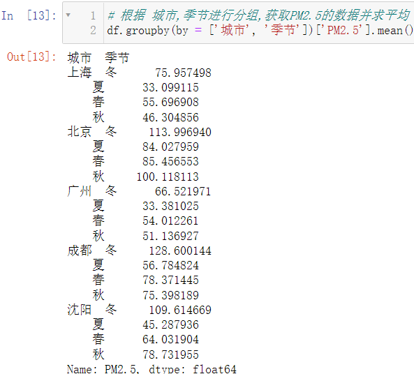
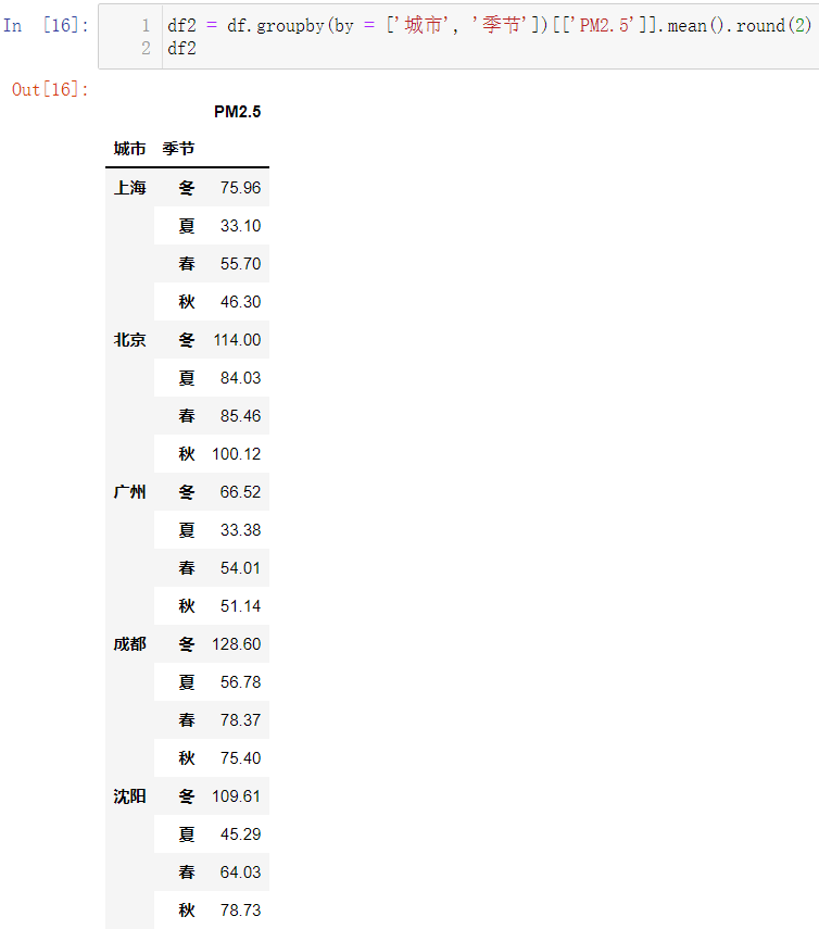
# Group according to city and season to obtain PM2 5 and average
df.groupby(by = ['city', 'season'])['PM2.5'].mean()
The data doesn't look very comfortable. Turn it into
D
a
t
a
F
r
a
m
e
DataFrame
DataFrame format with two decimal places
df2 = df.groupby(by = ['city', 'season'])[['PM2.5']].mean().round(2)
df2
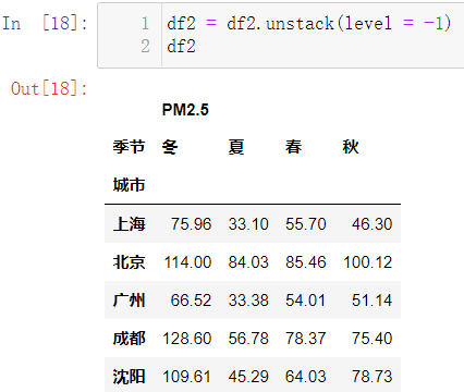
The data still looks unsightly. Data remodeling:
df2 = df2.unstack(level = -1)
df2
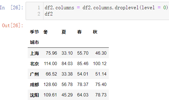
Delete PM2 5:
df2.columns = df2.columns.droplevel(level = 0)
df2
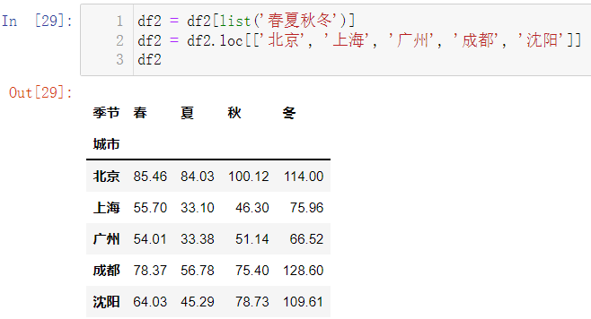
Adjust the order of column indexes:
df2 = df2[list('spring, summer, autumn and winter')]
df2 = df2.loc[['Beijing', 'Shanghai', 'Guangzhou', 'Chengdu', 'Shenyang']]
df2
mapping:
plt.rcParams['font.family'] = 'KaiTi'
plt.rcParams['font.size'] = 18
df2.plot.bar(figsize = (12, 9))
plt.grid(color = 'gray', ls = '--')