1, Layout
Description of Compose layout on the official website
Composable functions are the basic building blocks of Compose. Composable function is a function that emits "Unit", which is used to describe a part of the interface. This function takes some input and generates what is displayed on the screen. For more information on composable items, see Compose conception model file.
A composable function may emit multiple interface elements. However, if you don't provide guidance on how to arrange these elements, Compose may arrange them in a way you don't like.
When we try to write code like this
@Composable
fun MainPage() {
    Text(text = "Hello,Jetpack Compose!")
    Text(text = "hello,jetpack compose!")
}
In the preview view, you will find that the two texts overlap
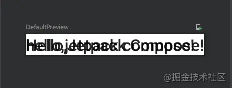
In xml, we can arrange / constrain the position of view elements in various layout methods, so how to implement it in Compose? Is there anything similar to LinearLayout, FrameLaoyout and ConstraintLayout in Compose?
The answer is: there must be.
In many cases, you only need to use Standard layout elements for Compose Just.
The following layout methods can basically meet the daily development layout requirements.
1. Row
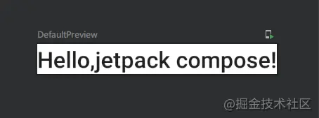
Row can be understood as the horizontal mode of LinearLayout in Xml layout, for example:
@Composable
fun MainPage() {
    Row(){
        Text(text = "Hello")
        Text(text = ",")
        Text(text = "jetpack compose!")
    }
}
From the source code of Row, we can see that we can also pass the following parameters:
@Composable
inline fun Row(
    modifier: Modifier = Modifier,
    horizontalArrangement: Arrangement.Horizontal = Arrangement.Start,
    verticalAlignment: Alignment.Vertical = Alignment.Top,
    content: @Composable RowScope.() -> Unit
) {
    ...
}| parameter | type | Default value | meaning |
|---|---|---|---|
| modifier | Modifier | Modifier | Modifier for layout |
| horizontalArrangement | Arrangement.Horizontal | Arrangement.Start | The horizontal placement method of layout children. By default, it is placed from the beginning of the layout to the end of the layout |
| verticalAlignment | Alignment.Vertical | Alignment.Top | The vertical alignment of layout children is from the top of the layout by default |
For example:
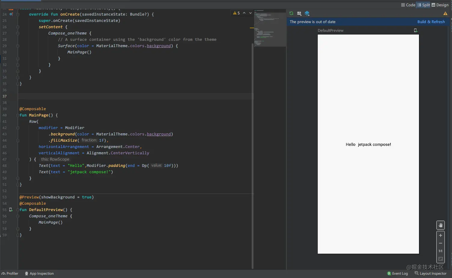
It should be noted that, like LinearLayout, views that exceed the maximum width or height of the layout setting will not be visible
2. Column
Column can be understood as the vertical mode of LinearLayout in Xml layout, for example:
@Composable
fun MainPage() {
    Column(Modifier.padding(Dp(50f))) {
        Text(text = "Hello")
        Text(text = ",")
        Text(text = "jetpack compose!")
    }
}
From the source code of Column, we can see that we can also pass the following parameters:
@Composable
inline fun Column(
    modifier: Modifier = Modifier,
    verticalArrangement: Arrangement.Vertical = Arrangement.Top,
    horizontalAlignment: Alignment.Horizontal = Alignment.Start,
    content: @Composable ColumnScope.() -> Unit
) {
    ...
}| parameter | type | Default value | meaning |
|---|---|---|---|
| modifier | Modifier | Modifier | Modifier for layout |
| verticalArrangement | Arrangement.Vertical | Arrangement.Top | The vertical placement of layout children is from the top of the layout to the bottom of the layout by default |
| horizontalAlignment | Alignment.Horizontal | Alignment.Start | The horizontal alignment of layout children starts from the layout by default |
Column has the same problem as Row. Note that the parameters used to decorate the placement of column children are different from Row
3. Box
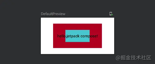
Box can be understood as FrameLayout in Xml layout, for example:
@Composable
fun MainPage() {
    Box(Modifier.size(Dp(300f), Dp(150f)),
        contentAlignment = Alignment.Center) {
        Box(modifier = Modifier
            .background(MaterialTheme.colors.error)
            .size(Dp(200f), Dp(100f)))
        Box(modifier = Modifier
            .background(MaterialTheme.colors.secondary)
            .size(Dp(100f), Dp(50f)))
        Text(text = "hello,jetpack compose!")
    }
}
From the source code of Column, we can see that we can also pass the following parameters:
@Composable
inline fun Box(
    modifier: Modifier = Modifier,
    contentAlignment: Alignment = Alignment.TopStart,
    propagateMinConstraints: Boolean = false,
    content: @Composable BoxScope.() -> Unit
) {
   ...
}| parameter | type | Default value | meaning |
|---|---|---|---|
| modifier | Modifier | Modifier | Modifier for layout |
| contentAlignment | Alignment | Alignment.TopStart | Default alignment within Box |
| propagateMinConstraints | Boolean | false | Whether the minimum constraint passed in should be passed to the content. |
4. BoxWithConstraints
To understand the constraints from the parent and design the layout accordingly, you can use {BoxWithConstraints. You can find it in the scope of the content lambda Measurement constraints.
BoxWithConstraints is exactly the same as Box, but as the official said, constraints can be measured, such as:
@Composable
fun MainPage1() {
    BoxWithConstraints {
        Text("My minHeight is $maxHeight while my maxWidth is $maxWidth")
    }
}
The maximum and minimum width and height information of BoxWithConstraints can be obtained within its scope.
5. ConstraintLayout
ConstraintLayout is actually the ConstraintLayout in Xml layout. Let's look at the official description
ConstraintLayout helps to place composable items on the screen according to their relative position. It is an alternative to using multiple nested rows, columns, boxes, and custom layout elements. ConstraintLayout is useful when implementing large layouts with complex alignment requirements.
Note: in the View system, it is recommended to use constraint layout to create complex large layouts, because flat View hierarchies perform better than nested views. However, this is not a problem in Compose because it can efficiently handle deeper layout hierarchies.
Note: whether to use constraint layout for a specific interface in Compose depends on the developer's preferences. In Android View system, constraint layout is used as a method to build higher performance layout, but this is not a problem in Compose. When you need to make a selection, consider whether constraint layout helps to improve the readability and maintainability of composable items.
It can be seen that although ConstraintLayout is officially provided, it is not recommended to use it in composition. The fundamental purpose of using ConstraintLayout in xml is to reduce the view nesting level and improve the page rendering performance of android. There is no concept of view nesting in composition, so whether to use ConstraintLayout, It is necessary to consider whether personal habits and constraint layout help to improve the readability and maintainability of composable items.
Before using ConstraintLayout, you need to build Add the following dependencies to gradle:
implementation "androidx.constraintlayout:constraintlayout-compose:1.0.0-alpha08"
Constraint layout support in Compose DSL:
- References are created using , createRefs() or , createRefFor(). Each composable item in ConstraintLayout , needs to have a reference associated with it.
- Constraints are provided using the constraint as() modifier, which takes a reference as a parameter and allows you to specify its constraints in the body lambda.
- Constraints are specified using {linkTo() or other useful methods.
- parent , is an existing reference that can be used to specify constraints on the , ConstraintLayout , composable item itself.
Still look at the following example:
@Composable
fun MainPage() {
    ConstraintLayout(Modifier.size(200.dp)) {
        val (button, text) = createRefs()
        Button(
            onClick = { },
            modifier = Modifier.constrainAs(button) {
                top.linkTo(parent.top)
                start.linkTo(parent.start)
                end.linkTo(parent.end)
                bottom.linkTo(parent.bottom)
            },
            colors = ButtonDefaults.buttonColors(
                backgroundColor = MaterialTheme.colors.secondary,
                contentColor = Color.White
            )
        ) {
            Text("Button")
        }

        Text("Text", Modifier.constrainAs(text) {
            top.linkTo(button.top)
        })
    }
}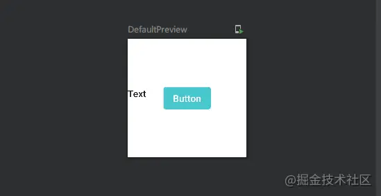
It can be seen that the usage is basically the same as that in xml. The button in the code is constrained to the center of the view, and the top of text is aligned with the top of the button.
6. Spacer
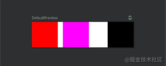
A blank view. The official does not provide a property similar to margin in Xml. It may be recommended to use this instead. For example:
@Composable
fun MainPage() {
    Row {
        Box(Modifier.size(100.dp).background(Color.Red))
        Spacer(Modifier.width(20.dp))
        Box(Modifier.size(100.dp).background(Color.Magenta))
        Spacer(Modifier.weight(1f))
        Box(Modifier.size(100.dp).background(Color.Black))
    }
}
2, Finally
A good memory is not as good as a bad pen. Learning Jetpack Compose series for the first time is my own learning notes. While deepening knowledge and consolidating, I can also exercise my writing skills. The content in the article is for reference only. If you have any questions, please leave a message for correction.
2. Scroll view
As mentioned above, Row and Column cannot be displayed if the fruit view exceeds the boundary of the parent view; ScrollView is generally used in xml to support view scrolling. Accordingly, it can be implemented by LazyRow and LazyColumn in Compose, but their functions are not only used to realize view scrolling, so they will not be expanded in this article. LazyRow and LazyColumn are expected to be described in the subsequent widget articles.