Declaration container
| option | explain |
|---|---|
| display: grid; | Block level container |
| display: inline-grid; | Row level container |
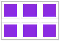
Divide rows and columns
A grid is a bit like a table, with rows and columns. Use the grid template columns rule to divide the number of columns, and use grid template rows to divide the number of rows.
Repeat settings
Use repeat to set values uniformly. The first parameter is the number of duplicates, and the second parameter is the duplicate value

display: grid;
grid-template-rows: repeat(2, 50%);
grid-template-columns: repeat(2, 100px 50px);
Auto fill
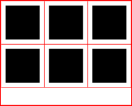
width: 300px;
height: 240px;
display: grid;
grid-template-rows: repeat(auto-fill, 100px);
grid-template-columns: repeat(auto-fill, 100px);//6 div
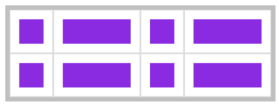
Proportion Division

width: 300px;
height: 100px;
display: grid;
grid-template-rows: repeat(2, 1fr);
grid-template-columns: repeat(2, 1fr 2fr);
Combination definition
Note: grid template is short for grid template rows, grid template columns and grid template areas.
display: grid;
grid-template: repeat(2, 1fr) / repeat(2, 1fr 2fr);
Set value range
The value range can be set by using minmax method. The following row heights are taken from the minimum 100px to the maximum 1fr.
width: 300px;
height: 300px;
display: grid;
grid-template-rows: 100px minmax(100px, 1fr);//Min 100px, Max infinity
grid-template-columns: 100px 1fr;
Spacing definition
grid-template-rows: repeat(2, 1fr);
grid-template-columns: repeat(3, 1fr);
row-gap: 20px;
column-gap: 20px;
//Abbreviated as follows
gap: 20px 10px;
merge cell
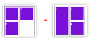
div:last-child{
      grid-row-start: 1; //Start with the first line
      grid-column-start: 1; //Start of the first column
      grid-row-end: 3;  //The third line ends
      grid-column-end: 2;  //End of the second column
    }
//Simple writing 1
grid-row: 1/3;
grid-column: 1/2;
//Simple writing 2
grid-area: 1/1/3/2;
Grid flow
Setting the grid auto flow property in the container can change the arrangement of cells.
| option | explain |
|---|---|
| column | Sort by column |
| row | Arrange by row |
| dense | The element uses the previous free grid (an example is shown below) |
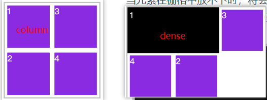
grid-auto-flow: row dense;
Element alignment
You can easily define the alignment of grids or elements through attributes
| option | explain | object |
|---|---|---|
| justify-content | The horizontal alignment of all grids in the container when the container has additional space | Grid Container |
| align-content | The vertical alignment of all grids in the container when the container has additional space | Grid Container |
| align-items | Vertical arrangement of all elements in the grid | Grid element |
| justify-items | The horizontal arrangement of all elements in the grid | Grid element |
| align-self | Vertical alignment of an element in the grid | Grid element |
| justify-self | Horizontal alignment of an element in the grid | Grid element |
The values of justify content / align content attribute are as follows
| value | explain |
|---|---|
| start | Container left |
| end | Right side of container |
| center | Middle of container |
| stretch | Fill the container |
| space-between | The first grid is on the left, the last grid is on the right, and the remaining elements distribute space equally |
| space-around | The spacing on both sides of each element is equal. Therefore, the spacing between grids is twice as large as the spacing between grids and container margins |
| space-evenly | The distance between grids is completely evenly distributed |
Abbreviation: place-content: Vertical and horizontal;
The values of the justify items / align items attribute are as follows
| value | explain |
|---|---|
| start | Align elements to the left of the grid |
| end | Align elements to the right of the grid |
| center | Align elements to the middle of the grid |
| stretch | Horizontal full grid |
Abbreviation: place-items:Vertical and horizontal;
The values of the justify self and align self attributes are as follows
| value | explain |
|---|---|
| start | Align elements to the left of the grid |
| end | Align elements to the right of the grid |
| center | Align elements to the middle of the grid |
| stretch | Horizontal full grid |
Abbreviation: place-self:vertical s