**Review: * * after reviewing the first chapter, we have a basic understanding of the Titanic data and some basic statistical methods. In the second chapter, we learned the data cleaning and reconstruction to make the data easier to understand; Today we are going to learn section 3 of Chapter 2: data visualization. We mainly introduce the Python data visualization library Matplotlib. In this chapter, you may find the data very interesting. In the process of playing the game, data visualization can let us better see the results of each key step, which can be used to optimize the scheme. It is a very useful skill.
Chapter 2: Data Visualization
Before you start, import numpy, pandas, and matplotlib packages and data
# Load the required libraries
# If modulenotfounderror appears: no module named 'XXXX'
# You just need to pip install xxxx under the terminal / cmd
import numpy as np
import pandas as pd
import matplotlib.pyplot as plt
%matplotlib inline
#Load result CSV this data
df = pd.read_csv('result.csv')
df.head()
| Unnamed: 0 | PassengerId | Survived | Pclass | Name | Sex | Age | SibSp | Parch | Ticket | Fare | Cabin | Embarked | |
|---|---|---|---|---|---|---|---|---|---|---|---|---|---|
| 0 | 0 | 1 | 0 | 3 | Braund, Mr. Owen Harris | male | 22.0 | 1.0 | 0.0 | A/5 21171 | 7.2500 | NaN | S |
| 1 | 1 | 2 | 1 | 1 | Cumings, Mrs. John Bradley (Florence Briggs Th... | female | 38.0 | 1.0 | 0.0 | PC 17599 | 71.2833 | C85 | C |
| 2 | 2 | 3 | 1 | 3 | Heikkinen, Miss. Laina | female | 26.0 | 0.0 | 0.0 | STON/O2. 3101282 | 7.9250 | NaN | S |
| 3 | 3 | 4 | 1 | 1 | Futrelle, Mrs. Jacques Heath (Lily May Peel) | female | 35.0 | 1.0 | 0.0 | 113803 | 53.1000 | C123 | S |
| 4 | 4 | 5 | 0 | 3 | Allen, Mr. William Henry | male | 35.0 | 0.0 | 0.0 | 373450 | 8.0500 | NaN | S |
2.7 how to make people understand your data at a glance?
Chapter 9 of Python for Data Analysis
2.7.1 task 1: follow Chapter 9 of the book, learn about matplotlib, create a data item by yourself and visualize it basically
[thinking] what are the most basic visual patterns? Which scenarios are applicable? (for example, a line chart is suitable for visualizing the trend of an attribute value over time)
#Think and answer
#In this part, we need to understand the logic of visual pattern and know what kind of pattern can express what kind of signal b
2.7.2 task 2: visually display the distribution of the number of surviving men and women in the Titanic data set (try with the histogram).
#Code writing

sex = df.groupby('Sex')['Survived'].sum() # sex is a Series
print(type(sex))
sex
<class 'pandas.core.series.Series'>


Sex
female    233
male      109
Name: Survived, dtype: int64
sex.plot.bar() # For this Series, directly call plot Bar () method can draw a histogram
plt.title("survived_count") # Add Title: PLT title()
plt.show() # Show graphics
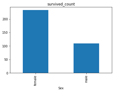
[thinking] calculate the death toll of men and women in the Titanic data set and display it visually? How can it be combined with the visual histogram of male and female survival? See your data visualization and talk about your first feelings (for example, if you can see that there are more boys living at a glance, then gender may affect the survival rate).
#Answer to thinking questions
2.7.3 task 3: visually display the proportion of survival and death of men and women in the Titanic data set (try with the histogram).
# Test and see what's printed out
df.groupby(['Sex','Survived']).count()
| Unnamed: 0 | PassengerId | Pclass | Name | Age | SibSp | Parch | Ticket | Fare | Cabin | Embarked | ||
|---|---|---|---|---|---|---|---|---|---|---|---|---|
| Sex | Survived | |||||||||||
| female | 0 | 81 | 81 | 81 | 81 | 64 | 81 | 81 | 81 | 81 | 6 | 81 |
| 1 | 233 | 233 | 233 | 233 | 197 | 233 | 233 | 233 | 233 | 91 | 231 | |
| male | 0 | 468 | 468 | 468 | 468 | 360 | 468 | 468 | 468 | 468 | 62 | 468 |
| 1 | 109 | 109 | 109 | 109 | 93 | 109 | 109 | 109 | 109 | 45 | 109 |
#Code writing
# Tip: calculate the number of deaths among men and women. 1 means survival and 0 means death

# Step 1 Grouped by Sex and visited,
count_Sex_Survived = df.groupby(['Sex','Survived'])['Survived'].count()
count_Sex_Survived
Sex     Survived
female  0            81
        1           233
male    0           468
        1           109
Name: Survived, dtype: int64
# Step 2 Use the untack() function to convert serise to DataFrame
unstack_count = count_Sex_Survived.unstack()
print(type(unstack_count))
unstack_count
<class 'pandas.core.frame.DataFrame'>
| Survived | 0 | 1 |
|---|---|---|
| Sex | ||
| female | 81 | 233 |
| male | 468 | 109 |
# Step 3: draw the DataFrame
unstack_count.plot(kind='bar',stacked='True')
plt.title("survived_count")
plt.ylabel('count')
Text(0, 0.5, 'count')
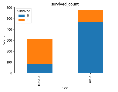
# stacked='True 'is the above, not the following
unstack_count.plot.bar()
plt.title("survived_count")
plt.ylabel('count')
Text(0, 0.5, 'count')
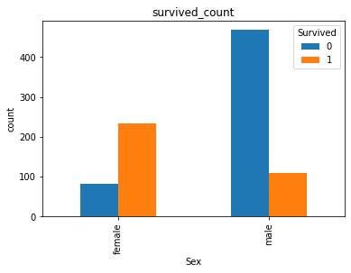
[hint] for the two data axes of men and women, the number of survival and death is represented by histogram in proportion
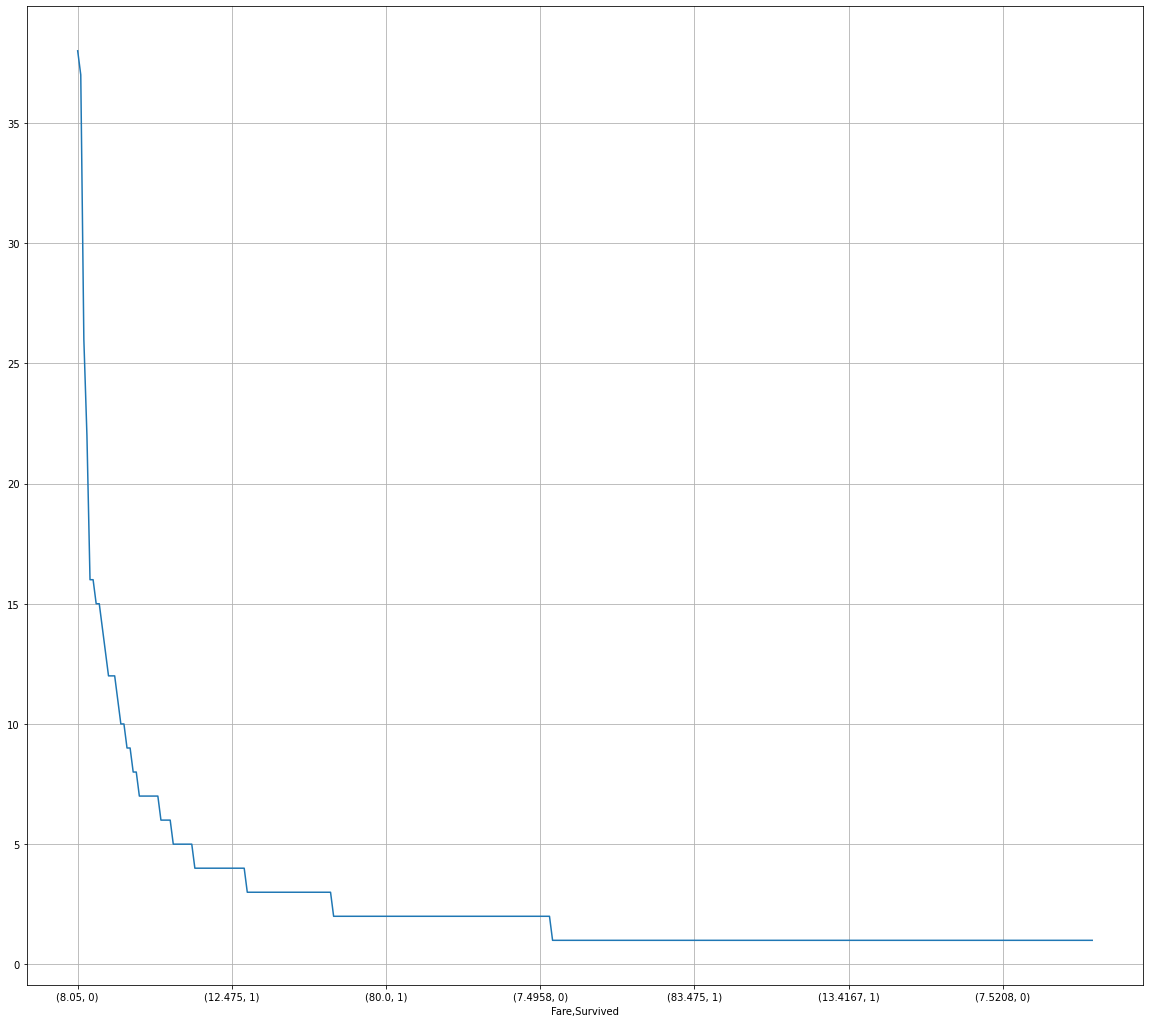
2.7.4 task 4: visually display the distribution of survival and death toll of people with different ticket prices in the Titanic data set. (try the broken line chart) (the horizontal axis shows different ticket prices, and the vertical axis shows the number of survivors)
[tip] for this statistical data represented by broken lines, you can consider sorting or not sorting the data to represent them respectively. See what you can find?
#Code writing
# Calculate the number of survival and death in different ticket prices. 1 means survival and 0 means death

# Step 1: group by
# Step 2: draw the group
fare_sur = df['Survived'].groupby(df['Fare']).value_counts().sort_values(ascending=False)
# These two are the same, fare_sur = text.groupby(['Fare'])['Survived'].value_counts().sort_values(ascending=False)
fare_sur
Fare     Survived
8.0500   0           38
7.8958   0           37
13.0000  0           26
7.7500   0           22
13.0000  1           16
                     ..
7.7417   0            1
26.2833  1            1
7.7375   1            1
26.3875  1            1
22.5250  0            1
Name: Survived, Length: 330, dtype: int64
# Draw a line chart after sorting: add some conditions instead of simple ones plot()
fig = plt.figure(figsize=(20,18)) # Define the size of the drawing board, but it is not necessarily the size of one picture. Sometimes there are multiple pictures
fare_sur.plot(grid=True) # show grid
# plt.legend()
plt.show()
2.7.5 task 5: visually display the distribution of survival and death of people at different positions in the Titanic data set. (try histogram)
#Code writing
# 1 means survival and 0 means death

# There are two ways to draw pictures here. The first is a test
# Test: describes count() and value_ The difference between counts()
# Method 1: use the same method as task 3
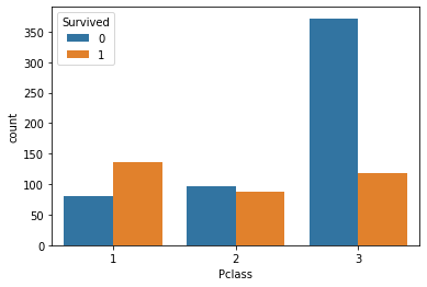
# Method 2: sns drawing

# test
df.groupby('Pclass')['Survived'].count()  # count() simply gets the quantity of each category
Pclass
1    216
2    184
3    491
Name: Survived, dtype: int64
# Method 1: it is divided into two steps

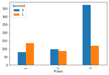
# Step 1: count the number of survivors and deaths of each bin level first
pclass_sur = df.groupby('Pclass')['Survived'].value_counts() # values_counts() gets the quantity of each category
pclass_sur
Pclass  Survived
1       1           136
        0            80
2       0            97
        1            87
3       0           372
        1           119
Name: Survived, dtype: int64
# Step 2: Drawing
pclass_sur.unstack().plot.bar()
<AxesSubplot:xlabel='Pclass'>
# Method 2: sns drawing

import seaborn as sns
sns.countplot(x='Pclass',hue='Survived',data=df)
<AxesSubplot:xlabel='Pclass', ylabel='count'>
[thinking] after seeing the previous data visualization, talk about your first feeling and your summary
#Answer to thinking questions

One feeling is that there are more than one way to draw pictures,I don't know which one is suitable,Easy to mix
2.7.6 task 6: visually display the distribution of survival and death toll at different ages in the Titanic data set. (unlimited expression)
#Code writing

# Painted with kde
facet = sns.FacetGrid(df, hue="Survived",aspect=3)
facet.map(sns.kdeplot,'Age',shade= True)
facet.set(xlim=(0, df['Age'].max()))
facet.add_legend()
<seaborn.axisgrid.FacetGrid at 0x19f07840788>

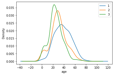
2.7.7 task 7: visually display the age distribution of people in different positions in the Titanic data set. (try the line chart)
#Code writing

df.Age[df.Pclass == 1].plot(kind='kde')
df.Age[df.Pclass == 2].plot(kind='kde')
df.Age[df.Pclass == 3].plot(kind='kde')
plt.xlabel("age")
plt.legend((1,2,3),loc="best")
<matplotlib.legend.Legend at 0x19f09914ac8>
[thinking] make an overall analysis of all the visual examples above, and see if you can find it yourself
#Answer to thinking questions
[summary] at this point, our visualization comes to an end. If you are very interested in data visualization, you can also learn about other visualization modules, such as pyecarts, bokeh, etc.
If you use data visualization in your work, you must know that the biggest role of data visualization is not to show off cool, but to understand what the data wants to express in the fastest and most intuitive way. What do you think?
summary
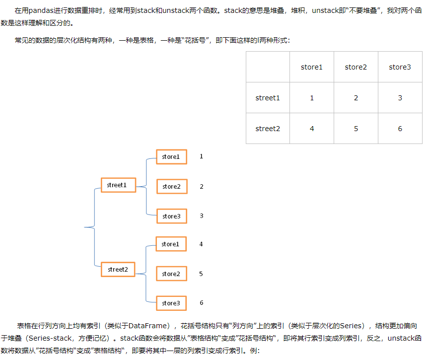
-
- stack() and unstack() functions in pandas
