Words written in the front

Hero League is a MOBA game with many players all over the world. It accompanies the growth of our generation. In the game, a team of five players is divided into two camps, red and blue. The team that first pushes out the base crystal of the other side is the winner. Each player in the team shares different responsibilities: Shangdan, Zhongdan, ADC, assistant and douye play their respective roles. They should not only focus on the operation of military lines and attack the opponent's defense tower, but also plunder map resources to gain greater advantages for the team. After so many years, the game of hero League has developed a variety of different playing methods, and each player has different understanding of the game, so team cooperation and communication in the game are particularly important. It is precisely because of its ever-changing playing methods and the new experience brought by each version update that it can harvest many players. At the same time, this game also promotes the development of China's e-sports industry, which makes our generation have its own unique memory.
In the theme of hero League data analysis, I will use the hero League data set in my hand to analyze the winning way of the game and the influence of various factors on the winning and losing of the game from the perspective of data analysis. At the same time, I hope that readers can provide suggestions from different perspectives to help me improve this thematic analysis.
Background
The data set contains about 25000 platinum segmented single player games, all of which are from the blue side (without analyzing the impact of Ban/Pick on the game). The data set contains a total of 55 data for analysis. In addition to the dominant factors affecting the game situation, such as the team's total killing, total assists, total death, total economy, and total experience, it also includes the potential factors influencing the game trend, such as whether to obtain a tower, a blood, kill the dragon, the valley pioneer, Baron, etc. Each game is divided into different time nodes, starting from 10 minutes, with 2 minutes as the interval gradually increased. For example, if a game lasts for 25 minutes, there will be data values of the tenth, 12, 14, 16,..., 24 minutes in the data set, so we can further analyze which factors are most likely to affect the trend of the game and become the game changer in the game.
Because the data set only contains the overall data of the team, the impact of hero selection and team match on the game is not studied.
The following are the fields contained in the dataset and their explanations:
gameId: unique game ID of each game, used to identify the data of the same game
gameDuration: duration of each game, in milliseconds
hasWon: whether the game wins
frame: different time nodes of the same game, unit: minute
golddiff: the overall economic gap with the other side
expDiff: the overall experience gap with the other party
champLevelDiff: the overall hero level gap with the opponent
... (many game element information contained in the middle will not be explained here due to the long length, and will be explained separately when the analysis is used)
Kills: total number of kills
Deaths: total number of deaths in the team
Assists: total assists of the team
Wards placed: the total number of field of vision placed by the team
wardsDestroyed: the total number of team exclusion horizons
wardsLost: the total number of lost horizons of the team
Data preprocessing
First, the data preprocessing steps are carried out according to the routine.
Because there is too much information in the data set, I choose to directly calculate the sum of all missing values. If there are too many missing values, then further analyze how to deal with the missing values of each column. But after getting the result, I found that this data set is very complete without any missing values, but I can't be happy too early, and I may encounter other problems. Let's move on. Now let's look at the data types in the dataset.
Similarly, because there is too much information and limited space in the dataset, I choose to use (value_ The results show that all the data in this dataset are numerical (int or float), which provides a lot of convenience for our next analysis. I have to say here that seeing such clean data, the mood of analysis is much happier. 
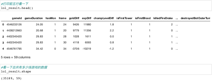
As I mentioned before, this data set has data of about 25000 games in total. Each game also includes data of different time nodes. How many pieces of data does this data set have?

The result shows that this data set contains more than 240 thousand game data. With this amount of data, we can get more quality analysis results.
In the previous explanation of the fields, careful readers may have found that although the two columns of gameDuration and frame data represent time, their units are not uniform. In order to make our analysis results clearer, we need to convert the column of gameDuration data into minutes.

At this stage, the data preprocessing process is basically over, but because the amount of information in the data set is too large, I decided to analyze from shallow to deep. First, we only look at the results, and extract the statistical results at the end of the game for analysis.

At this time, I encountered the first problem in dealing with this data set. It is clear that this data set only contains less than 25000 game data, but how can I extract more than 35000 game data? At this time, let's "zoom in" to see if there are repeated sessions.
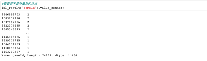
It seems that there are a lot of repeated appearances twice. What causes this? We continue with "zoom in".
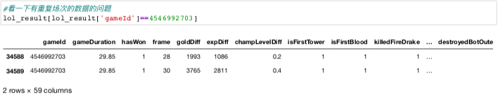
be careful ⚠️ In the two columns of gameDuration and frame, it seems that the frame is increased by two minutes. Some frames only count the time nodes before the end of the game, while others count the next time nodes because the end time is closer to the next time node. If we find out the reason, we can directly delete the earlier time nodes in the repeated field.
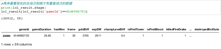
After processing, our data will be normal, and we can start the next step of analysis.
Exploratory data analysis and visualization
Let's first look at the number of wins and failures in the dataset.
#Let's see how many games win or lose in the data set
win_ratio=lol_result[lol_result['hasWon']==1]['gameId'].count()/lol_result.shape[0]
#Draw a pie chart and visualize it
plt.figure(figsize=(6,6))
sizes=[win_ratio,1-win_ratio]
labels=('Victory','Defeat')
plt.pie(sizes,labels=labels,autopct='%1.0f%%')
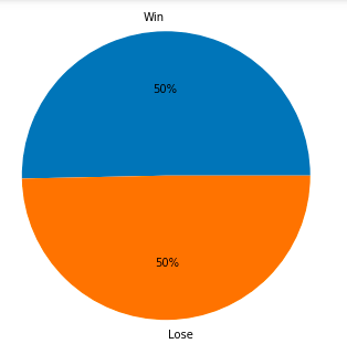 This data set is quite balanced, with the number of victories and failures being exactly 1:1, so we don't need to consider the sample balance when we train the model later.
Experience tells me that the earlier the game ends, the greater the experience gap between the two sides. That is to say, the mentality of the game is broken. Let's see if this is the case. I divided the data into four groups with the end time within 20 minutes, 20-25 minutes, 25-30 minutes and more than 30 minutes.
#Create a list to store the time interval of each game
time_interval=[]
for duration in lol_result['gameDuration']:
    if duration < 20:
        time_interval.append(1)
    elif (duration >= 20) & (duration < 25) :
        time_interval.append(2)
    elif (duration >= 25 ) & (duration < 30):
        time_interval.append(3)
    else:
        time_interval.append(4)
#Integrate time interval list into lol_ In the result data box
lol_result['time_interval']=time_interval
#The average of golddiff and expdiff in four time intervals is visualized
labels=['Within 20min','20min-25min','25min-30min','Over 30min']
golddiff_list=([abs(lol_result[lol_result['time_interval']==1]['goldDiff']).mean(),
                abs(lol_result[lol_result['time_interval']==2]['goldDiff']).mean(),
                abs(lol_result[lol_result['time_interval']==3]['goldDiff']).mean(),
                abs(lol_result[lol_result['time_interval']==4]['goldDiff']).mean()])
expdiff_list=([abs(lol_result[lol_result['time_interval']==1]['expDiff']).mean(),
                abs(lol_result[lol_result['time_interval']==2]['expDiff']).mean(),
                abs(lol_result[lol_result['time_interval']==3]['expDiff']).mean(),
                abs(lol_result[lol_result['time_interval']==4]['expDiff']).mean()])
plt.figure(figsize=(6,6))
gold=plt.bar(np.arange(4),height=golddiff_list,width=0.4,color='Orange',label='Gold')
exp=plt.bar([i+0.4 for i in np.arange(4)],height=expdiff_list,width=0.4,color='blue',label='Experience')
plt.xticks([i+0.2 for i in np.arange(4)],labels)
plt.legend()
plt.title('Gold and experience difference in different game duration interval')
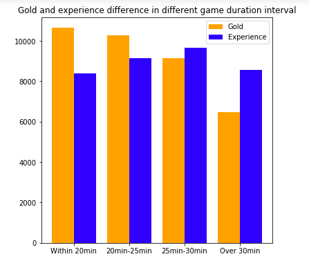 This result shows that with the increase of game time, the economic advantage of the winning team will be smaller and smaller, but the average economic advantage of the winning team whose game time is more than 30 minutes also exceeds 6000. This also reminds the players that when there is a huge economic advantage in the early stage, as long as there is no wave, there is a great chance to win. At the same time, it is also possible to turn over in the late stage if there is no wave in the early stage.

In the later stage of the game, the Baron wins the world. The buff bonus provided by the Baron can not only expand the advantages of the superior side, but also bring a glimmer of hope to the flopping if the inferior side can steal the baron. Let's use data analysis to see if such experience can stand the test of data. There are two fields related to barons in the data set, namely kill Baron nashor and lost baton nashor, which represent killing barons and losing barons. The data value is integer type (0, 1, 2,...), because some teams may kill or lose barons more than once.
#Calculate the proportion of the team that wins the Baron and the proportion of the team that loses the Baron
win_killed_baron=(lol_result[(lol_result['hasWon']==1)&(lol_result['killedBaronNashor']>0)]
                  ['gameId'].count()/lol_result[lol_result['killedBaronNashor']>0]
                 ['gameId'].count())
win_lost_baron=(lol_result[(lol_result['hasWon']==1)&(lol_result['lostBaronNashor']>0)]
                 ['gameId'].count()/lol_result[lol_result['lostBaronNashor']>0]
                 ['gameId'].count())
#Pie chart visualization
plt.figure(figsize=(10,10))
axe1=plt.subplot(1,2,1)
axe1.pie([win_killed_baron,1-win_killed_baron],
          labels=('Win','Lose'),
         autopct='%1.1f%%')
axe1.set_title('Killed Baron')
axe2=plt.subplot(1,2,2)
axe2.pie([win_lost_baron,1-win_lost_baron],
          labels=('Win','Lose'),
         autopct='%1.1f%%')
axe2.set_title('Lost Baron')
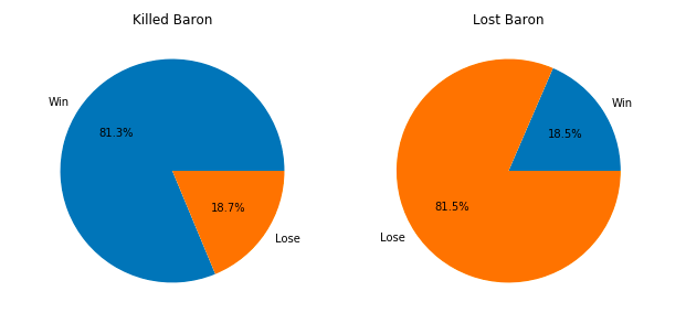
From the results, it can be clearly seen that the winning rate of the team that killed the Baron is over 80%, while the winning rate of the team that lost the Baron is only 18.5% (the data set only contains blue data, so there is no case of two teams in the same game). Through this analysis we can prove the importance of barons to win. It seems that our experience is correct.
Now let's analyze the impact of KDA (kills, deaths, assets) on the game results. We use the formula of hero league's official selection of MVP in the game: KDA=(K+A)/D*3 to see if the higher the KDA, the more likely the team is to win.
#Calculate the KDA of each game first
KDA=[]
for k,d,a in zip(lol_result['kills'],lol_result['deaths'],lol_result['assists']):
if d == 0:
kda=(k+a)/(d+1)*3
else:
kda=(k+a)/d*3
KDA.append(kda)
#Integrate KDA into data set
lol_result['KDA']=KDA
#Let's see how KDA is distributed
lol_result['KDA'].describe()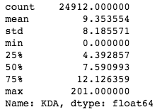 From the descriptive statistics, we can see that the average value of KDA is about 9.35, and the standard deviation is as high as 8.19. In addition, the minimum value and the maximum value also deviate from the average value very much, so I abandoned the idea of using the average value to represent the KDA level, and turned to using the box graph to visualize the relationship between KDA and game winning rate.
#Use box and line chart to visualize the relationship between team KDA data and winning or losing
win_kda=lol_result[lol_result['hasWon']==1]['KDA']
lose_kda=lol_result[lol_result['hasWon']==0]['KDA']
kda_list=[win_kda,lose_kda]

plt.figure(figsize=(6,6))
plt.boxplot(kda_list,patch_artist=True,showfliers=False,widths=0.8)
plt.xticks(np.arange(3),('','Win','Lose'))
plt.ylabel('KDA')
plt.title('KDA distribution for win and lose teams')
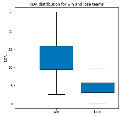 From this result, we can see that KDA is also one of the most dominant factors reflecting the game winning and losing. The upper limit of KDA of the negative side only reaches the lower quartile of KDA of the winning side, and the difference between the average value of KDA of the winning side and the negative side is very large. It will be easier to understand this result by combining our game experience. The higher the KDA team's economy and experience will lead the other team more, and the economy and experience will be converted into skills and equipment. The final direct result is that the higher the KDA team's overall damage will be higher and the overall defense will be better.
Next let's look at the impact of vision on the results of the game. In the high-level game, both teams will pay special attention to the layout of vision. Losing the vision of a key position may directly lead to teammates being killed and the other team will roll snowballs. If the field of vision is not good, teammates will frequently send this signal:
We use a custom number of effective fields of view (number of fields placed - number of fields excluded) to evaluate the field of view level of each team. The related fields in the original dataset are: wardsPlaced and wardsLost, which respectively represent the number of placed and lost fields.
#Calculate the number of effective views and integrate them into the data set
effective_wards=[i-j for i,j in zip(lol_result['wardsPlaced'],lol_result['wardsLost'])]
lol_result['effective_wards']=effective_wards
#Again, let's look at the distribution of the effective field of vision
lol_result['effective_wards'].describe()
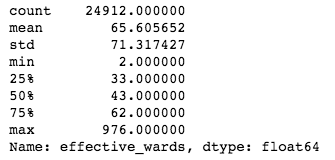 The distribution of data is similar to that of KDA. We also use box plot to visualize the relationship between the number of effective views and the game winning rate.
#Use box and line chart to visualize the relationship between the number of effective field of vision and the outcome of a team
win_wards=lol_result[lol_result['hasWon']==1]['effective_wards']
lose_wards=lol_result[lol_result['hasWon']==0]['effective_wards']
wards_list=[win_wards,lose_wards]

plt.figure(figsize=(6,6))
plt.boxplot(wards_list,patch_artist=True,showfliers=False,widths=0.8)
plt.xticks(np.arange(3),('','Win','Lose'))
plt.ylabel('Effective wards')
plt.title('Effective wards distribution for win and lose teams')
 The effective field of vision of the losing team is slightly lower than that of the winning team at all levels. This result shows that although the field of vision is very important, the factor of platinum segment cannot determine the success or failure of the game.
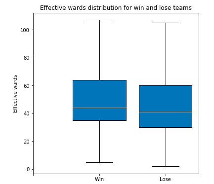
In the previous version, the attribute stack of the same yuan Sulong will bring a fairly objective buff bonus in the later part of the game. Let's see what impact a team will have on the game result if they kill or lose the same element dragon twice or more. The related fields in the original dataset are: killedfiredrake, killedwaterdrake, killedairdrake, killedearthdrake, lostfiredrake, lostvaterdrake, lostairdrake, losteearthdrake, which respectively represent killing or losing an element dragon. The data value is integer (0, 1, 2,...), because some teams may kill or lose the same element dragon more than once.
#Let's mark the game of killing and losing two or more Dragons of the same element
killed_same_drake_twoplus=[]
lost_same_drake_twoplus=[]
killed_cols=['killedFireDrake','killedWaterDrake','killedAirDrake','killedEarthDrake']
lost_cols=['lostFireDrake','lostWaterDrake','lostAirDrake','lostEarthDrake']
flag=0
for i in range(lol_result.shape[0]):
    for col in killed_cols:
        if lol_result.loc[i,col] >=2 :
            flag=1
        else:
            flag=0
    if flag == 1:
        killed_same_drake_twoplus.append(1)
    else:
        killed_same_drake_twoplus.append(0)

for i in range(lol_result.shape[0]):
    for col in lost_cols:
        if lol_result.loc[i,col] >=2 :
            flag=1
        else:
            flag=0
    if flag == 1:
        lost_same_drake_twoplus.append(1)
    else:
        lost_same_drake_twoplus.append(0)

#Integrating tags into a dataset
lol_result['killed_same_drake_twoplus']=killed_drake_twoplus
lol_result['lost_same_drake_twoplus']=lost_drake_twoplus

#First, let's see how many games can get more than two dragons of the same element
same_drake_twoplus=(lol_result[(lol_result['killed_same_drake_twoplus']==1)|
                               (lol_result['lost_same_drake_twoplus']==1)]['gameId'].count()
                   /lol_result.shape[0])

#Using pie visualization
plt.figure(figsize=(6,6))
sizes=[same_drake_twoplus,1-same_drake_twoplus]
labels=('Same Team Killed Same Drake','No Team Killed Same Drake')
plt.pie(sizes,labels=labels,autopct='%1.0f%%')
 Only 13% of the teams can kill the same attribute element dragon in the same game. Part of the reason is that the probability of refreshing which element dragon in the game is random, so the probability of killing the same element dragon by the same team based on refreshing the same element dragon in the game is lower.
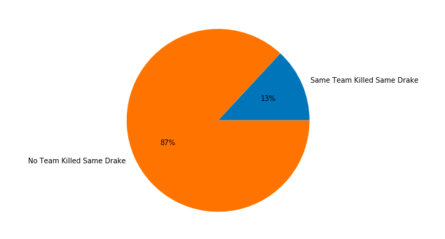
#Let's see the winning rate of the team that killed and lost the same yuan Sulong
win_killed_same_drake=(lol_result[(lol_result['hasWon']==1)&(lol_result['killed_same_drake_twoplus'] == 1)]
                  ['gameId'].count()/lol_result[lol_result['killed_same_drake_twoplus'] == 1]
                 ['gameId'].count())
win_lost_same_drake=(lol_result[(lol_result['hasWon']==1)&(lol_result['lost_same_drake_twoplus'] == 1)]
                 ['gameId'].count()/lol_result[lol_result['lost_same_drake_twoplus'] == 1]
                 ['gameId'].count())

#Using pie visualization
plt.figure(figsize=(10,10))
axe1=plt.subplot(1,2,1)
axe1.pie([win_killed_same_drake,1-win_killed_same_drake],
          labels=('Win','Lose'),
         autopct='%1.1f%%')
axe1.set_title('Killed Same Drake')
axe2=plt.subplot(1,2,2)
axe2.pie([win_lost_same_drake,1-win_lost_same_drake],
          labels=('Win','Lose'),
         autopct='%1.1f%%')
axe2.set_title('Lost Same Drake')
This result is basically the same as the effect of killing the dragon on the victory and defeat. It also shows from the side that if the team loses the chance to compete for the Baron in the game, the dragon will increase the chance to win if it can get the same element.
This is the end of exploratory data analysis and visualization. From the previous analysis, we can see that economy, Baron, KDA and the same element dragon are relatively dominant factors that affect the outcome of the game. In the next step, we will use these data to build a decision tree to more intuitively observe how these factors affect the outcome of the game.
Data modeling
In this section, we will use a very classic decision tree model to help us determine the factors that determine the absolute game winning and losing and the importance ranking. First of all, a brief introduction to the Decision Tree Classifier model: the decision tree model is a commonly used machine learning model in classification problems, which belongs to supervised learning. In the initial stage, all data exist in the root node, and then the data to be tested is divided into different leaf nodes according to different characteristic nodes. From the root node to each leaf node, there is a judgment path. The results of the decision tree model have the advantages of better interpretability and no need to normalize the features. (because this article focuses on the actual combat theory, I will write a separate article about the algorithm and technical problems of the decision tree model later.) after the decision tree classification model is generated, I will visualize the results to show more clearly the impact of different factors on the game results.
#Import the decision tree package to use
from sklearn.tree import DecisionTreeClassifier
#Import package to use for split dataset
from sklearn.model_selection import train_test_split
#Import packages to be used by metrics
from sklearn.metrics import accuracy_score,f1_score,precision_score,recall_score,plot_confusion_matrix
#Import graphviz for visualization
from sklearn.tree import export_graphviz
import graphviz
#First, we need to integrate all the features we want to use into the same data frame
decision_tree_df=lol_result.loc[:,('goldDiff','killedBaronNashor','KDA','killed_same_drake_twoplus','hasWon')]
#Extract features and labels respectively
X=decision_tree_df.iloc[:,0:-1]
y=decision_tree_df.iloc[:,-1]
#Separate training and test data sets
X_train,X_test,y_train,y_test=train_test_split(X,y,test_size=0.3,random_state=23)
#Instantiate the decision tree model. The Gini coefficient (gini) is used to determine the condition. The maximum depth is 8 and the maximum leaf node is 15
clf=DecisionTreeClassifier(max_depth=8,max_leaf_nodes=15,criterion='gini',random_state=23)
clf.fit(X_train,y_train)
predict_result=clf.predict(X_test)
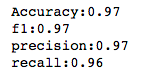
#Using different indicators to see the effect of the model
accuracy=accuracy_score(y_test,predict_result)
f1=f1_score(y_test,predict_result)
precision=precision_score(y_test,predict_result)
recall=recall_score(y_test,predict_result)
print('Accuracy:{0:.2f}\nf1:{1:.2f}\nprecision:{2:.2f}\nrecall:{3:.2f}'.format(accuracy,f1,precision,recall))
 Before training the model, we have first extracted all the information that has the strongest effect on classification, and the extracted data set is smaller, and the features are also less. These factors will make our model index results more optimistic. (the decision tree is used here for visualization, and the data set is also relatively simple. Therefore, GridSearch is not used here to optimize the model parameters and GBDT complex model, which will be emphasized later when dealing with complex data sets.)
The following focuses on the commonly used indicators of the evaluation model of the classification model: the fusion matrix
#Drawing confusion matrix
fig=plot_confusion_matrix(clf, X_test, y_test,
                                 display_labels=('Lose','Win'),normalize='all')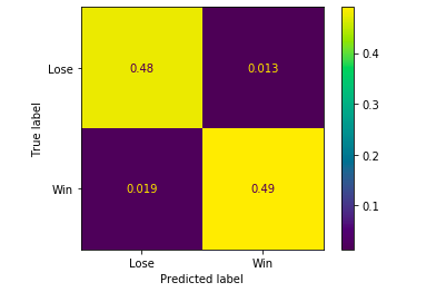
Let's first introduce some concepts:
True Positive: the prediction is positive, and the actual result is also positive, corresponding to the lower right corner of the figure
False positive: the prediction is positive, the actual result is negative, corresponding to the upper right corner of the figure
True Negative: the prediction is negative, and the actual result is also negative, corresponding to the upper left corner of the figure
False Negative: the prediction is negative, the actual result is positive, corresponding to the lower left corner of the figure
Precision: the proportion that the actual result is also positive in all samples with positive prediction,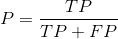
Recall: the proportion predicted to be positive in all samples actually positive,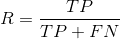
F1 value: F1 value is the harmonic mean value of precision value and recall rate,
These three values are reflected in the above index calculation. When the sample distribution is uneven (the difference between the number of positive and negative samples is particularly large), the Accuracy of the model cannot be objectively measured, so the above three indexes need to be used. (when the sample distribution is uneven, the problem of up sampling or down sampling is also involved in the training of the model. The data set samples used in this article are very balanced, so there is no need to deal with them, and relevant knowledge will be emphasized later.)
Finally, we visualize and print the decision tree results.
#Instantiate the result of decision tree
dot_data=export_graphviz(clf,feature_names=['goldDiff','killedBaronNashor','KDA','killed_same_drake_twoplus'],
                         class_names=['Lose','Win'])
#Use graphviz to generate a visual image and save it
graph=graphviz.Source(dot_data)
graph.render('mytree')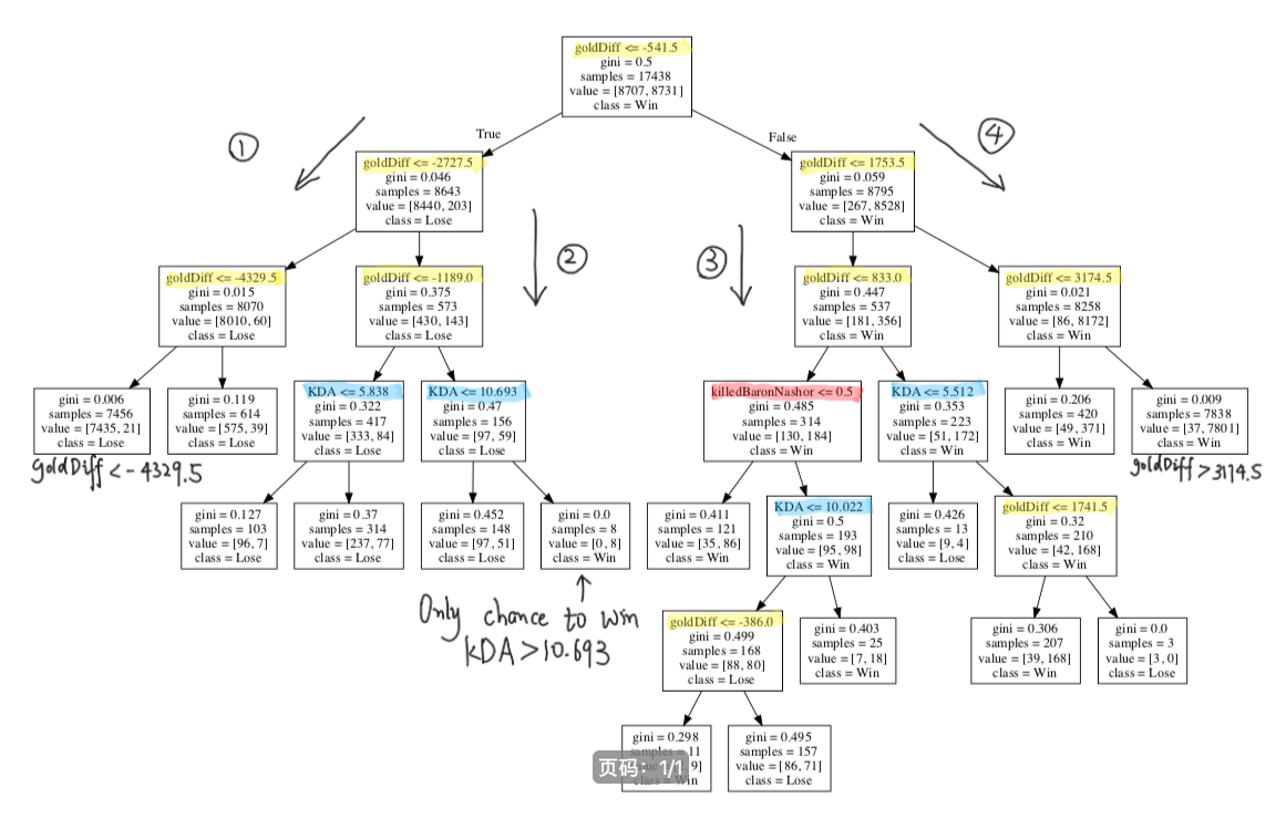
The above picture is the generated decision tree (of course, the above words are written by myself, no wonder they are ugly 🤣 🤣 🤣 ) , because it's more complex, so I divided it into four routes and we analyzed them one by one. In order to facilitate reading, I used yellow marker for economic gap classification, blue marker for KDA classification, and red marker for killing Baron classification.
The impact of killing the same kind of element dragon on the classification result is not reflected in this tree. It may be because the proportion of game pairs that can achieve this achievement is too small in the sample, which can not be used as the classification basis in the decision tree with fewer layers. If the depth of the tree is set more when training the model, the classification conditions of killing the same kind of element dragon may appear.
Let's first look at Route 1: this route shows that the economic disadvantage of the team has been increasing. When the economic disadvantage exceeds 4329.5, only 21 of the 7456 games have won.
Route 2: this route shows that when the economic disadvantage is not so great, the decisive factor is the overall team KDA. When the economic disadvantage is less than 1189, 8 teams with KDA greater than 10.693 win, but we need to note that in the upper leaf node, there are 156 teams with economic disadvantage less than 1189.
Route 3: this route shows that the situation is slightly more complicated than route 3 when the economic lead is not so large. First of all, when the economic lead is less than 833, whether it is to kill the dragon, KDA or the economic gap as the classification conditions, the difference between winning and losing games is not large after the classification (observe the value value, the first value is the losing game, the second value is the winning game), which also shows that the situation is very uncertain when the economic lead is within 833. Secondly, when the economic lead is greater than 833, if the KDA is greater than 5.512, the number of victories will greatly exceed the number of failures, and when the economic lead is greater than 1741.5, the three failures can be treated as outliers.
Finally, look at Route 4: this route shows that the economic lead of the team has been increasing. When the economic lead exceeds 3174.5, 7801 of the 7838 games have won.
Although the visual results of the decision tree show us the factors that determine the results of the game, the situation changes rapidly in the actual game, and the results can not be used as a reference to predict the results of the game in advance.
Last words
The author has just been in touch with data analysis and machine learning for two months. There are some mistakes or omissions in this paper. I hope that readers can point out them in time
I hope you can give me some valuable comments
Reprint please indicate the source