Author: Xu Yisheng
This article is transferred from: Android group English biography
Basic concept analysis of Span
International practice, official website, Zhenlou, this is the best overall overview of Span.
https://developer.android.com/guide/topics/text/spans
Span type
Span is usually classified according to the following two differences, that is, it is classified according to the appearance or size of Text modified by span and the Text range affected by span. In Android, more than 20 kinds of span are provided by default.
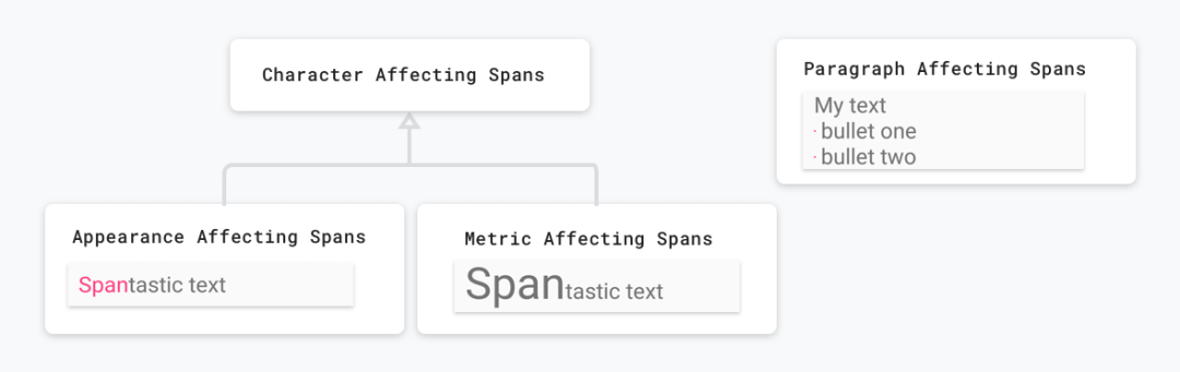
Affect the appearance and size of Text
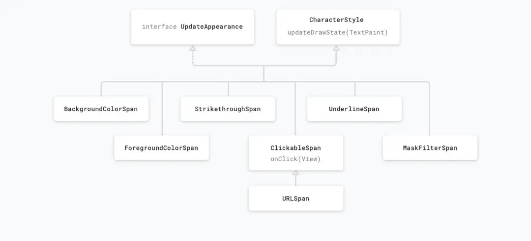
Span can modify some appearance of Text, such as Text color, background color, strikethrough, underline, etc. Such spans are inherited from CharacterStyle, such as UnderlineSpan.
val string = SpannableString("Text with underline span")
string.setSpan(UnderlineSpan(), 10, 19, Spanned.SPAN_EXCLUSIVE_EXCLUSIVE)
Span that only affects the appearance of Text will trigger redrawing of Text, but it will not trigger recalculation of layout. These spans implement UpdateAppearance and extend CharacterStyle, whose subclasses define how to redraw Text by providing settings to update TextPaint.
Span can also modify the size of Text. For example, RelativeSizeSpan can modify the size of Text. The code is as follows.
val string = SpannableString("Text with relative size span")
string.setSpan(RelativeSizeSpan(1.5f), 10, 24, Spanned.SPAN_EXCLUSIVE_EXCLUSIVE)
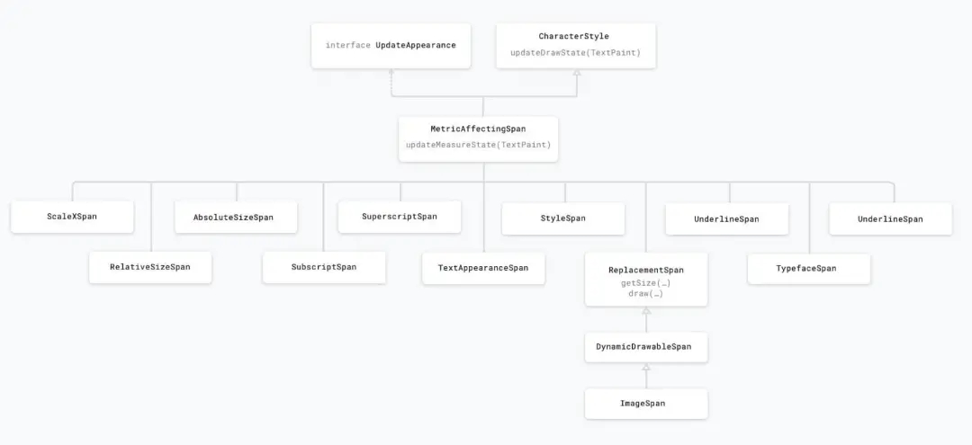
A Span that affects the size of the text will cause TextView to re measure the text for proper layout and rendering. For example, changing the text size may cause words to appear on different lines. So you need to trigger remeasurement, recalculate the text layout, and redraw the text.
These spans usually extend MetricAffectingSpan, which is an abstract class that allows subclasses to define how Span affects text measurement by providing access to TextPaint. Since MetricAffectingSpan inherits from CharacterSpan, subclasses also affect the appearance of text at the character level.
Scope of influence
Some spans only affect a single character, which is similar to the behavior of UnderlineSpan. You can control its effect on a limited number of characters, such as BackgroundColorSpan.
val string = SpannableString("Text with a background color span")
string.setSpan(BackgroundColorSpan(color), 12, 28, Spanned.SPAN_EXCLUSIVE_EXCLUSIVE)
There are also some spans that can act directly on the whole Paragraph, such as QuoteSpan.
val textString = SpannableStringBuilder("xuyisheng android Qunying biography flutter")
textString.setSpan(QuoteSpan(Color.RED), 0, textString.length, Spannable.SPAN_EXCLUSIVE_EXCLUSIVE)
In Android, paragraphs are defined based on line breaks (\ n)
Common Span Journal
The system provides many kinds of spans. Most of the time, these spans can meet our development needs. Even if they are not satisfied, they can be modified to achieve a similar effect by studying their source code. Here, the general usage and functions of these basic spans are simply recorded. They are just daily accounts. They are written to ensure the integrity of the article, Basic developers can skip this part directly.
BackgroundColorSpan modify background color
val string = SpannableString("Text with a background color span")
string.setSpan(BackgroundColorSpan(Color.RED), 12, 28, Spanned.SPAN_EXCLUSIVE_EXCLUSIVE)
ClickableSpan set click event
SpannableString("XXXXXXXX").setSpan(object : ClickableSpan() {
    override fun onClick(widget: View) {}
}, 0, 8, Spanned.SPAN_EXCLUSIVE_EXCLUSIVE)
text.movementMethod = LinkMovementMethod.getInstance()
If you want to click and set color or underline, ClickableSpan also provides updateDrawState to set color, underline and other properties.
ForegroundColorSpan text color (foreground color)
val span = ForegroundColorSpan()
val spannableString = SpannableString("CONTENT")
spannableString.setSpan(span, 0, spannableString.length / 2, Spanned.SPAN_EXCLUSIVE_EXCLUSIVE)
text.text = spannableString
DrawableMarginSpan insert Drawable at the beginning of text
val drawable = getDrawable(R.mipmap.ic_launcher)
val span = SpannableString("xxxxxxxxxx")
span.setSpan(DrawableMarginSpan(drawable!!), 0, span.length, 0)
MaskFilterSpan decoration effects, such as blurmaskfilter and embossmaskfilter
// Blur a character
span = MaskFilterSpan(BlurMaskFilter(density * 2, BlurMaskFilter.Blur.NORMAL))
// Emboss a character
span = MaskFilterSpan(EmbossMaskFilter(floatArrayOf(1f, 1f, 1f), 0.4f, 6, 3.5f))
Strikethrough span strikethrough (middle dash)
val span = StrikethroughSpan()
val spannableString = SpannableString("CONTENT")
spannableString.setSpan(span, 0, spannableString.length, Spanned.SPAN_EXCLUSIVE_EXCLUSIVE)
text.text = spannableString
UnderlineSpan underline
val span = UnderlineSpan()
val spannableString = SpannableString("CONTENT")
spannableString.setSpan(span, 0, spannableString.length, Spanned.SPAN_EXCLUSIVE_EXCLUSIVE)
text.text = spannableString
Quote span # quote before paragraph
val span = QuoteSpan(Color.RED)
val spannableString = SpannableString("CONTENT")
spannableString.setSpan(span, 0, 2, Spanned.SPAN_EXCLUSIVE_EXCLUSIVE)
text.text = spannableString
BulletSpan: dot before paragraph
val span = BulletSpan(15, Color.RED)
val spannableString = SpannableString("CONTENT")
spannableString.setSpan(span, 0, 1, Spanned.SPAN_EXCLUSIVE_EXCLUSIVE)
text.text = spannableString
AbsoluteSizeSpan font absolute size (text font)
val string = SpannableString("Text with absolute size span")
string.setSpan(AbsoluteSizeSpan(55, true), 10, 23, Spanned.SPAN_EXCLUSIVE_EXCLUSIVE)
ImageSpan pictures
val span = ImageSpan(this, R.mipmap.ic_launcher)
val spannableString = SpannableString("CONTENT")
spannableString.setSpan(span, 0, 1, Spanned.SPAN_EXCLUSIVE_EXCLUSIVE)
text.text = spannableString
IconMarginSpan # IconMarginSpan is similar to DrawableMarginSpan, except that the parameter types are different
val bmp = BitmapFactory.decodeResource(resources, R.mipmap.ic_launcher)
val span = SpannableString("xxxxxxxxx")
span.setSpan(IconMarginSpan(bmp), 0, span.length, 0)
span.setSpan(IconMarginSpan(bmp, 20), 0, span.length, 0)
RelativeSizeSpan font relative size (text font)
val span = RelativeSizeSpan(2.0f)
val spannableString = SpannableString("CONTENT")
spannableString.setSpan(span, 0, spannableString.length / 2, Spanned.SPAN_EXCLUSIVE_EXCLUSIVE)
text.text = spannableString
ScaleXSpan scales based on the X axis
val span = ScaleXSpan(2.0f)
val spannableString = SpannableString("CONTENT")
spannableString.setSpan(span, 0, spannableString.length / 2, Spanned.SPAN_EXCLUSIVE_EXCLUSIVE)
text.text = spannableString
StyleSpan font style: bold, italic, etc
val string = SpannableString("Bold and italic text")
string.setSpan(StyleSpan(Typeface.BOLD), 0, 4, Spannable.SPAN_EXCLUSIVE_EXCLUSIVE)
string.setSpan(StyleSpan(Typeface.ITALIC), 9, 15, Spannable.SPAN_EXCLUSIVE_EXCLUSIVE)
SubscriptSpan subscript
val span = SubscriptSpan()
val spannableString = SpannableString("CONTENT")
spannableString.setSpan(span, 0, spannableString.length / 2, Spanned.SPAN_EXCLUSIVE_EXCLUSIVE)
text.text = spannableString
Superscript span superscript (used in mathematical formulas) can even be used to make red dots
val span = SuperscriptSpan()
val spannableString = SpannableString("CONTENT")
spannableString.setSpan(span, 0, spannableString.length / 2, Spanned.SPAN_EXCLUSIVE_EXCLUSIVE)
text.text = spannableString
Red dot (a little tricky, not recommended)
val textString = SpannableString("You have new news●")
textString.apply {
    setSpan(ForegroundColorSpan(Color.RED), textString.length - 1, textString.length, Spanned.SPAN_EXCLUSIVE_EXCLUSIVE)
    setSpan(SuperscriptSpan(), textString.length - 1, textString.length, Spanned.SPAN_EXCLUSIVE_EXCLUSIVE)
}
text.text = textString
TextAppearanceSpan text font, size, style, and color
span = new TextAppearanceSpan(this, R.style.SpecialTextAppearance);
<-- style.xml -->
<style name="SpecialTextAppearance" parent="@android:style/TextAppearance">
  <item name="android:textColor">@color/color1</item>
  <item name="android:textColorHighlight">@color/color2</item>
  <item name="android:textColorHint">@color/color3</item>
  <item name="android:textColorLink">@color/color4</item>
  <item name="android:textSize">28sp</item>
  <item name="android:textStyle">italic</item>
</style>
TypefaceSpan set text font
val myTypeface = Typeface.create(
    ResourcesCompat.getFont(context, R.font.some_font),
    Typeface.BOLD
)
val string = SpannableString("Text with typeface span.")
string.setSpan(TypefaceSpan(myTypeface), 10, 18, Spannable.SPAN_EXCLUSIVE_EXCLUSIVE)
string.setSpan(TypefaceSpan("monospace"), 19, 22, Spannable.SPAN_EXCLUSIVE_EXCLUSIVE)
URLSpan text hyperlink
val string = SpannableString("Text with a url span")
string.setSpan(URLSpan("http://www.developer.android.com"), 12, 15, Spanned.SPAN_EXCLUSIVE_EXCLUSIVE)
TabStopSpan.Standard: used to replace the "\ t" in the string with the corresponding blank line. Generally, "\ t" will not be displayed. When tabstopspan is used, the "\ t" can be replaced with the blank area of the corresponding length.
AlignmentSpan.Standard text alignment
val string = SpannableString("Text with opposite alignment")
string.setSpan(
    AlignmentSpan.Standard(Layout.Alignment.ALIGN_OPPOSITE), 0,
    string.length, Spanned.SPAN_EXCLUSIVE_EXCLUSIVE
)
Leading marginspan: paragraph indent
val ss = SpannableString("xxxxxxxxx")
ss.setSpan(LeadingMarginSpan.Standard(60), 0, ss.length, 0)
ss.setSpan(LeadingMarginSpan.Standard(60, 20), 0, ss.length, 0)
LineBackgroundSpan: LineBackgroundSpan is a native Span, which encapsulates the Background of line objects. There is a simple implementation within it - Standard. If you need to modify the Background on the line, you can override LineBackgroundSpan.
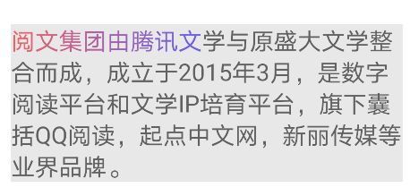
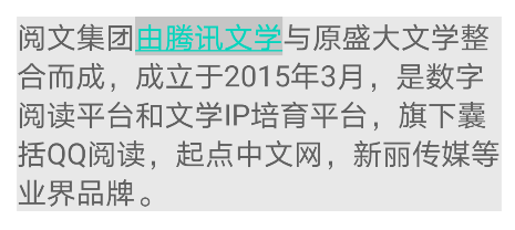
val textString = SpannableString("Reading group(Stock Code: 0772.HK)It was established in March 2015 by integrating Tencent literature and the original Shanda literature. Digital reading platform and Literature IP Cultivation platform, including QQ Reading, starting point Chinese network, Xinli media and other industry brands.")
textString.setSpan(LineBackgroundSpan.Standard(Color.CYAN), 0, 4, SPAN_INCLUSIVE_INCLUSIVE)
text.text = textString
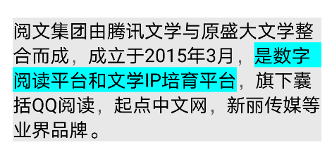
Linehightspan: adjust the Span of line height to unify the inconsistency of line height caused by different fonts.
textString.append("Yuewen group was established in March 2015 by integrating Tencent literature and the original Shanda literature. Digital reading platform and Literature IP Cultivation platform, including QQ Reading, starting point Chinese network, Xinli media and other industry brands.")
textString.setSpan(LineHeightSpan.Standard(90), 0, 1, Spanned.SPAN_EXCLUSIVE_EXCLUSIVE)
Boundary effect of Span
When inserting all spans, you need to set a flag. This flag is to control the inclusion behavior when inserting a new String at the existing Span boundary. This is demonstrated by the following example.
val textString = SpannableStringBuilder("xuyisheng android Qunying biography flutter")
textString.setSpan(ForegroundColorSpan(Color.RED), 0, 2, Spannable.SPAN_EXCLUSIVE_INCLUSIVE)
textString.insert(2,"shuai")
text.text = textString
SPAN_EXCLUSIVE_EXCLUSIVE

SPAN_EXCLUSIVE_INCLUSIVE

The fall flag bit of Span indicates whether the Span should be extended to the point containing the beginning and end of the inserted text. After any flag bit is set, Span will automatically expand as long as the position of the inserted text is between the start position and the end position.
The flags of Span have the following enumerations:
-
Spanned.SPAN_EXCLUSIVE_EXCLUSIVE: excluding the endpoints where start and end at both ends are located, i.e. (a,b).
-
Spanned.SPAN_EXCLUSIVE_INCLUSIVE: does not include the end start, but includes the end where the end is located, i.e. (a,b].
-
Spanned.SPAN_INCLUSIVE_EXCLUSIVE: includes start at both ends, but does not include the endpoint where end is located, i.e. [a,b).
-
Spanned.SPAN_INCLUSIVE_INCLUSIVE: contains the endpoints where start and end at both ends are located, i.e. [a,b].
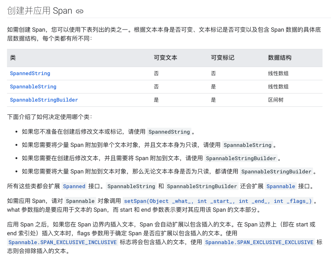
Create data structure of Span
When we use Span, we mainly use the following classes: SpannedString, SpannableString, or SpannableStringBuilder. Their differences can be represented by this picture on the official website.
Common methods of Span
There are many functions in Span to help developers obtain Span related status and data.
-
getSpanStart(Object tag) is used to get the start position of a span.
-
getSpanEnd(Object tag) is used to obtain the end position of a span.
-
getSpanFlags(Object tag) is used to get the flag set by this span.
-
getSpans(int start, int end, Classtype) is used to obtain all specific types of spans from start to end. This method is very useful. It can obtain the span of the specified type in Text, which is very useful in many scenarios.
-
removeSpan(span). This method is used to remove the specified Span instance. You can use this method to remove the display effect of Span.
-
nextSpanTransition(int start, int limit, Class type), this method will return the start position of the next Span type you specify within the text range you specify. It is similar to getSpan method, but it belongs to iterator type. Through this method, we can go through the specified Span type, and its efficiency is higher than getSpan method.
-
TextUtils.dumpSpans. This method can dump all Span instances under the current Text, which is very useful in debugging.
TextUtils.dumpSpans(textView.editableText, LogPrinter(Log.DEBUG, "xys"), "spans: ")
getSpans sorting problem
Android7.0 system. The above getSpans method will return out of order array, which is related to its internal implementation. Therefore, when using getSpans, if you want to obtain the ordered array, you need to sort the returned results manually. The code is as follows.
inline fun <reified T> getOrderedSpans(textView: TextView): Array<T> {
    val editable: Editable = textView.editableText
    val spans: Array<T> = editable.getSpans(0, textView.toString().length, T::class.java)
    Arrays.sort(spans) { o1, o2 -> editable.getSpanStart(o1) - editable.getSpanStart(o2) }
    return spans
}
However, if the nextSpanTransition(int start, int limit, Class kind) method is used to iterate, there will be no such problem. It will be obtained in the order of display.
Thoughts on setSpan
Let's think about what span is. In the method signature of setSpan, the parameter type of span is an Any type, which is usually used in this way.
spannable.setSpan(ExImageSpan(drawable, DynamicDrawableSpan.ALIGN_BOTTOM), start, end, Spanned.SPAN_EXCLUSIVE_EXCLUSIVE)
Usually, the setSpan method will pass in an xxxSpan, especially the MetricAffectingSpan of the inherited system, to modify the style of the Span. However, in fact, this parameter is of Any type, and you can set Any class for it, for example:
setSpan(User(id = 1, name = "xys"), 0, length, Spannable.SPAN_EXCLUSIVE_EXCLUSIVE)
We set up a Span above. This Span is a simple class instance, so there will be no change in the style of the Span, but this text has been marked as User type. You can understand that the User class is a Span without modifying any style.
So what are the benefits of doing so?
This design method actually expands Span into a comprehensive development platform, not only adding style modifications, but also making many other type marks, which can well expand the business scenario of TextView. A paragraph of text can even contain many non display business scenarios.
Custom Span
Usually, we can complete the development by using the Span provided by Android natively, but in most scenarios, it must be able to support custom Span. The official document gives the following suggestions:
-
Affect text - > CharacterStyle in character level
-
Affect text in paragraph level - > ParagraphStyle
-
Affect text appearance - > UpdateAppearance
-
Affect text size - > updatelayout
However, in most scenarios, we are not likely to customize to such an in-depth level. Choosing an appropriate existing Span for expansion is a way to get twice the result with half the effort.
Composite Span effect
For example, we need to increase the size of Span relative text to achieve a certain effect. For example, we can increase the size of Span relative text. In this case, we can extend RelativeSizeSpan and set the color of TextPaint in the painting state by overriding the updateMeasureState method, so as to achieve this composite effect. The code is as follows.
class RelativeSizeColorSpan(
    @ColorInt private val color: Int,
    size: Float
) : RelativeSizeSpan(size) {
    override fun updateDrawState(textPaint: TextPaint?) {
         super.updateDrawState(ds)
         textPaint?.color = color
    }
}
Border label
ReplacementSpan is the most important role of user-defined Span. ReplacementSpan will be explained in detail later. Here is only a brief introduction to the general way of realizing user-defined Span through ReplacementSpan. The code is as follows.
class FrameSpan : ReplacementSpan() {
    private val paint: Paint = Paint()
    private var width = 0F
    override fun getSize(paint: Paint, text: CharSequence?, start: Int, end: Int, fm: Paint.FontMetricsInt?): Int {
        width = paint.measureText(text, start, end)
        return width.toInt()
    }

    override fun draw(canvas: Canvas, text: CharSequence?, start: Int, end: Int, x: Float, top: Int, y: Int, bottom: Int, paint: Paint) {
        canvas.drawRect(x, top.toFloat(), x + width, bottom.toFloat(), this.paint)
        canvas.drawText(text.toString(), start, end, x, y.toFloat(), paint)
    }

    init {
        paint.style = Paint.Style.STROKE
        paint.color = Color.BLUE
        paint.isAntiAlias = true
    }
}
Increase segment spacing
It also uses ReplacementSpan, but this time it rewrites its getSize method to achieve the effect of increasing segment spacing. The code is as follows.
class BlockSpaceSpan(private val mHeight: Int) : ReplacementSpan() {
    override fun getSize(paint: Paint, text: CharSequence, start: Int, end: Int, fm: FontMetricsInt?): Int {
        if (fm != null) {
            fm.top = -mHeight - paint.getFontMetricsInt(fm)
            fm.ascent = fm.top
            fm.bottom = 0
            fm.descent = fm.bottom
        }
        return 0
    }

    override fun draw(canvas: Canvas, text: CharSequence, start: Int, end: Int, x: Float, top: Int, y: Int, bottom: Int, paint: Paint) {}
}
The usage is as follows.
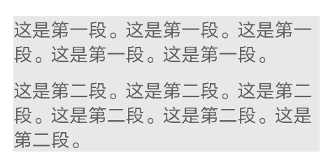
val paragraphFirst = "This is the first paragraph. This is the first paragraph. This is the first paragraph. This is the first paragraph. This is the first paragraph.\n"
val paragraphSecond = "This is the second paragraph. This is the second paragraph. This is the second paragraph. This is the second paragraph. This is the second paragraph."
val spaceString = "[space]"
val paragraphText = SpannableString(paragraphFirst + spaceString + paragraphSecond)
paragraphText.setSpan(BlockSpaceSpan(10.dp), paragraphFirst.length, paragraphFirst.length + spaceString.length, Spannable.SPAN_EXCLUSIVE_EXCLUSIVE)
text.text = paragraphText
The display effect is as follows.
Text around Image
With LeadingMarginSpan2, the white space in front of Text can be realized, so that the effect of Text surrounding the picture can be realized.
class TextRoundSpan(private val lines: Int, private val margin: Int) : LeadingMarginSpan2 {

    override fun getLeadingMargin(first: Boolean): Int {
        return if (first) {
            margin
        } else {
            0
        }
    }

    override fun drawLeadingMargin(c: Canvas?, p: Paint?, x: Int, dir: Int, top: Int, baseline: Int, bottom: Int, text: CharSequence?, start: Int, end: Int, first: Boolean, layout: Layout?) {}

    override fun getLeadingMarginLineCount(): Int = lines
}
When using, you only need to calculate the number of lines and margins that TextView needs to leave according to the Image. The code is as follows.
textString.append("Yuewen group was established in March 2015 by integrating Tencent literature and the original Shanda literature. Digital reading platform and Literature IP Cultivation platform, including QQ Reading, starting point Chinese network, Xinli media and other industry brands.")
textString.setSpan(TextRoundSpan(3, 200), 0, 1, Spanned.SPAN_EXCLUSIVE_EXCLUSIVE)
text.text = textString
The display effect is shown in the figure.
With such a blank, you can easily insert Image here, so as to achieve the effect of text wrapping.
CharacterStyle,UpdateAppearance
The custom Span method recommended by the government was introduced earlier. Here is a simple example to demonstrate how to modify the "text appearance" at the "character level". The code is as follows.
private class RainbowSpan(val textLength: Int) : CharacterStyle(), UpdateAppearance {

    override fun updateDrawState(paint: TextPaint) {
        paint.style = Paint.Style.FILL
        val shader: Shader = LinearGradient(
            0F, 0F, paint.textSize * textLength, 0F,
            Color.RED, Color.BLUE, Shader.TileMode.CLAMP
        )
        paint.shader = shader
    }
}
The display effect is shown in the figure.
Span advanced
Span is a very powerful concept. The previous understanding of span can only be said to be a drop in the bucket. For rich text, span still has a lot to explore. In the following part, we will have a deeper understanding of some rich text features of span.
SpanWatcher
SpanWatcher is similar to TextWatcher. They are all listening callbacks for text changes. After setting SpanWatcher for a Spannable object, if the Span within its range changes, it will notify the SpanWatcher.
SpanWatcher inherits from NoCopySpan. In the setText method of TextView, a new Spannable object will be created based on the incoming text. In this process, SpanWatcher will not be copied to the new Spannable object. Therefore, you need to set the text of TextView first, and then take out the Spannable object from TextView to call the following method:
setSpan(xxxSpanWatcher, 0, text.length(), Spanned.SPAN_INCLUSIVE_INCLUSIVE | Spanned.SPAN_PRIORITY)
Or use spannable Factory().
Selection
Selection is used to perform the selection function in EditText. It is an essential part when developing a rich text editor. Moreover, selection is independent of EditText and can operate the selection of the cursor without using EditText.
-
selectionStart indicates the cursor position that remains unchanged during the selection process.
-
selectionEnd indicates the position moved during the selection process.
This is very important. Start and End do not refer to the start position and End position of the cursor, but the cursor position moved and fixed under one operation.
-
The Selection state has a start and an end, and the start and end are reflected in the text. In fact, they are two nocopyspans: start and end.
-
The cursor is a special selected state. start and end are in the same position.
Therefore, after knowing selectionStart/selectionEnd and the moving direction of the cursor, the following scenarios can be obtained:
| selectionEnd > selectionStart | selectionEnd cursor movement direction | result |
|---|---|---|
| true | Shift left | Select the left |
| false | Shift left | Uncheck the right |
| true | Shift right | Select the right |
| false | Shift right | Uncheck the left |
For selection Setselection (spannable text, int start, int stop) method, if start= Stop, then start represents the cursor that remains unchanged during the selection process, and stop represents the cursor that changes.
Span best practices
Create a Span for existing Text
When TextView calls setText, the text in TextView will become immutable. At this time, if you want to modify the text or create a Span for the existing text, you must rebuild the spannable object and call setText again, which will trigger rendering and layout again. In this scenario, it will waste spannable resources. At this time, you can use buffertype Spannable is created by spannable.
val textString = "xuyisheng android Qunying biography flutter"
text.setText(textString, TextView.BufferType.SPANNABLE)
val spannableText = text.text as Spannable
spannableText.setSpan(ForegroundColorSpan(Color.RED), 3, spannableText.length, SPAN_INCLUSIVE_INCLUSIVE)
In this way, TextView can mark the content as a variable type when creating Spannable objects, so that subsequent updating of Span will no longer cause waste of resources. After updating, TextView will automatically update the modification of Span.
After modifying the properties of an existing Span, you need to call invalidate or requestLayout to refresh.
KTX expansion
In KTX, Kotlin encapsulates many syntax sugars of Span. You can refer to the official link to learn more about the KTX expansion of Span.
https://developer.android.google.cn/kotlin/ktx/extensions-list#androidxcoretext
Analysis of rich text focused Span
ImageSpan
ImageSpan is the core member of rich text. Through ImageSpan, various rich text effects can be realized theoretically. Although the effect of some scenes is not satisfactory, it is enough to reflect its power. Therefore, mastering ImageSpan is the top priority of mastering rich text. Here are some scenarios to analyze the core logic and usage of ImageSpan.
Direct use of resource files
This is the most basic method of using ImageSpan. The code is as follows.
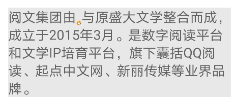
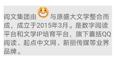
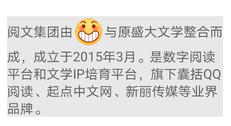
val textString = SpannableStringBuilder("Yuewen group was established in March 2015 by integrating Tencent literature and the original Shanda literature. Digital reading platform and Literature IP Cultivation platform, including QQ Reading, starting point Chinese network, Xinli media and other industry brands.")
textString.setSpan(ImageSpan(this, R.drawable.emoji, DynamicDrawableSpan.ALIGN_BOTTOM), 1, 4, Spanned.SPAN_EXCLUSIVE_EXCLUSIVE)
text.text = textString
Using Drawable files
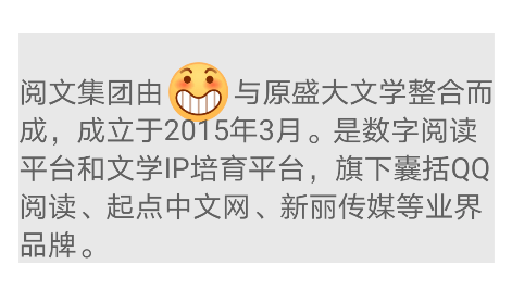
Through Drawable, you can control the display size of ImageSpan by setting boundaries. In addition to converting Drawable through resource files, you can also use various Drawable in Android API.
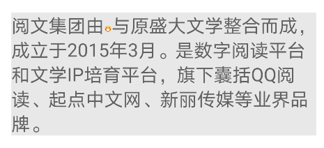
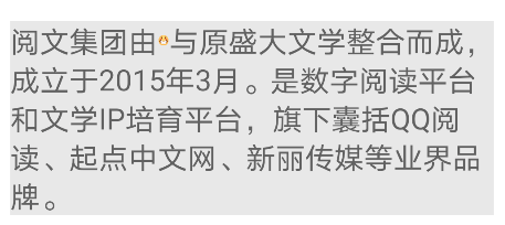
val textString = SpannableStringBuilder("Yuewen group was established in March 2015 by integrating Tencent literature and the original Shanda literature. Digital reading platform and Literature IP Cultivation platform, including QQ Reading, starting point Chinese network, Xinli media and other industry brands.")
val drawable = ContextCompat.getDrawable(this, R.drawable.emoji)
drawable?.let {
    drawable.setBounds(0, 0, 48.dp, 48.dp)
    textString.setSpan(ImageSpan(drawable), 5, 9, Spanned.SPAN_EXCLUSIVE_EXCLUSIVE)
}
text.text = textString
If there is no such a simple article as ImageSpan.
When using ImageSpan, we often encounter the problem of alignment. The effect of alignment is different in different scenes for the inserted Image and text size. This is also the source of various pits of ImageSpan. Let's take a look at several examples below.
Scenes with ImageSpan height less than text height
When the Image height is less than the text height, you can control its alignment through the verticalAlignment attribute of ImageSpan, that is, set dynamicdrrawablespan ALIGN_ BOTTOM,DynamicDrawableSpan.ALIGN_BASELINE,DynamicDrawableSpan.ALIGN_CENTER.
The above code can be set as:
drawable.setBounds(0, 0, 8.dp, 8.dp)
textString.setSpan(ImageSpan(drawable, DynamicDrawableSpan.ALIGN_BOTTOM), 5, 9, Spanned.SPAN_EXCLUSIVE_EXCLUSIVE)
The effect is as follows.
The picture size should be set smaller to better see the difference.
ALIGN_BOTTOM:
ALIGN_BASELINE:
ALIGN_CENTER:
In these cases, the performance of ImageSpan is basically consistent with the design. Therefore, the simplest way to solve various pits of ImageSpan is to make the boundaries of ImageSpan less than the height of text.
Scenes where the ImageSpan height is greater than the text height
Align when the ImageSpan height is greater than the text height_ The center will fail, causing the ImageSpan to always be ALIGN_BOTTOM effect. The test code is shown below.
drawable.setBounds(0, 0, 40.dp, 40.dp)
textString.setSpan(ImageSpan(drawable, DynamicDrawableSpan.ALIGN_BOTTOM), 5, 9, Spanned.SPAN_EXCLUSIVE_EXCLUSIVE)

ALIGN_BASELINE:
In this scenario, to achieve the center alignment of ImageSpan, you need to modify the text layout.
The first method: do not modify the getSize function, and offset the content when draw ing:
override fun draw(canvas: Canvas, text: CharSequence, start: Int, end: Int, x: Float, top: Int, y: Int, bottom: Int, paint: Paint) {
    val b = getCachedDrawable()
    b?.let {
        val fm = paint.fontMetricsInt
        val transY = (y + fm.descent + y + fm.ascent) / 2 - b.bounds.bottom / 2
        canvas.save()
        canvas.translate(x, transY.toFloat())
        b.draw(canvas)
        canvas.restore()
    }
}
y + fm.descent gets the Y coordinate of the font descent, y + FM Ascent gets the Y coordinate of the ascent of the font. Divide by 2 to get the Y coordinate of the middle line, and b.bounds bottom / 2. The center line coordinates of Image are obtained, and the vertex coordinates drawn by Image are obtained after subtraction.
This method is possible when the size of the ImageSpan is not very large. Its principle is to offset the ImageSpan, but the line height of the text has not changed. That is, as shown in the figure, the line height of multi line text has not changed, but the ImageSpan realizes the effect of centering.
The second way is to modify the line height attribute of the text, that is, make the size of the ImageSpan smaller than the line height, and dynamically change the line height of the original text to the size of the ImageSpan, or even larger, so that the ImageSpan can be centered naturally.
After processing in this way, the text and ImageSpan will be centered in the new line parameters as a whole. This effect should be relatively expansive. Unlike the first one, when the ImageSpan is too large, it will block the text of the next line. The expanded code is actually very simple. First modify the line height in getSize, and then offset the image in draw. The example code is as follows.
class ExImageSpan(drawable: Drawable, verticalAlignment: Int) : ImageSpan(drawable, verticalAlignment) {

    private var drawableRef: WeakReference<Drawable>? = null

    override fun getSize(paint: Paint, text: CharSequence?, start: Int, end: Int, fm: Paint.FontMetricsInt?): Int {
        val d = getCachedDrawable()
        d?.let {
            val rect = d.bounds
            if (fm != null) {
                val fmPaint = paint.fontMetricsInt
                val textHeight = fmPaint.descent - fmPaint.ascent
                val imageHeight = rect.bottom - rect.top
                if (imageHeight > textHeight && verticalAlignment == ALIGN_CENTER) {
                    fm.ascent = fmPaint.ascent - (imageHeight - textHeight) / 2
                    fm.top = fmPaint.ascent - (imageHeight - textHeight) / 2
                    fm.bottom = fmPaint.descent + (imageHeight - textHeight) / 2
                    fm.descent = fmPaint.descent + (imageHeight - textHeight) / 2
                } else {
                    fm.ascent = -rect.bottom
                    fm.descent = 0
                    fm.top = fm.ascent
                    fm.bottom = 0
                }
            }
            return rect.right
        }
        return 0
    }

    override fun draw(canvas: Canvas, text: CharSequence?, start: Int, end: Int, x: Float, top: Int, y: Int, bottom: Int, paint: Paint) {
        when (verticalAlignment) {
            ALIGN_CENTER -> {
                canvas.save()
                val fmPaint = paint.fontMetricsInt
                val fontHeight = fmPaint.descent - fmPaint.ascent
                val centerY = y + fmPaint.descent - fontHeight / 2
                val transY = centerY - (drawable.bounds.bottom - drawable.bounds.top) / 2
                canvas.translate(x, transY.toFloat())
                drawable.draw(canvas)
                canvas.restore()
            }
            else -> {
                canvas.save()
                val transY: Int = top + paint.fontMetricsInt.ascent - paint.fontMetricsInt.top
                canvas.translate(x, transY.toFloat())
                d.draw(canvas)
                canvas.restore()
            }
        }
    }

    private fun getCachedDrawable(): Drawable? {
        val wr: WeakReference<Drawable>? = drawableRef
        var d: Drawable? = null
        if (wr != null) {
            d = wr.get()
        }
        if (d == null) {
            d = drawable
            drawableRef = WeakReference<Drawable>(d)
        }
        return d
    }
}
This scheme is actually obtained from the source code of DynamicDrawableSpan, which is also the base class of ImageSpan. Here we can find out how the native ImageSpan handles offset. Refer to its implementation. We only check the size of the incoming ImageSpan > text height and align in getSize_ The size of center can be modified only when the center is, so that a perfect alignment effect can be obtained under any size and alignment method.
Other processing in draw is to process line feed and set setLineSpacing to a non default value.
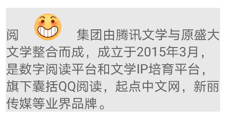
Load network diagram
In addition to loading local resource files, ImageSpan is most commonly used to load network images with the help of TextView BufferType. Spannable feature can easily load and refresh the network diagram. The code is as follows.
const val imageUrl = "https://qdclient-resources-1252317822.cos.ap-chengdu.myqcloud.com/Android/test/maomao1.jpeg"

val textString = SpannableStringBuilder("Founded in March 2015, Yuewen group, an integration of Tencent literature and the original Shanda literature, is a digital reading platform and literature platform IP Cultivation platform, including QQ Reading, starting point Chinese network, Xinli media and other industry brands.")
val drawable = ContextCompat.getDrawable(this, R.drawable.emoji)

text.setText(textString, TextView.BufferType.SPANNABLE)
val spannableText = text.text as Spannable
drawable?.let {
    drawable.setBounds(0, 0, 48.dp, 48.dp)
    spannableText.setSpan(ImageSpan(drawable), 5, 9, Spanned.SPAN_EXCLUSIVE_EXCLUSIVE)
}

Glide.with(this).asBitmap().load(imageUrl).into(object : SimpleTarget<Bitmap>() {
    override fun onResourceReady(resource: Bitmap, transition: Transition<in Bitmap>?) {
        Handler().postDelayed({
            val bitmapDrawable: Drawable = BitmapDrawable(resources, resource)
            bitmapDrawable.setBounds(0, 0, 200.dp, 200.dp)
            spannableText.setSpan(ImageSpan(bitmapDrawable), 5, 9, Spanned.SPAN_EXCLUSIVE_EXCLUSIVE)
        }, 3000)
    }
})
A default booth map is made here, and the time-consuming process of network loading is simulated through delay.
expand
After understanding the principle of modifying ImageSpan and expanding the display effect, the idea is very clear. For example, to add a requirement of "modifying left and right margins", you only need to add margins in getSize. The example code is as follows.
class MarginImageSpan @JvmOverloads constructor(d: Drawable, verticalAlignment: Int, private val marginLeft: Int, private val marginRight: Int, private val imageWidth: Int = 0) : ImageSpan(d, verticalAlignment) {

    override fun getSize(paint: Paint, text: CharSequence?, start: Int, end: Int, fm: FontMetricsInt?): Int {
        return if (marginLeft != 0 || marginRight != 0) {
            super.getSize(paint, text, start, end, fm)
            imageWidth + marginLeft + marginRight
        } else {
            super.getSize(paint, text, start, end, fm)
        }
    }

    override fun draw(canvas: Canvas, text: CharSequence, start: Int, end: Int, x: Float, top: Int, y: Int, bottom: Int, paint: Paint) {
        canvas.save()
        super.draw(canvas, text, start, end, x + marginLeft, top, y, bottom, paint)
        canvas.restore()
    }
}
The calling code is similar to the basic ImageSpan. The code is as follows.
val drawable = ContextCompat.getDrawable(this, R.drawable.emoji)
drawable?.let {
    drawable.setBounds(0, 0, 48.dp, 48.dp)
    textString.setSpan(MarginImageSpan(drawable, DynamicDrawableSpan.ALIGN_BOTTOM, 20.dp, 20.dp, 48.dp), 1, 2, Spanned.SPAN_EXCLUSIVE_EXCLUSIVE)
}
The display effect is shown in the figure.
As mentioned earlier, many complex rich text styles can be realized through ImageSpan. Here are two ways to generate ImageSpan to expand your ideas.
fun createDrawable(editText: EditText, source: CharSequence): Drawable {
    val editLayout = editText.layout
    val width = editLayout.width
    var layout = DynamicLayout(
        SpannableStringBuilder(),
        editLayout.paint,
        editLayout.width,
        editLayout.alignment,
        editLayout.spacingMultiplier,
        editLayout.spacingAdd,
        true
    )
    val builder = layout.text as SpannableStringBuilder
    builder.clear()
    builder.append(source)
    val want = editLayout.paint.measureText(builder, 0, builder.length).toInt()
    if (want != layout.width) {
        layout = DynamicLayout(
            builder,
            layout.paint,
            min(want, width),
            layout.alignment,
            layout.spacingMultiplier,
            layout.spacingAdd,
            true
        )
    }
    val bitmap = Bitmap.createBitmap(layout.width, layout.height, Bitmap.Config.ARGB_8888)
    val rect = Rect(0, 0, bitmap.width, bitmap.height)
    layout.draw(Canvas(bitmap))
    return BitmapDrawable(bitmap).apply { bounds = rect }
}
Through this function, you can easily insert the text generated Bitmap into EditText.
The following function converts a View into a Bitmap and inserts it as an ImageSpan.
fun convertViewToDrawableNew(view: View): Bitmap {
    val spec = View.MeasureSpec.makeMeasureSpec(0, View.MeasureSpec.UNSPECIFIED)
    view.measure(spec, spec)
    view.layout(0, 0, view.measuredWidth, view.measuredHeight)
    val bitmap = Bitmap.createBitmap(view.measuredWidth, view.measuredHeight, Bitmap.Config.ARGB_8888)
    val canvas = Canvas(bitmap)
    val background = view.background
    background?.draw(canvas)
    view.draw(canvas)
    return bitmap
}
Through this function, you can easily construct a complex Layout and then convert it into ImageSpan.
ClickableSpan
ClickableSpan is an important means to add interactive functions to Span, and it is also an essential part of rich text processing.
Most basic use
First, let's take a look at the most basic use of ClickableSpan. The code is as follows.
val textString = SpannableStringBuilder("Founded in March 2015, Yuewen group, an integration of Tencent literature and the original Shanda literature, is a digital reading platform and literature platform IP Cultivation platform, including QQ Reading, starting point Chinese network, Xinli media and other industry brands.")
textString.setSpan(object : ClickableSpan() {
    override fun onClick(widget: View) {
        Toast.makeText(this@MainActivity, "ClickableSpan1", Toast.LENGTH_SHORT).show()
    }
}, 4, 9, Spanned.SPAN_EXCLUSIVE_EXCLUSIVE)
text.highlightColor = Color.LTGRAY
text.text = textString
text.movementMethod = LinkMovementMethod.getInstance()
The effect is shown in the figure.
For ClickableSpan, you must set movementMethod to trigger the click effect.
Like ImageSpan, the native ClickableSpan can hardly be used out of the box. We can find several common problems:
-
There is a default highlight when selected.
-
Underlined.
The highlight effect selected by default can be solved by setting the highlightColor, which is the default logic of TextView. To remove the highlight, just set the highlightColor to transparent.
text.highlightColor = Color.TRANSPARENT
For underscores, you can modify updateDrawState.
class ExClickableSpan(val onSpanClick: () -> Unit) : ClickableSpan() {

    override fun onClick(widget: View) {
        onSpanClick()
    }

    override fun updateDrawState(ds: TextPaint) {
        ds.color = Color.parseColor("#5790DF")
        ds.isUnderlineText = false
    }
}
The display effect is as follows.
If you want to get the text in the Span in ClickableSpan, you can't get it directly through getText. You also need to modify the above code.
class ExClickableSpan(val onSpanClick: (String) -> Unit) : ClickableSpan() {

    override fun onClick(widget: View) {
        val tv = widget as TextView
        val s = tv.text as Spanned
        val start = s.getSpanStart(this)
        val end = s.getSpanEnd(this)
        onSpanClick(s.subSequence(start, end).toString())
    }

    override fun updateDrawState(ds: TextPaint) {
        ds.color = Color.parseColor("#5790DF")
        ds.isUnderlineText = false
    }
}

//Use
textString.setSpan(ExClickableSpan {
    Toast.makeText(this@MainActivity, "ClickableSpan1 $it", Toast.LENGTH_SHORT).show()
}, 4, 9, Spanned.SPAN_EXCLUSIVE_EXCLUSIVE)
Respond to click events
Next, continue to add multiple clickablespans and add click events to the Text as a whole. The code is as follows.
val textString = SpannableStringBuilder("Founded in March 2015, Yuewen group, an integration of Tencent literature and the original Shanda literature, is a digital reading platform and literature platform IP Cultivation platform, including QQ Reading, starting point Chinese network, Xinli media and other industry brands.")
textString.setSpan(ExClickableSpan {
    Toast.makeText(this@MainActivity, "ClickableSpan1 $it", Toast.LENGTH_SHORT).show()
}, 4, 9, Spanned.SPAN_EXCLUSIVE_EXCLUSIVE)
textString.setSpan(ExClickableSpan {
    Toast.makeText(this@MainActivity, "ClickableSpan2 $it", Toast.LENGTH_SHORT).show()
}, 11, 15, Spanned.SPAN_EXCLUSIVE_EXCLUSIVE)
text.setOnClickListener {
    Toast.makeText(this@MainActivity, "Text", Toast.LENGTH_SHORT).show()
}
text.highlightColor = Color.LTGRAY
text.text = textString
text.movementMethod = LinkMovementMethod.getInstance()
At this time, we set the click event for TextView and set the click event for two different spans in TextView. When we click again, we will find a new problem of ClickableSpan, that is, when clicking ClickableSpan, TextView will respond if the click event is set, that is, click the ClickableSpan area, Two click events are triggered.
There are generally two solutions to this problem.
Outer layer solution
This method usually sets a layer of Container outside the TextView to handle click events, such as FrameLayout. Set the overall click events in the FrameLayout, and the ClickableSpan events are still set in the ClickableSpan. At the same time, modify the movementMethod.
object MyLinkedMovementMethod : LinkMovementMethod() {
    override fun onTouchEvent(widget: TextView, buffer: Spannable, event: MotionEvent): Boolean {
        val isConsume = super.onTouchEvent(widget, buffer, event)
        if (!isConsume && event.action == MotionEvent.ACTION_UP) {
            val parent = widget.parent
            if (parent is ViewGroup) {
                parent.performClick()
            }
        }
        return isConsume
    }
}
When calling, set the overall click event to the outer Container, and the code is as follows.
val textString = SpannableStringBuilder("Founded in March 2015, Yuewen group, an integration of Tencent literature and the original Shanda literature, is a digital reading platform and literature platform IP Cultivation platform, including QQ Reading, starting point Chinese network, Xinli media and other industry brands.")
textString.setSpan(ExClickableSpan {
    Toast.makeText(this@MainActivity, "ClickableSpan1 $it", Toast.LENGTH_SHORT).show()
}, 4, 9, Spanned.SPAN_EXCLUSIVE_EXCLUSIVE)
textString.setSpan(ExClickableSpan {
    Toast.makeText(this@MainActivity, "ClickableSpan2 $it", Toast.LENGTH_SHORT).show()
}, 11, 15, Spanned.SPAN_EXCLUSIVE_EXCLUSIVE)
container.setOnClickListener {
    Toast.makeText(this@MainActivity, "Text", Toast.LENGTH_SHORT).show()
}
text.highlightColor = Color.TRANSPARENT
text.text = textString
text.movementMethod = MyLinkedMovementMethod
There are two main modifications:
-
Click the event handed over to the outer layer as a whole.
-
Modify the movementMethod to custom.
Inner layer solution
In this way, the LinkMovementMethod is directly modified. With its function, it is directly implemented through hosting onTouchEvent. The code is as follows.
object ExLinkMovementMethod : LinkMovementMethod() {
    override fun onTouchEvent(widget: TextView, buffer: Spannable, event: MotionEvent): Boolean {
        val action = event.action
        if (action == MotionEvent.ACTION_UP || action == MotionEvent.ACTION_DOWN) {
            var x = event.x.toInt()
            var y = event.y.toInt()
            x -= widget.totalPaddingLeft
            y -= widget.totalPaddingTop
            x += widget.scrollX
            y += widget.scrollY
            val layout = widget.layout
            val line = layout.getLineForVertical(y)
            var off = layout.getOffsetForHorizontal(line, x.toFloat())
            var xLeft = layout.getPrimaryHorizontal(off)
            if (xLeft < x) {
                if (off < widget.length() - 1) {
                    off += 1
                }
            } else {
                if (off > 0) {
                    off -= 1
                }
            }
            val links = buffer.getSpans(off, off, ClickableSpan::class.java)
            if (links.isNotEmpty()) {
                val span = links[0]
                val spanStartOffset = buffer.getSpanStart(span)
                val spanEndOffset = buffer.getSpanEnd(span)
                xLeft = layout.getPrimaryHorizontal(spanStartOffset)
                val bound = Rect()
                val offsetOfLine = layout.getLineForOffset(off)
                layout.getLineBounds(offsetOfLine, bound)
                if (y < bound.top || y > bound.bottom) {
                    return false
                }
                val xRight = layout.getPrimaryHorizontal(spanEndOffset - 1)
                if (xRight > xLeft && (x > xRight || x < xLeft)) {
                    return false
                }
                if (action == MotionEvent.ACTION_UP) {
                    links[0].onClick(widget)
                } else if (action == MotionEvent.ACTION_DOWN) {
                    Selection.setSelection(
                        buffer,
                        buffer.getSpanStart(links[0]),
                        buffer.getSpanEnd(links[0])
                    )
                }
                return true
            } else {
                Selection.removeSelection(buffer)
            }
        }
        return false
    }
}
The key point of this modification is actually the final return value, which is determined by return super onTouchEvent(widget, buffer, event); Change to return false to break the delivery chain.
This modification method is a common processing method at present. Most articles use this method to solve the click problem of ClickableSpan.
val textString = SpannableStringBuilder("Founded in March 2015, Yuewen group, an integration of Tencent literature and the original Shanda literature, is a digital reading platform and literature platform IP Cultivation platform, including QQ Reading, starting point Chinese network, Xinli media and other industry brands.")
textString.setSpan(ExClickableSpan {
    Toast.makeText(this@MainActivity, "ClickableSpan1 $it", Toast.LENGTH_SHORT).show()
}, 4, 9, Spanned.SPAN_EXCLUSIVE_EXCLUSIVE)
textString.setSpan(ExClickableSpan {
    Toast.makeText(this@MainActivity, "ClickableSpan2 $it", Toast.LENGTH_SHORT).show()
}, 11, 15, Spanned.SPAN_EXCLUSIVE_EXCLUSIVE)
text.setOnClickListener {
    Toast.makeText(this@MainActivity, "Text", Toast.LENGTH_SHORT).show()
}
text.setOnTouchListener { _, event ->
    ExLinkMovementMethod.onTouchEvent(
        text,
        Spannable.Factory.getInstance().newSpannable(text.text), event
    )
}
text.highlightColor = Color.TRANSPARENT
text.text = textString
The main modification points are:
-
Remove the call of movementMethod and directly host onTouchEvent.
-
The overall click event and ClickableSpan click event can be set at the same time.
Best solution
According to international practice, complex is not necessarily the best. The above processing is relatively complex, which is good for us to understand its working principle, but there are simpler methods to avoid click conflict. The code is shown below.
text.setOnClickListener {
    if (text.selectionStart == -1 && text.selectionEnd == -1) {
        Toast.makeText(this@MainActivity, "Text", Toast.LENGTH_SHORT).show()
    }
}
In this way, there is no need to make other settings, just add a layer of judgment on the click event of TextView. Because when ClickableSpan is clicked, the selectionStart and selectionEnd of TextView will change. At this time, there is no need to deal with the click events of TextView. After this layer of filtering, the mutually exclusive click of TextView and ClickableSpan is realized. We can encapsulate the setOnClickListener method of TextView and add a layer of logic without modifying any other logic. It should be the best solution to deal with this problem.
expand
ClickableSpan is an important means to realize Span interaction. For example, we can use ClickableSpan to realize the function of "click to select a sentence". The code is as follows.
class MainActivity : AppCompatActivity() {
    override fun onCreate(savedInstanceState: Bundle?) {
        super.onCreate(savedInstanceState)
        setContentView(R.layout.activity_main)
        val textString = SpannableStringBuilder("Founded in March 2015, Yuewen group, an integration of Tencent literature and the original Shanda literature, is a digital reading platform and literature platform IP Cultivation platform, including QQ Reading, starting point Chinese network, Xinli media and other industry brands.")
        val indices = getIndices(textString.toString(), ',')

        var start = 0
        var end: Int
        for (i in 0..indices.size) {
            val clickSpan: ClickableSpan = getClickableSpan()
            end = if (i < indices.size) indices[i] else textString.length
            textString.setSpan(
                clickSpan, start, end,
                Spannable.SPAN_EXCLUSIVE_EXCLUSIVE
            )
            start = end + 1
        }
        text.highlightColor = Color.CYAN
        text.text = textString
        text.movementMethod = LinkMovementMethod.getInstance()
    }

    private fun getClickableSpan(): ClickableSpan {
        return object : ClickableSpan() {
            override fun onClick(widget: View) {
                val tv = widget as TextView
                tv.text.subSequence(
                    tv.selectionStart,
                    tv.selectionEnd
                ).toString()
            }

            override fun updateDrawState(ds: TextPaint) {
                ds.isUnderlineText = false
            }
        }
    }

    private fun getIndices(text: String, char: Char): MutableList<Int> {
        var pos = text.indexOf(char, 0)
        val indices: MutableList<Int> = mutableListOf()
        while (pos != -1) {
            indices.add(pos)
            pos = text.indexOf(char, pos + 1)
        }
        return indices
    }
}
Clicking on different sentences will trigger the ClickableSpan effect, as shown below.
The principle is to set the click color of ClickableSpan to Cyan, break sentences for the whole copy, and set ClickableSpan according to sentences, so as to realize the function of click selection.
ReplacementSpan
ReplacementSpan is an abstract class. It mainly provides two abstract methods, getSize and draw. GetSize returns the width required by the current span. Draw is used to draw span to Canvas. With Canvas, you can use the Canvas API to realize various drawing functions, which is also the strength of ReplacementSpan.
The draw function of ReplacementSpan will be called during TextView drawing. We can use these parameters returned by it to help us draw.
The following code demonstrates the basic usage of ReplacementSpan.
class MainActivity : AppCompatActivity() {
override fun onCreate(savedInstanceState: Bundle?) {
super.onCreate(savedInstanceState)
setContentView(R.layout.activity_main)
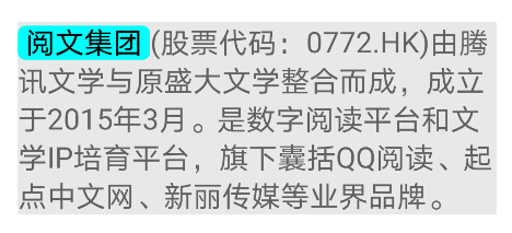
val textString = SpannableString("Reading group(Stock Code: 0772.HK)It was established in March 2015 by integrating Tencent literature and the original Shanda literature. Digital reading platform and Literature IP Cultivation platform, including QQ Reading, starting point Chinese network, Xinli media and other industry brands.")
textString.setSpan(RoundRectBackGroundSpan(Color.BLACK, Color.CYAN, 16F), 0, 4, SPAN_INCLUSIVE_INCLUSIVE)
text.text = textString
}
}
class RoundRectBackGroundSpan(private val colorText: Int, private val colorBg: Int, private val radius: Float) : ReplacementSpan() {
private var spanSize = 0
override fun getSize(paint: Paint, text: CharSequence?, start: Int, end: Int, fm: Paint.FontMetricsInt?): Int {
spanSize = (paint.measureText(text, start, end) + 2 * radius).toInt()
return spanSize
}
override fun draw(canvas: Canvas, text: CharSequence?, start: Int, end: Int, x: Float, top: Int, y: Int, bottom: Int, paint: Paint) {
paint.apply {
color = colorBg
isAntiAlias = true
}
val rect = RectF(x, y + paint.ascent(), x + spanSize, y + paint.descent())
canvas.drawRoundRect(rect, radius, radius, paint)
paint.color = colorText
canvas.drawText(text.toString(), start, end, x + radius, y.toFloat(), paint)
}
}
ReplacementSpan is the most commonly used custom Span method. With it, you can modify specific characters in the text to a new Span. At the same time, with Canvas, you can easily set various styles.
There are many usage scenarios for ReplacementSpan. After all, you can fully master the drawing ability. Here are several common usage scenarios to demonstrate the usage steps of ReplacementSpan.
In addition to ReplacementSpan, DynamicDrawableSpan is also a very common extended base class.
Common scenarios - adding labels
This is a common use scenario. We can spell a default placeholder character before adding the text of the label, and then replace the placeholder character through ReplacementSpan, so as to draw the label. The code is as follows.
class MainActivity : AppCompatActivity() {
    override fun onCreate(savedInstanceState: Bundle?) {
        super.onCreate(savedInstanceState)
        setContentView(R.layout.activity_main)
        val textString = SpannableStringBuilder(" ")
        textString.append("Yuewen group was established in March 2015 by integrating Tencent literature and the original Shanda literature. Digital reading platform and Literature IP Cultivation platform, including QQ Reading, starting point Chinese network, Xinli media and other industry brands.")
        textString.setSpan(RoundBackgroundColorSpan(Color.RED, Color.WHITE, 8, "Color color"), 0, 1, Spanned.SPAN_EXCLUSIVE_EXCLUSIVE)
        text.text = textString
    }
}

class RoundBackgroundColorSpan(private val bgColor: Int, private val textColor: Int, private val radius: Int, private val textString: String) : ReplacementSpan() {

    private var spanWidth = 0

    override fun getSize(paint: Paint, text: CharSequence?, start: Int, end: Int, fm: FontMetricsInt?): Int {
        return ((paint.measureText(textString, 0, textString.length) + 2 * radius).toInt()).also { spanWidth = it }
    }

    override fun draw(canvas: Canvas, text: CharSequence?, start: Int, end: Int, x: Float, top: Int, y: Int, bottom: Int, paint: Paint) {
        val originalColor = paint.color
        paint.color = bgColor
        paint.isAntiAlias = true
        val rectF = RectF(x, y + paint.ascent(), x + spanWidth, y + paint.descent())
        canvas.drawRoundRect(rectF, radius.toFloat(), radius.toFloat(), paint)
        paint.color = textColor
        canvas.drawText(textString, x + radius, y.toFloat(), paint)
        paint.color = originalColor
    }
}
The effect is shown in the figure.

After knowing the principle, you can easily draw various effects, such as gradient, border, etc. take gradient as an example.
class RoundBackgroundColorSpan(private val bgColor: Int, private val textColor: Int, private val radius: Int, private val textString: String) : ReplacementSpan() {

    private var spanWidth = 0

    override fun getSize(paint: Paint, text: CharSequence?, start: Int, end: Int, fm: Paint.FontMetricsInt?): Int {
        return ((paint.measureText(textString, 0, textString.length) + 2 * radius).toInt()).also { spanWidth = it }
    }

    override fun draw(canvas: Canvas, text: CharSequence?, start: Int, end: Int, x: Float, top: Int, y: Int, bottom: Int, paint: Paint) {
        val newPaint = Paint().apply {
            isAntiAlias = true
            color = textColor
            textSize = paint.textSize
        }
        val rectF = RectF(x, y + paint.ascent(), x + spanWidth, y + paint.descent())
        val linearGradient = LinearGradient(
                0f, 0f, rectF.right, rectF.bottom,
                Color.RED,
                Color.BLUE,
                Shader.TileMode.CLAMP)
        newPaint.shader = linearGradient
        canvas.drawRoundRect(rectF, radius.toFloat(), radius.toFloat(), newPaint)
        newPaint.shader = null
        canvas.drawText(textString, x + radius, y.toFloat(), newPaint)
    }
}
The display effect is shown in the figure.

It should be noted that when multiple spans are mixed, because the ReplacementSpan will change the width of the Span, it is generally necessary to set the ReplacementSpan first and then other spans to avoid the change of coordinates after adjusting the size, such as click dislocation of ClickableSpan.
Transferred from: https://mp.weixin.qq.com/s/ji9MRaMhpVM711lDYL0LFw