
Preface
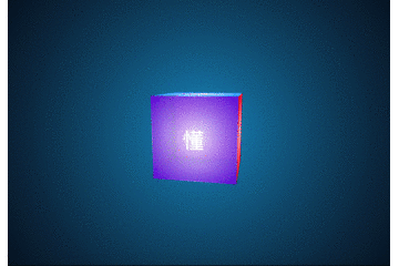
Writing recently< Animation Point Series > The article was shared in the last issue. Hands teach you how to draw a sports car. This issue brings you a three-dimensional 3d magic cube combined with CSS3, which combines js to let you turn as you like. Here is @ IT Pingtou Coalition I'm the chief filling officer. South of Jiangsu (South Su), let's look at the effect first, and then decompose its implementation process.
- Author: Chief Filling Officer Southern Jiangsu
- Exchange: 912594095, public number: honey Badger8; this article is original, the copyright belongs to the author, reproduced please indicate the original link and source.
Drawing process:
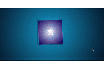
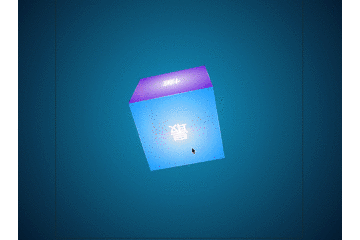
OK, the gif chart looks a little bit unclear. Students who want to preview online can click on it. Online Preview (viii) No more nonsense, let's first analyze and see how to achieve this function.
_API preheating:
- This example is a three-dimensional square. Since it has a three-dimensional effect, there must be - webkit-perspective - perspective, preserve-3d - three-dimensional space in CSS3. These two are the key points. Of course, there are transform-origin, transition, transformation and so on. First, let's go back and forth, so what's the API about?
perspective values:
- none: no perspective is specified;
- length: Specify the distance between the observer and the "z=0" plane, so that elements with three-dimensional position transformation can produce perspective effect. The three-dimensional elements of "z > 0" are larger than normal, while those of "z < 0" are smaller than normal. The magnitude of the three-dimensional elements is determined by the value of the attribute, and negative values are not allowed.
transform-style values:
- flat: Specifies that the child element is in the plane where the element is located.
- Preserve-3d: Specify that the child element is located in the three-dimensional space. When the attribute value is preserve-3d, the element will create a local stacking context.
- Summary: To determine whether a transformation element appears to be in a three-dimensional space or in a plane, we need to define <'transform-style'> attributes on the parent element of the element, that is to say, if an element has a three-dimensional effect, we need to set its parent to preserve-3d.
Transf-origin values:
- Percentage: specify coordinate values by percentage. It can be negative.
- Length: The coordinate value is specified by the length value. It can be negative.
- Left: specify the abscissa of the origin as left;
- Center 1: designate the abscissa of the origin as center;
- Right: specify the abscissa of the origin as right;
- Top: specify the ordinate of the origin as top;
- Center 2: The ordinates of the origin are designated as center.
- Bottom: specify the ordinate of the origin as bottom;
- transform, transition, etc. are not introduced.
/* perspective Use examples:*/
div{
    -webkit-perspective:600px;
    perspective:600px;
}

/*transform-style Use examples:*/
.preserve{//Chief Filling Officer Column Exchange in Southern Jiangsu: 9125 94095, Public No. honey Badger 8
    transform-style:preserve-3d;
    -webkit-transform-style:preserve-3d;
}

  /*transform-origin Use examples:*/
.preserve{
    -webkit-transform-origin:50% 50% -100px; or
    -webkit-transform-origin:bottom; or
    -webkit-transform-origin:top;
    ............
}
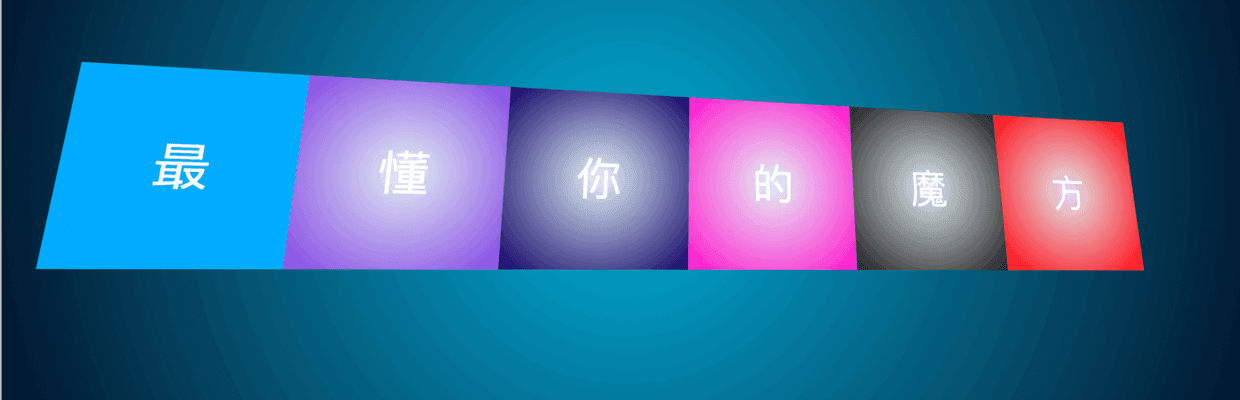
_Draw six planes:
- Yes, I'm not wrong. There are six sides: top, front, bottom, back, left and right.
- The API above talks about so much. Let's try it out. Write six div s. The structure is probably like this. It's also the structure that the magic cube needs next.
<div class="cube">
    <div class="cube-inner running">
        <p class="single-side s1"><span>most</span></p>
        <p class="single-side s2"><span>understand</span></p>
        <p class="single-side s3"><span>you</span></p>
        <p class="single-side s4"><span>Of</span></p>
        <p class="single-side s5"><span>magic</span></p>
        <p class="single-side s6"><span>square</span></p>
    </div>
</div>
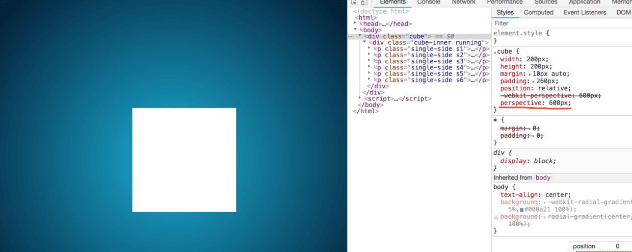

- !!! What happened? Am I surprised? The bigger the value, the stronger the perspective effect? Behind the Ming Ming Dynasty, there is a sister, how can we see without perspective?
- At first, I was as surprised as you, but in an instant I realized that rotate was not enough. Add it and see the effect again.
.cube{
    width:200px;
    height:200px;
    margin:10px auto;
    padding:260px;
    position:relative;
    -webkit-perspective:600px;
    perspective:600px;
    transition: .5s ;

}
.cube-inner{
    width:200px;
    height:200px;
    position:relative;
    -webkit-transform-style:preserve-3d;
    transition:.3s;
    -webkit-transform-origin:50% 50% -100px;
    transform: rotateX(45deg);
}
.cube:hover{
    /*When the mouse passes by, transit the perspective s to 100 */
    -webkit-perspective:100px;
    perspective:100px;
}
- Since the API is valid, then pull down and draw six faces, according to: top, front, bottom, back, left, right, this order to set it;
- First, we specify that they are preserve-3d in three-dimensional space, that is, the parent of six planes should set the transform-style.
- After all these are set up, let's look at six more faces. In order to distinguish them easily, we set different colors for each of them (using the gradient radial-gradient of css3) - students who don't want to write by hand. Recommend a website You can set the effect you want online and copy the style. First, you can see the elegance. For easy observation, the whole angle is rotated by 10 deg:
- Speaking of gradient, an interesting thing happened to be hue-rotate, which can rotate the tone and content of elements on the basis of your initial color to achieve different results. Learn more
hue-rotate : The hue-rotate() CSS function rotates the hue of an element and its contents. Its result is a
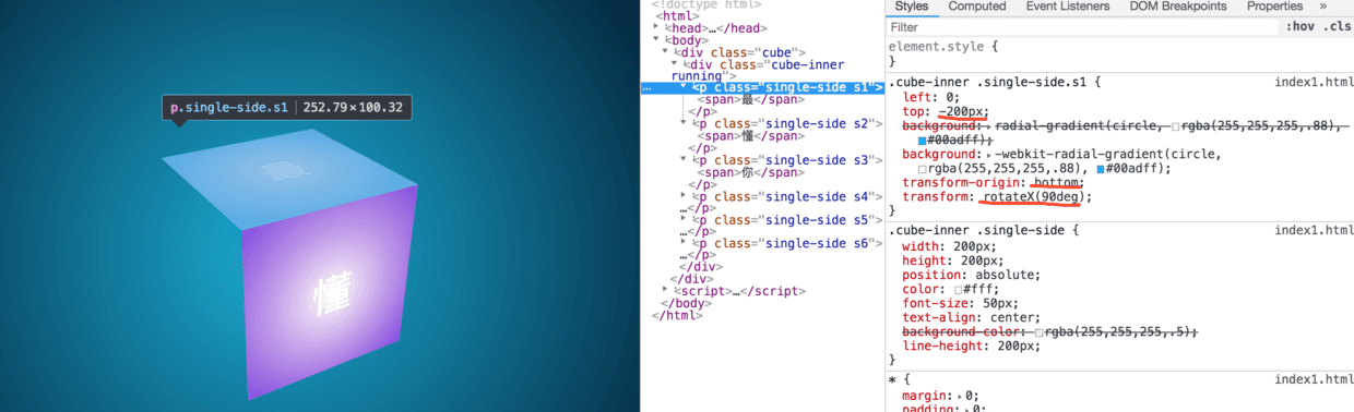
- Top-most:
.cube-inner .single-side.s1{
    /*s1 Top*/
    left:0;top:-200px;
    background: radial-gradient(circle, rgba(255,255,255,.88), #00adff);
    background: -webkit-radial-gradient(circle, rgba(255,255,255,.88), #00adff);
    transform-origin:bottom;
    -webkit-transform-origin:bottom;
    transform:rotateX(90deg);
    -webkit-transform:rotateX(90deg);
}
-
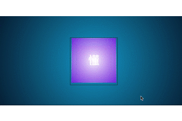
Positive - "Understand":
- The following is the default, nothing need to be set, so it is not shown;
-
Next - "You":
- That is to say, the setting of the bottom is just opposite to that of the top. One origin takes the bottom as the reference coordinate and the other takes the top as the reference coordinate.
.cube-inner .single-side.s3{
    /*s3 bottom*/
    left:0;top:200px;
    background: radial-gradient(circle, rgba(255,255,255,.88), #100067);
    background: -webkit-radial-gradient(circle, rgba(255,255,255,.88), #100067);
    transform-origin:top;
    -webkit-transform-origin:top;
    transform:rotateX(-90deg);
    -webkit-transform:rotateX(-90deg);
}
-
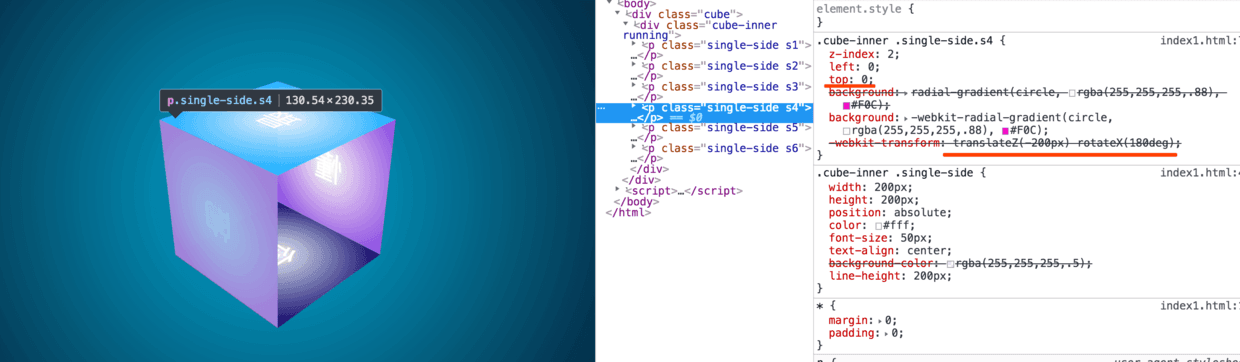
Back - "Yes":
- That is, the back of the front rotates 135 deg, making the back more intuitive to see.
- Translation Z and rotateX move at the same time, forming a perspective relationship, making it look, behind the front;
- Figure 2 below sets the default front and transparency to show the perspective effect on the back.
.cube-inner .single-side.s4{
    /*s4 Back, Public No. honey Badger 8*/
    z-index:2;
    left:0;top:0;//Chief Filling Officer Column Exchange in Southern Jiangsu: 9125 94095, Public No. honey Badger 8
    background: radial-gradient(circle, rgba(255,255,255,.88), #F0C);
    background: -webkit-radial-gradient(circle, rgba(255,255,255,.88), #F0C);
    transform:translateZ(-200px) rotateX(180deg) ;
    -webkit-transform:translateZ(-200px) rotateX(180deg) ; /*rotateZ(-180deg) When rotating left and right, the Z axis rotates 180 degrees, because the word is inverted.*/
}
-
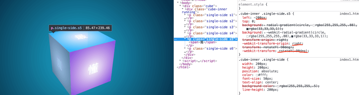
On the left side - "Devil":
- The origin is based on right, the width of negative element of left and rotateY axis rotates 90 DEG.
.cube-inner .single-side.s5{
    /*s5 Left*/
    left:-200px;top:0;
    background: radial-gradient(circle, rgba(255,255,255,.88),rgba(33,33,33,1));
    background: -webkit-radial-gradient(circle, rgba(255,255,255,.88),rgba(33,33,33,1));
    transform-origin:right;
    -webkit-transform-origin:right;
    transform:rotateY(-90deg)
    -webkit-transform:rotateY(-90deg)
}
-
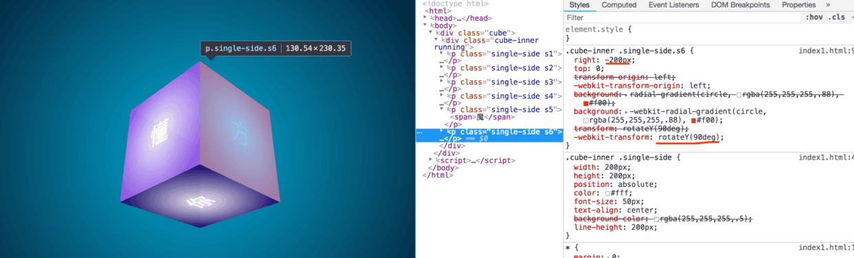
On the right side - "Fang":
- Similarly, the right side is the opposite to the left side.
.cube-inner .single-side.s6{
    /*s6 Right*/
    right:-200px;top:0;
    transform-origin:left;//Chief Filling Officer Column Exchange in Southern Jiangsu: 9125 94095, Public No. honey Badger 8
    -webkit-transform-origin:left;
    background: radial-gradient(circle, rgba(255,255,255,.88), #f00);
    background: -webkit-radial-gradient(circle, rgba(255,255,255,.88), #f00);
    transform:rotateY(90deg);
    -webkit-transform:rotateY(90deg);
}
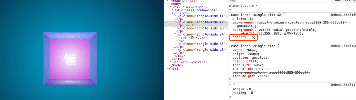
Summary: Well, the drawing process of the above six sides of the magic cube has basically been completed, mainly in the application of transform-origin, rotate, translate and other attributes, but in order to make it more cool, we need to add some light to the corner.
_Add highlights:
- Careful baby, the front layout should have been found, each row layout of the p tag, there is an additional layer of span, is for high light, buried foreshadows, a flat square has four sides, after, before only two, then certainly to set another layer, of course, many methods, such as direct use of border is also possible, but more trouble, I chose to do now. In this regard:
- after, before set the 1px border, set a linear gradient, the middle is white, the two breaks are transitional to transparent, so there is highlight, let's see a set of graphs:
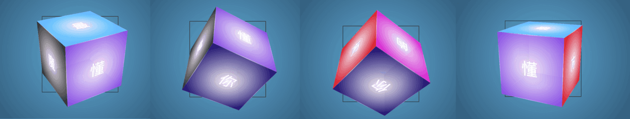
CSS 360 degree rotation:
- Above is a mouse through the transition animation, you can see the stereo effect is already there, then write a CSS animation animation, let it rotate 360 degrees, every corner can see, so it will show 666;
- animation is used in conjunction with keyframes, see the code example:
.cube .cube-inner{
    /*-webkit-transform:rotateX(180deg) rotateY(0deg) ;*/
    animation: elfCube 10s infinite ease-in-out;
    -webkit-animation: elfCube 10s infinite ease alternate;
}

@keyframes elfCube {
    0% {
        transform: rotateX(0deg) rotateY(0deg);
    }
    50% {
        transform: rotateX(360deg) rotateY(360deg);
    }
    100% { //Chief Filling Officer Column Exchange in Southern Jiangsu: 9125 94095, Public No. honey Badger 8
        transform: rotateX(0deg) rotateY(0deg);
    }
}
@-webkit-keyframes elfCube {
    0% {
     -webkit-transform: rotateX(0deg) rotateY(0deg);
    }
    50% {
     -webkit-transform: rotateX(360deg) rotateY(360deg);
    }
    100% {
        transform: rotateX(0deg) rotateY(0deg);
    }
}
Follow the mouse to rotate:
- What about spinning with the mouse?
- Don't panic. Next is to pretend to take you and fly you.
- First, we need to understand the location of the mouse in the container, X = e.pageX - ele.offsetLeft, Y = e.pageY - ele.offsetTop;
- At the same time, we should know the central point of the element: centerX = width/2,centerY =height/2;
- Then we get the values: axisX = X - centerX, axisY = Y - centerY;
- PS: I began to think about the direction from which the mouse entered and got its angle, but found that the effect of rotation was not obvious. Interested students can try ((Math. atan2 (Y, X)* (180/Math. PI)+180)/90), refer to the God of stuart. JS determines where the mouse enters a container;
- Finally, bind the container with events: mouseover, mousemove, mouseout. When the mouse enters, pause the animation of css, or fight with each other!
 ......
getAxisX(e){
    let left = this.cubeEle.offsetLeft;
    return e.pageX - left - (this.cubeW/2) * (this.cubeW>this.cubeH ? this.cubeH/this.cubeW : 1);
}
getAxisY(e){
    let top = this.cubeEle.offsetTop;
    return e.pageY - top - (this.cubeH/2) * (this.cubeH>this.cubeW ? this.cubeW/this.cubeH : 1);
}
 ............
 ............
run(){
    this.cubeEle.addEventListener('mouseover',(e)=>this.hoverOut(e),false);
    this.cubeEle.addEventListener('mousemove',(e)=>this.move(e),false);
    this.cubeEle.addEventListener('mouseout',(e)=>this.hoverOut(e),false);
}
hoverOut(e){
    //Enter/leave
    e.preventDefault();
    this.axisX = this.getAxisX(e),
    this.axisY = this.getAxisY(e);

    if(e.type == 'mouseout'){ //leave
        this.axisX=0;
        this.axisY = 0;//Chief Filling Officer Column Exchange in Southern Jiangsu: 9125 94095, Public No. honey Badger 8
        console.log("leave")
        this.cubeInner.className="cube-inner running";
    }else{
        this.cubeInner.className="cube-inner";
        console.log("Get into")
    };
    let rotate = `rotateX(${-this.axisY}deg) rotateY(${-this.axisX}deg)`;
    this.cubeInner.style.WebkitTransform = this.cubeInner.style.transform = rotate;
}
 ......
Ending:
- -webkit-perspective,
- -webkit-transform-style,
- -webkit-transform-origin,
- radial-gradient,linear-gradient,
- transform: rotate,translate,scale,
- transition,
- animation;
- These are the API s for sharing and using knowledge points for you today. If there are any mistakes in the article, please correct them.
- Article source code acquisition - > blog-resource_
- Want direct online preview (vii)
PS: If you think the article is good and want to get more front-end content, please pay attention to the public number below. It's a surprise.

Author: South Jiangsu- Chief Pit Filling Officer
Link: https://blog.csdn.net/weixin_43254766/article/details/83472829
Exchange Group: 912594095, Public No. honey Badger 8
This article is original and the copyright belongs to the author. For commercial reprints, please contact @IT.Pingtouge Alliance for authorization. For non-commercial reprints, please indicate the original link and source.