preface
The text and pictures of this article are from the Internet, only for learning and communication, not for any commercial purpose. The copyright belongs to the original author. If you have any questions, please contact us in time for handling.
Author: Python Chinese community
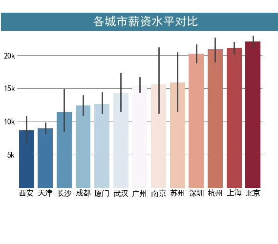
The data used in this paper is as shown in the figure. The data frame shows the region corresponding to the relevant position and the corresponding salary status. The unit is thousand, and the salary status of each city should be counted.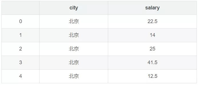
The ultimate goal is to use Matplotlib in combination with Seaborn to get this kind of visualization effect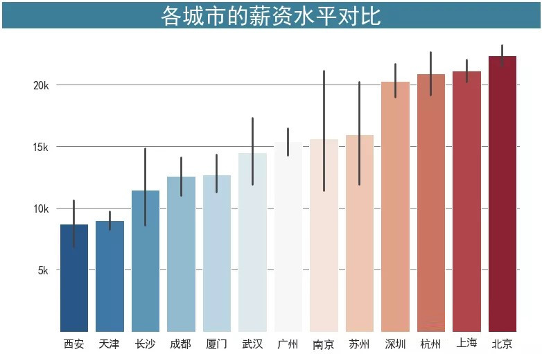
First, to import the package to be used, you need to set some fonts because you need to display Chinese characters in the diagram.
import matplotlib.pyplot as plt
import seaborn as sns
%matplotlib inline


# Set Chinese font to Microsoft YaHei
plt.rcParams['font.sans-serif'] = 'SimHei'
First, Seaborn is used to generate a basic histogram and add a title to the graph, and then make further modifications around the graph.
fig,ax = plt.subplots(figsize=(9,6))
sns.barplot(x='city',y='salary',data=df,ci=95,ax=ax)
ax.set_title('Comparison of salary levels in different cities')
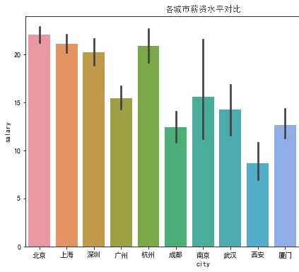
It can be seen clearly that the font of the scale label in horizontal and vertical coordinates is a little small, and the scale line is not good-looking, so the first step is to enlarge the font of the scale label and remove the scale line.
Since the setting of scale is the attribute of tick, the ax.tick_param() is used to set the scale label size, and the length parameter is used to set the scale length.
fig,ax = plt.subplots(figsize=(9,6))
sns.barplot(x='city',y='salary',data=df,ci=95,ax=ax)
ax.set_title('Comparison of salary levels in different cities')

# Font 16 px Size, tick mark length 0
ax.tick_params(labelsize=16,length=0)
The second step is to remove the border of four sides (it's really ugly). There are two ways to achieve this.
The first is from the last article ax.spines [‘xx’].set_visible(False) sets top, bottoom, left, and right respectively.
In the second way, since there is only one axis and all four borders are removed, you can also use it directly plt.box(False)
fig,ax = plt.subplots(figsize=(9,6))
sns.barplot(x='city',y='salary',data=df,ci=95,ax=ax)
ax.set_title('Comparison of salary levels in different cities')

# Font 16 px Size, tick mark length 0
ax.tick_params(labelsize=16,length=0)

#Law 1:
ax.spines['left'].set_visible(False)
ax.spines['top'].set_visible(False)
ax.spines['right'].set_visible(False)
ax.spines['bottom'].set_visible(False)

#Law two
plt.box(False)
Next, in order to make the bar graph gradient from small to large, you can specify the order of each city, and set the corresponding color mapping.
Average the salaries of each city and rank them from small to large to obtain the city ranking list_ order
city_order = df.groupby("city")["salary"].mean()\
               .sort_values()\
               .index.tolist()
Then use order and palette in Seaborn to set the order and color respectively.
fig,ax = plt.subplots(figsize=(9,6))
sns.barplot(x='city',y='salary',data=df,ci=95,ax=ax,
           order = city_order,palette = "RdBu_r")
ax.set_title('Comparison of salary levels in different cities')

# Font 16 px Size, tick mark length 0
ax.tick_params(labelsize=16,length=0)
plt.box(False)
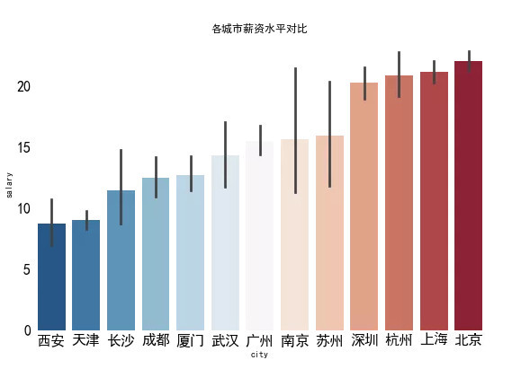
Then add grid lines on the y-axis to observe the numerical value of each column. Because the grid line is grid on the y-axis, use the ax.yaxis.grid() set up
fig,ax = plt.subplots(figsize=(9,6))
sns.barplot(x='city',y='salary',data=df,ci=95,ax=ax,
           order = city_order,palette = "RdBu_r")
ax.set_title('Comparison of salary levels in different cities')

# Font 16 px Size, tick mark length 0
ax.tick_params(labelsize=16,length=0)
plt.box(False)

# set up y Axis gridlines
ax.yaxis.grid(linewidth=0.5,color='black')
# Bring gridlines to the bottom
ax.set_axisbelow(True)
Because the meaning of x-axis and y-axis is clear, the labels of horizontal and vertical coordinates can be removed. At the same time, in order to be more intuitive, the scale labels of y-axis can be changed from 20, 15 For 20k,15k
This process uses ax.set_xlabel(),ax.set_ylabel() and ax.set_yticklabels()
fig,ax = plt.subplots(figsize=(9,6))
sns.barplot(x='city',y='salary',data=df,ci=95,ax=ax,
           order = city_order,palette = "RdBu_r")
ax.set_title('Comparison of salary levels in different cities')

# Font 16 px Size, tick mark length 0
ax.tick_params(labelsize=16,length=0)
plt.box(False)

# set up y Axis gridlines
ax.yaxis.grid(linewidth=0.5,color='black')
# Place gridlines at the bottom,
ax.set_axisbelow(True)

ax.set_xlabel('')
ax.set_ylabel('')
# Set 0 as an empty string and add k
ax.set_yticklabels([" ","5k","10k","15k","20k"])
Finally, set the title to make it more beautiful. This step is mainly to ax.set_ The parameters in title () are adjusted, mainly including
backgroundcolor: Control background color
fontsize: Control font size
weight: Control font weight
color: Control font color
fig,ax = plt.subplots(figsize=(9,6))

sns.barplot(x='city',y='salary',data=df,ci=95,ax=ax,
           order = city_order,palette = "RdBu_r")

# Font 16 px Size, tick mark length 0
ax.tick_params(labelsize=16,length=0)
plt.box(False)

# set up y Axis gridlines
ax.yaxis.grid(linewidth=0.5,color='black')
# Place gridlines at the bottom,
ax.set_axisbelow(True)

ax.set_xlabel('')
ax.set_ylabel('')
# Set 0 as an empty string and add k
ax.set_yticklabels([" ","5k","10k","15k","20k"])

ax.set_title('               Comparison of salary levels in different cities             ',backgroundcolor='#3c7f99',
            fontsize=24, weight='bold',color='white')