preface
Hello! buddy!
First of all, thank you very much for reading Haihong's article. If there are mistakes in the article, you are welcome to point out ~
Ha ha, introduce yourself
Nickname: Haihong
Label: program ape a C + + player student
Introduction: I got acquainted with programming in C language and then transferred to computer major. I was lucky to have won national and provincial awards and have been guaranteed for research. Currently learning C++/Linux (really, really hard ~)
Learning experience: solid foundation + taking more notes + typing more codes + thinking more + learning English well!
Daily sharing: WeChat official account Pro, recording life, learning bits, sharing some source code or learning materials, welcome to pay attention to
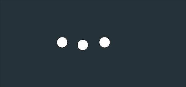
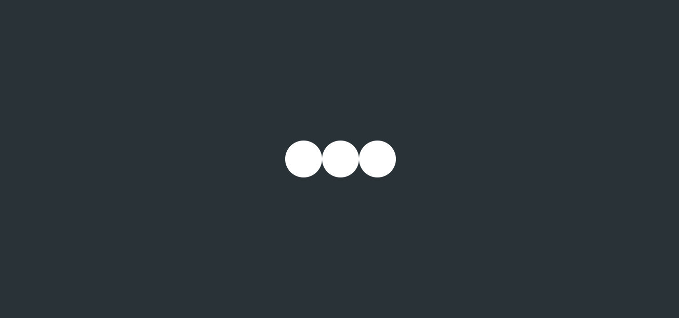
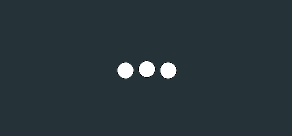
Effect display
Demo code
HTML
<!DOCTYPE html>
<html lang="en">
<head>
    <meta charset="UTF-8">
    <meta http-equiv="X-UA-Compatible" content="IE=edge">
    <meta name="viewport" content="width=device-width, initial-scale=1.0">
    <link rel="stylesheet" href="style.css">
    <title>Document</title>
</head>
<body>
    <section><span></span></section>
</body>
</html>
CSS
html, body {
  margin: 0;
  height: 100%;
}

body {
  display: flex;
  justify-content: center;
  align-items: center;
  background: #263238;
}

section {
  width: 650px;
  height: 300px;
  padding: 10px;
  position: relative;
  display: flex;
  align-items: center;
  justify-content: center;
  border: 2px solid red;
}

span {
  width: 36px;
  height: 36px;
  border-radius: 50%;
  position: relative;
  color: #fff;
  animation: animloader 1s linear infinite alternate;
}

@keyframes animloader {
  0% {
    box-shadow: -110px -6px, -38px 6px, 38px -6px
  }
  33% {
    box-shadow: -110px 6px, -38px -6px, 38px 6px
  }
  66% {
    box-shadow: -110px -6px, -38px 6px, 38px -6px
  }
  100% {
    box-shadow: -110px 6px, -38px -6px, 38px 6px
  }
}
This version of the code is copied from the boss's scss code and copied in css
The main principle is that the three small balls are generated by box shadow shadow
Then use animation
Set the position of the ball at each critical moment
Smooth transitions produce animation
So as to achieve the effect shown in the figure above
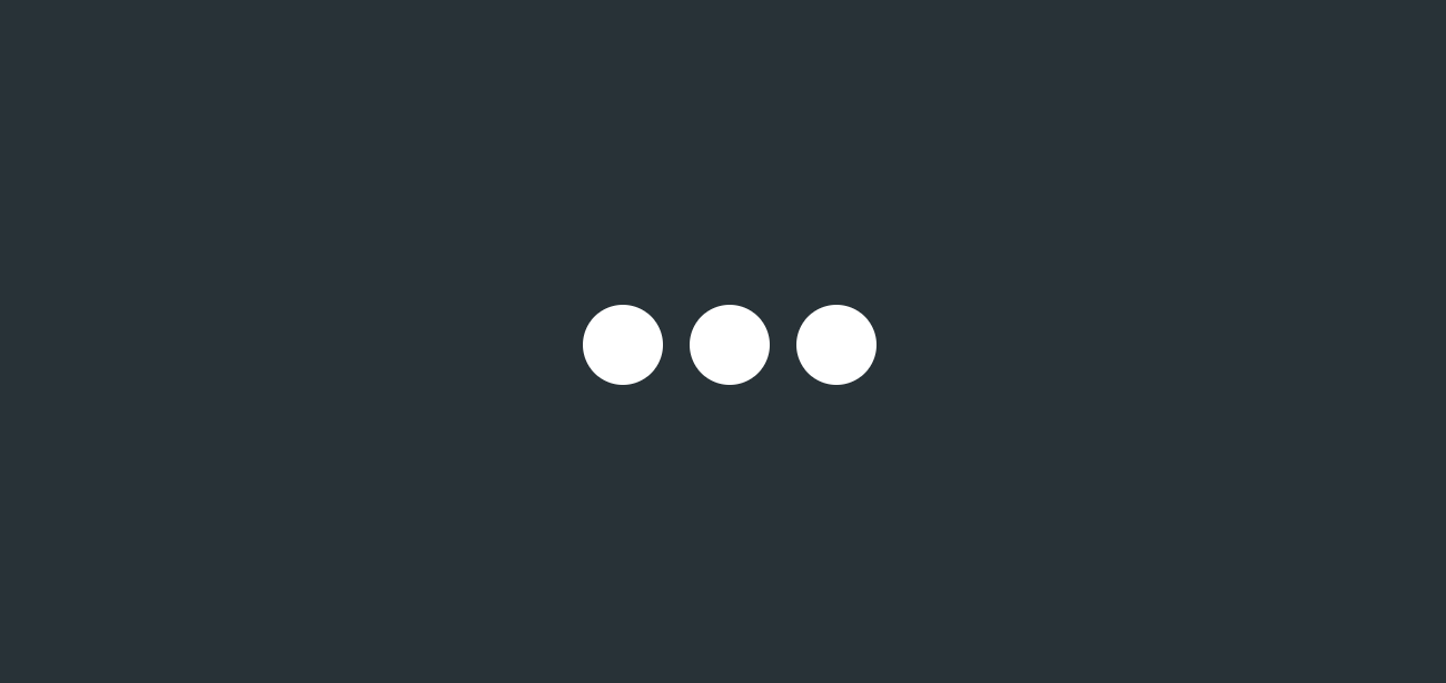
However, if the original span label is displayed
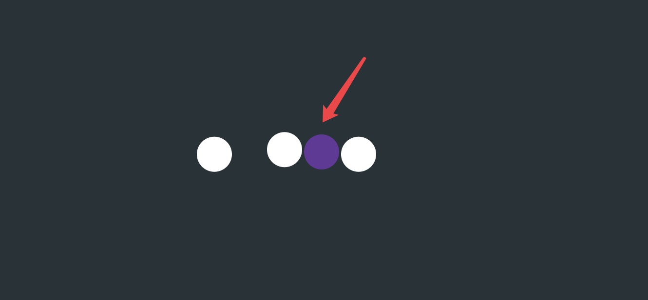
You'll find out
The three balls are not in the middle
It's a little offset to the left
So in order to get symmetrical animation
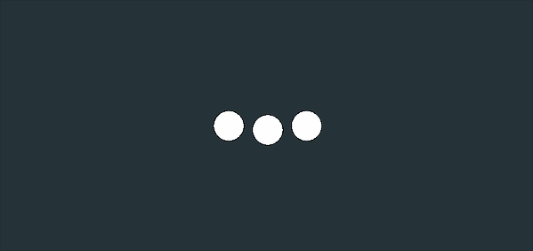
Hai Hong wrote a new animation according to his own ideas, as follows:
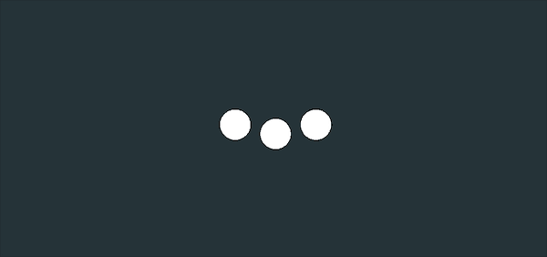
Effect display
Demo code
HTML
<!DOCTYPE html>
<html lang="en">

<head>
    <meta charset="UTF-8">
    <meta http-equiv="X-UA-Compatible" content="IE=edge">
    <meta name="viewport" content="width=device-width, initial-scale=1.0">
    <link rel="stylesheet" href="style.css">
    <title>Document</title>
</head>

<body>
    <section>
        <span class="a"></span>
        <span class="b"></span>
        <span class="c"></span>
    </section>
</body>

</html>
CSS
html,body{
  margin: 0;
  height: 100%;
}
body{
  display: flex;
  justify-content: center;
  align-items: center;
  background: #263238;
}
section {
    width: 650px;
    height: 300px;
    padding: 10px;
    position: relative;
    display: flex;
    align-items: center;
    justify-content: center;
    border: 2px solid red;
}
span{
  width : 36px;
  height: 36px;
  border-radius: 50%;
  position: relative;
  background-color:white;
}

.a {
  margin-right: 12px;
  animation: animloader1 1s linear infinite alternate;
}
.b{
  animation: animloader2 1s linear infinite alternate;
}
.c{
  margin-left: 12px;
  animation: animloader1 1s linear infinite alternate;
}

@keyframes animloader1
{
  0%{
    margin-top: -12px;
  }
  33%{
    margin-top: 12px;
  }
  66%{
    margin-top: -12px;
  }
  100%{
    margin-top: 12px;
  }
}
@keyframes animloader2 {
  0%{
    margin-top: 12px;
  }
  33%{
    margin-top: -12px;
  }
  66%{
    margin-top: 12px;
  }
  100%{
    margin-top: -12px;
  }
}
Detailed explanation of principle
Step 1
Three span tags are used here
Each represents three small white balls
Set to:
- The width and height are 36px
- Rounded (50%)
- Background color: white
- Three small balls are juxtaposed
span{
  width : 36px;
  height: 36px;
  border-radius: 50%;
  position: relative;
  background-color:white;
}
The renderings are as follows
Step 2
Increase the distance between the left / right ball and the middle ball
/*Left ball*/
.a {
  margin-right: 12px;
}
/*Middle ball*/
.b{
}
/*Right ball*/
.c{
  margin-left: 12px;
}
The renderings are as follows
Step 3
Add right and left balls to animation
Effect description: regular movement up and down
There's no shadow here
Margin top is used to realize the up and down movement of the small ball
The key has 2 frames
Take the left ball as an example. For better observation, the left ball is marked in red
The small ball is at the highest point margin top: - 12px; Time
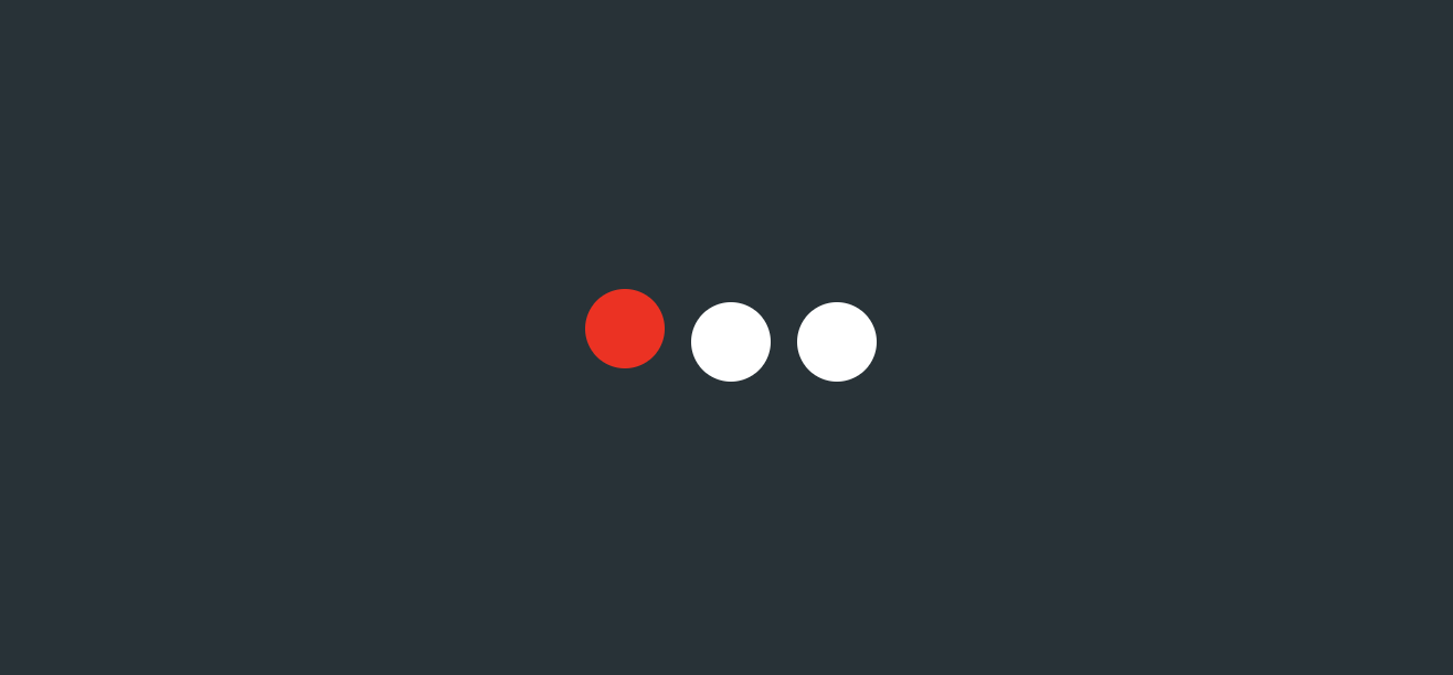
The small ball is at the lowest point margin top: 12px; Time
Write the following code according to the requirements
animation: animloader1 1s linear infinite alternate;
@keyframes animloader1
{
  0%{
    margin-top: -12px;
  }
  33%{
    margin-top: 12px;
  }
  66%{
    margin-top: -12px;
  }
  100%{
    margin-top: 12px;
  }
}
The renderings are as follows
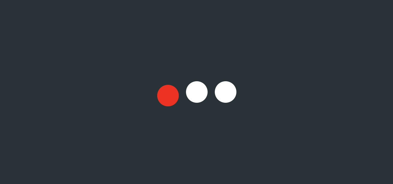
Step 4
Animate the middle ball
Effect description: regular movement up and down
The principle is the same as the left ball animation
animation: animloader2 1s linear infinite alternate;
@keyframes animloader2 {
  0%{
    margin-top: 12px;
  }
  33%{
    margin-top: -12px;
  }
  66%{
    margin-top: 12px;
  }
  100%{
    margin-top: -12px;
  }
}
The renderings are as follows
Step 5
The animation superposition effect generated in steps 3 and 4 is the final effect
Note: the starting and final positions of the middle ball are opposite to the left and right balls
epilogue
Learning source:
https://codepen.io/bhadupranjal/pen/vYLZYqQ
The article is only used as a learning note to record a process from 0 to 1. I hope it will help you. If you have any mistakes, you are welcome to correct them
I'm Hai Hongyu ˊ ᵕ ˋ) If you think it's OK, please give it a compliment
Writing is not easy, "like" + "collect" + "forward"
Thank you for your support ❤️