preface
Hello! buddy!
First of all, thank you very much for reading Haihong's article. If there are mistakes in the article, you are welcome to point out ~
Ha ha, introduce yourself
Nickname: Haihong
Label: program ape a C + + player student
Introduction: I got acquainted with programming in C language and then transferred to computer major. I was lucky to have won national and provincial awards and have been guaranteed for research. Currently learning C++/Linux (really, really hard ~)
Learning experience: solid foundation + taking more notes + typing more codes + thinking more + learning English well!
Daily sharing: WeChat official account Pro, recording life, learning bits, sharing some source code or learning materials, welcome to pay attention to
Effect display

Demo code
HTML
<!DOCTYPE html>
<html lang="en">
<head>
    <meta charset="UTF-8">
    <meta http-equiv="X-UA-Compatible" content="IE=edge">
    <meta name="viewport" content="width=device-width, initial-scale=1.0">
    <link rel="stylesheet" href="style.css">
    <title>Document</title>
</head>
<body>
    <section><span></span></section>
</body>
</html>
CSS
html,body{
  margin: 0;
  height: 100%;
}
body{
  display: flex;
  justify-content: center;
  align-items: center;
  background: #263238;
}
section {
    width: 650px;
    height: 300px;
    padding: 10px;
    position: relative;
    display: flex;
    align-items: center;
    justify-content: center;
    /* The red border is only a hint */
    border: 2px solid red;
}

span{
  width : 24px;
    height: 24px;
    border-radius: 50%;
    display: inline-block;
    position: relative;
    color: white;
    /* background-color: red; */
    animation: loading 2s linear infinite;
}
@keyframes loading {
  0% {  box-shadow:   26px 0 0 -2px,  78px 0 0 -2px,
                      -26px 0 0 -2px,  -78px 0 0 -2px
  }

  25% {  box-shadow:   26px 0 0 -2px,  78px 0 0 -2px,
                      -26px 0 0 -2px,  -78px 0 0 2px
  }

  50% {  box-shadow:   26px 0 0 -2px,  78px 0 0 -2px,
                      -26px 0 0 2px,  -78px 0 0 -2px
  }
  75% {  box-shadow:   26px 0 0 2px,  78px 0 0 -2px,
                      -26px 0 0 -2px,  -78px 0 0 -2px
  }
  100% {  box-shadow:   26px 0 0 -2px,  78px 0 0 2px,
                      -26px 0 0 -2px,  -78px 0 0 -2px
  }
}
Detailed explanation of principle
Step 1
Using the span tag, set to
- The width and height are 24px
- Background color: Red

Step 2
span label rounding
border-radius: 50%;

Step 3
Add animation to span
Use box shadow as a small white ball
The key has five frames
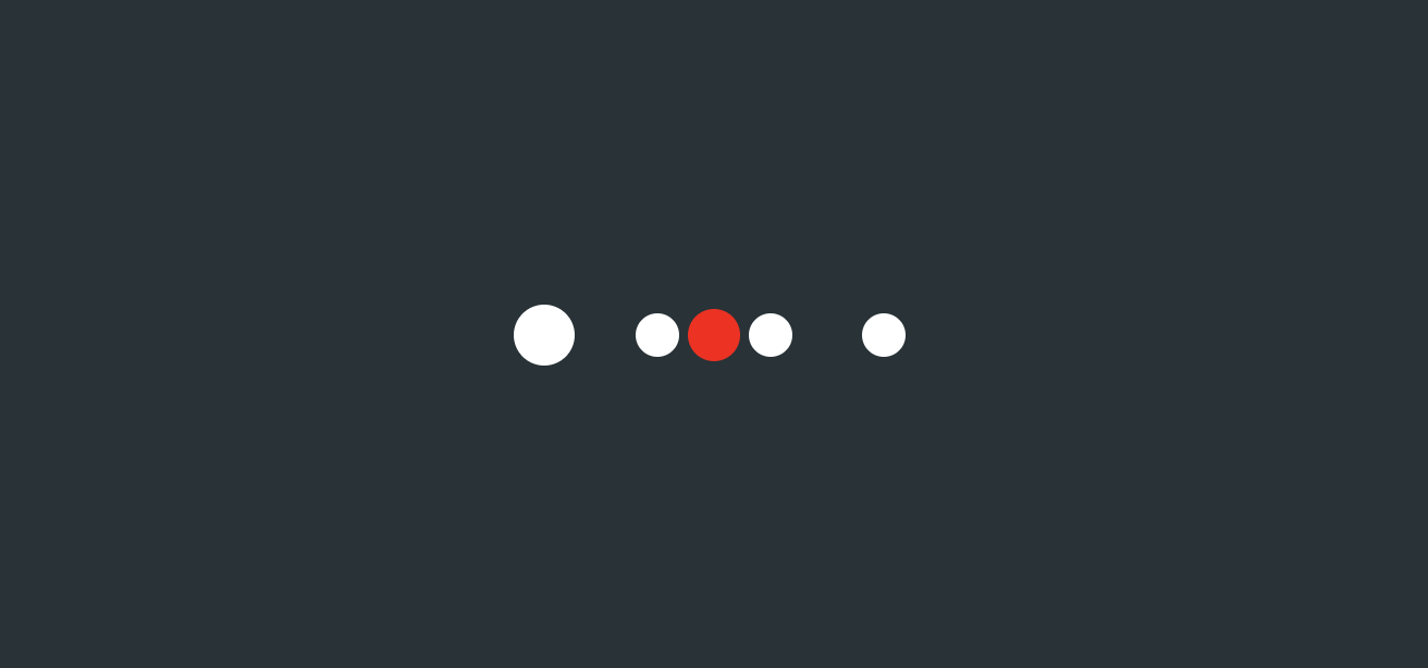
First frame
- initial position
- Use box shadow to define four small white balls (the shadow of span)
- Located on the left and right of the red ball
    box-shadow:   26px 0 0 -2px,  78px 0 0 -2px,
    -26px 0 0 -2px,  -78px 0 0 -2px;
The renderings are as follows

Second frame
Make the leftmost ball larger and the rest unchanged
   box-shadow:   26px 0 0 -2px,  78px 0 0 -2px,
                      -26px 0 0 -2px,  -78px 0 0 2px;
The renderings are as follows
Frame 3
Make the second small ball on the left bigger and the rest unchanged
 box-shadow:   26px 0 0 -2px,  78px 0 0 -2px,
                      -26px 0 0 2px,  -78px 0 0 -2px;
The renderings are as follows

Frame 4
Make the third small ball on the left bigger and keep the rest unchanged
 box-shadow:   26px 0 0 2px,  78px 0 0 -2px,
                      -26px 0 0 -2px,  -78px 0 0 -2px
The renderings are as follows

Frame 5
Make the fourth small ball on the left bigger and keep the rest unchanged
   box-shadow:   26px 0 0 -2px,  78px 0 0 2px,
    -26px 0 0 -2px,  -78px 0 0 -2px;
The renderings are as follows

Finally, comment out the background color of span
Summary description
Code is
animation: loading 2s linear infinite;
@keyframes loading {
  0% {  box-shadow:   26px 0 0 -2px,  78px 0 0 -2px,
                      -26px 0 0 -2px,  -78px 0 0 -2px
  }

  25% {  box-shadow:   26px 0 0 -2px,  78px 0 0 -2px,
                      -26px 0 0 -2px,  -78px 0 0 2px
  }

  50% {  box-shadow:   26px 0 0 -2px,  78px 0 0 -2px,
                      -26px 0 0 2px,  -78px 0 0 -2px
  }
  75% {  box-shadow:   26px 0 0 2px,  78px 0 0 -2px,
                      -26px 0 0 -2px,  -78px 0 0 -2px
  }
  100% {  box-shadow:   26px 0 0 -2px,  78px 0 0 2px,
                      -26px 0 0 -2px,  -78px 0 0 -2px
  }
}
The renderings are as follows
epilogue
Learning source:
https://codepen.io/bhadupranjal/pen/vYLZYqQ
The article is only used as a learning note to record a process from 0 to 1. I hope it will help you. If you have any mistakes, you are welcome to correct them
I'm Hai Hongyu ˊ ᵕ ˋ) If you think it's OK, please give it a compliment
Writing is not easy, "like" + "collect" + "forward"
Thank you for your support ❤️