HTML
First HTML page
<!--
	1.This is HTML Notes for
	2.Add the first line of the following code HTML5 Grammar, remove to indicate HTML4.0
	3.HTML Case insensitive, loose and lax syntax
-->
<!doctype html>
<!--root-->
<html>
	<!--head-->
    <head>
		<!--Page title, displayed in the upper left corner of the page-->
		<title>Title of web page</title>
	</head>
	<!--body-->
    <body>
    	The main content of the web page, welcome to learn HTML!
    </body>
</html>
Common labels
1. Title labels h1~h6
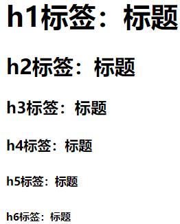
<!DOCTYPE html>
<html>
	<head>
		<meta charset="utf-8">
		<title>Title label</title>
	</head>
	<body>
		<!-- Title label -->
		<h1>h1 Labels: titles</h1>
		<h2>h2 Labels: titles</h2>
		<h3>h3 Labels: titles</h3>
		<h4>h4 Labels: titles</h4>
		<h5>h5 Labels: titles</h5>
		<h6>h6 Labels: titles</h6>
	</body>
</html>
2. Paragraph label p
Note: it doesn't work to write spaces or lines directly on the web page. It must be determined by tags or CSS styles
<!DOCTYPE html>
<html>
	<head>
		<meta charset="utf-8">
		<title>Paragraph label</title>
	</head>
	<body>
		<!-- Title label -->
        <h3>Qing pingdiao·firstly</h2>
        <h6>[Tang]Li Bai</h6>
        <!-- Paragraph label -->
        <p>Clouds want clothes, flowers want looks,</p>
        <p>The spring breeze blows the sill, and the dew is thick.</p>
        <p>If I hadn't seen you at the head of Qun Yushan,</p>
        <p>I'll meet you at Yaotai.</p>
	</body>
</html>
3. Picture label img
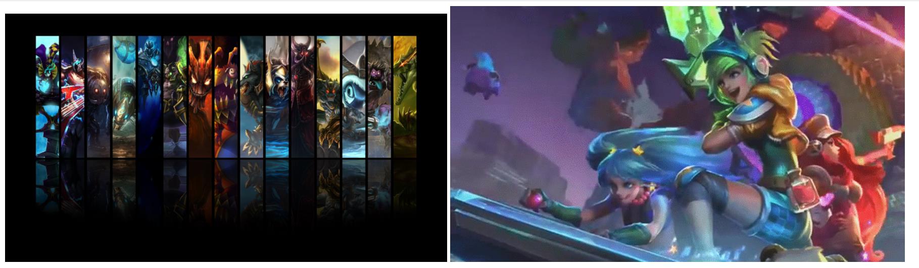
<!DOCTYPE html>
<html>
	<head>
		<meta charset="utf-8">
		<title></title>
	</head>
	<body>
		<!-- scr Property: tells the network address of the picture-->
		<img src="http://bbsimg. res.flyme. cn/forum/201502/06/204658egmkwhimyycmae11. Png "ALT =" static chart - Hero League "width =" 700px ">
		<!-- scr Property: tells the file address of the picture-->
		<img src="img/Video game series.gif" alt="Dynamic graph-Hero League video game series">
	</body>
</html>
4. Link label a
It can be used to jump between pages and inside pages
<!DOCTYPE html>
<html>
	<head>
		<meta charset="utf-8">
		<title>Link label</title>
	</head>
	<body>
		<!-- Website URL jump -->
		<a href="https://www.acfun. Cn / "> station a</a>
		<a href="https://www.bilibili. COM / "> station B</a>
		<!-- Page Jump -->
		<a href="03 Picture label.html">Picture label presentation</a>
	</body>
</html>
5. List label
- Unordered list (small black dots) ul > li, UL is the parent element label of the list, and li is the child element label
- Ordered list ol (preceding numeric sequence number)
<!DOCTYPE html>
<html>
	<head>
		<meta charset="utf-8">
		<title>List label</title>
	</head>
	<body>
		<!-- Unordered list -->
		<!-- Shortcut: ul>li*5 Press again Tab key -->
		<ul>
			<li>News headline 1</li>
			<li>News headline 2</li>
			<li>News headline 3</li>
			<li>News headline 4</li>
			<li>News headline 5</li>
		</ul>
		<!-- Ordered list -->
		<!-- Shortcut: ol>li*5 Press again Tab key -->
		<ol>
			<li>News headlines</li>
			<li>News headlines</li>
			<li>News headlines</li>
			<li>News headlines</li>
			<li>News headlines</li>
		</ol>
	</body>
</html>
6.DIV label: container label
<!DOCTYPE html>
<html>
<head>
<meta charset="utf-8">
<title>DIV label</title>
<style type="text/css">
.a1 {
/* Set the left outer margin of the first a label to 550 pixels */
margin-left: 550px;
}
a {
/* Set the left inner margin of a label to 50 pixels */
padding-left: 50px;
}
div {
/* Box content centered */
text-align: center;
}
img {
/* Set picture size */
width: 500px;
}
</style>
</head>
<body>
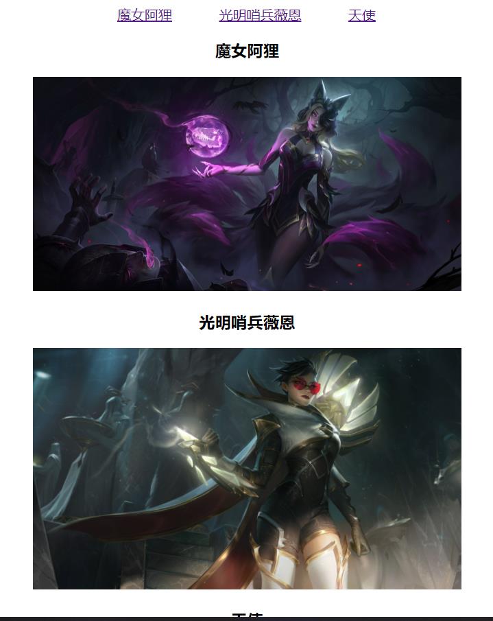
<!-- Click to jump to the target image position -->
<a href="#Content1 "class =" A1 "> witch Ali</a>
<a href="#Content2 "> bright sentry Wayne</a>
<a href="#Content3 "> ANGEL</a>
<div id="content1">
<h3>Witch Ali</h3>
<img src="img/Witch Ali.jpg" >
</div>
<div id="content2">
<h3>Sentinel of light Wayne</h3>
<img src="img/Sentinel of light Wayne.jpg" >
</div>
<div id="content3">
<h3>angel</h3>
<img src="img/angel.png" >
</div>
</body>
</html>
7. Some other labels
<!-- Line feed -->
<br>
<!-- Font settings -->
<b>Bold</b>
<br>
<i>italics</i>
8. Form label
Form: form label
Properties:
-
action: where to submit the data of the form
-
Method: submitted method -------- -- > get, post
get method: put the data of the form directly on the link address, and you can see it directly. Unsafe but efficient
post method: the form data is placed in the body of the request and is not displayed directly. It is safe but slightly inefficient. You can submit large form data
input tag
Properties:
- Type: defines the type of input tag, text/password/submit
- Name: the name of the submitted data
- Value: the value of the input box for submitting data
- placeholder: preset text
- maxlength: specify the maximum length of characters in the input field (just understand)
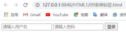
<!DOCTYPE html>
<html>
	<head>
		<meta charset="utf-8">
		<title>Form label</title>
	</head>
	<body>
		<form action="" method="get">
			<input type="text" name="username" placeholder="enter one user name" id="" value="" />
			<input type="password" name="password" id="" placeholder="Please input a password" value="" />
			<input type="submit" value="Sign in" />
		</form>
	</body>
</html>
Drop down form
- The select contains at least one pair of option s
- When selected = "selected" is defined in option, the current item is the default selected item
<!DOCTYPE html>
<html>
<head>
<meta charset="utf-8">
<title></title>
</head>
<body>
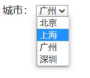
city:
<select name="">
<option>Beijing</option>
<option>Shanghai</option>
<!-- The default setting is Guangzhou -->
<option selected="selected">Guangzhou</option>
<option>Shenzhen</option>
</select>
</body>
</html>
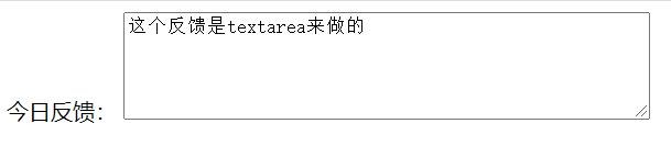
Text field
It is used to define the control of multi line text input, which is often used in message boards and comments
<!DOCTYPE html>
<html>
	<head>
		<meta charset="utf-8">
		<title></title>
	</head>
	<body>
		<form>
			Today's feedback:
			<!-- A line of 50 words, display 5 lines, understand -->
			<textarea cols="50" rows="5">This feedback is textarea To do it</textarea>
		</form>
	</body>
</html>
9. Form label
Basic grammar
<table>
<tr>
<td>Text in cell</td>
...
</tr>
...
</table>
<!--
table Used to define table labels
tr Used to define rows in a table, which must be nested in table In label
td Used to define cells in a table, which must be nested in tr In label
letter td Refers to tabular data( table data),That is, the content of the data cell
-->
<!DOCTYPE html>
<html>
<head>
<meta charset="utf-8">
<title></title>
</head>
<body>
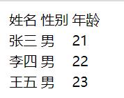
<table>
<tr><td>full name</td> <td>Gender</td> <td>Age</td></tr>
<tr><td>Zhang San</td> <td>male</td> <td>21</td></tr>
<tr><td>Li Si</td> <td>male</td> <td>22</td></tr>
<tr><td>Wang Wu</td> <td>male</td> <td>23</td></tr>
</table>
</body>
</html>
Header cell label
<table>
	<tr><th>full name</th> <th>Gender</th> <th>Age</th></tr>
	<tr><td>Zhang San</td> <td>male</td> <td>21</td></tr>
	<tr><td>Li Si</td> <td>male</td> <td>22</td></tr>
	<tr><td>Wang Wu</td> <td>male</td> <td>23</td></tr>
</table>
<!--
	effect: th The contents of the label are bold and centered
-->
Table related attributes
<!--
The following labels are to be written to the table labels table Go inside
align : Alignment, Attribute value: left,center,right
border : Border, property value: 1 or"",""Indicates default, borderless
width :  Width, attribute value: pixel value or percentage
-->
Table structure label
<!DOCTYPE html>
<html>
	<head>
		<meta charset="utf-8">
		<title>Top games</title>
	</head>
	<body>
		<table border="1" align="center" width="500" height="250" cellspacing="0" cellpadding="0">
		<!-- Header -->
         <thead>
			<tr>
				<th>ranking</th>
				<th>name</th>
				<th>type</th>
				<th>Public comment</th>
			</tr>
		</thead>
  		<!-- content -->
		<tbody>
			<tr align="center">
				<td>1</td>
				<td>Travel in pairs</td>
				<td>AVG</td>
				<td>9.7</td>
			</tr>
			<tr align="center">
				<td>2</td>
				<td>Ghost Valley eight wasteland</td>
				<td>RPG</td>
				<td>8.7</td>
			</tr>
			...
		</tbody>
		</table>
	</body>
</html>
merge cell
mode
- Cross row merge: rowspan = "number of merged cells"
- Cross column merge: colspan = "number of merged cells"
set cell
- Cross row: the uppermost cell is the target cell, and the merge code is written
- Cross column: the leftmost cell is the target cell, and the merge code is written
Form synthesis case
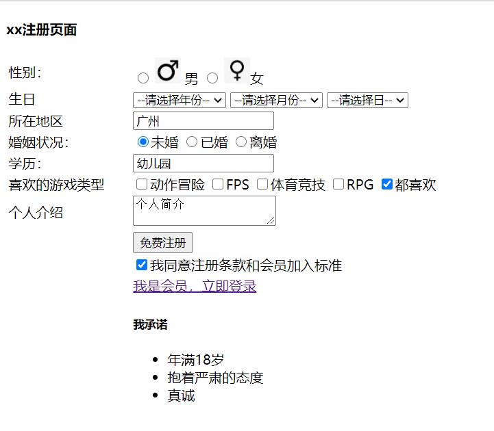
<!DOCTYPE html>
<html>
	<head>
		<meta charset="utf-8">
		<title></title>
	</head>
	<body>
		<h4>xx Registration page</h4>
		<table width="600">
			<!-- first line -->
			<tr>
				<td>Gender:</td>
				<td>
					<!-- Below label Include the picture and font. You can click the font or image instead of just clicking the circle in the option -->
					<input type="radio" name="sex" id="nan"> <label for="nan"> <img src="img/male.png" width="30" > male </label>
					<input type="radio" name="sex" id="nv"> <label for="nv"> <img src="img/female.png" width="30" >female </label>
				</td>
			</tr>
			<!-- Second line -->
			<tr>
				<td>birthday</td>
				<td>
					<select>
						<option>--Please select a year--</option>
						<option>1997</option>
						<option>1998</option>
						<option>1999</option>
						<option>2000</option>
						<option>2001</option>
					</select>
					<select>
						<option>--Please select a month--</option>
						<option>1</option>
						<option>2</option>
						<option>3</option>
						<option>4</option>
						<option>5</option>
					</select>
					<select>
						<option>--Please select a day--</option>
						<option>1</option>
						<option>2</option>
						<option>3</option>
						<option>4</option>
						<option>5</option>
					</select>
				</td>
			</tr>
			<!-- Third line -->
			<tr>
				<td>Location</td>
				<td><input type="text" value="Guangzhou" /></td>
			</tr>
			<!-- Fourth line -->
			<tr>
				<td>marital status:</td>
				<td>
					<!-- Below label Include the font and click the font instead of just clicking the circle in the option -->
					<!-- checked="checked"Indicates the default selection -->
					<input type="radio" name="marry" id="wh" checked="checked"><label for="wh">unmarried</label>
					<input type="radio" name="marry" id="yh"><label for="yh">married</label>
					<input type="radio" name="marry" id="lh"><label for="lh">divorce</label>
				</td>
			</tr>
			<!-- The fifth line -->
			<tr>
				<td>education:</td>
				<td><input type="text" value="kindergarten" /></td>
			</tr>
			<!-- Line 6 -->
			<tr>
				<td>Favorite game types</td>
				<td>
					<input type="checkbox" name="love">Action adventure
					<input type="checkbox" name="love">FPS
					<input type="checkbox" name="love">Sports competition
					<input type="checkbox" name="love">RPG
					<input type="checkbox" name="love" checked="checked">I like all of them
				</td>
			</tr>
			<!-- Line 7 -->
			<tr>
				<td>Personal introduction</td>
				<td>
					<textarea>Personal profile</textarea>
				</td>
			</tr>
			<!-- Line 8 -->
			<tr>
				<td></td>
				<td>
					<input type="submit" value="Free registration" >
				</td>
			</tr>
			<!-- Line 9 -->
			<tr>
				<td></td>
				<td>
					<input type="checkbox" checked="checked">I agree to the terms of registration and membership criteria
				</td>
			</tr>
			<tr>
				<td></td>
				<td>
					<a href="#"> I'm a member, log in now</a>
				</td>
			</tr>
			<tr>
				<td></td>
				<td>
					<h5>I promise</h5>
					<ul>
						<li>At least 18 years old</li>
						<li>Take a serious attitude</li>
						<li>sincere</li>
					</ul>
				</td>
			</tr>
		</table>
	</body>
</html>
10.span
span is used to combine inline elements in a document.
The span tag has no fixed format representation. When you apply a style to it, it changes visually. If you do not apply a style to span, the text in the span element will not be visually different from other text.
The span tag provides a way to separate a part of the text or a part of the document.
<p>
    My mother has
    <span style="color:blue;font-weight:bold">blue</span>
    My father has eyes
    <span style="color:darkolivegreen;font-weight:bold">Turquoise</span>
    My eyes.
</p>
11.label
The label label defines a label (tag) for the input element.
The label element does not present any special effects to the user. However, it improves usability for mouse users. This control is triggered if you click text inside the label element. That is, when the user selects the label, the browser will automatically focus on the form control related to the label.
<p>Click one of the text tabs to select the option:</p>

<form action="demo_form.php">
  <label for="male">Male</label>
  <input type="radio" name="sex" id="male" value="male"><br>
  <label for="female">Female</label>
  <input type="radio" name="sex" id="female" value="female"><br><br>
  <input type="submit" value="Submit">
</form>
<!-- If not label male If you click the text, it will not be selected. If you click the text, it will also be selected -->
New features of HTML5
New semantic tags
- Header: header label
- nav: navigation tab
- article: content label
- section: defines an area of the document
- aside: sidebar label
- footer: tail label
be careful:
- This semantic standard is mainly for search engines
- These new tabs can be used multiple times in a page
- In IE9, these elements need to be converted into block level elements
- In fact, our mobile terminal prefers to use these tags
New multimedia Tags
video
<video src="File address" controls="controls"></video>
Common properties
| attribute | value | describe |
|---|---|---|
| autoplay | autoplay | Video ready auto play (Google browser needs to add muted to solve the problem of auto play) |
| controls | controls | Show playback controls to users |
| width | pixels | Set playback width |
| height | pixels | Set playback height |
| loop | loop | After playing, do you want to continue playing the video and cycle |
| preload | auto (pre loaded video), none (video should not be loaded) | Specify whether to load video (ignore this attribute if autoplay is available) |
| src | url | Video url address |
| poster | imgurl | Loading waiting picture |
| muted | muted | Mute play |
<!DOCTYPE html>
<html>
	<head>
		<meta charset="utf-8">
		<title>h5 New video tag</title>
		<style type="text/css">
			video {
				margin: 200px 500px;
				width: 800px;
			}
		</style>
	</head>
	<body>
		<video src="../vide/redmiG.mp4" autoplay="autoplay" muted="muted" | loop="loop"></video>
	</body>
</html>
audio
<audio src="File address" controls="controls"></audio>
<audio controls="controls">
	<source src="happy.mp3" type="audio/mpeg">
	<source src="happy.ogg" type="audio/ogg">
	Your browser does not support<audio>label.
</audio>
Common properties
| attribute | value | describe |
|---|---|---|
| autoplay | autoplay | If this attribute appears, the audio will play as soon as it is ready |
| controls | controls | If this property appears, a control, such as a play button, is displayed to the user |
| loop | loop | If this attribute appears, playback is restarted whenever the audio ends |
| src | url | The URL of the audio to play |
Multimedia tag summary
- The use of audio tags and video tags is basically the same
- Browser support is different
- Google browser has banned the automatic playback of audio and video
- We can add muted attribute to the video tag to mute the video, but the audio can't (it can be solved through JavaScript)
- Video tags are the key. We often set automatic playback without using controls, loop and set size properties
New input type
| Attribute value | explain |
|---|---|
| type="email" | User type must be Email |
| type="url" | Restrict user input must be of URL type |
| type="date" | Restricted user input must be of date type |
| type="time" | Restrict user input must be time type |
| type="month" | Restricted user input must be of month type |
| type="week" | Restricted user input must be of type week |
| type="number" | Restrict user input must be numeric |
| type="tel" | phone number |
| type="search" | Search box |
| type="color" | Generate a color selection form |
Key points to remember: number, tel and search
<!DOCTYPE html>
<html>
	<head>
		<meta charset="utf-8">
		<title>newly added input form </title>
		<style type="text/css">

		</style>
	</head>
	<body>
		<!-- Must be added during verification form Form field -->
		<form action="">
			<ul>
				<li>Email:<input type="email" /></li>
				<li>website:<input type="url" /></li>
				<li>Date:<input type="date" /></li>
				<li>Time:<input type="time" /></li>
				<li>number:<input type="number" /></li>
				<li>phone number:<input type="tel" /></li>
				<li>Search:<input type="search" /></li>
				<li>Color:<input type="color" /></li>
				<!-- When we click the submit button, we can verify the form -->
				<li><input type="submit" value="Submit"></li>
			</ul>
		</form>
	</body>
</html>
New form properties
| attribute | value | explain |
|---|---|---|
| required | required | If the form has this attribute, its content cannot be empty. It is required |
| placeholder | Prompt text | The prompt information of the form will not be displayed if there is a default value |
| autofocus | autofocus | Auto focus attribute, auto focus to the specified form after page loading |
| autocomplete | off / on | When the user starts typing in the field, the browser should display the options filled in the field based on the previously typed values. It is turned on by default, such as autocomplete = "on". When autocomplete="off" is turned off, it needs to be placed in the form, add the name attribute, and submit successfully at the same time |
| multiple | multiple | You can submit multiple files |
The font color in the placeholder can be modified through the following settings:
input::placehokder {
    color:pink;
}
<!DOCTYPE html>
<html>
	<head>
		<meta charset="utf-8">
		<title>Add form properties</title>
		<style type="text/css">
			input::placeholder {
				color: pink;
			}
		</style>
	</head>
	<body>
		<form action="">
			<input type="search" name="sear" id="" required="required" placeholder="APO"
			autofocus="autofocus" autocomplete="off">
			<input type="submit" value="Submit">
		</form>
	</body>
</html>
CSS
Three ways of introducing CSS into HTML
1. Inline definition method
Use the style attribute inside the tag to set the CSS style of the element, which is called inline definition
Syntax format:
<label style = "Style name:Style value; Style name:Style value; Style name:Style value; ..."></label>
2. Style block method
Using style blocks in head tags is called style block method
Syntax format:
<head>
    <style type = "text/css">
        selector {
            Style name:Style value;
            Style name:Style value;
            ......
        }
        selector {
            Style name:Style value;
            Style name:Style value;
            ......
        }
    </style>
</head>
3. Link external style sheet files
Chaining to external style sheet files is the most common method. (write the style into an independent xxx.css file, and directly import the CSS file on the required web page to import the style)
Syntax format:
<link type = "text/css" rel = "stylesheet" href = "css Path to file" />
CSS style introduction method summary
| style sheet | advantage | shortcoming | Usage | Control range |
|---|---|---|---|---|
| Inline style sheet | Convenient writing and high weight | Structure style mixing | less | Control a label |
| Internal style sheet | Part of the structure and style are separated | Not completely separated | More | Control a page |
| External style sheet | Complete separation of structure and style | Need to introduce | At most, hematemesis is recommended | Control multiple pages |
selector
tag chooser
It refers to using HTML tag name as selector, classifying by tag name, and specifying unified CSS style for a certain type of tag in the page
Tag name {
    Attribute 1: Attribute value 1;
    Attribute 2: Attribute value 2;
    Attribute 3: Attribute value 3;
    ...
}
<!DOCTYPE html>
<html>
	<head>
		<meta charset="utf-8">
		<title>Label selector of base selector</title>
		<style type="text/css">
			/* Label selector: write superscript signature */
			p {
				color: green;
			}
			div {
				color: pink;
			}
		</style>
	</head>
	<body>
		<p>schoolboy</p>
		<div>girl student</div>
	</body>
</html>
Class selector
If you want to select different labels differently, select one or several labels separately, you can use the class selector
.Class name {
    Attribute 1: Attribute value 1;
    ...
}
be careful:
- Class selectors use "." (English dot) followed by the class name (custom, we named it ourselves)
- It can be understood that a name is given to this label to indicate
- Long names or phrases can use horizontal lines to name selectors
- Do not use pure numbers, Chinese names, etc. try to use English letters
- Naming should be meaningful. Try to make others know the purpose of this class name at a glance
<!DOCTYPE html>
<html>
	<head>
		<meta charset="utf-8">
		<title>Draw three boxes using the class selector</title>
		<style type="text/css">
            /* Class selector formula: style point definition 	 Structure class call 	 One or more 	 Most commonly used in development */
			.red {
				width: 100px;
				height: 100px;
				/* background color  */
				background-color: red;
			}
			.green {
				width: 100px;
				height: 100px;
				background-color: green;
			}
		</style>
	</head>
	<body>
		<div class="red"></div>
		<div class="green"></div>
		<div class="red"></div>
	</body>
</html>
Multi class name
<!DOCTYPE html>
<html>
	<head>
		<meta charset="utf-8">
		<title>How to use multiple class names</title>
		<style type="text/css">
			.red {
				color: red;
			}
			.font35 {
				font-size: 35px;
			}
		</style>
	</head>
	<body>
		<div class="red font35">Lau Andy</div>
	</body>
</html>
id selector
You can specify a specific style for HTML elements marked with a specific id
The HTML element sets the id selector with the id attribute, and the id selector in CSS is defined with "#"
#id name{
	Attribute 1: Attribute value 1;
	...
}
<!DOCTYPE html>
<html>
	<head>
		<meta charset="utf-8">
		<title>Basic selector id selector</title>
		<style type="text/css">
			/* id The pithy formula of selector: style # definition, structure id can only be called once, and others should not use it */
			#pink {
				color: pink;
			}
		</style>
	</head>
	<body>
		<div id="pink">Michael.Jackson</div>
		<!-- <div id="pink">APO</div> error-->
	</body>
</html>
The difference between id selector and class selector
- Class selectors are like people's names. A person can have multiple names, and a name can also be used by multiple people
- id selector is like the id number of people. China is the only one. No repetition.
- The biggest difference between id selector and class selector lies in the number of uses
- Class selectors are most used in modifying styles. id selectors are generally used for page unique elements and are often used with JavaScript
Wildcard selector
Use the "*" definition to select all elements (labels) in the page
Note: the wildcard selector does not need to be called and automatically uses styles for all elements
<!DOCTYPE html>
<html>
	<head>
		<meta charset="utf-8">
		<title>Wildcard selector of base selector</title>
		<style type="text/css">
			* {
				color: red;
			}
			/* *Here, change the tags of html, body, div, span li, etc. to red */
		</style>
	</head>
	<body>
		<div>my</div>
		<span>my</span>
		<ul>
			<li>It's still mine</li>
		</ul>
	</body>
</html>
Basic selector summary
| Base selector | effect | characteristic | Usage | usage |
|---|---|---|---|---|
| tag chooser | You can select all the same tags, such as p | No differentiated choice | More | p {color: red;} |
| Class selector | One or more labels can be selected | You can choose according to your needs | A lot | .nav {color: red;} |
| id selector | Only 1 label can be selected at a time | Each HTML attribute can only appear once in the document id | A bunch with js | #nav {color: red;} |
| Wildcard selector | Select all labels | There are too many choices, some of which are not needed | Use under special circumstances | * {color: red;} |
Descendant selector (important)
The descendant selector, also known as the include selector, can select the child elements in the parent element
Syntax:
Element 1 element 2 { Style declaration }

The above syntax means to select all elements 2 (descendant elements) in element 1

be careful:
1. Elements 1 and 2 are separated by spaces
2. Element 1 is the parent, element 2 is the child, and element 2 is finally selected
3. Element 2 can be a son or a grandson, as long as it is a descendant of element 1
<!DOCTYPE html>
<html>
	<head>
		<meta charset="utf-8">
		<title>Composite selector and subsequent generation selector</title>
		<style type="text/css">
			/* Want to change the little li in ol to green */
			ol li {
				color: green;
			}
			ol li a {
				color: red;
			}

			.nav li a {
				color: yellow;
			}
		</style>
	</head>
	<body>
		<ol>
			Ha ha ha~
			<li>I am ol My child</li>
			<li><a href="#"> I'm a grandson</a></li>
		</ol>
		<ul>
			<li>I am ul My child</li>
			<li><a href="#"> it won't change</a></li>
		</ul>
		<ul class="nav">
			<li>I am ul My child</li>
			<!-- Want to change the color below -->
			<li><a href="#"> it won't change</a></li>
		</ul>
	</body>
</html>
Sub selector (important)
The child element selector (sub selector) can only select the nearest child element of an element. It is simply understood that the parent child element is selected
Syntax:
Element 1 > Element 2{ Style declaration }

The above syntax indicates that all direct descendants (child elements) elements 2 in element 1 are selected

be careful:
1. Elements 1 and 2 are separated by a greater than sign
2. Element 1 is the parent, element 2 is the child, and element 2 is finally selected
3. Element 2 must be a real son. Its grandchildren and great grandchildren are not under its control. You can also call it a real son
<!DOCTYPE html>
<html>
	<head>
		<meta charset="utf-8">
		<title>Child selector of compound selector</title>
		<style type="text/css">
			.nav>a {
				color: red;
			}
		</style>
	</head>
	<body>
		<div class="nav">
			<!-- a And p All sons, p Inside a no -->
			<a href="#"> I'm a son</a>
			<p>
				<a href="#"> I'm a grandson</a>
			</p>
		</div>
	</body>
</html>
Union selector
The union selector can select multiple groups of labels and define the same style for them at the same time, which is usually used for collective declaration
Union selector is formed by connecting all selectors with English commas. Any form of selector can be used as a part of union selector
Syntax:
Element 1,Element 2 { Style declaration }

The above syntax indicates that element 1 and element 2 are selected

be careful:
1. Elements 1 and 2 are separated by commas
2. Comma can be understood as and
3. Union selectors are often used for collective declarations
<!DOCTYPE html>
<html>
	<head>
		<meta charset="utf-8">
		<title>Union selector of compound selector</title>
		<style type="text/css">
			/* Requirement 1: change big bear 2 to pink */
		/* 	div,p {
				color: pink;
			} */

			/* Requirement 2: change the big bear 2 to pink and the little pig family to pink */
			div,
			p,
			.pig li {
				color: pink;
			}
			/* The syntax specification of the Convention, and the union selector likes to write vertically */
			/* It is important to note that the last selector does not need a comma */
		</style>
	</head>
	<body>
		<div>Xiong Da</div>
		<p>Xiong er</p>
		<span>Bald head strength</span>
		<ul class="pig">
			<li>Peppa Pig</li>
			<li>Father pig</li>
			<li>Mother pig</li>
		</ul>
	</body>
</html>
Pseudo class selector
Pseudo class selectors are used to add special effects to some selectors, such as adding special effects to links, or selecting the first and Nth elements
The biggest feature of pseudo class selector writing is that it is represented by colon (:), such as: hover,: first child
Link pseudo class selector
a:link		/* Select all links that are not accessed */
a:visited	/* Select all links that have been accessed */
a:hover		/* Select the link on which the mouse pointer is located */
a:active	/* Select the active link (click the link that does not pop up) */
<!DOCTYPE html>
<html>
	<head>
		<meta charset="utf-8">
		<title>Link pseudo class selector of composite selector</title>
		<style type="text/css">
			/* Links not visited a:link select the links that have not been clicked */
			a:link {
				color: #333;
				text-decoration: none;
			}
			/* a:visited Select the clicked link */
			a:visited {
				color: orange;
			}
			/* a:hover Select the link that the mouse passes over */
			a:hover {
				color: skyblue;
			}
			/* a:active The selected link is the one that the mouse is pressing and has not popped up */
			a:active {
				color: green;
			}
		</style>
	</head>
	<body>
		<a href="#"> piggy page </a>
		<a href="http:www.XXX.com">Unknown link</a>
	</body>
</html>
Precautions for link pseudo class selector:
- To ensure effectiveness, please declare: link -: visited -: hover -: active in the order of LVHA
- Because a link has a default style in the browser, we need to assign a separate style to the link in our actual work
Writing method of link pseudo class selector in actual development work
/* a Is the label selector, all links */
a {
	color: gray;
}
/* :hover Is a link pseudo class selector, mouse over */
a:hover {
	color: red;/* When the mouse passes, it changes from gray to red */
}
: focus pseudo class selector
It is used to select the form element to obtain the focus. The focus is the cursor. Generally, the input form element can be obtained. Therefore, this selector is mainly used for form elements
input:focus {
	background-color:yellow;
}
<!DOCTYPE html>
<html>
	<head>
		<meta charset="utf-8">
		<title>focus selector</title>
		<style type="text/css">
			/* Select the input form element that gets the cursor */
			input:focus {
                 /* Where the cursor is, it turns pink */
				background-color: deeppink;
			}
		</style>
	</head>
	<body>
		<input type="text">
		<input type="text">
		<input type="text">
	</body>
</html>
Composite selector summary
| selector | effect | features | Usage | Separation symbol and usage |
|---|---|---|---|---|
| Descendant Selectors | Used to select descendant elements | It can be future generations | More | Symbols are spaces nav a |
| Progeny selector | Select the nearest element | Only choose your own son | less | The symbol is greater than nav>p |
| Union selector | Select some elements of the same style | Can be used for collective statements | More | The symbol is a comma nav,.header |
| Link pseudo class selector | Select links in different states | Link related | More | Remember a{} and a:hover's actual development |
| : focus selector | Select the form that gets the cursor | Form related | less | input:focus remember this |
Font properties
The Fonts attribute defines the font family, size, thickness, and text style
font family
CSS uses the font family attribute to define the font family of text
p { font-family:"Microsoft YaHei ";}
div {font-family: Arial,"Microsoft Yahei","Microsoft YaHei ";}
font size
The font size property defines the size of the font
p { font-size: 20px; }
Common unit
1.px pixels
Pixel px is related to the window resolution of the current operating system (a pixel represents a point: 1920 * 1080 indicates 1920 points horizontally and 1080 points vertically). It is the most commonly used unit
2.em
The relative unit can be understood as a multiple. For example, the font size of p is set to 2em and the font size of body is set to 10px. In this way, 2em is equal to 20px (10px * 2em = 20px)
3.rem
Similar to em, the only difference is that it is calculated based on the font size setting of the root element, that is, the html element. It can simply adjust all font sizes by changing the size of the html element.
4.vw and vh
vw (Viewport Width) and vh(Viewport Height) are units based on the view window, which are part of css3. Based on the units of the view window, the set values are only 1 ~ 100. 50vw is half the picture width and 50vh is half the picture height.
5.vmin and vmax
vmin: the smaller of vw and vh.
vmax: the larger of vw and vh.
Font weight
The font weight property is used to set the weight of the text font
<!DOCTYPE html>
<html>
	<head>
		<meta charset="utf-8">
		<title>CSS Font weight of font attribute</title>
		<style type="text/css">
			.bold {
				/* font-weight: bold; Define bold (BOLD) */
				/* This 700 is not followed by the unit, which is equivalent to bold. It is a bold effect */
				font-weight: 700;
			}
			h2 {
				font-weight: normal;/* Default (not bold) */
				/* font-weight: 400 */
			}
		</style>
	</head>
	<body>
		<h2><Title</h2>
		<p>Content 1</p>
		<p class="bold">Content 2</p>
		<p>Content 3</p>
	</body>
</html>
Text style
The font style property sets the style of the text
p { font-style: normal; }
| Attribute value | effect |
|---|---|
| normal | By default, the browser displays the standard font style |
| italic | The browser displays the italic font style |
Note: to change the italic label (em,i) to non italic font, you can set it with font style
Text properties
The Text property defines the appearance of the Text, such as color, alignment, decorative Text, Text indentation, line spacing, and so on
text color
The color property defines the color of the text
| Representation | Attribute value |
|---|---|
| Predefined color values | red, green, blue, and other colors |
| hexadecimal | #FF0000,#FF6600,#29D794 |
| RGB code | rgb(255,0,0) or rgb(100%,0%,0%) |
<!DOCTYPE html>
<html>
	<head>
		<meta charset="utf-8">
		<title>CSS Color of text appearance attribute</title>
		<style type="text/css">
			div {
				/* color: deeppink; */
				/* color: #ff00ff; */
				color: rgb(255, 88, 188);
			}
		</style>
	</head>
	<body>
		<div>Ha ha ha ha ha ha ha ha ha ha ha ha ha ha ha ha ha ha ha ha ha ha ha ha ha ha ha ha ha ha ha ha ha ha ha ha ha ha ha ha ha ha ha ha ha ha ha ha ha ha ha ha ha ha ha ha ha ha ha ha ha ha ha ha ha ha ha ha ha ha ha ha ha ha ha ha ha ha ha ha ha ha ha ha ha ha</div>
	</body>
</html>
align text
The text align property is used to set the horizontal alignment of the text content within the element
<!DOCTYPE html>
<html>
	<head>
		<meta charset="utf-8">
		<title>Text alignment for text appearance</title>
		<style type="text/css">
			h1 {
				/* The essence is to center the text in the h1 box horizontally */
				text-align: center;
				/* text-align: left; Align left */
				/* text-align: right; Right align */
			}
		</style>
	</head>
	<body>
		<h1>Centered title</h1>
	</body>
</html>
Text indent
The text indent property is used to specify the indentation of the first line of text, usually the first line of a paragraph
p {
	font-size: 24px;
	/* text-indent: 20px; */
	/* If 2em is written at this time, it is the distance of indenting the current element by 2 text sizes */
	text-indent: 2em;
}
Row spacing
The line height property is used to set the distance between lines (line height), which can control the distance between text lines
The line spacing is composed of three parts: upper spacing, text height and lower spacing
Decorative text
The text decoration property specifies the decoration to be added to the text. You can add underscores, strikeouts, dashes, and so on to text
| Attribute value | describe |
|---|---|
| none | Default. No decorative line (most commonly used) |
| underline | Underline. Link a is underlined (common) |
| overline | Underline. (hardly used) |
| line-through | Delete line. (not commonly used) |
Note: important to remember - > how to add underline? How do I delete underscores? Others understand.
<!DOCTYPE html>
<html>
	<head>
		<meta charset="utf-8">
		<title>Decorative text of text appearance</title>
		<style type="text/css">
			div {
				/* Underline */
				/* text-decoration: underline; */

				/* Delete line */
				/* text-decoration: line-through; */

				/* Upper scribe */
				text-decoration: overline;
			}
			a {
				text-decoration: none;/* Underline links */
				color: #FFFF00;
			}
		</style>
	</head>
	<body>
		<div>Pink memories</div>
		<br>
		<a href="#"> yellow memories</a>
	</body>
</html>
Element display mode
HTML elements are generally divided into two types: block elements and inline elements
Block element
Common block elements include h1~h6, p, div, ul, ol, li, etc., among which div is the most typical block element
characteristic:
1. He is more overbearing and monopolizes his own business
2. Height, width, outer margin and inner margin can be controlled
3. The width defaults to 100 times the width of the container (parent)%
4. Is a container and box that can release internal or block elements

be careful:
1. Block level elements cannot be used within elements of a text class
2. p Labels are mainly used to store text, so p Block level elements cannot be placed inside, especially div
3. Similarly h1~h6 They are all text block level labels, and other block level elements cannot be placed in them
<!DOCTYPE html>
<html>
	<head>
		<meta charset="utf-8">
		<title>Block element of display mode</title>
		<style type="text/css">
			div {
				/* width: 200px; */
				height: 200px;
				background-color: pink;
			}
		</style>
	</head>
	<body>
		<div>He is more overbearing and monopolizes his own business</div>Shiver
		<p>
			<div>There's a problem here</div>
		</p>
	</body>
</html>
Inline element
Common inline elements include a, strong, b, em, i, del, s, ins, u, span, etc. the span tag is the most typical inline element. In some places, inline elements are also called inline elements.
characteristic:
1. Elements in adjacent rows are on one row, and multiple elements can be displayed in one row
2. The direct setting of height and width is invalid
3. The default width is the width of its own content
4. Inline elements can only hold text or other inline elements

be careful:
1. No more links can be placed in the link
2. Special case link<a>You can put block level elements in it, but here you are<a>It's safest to switch to block mode
<!DOCTYPE html>
<html>
	<head>
		<meta charset="utf-8">
		<title>Display inline elements of the schema</title>
		<style type="text/css">
			span {
				width: 100px;
				height: 100px;
				background-color: deeppink;
			}
		</style>
	</head>
	<body>
		<span>Po, why are you wearing pinru's clothes</span><strong>Pinru's wardrobe</strong>
		<span>APO</span><strong>Pinru's wardrobe</strong>
		<!-- <a href="http://www.baidu.com">
			<a href="#"></a>
		</a> Not allowed!!! -->
	</body>
</html>
Inline block element
There are several special tags in inline elements: img, input, td, which have the characteristics of both block elements and inline elements
characteristic:
1. On the same line as the adjacent elements in the line (in the line block), but there will be a gap between them. Multiple elements can be displayed in a row (characteristics of elements in a row)
2. The default width is the width of its own content (characteristics of inline elements)
3. Height, width, outer margin and inner margin can be controlled (block level element characteristics)
Element display mode summary
| Element pattern | Element arrangement | Set style | Default width | contain |
|---|---|---|---|---|
| Block level element | Only one block level element can be placed in a row | You can set the width and height | 100% of container | The container level can contain any label |
| Inline element | A row can hold multiple inline elements | The width and height cannot be set directly | The width of its own content | Holds text or other inline elements |
| Inline block element | A row can hold multiple inline block elements | You can set the width and height | The width of its own content |
Conversion of element display mode
Convert to block element: display:block;

Convert to inline element: display:inline

Convert to inline block elements: display:inline-block;
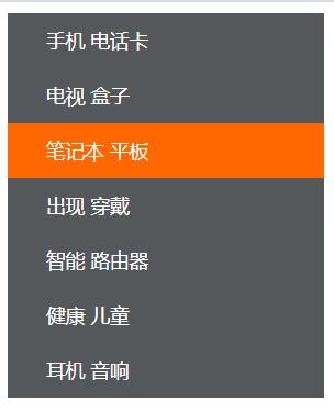
Millet sidebar case
Core idea:
- Convert link a into block level elements so that the link can occupy a single line and have width and height
- Mouse over a to set the background color for the link
antic
Single line text centered vertically
CSS does not provide vertical centering code for text. We can use a little trick to achieve it
Solution: make the line height of the text equal to the height of the box to center the text vertically in the current box
<!DOCTYPE html>
<html>
	<head>
		<meta charset="utf-8">
		<title>Concise millet sidebar</title>
		<style type="text/css">
			/* 1.Convert links to block level elements */
			a {
				display: block;
				width: 230px;
				height: 40px;
				background-color: #55585a;
				font-size: 14px;
				color: #fff;
				text-decoration: none;
				text-indent: 2em;
                 /* antic */
				line-height: 40px;
			}
			/* 2.The mouse passes through a to change the background color */
			a:hover {
				background-color: #ff6700;
			}
		</style>
	</head>
	<body>
		<a href="#"> mobile phone card</a>
		<a href="#"> TV box</a>
		<a href="#"> notebook tablet</a>
		<a href="#"> appear</a>
		<a href="#"> smart router</a>
		<a href="#"> healthy children</a>
		<a href="#"> headphone audio</a>
	</body>
</html>
Background properties
background color
The background color attribute defines the background color of the element
background-color:Color value;
Generally, the default value of element background color is transparent. We can also manually specify the background color as transparent
<!DOCTYPE html>
<html>
	<head>
		<meta charset="utf-8">
		<title>background color </title>
		<style type="text/css">
			div {
				width: 200px;
				height: 200px;
				/* background-color: transparent; Transparent clear */
				background-color: pink;
			}
		</style>
	</head>
	<body>
		<div></div>
	</body>
</html>
Background picture
The background image attribute describes the background image of the element. The actual development is common in logo s or some decorative small pictures or oversized background pictures. The advantage is that it is very easy to control the position (sprite diagram is also an application scenario)
background-image:none | url (url)
| Parameter value | effect |
|---|---|
| none | No background (default) |
| url | Specifies the background image using absolute or relative |
Background tile
background-repeat:repeat | no-repeat | repeat-x | repeat-y
| Parameter value | effect |
|---|---|
| repeat | The background image is tiled vertically and horizontally (default) |
| no-repeat | Background image is not tiled |
| repeat-x | The background image is tiled horizontally |
| repeat-y | The background image is tiled vertically |
<!DOCTYPE html>
<html>
	<head>
		<meta charset="utf-8">
		<title>Background tile</title>
		<style type="text/css">
			div {
				width: 800px;
				height: 800px;
				background-color: pink;
				background-image: url(../img/Elektra .jpg);
				/* 1.The background picture is not tiled */
				/* background-repeat: no-repeat; */
				/* 2.By default, the background image is Pingpu */
				/* background-repeat: repeat; */
				/* 3.Tile along the x axis */
				/* background-repeat: repeat-x; */
				/* 4.Tile along y axis */
				background-repeat: repeat-y;
				/* Page elements can be added with background color or background picture, but the background picture will suppress the background color */
			}
		</style>
	</head>
	<body>
		<div></div>
	</body>
</html>
Background picture location
background-position:x y;
The parameter represents: x Coordinates and y Coordinates, you can use location nouns or spiritual units
| Parameter value | explain |
|---|---|
| length | Percentage | length value composed of floating-point number and unit identifier |
| position | top | center | bottom | left | center | right |
Parameters are location nouns
- If both specified values are location nouns, the sequence of the two values is irrelevant. For example, the effects of left top and top left are the same
- If only one orientation noun is specified and the other value is omitted, the second value is centered by default
<!DOCTYPE html>
<html>
	<head>
		<meta charset="utf-8">
		<title>Background position-Location NOUN</title>
		<style type="text/css">
			div {
				width: 600px;
				height: 600px;
				background-color: pink;
				background-image: url(../img/Elektra .jpg);
				background-repeat: no-repeat;
				/* background-position: Location noun; */
				/* background-position: center top; */

				/* background-position: right center; */
				/* If it's a location noun, right center and center right, the effect is equivalent and has nothing to do with the order */

				/* background-position: center right; */
				/* At this time, the horizontal must be aligned to the right. The second parameter is omitted, and the y axis is displayed vertically in the center */

				/* background-position: right; */
				/* At this time, the first parameter must be top, and the Y axis is aligned at the top. The second parameter is omitted, and the x axis is displayed horizontally and centrally */
				background-position: top;
			}
		</style>
	</head>
	<body>
		<div></div>
	</body>
</html>
If you want the picture to be centered horizontally and vertically at the same time
/* Center both horizontally and vertically */
background-position: center;
Parameters are in exact units
- If the parameter is an exact coordinate, the first must be an x coordinate and the second must be a y coordinate
- If only one value is specified, the value must be the x coordinate, and the other is centered vertically by default
<!DOCTYPE html>
<html>
	<head>
		<meta charset="utf-8">
		<title>Background position-Exact unit</title>
		<style type="text/css">
			div {
				width: 600px;
				height: 600px;
				background-color: pink;
				background-image: url(../img/Elektra .jpg);
				background-repeat: no-repeat;
				/* 20px 50px; x The axis must be 20 and the Y axis must be 50 */
				/* background-position: 20px 50px; */
				/* background-position: 50px 20px; Different from 20 50 */

				background-position: 20px;
			}
		</style>
	</head>
	<body>
		<div></div>
	</body>
</html>
The parameter is a mixed unit
If the two values specified are a mixture of exact units and azimuth nouns, the first value is the x coordinate and the second value is the y coordinate
<!DOCTYPE html>
<html>
	<head>
		<meta charset="utf-8">
		<title>Background position-Mixed unit</title>
		<style type="text/css">
			div {
				width: 600px;
				height: 600px;
				background-color: pink;
				background-image: url(../img/Elektra .jpg);
				background-repeat: no-repeat;
				/* 20px center x must be 20 and Y is center, which is equivalent to background position: 20px; */
				/* background-position: 20px center; */

				/* The horizontal alignment is centered and the vertical alignment is 20px */
				background-position: center 20px;
			}
		</style>
	</head>
	<body>
		<div></div>
	</body>
</html>
Background picture case
<!DOCTYPE html>
<html>
	<head>
		<meta charset="utf-8">
		<title>Super large background picture case</title>
		<style type="text/css">
			body {
				background-image: url(../img/King background.png);
				background-repeat: no-repeat;
				background-position: center top;
			}
		</style>
	</head>
	<body>
	</body>
</html>

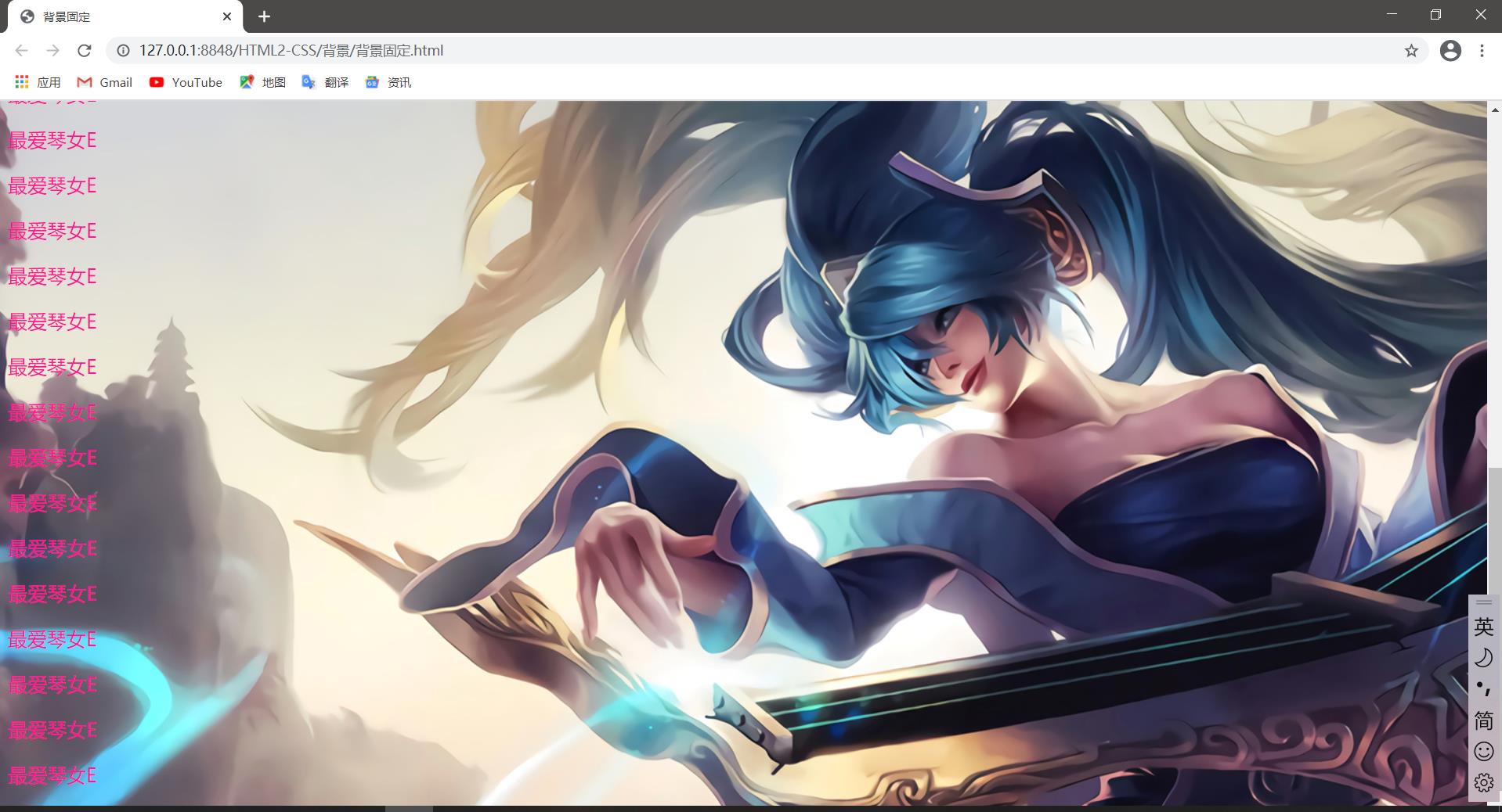
Background image fixed (background attached)
The background attachment property sets whether the background image is fixed or scrolls with the rest of the page. Parallax scrolling can be produced later.
background-attachement:scroll | fixed
| parameter | effect |
|---|---|
| scroll | The background image scrolls with the object content |
| fixed | Background image fixation |
<!DOCTYPE html>
<html>
	<head>
		<meta charset="utf-8">
		<title>Fixed background</title>
		<style type="text/css">
			body {
				background-image: url(../img/Harp Fairy%20 SANA 1920 x1080.jpg);
				background-repeat: no-repeat;
				background-position: center top;
				color: deeppink;
				font-size: 20px;
			}
		</style>
	</head>
	<body>
		<p>Most Aegean girl E</p>
		<p>Most Aegean girl E</p>
		<p>Most Aegean girl E</p>
		<p>Most Aegean girl E</p>
		<p>Most Aegean girl E</p>
		<p>Most Aegean girl E</p>
		<p>Most Aegean girl E</p>
		<p>Most Aegean girl E</p>
		<p>Most Aegean girl E</p>
		<p>Most Aegean girl E</p>
		<p>Most Aegean girl E</p>
		<p>Most Aegean girl E</p>
		<p>Most Aegean girl E</p>
		<p>Most Aegean girl E</p>
		<p>Most Aegean girl E</p>
		<p>Most Aegean girl E</p>
		<p>Most Aegean girl E</p>
		<p>Most Aegean girl E</p>
		<p>Most Aegean girl E</p>
		<p>Most Aegean girl E</p>
		<p>Most Aegean girl E</p>
		<p>Most Aegean girl E</p>
		<p>Most Aegean girl E</p>
		<p>Most Aegean girl E</p>
		<p>Most Aegean girl E</p>
		<p>Most Aegean girl E</p>
		<p>Most Aegean girl E</p>
		<p>Most Aegean girl E</p>
		<p>Most Aegean girl E</p>
		<p>Most Aegean girl E</p>
		<p>Most Aegean girl E</p>
		<p>Most Aegean girl E</p>
	</body>
</html>
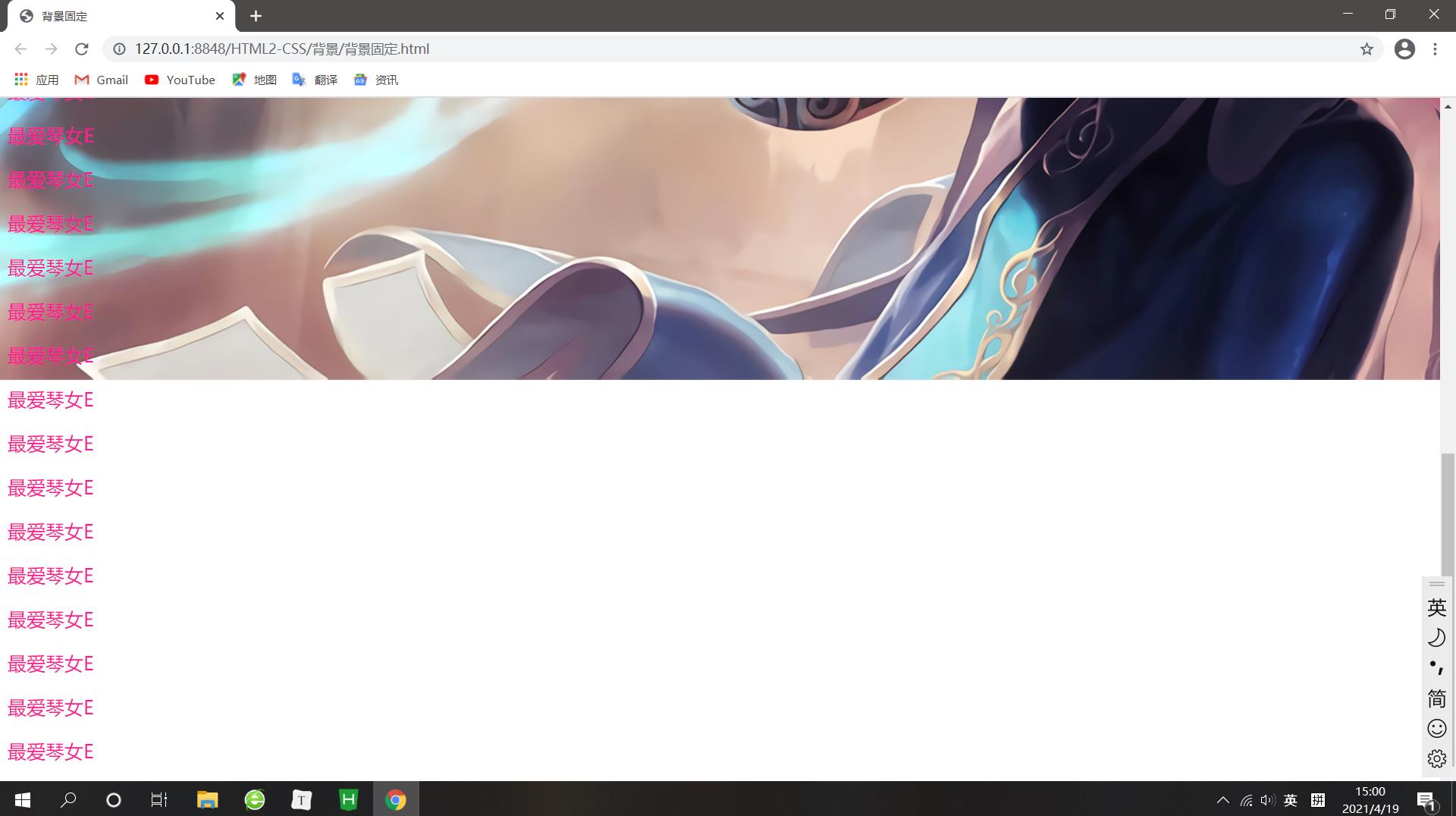
After setting and fixing, the effect is as follows
body {
				background-image: url(../img/Harp Fairy%20 SANA 1920 x1080.jpg);
				background-repeat: no-repeat;
				background-position: center top;
				/* Fix the background picture */
				background-attachment: fixed;
				color: deeppink;
				font-size: 20px;
			}
Background attribute compound writing
In order to simplify the code of background attributes, we can combine these attributes and abbreviate them in the same attribute background, so as to save code
The abbreviation attribute is used because there is no specific writing order. The general customary order is as follows:
background:Background color background picture address background tile background image scroll background picture position;

background: transparent url(image.jpg) repeat-y fixed top;
body {
				/* background-image: url(../img/Zither fairy% 20 Sona 1920x1080 jpg);
				background-repeat: no-repeat;
				background-position: center top;
			    Fix the background picture
				background-attachment: fixed; */
				color: deeppink;
				font-size: 20px;
				background: black url(../img/Harp Fairy%20 SANA 1920 x1080.jpg) no-repeat fixed center top;
			}
Background color translucent
CSS3 provides us with the effect of translucent background color
background: rgba(0,0,0,0.3);
- The last parameter is aipha transparency, which ranges from 0 to 1
- 0 of 0.3 can be omitted and written as background:rgba(0,0,0,.3);
- Note: background translucency means that the box background is translucent, and the contents of the box are not affected
Background summary
| attribute | effect | value |
|---|---|---|
| background-color | background color | Predefined color values / hex / RGB codes |
| background-image | Background picture | url (picture path) |
| background-repeat | Tiled | repeat/no-repeat/repeat-x/repeat-y |
| background-position | Background position | length/position are the x and y coordinates, respectively |
| background-attachment | Background attachment | scroll / fixed |
| Background abbreviation | Writing is easier | Background color background picture address background tile background scroll background position |
| Background color translucent | Background color translucent | background:rgba(0,0,0,0.3); Must be followed by 4 values |
Three features of CSS
CSS has three very important features: cascading, inheritance and priority.
Lamination
Set the same style to the same selector, and one style will overwrite (cascade) another conflicting style. Cascading is mainly to solve the problem of style conflict
Stacking principle:
- The principle of style conflict is the principle of proximity. Whichever style is close to the structure will be implemented
- Styles do not conflict and do not cascade
<!DOCTYPE html>
<html>
	<head>
		<meta charset="utf-8">
		<title>CSS Lamination</title>
		<style type="text/css">
			div {
				color: red;
				font-size: 12px;
			}
			div {
                 /* Covering the above red */
				color: pink;
			}
		</style>
	</head>
	<body>
		<div>XXXXX,XXXXX</div>
	</body>
</html>
Operation result: XXX is in pink font with a size of 12px
Inheritance
The child label inherits some styles of the parent label, such as text color and letters. The simple understanding is that a son inherits his father's business
- Proper use of inheritance can simplify code and reduce the complexity of CSS styles
- The child element can inherit the style of the parent element (text -, font -, line - those at the beginning of these elements can inherit, as well as the color attribute)
<!DOCTYPE html>
<html>
	<head>
		<meta charset="utf-8">
		<title>CSS Inheritance</title>
		<style type="text/css">
			div {
				color: deeppink;
				font-size: 14px;
			}
		</style>
	</head>
	<body>
		<div>
			<p>The dragon begets the dragon, the Phoenix begets the Phoenix, and the mouse's son can make a hole</p>
		</div>
	</body>
</html>
Running result: the font is pink, with a size of 14px
priority
When the same element specifies multiple selectors, priority will be generated
- If the selectors are the same, cascading is performed
- If the selector is different, it is executed according to the selector weight
| selector | Selector weight |
|---|---|
| Inherit or* | 0,0,0,0 |
| element selector | 0,0,0,1 |
| Class selector | 0,0,1,0 |
| ID Selector | 0,1,0,0 |
| Inline style sheet style | 1,0,0,0 |
| ! Important important | Infinity |
<!DOCTYPE html>
<html>
	<head>
		<meta charset="utf-8">
		<title>CSS priority</title>
		<style type="text/css">
			div { color: deeppink !important; }
			.test { color: red; }
			#demo { color: green; }
		</style>
	</head>
	<body>
		<div class="test" id="demo" style="color: purple;">You look good with a smile</div>
	</body>
</html>
Running result: the font is pink
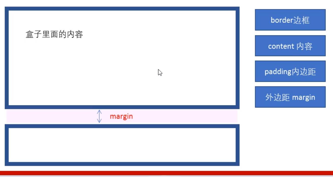
Box model
The core essence of web page layout is to use CSS to put boxes
Box model composition
Border border
Syntax:
border:border-width || border-style || border-color
| attribute | effect |
|---|---|
| border-width | Defines the border thickness in px |
| border-style | The style of the border |
| border-color | Border color |
<!DOCTYPE html>
<html>
	<head>
		<meta charset="utf-8">
		<title>Box model border border</title>
		<style type="text/css">
			div {
				width: 300px;
				height: 200px;
				/* border-width The thickness of the border is generally px */
				border-width: 5px;

				/* border-style Style of border solid solid line border */
				border-style: solid;

				/* border-color border color  */
				border-color: deeppink;
			}
		</style>
	</head>
	<body>
		<div></div>
	</body>
</html>
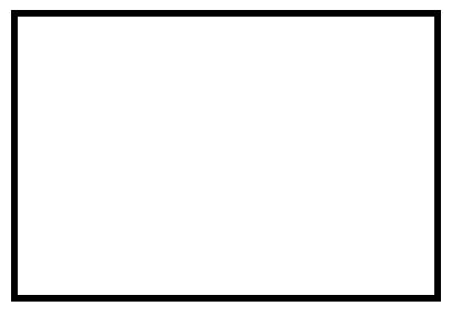
/* border-style Style of border dashed dashed border */
border-style: dashed;
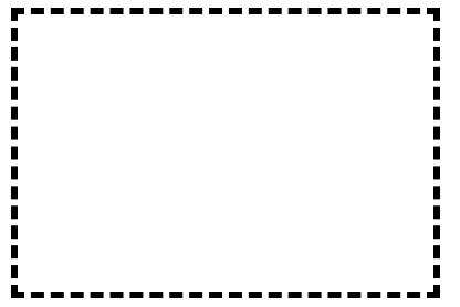
/* border-style Border style dotted dotted line border */
border-style: dotted;
Compound writing of border
border:1px solid red; No order
<!DOCTYPE html>
<html>
	<head>
		<meta charset="utf-8">
		<title>Compound writing of border</title>
		<style type="text/css">
			div {
				width: 300px;
				height: 200px;
				/* border-width: 5px;
				border-style: solid;
				border-color:deeppink; */
				/* Compound abbreviation of border */
				border: 5px solid deeppink;
			}
		</style>
	</head>
	<body>
		<div></div>
	</body>
</html>
Border separation
border-top:1px solid red; /* Only the top border is set, and the rest are the same */
<!DOCTYPE html>
<html>
	<head>
		<meta charset="utf-8">
		<title>How to write the border</title>
		<style type="text/css">
			div {
				width: 300px;
				height: 200px;
				border-top: 5px solid deeppink;
				border-bottom: 10px dashed purple;
			}
		</style>
	</head>
	<body>
		<div></div>
	</body>
</html>
practice
<!DOCTYPE html>
<html>
	<head>
		<meta charset="utf-8">
		<title>Border exercises</title>
		<style type="text/css">
			/* Please give a 200 * 200 box. Set the top border to red and the other borders to blue */
			div {
				width: 200px;
				height: 200px;
				/* border-top: 1px solid red;
				border-bottom: 1px solid blue;
				border-left: 1px solid blue;
				border-right: 1px solid blue; */

				/* border Contains four edges */
				border: 1px solid blue;
				/* Stackability simply overlaps the top border */
				/* If the following statement is above, the top border effect is still blue */
				border-top: 1px solid red;
			}
		</style>
	</head>
	<body>
		<div></div>
	</body>
</html>
Table thin line border
The border collapse property controls how the browser draws the table border. It controls the borders of adjacent cells.
border-collapse:collapse;
- The word collapse means merge
- border-collapse:collapse; Indicates that adjacent borders are merged together
padding
The padding property is used to set the inner margin, that is, the distance between the border and the content
| attribute | effect |
|---|---|
| padding-left | Left inner margin |
| padding-right | Right inner margin |
| padding-top | Upper inner margin |
| padding-bottom | Lower inner margin |
padding composite attribute
| Number of values | Express meaning |
|---|---|
| padding:5px; | 1 value, which means that there are 5 pixel inner margins up, down, left and right |
| padding:5px 10px; | 2 values, representing that the upper and lower inner margins are 5 pixels and the left and right inner margins are 10 pixels |
| padding:5px 10px 20px; | 3 values, representing that the upper inner margin is 5 pixels, the left and right inner margin is 10 pixels, and the lower inner margin is 20 pixels |
| padding:5px 10px 20px 30px; | Four values, representing 5 pixels on the top, 10 pixels on the right, 20 pixels on the bottom, 30 pixels on the left, clockwise |
Margin
The margin property is used to set the outer margin, which controls the distance between boxes
| attribute | effect |
|---|---|
| margin-left | Left outer margin |
| margin-right | Right outer margin |
| margin-top | Upper outer margin |
| margin-bottom | Bottom outer margin |
The meaning of margin is exactly the same as padding
The outer margin can center the block level box horizontally, but two conditions must be met:
- The box must have a width specified
- The left and right outer margins of the box are set to auto
.header { width:96px;margin:0 auto; }
There are three common ways to write:
- margin-left:auto; margin-right:auto;
- margin:auto;
- margin:0 auto;
Note: the above method is to center the block level element horizontally, and the inline element or inline block element horizontally. Add text align: Center to its parent element
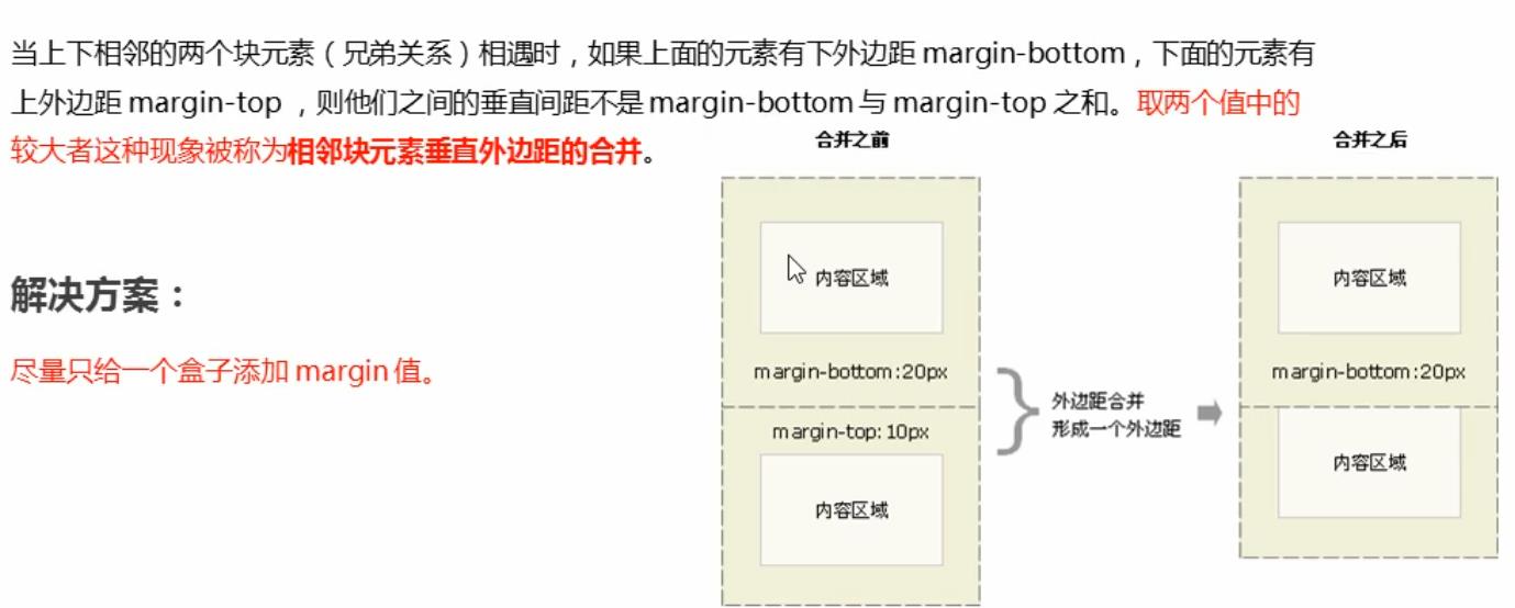
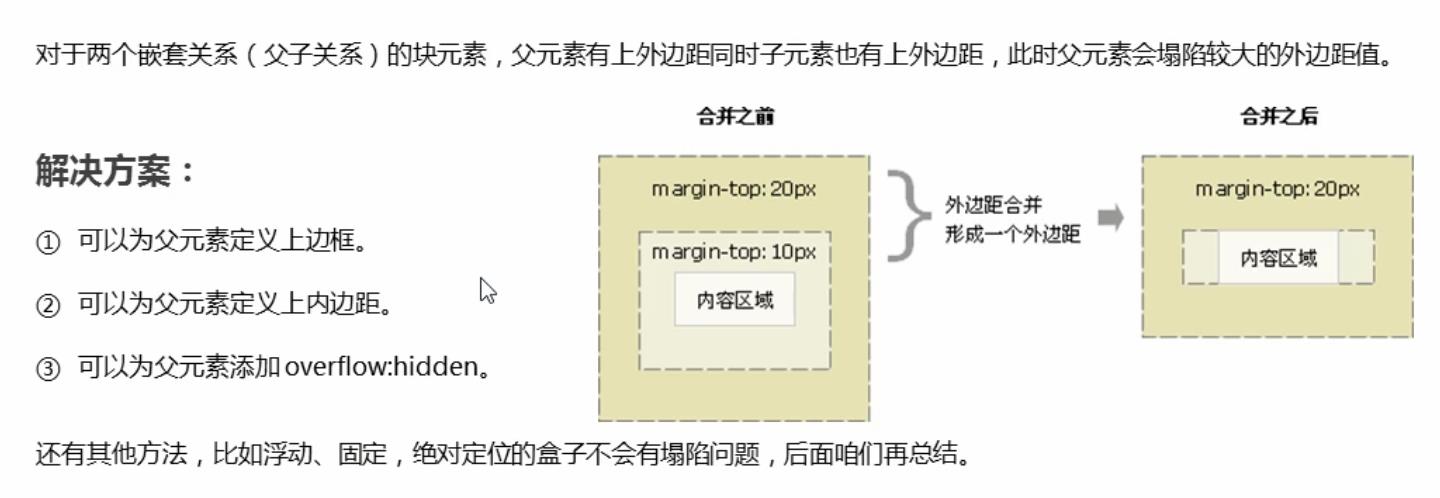
Outer margin merge
When using margin to define the vertical outer margins of block elements, merging of outer margins may occur
Merging of vertical outer margins of adjacent block elements
Collapse of the vertical outer margin of nested block elements
<!DOCTYPE html>
<html>
	<head>
		<meta charset="utf-8">
		<title>Outer margin merge-Collapse of vertical outer margin of nested block elements</title>
		<style type="text/css">
			.father {
				width: 400px;
				height: 400px;
				background-color: purple;
			}
			.son {
				width: 200px;
				height: 200px;
				background-color: pink;
			}
		</style>
	</head>
	<body>
		<div class="father">
			<div class="son"></div>
		</div>
	</body>
</html>
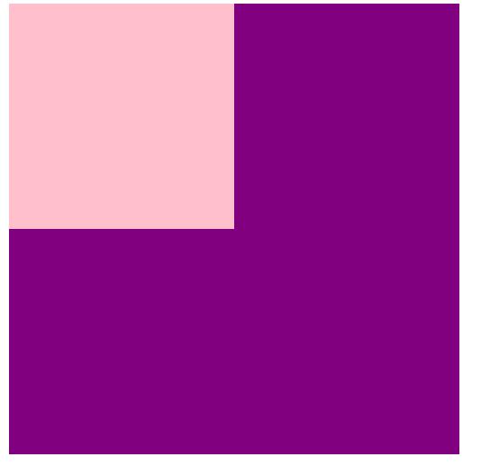
		<style type="text/css">
			.father {
				width: 400px;
				height: 400px;
				background-color: purple;
				margin-top: 50px;

				/* Option 1
				border: 1px solid red;
				border: 1px solid transparent; */

				/* Option 2
				padding: 1px; */

				/* Option 3 */
				overflow: hidden;
			}
			.son {
				width: 200px;
				height: 200px;
				background-color: pink;
				margin-top: 100px;
			}
		</style>
Clear inner and outer margins
Many web page elements have default inside and outside margins, and the defaults of different browsers are also inconsistent. Therefore, before layout, we should first clear the internal and external margins of web page elements.
* {
    padding:0;	/*Clear inner margin*/
    margin:0;	/*Clear outer margin*/
}
Note: for in-line elements, in order to take care of compatibility, try to set only the left and right inner and outer margins, not the upper and lower inner and outer margins. However, it is OK to convert to block level and inline block elements
case
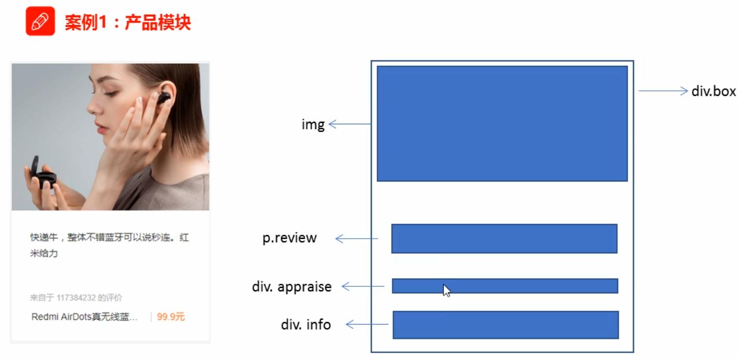
<!DOCTYPE html>
<html>
	<head>
		<meta charset="utf-8">
		<title>Product module</title>
		<style type="text/css">
			* {
				margin: 0;
				padding: 0;
			}
			body {
				background-color: #f5f5f5;
			}
			a {
				color: #333;
				text-decoration: none;
			}
			.box {
				width: 298px;
				height: 400px;
				background-color: #fff;
				/* Center the block level boxes horizontally */
				margin: 100px auto;
			}
			.box img {
				/* The picture is as wide as my father */
				width: 100%;
			}
			.review {
				height: 100px;
				font-size: 14px;
				/* Because this paragraph has no width attribute, all padding will not open the width of the box */
				padding: 0 50px;
				margin-top: 30px;
			}
			.appraise {
				font-size: 12px;
				color: #b0b0b0;
				margin-top: 20px;
				padding: 0 30px;
			}
			.info {
				font-size: 14px;
				margin-top: 15px;
				padding: 0 30px;
			}
			.info h4 {
				display: inline-block;
				font-weight: 400;
				font-size: 14px;
			}
			.info em {
				font-style: normal;
			}
			.info span {
				color: #FF6700;
			}
		</style>
	</head>
	<body>
		<div class="box">
			<a href="#"><img src="../ IMG / product module case diagram jpg" /></a>
			<p class="review">A mechanical world full of personality, 2 B The swing of the skirt makes people addicted to it~</p>
			<div class="appraise">Comments from APO</div>
			<div class="info">
				<h4><a href="#"> Games: Neil: the mechanical age < / a > < / H4 >
				<em>|</em>
				<span>199.9 element</span>
			</div>
		</div>
	</body>
</html>
New knowledge points: remove the bullet (small dot) in front of li
list-style:none;
Rounded border (emphasis)
In CSS3, the rounded border style is added, so that our box can be rounded
Syntax:
border-radius:length;
radius Radius (radius of a circle) principle: the intersection of a circle and a border forms a fillet effect
<!DOCTYPE html>
<html>
<head>
<meta charset="utf-8">
<title>Rounded border</title>
<style type="text/css">
.yuanxing {
width: 200px;
height: 200px;
background-color: pink;
/* border-radius: 100px; */
/* 50%Half the width and height is equivalent to 100px */
border-radius: 50%;
}
.juxing {
width: 300px;
height: 100px;
background-color: pink;
border-radius: 50px;
}
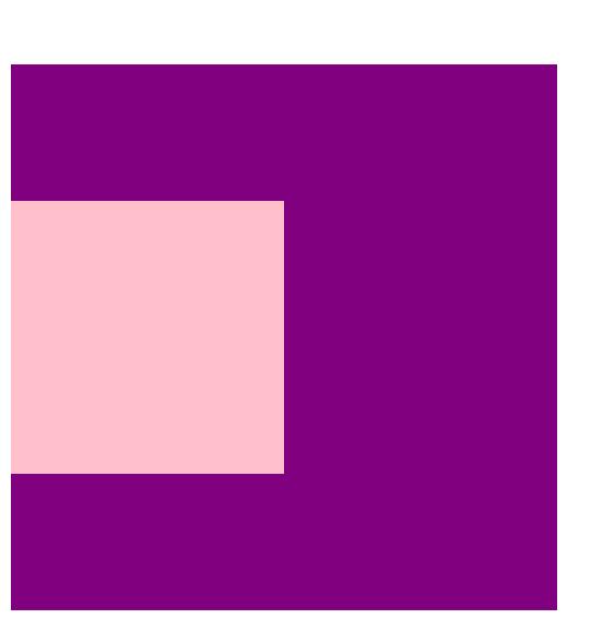
.radius {
width: 200px;
height: 200px;
/* border-radius: 10px 20px 30px 40px; */
border-radius: 10px 40px;
background-color: pink;
}
</style>
</head>
<body>
1.Circle method:
<div class="yuanxing"></div>
2 Method of fillet rectangle:
<div class="juxing"></div>
3 You can set different fillets:
<div class="radius"></div>
</body>
</html>
- Parameter values can be numeric or percentage
- If it is a square, if you want to set it as a circle, change the value to half of the height or width, or write 50% directly
- If it is a rectangle, set it to half the height
- This attribute is a shorthand attribute and can be followed by four values, representing upper left corner, upper right corner, lower right corner and lower left corner respectively
Box shadow (emphasis)
CSS3 has added box shadow. We can use the box shadow attribute to add shadow to the box
Syntax:
box-shadow:h-shadow v-shadow blur spread color inset;
| value | describe |
|---|---|
| h-shadow | Required, the position of the horizontal shadow. Negative values are allowed |
| v-shadow | Required, the position of the vertical shadow. Negative values are allowed |
| blur | Optional, blur distance |
| spread | Optional, the size of the shadow |
| color | Optional, the color of the shadow |
| inset | Optionally, change the outer shadow to the inner shadow |
be careful:
- The default is the outer shadow, but you can't write this word, otherwise the shadow will be invalid
- Box shadows do not take up space and do not affect the arrangement of other boxes
<!DOCTYPE html>
<html>
	<head>
		<meta charset="utf-8">
		<title>Box shadow</title>
		<style type="text/css">
			div {
				width: 200px;
				height: 200px;
				background-color: pink;
				margin: 100px auto;
				/* box-shadow: 10px 10px; */
			}
			div:hover {
				box-shadow: 10px 10px 10px -4px rgba(0,0,0,0.3);
			}
			/* Originally, there was no shadow in the box. When we mouse over the box, we add a shadow effect */
		</style>
	</head>
	<body>
		<div></div>
	</body>
</html>
Text shadow
In CSS3, we can use the text shadow attribute to apply shadows to text
Syntax:
text-shadow:h-shadow v-shadow blur color;
| value | describe |
|---|---|
| h-shadow | Required, negative values are allowed for the location of horizontal shadows |
| v-shadow | Required, negative values are allowed for the position of vertical shadows |
| blur | Optional, blurred distance |
| color | Optional, the color of the shadow |
float
CSS provides three traditional layout methods:
- Normal flow (standard flow)
- float
- location
1. Standard stream (normal stream / document stream)
The so-called standard flow: the tags are arranged according to the specified default mode
- Block level elements are arranged on a single row in order from top to bottom
- The elements in the line will be arranged in order from left to right. If they touch the edge of the parent element, they will wrap automatically
2. Floating
The float attribute is used to create a floater and move it to one side until the left edge touches the edge containing the block or another floater
selector { float:Attribute value; }
| Attribute value | describe |
|---|---|
| none | Element does not float (default) |
| left | The element floats to the left |
| right | The element floats to the right |
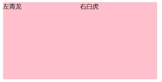
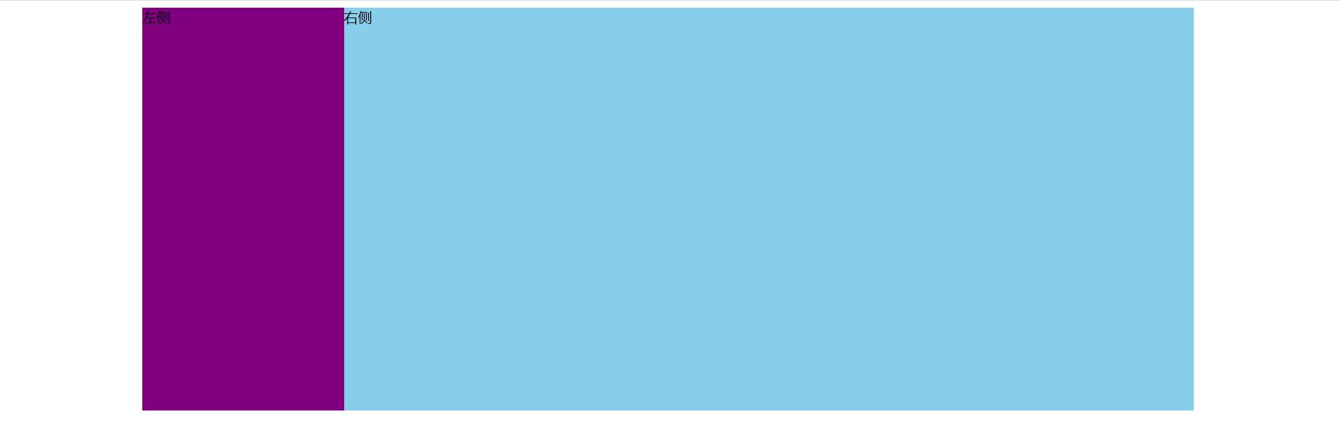
<!DOCTYPE html>
<html>
	<head>
		<meta charset="utf-8">
		<title>What is floating</title>
		<style type="text/css">
			.left,
			.right {
				float: left;
				width: 200px;
				height:200px;
				background-color: pink;
			}
		</style>
	</head>
	<body>
		<div class="left">Zuo Qinglong</div>
		<div class="right">Right white tiger</div>
	</body>
</html>
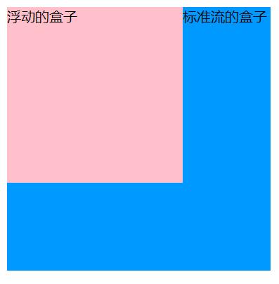
Floating characteristics (key points)
After adding floating elements, they will have many characteristics that we need to master
- Floating elements break away from the standard flow (de labeling)
- Floating elements are displayed in a row and aligned at the top of the element
- Floating elements have the properties of inline block elements
Set the most important properties of floating elements:
- Move from the control (floating) of standard ordinary flow to the specified position (moving), (commonly known as off standard)
- The floating box no longer retains its original position
Pink box with floating front
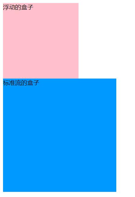
Pink box with floating
Floating elements are displayed in one line (multiple boxes set floating)
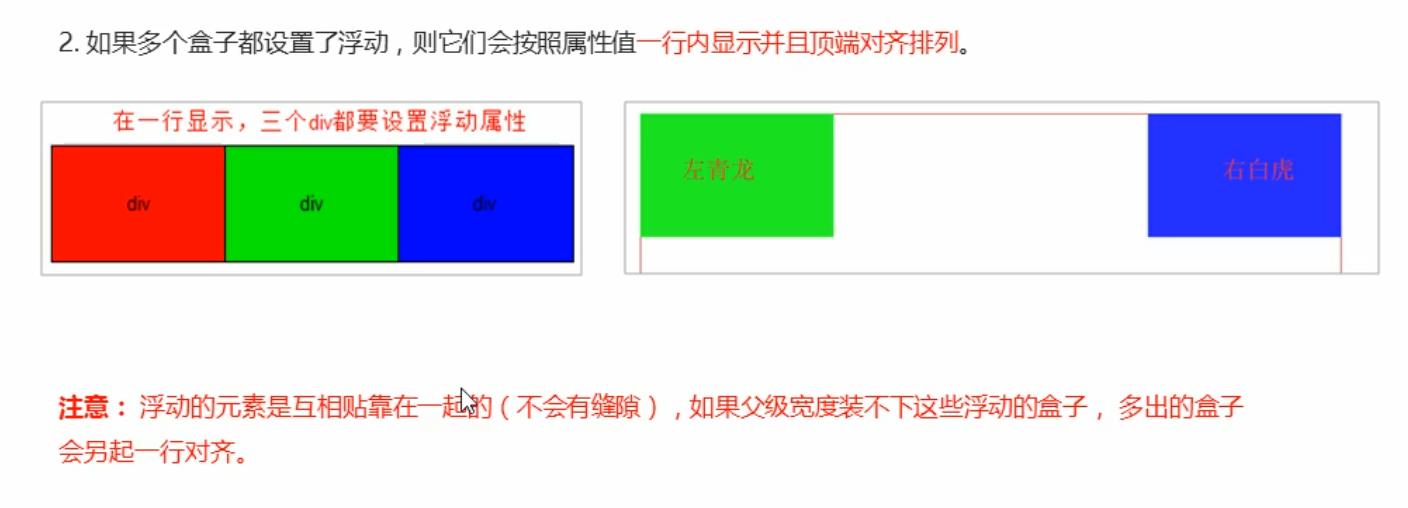
Before adding floating
After adding float
Floating has inline block element properties
Any element can be floated. No matter what the original mode of element is, it has the similar characteristics of inline block elements after adding floating
- If the width of the block level box is not set, the default width is the same as that of the parent, but after adding a float, its size depends on the content
- There is no gap in the middle of the floating box, which is next to each other
- The same is true for inline elements
Case layout
<!DOCTYPE html>
<html>
	<head>
		<meta charset="utf-8">
		<title>Floating element with standard flow parent box</title>
		<style type="text/css">
			.box {
				width: 1200px;
				height: 460px;
				background-color: pink;
				margin: 0 auto;
			}
			.left {
				float: left;
				width: 230px;
				height: 460px;
				background-color: purple;
			}
			.right {
				float: left;
				width: 970px;
				height: 460px;
				background-color: skyblue;
			}
		</style>
	</head>
	<body>
		<div class="box">
			<div class="left">left</div>
			<div class="right">right</div>
		</div>
	</body>
</html>
Layout case 2
<!DOCTYPE html>
<html>
	<head>
		<meta charset="utf-8">
		<title>Floating element with standard flow parent box 2</title>
		<style type="text/css">
			* {
				margin: 0;
				padding: 0;
			}

			li {
				list-style: none;
			}

			.box {
				width: 1226px;
				height: 285px;
				background-color: pink;
				margin: 0 auto;
			}

			.box li {
				width: 296px;
				height: 285px;
				background-color: purple;
				float: left;
				margin-right: 14px;
			}

			/* It must be written here box .last, pay attention to the weight */
			.box .last {
				margin-right: 0;
			}
		</style>
	</head>
	<body>
		<ul class="box">
			<li>1</li>
			<li>2</li>
			<li>3</li>
			<li class="last">4</li>
		</ul>
	</body>
</html>
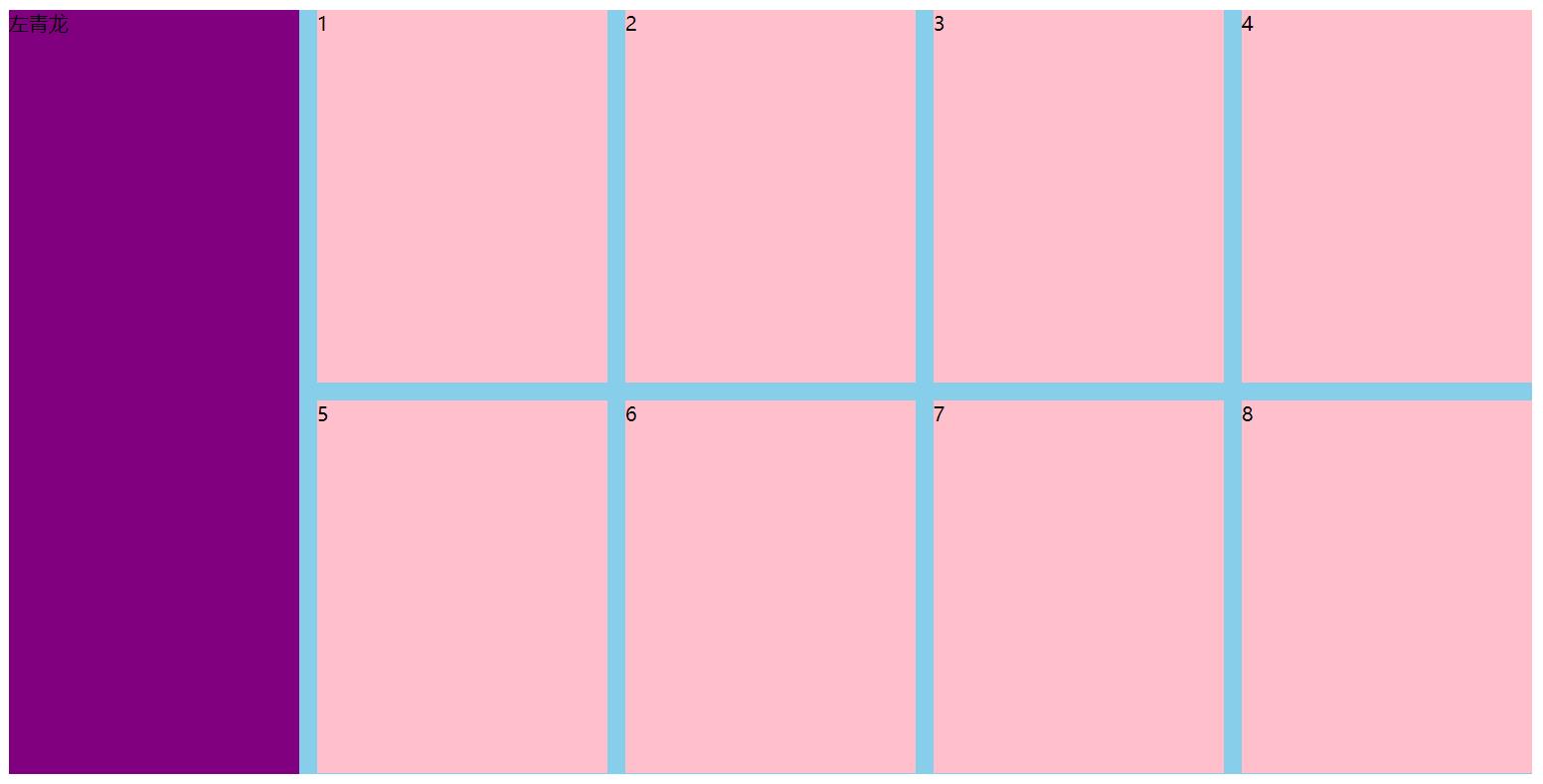
Case 3
<!DOCTYPE html>
<html>
	<head>
		<meta charset="utf-8">
		<title>Floating layout exercise 3</title>
		<style type="text/css">
			.box {
				width: 1226px;
				height: 615px;
				background-color: pink;
				margin: 0 auto;
			}

			.left {
				float: left;
				width: 234px;
				height: 615px;
				background-color: purple;
			}

			.right {
				float: left;
				width: 992px;
				height: 615px;
				background-color: skyblue;
			}
			.right>div {
				float: left;
				width: 234px;
				height: 300px;
				background-color: pink;
				margin-left: 14px;
				margin-bottom: 14px;
			}
		</style>
	</head>
	<body>
		<div class="box">
			<div class="left">Zuo Qinglong</div>
			<div class="right">
				<div>1</div>
				<div>2</div>
				<div>3</div>
				<div>4</div>
				<div>5</div>
				<div>6</div>
				<div>7</div>
				<div>8</div>
			</div>
		</div>
	</body>
</html>
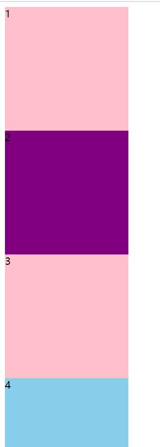
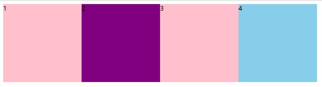
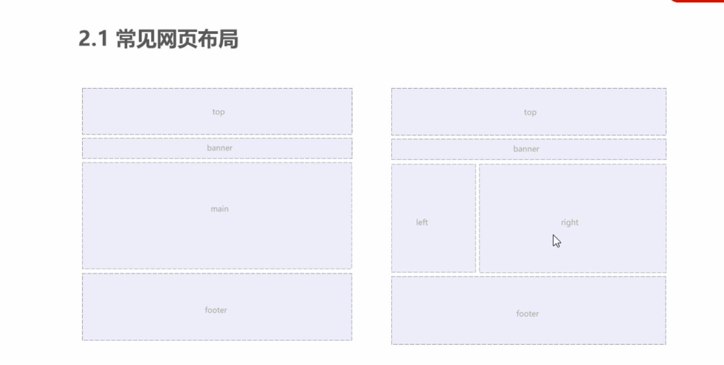
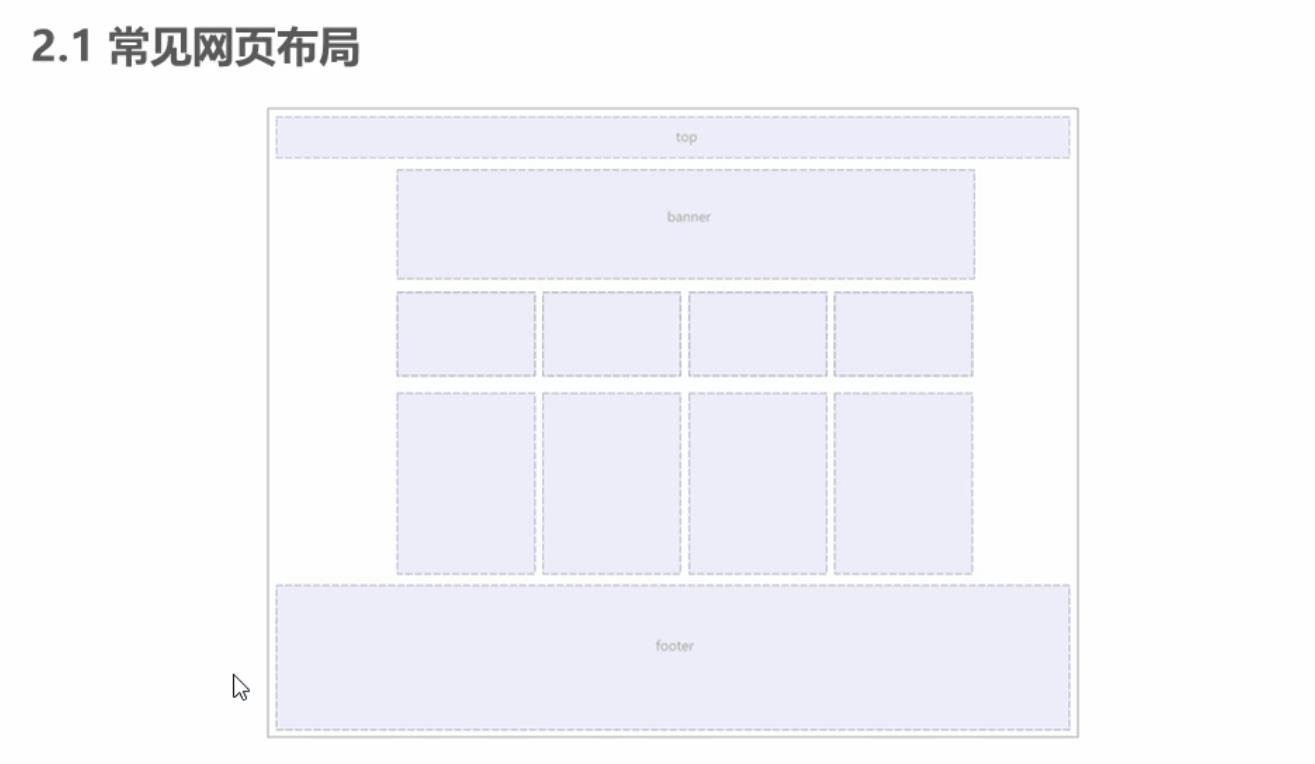
Common web page layout
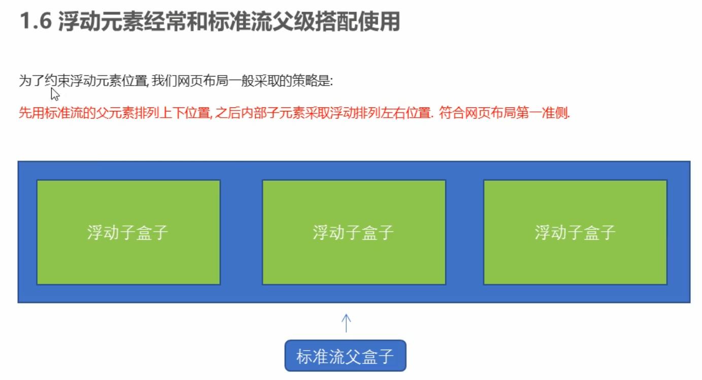
Floating layout considerations
- Parent box collocation of floating and standard flow
First, the parent elements of the standard flow are used to arrange the upper and lower positions, and then the internal elements are floating to arrange the left and right positions
- If one element floats, theoretically the other sibling elements will also float
There are multiple boxes in a box. If one of the boxes floats, the other brothers should also float to prevent problems
A floating box will only affect the standard flow behind the floating box, not the previous standard flow
Clear float
essence
- The essence of clearing floating is to clear the influence caused by floating elements
- If the parent box itself has a height, you do not need to clear the float
- After floating is cleared, the parent will automatically detect the height according to the floating sub box. If the parent has a height, it will not affect the following standard flow
Syntax:
selector{ clear:Attribute value; }
| Attribute value | describe |
|---|---|
| left | Floating elements on the left are not allowed (clear the influence of floating on the left) |
| right | Floating elements on the right are not allowed (clear the influence of floating on the right) |
| both | At the same time, remove the influence of left and right floating |
In practical work, almost only clear:both;
The strategy to clear floating is to close floating
Method of clearing floating
- The additional labeling method, also known as the partition method, is w3c recommended
- Add overflow attribute to parent
- Add after pseudo element to parent
- Add double pseudo element to parent
Additional labeling method
The extra tag method adds an empty tag to the end of the floating element. For example, < div style = "clear:both" > < / div >, or other labels (such as: br labels, etc.)
Note: this new empty tag must be a block level element
Add overflow to parent
Add the overflow attribute to the parent and set its attribute to hidden, auto, or scroll
.box {
		/* Clear float */
		overflow: hidden;
		width: 800px;
		border: 1px solid blue;
		margin: 0 auto;
}
: after pseudo element method
: the after method is an upgraded version of the additional tagging method, which is also added to the parent element
.clearfix:after {
    content:"";
    display: block;
    height: 0;
    clear: both;
    visibility: hidden;
}

.clearfix { /* IE6,7 proper */
    *zoom: 1;
}
.box {
	width: 800px;
	border: 1px solid blue;
	margin: 0 auto;
}
<div class="box clearfix"></div>
Double pseudo element clear float
It is also added to the parent element
.clearfix:before,.clearfix:after {
    content:"";
    display:table;
}

.clearfix:after {
    clear:both;
}

.clearfix {
    *zoom:1;
}
<div class="box clearfix"></div>
summary
Why do I need to clear the float?
- The parent has no height
- The sub box floats
- It affects the following layout
| Clear floating mode | advantage | shortcoming |
|---|---|---|
| Additional labeling method | Easy to understand and write | Add many meaningless tags and poor structure |
| Parent overflow:hidden; | Simple writing | Overflow hiding |
| Parent after pseudo element | Correct semantic structure | Because IE6 and 7 do not support: after, there is a compatibility problem |
| Parent double pseudo element | Correct semantic structure | Because IE6 and 7 do not support: after, there is a compatibility problem |
3. Positioning
Set the box in a certain position, so positioning is also placing the box, and move the box according to the positioning method
Positioning = positioning mode + edge offset
The positioning mode is used to specify the positioning mode of an element in the document, and the edge offset determines the final position of the element
Positioning mode
The positioning mode determines the positioning mode of elements. It is set through the position attribute of CSS. Its values can be divided into four:
| value | semantics |
|---|---|
| static | Static positioning |
| relative | Relative positioning |
| absolute | Absolute positioning |
| fixed | Fixed positioning |
Edge offset
Edge offset is the movement of the positioned box to the final position. It has four attributes
| Edge offset attribute | Example | describe |
|---|---|---|
| top | top: 80px | The top offset, which defines the distance of the element from the upper edge of its parent element |
| bottom | bottom: 80px | Bottom offset, which defines the distance of the element from the lower edge of its parent element |
| left | left: 80px | The left offset defines the distance of the element from the left line of its parent element |
| right | right: 80px | Right offset, which defines the distance of the element from the right line of its parent element |
static positioning (understand)
Static positioning is the default positioning method of an element. It has no meaning of positioning
- Static positioning is placed according to the standard flow characteristics, and it has no edge offset
- Static positioning is rarely used in layout
relative positioning (important)
Relative positioning means that when an element moves its position, it is relative to its original position (narcissistic type)
Characteristics of relative positioning: (remember)
- It moves relative to its original position (the reference point is its original position when moving the position)
- The original position in the standard flow continues to be occupied, and the back box still treats it in the way of standard flow. (keep the original position without losing the bid)
No relative positioning
.box1 {
	width: 200px;
	height: 200px;
	background-color: pink;
}
.box2 {
	width: 200px;
	height: 200px;
	background-color: skyblue;
}
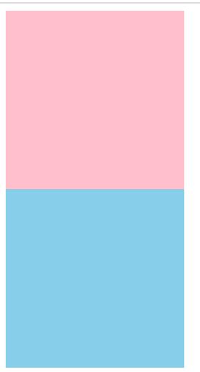
Add relative positioning
.box1 {
	position: relative;
	top: 100px;
	left: 100px;
	width: 200px;
	height: 200px;
	background-color: pink;
}
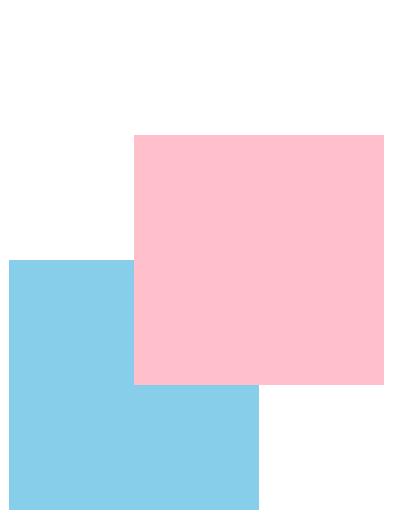
absolute positioning (important)
Absolute positioning is when an element moves its position, which is relative to its ancestor element (spell father type)
Characteristics of absolute positioning: (remember)
- If there is no ancestor element or the ancestor element is not located, the browser shall prevail (Document document)
- If the ancestor element has positioning (relative, absolute and fixed positioning), move the position with the nearest positioned ancestor element as the reference point
- Absolute positioning no longer occupies the original position (off label)
Son Jue father phase
If the child is absolutely positioned, the parent should use relative positioning
- The child is absolutely positioned and does not occupy a position. It can be placed anywhere in the parent box without affecting other brother boxes
- The parent box does not need positioning restrictions, and the child box is displayed in the parent box
- When the parent layout needs to be positioned, the parent can only occupy the relative position
This is the origin of the son's absolute father phase, so relative positioning is often used as the parent of absolute positioning
Summary: because the parent needs to occupy a position, it is relative positioning. If the sub box does not need to occupy a position, it is absolute positioning
Of course, the child Jue father phase is not always the same. If the parent element does not need to occupy a position, the child Jue father Jue will also encounter it
fixed positioning (important)
Fixed positioning is where an element is fixed to the viewable area of the browser
Features: (remember)
- Move the element with the browser's visual window as the reference point
It has nothing to do with the parent element
Do not scroll with the scroll bar
- Fixed positioning no longer occupies the original position
Fixed positioning is also off standard. In fact, fixed positioning can also be regarded as a special absolute positioning
<!DOCTYPE html>
<html>
	<head>
		<meta charset="utf-8">
		<title>Fixed positioning</title>
		<style type="text/css">
			.dj {
				position: fixed;
				top: 100px;
				left: 40px;
			}
		</style>
	</head>
	<body>
		<div class="dj">
			<img src="../img/r_dj.png" >
		</div>
		<p>Lala Lala Lala</p>
		<p>Lala Lala Lala</p>
		<p>Lala Lala Lala</p>
		<p>Lala Lala Lala</p>
		<p>Lala Lala Lala</p>
		<p>Lala Lala Lala</p>
		<p>Lala Lala Lala</p>
		<p>Lala Lala Lala</p>
		<p>Lala Lala Lala</p>
		<p>Lala Lala Lala</p>
		<p>Lala Lala Lala</p>
		<p>Lala Lala Lala</p>
		<p>Lala Lala Lala</p>
		<p>Lala Lala Lala</p>
		<p>Lala Lala Lala</p>
		<p>Lala Lala Lala</p>
		<p>Lala Lala Lala</p>
		<p>Lala Lala Lala</p>
		<p>Lala Lala Lala</p>
		<p>Lala Lala Lala</p>
		<p>Lala Lala Lala</p>
		<p>Lala Lala Lala</p>
		<p>Lala Lala Lala</p>
		<p>Lala Lala Lala</p>
	</body>
</html>
Fixed positioning tips: fixed on the right side of the layout Center
Small algorithm:
- Let the fixed positioning box left:50% go to half of the browser viewing area (also known as the layout Center)
- Make the margin left of the fixed positioning box half the width of the layout center, and more than half the width of the layout center, so that the fixed positioning box can be aligned close to the right side of the layout center
.w {
	width: 800px;
	height: 1400px;
	background-color: pink;
	margin: 0 auto;
}
.fixed {
	width: 50px;
	height: 150px;
	background-color: skyblue;
}
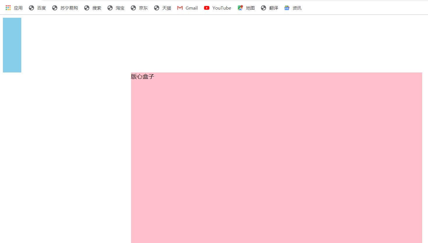
.w {
	width: 800px;
	height: 1400px;
	background-color: pink;
	margin: 0 auto;
}
.fixed {
	position: fixed;
	/* 1.Take half the width of the browser */
	left: 50%;
	/* 2.Use margin to take half the width of the layout box */
	margin-left: 405px;
	width: 50px;
	height: 150px;
	background-color: skyblue;
}
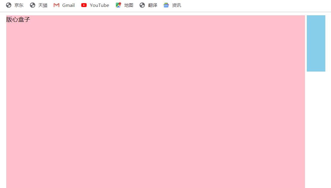
Viscous positioning (understanding)
Syntax:
selector { position: sticky; top: 10px; }
characteristic:
- Move elements with the visual window of the browser as the reference point (fixed positioning feature)
- Viscous positioning occupies the original position (relative positioning characteristics)
- One of top, left, right and bottom must be added to be valid
Used in combination with page scrolling, it has poor compatibility and is not supported by IE
Positioning summary
| Positioning mode | Whether the bid is off | Move position | Is it commonly used |
|---|---|---|---|
| Static static positioning | no | You cannot use edge offsets | very seldom |
| relative positioning | No (occupied position) | Move relative to its own position | Commonly used |
| Absolute absolute positioning | Yes (no position) | Parent with anchor | Commonly used |
| fixed positioning | Yes (no position) | Browser viewable area | Commonly used |
| Sticky sticky positioning | No (occupied position) | Browser viewable area | Less at the current stage |
Positioning stacking order z-index
When using a positioning layout, boxes may overlap. At this point, you can use z-index to control the order of boxes (z-axis)
selector { z-index:1; }
- The value can be a positive integer, a negative integer or 0. The default value is auto. The larger the value, the higher the box
- If the attribute values are the same, the second comes first in writing order
- No unit can be added after the number
- Only the positioned box has the z-index attribute
Location extension
Absolutely positioned box centered
The box with absolute positioning cannot be centered horizontally through margin: 0 auto, but it can be centered horizontally and vertically through the following methods
- Left: 50%, move the left side of the box to the horizontal center of the parent element
- Margin left: - 100px, let the box move half its width to the left
<!DOCTYPE html>
<html>
	<head>
		<meta charset="utf-8">
		<title>Absolute positioning horizontal vertical center</title>
		<style type="text/css">
			.box {
				position: absolute;
				/* 1.left Take 50% of the width of the parent container */
				left: 50%;
				/* 2.margin Negative values go to the left half the width of their box */
				margin-left: -100px;
				top: 50%;
				margin-top: -100px;
				width: 200px;
				height: 200px;
				background-color: pink;
			}
		</style>
	</head>
	<body>
		<div class="box"></div>
	</body>
</html>
Positioning special features
Absolute positioning and fixed positioning are also similar to floating positioning
- Absolute or fixed positioning is added to the elements in the line, and the height and width can be set directly
- Block level elements add absolute or fixed positioning. If the width or height is not given, the default size is the size of the content
Off label boxes will not trigger outer margin collapse
Floating elements and absolute positioning (fixed positioning) elements will not trigger the problem of outer margin merging
Absolute positioning (fixed positioning) will completely press the box
Different from the floating element, it will only press the standard flow box below it, but it will not press the text (picture) in the standard flow box below
However, absolute positioning (fixed positioning) will suppress all the contents of the following standard stream
<!DOCTYPE html>
<html>
	<head>
		<meta charset="utf-8">
		<title>Positioning will completely press the contents of the standard flow box</title>
		<style type="text/css">
			.box {
				/* 1.Floating elements do not suppress the text of the following standard stream */
				/* float:left; */
				/* 2.Absolute positioning (fixed positioning) will suppress all the contents of the following standard stream */
				position: absolute;
				width: 150px;
				height: 150px;
				background-color: pink;
			}
		</style>
	</head>
	<body>
		<div class="box"></div>
		<p>Why don't you rise with the wind and soar up to 90000 miles</p>
	</body>
</html>
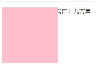
Page layout summary
Through the box model, it is clear that most html tags are a box
Through css floating and positioning, each box can be arranged into a web page
The layout of a complete web page is completed by standard flow, floating and positioning. Each page has its own special usage
-
Standard flow
The boxes can be arranged up and down or left and right. The vertical block level box display uses the standard flow layout
-
float
Multiple elements can be displayed in one line or aligned with boxes left and right. Multiple block level boxes can be displayed horizontally with floating layout
-
location
The biggest feature of positioning is the concept of stacking, that is, multiple boxes can be stacked back and forth to display. If the elements move freely in a box, the positioning layout is used
Display and hiding of elements
Essence: let an element be hidden or displayed on the page
display property
Used to set how an element should be displayed
- display: none; hidden object
- display: block; In addition to converting to block level elements, there is also the meaning of display elements
display no longer occupies the original position after hiding the element
The latter is widely used. With js, you can do a lot of web page special effects
visibility
Specifies whether an element should be visible or hidden
- visibility: visible; Element visibility
- visibility: hidden; Element hiding
visibility hides the element and continues to occupy its original position
If the hidden element wants its original position, use visibility: hidden
If the hidden element does not want the original position, use display: none (more important)
Overflow overflow
The overflow attribute specifies what happens if the content overflows an element's box
| Attribute value | describe |
|---|---|
| visible | Do not cut content or add scroll bars |
| hidden | The content exceeding the object size is not displayed, and the exceeding part is hidden |
| scroll | The scroll bar is always displayed regardless of whether the content is exceeded or not |
| auto | Beyond the automatic display of the scroll bar, not beyond the display of the scroll bar |
Generally, we don't want the overflow content to be displayed, because the overflow part will affect the layout
However, if there is a positioning box, please use overflow: hidden with caution, because it will hide the redundant part
summary
- display shows hidden elements, but does not preserve position
- visibility shows hidden elements, but retains their original position
- Overflow overflow is displayed or hidden, but it is only partially handled
Show or hide mask cases
<!DOCTYPE html>
<html>
	<head>
		<meta charset="utf-8">
		<title></title>
		<style type="text/css">
			.tudou {
				position: relative;
				width: 222px;
				height: 240px;
				background-color: pink;
				margin: 30px auto;
			}
			.tudou img {
				width: 100%;
				height: 100%;
			}
			.mask {
				display: none;
				position: absolute;
				top: 0;
				left: 0;
				width: 100%;
				height: 100%;
				background: rgba(0,0,0,.4) url(../img/850354.jpg) no-repeat center;
			}
			/* When we mouse over the box, the mask layer is displayed */
			.tudou:hover .mask {
				/* Display element */
				display: block;
			}
		</style>
	</head>
	<body>
		<div class="tudou">
			<div class="mask"></div>
			<img src="../img/Potato case map.jpg"
		</div>
	</body>
</html>
Sprite map
Purpose of wizard Technology: in order to effectively reduce the number of requests received and sent by the server and improve the loading speed of the page
use:
- Sprite image is mainly used for small background images
- It is mainly realized with the help of background position
- Generally, Sprite graphs are negative values (pay attention to the coordinates in the web page: the right side of the x-axis is positive, the left side is negative, and the same is true for the y-axis)
<!DOCTYPE html>
<html>
	<head>
		<meta charset="utf-8">
		<title>Sprite map usage</title>
		<style type="text/css">
			.box1 {
				width: 60px;
				height: 60px;
				background-color: pink;
				margin: 100px auto;
				background: url(../img/sprites.png);
				background-position: -182px 0;
			}
			.box2 {
				width: 27px;
				height: 25px;
				background-color: yellow;
				margin: 200px;
				background: url(../img/sprites.png) no-repeat -155px -106px;
			}
		</style>
	</head>
	<body>
		<div class="box1"></div>
		<div class="box2"></div>
	</body>
</html>
Sprite map
Font Icon
Usage scenario: mainly used to display some small icons commonly used in web pages
Sprite map has many advantages, but its disadvantages are also obvious
- The picture file is relatively large
- The picture itself will be distorted when zoomed in and out
- Once the picture is made, it is very complicated to change it
At this time, the appearance of font icons solves the above problems. Font icons show icons, which essentially belong to fonts
advantage
- Lightweight: an icon font is smaller than a series of images. Once the font is loaded, the icon will be rendered immediately, reducing server requests
- Flexibility: the essence is text, which can change color, produce shadow, transparent effect, rotation, etc. at will
- Compatibility: almost all browsers are supported
Note: font icons cannot replace sprite technology, but only improve and optimize the icon technology in work
summary
- If you encounter some small icons with simple structure and style, use font icons
- If you encounter some small pictures with more complex structure and style, use the wizard diagram
Font Icon recommended download website
- Icomoon font: http://icomoon.jo
- Ali iconfont font library: http://www.iconfont.cn/
use
- Put the fonts folder in the download package into the root directory of the page
- Global declaration of fonts in CSS Style: simply understand how to introduce these font files into our page through CSS. Be sure to pay attention to the path of font files
In the folder style.css
@font-face {
	font-family:'icomoon';
    src: url('fonts/icomoon.eot?7kkyc2');
    src: url('fonts/icomoon.eot?7kkyc2#iefix') format('embedded-opentype'),
        url('fonts/icomoon.ttf?7kkyc2') format('truetype'),
        url('fonts/icomoon.woff?7kkyc2') format('woff'),
        url('fonts/icomoon.svg?7kkyc2#icomoon') format('svg');
    font-weight:normal;
    font-style:normal;
}
<!DOCTYPE html>
<html>
<head>
<meta charset="utf-8">
<title>Font Icon usage</title>
<style type="text/css">
/* Font declaration */
@font-face {
font-family: 'icomoon';
src: url('fonts/icomoon.eot?iv11jt');
src: url('fonts/icomoon.eot?iv11jt#iefix') format('embedded-opentype'),
url('fonts/icomoon.ttf?iv11jt') format('truetype'),
url('fonts/icomoon.woff?iv11jt') format('woff'),
url('fonts/icomoon.svg?iv11jt#icomoon') format('svg');
font-weight: normal;
font-style: normal;
font-display: block;
}
span {
font-family: 'icomoon';
}
</style>
</head>
<body>
<span></span>
<span></span>
</body>
</html>
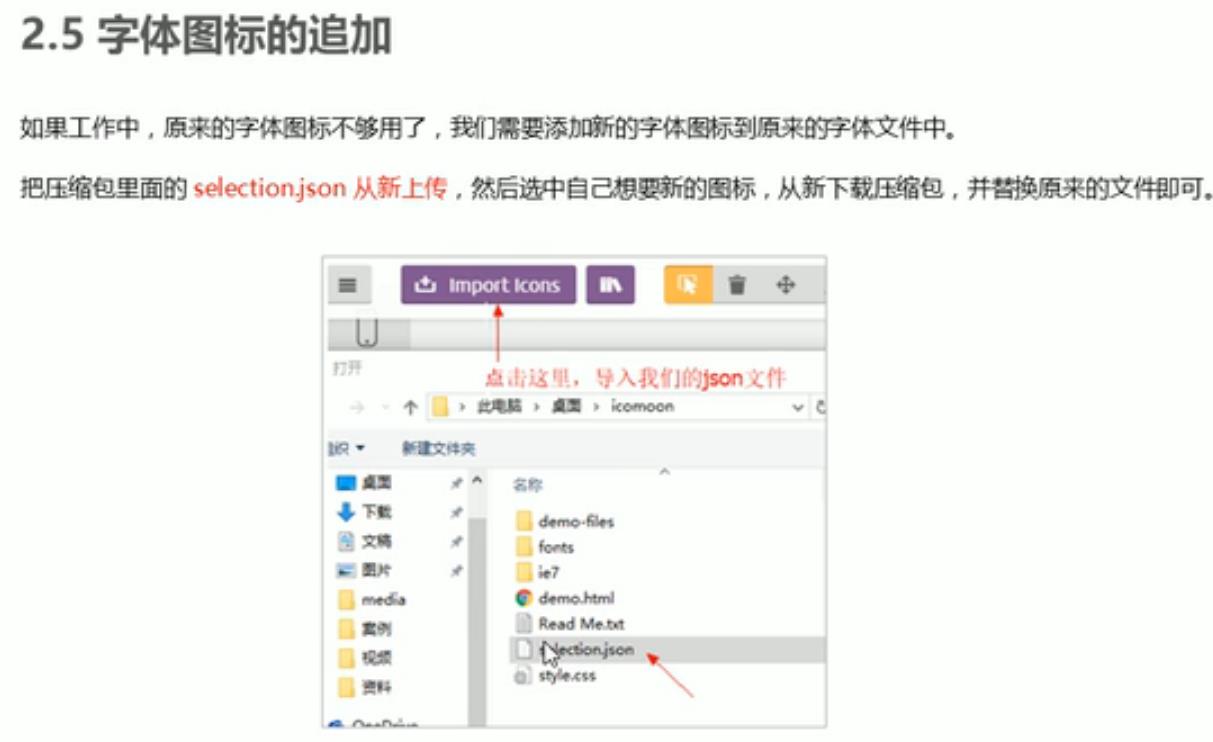
CSS triangle
Some triangles are common in web pages. You can draw them directly using CSS without making pictures or font icons
div {
	width:0;
	height:0;
	line-height:0;
	font-size:0;
	border:50px solid transparent;
	border-left-color:pink;
}
<!DOCTYPE html>
<html>
	<head>
		<meta charset="utf-8">
		<title>css Triangle making</title>
		<style type="text/css">
			.box1 {
				width: 0;
				height: 0;
				/* border: 10px solid pink; */
				border-top: 10px solid pink;
				border-right: 10px solid red;
				border-bottom: 10px solid blue;
				border-left: 10px solid green;
			}
			.box2 {
				width: 0;
				height: 0;
				border: 50px solid transparent;
				border-left-color: pink;
				margin: 100px auto;
			}
			.jd {
				position: relative;
				width: 120px;
				height: 249px;
				background-color: pink;
			}
			.jd span {
				position: absolute;
				right: 15px;
				top: -10px;
				width: 0;
				height: 0;
				/* To take care of compatibility */
				line-height: 0;
				font-size: 0;
				border: 5px solid transparent;
				border-bottom-color: pink;
			}
		</style>
	</head>
	<body>
		<div class="box1"></div>
		<div class="box2"></div>
		<div class="jd">
			<span></span>
		</div>
	</body>
</html>
User interface styles
Mouse style cursor
li { cursor:pointer; }
Sets or retrieves which system predefined cursor shape the mouse pointer moves over the object
| Attribute value | describe |
|---|---|
| default | Xiaobai default |
| pointer | Little hand |
| move | move |
| text | text |
| not-allowed | prohibit |
<!DOCTYPE html>
<html>
	<head>
		<meta charset="utf-8">
		<title>User interface styles-Mouse style</title>
	</head>
	<body>
		<ul>
			<li style="cursor: default;">I am the default little white mouse style</li>
			<li style="cursor: pointer;">I'm a mouse hand style</li>
			<li style="cursor: move;">I am a mouse movement style</li>
			<li style="cursor: text;">I am a mouse text style</li>
			<li style="cursor: not-allowed;">I'm a mouse forbidden style</li>
		</ul>
	</body>
</html>
outline
Add Outline: 0 to the form; Or outline: none; After the style, you can remove the default blue border
<!DOCTYPE html>
<html>
	<head>
		<meta charset="utf-8">
		<title></title>
		<style type="text/css">
			input {
				/* Cancel form outline */
				outline: none;
			}
		</style>
	</head>
	<body>
		<!-- Cancel form outline -->
		<input type="text">
	</body>
</html>
Prevent text field dragging
Add resize: none to the text field; After the style, you can prevent dragging the text field
<!DOCTYPE html>
<html>
	<head>
		<meta charset="utf-8">
		<title></title>
		<style type="text/css">
			textarea {
				resize: none;
			}
		</style>
	</head>
	<body>
		<!-- Prevent dragging text fields -->
		<textarea rows="10" cols="30"></textarea>
	</body>
</html>
Vertical align attribute application
It is often used to set the vertical alignment between pictures or forms (inline block elements) and text
Official explanation: used to set the vertical alignment of an element, but it is only valid for inline elements or block elements
vertical-align:baseline | top | middle | bottom
| value | describe |
|---|---|
| baseline | By default, the element is placed on the baseline of the parent element |
| top | Align the top of the element with the top of the highest element in the row |
| middle | Place this element in the middle of the parent element |
| bottom | Align the top of the element with the top of the lowest element in the row |
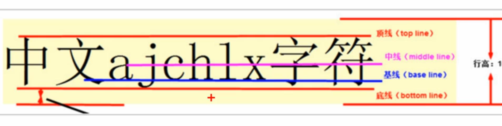
Picture, form, and text alignment
Pictures and forms belong to inline block elements. The default vertical align is baseline alignment
At this time, you can set the vertical align attribute of the block elements in the lines of the picture and the form to middle, so that the text and the picture can be vertically centered and aligned
<!DOCTYPE html>
<html>
	<head>
		<meta charset="utf-8">
		<title>utilize vertical-align Realize vertical center alignment of picture and text</title>
		<style type="text/css">
			img {
				width: 400px;
				height: 480px;
				/* vertical-align:bottom; */
				/* vertical-align:top; */

				/* Center the picture and text vertically */
				vertical-align: middle;
			}
			textarea {
				vertical-align: middle;
			}
		</style>
	</head>
	<body>
		<img src="../img/Qin Nu and Ali.jpg" >Qin Nu and Ali
		<br>
		<textarea rows="10" cols="30"></textarea>Please leave a message
	</body>
</html>
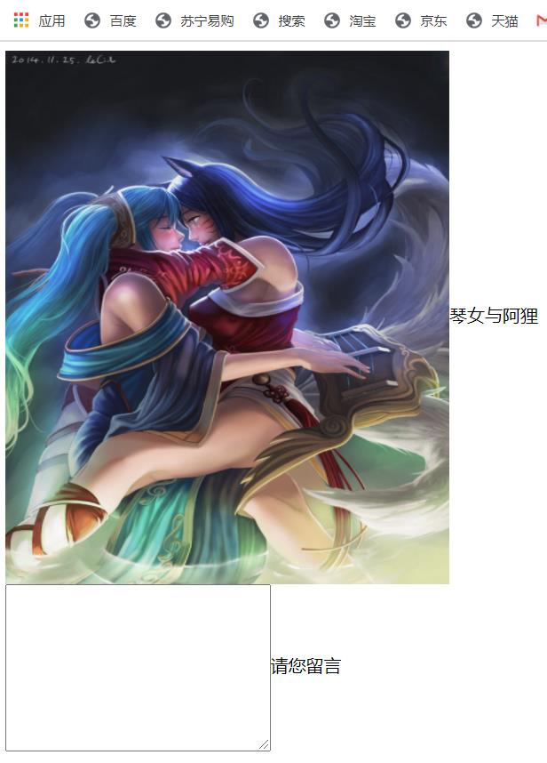
Solve the problem of default blank gap at the bottom of the picture
bug: there will be a blank gap at the bottom of the picture because the block elements in the line will align with the baseline of the text
There are two main solutions:
- Add vertical align: middle | top | bottom, etc. to the picture (it is recommended to use)
- Convert the picture into a block level element display: block;
Overflow display ellipsis
Single line text overflow display ellipsis
<!DOCTYPE html>
<html>
	<head>
		<meta charset="utf-8">
		<title>Single line text overflow display ellipsis</title>
		<style type="text/css">
			div {
				width: 150px;
				height: 80px;
				background-color: pink;
				margin: 100px auto;
				/* This word means that if the text does not display, auto wrap will be turned on */
				/* white-space: normal; */

				/* 1.This word means that if the text cannot be displayed, it must also be forced to be displayed in one line */
				white-space: nowrap;
				/* 2.The overflow is hidden */
				overflow: hidden;
				/* 3.When the text overflows, it is displayed with an ellipsis */
				text-overflow: ellipsis;
			}
		</style>
	</head>
	<body>
		<div>Don't say anything. Ten thousand words are omitted here</div>
	</body>
</html>
Multi line text overflow displays ellipsis, which has large compatibility problems. It is suitable for webkit browsers or mobile terminals (most of the mobile terminals are webkit kernel)
<!DOCTYPE html>
<html>
	<head>
		<meta charset="utf-8">
		<title></title>
		<style type="text/css">
			div {
				width: 150px;
				height: 80px;
				background-color: pink;
				margin: 100px auto;
				overflow: hidden;
				text-overflow: ellipsis;
				/* Elastic box model display */
				display: -webkit-box;
				/* Limit the number of lines of text displayed in a block element */
				-webkit-line-clamp: 3;
				/* Sets or retrieves the arrangement of the child elements of the expansion box object */
				-webkit-box-orient: vertical;
			}
		</style>
	</head>
	<body>
		<div>Don't say anything. Omit 10000 words here. Don't say anything. Omit 10000 words here aaa</div>
	</body>
</html>
CSS initialization
Different browsers have different default values for some tags. In order to eliminate the differences in HTML text rendering between different browsers and take care of browser compatibility, we need to initialize CSS
Simple understanding: CSS initialization refers to resetting the style of the browser
Every web page must first be initialized with CSS
Unicode encoded font:
- Bold \ 9ED1F53
- Arial \ 5B8BF53
- Microsoft YaHei \ 5FAEF6FC5ED1
* {
	margin:0;padding:0
}
em,i {
	font-style:normal
}
li {
	list-style:none
}
img {
	/* border 0 Take care of lower version browsers. If the picture contains links, there will be border problems */
	border:0;
	/* Cancel the problem of blank gap at the bottom of the picture */
	vertical-align:middle
}
button {
	/* When our mouse passes the button, the mouse becomes a small hand */
	cursor:pointer
}
a {
	color:#666;
	text-decoration:none
}
a:hover {
	color:#c81623
}
button,input {
	font-family:Microsoft YaHei,Heiti SC,tahoma,arial,Hiragino Sans GB,"\5B8B\4F53",sans-serif
}
body {
	-webkit-font-smoothing:antialiased;
	background-color:#fff;
	font:12px/1.5 Microsoft YaHei,Heiti SC,tahoma,arial,Hiragino Sans GB,"\5B8B\4F53",sans-serif;
	color:#666
}
.hide,.none {
	display:none
}
/* Clear float */
.clearfix:after {
	visibility:hidden;
	clear:both;
	display:block;
	content:".";
	height:0
}
.clearfix {
	*zoom:1
}
New features of CSS3
CSS3 new selector
- attribute selectors
- Structure pseudo class selector
- Pseudo element selector
attribute selectors
| Selector | brief introduction |
|---|---|
| E[att] | Select the E element with att attribute |
| E[att="val"] | Select the E element with att attribute and attribute value equal to val |
| E[att^="val"] | Match the E element with att attribute and value starting with val |
| E[att$="val"] | Match the E element with att attribute and value ending with val |
| E[att*="val"] | Match the E element with att attribute and val in the value |
Note: the weight of class selector, attribute selector and pseudo class selector is 10
Structure pseudo class selector
| Selector | brief introduction |
|---|---|
| E:first-child | Match the first child element E in the parent element |
| E:last-child | Match the last child element E in the parent element |
| E:nth-child | Matches the nth child element E in the parent element |
| E:first-of-type | Specifies the first of type E |
| E:last-of-type | Specifies the last of type E |
| E:nth-of-type(n) | Specifies the n th of type E |
<!DOCTYPE html>
<html>
	<head>
		<meta charset="utf-8">
		<title></title>
		<style type="text/css">
			/* 1.Choose the first child in ul, little li */
			ul li:first-child {
				background-color: pink;
			}
			/* 2.Choose the last child in ul, little li */
			ul li:last-child {
				background-color: pink;
			}
			/* 3.Select the fourth child in ul, li */
			ul li:nth-child(4) {
				background-color: deepskyblue;
			}
		</style>
	</head>
	<body>
		<ul>
			<li>I am the first child</li>
			<li>I'm the second child</li>
			<li>I'm the third child</li>
			<li>I'm the fourth child</li>
			<li>I'm the fifth child</li>
			<li>I'm the sixth child</li>
			<li>I'm the seventh child</li>
			<li>I'm the eighth child</li>
		</ul>
	</body>
</html>
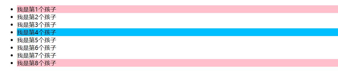
Nth child selector
- n can be numbers, keywords and formulas
- If n is a number, it is to select the nth child element, in which the number starts from 1
- n can be Keywords: even, odd
- n can be a formula: the common formula is as follows (if it is a formula, it will be calculated from 0, but the 0th element or the number exceeding the element will be ignored)
| formula | Value |
|---|---|
| 2n | Even number, equivalent to even |
| 2n+1 | Odd number, equivalent to odd |
| 5n | 5 10 15... |
| n+5 | From the fifth (including the fifth) to the last |
| -n+5 | Top 5 (including the fifth) |
<!DOCTYPE html>
<html>
	<head>
		<meta charset="utf-8">
		<title>nth-child selector</title>
		<style type="text/css">
			/* 1.Pick out all the even even even children */
			ul li:nth-child(even) {
				background-color: skyblue;
			}
			/* 2.Pick out all the odd odd odd children */
			ul li:nth-child(odd) {
				background-color: pink;
			}
		</style>
	</head>
	<body>
		<ul>
			<li>I am the first child</li>
			<li>I am the second child</li>
			<li>I'm the third child</li>
			<li>I'm the fourth child</li>
			<li>I'm the fifth child</li>
			<li>I'm the sixth child</li>
			<li>I'm the seventh child</li>
			<li>I'm the eighth child</li>
		</ul>
	</body>
</html>
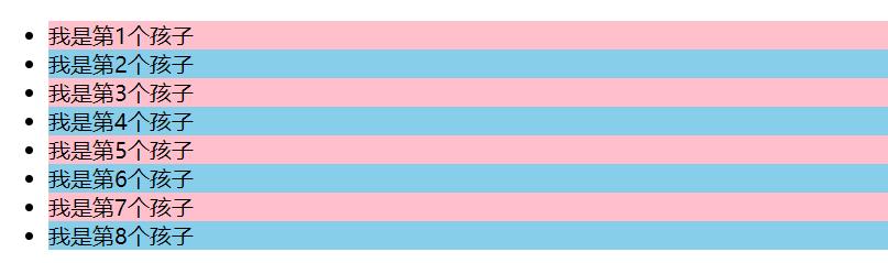
<!DOCTYPE html>
<html>
	<head>
		<meta charset="utf-8">
		<title></title>
		<style type="text/css">
			/* nth-child(n) Starting from 0, add 1 to the back every time. It must be n, not all children selected by other letters */
			ol li:nth-child(n) {
				background-color: pink;
			}
		</style>
	</head>
	<body>
		<ol>
			<li>I am the first child</li>
			<li>I'm the second child</li>
			<li>I'm the third child</li>
			<li>I'm the fourth child</li>
			<li>I'm the fifth child</li>
			<li>I'm the sixth child</li>
			<li>I'm the seventh child</li>
			<li>I'm the eighth child</li>
		</ol>
	</body>
</html>
difference
- Nth child sorts all children in the parent element (the sequence number is fixed). First find the nth child, and then see if it matches E
- Nth of type sorts and selects the specified child elements in the parent element. Match e first, and then find the nth child according to E
<!DOCTYPE html>
<html>
	<head>
		<meta charset="utf-8">
		<title>nth-type-of selector</title>
		<style type="text/css">
			ul li:first-of-type {
				background-color: pink;
			}
			ul li:last-of-type {
				background-color: pink;
			}
			/* nth-child Will sequence all boxes */
			/* When executing, first look at nth child (1), and then go back to the div in front */
			section div:nth-child(1) {
				background-color: red;
			}

			/* nth-of-type The boxes of the specified elements are numbered */
			/* When executing, first look at the element specified by div, and then go back to see: nth of type (1) which child */
			section div:nth-of-type(1){
				background-color: blue;
			}
		</style>
	</head>
	<body>
		<ul>
			<li>I am the first child</li>
			<li>I'm the second child</li>
			<li>I'm the third child</li>
			<li>I'm the fourth child</li>
			<li>I'm the fifth child</li>
			<li>I'm the sixth child</li>
			<li>I'm the seventh child</li>
			<li>I'm the eighth child</li>
		</ul>
		<!-- difference -->
		<section>
			<p>Bald head strength</p>
			<div>Xiong Da</div>
			<div>Xiong er</div>
		</section>
	</body>
</html>
Summary
- Structure pseudo class selectors are generally used to select the children in the parent element
- Nth child sorts all children in the parent element (the sequence number is fixed). First find the nth child, and then see if it matches E
- Nth of type sorts and selects the specified child elements in the parent element, matches e first, and then finds the nth child according to E
- For nth child (n), we should know that n is calculated from 0, and remember the commonly used formula
- If it is an unordered list, we must use nth child more
- Class selector, attribute selector and pseudo class selector, with a weight of 10
Focus selector (pseudo focus element)
| Selector | brief introduction |
|---|---|
| ::before | Insert content before the inside of the element |
| ::after | Insert content after the inside of the element |
be careful:
- before and after create an element, but it is not an inline element
- The newly created element cannot be found in the document tree species. We call it a pseudo element
- Syntax: element::before {}
- before and after must have content attribute
- Before creates an element before the parent element content, and after inserts an element after the parent element content
- The pseudo element selector, like the label selector, has a weight of 1
<!DOCTYPE html>
<html>
	<head>
		<meta charset="utf-8">
		<title>Pseudo element selector</title>
		<style type="text/css">
			div {
				width: 200px;
				height: 200px;
				background-color: pink;
			}
			div::before {
				/* This content must be written */
				content: 'I';
			}
			div::after {
				content: 'APO';
			}
		</style>
	</head>
	<body>
		<div>
			yes
		</div>
	</body>
</html>
Use with Font Icon
<!DOCTYPE html>
<html>
<head>
<meta charset="utf-8">
<title></title>
<style type="text/css">
@font-face {
font-family: 'icomoon';
src: url('fonts/icomoon.eot?zc2vt0');
src: url('fonts/icomoon.eot?zc2vt0#iefix') format('embedded-opentype'),
url('fonts/icomoon.ttf?zc2vt0') format('truetype'),
url('fonts/icomoon.woff?zc2vt0') format('woff'),
url('fonts/icomoon.svg?zc2vt0#icomoon') format('svg');
font-weight: normal;
font-style: normal;
font-display: block;
}
div {
position: relative;
width: 200px;
height: 35px;
border: 1px solid red;
}
div::after {
position: absolute;
top: 10px;
right: 10px;
font-family: 'icomoon';
/* content: ''; */
content: '\e900';
color: red;
font-size: 18px;
}
</style>
</head>
<body>
<div></div>
</body>
</html>
Mask case modification
<!DOCTYPE html>
<html>
	<head>
		<meta charset="utf-8">
		<title>Mask case modification</title>
		<style type="text/css">
			.tudou {
				position: relative;
				width: 260px;
				height: 200px;
				background-color: pink;
				margin: 30px auto;
			}
			.tudou img {
				width: 100%;
				height: 100%;
			}
			.tudou::before {
				content: '';
				/* Hide mask layer */
				display: none;
				position: absolute;
				top: 0;
				left: 0;
				width: 100%;
				height: 100%;
				background: rgba(0,0,0,.4) url(../img/Sina small icon.png) no-repeat center;
			}
			/* When we mouse over the box, the mask layer is displayed */
			.tudou:hover::before {
				/* Display element */
				display: block;
			}
		</style>
	</head>
	<body>
		<div class="tudou">
			<img src="../img/Sona .jpg" >
		</div>
	</body>
</html>

Box model
In CSS3, you can specify the box model through box sizing. There are two values: content box and border box, which changes the way we calculate the box size
It can be divided into two cases:
- Box sizing: content box the box size is width + padding + border (previously the default)
- Box sizing: the size of the border box is width
If we change the box model to box sizing: border box, the padding and border will not support the box (provided that the padding and border will not exceed the width)
<!DOCTYPE html>
<html>
	<head>
		<meta charset="utf-8">
		<title>Box model</title>
		<style type="text/css">
			* {
				margin: 0;
				padding: 0;
			}
			div {
				width: 200px;
				height: 200px;
				background-color: pink;
				border: 20px solid red;
				padding: 15px;
				box-sizing: content-box;
			}
			p {
				width: 200px;
				height: 200px;
				background-color: pink;
				border: 20px solid red;
				padding: 15px;
				/* CSS3 The final size of the box model box is the size of width 200 */
				box-sizing: border-box;
			}
		</style>
	</head>
	<body>
		<div>George the pig</div><br>
		<p>Peppa Pig</p>
	</body>
</html>
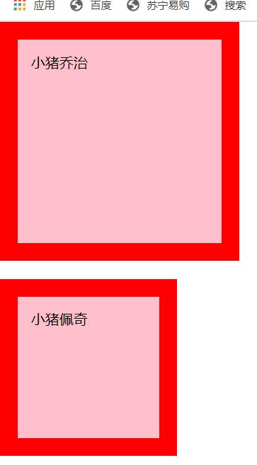
Other new features (understand)
The picture becomes blurred
CSS3 filter:
The filter CSS property applies graphical effects such as blur or color offset to elements
filter: function(); For example: filter: blur(5px); blur The larger the fuzzy value, the more fuzzy
<!DOCTYPE html>
<html>
	<head>
		<meta charset="utf-8">
		<title>Picture blur</title>
		<style type="text/css">
			img {
				/* blur Is a function. The larger the value in parentheses, the more blurred the picture. Note that the value should be added with px unit */
				filter: blur(5px);
			}
			img:hover {
				filter: blur(0);
			}
		</style>
	</head>
	<body>
		<img src="../img/Sona .jpg" >
	</body>
</html>
Mouse out blur

calc function
This function allows you to perform some calculations when declaring CSS property values
width:calc(100% - 80px);
You can use +, -, *, / in parentheses for calculation
<!DOCTYPE html>
<html>
	<head>
		<meta charset="utf-8">
		<title>calc function</title>
		<style type="text/css">
			.father {
				width: 300px;
				height: 200px;
				background-color: pink;
			}
			.son {
				/* width:150px */
				/* width:calc(150px + 30px); */
				width: calc(100% - 30px);
				height: 30px;
				background-color: skyblue;
			}
		</style>
	</head>
	<body>
		<!-- The width of our box is always 30 smaller than the parent box px -->
		<div class="father">
			<div class="son"></div>
		</div>
	</body>
</html>
Transition (key)
transition:The attributes to transition take time. When does the motion curve begin;
- Attributes: the css attributes you want to change, such as width, height, background color, and inner and outer margins. If you want all attributes to change, write an all
- Time spent: unit: hour and second (unit must be written), such as 0.5s
- Motion curve: the default is ease (can be omitted)
- When to start: the unit is seconds. You can set the delay trigger time. The default is 0s
Remember the pithy formula of transition: who makes the transition adds to who
<!DOCTYPE html>
<html>
	<head>
		<meta charset="utf-8">
		<title>Transition effect</title>
		<style type="text/css">
			div {
				width: 200px;
				height: 100px;
				background-color: pink;
				/* transition:When the changing attribute takes time and the motion curve starts; */
				/* transition: width .5s ease 0s; */
				/* If you want to write multiple attributes, separate them with commas. If you want multiple attributes to change, write all for the attribute */
				/* transition: width .5s,height .5s; */
				transition: all 0.5s;
			}
			div:hover {
				width: 400px;
				height: 200px;
				background-color: skyblue;
			}
		</style>
	</head>
	<body>
		<div></div>
	</body>
</html>
Mouse passing effect
2D conversion
transform is one of the subversive features in CSS, which can realize the effects of element displacement, rotation, scaling and so on
- Moving: translate
- Rotation: rotate
- Zoom: scale
Move translate
2D movement is a function of 2D conversion, which can change the position of elements in the page, similar to positioning
transform:translate(x,y);Or write it separately
transform:translateX(n);
transform:translateY(n);
a key:
- Defines the movement in 2D conversion, moving elements along the x and y axes
- The biggest advantage of translate: it will not affect the position of other elements
- The percentage unit in translate is the translate(50%,50%) relative to its own element;
- No effect on inline labels
Center the box horizontally
<!DOCTYPE html>
<html>
	<head>
		<meta charset="utf-8">
		<title></title>
		<style type="text/css">
			div {
				width: 500px;
				height: 500px;
				background-color: pink;
				/* 1.The parameters in our translate can be in% */
				/* 2.If the parameter inside is%, the moving distance is compared with the width or height of the box itself */
				/* Here 50% is 100px, because the width of the box is 200px */
				transform: translate(50%);
			}

			p {
				position: absolute;
				top: 50%;
				left: 50%;
				width: 200px;
				height: 200px;
				background-color: purple;
				/* translate(-50%, -50%) The box goes up half its height */
				transform: translate(-50%, -50%);
			}

			span {
				/* translate Is not valid for inline elements */
				transform: translate(300px, 300px);
			}
		</style>
	</head>
	<body>
		<div>
			<p></p>
		</div>
		<span>123</span>
	</body>
</html>
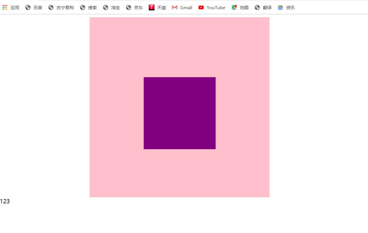
rotate
2D rotation refers to rotating an element clockwise or counterclockwise in a 2-dimensional plane
transform:rotate(degrees)
a key:
- Rotate is followed by degrees. The unit is deg, such as rotate (45deg)
- When the angle is positive, it is clockwise, and when it is negative, it is counterclockwise
- The default rotation center point is the center point of the element
<!DOCTYPE html>
<html>
	<head>
		<meta charset="utf-8">
		<title></title>
		<style type="text/css">
			img {
				width: 150px;
				/* 18 degrees clockwise */
				transform: rotate(18deg);
				border-radius: 50%;
				border: 5px solid pink;
				/* When the transition is written on itself, who will animate and add to who */
				transition: all; 0.3s;
			}

			img:hover {
				transform: rotate(90deg);
			}
		</style>
	</head>
	<body>
		<img src="../img/2D Sona .gif" >
	</body>
</html>
Transform origin
We can set the center point of element transformation
transform-origin:x y;
a key
- Note that the following parameters x and y are separated by spaces
- xy default conversion center point is the center point of the element (50%)
- You can also set a pixel or a top bottom left right center for xy
Zoom scale
Zoom, as the name suggests, can zoom in and out. As long as you add this attribute to an element, you can control whether it zooms in or out
transform:scale(x,y);
be careful:
- Notice that x and y are separated by commas
- transform: scale (1, 1): double the width and height, compared with no magnification
- transform: scale (2, 2): both width and height are magnified twice
- transform: Scale (2): write only one parameter. The second parameter is the same as the first parameter, which is equivalent to scale (2, 2)
- transform (0.5, 0.5): zoom out
- The biggest advantage of scale scaling: you can set the rotation center point scaling, which is scaled by the center point by default, and does not affect other boxes
div:hover {
				/* 1.The number written inside does not follow the unit, which means multiple. 1 is a multiple of 1 and 2 is a multiple of 2 */
				/* transform: scale(x,y); */
				transform: scale(2,2);

				/* 2.The width is changed to 2 times of the original, and the height remains unchanged */
				/* transform: scale(2,1); */

				/* 3.We have a simple way to modify the width and height at the same time. The following is that the width is modified twice, and the height is the same as the first parameter by default */
				/* transform: scale(2); */

				/* 4.We can zoom out. Less than 1 is zoom */
				/* transform: scale(0.5,0.5); */
				/* transform: scale(0.5); */

				/* 5.scale Advantages: it will not affect other boxes, and the center point of scaling can be set */
			}
Picture enlargement case
<!DOCTYPE html>
<html>
	<head>
		<meta charset="utf-8">
		<title>Picture enlargement case</title>
		<style type="text/css">
			div {
				overflow: hidden;
				float: left;
				margin: 10px;
			}
			div img {
				width: 300px;
				transition: all 0.9s;
				vertical-align: middle;
			}
			div img:hover {
				transform: scale(2,2);
			}
		</style>
	</head>
	<body>
		<div>
			<a href="#"> < img SRC =" img / Wei jpg" ></a>
		</div>
		<div>
			<a href="#"> < img SRC =" img / Ruiwen png" ></a>
		</div>
		<div>
			<a href="#"> < img SRC =" img / ALI jpg" ></a>
		</div>
	</body>
</html>
Mouse in effect
2D conversion synthesis
be careful:
- Multiple transformations are used at the same time. The format is: transform: translate() rotate() scale()... And so on
- The order will affect the effect of the conversion (first change the direction of the coordinate axis)
- When we have displacement and other attributes at the same time, remember to put the displacement first
div:hover {
				transform: translate(150px,150px) rotate(180deg);
				/* These two have different effects */
				/* transform: rotate(180deg) translate(150px,150px); */
			}
CSS3 animation
Animation is divided into two steps:
- Define the animation first
- Reuse (call) animation
use keyframes Define animation (similar to defining class selectors)
@keyframes Animation name {
    0% {
        width:100px;
    }
    100% {
        width:200px;
    }
}
Element uses (invokes) animation
div {
    width:200px;
    height:200px;
    background-color:aqua;
    margin:100px auto;
    /* Call animation */
    animation-name:Animation name;
    /* Duration */
    animation-duration:Duration;
}
<!DOCTYPE html>
<html>
	<head>
		<meta charset="utf-8">
		<title></title>
		<style type="text/css">
			/* As soon as the page opens, a box goes from left to right */
			/* 1.Define animation */
			@keyframes move {
				/* Start state */
				0% {
					transform: translateX(0px);
				}
				/* End state */
				100% {
					transform: translateX(1000px);
				}
			}
			div {
				width: 200px;
				height: 200px;
				background-color: pink;
				/* 2.Call animation */
				/* Animation name */
				animation-name: move;
				/* Duration */
				animation-duration: 2s;
			}
		</style>
	</head>
	<body>
		<div></div>
	</body>
</html>
Animation sequence
- 0% is the beginning of the animation and 100% is the completion of the animation. Such a rule is the animation sequence
- If you specify a css style in @ keyframes, you can create an animation effect that gradually changes from the current style to a new style
- Animation is the effect of gradually changing elements from one style to another. You can change any number of styles as many times as you want
- Please specify the time of change in percentage, or use the keywords "form" and "to", which are equivalent to 0% and 100%
<!DOCTYPE html>
<html>
	<head>
		<meta charset="utf-8">
		<title>Animation sequence</title>
		<style type="text/css">
			/* @keyframes move{
				from {
					transform: translate(0,0);
				}
				to {
					transform: translate(1000px,0);
				}
			} */
			/* The box goes round */
			/* Animation sequence */
			/* 1.You can change multiple states keyframes: keyframes */
			/* 2.The percentage inside should be an integer */
			/* 3.The percentage inside is the division of the total time (10s in this case) */
			@keyframes move{
				0% {
					transform: translate(0,0);
				}
				25% {
					transform: translate(1000px,0);
				}
				50% {
					transform: translate(1000px,500px);
				}
				75% {
					transform: translate(0,500px);
				}
				100% {
					transform: translate(0,0);
				}
			}
			div {
				width: 100px;
				height: 100px;
				background-color: pink;
				animation-name: move;
				animation-duration: 10s;
			}
		</style>
	</head>
	<body>
		<div></div>
	</body>
</html>
Common animation attributes
| attribute | describe |
|---|---|
| @keyframes | Specified animation |
| animation | Short for all animation attributes, except the animation play state attribute |
| animation-name | Specifies the name of the @ keyframes animation (required) |
| animation-duration | Specifies the seconds or milliseconds that the animation takes to complete a cycle. The default is 0 (required) |
| animation-timing-function | Specifies the speed curve of the animation. The default is "ease" |
| animation-delay | Specifies when the animation starts. The default is 0 |
| animation-iteration-count | Specify the number of times the animation is played. The default is 1 and infinite |
| animation-direction | Specifies whether the animation is played backwards in the next cycle. The default is "normal", and alternate is played backwards |
| animation-play-state | Specifies whether the animation is running or paused. The default is "running" and "pause" |
| animation-fill-mode | Specify the state after the animation ends, and keep forwards back to the starting backwards |
<!DOCTYPE html>
<html>
	<head>
		<meta charset="utf-8">
		<title>Animation properties</title>
		<style type="text/css">
			@keyframes move {
				0% {
					transform: translate(0,0);
				}
				100% {
					transform: translate(1000px,0);
				}
			}
			div {
				width: 100px;
				height: 100px;
				background-color: pink;
				animation-name: move;
				animation-duration: 2s;
				/* Motion curve */
				/* animation-timing-function: ease; */

				/* When does it start */
				animation-delay: 1s;

				/* Number of repetitions iteration number of repetitions, count, infinite */
				/* animation-iteration-count: infinite; */

				/* Whether to play in the opposite direction. The default is normal. If you want to play in the opposite direction, write alternate */
				/* animation-direction: alternate; */

				/* The state after the animation ends. The default is that backwards returns to the start state. You can change it to stay in the end state forwards */
				animation-fill-mode: forwards;
			}

			div:hover {
				/* The mouse passes over the div to stop the animation */
				animation-play-state: paused;
			}
		</style>
	</head>
	<body>
		<div></div>
	</body>
</html>
Animation abbreviation properties
Animation: animation name duration when the motion curve starts playing times whether the animation starts or ends in the opposite direction
animation:myfirst 5s linear 2s infinite alternate;
<!-- Abbreviation of the above code -->
<!DOCTYPE html>
<html>
	<head>
		<meta charset="utf-8">
		<title>Animation properties</title>
		<style type="text/css">
			@keyframes move {
				0% {
					transform: translate(0,0);
				}
				100% {
					transform: translate(1000px,0);
				}
			}
			div {
				width: 100px;
				height: 100px;
				background-color: pink;
				animation-name: move;
				animation-duration: 2s;
				/* Abbreviation */
				/* The first two attributes name and duration must be written */
				animation: move 2s linear 0s 1 alternate forwards;
			}

			div:hover {
				/* The mouse passes over the div to stop the animation */
				animation-play-state: paused;
			}
		</style>
	</head>
	<body>
		<div></div>
	</body>
</html>
be careful:
- The short attribute does not contain animation play state
- Pause animation play state: pause; It is often used in conjunction with other devices such as the mouse
- Want the animation to come back instead of jumping back: animation direction: alternate
- After the box animation, stop at the end position: animation fill mode: forwards
steps of velocity curve
Animation timing function: Specifies the speed curve of animation. The default is "ease"
| value | describe |
|---|---|
| linear | The speed of animation from beginning to end is the same, uniform |
| ease | By default, the animation starts at low speed, then speeds up, and slows down before it ends |
| ease-in | The animation starts at a low speed |
| ease-out | The animation ends at low speed |
| ease-in-out | The animation starts and ends at low speed |
| steps() | Specifies the number of intervals (in steps) in the time function |
<!DOCTYPE html>
<html>
	<head>
		<meta charset="utf-8">
		<title>steps step</title>
		<style type="text/css">
			div {
				font-size: 20px;
				width: 0;
				height: 30px;
				background-color: pink;
				/* Force text to appear on one line */
				white-space: nowrap;
				/* steps It is to complete our animation in several steps. With steps, don't write ease or linear again */
				animation: w 4s steps(10) forwards;
			}

			@keyframes w {
				0% {
					width: 0;
				}
				100% {
					width: 200px;
				}
			}
		</style>
	</head>
	<body>
		<div>Most Aegean girl E,Piano girl 36 D</div>
	</body>
</html>
3D conversion
Three dimensional coordinate system actually refers to three-dimensional space, which is composed of three axes
- x axis: horizontal right note: the right side of x is positive and the left side is negative
- y-axis: vertically downward note: the lower part of y is positive and the upper part is negative
- z-axis: vertical screen note: positive value to the outside and negative value to the inside
Main knowledge points
- 3D displacement: translate3d (x, y, z)
- 3D rotation: rotate3d (x, y, z)
- perspective: perspective
- 3D rendering transform style
3D mobile translate3d
3D movement adds a movable direction on the basis of 2D movement, that is, the z-axis direction
- transform: translateX (100px): just move on the x axis
- transform: translateY (100px): just move on the y axis
- transform: translateZ (100px): only moves on the z axis (Note: translateZ is generally in PX units)
- transform: translate3d (x, y, z): where x, y and Z respectively refer to the distance in the direction of the axis to be moved
div {
	width: 200px;
	height: 200px;
	background-color: pink;
	/* transform: translateX(100px); */
	/* transform: translateY(100px); */
	/* transform: translateX(100px) translateY(100px) translateZ(100px); */
	/* 1.translateZ Move along the z axis */
	/* 2.translateZ We usually follow px in the following units */
	/* 3.translateZ(100px)Move 100px outward (towards our eyes) */
	/* 4.3D There are short ways to move */
	/* transform: translate3d(x,y,z); */
	/* transform: translate3d(100px,100px,100px); */
	/* 5.xyz It cannot be omitted. If not, write 0 */
	transform: translate3d(0,100px,100px);
}
perspective
The near large far small visual stereo is generated in the 2D plane, but the effect is only two-dimensional
- If you want to produce a 3D effect on a web page, you need Perspective (understood as a 3D object projected in a 2D plane)
- Simulating human visual position, we can think of arranging one eye to see
- Perspective is also called sight distance: sight distance is the distance from people's eyes to the screen
- The closer to the visual point, the larger the imaging in the computer plane, and the farther the imaging is, the smaller the imaging
- The unit of perspective is pixels
<!DOCTYPE html>
<html>
	<head>
		<meta charset="utf-8">
		<title></title>
		<style type="text/css">
			body {
				/* The perspective is written on the parent box of the observed element!!! */
				perspective: 500px;
			}
			div {
				width: 200px;
				height: 200px;
				background-color: pink;
				transform: translate3d(400px,100px,100px);
			}
		</style>
	</head>
	<body>
		<div></div>
	</body>
</html>
translateZ
translateZ (100px): just move on the Z axis. With perspective, you can see the changes caused by translateZ
body {
	perspective: 500px;
}
div {
	width: 200px;
	height: 200px;
	background-color: pink;
	margin: 100px auto;
	transform: translateZ(0);
}
3D conversion rotate3d
3D rotation refers to the rotation of elements along the x axis, y axis, z axis or user-defined axis in the 3D plane
transform:rotateX(45deg): along x Rotate the shaft 45 degrees in the positive direction
transform:rotateY(45deg): along y Rotate the shaft 45 degrees in the positive direction
transform:rotateZ(45deg): along z Rotate the shaft 45 degrees in the positive direction
transform:rotate3d(x,y,z,deg): Rotate along a custom axis, deg Angle (just understand)
rotateX
Left handed criterion
- The thumb of the left hand points in the positive direction of the x axis
- The bending direction of the other fingers is the direction in which the element rotates along the x axis
<!DOCTYPE html>
<html>
	<head>
		<meta charset="utf-8">
		<title></title>
		<style type="text/css">
			body {
				perspective: 300px;
			}

			img {
				display: block;
				width: 300px;
				margin: 100px auto;
				transition: all 1s;
			}

			img:hover {
				transform: rotateX(60deg);
			}
		</style>
	</head>
	<body>
		<img src="img/Jianji.jpg" >
	</body>
</html>
rotateY
Left handed criterion
- The thumb of the left hand points in the positive direction of the y axis
- The bending direction of the remaining fingers is the direction in which the element rotates along the y axis (positive)
<!DOCTYPE html>
<html>
	<head>
		<meta charset="utf-8">
		<title></title>
		<style type="text/css">
			body {
				perspective: 500px;
			}

			img {
				display: block;
				width: 300px;
				margin: 100px auto;
				transition: all 1s;
			}

			img:hover {
				transform: rotateY(60deg);
			}
		</style>
	</head>
	<body>
		<img src="img/Jianji.jpg" >
	</body>
</html>

rotateZ
<!DOCTYPE html>
<html>
	<head>
		<meta charset="utf-8">
		<title></title>
		<style type="text/css">
			body {
				perspective: 500px;
			}

			img {
				display: block;
				width: 300px;
				margin: 100px auto;
				transition: all 1s;
			}

			img:hover {
				transform: rotateZ(180deg);
			}
		</style>
	</head>
	<body>
		<img src="img/Jianji.jpg" >
	</body>
</html>

rotate3d
transform:rotate3d (x, y, z, deg): rotate deg as an angle along a user-defined axis (just understand)
xyz is the vector representing the rotation axis, indicating whether you want to rotate along the axis, and the last indicates the rotation angle
- transform: rotate3d (1, 0, 0, 45deg) is to rotate 45deg along the x axis
- transform: rotate3d (1, 1, 0, 45deg) is to rotate 45deg along the diagonal
3D rendering transform style
- Controls whether the child element turns on the 3D environment
- Transform style: the child element of flat does not turn on the default of 3d stereo space
- transform-style: preserve-3d; Child elements open three-dimensional space
- The code is written to the parent, but it affects the child box
- This attribute is very important and will be used later
Two sided box flip example
<!DOCTYPE html>
<html>
	<head>
		<meta charset="utf-8">
		<title></title>
		<style type="text/css">
			body {
				perspective: 350px;
			}
			.box {
				position: relative;
				width: 150px;
				height: 150px;
				margin: 100px auto;
				animation-timing-function: linear;
				transition: all .3s;
				/* Let the box on the back reserve three-dimensional space for the parent to add */
				transform-style: preserve-3d;
			}
			.box:hover {
				transform: rotateY(180deg);
			}
			.front,
			.back {
				position: absolute;
				top: 0;
				left: 0;
				width: 100%;
				height: 100%;
				border-radius: 50%;
				text-align: center;
				line-height: 300px;
			}

			.front {
				z-index: 1;
			}
			.front img {
				width: 150px;
				border-radius: calc(50%);
			}
			.back {
				/* Rotate back to back like a mobile phone */
				transform: rotateY(180deg);
			}
			.back img {
				width: 150px;
				border-radius: calc(50%);
			}
		</style>
	</head>
	<body>
		<div class="box">
			<div class="front"><img src="img/Akali ghost dancer.jpg" ></div>
			<div class="back"><img src="img/Peak thorn akali.jpg" ></div>
		</div>
	</body>
</html>
Carousel case
<!DOCTYPE html>
<html>
	<head>
		<meta charset="utf-8">
		<title></title>
		<style type="text/css">
			body {
				perspective: 1000px;
			}
			section {
				position: relative;
				width: 300px;
				height: 200px;
				margin: 178px auto;
				transform-style: preserve-3d;
				/* Add animation effects */
				animation: rotate 10s linear infinite;
				background: url(img/Akali 4.jpg)
			}

			section:hover {
				/* Put the mouse into the section to stop the animation */
				animation-play-state: paused;
			}

			@keyframes rotate {
				0% {
					transform: rotateY(0);
				}
				100% {
					transform: rotateY(360deg);
				}
			}

			section div {
				position: absolute;
				top: 0;
				left: 0;
				width: 100%;
				height: 100%;
			}

			section div:nth-child(1) {
				/* Rotate first and then move the distance */
				transform: translateZ(300px);
				background: url(img/Akali 1.jpg);
			}
			section div:nth-child(2) {
				transform: rotateY(60deg) translateZ(300px);
				background: url(img/Akali 2.jpg);
			}
			section div:nth-child(3) {
				transform: rotateY(120deg) translateZ(300px);
				background: url(img/Akali 3.jpg);
			}
			section div:nth-child(4) {
				transform: rotateY(180deg) translateZ(300px);
				background: url(img/Akali 7.jpg);
			}
			section div:nth-child(5) {
				transform: rotateY(240deg) translateZ(300px);
				background: url(img/Akali 5.jpg);
			}
			section div:nth-child(6) {
				transform: rotateY(300deg) translateZ(300px);
				background: url(img/Akali 6.png);
			}
		</style>
	</head>
	<body>
		<section>
			<div></div>
			<div></div>
			<div></div>
			<div></div>
			<div></div>
			<div></div>
		</section>
	</body>
</html>
Emmet syntax
- To generate labels, you can directly enter the label name and press tab. For example, you can enter div and then press tab to generate div labels
- If you want to generate multiple identical tags, you can add * for example, div * 3 (without spaces) and press tab to quickly generate three div's
- If there is a parent-child label, you can use > such as UL > Li
- If there is a label of brotherhood, use + such as div+p
- If a class name or id name is generated, write it directly Just press demo or #two tab
p.one
 Press tab Key followed by
<p class="one"></p>

p#two
 Press tab Key followed by
<p id="two"></p>
If the generated div class names are in order, you can use the autoincrement symbol$
.demo$*5
 Press tab Key followed by
<div class="demo1"></div>
<div class="demo2"></div>
<div class="demo3"></div>
<div class="demo4"></div>
<div class="demo5"></div>
If you want to write content inside the generated tag, you can use {}
div{Most Aegean girl E}
Press tab Key followed by
<div>Most Aegean girl E</div>

div{Big big}*3
 Press tab Key followed by
<div>Big big</div>
<div>Big big</div>
<div>Big big</div>

div{$}*5
 Press tab Key followed by
<div>1</div>
<div>2</div>
<div>3</div>
<div>4</div>
<div>5</div>
Quickly generate CSS style syntax
CSS basically takes short form
- For example, w200 can generate width:200px by pressing tab;
- For example, lh26 press tab to generate line height: 26px;
.one {
		tac
		w100
		h200
			}
Press tab Key followed by
.one {
		text-align: center;
		width: 100px;
		height: 200px;
			}
extend
Website favicon Icon
favicon.ico is generally used as an abbreviated website logo. It is displayed on the address bar or label of the browser. At present, the main browsers support favicon ICO icon.
Make favicon Icon
- Cut the icon into png pictures
- Converting png images into ico icons requires the help of a third-party conversion website, such as bitbug: http / / www.bitbug.com net/
<!-- It can be imported after production -->
<!DOCTYPE html>
<html>
	<head>
		<meta charset="utf-8">
		<title>Game purchase</title>
		<!-- favicon Icon -->
		<link rel="shortcut icon" href="images/favicon.png"/>
		<!-- Import initialization style file -->
		<link rel="stylesheet" href="css/base.css"/>
		<!-- Bring in a common style file -->
		<link rel="stylesheet" href="css/common.css"/>
	</head>
	<body>
	</body>
</html>
Website TDK three tags SEO optimization
SEO (Search Engine Optimization) is a way to improve the natural ranking of websites in relevant search engines by using the rules of search engines
The purpose is to deeply optimize the website, so as to help the website obtain free traffic, improve the ranking of the website on the search engine and improve the popularity of the website
The page must have three tags to comply with SEO optimization
Title website title
title is irreplaceable. It is the first important label in our page and the best judgment point for search engines to understand the entrance of web pages and the attribution of Web topics
Suggestion: website name (product name) - website introduction (try not to exceed 30 Chinese characters)
For example:
- JD.COM - first choice for comprehensive online shopping - genuine low price, quality assurance, timely distribution and easy shopping!
- Xiaomi Mall - official websites of Xiaomi 5s, Hongmi Note4, Xiaomi MIX and Xiaomi notebook
Description website description
Briefly describe what our website mainly does
We advocate that description, as the summary of the overall business and theme of the website, use statements such as "we are...", "we provide...", "XXX network as...", "Tel: 010...".
For example:
<meta name="description" content="JD.COM JD.COM-The professional comprehensive online shopping mall sells tens of thousands of brand high-quality commodities such as home appliances, digital communications, computers, home department stores, clothing, mother and baby, books, food and so on. Convenient and honest services provide you with a pleasant online shopping experience!" />
keywords keyword
keywords is a page keyword, which is one of the concerns of search engines
It is best to limit to 6 ~ 8 keywords, separated by English commas, in the form of keyword 1 and keyword 2.
For example:
<meta name="keywords" content="Online shopping, online shopping mall, mobile phone, laptop, computer, MP3,CD,VCD,DV,Camera, digital, accessories, watch, memory card, JD" />
example
<!DOCTYPE html>
<html>
	<head>
		<meta charset="utf-8">
		<title>Game purchase-Game online shopping preferred-Genuine low price, quality assurance, timely delivery and easy shopping!</title>
		<!-- Website description -->
		<meta name="description" content="Game shopping mall-Professional game shopping mall,Sell all kinds of games,Whether it's a stand-alone masterpiece,Independent game or small game,have everything that one expects to find,
		There are also tens of thousands of high-quality games from many manufacturers at home and abroad,Convenient and honest service,Provide you with a pleasant online shopping experience!" />
		<!-- keyword -->
		<meta name="Keywords" content="Online shopping,E-Shop,game,Stand alone game,network game,Independent game,Games,Game purchase"/>
		<!-- introduce favicon Icon -->
		<link rel="shortcut icon" href="images/favicon.png"/>
		<!-- Import initialization style file -->
		<link rel="stylesheet" href="css/base.css"/>
		<!-- Bring in a common style file -->
		<link rel="stylesheet" href="css/common.css"/>
	</head>
	<body>
	</body>
</html>
Browser private prefix
The browser is private in order to be compatible with the writing method of the old version, and the newer version of the browser does not need to be added
1. Private prefix
- -moz -: represents the private property of Firefox browser
- -ms -: represents the private property of IE browser
- -webkit -: represents safari and chrome private attributes
- -o -: represents the private property of Opera
2. Advocated writing
-moz-border-radius:10px;
-webkit-border-radius:10px
-o-border-radius:10px;
border-radius:10px;