At the 2019 Google/IO conference, a new Android native UI development framework Jetpack Compose was unveiled. Like SwiftUI of IOS, Jetpack Compose is also a declarative UI framework. With the launch of its own platform specific declarative UI framework by Android and IOS mobile platforms, the whole industry has begun to turn to declarative interface model, which greatly simplifies the engineering design associated with building and updating interfaces
After more than two years of polishing, by the end of July this year, Google officially released Jetpack Compose version 1.0, which is a stable version of Compose for developers to use in the production environment
Citing the introduction of Jetpack Compose on Google's official website: Jetpack Compose is a new toolkit for building a native Android interface. It can simplify and speed up the interface development on Android, and help you quickly create vivid and wonderful applications with less code, powerful tools and intuitive Kotlin API
Its core functions include:
- Interoperability: Compose can interoperate with existing applications. You can embed the Compose UI into the View and vice versa. You can add only one button on the screen, or keep the custom View you created in the interface now built with Compose
- Jetpack integration: Compose is naturally integrated with the well-known and favorite jetpack development library. By integrating with Navigation, Paging, LiveData (or Flow/RxJava), ViewModel and Hilt, Compose can perfectly coexist with your existing architecture
- Material: Compose provides the implementation of Material Design components and themes, enabling you to easily build beautiful applications that meet your brand personality. The material theme system is easier to understand and track, and there is no need to browse multiple XML files
- List: the Lazy component of Compose provides a simple, concise and powerful way for the presentation of data list, and simplifies the template code to a minimum
- Animation: Compose's concise animation API makes it easier for you to create a dazzling experience for users
1, compose_chat
The world of technology is always changing, and new technologies are always emerging. I counted the following basic skills that an Android application development engineer needs to master, which is a bit like MMP 🤣🤣
UI development framework to master:
- Traditional View system
- Cross platform Flutter
- Latest Jetpack Compose
- xxxxx
The languages to be mastered are:
- Java
- Dart
- Kotlin
- xxxxx
Practice leads to truth. If you can't learn, you should learn 🤣🤣 Jetpack Compose will probably become the preferred technical solution for the development of Android native applications in the future, so I also did a practical exercise and spent two months to continuously write an IM APP completely realized by Compose, realizing the basic friend chat function

The whole APP adopts the form of single Activity. It simulates multi screen jump through navigation internally, and uses one-way data flow mode. All business logic is completed through ViewModel. The processing results of business logic are returned to the UI layer in the form of input parameters of composable functions, and the bottom layer realizes communication through Tencent cloud's IM SDK
This article mainly introduces various key concepts and function points of Jetpack Compose, and does not involve too many compose_ The actual coding content of chat, but it will be written in compose_chat as an auxiliary example of explanation. If the reader wants to learn Jetpack Compose, compose_chat will be a good introductory learning project. I hope it will be helpful to you 🤣🤣
2, Imperative and declarative
For a long time, the View hierarchy of Android can be expressed as a View tree. Several views and viewgroups form the whole View tree in a nested relationship. Developers declare the hierarchy of the whole View tree through XML, and then get the reference of each control through findViewById(). When the state changes and the UI needs to be refreshed, the UI is updated by actively calling a specific method of the control
The whole process is similar to the following. The user name is displayed through TextView. When the user name changes, you need to actively call TextView The settext method is used to refresh the UI. The developer directly holds and maintains each view node. If you want to update the view, the developer needs to directly issue "instructions" to the control. The complexity and error probability of the whole process increase with the increase of the number of controls to be maintained. This method is imperative
val tvUserName = findViewById<TextView>(R.id.tvUserName)
fun onUserNameChanged(userName: String) {
tvUserName.text = userName
}
onUserNameChanged("Ye Zhichen")
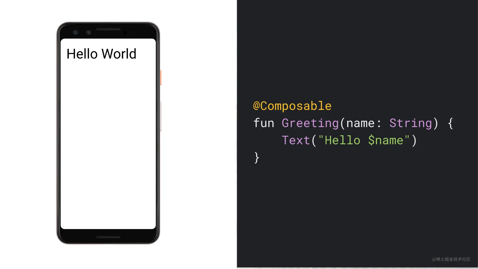
Copy codeCompose builds the interface by declaring a series of composable functions that do not contain return values. Composable functions are only responsible for describing the required screen state, and do not provide any reference of view controls to developers. Composable functions can contain input parameters, which are used to describe the screen state. When the screen state needs to be changed, UI refresh is also realized by generating new input parameters and calling composable functions again
The whole process is similar to the following. The "control" corresponding to TextView in Compose is the Text() function. After getting the user name, the Greeting function displays it through the Text() function, which receives a String parameter for displaying text information on the screen. In the whole process, the developer does not hold the reference of any view node, but declares how the view should be presented in a descriptive way, and the view does not directly hold the state, but depends on the state to generate itself. This method is declarative
A notable feature of declarative UI is that whether a view exists is determined by whether it has been declared or not
With compose_chat as an example, the main interface contains a floating button, floatingActionButton

This button will only appear on the friendship page. HomeScreen depends on the if (screenSelected == ViewScreen.Friendship) statement to determine its occurrence time. Only if the statement is true, the FloatingActionButton() function will be executed and the floating button will be displayed
This is very different from the original View system. If it is implemented according to the method of View system, the FloatingActionButton will correspond to a control object, and the object always exists, but we selectively use View Gone() to hide it. By pressing Compose, the hover button will exist only after the FloatingActionButton() function is executed. Otherwise, for the current screen, the hover button will never appear
@Composable
fun HomeScreen(
    navController: NavHostController,
    screenSelected: ViewScreen,
    onTabSelected: (ViewScreen) -> Unit
) {
    ChatTheme(appTheme = appTheme) {
        ProvideWindowInsets {
            ModalBottomSheetLayout() {
                Scaffold(
                    floatingActionButton = {
                        if (screenSelected == ViewScreen.Friendship) {
                            FloatingActionButton(
                                backgroundColor = MaterialTheme.colors.primary,
                                onClick = {
                                    sheetContentAnimateTo(targetValue = ModalBottomSheetValue.Expanded)
                                }) {
                                Icon(
                                    imageVector = Icons.Filled.Favorite,
                                    tint = Color.White,
                                    contentDescription = null,
                                )
                            }
                        }
                    },
                )
            }
        }
    }
}
Copy code
3, Composable function
A function with the @ Composable annotation can be a composite function, which is used to inform the Compose compiler that this function is designed to convert data into an interface. For example, the Text() function of Compose provides all the functions of TextView out of the box. The method signature is shown below
@Composable
fun Text(
    text: String,
    modifier: Modifier = Modifier,
    color: Color = Color.Unspecified,
    fontSize: TextUnit = TextUnit.Unspecified,
    fontStyle: FontStyle? = null,
    fontWeight: FontWeight? = null,
    fontFamily: FontFamily? = null,
    letterSpacing: TextUnit = TextUnit.Unspecified,
    textDecoration: TextDecoration? = null,
    textAlign: TextAlign? = null,
    lineHeight: TextUnit = TextUnit.Unspecified,
    overflow: TextOverflow = TextOverflow.Clip,
    softWrap: Boolean = true,
    maxLines: Int = Int.MAX_VALUE,
    onTextLayout: (TextLayoutResult) -> Unit = {},
    style: TextStyle = LocalTextStyle.current
)
Copy code
Among them, the most important parameter to be concerned about is the modifier parameter. Compose provides a series of "control" functions out of the box, such as Box() corresponding to FrameLayout, Image() corresponding to ImageView, LazyColumn() corresponding to RecyclerView, etc. these controls all contain a modifier parameter. Modifier has very powerful functions. The width, height, size, position, direction, alignment, cutting, spacing, background color, click, and even gesture recognition of each control need to be completed through it. Each function is declared by extending the function and used in the way of chain call
Text(
modifier = Modifier
.weight(weight = messageWidthWeight, fill = false)
.padding(
start = messageStartPadding,
top = messageTopPadding,
end = messageEndPadding
)
.clip(shape = messageShape)
.background(color = friendMsgBgColor)
.pointerInput(key1 = Unit) {
detectTapGestures(
onLongPress = {
onLongPressMessage(textMessage)
},
)
}
.padding(
start = messageInnerPadding,
top = messageInnerPadding,
end = messageInnerPadding,
bottom = messageInnerPadding
),
text = textMessage.msg,
style = MaterialTheme.typography.subtitle1,
textAlign = TextAlign.Left,
)
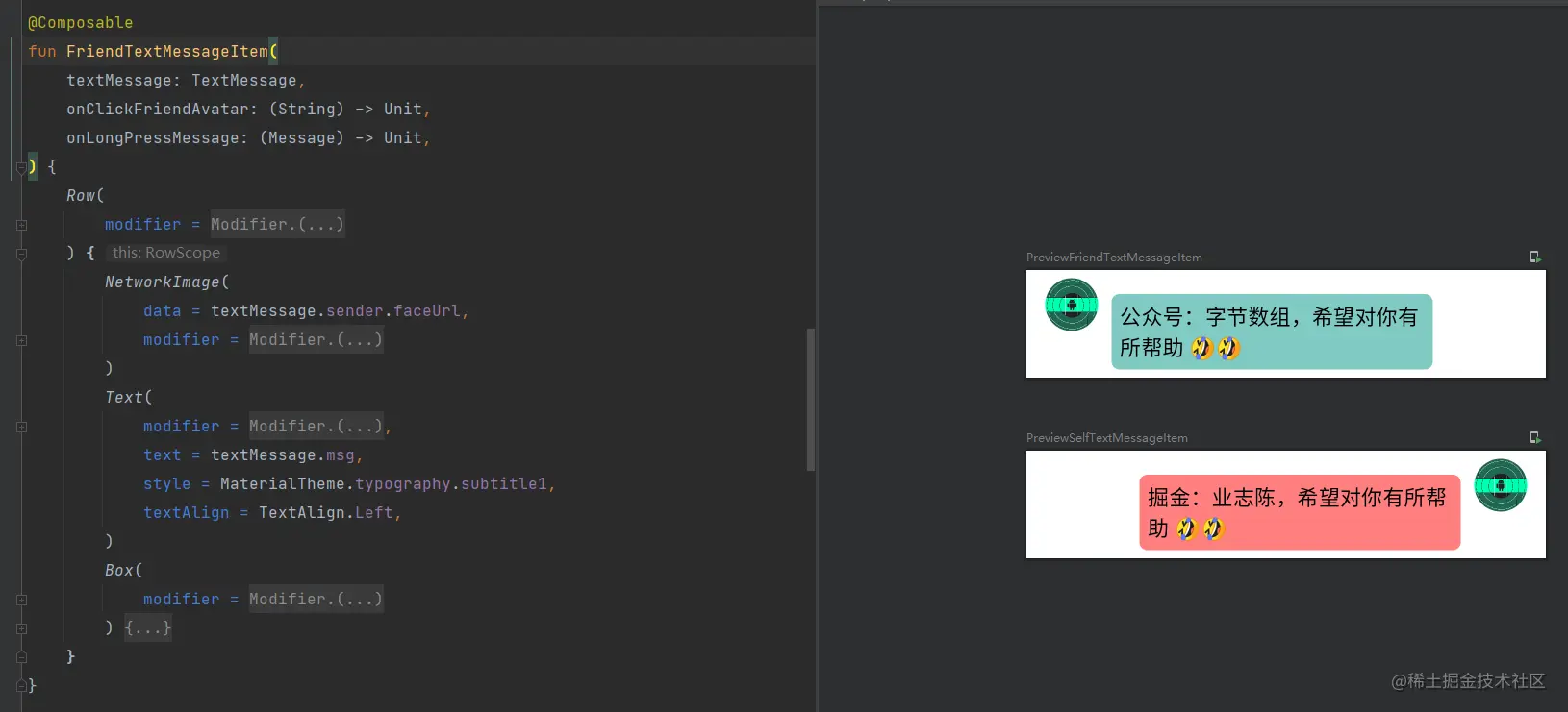
Copy codeA series of "control" functions provided by Compose can basically meet our daily development needs. When developing Compose applications, we can realize various custom requirements by nesting and combining the officially provided controls
With compose_chat as an example, every message sent by a friend is displayed through FriendTextMessageItem(), including a friend's Avatar and a text message, in which multiple official controls are nested
4, Status
Application State refers to any value that can change over time. Its definition is very broad, including the input parameter of the function and the background color of the application
For the traditional View structure of Android, the control will directly hold the State. For example, EditText contains a global variable mText of type CharSequence, which is used to store the text currently displayed by EditText. When you want to change the text content, you need to manually call EditText Settext method to change mText, and EditText will also be refreshed. mText is the State held by EditText
Composition describes the whole screen State by combining multiple composable functions and draws the screen. The only way to update the view is to generate new input parameter and call the composable function again. The new input parameter represents the desired screen State. Whenever the State is updated, the composable function will be triggered to reorganize, so as to realize UI refresh. In the whole process, composable functions do not directly hold the State, but determine how they should be displayed by reading the State
The OutlinedTextField function in Compose is similar to EditText in function, but it will be a little troublesome for OutlinedTextField to achieve the same effect as EditText
Look at the following example. When the user keeps inputting information to the OutlinedTextField, because its value is always an empty string, the OutlinedTextField will only be empty all the time, because the OutlinedTextField will only refresh the UI when the value value changes
@Composable
fun HelloContent() {
    OutlinedTextField(
        value = "",
        onValueChange = {

        }
    )
}
Copy code
If you want the OutlinedTextField to achieve the same effect as EditText, you need an intermediate value to describe its state, that is, the following name. mutableStateOf function returns an observable type integrated with Compose runtime. When mutableState value changes, it will trigger all composable functions reading the value to recombine. The function of remember is to let Compose store the value saved by it in the combination during the initial combination, and return the stored value during the reorganization, so that the value can be retained across the reorganization. Of course, this retention period is limited to a single life cycle of composable functions
@Composable
fun HelloContent() {
var name by remember { mutableStateOf("") }
OutlinedTextField(
value = name,
onValueChange = {
name = it
}
)
}
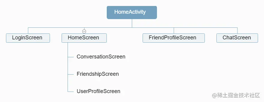
Copy codeWith compose_chat as an example, its main interface is as follows

The main interface is declared by the HomeScreen function, which contains three sub interfaces, corresponding to ConversationScreen, FriendshipScreen and UserProfileScreen. HomeScreen uses screenSelected to control which sub interface needs to be displayed at present. When screenSelected changes, it will trigger the reorganization of HomeScreen function to make the when expression execute again, so as to display the new sub interface
@Composable
fun HomeScreen(
    navController: NavHostController,
    screenSelected: HomeScreenTab,
    onTabSelected: (HomeScreenTab) -> Unit,
    backDispatcher: OnBackPressedDispatcher,
) {
    ModalBottomSheetLayout() {
        Scaffold() {
            when (screenSelected) {
                HomeScreenTab.Conversation -> {
                    ConversationScreen()
                }
                HomeScreenTab.Friendship -> {
                    FriendshipScreen()
                }
                HomeScreenTab.UserProfile -> {
                    UserProfileScreen()
                }
            }
        }
    }
}
Copy code
5, State promotion
Look at the following example. The existence of name is equivalent to making the composable function HelloContent contain an internal state, which is completely invisible to the caller. If the caller does not need to control the state change or receive notification of the state change, hiding the internal state becomes very useful because it reduces the calling cost of the caller. However, composable items with internal state are often not easy to reuse and more difficult to test
@Composable
fun HelloContent() {
    var name by remember { mutableStateOf("") }
    OutlinedTextField(
        value = name,
        onValueChange = {
            name = it
        }
    )
}
Copy code
If you want to transform HelloContent into stateless mode, you need to promote the state. State promotion is a mode that moves the state to the caller of composable items to make composable items stateless. Following the method of OutlinedTextField, the states are provided externally, so that the state value of name is maintained and held by the caller HelloContentOwner
@Composable
fun HelloContent(name: String, onValueChange: (String) -> Unit) {
OutlinedTextField(
value = name,
onValueChange = onValueChange
)
}
@Composable
fun HelloContentOwner() {
var name by remember { mutableStateOf("") }
HelloContent(name = name) {
name = it
}
}
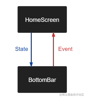
Copy codeWith compose_ Take chat as an example. The sub interface of HomeScreen is switched by clicking the BottomBar at the bottom, that is, the request to switch the sub interface is initiated from the BottomBar. The BottomBar needs to get screenSelected to determine which tab should be selected, and the HomeScreen also needs to get screenSelected to know which sub interface should be displayed. Therefore, the BottomBar should not directly hold the state of screenSelected, but should be provided by the caller. The concept of state promotion is used here
BottomBar does not directly hold screenSelected, but is provided by HomeScreen. When the user clicks the BottomBar, the click event will also be passed up from the BottomBar to HomeScreen (HomeScreen will call back the event to the caller at the higher level). The caller at the top level is responsible for changing the current value of screenSelected, so as to trigger the reorganization of BottomBar and HomeScreen
In the whole process, the BottomBar does not contain any internal state, but is only responsible for passing the user's click event to the caller, which itself is stateless. The ontabs selected callback function is equivalent to the business logic of the application. It is responsible for responding to the user's click event and changing the value of screenSelected, which is equivalent to the state of the application. When the screenSelected changes, Compose will pass the latest state value to the composable function to trigger screen redrawing. The process of recombinable function executing again due to the change of state is called reorganization
@Composable
fun HomeScreen(
    navController: NavHostController,
    screenSelected: HomeScreenTab,
    onTabSelected: (HomeScreenTab) -> Unit,
    backDispatcher: OnBackPressedDispatcher,
) {
    ChatTheme() {
        ProvideWindowInsets {
            ModalBottomSheetLayout {
                Scaffold(
                    bottomBar = {
                        HomeScreenBottomBar(
                            screenList = ViewScreen.values().toList(),
                            screenSelected = screenSelected,
                            onTabSelected = onTabSelected
                        )
                    },
                ) {
                    when (screenSelected) {
                        HomeScreenTab.Conversation -> {
                            ConversationScreen()
                        }
                        HomeScreenTab.Friendship -> {
                            FriendshipScreen()
                        }
                        HomeScreenTab.UserProfile -> {
                            UserProfileScreen()
                        }
                    }
                }
            }
        }
    }
}
Copy code
In the whole process, the state is passed down and the event is passed up. The mode of state falling and event rising is called "one-way data flow". By following the one-way data flow, the composable items displaying the state in the interface can be decoupled from the parts storing and changing the state in the application. Therefore, the interface state of the application should be defined by the input parameter of the composable function, while the business logic of the application should be accommodated and processed by ViewModel, and the processing results of the business logic should be passed to the composable function in the form of new input parameter, so as to respond to the user and update the interface. Following this rule, the UI layer will have a unified and single data source, so that the application is less error prone
When promoting a state, there are three rules to help developers figure out where the state should go:
- The state should be raised at least to the lowest common parent of all composable items that use that state (read)
- The state should be raised at least to the highest level at which it can change (write)
- If the two states change in response to the same event, they should rise together
In my opinion, following the concept of state improvement does not necessarily mean that all composable items are stateless. Although the BottomBar is stateless, the final screenSelected needs to be transferred to the caller of the upper level for holding. The caller is stateful. Although screenSelected can be promoted to ViewModel again for holding, I think it can be promoted to the lowest common parent of all composable items using this state (read), which does not depend on the external environment (e.g., network request, system configuration, etc.) and only depends on user events, There is no need to force all composable items to be stateless
6, Pure function
In many articles or books explaining the best practices of programming, a coding principle will be recommended: use val, immutable objects and pure functions to design programs as much as possible. This principle also needs to be observed in Compose, because a qualified composable function should belong to pure function, idempotent and have no side effects
What is a pure function? If a function is repeatedly executed with the same input parameter, it can always obtain the same operation result, and the operation result will not affect any external state, and there is no need to worry about the external changes caused by repeated execution, then this function is called pure function
Pure functions have no side effects and reference transparency. Side effects refer to modifying something somewhere, such as:
- The value of an external variable is referenced or modified
- IO operations are performed, such as reading and writing SharedPreferences
- UI operations are performed, such as modifying the operable state of a button
The following example is not a pure function. Due to the influence of external variables, the results of executing the count function multiple times with the same input parameter are not all the same, and each execution will affect the external environment (using the println function). These are side effects
var count = 1

fun count(x: Int): Int {
    count += x
    println(count)
    return count
}
Copy code
When using Compose, you should pay attention to:
- Composable functions can be executed in any order
- Composable functions can be executed in parallel
- Reorganization skips as many composable functions and Lambdas as possible
- Restructuring is an optimistic operation and may be cancelled
- Composable functions can run as frequently as every frame of an animation
Look at the following example. According to our intuitive understanding, the three functions in ButtonRow will be executed in sequence, and the three functions will get a count value that increases in turn, but this is not guaranteed in Compose. In order to improve the running efficiency, Compose may execute multiple composable functions in parallel in the background thread, which also means that the order of composable functions is uncertain. Moreover, due to the existence of intelligent reorganization, Compose will automatically recognize which composable functions have not changed, so as to skip the reorganization, and only re execute some changed functions, so as to update only a part of the screen
These measures of Compose are to improve the running efficiency of the program and the drawing efficiency of the screen, but this also leads to the fact that composable functions are not guaranteed when reading and writing external variables. We cannot assume that StartScreen has modified count before executing MiddleScreen, and the order of the two may be completely opposite or even not executed at all
@Composable
fun ButtonRow() {
    StartScreen()
    MiddleScreen()
    EndScreen()
}

var count = 0

@Composable
fun StartScreen() {
    Text(text = count.toString())
    count += 1
}

@Composable
fun MiddleScreen() {
    Text(text = count.toString())
    count += 1
}

@Composable
fun EndScreen() {
    Text(text = count.toString())
    count += 1
}
Copy code
In addition, the composable function may be re executed as frequently as each frame. For example, when executing the animation, the composable function will execute quickly to avoid jamming during the playback of the animation. In this process, the composable function will be repeatedly called. If the composable function has side effects, such as the operation of reading and writing SharedPreferences, it may be called hundreds of times a second, which will seriously affect the rendering efficiency of the screen and cause the page to get stuck. Therefore, such expensive operations need to be executed in the background collaboration, And pass the execution result as a parameter to the composable function
Therefore, composable functions need to be free of side effects in order to get the correct expected results. In addition, composable functions should always present the same representation for the same input parameters. Multiple composable functions should be state independent and cannot depend on each other. The shared state should be passed in the form of input parameters, and the state should be maintained in the top-level function or ViewModel
7, Side effects
In some cases, composable functions may not be completely free of side effects. For example, when switching application topics, we hope that the system status bar can change the background color together. At this time, composable functions have side effects. To deal with this situation, Compose also provides an Effect API to perform these side effects in a predictable manner
With compose_ Take chat as an example. Setting the color of the system status bar is achieved through the SetSystemBarsColor() function. We hope that SetSystemBarsColor() can be executed once when the application is just started and when the application theme changes, which can be realized through DisposableEffect
When the DisposableEffect enters the combination or the key changes, the code in the DisposableEffect will be executed to change the system status bar. In addition, it will not be executed again every time the interface is reorganized, so as to avoid meaningless calls
@Composable
fun SetSystemBarsColor(
    key: Any = Unit,
    statusBarColor: Color = MaterialTheme.colors.background,
    navigationBarColor: Color = MaterialTheme.colors.background
) {
    val systemUiController = rememberSystemUiController()
    val isLight = MaterialTheme.colors.isLight
    DisposableEffect(key1 = key) {
        systemUiController.setStatusBarColor(
            color = statusBarColor,
            darkIcons = isLight
        )
        systemUiController.setNavigationBarColor(
            color = navigationBarColor,
            darkIcons = isLight
        )
        systemUiController.systemBarsDarkContentEnabled = isLight
        onDispose {

        }
    }
}
Copy code
The Key passed by HomeScreen to SetSystemBarsColor, that is, appTheme, ensures that the DisposableEffect will be executed again after each topic switching
@Composable
fun HomeScreen(
    navController: NavHostController,
    screenSelected: HomeScreenTab,
    onTabSelected: (HomeScreenTab) -> Unit
) {
    val homeViewModel = viewModel<HomeViewModel>()
    val appTheme by homeViewModel.appTheme.collectAsState()
    ChatTheme(appTheme = appTheme) {
        ProvideWindowInsets {
            SetSystemBarsColor(
                key = appTheme,
                statusBarColor = Color.Transparent,
                navigationBarColor = MaterialTheme.colors.primaryVariant
            )
        }
    }
}
Copy code
For more information about the Effect API, please see here: Side effects in Compose
8, Layout
Layout is a necessary function of every UI framework. Whether it is View, fluent or Compose, it must provide some layout controls out of the box. Here is the introduction of Compose_ ConstraintLayout and LazyColumn, which are commonly used in chat
ConstraintLayout
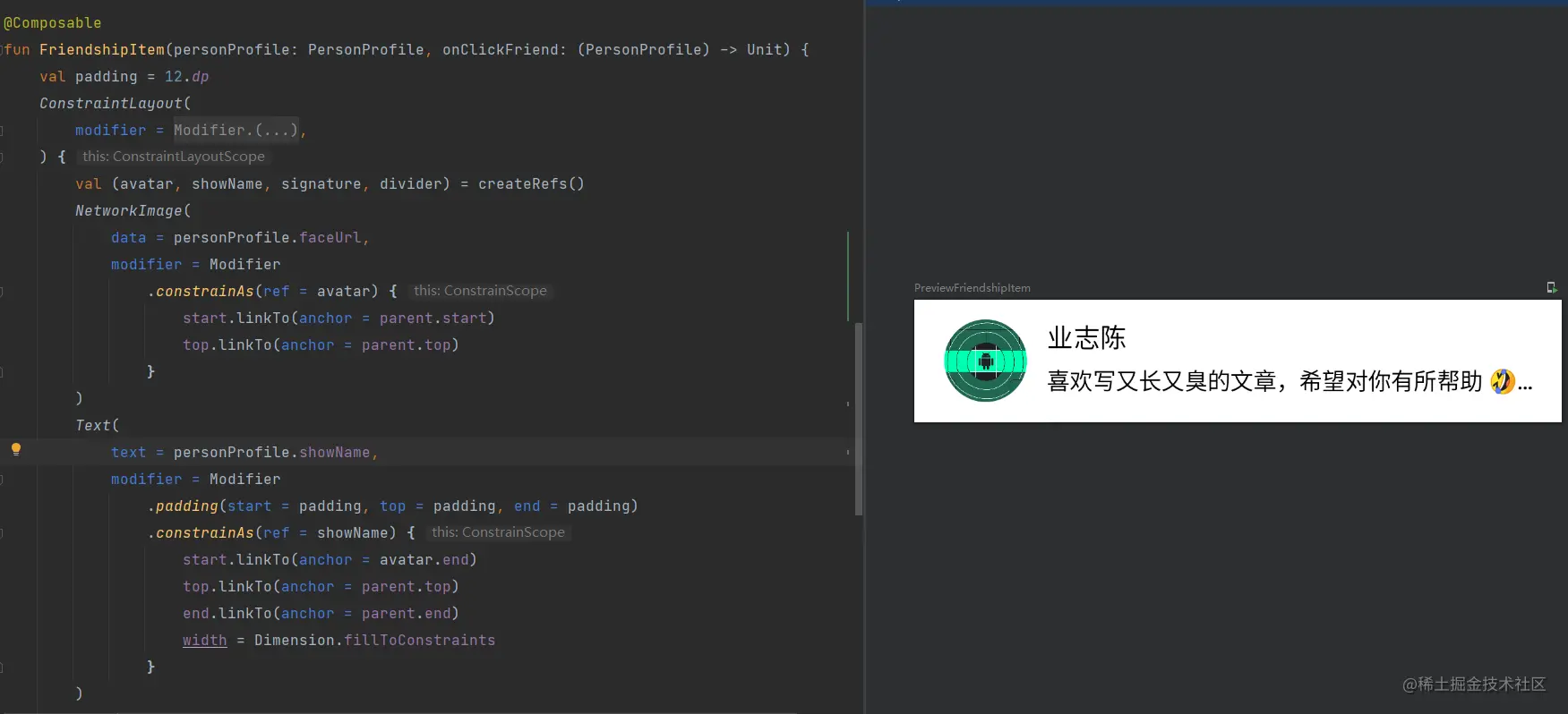
Under the previous Android View system, we will try to avoid multi-layer nesting in the layout, because the deeper the nesting level, the more times and time will be required to measure the View, which will seriously affect the running performance of the application. Therefore, Google officials also suggest that developers try to use ConstraintLayout for layout to realize flat layout. However, Compose is different. Because Compose can avoid multiple measurements, developers can nest deeply as needed without worrying about affecting performance. At the same time, Compose also provides its own constraint layout composition for constraint positioning
With compose_ Take chat as an example. Each friend list Item corresponds to the FriendshipItem() function, which internally uses the ConstraintLayout for layout, which is similar to the View version. First, you need to declare the reference of the "control" through createRefs(), and then bind the reference to the "control" through constrainAs, which is similar to declaring the ID for the "control". Then, each "control" can be associated and located through the linkTo method, in which the parent refers to the ConstraintLayout itself
LazyColumn
Under the previous Android View system, we usually use RecyclerView to load long lists, so that we can cache and reuse items. RecyclerView has excellent sliding performance and can effectively avoid sliding jams caused by excessive data. The disadvantage is that developers need to declare various adapters and viewholders, This is troublesome
The corresponding RecyclerView in Compose is the LazyColumn() function. You can guess from the name that this function is a vertical sliding list and implements lazy loading. In fact, LazyColumn does implement the cache reuse mechanism of Item, which is much simpler to use than RecyclerView, because we no longer need to declare all kinds of cumbersome adapters and viewholders
With compose_ Take chat as an example. After getting the friendList of the friends list, through the for loop, each person profile corresponds to a list Item item item() of LazyColumn. The FriendshipItem() declared in the item() function is the view to be rendered by each list Item. By calling the item() function in a loop, you can complete the declaration of the data items in the entire sliding list. Even if there are multiple styles of items, you can declare them in the same way, just like in the following example, I added a bottom spacing Spacer to the list
@Composable
fun FriendshipScreen(
    paddingValues: PaddingValues,
    friendList: List<PersonProfile>,
    onClickFriend: (PersonProfile) -> Unit
) {
    Scaffold(
        modifier = Modifier
            .padding(bottom = paddingValues.calculateBottomPadding())
            .fillMaxSize()
    ) {
        if (friendList.isEmpty()) {
            EmptyView()
        } else {
            LazyColumn {
                friendList.forEach {
                    item(key = it.userId) {
                        FriendshipItem(personProfile = it, onClickFriend = onClickFriend)
                    }
                }
                item {
                    Spacer(modifier = Modifier.height(40.dp))
                }
            }
        }
    }
}
Copy code
9, Animation & gesture manipulation
Jetpack Compose provides some powerful and extensible APIs that can be used to easily realize various animation effects in the application interface. Animation is very important in modern mobile applications. Its purpose is to achieve a natural, smooth and easy to understand user experience. Many Jetpack Compose animation APIs can provide composable functions, just like layout and other interface elements; They are supported by lower level APIs built using the Kotlin coroutine suspend function
In addition, Compose also provides a variety of APIs for detecting gestures generated by user interaction. The API covers various use cases:
- Some of them are high-level and are designed to cover the most commonly used gestures. For example, the clickable modifier can be used to easily detect clicks. In addition, it provides accessibility and displays visual indications (such as ripples) on time at points
- There are also less commonly used gesture detectors that provide greater flexibility at lower levels, such as pointerinputscope Detecttapgestures or pointerinputscope Detectdraggestures, but does not provide additional features
With compose_ Take chat as an example. Profile screen on the profile page is applied to animation and gesture operation at the same time: the background image includes three kinds of animation: cutting + scaling + rotation. Users can drag the avatar to move. When they let go, the avatar will automatically move back to its original position through spring animation

animation
As mentioned in many places before, the only way to update the view is to generate new input parameters and call composable functions again, and so is animation. If you want the view to be transformed in a coherent and natural way, that means you need a value generator to change the parameter values of composable functions consistently
ProfileScreen uses rememberInfiniteTransition() to achieve this effect. Infinite transition saves sub animations through animateFloat, animateValue, animateColor, etc. these animations start running as soon as they enter the combination stage, and will not stop unless they are removed. Then specify an initial value and an end value for InfiniteTransition, and specify that the animation runs back and forth in the form of inversion. animateValue will continuously change between the two values, and then apply animateValue to the layout parameters of the background image to achieve the animation effect
        val animateValue by rememberInfiniteTransition().animateFloat(
            initialValue = 1.3f, targetValue = 1.9f,
            animationSpec = infiniteRepeatable(
                animation = tween(durationMillis = 1800, easing = FastOutSlowInEasing),
                repeatMode = RepeatMode.Reverse,
            ),
        )
        NetworkImage(
            data = userFaceUrl,
            modifier = Modifier
                .constrainAs(ref = background) {

                }
                .fillMaxWidth()
                .aspectRatio(ratio = 5f / 4f)
                .scrim(colors = listOf(Color(0x40000000), Color(0x40F4F4F4)))
                .clip(shape = BezierShape(padding = animateValue * 100)) //Cutting
                .scale(scale = animateValue) //zoom
                .rotate(degrees = animateValue * 10.3f) //rotate
        )
Copy code
Gesture operation
The Modifier in Compose is very powerful. It is not only used for layout, but also needs to be completed like click events and gesture operations. The pointerInput function is used to identify the user's gesture operations. The Modifier also provides the offset function to control the offset of the control. The offset of the control is dynamically changed by combining the pointerInput and offset functions, You can drag and drop the user's Avatar
During the process of dragging and dropping the OutlinedAvatar, the system will constantly call back the onDrag function. In the callback, the user can continuously trigger the reorganization of the OutlinedAvatar by constantly changing the two values of offsetX and offsetY through the dragging value of the user, so as to realize the dragging effect. When the user lets go, the onDragEnd function will be called back, and then the offset of OutlinedAvatar will be reset to zero through Animatable. In this way, the effect of automatically moving back to the original position can be realized
        val coroutineScope = rememberCoroutineScope()
        var offsetX by remember { mutableStateOf(0f) }
        var offsetY by remember { mutableStateOf(0f) }
        OutlinedAvatar(
            data = userFaceUrl,
            modifier = Modifier
                .offset {
                    IntOffset(
                        x = offsetX.roundToInt(),
                        y = offsetY.roundToInt()
                    )
                }
                .pointerInput(Unit) {
                    detectDragGestures(
                        onDragStart = {

                        },
                        onDragCancel = {

                        },
                        onDragEnd = {
                            coroutineScope.launch {
                                Animatable(
                                    initialValue = Offset(offsetX, offsetY),
                                    typeConverter = Offset.VectorConverter
                                ).animateTo(
                                    targetValue = Offset(x = 0f, y = 0f),
                                    animationSpec = SpringSpec(dampingRatio = Spring.DampingRatioHighBouncy),
                                    block = {
                                        offsetX = value.x
                                        offsetY = value.y
                                    }
                                )
                            }
                        },
                        onDrag = { change, dragAmount ->
                            change.consumeAllChanges()
                            offsetX += dragAmount.x
                            offsetY += dragAmount.y
                        },
                    )
                }
        )
Copy code
10, Theme
Previously, Android applications needed to declare multiple XML files when implementing multi Theme theme switching. For example, two sets of colors were required when implementing night mode XML and styles XML, this mechanism can not be said to be low in performance, but it is not high in ease of use
The Theme of compose is excellent. It is completely implemented based on Kotlin language, avoiding the sense of fragmentation of the original implementation. Compared with the original implementation, it has improved a lot in performance and ease of use. Compose provides a Theme based on Material Design style, material Theme, androidx compose. All controls provided in the material package are designed in accordance with MaterialTheme to ensure a unified style of the whole application
When you use Android Studio to create a Compose project, it will be automatically displayed in UI The following four files are created in the theme package directory, of which Dark and Light theme styles are provided by default
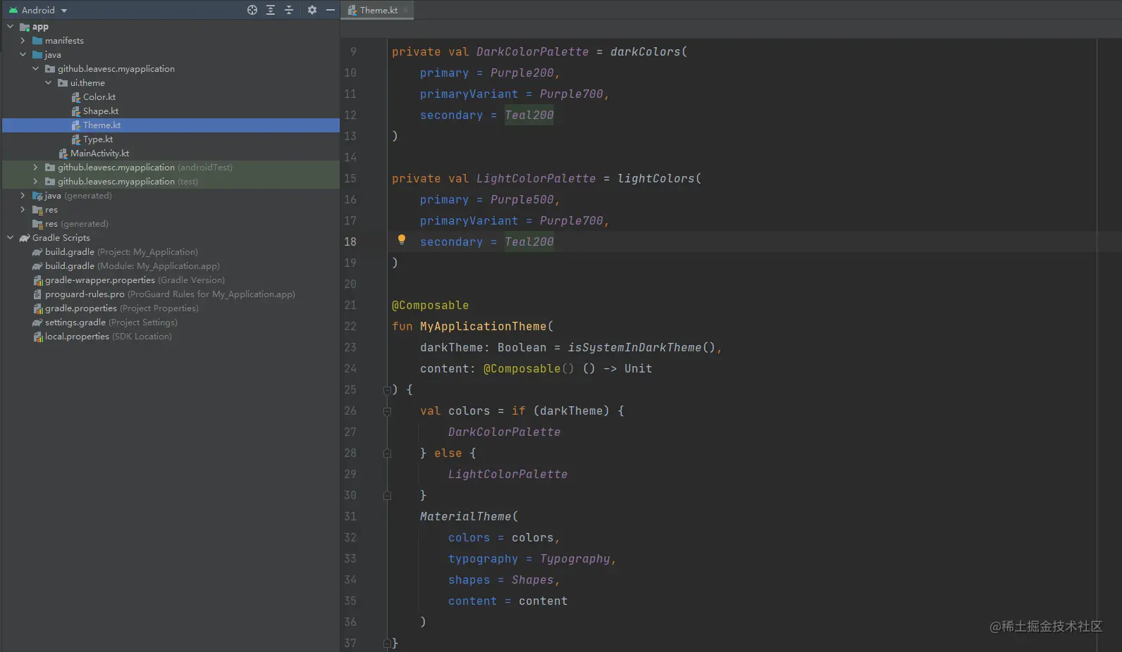
DarkColorPalette and LightColorPalette define the color values used in night mode and day mode respectively. Different theme styles can be realized by selecting different colors objects and passing them to MaterialTheme
private val DarkColorPalette = darkColors(
    primary = Purple200,
    primaryVariant = Purple700,
    secondary = Teal200
)

private val LightColorPalette = lightColors(
    primary = Purple500,
    primaryVariant = Purple700,
    secondary = Teal200
)

@Composable
fun MyApplicationTheme(
    darkTheme: Boolean = isSystemInDarkTheme(),
    content: @Composable() () -> Unit
) {
    val colors = if (darkTheme) {
        DarkColorPalette
    } else {
        LightColorPalette
    }
    MaterialTheme(
        colors = colors,
        typography = Typography,
        shapes = Shapes,
        content = content
    )
}
Copy code
MaterialTheme consists of colors, typesetting and shape shapes. When these attributes are customized, the changes will be automatically reflected in all components used to build applications. MaterialTheme will save different configuration item mappings as application environment variables. For example, the colors we pass in will be saved as the static constant LocalColors
internal val LocalColors = staticCompositionLocalOf { lightColors() }

@Composable
fun MaterialTheme(
    colors: Colors = MaterialTheme.colors,
    typography: Typography = MaterialTheme.typography,
    shapes: Shapes = MaterialTheme.shapes,
    content: @Composable () -> Unit
) {
    val rememberedColors = remember {
        // Explicitly creating a new object here so we don't mutate the initial [colors]
        // provided, and overwrite the values set in it.
        colors.copy()
    }.apply { updateColorsFrom(colors) }
    val rippleIndication = rememberRipple()
    val selectionColors = rememberTextSelectionColors(rememberedColors)
    CompositionLocalProvider(
        LocalColors provides rememberedColors,
        LocalContentAlpha provides ContentAlpha.high,
        LocalIndication provides rippleIndication,
        LocalRippleTheme provides MaterialRippleTheme,
        LocalShapes provides shapes,
        LocalTextSelectionColors provides selectionColors,
        LocalTypography provides typography
    ) {
        ProvideTextStyle(value = typography.body1, content = content)
    }
}
Copy code
Various "control" functions provided in Compose will read the color value in LocalColors by default to paint themselves. For example, surface is defaulted to materialtheme colors. Surface as background color
@Composable
fun Surface(
    modifier: Modifier = Modifier,
    shape: Shape = RectangleShape,
    color: Color = MaterialTheme.colors.surface,
    contentColor: Color = contentColorFor(color),
    border: BorderStroke? = null,
    elevation: Dp = 0.dp,
    content: @Composable () -> Unit
)
Copy code
With compose_ For example, chat provides three sets of topics: Light, Dark and Pink

The three theme types correspond to the enumeration class AppTheme and three sets of color values. You can pass different color values to MaterialTheme according to the currently selected theme type
private val LightColorPalette = lightColors(
    background = BackgroundColorLight,
    primary = PrimaryColorLight,
    primaryVariant = PrimaryVariantColorLight,
    surface = SurfaceColorLight,
    secondary = DivideColorLight,
)

private val DarkColorPalette = darkColors(
    background = BackgroundColorDark,
    primary = PrimaryColorDark,
    primaryVariant = PrimaryVariantColorDark,
    surface = SurfaceColorDark,
    secondary = DivideColorDark,
)

private val PinkColorPalette = lightColors(
    background = BackgroundColorPink,
    primary = PrimaryColorPink,
    primaryVariant = PrimaryVariantColorPink,
    surface = SurfaceColorPink,
    secondary = DivideColorPink,
)

@Composable
fun ChatTheme(
    appTheme: AppTheme = AppThemeHolder.currentTheme,
    content: @Composable () -> Unit
) {
    val colors = when (appTheme) {
        AppTheme.Light -> {
            LightColorPalette
        }
        AppTheme.Dark -> {
            DarkColorPalette
        }
        AppTheme.Pink -> {
            PinkColorPalette
        }
    }
    val typography = if (appTheme.isDarkTheme()) {
        DarkTypography
    } else {
        LightTypography
    }
    MaterialTheme(
        colors = colors,
        typography = typography,
        shapes = AppShapes,
        content = content
    )
}
Copy code
The topic switching of Compose also depends on the reorganization operation of composable functions. With Compose_ Taking chat as an example, the whole interior of HomeScreen is wrapped in ChatTheme. When the application theme is switched, that is, the appTheme is changed, it will trigger the reorganization of ChatTheme and HomeScreen, and the reorganization process will read the latest theme configuration, so as to realize theme switching
@Composable
fun HomeScreen(
    navController: NavHostController,
    screenSelected: ViewScreen,
    onTabSelected: (ViewScreen) -> Unit
) {
    val homeViewModel = viewModel<HomeViewModel>()
    val appTheme by homeViewModel.appTheme.collectAsState()
    ChatTheme(appTheme = appTheme) {

    }
}
Copy code
It can be seen that the theme switching of Compose completely depends on memory reading and writing, which avoids the situation that the native Android method also needs to read XML files through IO stream. It is relatively much more efficient in execution, and it is also very convenient when defining themes. It only needs to declare one more Colors object, which is type safe and helps to reduce the amount of code
11, Ending
Most of the knowledge points about Jetpack Compose have been finished. I feel composed_ Chat can help readers get started. Of course, the source code is indispensable in the end
Project address: compose_chat
APK Download: compose_chat
Since the free version of Tencent cloud IM SDK can only register up to 100 accounts, readers can use the following accounts I registered in advance if they find that they can't register, but if multiple devices log in at the same time, they will squeeze each other out of the line~~
- Android
- Compose
- Flutter
- Java
- Kotlin
- Dart
- Jetpack
- ViewModel
- LiveData
Author: ye Zhichen
Link: https://juejin.cn/post/6991429231821684773
Source: rare earth Nuggets
The copyright belongs to the author. For commercial reprint, please contact the author for authorization. For non-commercial reprint, please indicate the source.