This article uses an example of PageView to impress you, and in a subsequent column, we'll deepen this example to create an image Banner that supports infinite sliding from top to bottom, and teach you how to make it a Dart library and open it to others.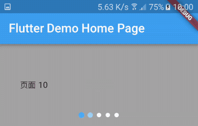
I. Unlimited Sliding PageView
Before implementing the PageView indicator, we need to implement a PageView first. Implementing a PageView in Flutter is simple.
class BannerGalleryWidget extends StatefulWidget {
  @override
  State<StatefulWidget> createState() {
    return BannerGalleryWidgetState();
  }
}

class BannerGalleryWidgetState extends State<BannerGalleryWidget> {
  final PageController controller = PageController(initialPage: 200);

  @override
  Widget build(BuildContext context) {
    return SizedBox(
        height: 250.0,
        child: Container(
          color: Colors.grey,
          child: PageView.builder(
            controller: controller,
            itemBuilder: (context, index) {
              return new Center(
                child: new Text('page ${index}'),
              );
            },
          ),
        ));
  }
}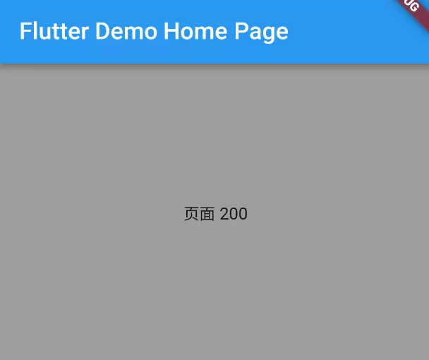
The above code will give you such an interface. Explain the code a little:
/// Specify a controller to control the sliding of PageView and the initial position on page 200
/// Mainly for the realization of "infinite cycle"
final PageController controller = PageController(initialPage: 200);

/// A container of fixed size, designated here as 250.
SizedBox(height: 250.0)
/// A container used to set the background color to grey
Container(color: Colors.grey)
/// The protagonist PageView displays the current index in the middle of the text.
PageView.builder(
            controller: controller,
            itemBuilder: (context, index) {
              return new Center(
                child: new Text('page ${index}'),
              );},),
2. Implementing an Indicator
With an infinite sliding PageView, let's associate an indicator:
class Indicator extends StatelessWidget {
  Indicator({
    this.controller,
    this.itemCount: 0,
  }) : assert(controller != null);

  /// PageView Controller
  final PageController controller;

  /// Number of indicators
  final int itemCount;

  /// Ordinary colours
  final Color normalColor = Colors.blue;

  /// Selected color
  final Color selectedColor = Colors.red;

  /// Size of points
  final double size = 8.0;

  /// Spacing of points
  final double spacing = 4.0;

  /// Point Widget
  Widget _buildIndicator(
      int index, int pageCount, double dotSize, double spacing) {
    // Is the current page selected?
    bool isCurrentPageSelected = index ==
        (controller.page != null ? controller.page.round() % pageCount : 0);

    return new Container(
      height: size,
      width: size + (2 * spacing),
      child: new Center(
        child: new Material(
          color: isCurrentPageSelected ? selectedColor : normalColor,
          type: MaterialType.circle,
          child: new Container(
            width: dotSize,
            height: dotSize,
          ),
        ),
      ),
    );
  }

  @override
  Widget build(BuildContext context) {
    return new Row(
      mainAxisAlignment: MainAxisAlignment.center,
      children: new List<Widget>.generate(itemCount, (int index) {
        return _buildIndicator(index, itemCount, size, spacing);
      }),
    );
  }
}
This code is relatively simple, and a horizontal List is built in the build() method.
List's Item is a fixed-size dot, selected as a color, not another color.
III. Relevant PageView and Indicators
class BannerGalleryWidgetState2 extends State<BannerGalleryWidget2> {
  final PageController controller = PageController(initialPage: 200);

  void _pageChanged(int index) {
    setState(() {});
  }

  @override
  Widget build(BuildContext context) {
    return Column(
      children: <Widget>[
        SizedBox(
            height: 150.0,
            child: Container(
              color: Colors.grey,
              child: PageView.builder(
                onPageChanged: _pageChanged,
                controller: controller,
                itemBuilder: (context, index) {
                  return new Center(
                    child: new Text('page ${index}'),
                  );
                },
              ),
            )),
        Indicator(
          controller: controller,
          itemCount: 5,
        ),
      ],
    );
  }
}
Change the layout container, wrap PageView and Indicator in a column, add an onPageChanged to PageView, and check that setState() refreshes the UI when the page changes.
IV. Summary
So far, the infinite sliding PageView indicator has been completed, and although it looks a little different from the sample image at the beginning of the column, at least the requirement has been fulfilled. But now the indicator is silly, for example, it won't change color until it's selected, and it won't zoom in. In the next column, I will teach you how to improve the indicator and provide the complete code for the whole project. Please look forward to it.