Scalable vector image
Simple understanding
Used to describe two - dimensional vector graphics, XML - based markup language
What is vector graphics
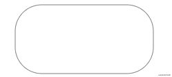
The figures described by lines and curves are composed of some points, lines, rectangles, polygons, circles and arcs, which are calculated by mathematical formulas and have the characteristics of no distortion after editing.
advantage
- Elegant and concise rendering of graphics of different sizes
- It can connect seamlessly with CSS, DOM, JS and other network standards
- You can search, index, script and compress
- You can edit with a text editor or a graphic editor
- Infinite amplification without distortion and quality degradation
Small trial ox knife
Define several common graphics: complex graphics such as circle, rectangle, line or curve, and support gradient, rotation, animation, filter and other effects
svg basic elements svg root elements and other graphic elements, grouping elements g, elements and attributes must be written in strict accordance with the specification and case sensitive
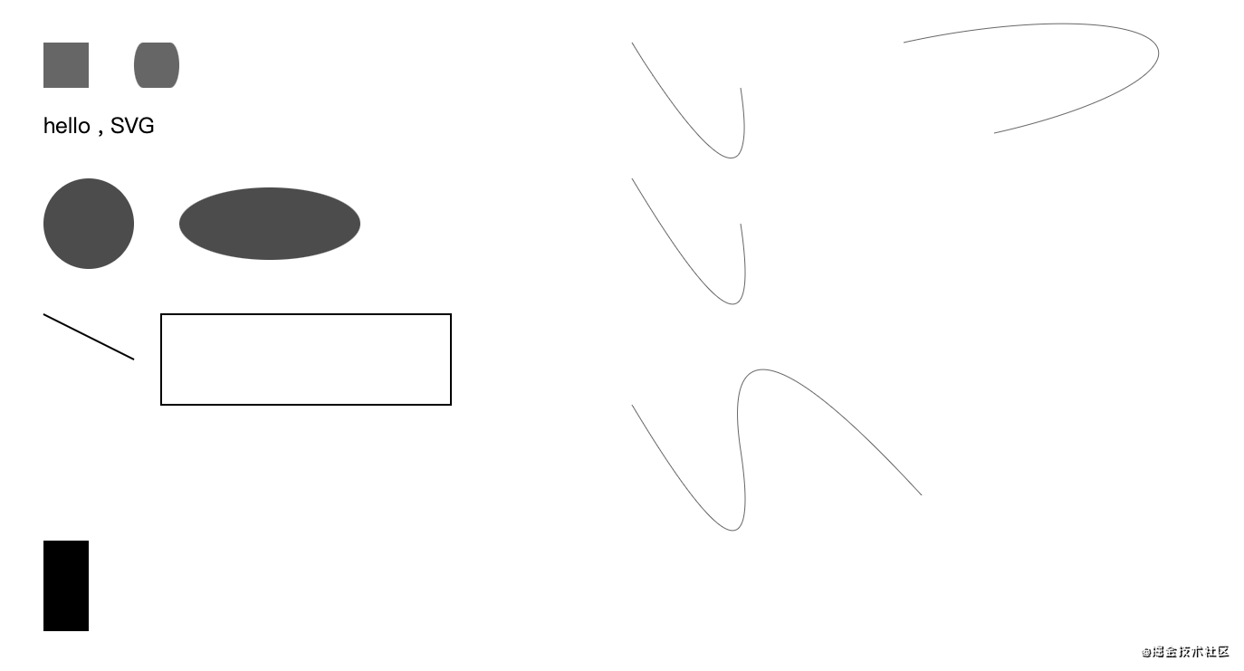
Draw rectangle, circle, text
Simple example:
<svg xmlns="http://www.w3.org/2000/svg">
    <rect x="50" y="50" width="50" height="50" fill="rgba(0,0,0,.6)"></rect>
    <circle cx="100" cy="250" r="50" fill="rgba(0,0,0,.7)"></circle>
    <text x="50" y="150" font-size="24" fill="#000">hello , SVG </text>
</svg>
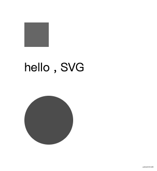
- xmlns is a space declaration and must exist with binding value of http://www.w3.org/2000/svg
- rect - rectangle, circle - circle, text - text; The fill property is the color value of the fill
- The coordinate point drawn by x\y\width\hegiht. The default upper left corner is the starting point (0,0)
It can be directly embedded in HTML
It can also be embedded through object element or iframe
<object data="icon.svg" type="image/svg+xml">

</object>
It can be dynamically created and injected into HTML through JS
Basic graphic description
All complex graphics can be split and composed of basic graphic elements Mastering the basic graphic composition, you can create more complex graphic elements
The drawing of rectangle, circle and text has been basically shown in the example The graphic elements and attributes are described in detail below
Rectangle - rect
- x - upper left corner
- y - upper right corner
- Width - width
- Height - height
- rx - radius of the fillet in the x direction
- ry - radius of the y direction of the fillet
<svg xmlns="http://www.w3.org/2000/svg">
    <rect x="50" y="50" width="50" height="50" fill="rgba(0,0,0,.6)"></rect>
    <rect x="150" y="50" width="50" height="50" rx="10" ry="10" fill="rgba(0,0,0,.6)"></rect>
</svg>

If rx\ry settings are the same, only rx or ry can be set
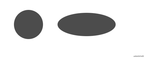
Circle - circle
- r - circle radius
- cx - circular x position
- cy - position of circle y
Ellipse ellipse
- rx - ellipse x radius
- ry - y radius of ellipse
- cx - ellipse center x position
- cy - ellipse center y position
<svg xmlns="http://www.w3.org/2000/svg">
    <circle cx="100" cy="250" r="50" fill="rgba(0,0,0,.7)"></circle>
    <ellipse cx="300" cy="250" rx="100" ry="40" fill="rgba(0,0,0,.7)"/>
</svg>
Line - line
- x1 - starting point x position
- y1 - start y position
- x2 - end x position
- y2 - end y position
Polyline - polyline
- points - point set sequence, blank split number; Comma, line break, space separator Example: 2, 3, 23, 3, 1, 2
<svg xmlns="http://www.w3.org/2000/svg">
    <line x1="50" y1="350" x2="150" y2="400" stroke="rgba(0,0,0.6)" stroke-width="2"/>
    <polyline points="180 350,500 350,500 450,180 450,180 350" fill="transparent" stroke="rgba(0,0,0.6)" stroke-width="2"/>
</svg>
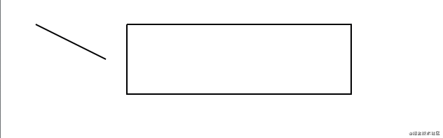
polyline draws a rectangle. Other attributes such as stroke \ stroke width define the color and width to be drawn
Polygon polygon
- Points - point set sequence, white space separated numbers, comma separated points Example: 2, 3, 23, 3, 1, 2
Unlike polylines, it is automatically merged, that is, the last point is connected back to the first point
<svg xmlns="http://www.w3.org/2000/svg">
    <line x1="50" y1="350" x2="150" y2="400" stroke="rgba(0,0,0.6)" stroke-width="2"/>
    <!-- <polyline points="180 350,500 350,500 450,180 450,180 350" fill="transparent" stroke="rgba(0,0,0.6)" stroke-width="2"/> -->
    <polygon points="180 350,500 350,500 450,180 450" fill="transparent" stroke="rgba(0,0,0.6)" stroke-width="2"/>
</svg>
You can see that the last point in the points point set does not need a starting point
Path - path
- d - point set sequence is a sequence set of Command + parameters
You can draw any graph, including rectangle, circle, ellipse, polyline, polygon, Bezier curve, conic, etc,
There are many commands available for drawing these figures to represent the drawing intention It can be divided into straight lines and curves These commands indicate absolute positioning in uppercase and relative positioning in lowercase
Line drawing
- M\m move to a location
- L\l draws a line from the current position to the specified point
- H\h represents the moving distance on the x-axis. There is only one parameter
- V\v represents the moving distance on the y axis, and there is only one parameter
Using the above command, draw a rectangle:
Explain: move start to (50100) - move horizontally x to 100 (width 50) - move vertically to 700 (height 100) - move horizontally to 50 - draw lines (50600) Close the start point
<svg xmlns="http://www.w3.org/2000/svg">
    <path d="M 50 600 H 100 V 700 H 50 L 50 600" />
</svg>
Closed waypoints can be simplified with the command:
- Z\z closed path
<svg xmlns="http://www.w3.org/2000/svg">
    <!-- <path d="M 50 600 H 100 V 700 H 50 L 50 600" /> -->
         <path d="M 50 600 H 100 V 700 H 50 Z" />
</svg>
The upper case instructions used above are absolute positioning, that is, drawing relative to the origin (0,0). Through relative positioning, use the lower case command to simplify the calculation
<svg xmlns="http://www.w3.org/2000/svg">
    <!-- <path d="M 50 600 H 100 V 700 H 50 L 50 600" /> -->
    <!-- <path d="M 50 600 H 100 V 700 H 50 Z" /> -->
    <path d="M 50 600 h 50 v 100 h -50 z" />
</svg>
Curve drawing
There are three commands for drawing smooth curves, two for drawing Bezier curves and the other for drawing arcs
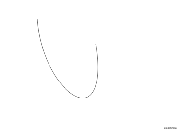
- C\c to create cubic Bezier curve C, defining one point and two control points
<svg xmlns="http://www.w3.org/2000/svg">
    <path d="M 700 50 c 10 150,150 250,120 50" fill="none" stroke="rgba(0,0,0,.6)" />
</svg>
fill="none" is removed, stroke="rgba(0,0,0,.6)" is drawn, lowercase relative positioning is adopted, and point coordinate operation is simplified
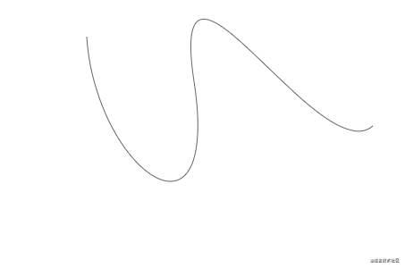
If you need to link multiple Bezier curves, use the following command:
- S\s, the previous point is the control point, keep the slope consistent, and the parameters are two points It ends in the direction from the second point to the end point
<svg xmlns="http://www.w3.org/2000/svg">
    <path d="M 700 50 c 10 150,150 250,120 50 s 140 100,200 50"
        fill="none"
        stroke="rgba(0,0,0,.6)" />
</svg>
If S is not preceded by C or S, draw a curve starting from the current point Achieve the drawing effect of Bezier curve
<svg xmlns="http://www.w3.org/2000/svg">
    <!-- <path d="M 700 50 c 10 150,150 250,120 50 s 140 100,200 50" fill="none" stroke="rgba(0,0,0,.6)" /> -->
    <path d="M 700 50 s 150 250,120 50" fill="none" stroke="rgba(0,0,0,.6)" />
</svg>
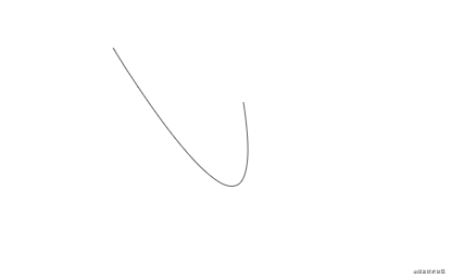
- Q\s to draw quadratic Bezier curve Q, only one control point and endpoint coordinates are required
<svg xmlns="http://www.w3.org/2000/svg">
    <!-- <path d="M 700 50 c 10 150,150 250,120 50 s 140 100,200 50" fill="none" stroke="rgba(0,0,0,.6)" /> -->
    <path d="M 700 50 s 150 250,120 50" fill="none" stroke="rgba(0,0,0,.6)" />
    <path d="M 700 200 q 150 250,120 50" fill="none" stroke="rgba(0,0,0,.6)" />
</svg>
You can get the same curve as the above example
- T \ TEXTENSION command of conic, through the previous control point, you can only define the end point and draw the curve
The T command must be preceded by a Q or T command If used alone, a straight line is drawn
<svg xmlns="http://www.w3.org/2000/svg">
    <!-- <path d="M 700 200 q 150 250,120 50" fill="none" stroke="rgba(0,0,0,.6)" /> -->
    <path d="M 700 450 q 150 250,120 50 t 200 50" fill="none" stroke="rgba(0,0,0,.6)" />
</svg>
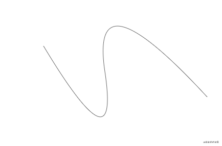
By observing several renderings, we can see that the radians of cubic Bezier curve and quadratic Bezier curve are different from the starting and ending points
Arc
- A\a draw an arc,
a rx ry x-axis-rotation large-arc-flag sweep-flag x y
Parameter Description:
- rx ry x-axis radius, y-axis radius
- x-axis-rotation the rotation angle of the arc
- Large arc flag angle size, 0 indicates that the small angle is less than 180 degrees; 1 indicates that the large angle is greater than 180 degrees;
- Sweep flag indicates the direction of the arc, and 0 indicates drawing an arc counterclockwise; 1 indicates clockwise arc;
- The end of the x y arc
<svg xmlns="http://www.w3.org/2000/svg">
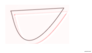
<path d="M 1000 50 a 10 40,90,0,1,100 100" fill="none" stroke="rgba(0,0,0,.6)" />
</svg>
Description: positioning (1000,50) - draw an arc with the x-axis radius of 10 and the y-axis radius of 40 - rotate 90 degrees clockwise - the end point is (100100)
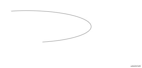
However, the value of large arc flag has been measured many times, but no effect has been set
Here is the full graph of the above test:
Other label descriptions
There are also some element labels for aided design
defs
- Define graphic elements that need to be reused and render them elsewhere with the use element
- You can define a style
- Define animation and gradient elements
- Define script script
- ...
use
The target node can be obtained, copied and displayed elsewhere
<svg xmlns="http://www.w3.org/2000/svg" xmlns:xlink="http://www.w3.org/1999/xlink">
    <path id="path" d="M 250 50 c 10 10,25 225,180 -10" fill="rgba(0,0,0,.5)" />
    <use xlink:href="#path" x="100" y="0" />
</svg>
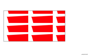
pattern
Pattern template, defined in defs, can be fill ed or stroke d
- x\y - defines where to start
- width\height - defines the size of the parent element of the current template station
<svg xmlns="http://www.w3.org/2000/svg" xmlns:xlink="http://www.w3.org/1999/xlink">
    <defs>
        <pattern id="pattern" x="0" y="10" width=".4" height=".3">
            <path d="m 10 10 c 10 10,25 225,180 -10 z" fill="red" />
        </pattern>
     </defs>
     <rect x="550" y="50" width="200"
         height="100"
         fill="url(#pattern)"
         stroke="rgba(0,0,0,.5)"
         stroke-width="1" />
</svg>
g
Container for combining objects The transformation added to the g element is applied to all child elements
desc
Provide a descriptive string for each element Improve accessibility When an element is rendered, it is not displayed as part of the view
animate
An animation element defines that an attribute of an element changes within a specified time
<svg xmlns="http://www.w3.org/2000/svg" xmlns:xlink="http://www.w3.org/1999/xlink">
    <rect x="550" y="200" width="200" height="100" fill="none" stroke="rgba(0,0,0,.5)">
       <animate attributeName="rx" values="0;40;0" dur="5s" repeatCount="indefinite" />
    </rect>
</svg>
I think the animation is very fun. It's still natural and silky You can define the animation of some complex graphics
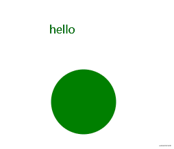
script
JS script can handle DOM elements, such as some click and mouse events
<svg xmlns="http://www.w3.org/2000/svg" xmlns:xlink="http://www.w3.org/1999/xlink" viewbox="0 0 100 100">
    <script type="text/javascript">
        // <![CDATA[
        function change(evt) {
            var target = evt.target;
            var radius = target.getAttribute("r");

            // The obtained radius data is inserted into the belonging text for display
            document.querySelector("#text").innerHTML = radius;
        }
        // ]]>
    </script>
    <text id="text" x="500" y="300" fill="#000">hello</text>
    <circle cx="550" cy="400" r="45" fill="green" onclick="change(evt)">
        <animate attributeName="r" values="45;50;45" dur="5s" repeatCount="indefinite" />
    </circle>
</svg>
Element attribute description
Set style, including color, width, height, etc
You can directly set the attribute of the element, and the value needs to be wrapped in quotation marks
Reference properties - xlink:href
You can define elements already, including text, animation, templates, gradients, and so on
All references must be added with namespace xmlns:xlink:
<linearGradient id="linear-copy-reflect" xmlns:xlink="http://www.w3.org/1999/xlink" xlink:href="#radial-copy" />
It can also be directly added to the following element svg without introducing it every time
<svg xmlns="http://www.w3.org/2000/svg" xmlns:xlink="http://www.w3.org/1999/xlink"></svg>
viewbox - define container scaling
- x\y - defines the location coordinates
- width \ height - defines the width and height. When it is 0 or less, the element is not displayed
color
- Fill - fill color
- stroke - draw line color
- Fill opacity - fill transparency
- Stroke opacity - paint color transparency
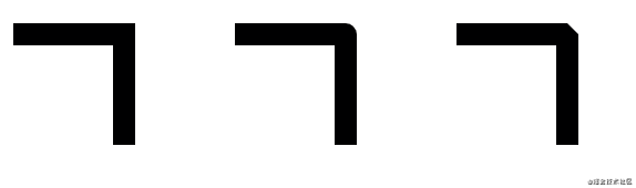
frame
- Stroke width - border width
- Stroke linecap - controls the shape of the end of the border
- But - straight edge
- square - is also a straight edge. Different reasons are beyond the range of the actual path. The size is stroke width
- round - fillet shape
<svg xmlns="http://www.w3.org/2000/svg">
    <line x1="1000" y1="200" x2="1100" y2="200" stroke="rgba(0,0,0,.6)" stroke-width="10" stroke-linecap="butt" />
    <line x1="1000" y1="250" x2="1100" y2="250" stroke="rgba(0,0,0,.6)" stroke-width="10" stroke-linecap="square" />
    <line x1="1000" y1="300" x2="1100" y2="300" stroke="rgba(0,0,0,.6)" stroke-width="10" stroke-linecap="round" />
</svg>

- Stroke linejoin - controls the connection between two line segments
- miter - square, forming sharp corners
- Round - round
- Bevel - bevel
<svg xmlns="http://www.w3.org/2000/svg">
    <polyline points="1000 350,1100,350,1100 450" fill="none" stroke="rgba(0,0,0.6)" stroke-width="20" stroke-linejoin="miter"/>
    <polyline points="1200 350,1300,350,1300 450" fill="none" stroke="rgba(0,0,0.6)" stroke-width="20" stroke-linejoin="round"/>
    <polyline points="1400 350,1500,350,1500 450" fill="none" stroke="rgba(0,0,0.6)" stroke-width="20" stroke-linejoin="bevel"/>
</svg>
-
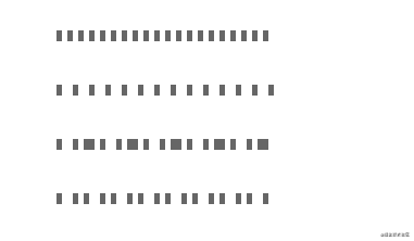
Stroke dasharray - indicates the dotted line edge. The parameters are numeric sequences and must be separated by commas For example: 4,5,6
When three sets of numbers are defined, the dashed connecting edges are created repeatedly in a circular pattern Fill - empty - fill - empty - fill - empty
<svg xmlns="http://www.w3.org/2000/svg">
    <line x1="1100" y1="500" x2="1300" y2="500" stroke="rgba(0,0,0,.6)" stroke-width="10" stroke-dasharray="5" />
    <line x1="1100" y1="550" x2="1300" y2="550" stroke="rgba(0,0,0,.6)" stroke-width="10" stroke-dasharray="5,10" />
    <line x1="1100" y1="600" x2="1300" y2="600" stroke="rgba(0,0,0,.6)" stroke-width="10" stroke-dasharray="5,10,5" />
    <line x1="1100" y1="650" x2="1300" y2="650" stroke="rgba(0,0,0,.6)" stroke-width="10" stroke-dasharray="5,10,5,5" />
</svg>
- Fill rule - defines how to color areas where graphics overlap
- Stroke mitterlimit - defines when to draw or not draw the miter effect of the border connection
- Stroke dash offset - defines where the dashed line begins
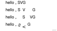
Text properties
In the text, you can also use fill to fill the text with color; Stroke stroke text
- Text anchor - defines the direction of the text. The optional values are start\middle\end\inherit
- font-weight,font-family,font-style,font-variant,font-stretch,font-size,font-size-adjust,kerning,letter-spacing,word-spacing,text-decoration
tspan
The part of marked text must be a word element of text or tspan
- x\y - sets the absolute positioning coordinates, including the number sequence, which is applied to each character at a time
- dx\dy - offset, including numerical sequence, accumulating offset each time
- rotate - defines the angle of rotation It can be a sequence,
- textLength - the calculated length of the string
<svg xmlns="http://www.w3.org/2000/svg">
    <text x="250" y="20" font-size="16" fill="#000">
        hello ,
        <tspan>SVG</tspan>
    </text>
    <text x="250" y="50" font-size="16" fill="#000">
        hello ,
        <tspan x="300,320,340">SVG</tspan>
    </text>
    <text x="250" y="80" font-size="16" fill="#000">
        hello ,
        <tspan dx="20,20">SVG</tspan>
    </text>
    <text x="250" y="110" font-size="16" fill="#000">
        hello ,
        <tspan dx="0,10,10" rotate="30,90,0">SVG</tspan>
    </text>
</svg>
tref
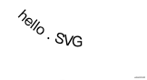
Reference already defined text Use the xlink:href attribute to point to an element
textPath
Define the attribute xlink:href to point to any path, and the font surrounds the path
<svg xmlns="http://www.w3.org/2000/svg">
    <defs>
        <path id="my_path" d="M 250,140 c 40,40 80,40 100,20" />
        <text font-size="16" fill="#000">hello</text>
    </defs>
    <text>
        <textPath xmlns:xlink="http://www.w3.org/1999/xlink" xlink:href="#my_path">
            hello . SVG
        </textPath>
    </text>
</svg>
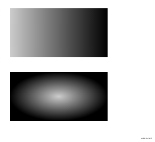
Gradient, animation
It is defined in the defs element, given an ID, and referenced by url(# * *) as the value of fill \ stroke,
Linear gradient, radial gradient
- linearGradient - linear gradient
- x1\y1\x2\y2 can define the direction of the gradient
- radialGradient - radial gradient
- cx\cy defines the ring around the end of the gradient and sets the r radius
- r defines the radius of the ring
- Gradient center definition.fx/fx
Set the interrupt value attribute through the stop element,
- Offset - gradient offset * stop color - gradient color * stop opacity - gradient transparency
<svg xmlns="http://www.w3.org/2000/svg">
    <defs>
        <linearGradient id="linear">
            <stop offset="0%" stop-color="rgba(0,0,0,.2)" />
            <stop offset="100%" stop-color="rgba(0,0,0,1)" />
        </linearGradient>
        <radialGradient id="radial">
            <stop offset="0%" stop-color="rgba(0,0,0,.2)" />
            <stop offset="100%" stop-color="rgba(0,0,0,1)" />
        </radialGradient>
    </defs>
    <rect x="20" y="20" width="200" height="100" fill="url(#linear)" />
    <rect x="20" y="150" width="200" height="100" fill="url(#radial)" />
</svg>
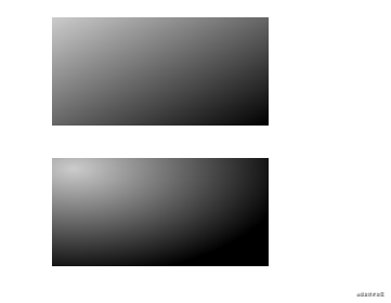
The following example shows the attribute settings of linear gradient and radial gradient
<svg xmlns="http://www.w3.org/2000/svg">
    <defs>
        <linearGradient id="linear-copy" x1="0" y1="0" x2="1" y2="1">
            <stop offset="0%" stop-color="rgba(0,0,0,.2)" />
            <stop offset="100%" stop-color="rgba(0,0,0,1)" />
        </linearGradient>
        <radialGradient id="radial-copy" cx=".1" cy=".1" r="1" fx=".1" fy=".1">
            <stop offset="0%" stop-color="rgba(0,0,0,.2)" />
            <stop offset="100%" stop-color="rgba(0,0,0,1)" />
        </radialGradient>
    </defs>
    <rect x="300" y="20" width="200" height="100" fill="url(#linear-copy)" />
    <rect x="300" y="150" width="200" height="100" fill="url(#radial-copy)" />
</svg>
Other attribute definitions
-
spreadMethod - describes the gradient process
- pad - default effect
- refelct - lets the gradient continue
- Repeat - repeat the previous gradient process to continue the gradient
-
gradientUnits gradient cell attribute that describes the size and direction of the gradient
- uesrSpaceOnUse - calculates the position of an object using absolute cells
- objectBoundingBox - default, relative positioning, specifying coordinate values of 0 - 1
Pan, rotate, bevel, zoom
Using the transform attribute definition
- translate(x,y) - translate, moving elements to x, y
- rotate(num,x,y) - rotation, which can be defined with (x,y) as the origin The default is the current element coordinate system (upper left corner)
- skewX()\skewY() - skew transform
- scale(x\y) - scale Equal scale
<svg xmlns="http://www.w3.org/2000/svg">
    <rect x="20" y="300" width="150" height="100" fill="rgba(0,0,0,.4)" />
    <rect x="200" y="300" width="150" height="100" fill="rgba(0,0,0,.4)" transform="translate(0,20)" />
    <rect x="400" y="300" width="150" height="100" fill="rgba(0,0,0,.4)" transform="rotate(5)" />
    <rect x="20" y="480" width="150" height="100" fill="rgba(0,0,0,.4)" transform="skewX(5)" />
    <rect x="240" y="480" width="150" height="100" fill="rgba(0,0,0,.4)" transform="scale(.5)" />

    <text x="90" y="350" fill="red">1</text>
    <text x="275" y="380" fill="red">2</text>
    <text x="440" y="400" fill="red">3</text>
    <text x="130" y="530" fill="red">4</text>
    <text x="150" y="270" fill="red">5</text>
</svg>
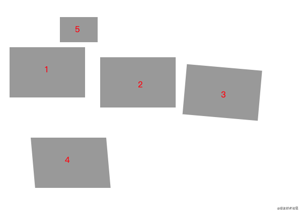
Mark the position of each block with text, and the center point of the block is the upper left corner (0,0)
matrix complex deformation
The matrix(a b c d e f) parameter is defined as a transformation matrix with six values

<svg xmlns="http://www.w3.org/2000/svg">
    <path d="M 600 400 c 10 10,20 200,200 0 z" fill="none" stroke="rgba(0,0,0,.6)" />
    <path d="M 600 400 c 10 10,20 200,200 0 z" fill="none" stroke="rgba(0,0,0,.6)" transform="matrix(1 1 0 -1 10 1)" />
</svg>
Cut, mask
Erase part of the created element
Cut - clipPath
Remove parts of other elements It is usually defined in the defs element and referenced by the attribute clip path
<svg xmlns="http://www.w3.org/2000/svg">
    <defs>
        <clipPath id="clip">
            <path d="M 920 580 c 20 50,50 90,100 0" />
        </clipPath>
    </defs>
    <rect x="900" y="400" width="150" height="100" fill="rgba(0,0,0,.6)" />
    <rect x="900" y="550" width="150" height="100" fill="none" stroke="red" />
    <rect x="900" y="550" width="150" height="100" fill="rgba(0,0,0,.6)" clip-path="url(#clip)" />
</svg>
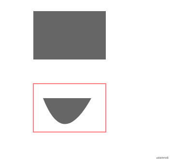
Show the part covered by the cut element
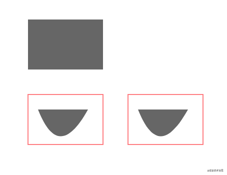
Mask mask
Reference through attribute mask
<svg xmlns="http://www.w3.org/2000/svg">
    <defs>
        <clipPath id="clip">
            <path d="M 920 580 c 20 50,50 90,100 0" />
        </clipPath>
        <mask id="mask">
            <path d="M 1120 580 c 20 50,50 90,100 0" fill="#fff" />
        </mask>
    </defs>
    <rect x="900" y="400" width="150" height="100" fill="rgba(0,0,0,.6)" />
    <rect x="900" y="550" width="150" height="100" fill="none" stroke="red" />
    <rect x="900" y="550" width="150" height="100" fill="rgba(0,0,0,.6)" clip-path="url(#clip)" />
    <rect x="1100" y="550" width="150" height="100" fill="none" stroke="red" />
    <rect x="1100" y="550" width="150" height="100" fill="rgba(0,0,0,.6)" mask="url(#mask)" />
</svg>
Filter
Achieve shadow effect, blur and gradient
The filter element is defined in defs, and the attribute filter reference is used
Define fuzzy attributes through word elements:
- Fegaussian blur - defines image blur
- in refers to the result attribute defined by the previous element. The optional fixed attribute values are: SourceGraphic\SourceAlpha\BackgroundImage, etc
- stdDeviation - define ambiguity
- result - defines a temporary cache, and subsequent elements can point to references
<svg xmlns="http://www.w3.org/2000/svg">
<filter id="filter">
<feGaussianBlur in="SourceGraphic" stdDeviation="5" result="blur" />
</filter>
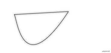
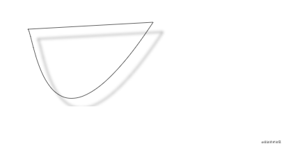
<path d="M 50 50 c 10 10,25 225,180 -10 z" fill="none" stroke="rgba(0,0,0,1)" />
<path d="M 50 50 c 10 10,25 225,180 -10 z" fill="none" stroke="rgba(0,0,0,1)" filter="url(#filter)" />
</svg>
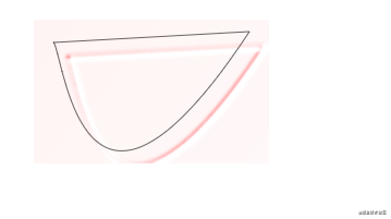
- feOffset - this is the blur offset
- in - refers to the result attribute defined by the previous element, and the custom attribute value is the same as above
- dx\dy - relative offset
- result - defines a temporary cache, and subsequent elements can point to references
<svg xmlns="http://www.w3.org/2000/svg">
    <filter id="filter-offset">
        <feGaussianBlur in="SourceGraphic" stdDeviation="2" result="blur" />
        <feOffset in="blur" dx="14" dy="14" />
    </filter>
    <path d="M 50 200 c 10 10,25 225,180 -10 z" fill="none" stroke="rgba(0,0,0,.6)" />
    <path d="M 50 200 c 10 10,25 225,180 -10 z" fill="none" stroke="rgba(0,0,0,.6)" filter="url(#filter-offset)" />
</svg>
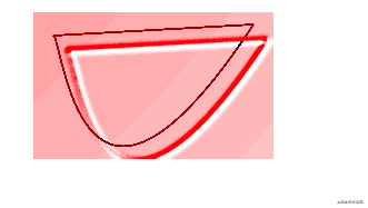
- feSpecularLighting - set the input source, lighting effect, and set the offset through the sub element fePointLight
- in definition
- surfaceScale -
- specularConstant -
- specularExponent -
- lighting-color -
- result - defines a temporary cache, and subsequent elements can point to references
<svg xmlns="http://www.w3.org/2000/svg">
    <filter id="filter-light">
        <feGaussianBlur in="SourceGraphic" stdDeviation="2" result="blur" />
        <feOffset in="blur" dx="14" dy="14" result="offset" />
        <feSpecularLighting surfaceScale="5" specularConstant=".4" specularExponent="20" lighting-color="red">
            <fePointLight x='-1000' y="-500" z="1000" />
        </feSpecularLighting>
    </filter>
    <path d="M 50 350 c 10 10,25 225,180 -10 z" fill="none" stroke="rgba(0,0,0,.6)" />
    <path d="M 50 350 c 10 10,25 225,180 -10 z" fill="none" stroke="rgba(0,0,0,.6)" filter="url(#filter-light)" />
</svg>
- feComposite - effect synthesis
- in\in2 - point to input source
- operator - defines the composition pattern
- k1\k2\k3\k4
- result - defines a temporary cache, and subsequent elements can point to references
<svg xmlns="http://www.w3.org/2000/svg">
    <filter id="filter-composite">
        <feGaussianBlur in="SourceGraphic" stdDeviation="2" result="blur" />
        <feOffset in="blur" dx="14" dy="14" result="offset" />
        <feSpecularLighting surfaceScale="5" specularConstant=".4" specularExponent="20" lighting-color="red"
            result="light">
            <fePointLight x='-1000' y="-500" z="1000" />
        </feSpecularLighting>
        <feComposite in2="light" in="SourceGraphic" operator="arithmetic" k1="10" k2="10" k3="10" k4="0" />
    </filter>
    <path d="M 50 500 c 10 10,25 225,180 -10 z" fill="none" stroke="rgba(0,0,0,.6)" />
    <path d="M 50 500 c 10 10,25 225,180 -10 z" fill="none" stroke="rgba(0,0,0,.6)" filter="url(#filter-composite)" />
</svg>
- feMerge - merges the effects through the sub element feMergeNode
<svg xmlns="http://www.w3.org/2000/svg">
    <filter id="filter-merge">
        <feGaussianBlur in="SourceGraphic" stdDeviation="2" result="blur" />
        <feOffset in="blur" dx="14" dy="14" result="offset" />
        <feSpecularLighting surfaceScale="5" specularConstant=".4" specularExponent="20" lighting-color="red"
            result="light">
            <fePointLight x='-1000' y="-500" z="1000" />
        </feSpecularLighting>
        <feComposite in2="light" in="SourceGraphic" operator="arithmetic" k1="10" k2="10" k3="10" k4="0"
            result="composite" />
        <feMerge>
            <feMergeNode in="blur" />
            <feMergeNode in="light" />
        </feMerge>
    </filter>
    <path d="M 300 500 c 10 10,25 225,180 -10 z" fill="none" stroke="rgba(0,0,0,.6)" />
    <path d="M 300 500 c 10 10,25 225,180 -10 z" fill="none" stroke="rgba(0,0,0,.6)" filter="url(#filter-merge)" />
</svg>
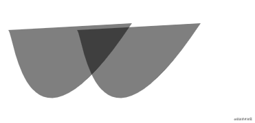
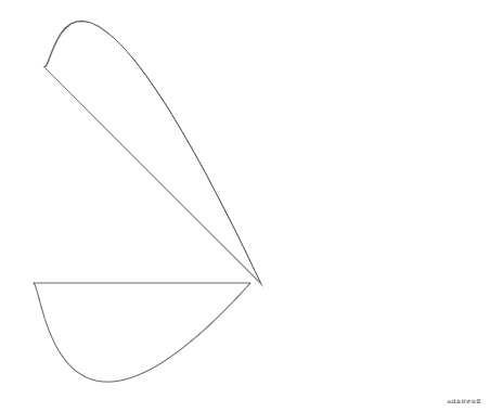
Draw a heart shape
<svg xmlns="http://www.w3.org/2000/svg" xmlns:xlink="http://www.w3.org/1999/xlink" viewbox="0 0 100 100">
    <defs>
        <pattern id="color" x="10" y="10" width=".1" height=".02">
            <rect x="0" y="0" width="5" height="15" fill="red" fill-opacity=".5" />
        </pattern>
    </defs>

    <g id="heart" fill="url(#color)">
        <path d="M 200 500 c -150 -80,-80 100,50 150" stroke="rgba(0,0,0,.6)" stroke-width="2" />
        <path d="M 200 500 c 100 -180,80 100,50 150" stroke="rgba(0,0,0,.6)" stroke-width="2" />
    </g>
</svg>
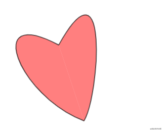
It's too difficult. It's been drawing for a long time 😭