1 introduction of Echarts
1.1 installation
Install ECharts through npm using the following command
npm install echarts --save
Note: the version of echarts installed in this article is "echarts": "5.2.1"
1.2 introduction
After the installation is completed, you can import all ecarts, so that we can use all components of ecarts on this page; The import code is as follows:
import * as echarts from "echarts";
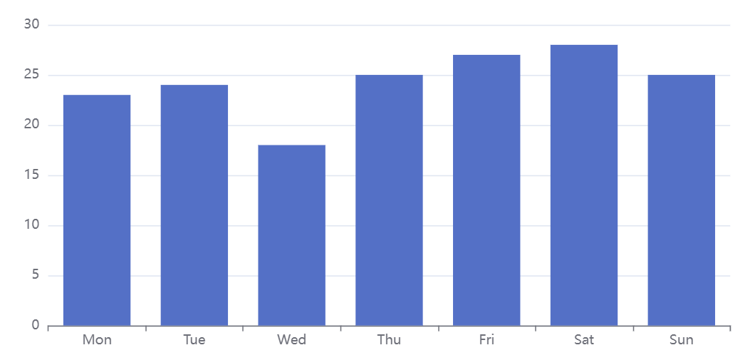
2 basic histogram
Bar chart (or bar chart) is a common chart type that shows the size of data through the length of column.
The way to set the histogram is to set the type of series in the configuration item to 'bar'
The simplest histogram can be set as follows:
option = {
  xAxis: {
    data: ['Mon', 'Tue', 'Wed', 'Thu', 'Fri', 'Sat', 'Sun']
  },
  yAxis: {},
  series: [
    {
      type: 'bar',
      data: [23, 24, 18, 25, 27, 28, 25]
    }
  ]
};
As shown in the figure:
The vue complete code in the figure above is as follows:
<template>
  <div class="echart" id="mychart" :style="myChartStyle"></div>
</template>

<script>
import * as echarts from "echarts";

export default {
  data() {
    return {
      xData: ["Mon", "Tue", "Wed", "Thu", "Fri", "Sat", "Sun"], //Abscissa
      yData: [23, 24, 18, 25, 27, 28, 25], //data
      myChartStyle: { float: "left", width: "100%", height: "400px" } //Chart style
    };
  },
  mounted() {
    this.initEcharts();
  },
  methods: {
    initEcharts() {
      // Basic histogram
      const option = {
        xAxis: {
          data: this.xData
        },
        yAxis: {},
        series: [
          {
            type: "bar", //The shape is a histogram
            data: this.yData
          }
        ]
      };
      const myChart = echarts.init(document.getElementById("mychart"));
      myChart.setOption(option);
      //Adjust the chart with the screen size
      window.addEventListener("resize", () => {
        myChart.resize();
      });
    }
  }
};
</script>
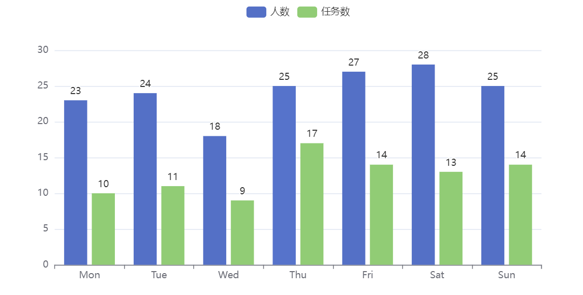
3 multi column column diagram
When there are multiple columns of data to be displayed, we need to use the multi column column column chart. Just add one more item in the series:
series: [
          {
            type: "bar", //The shape is a histogram
            data: data1,
          },
          {
            type: "bar", //The shape is a histogram
            data: data2,
          }
    ]
Usually, when there are multiple columns of data, we need to display each column in different colors and explain it in the histogram. By default, echarts will use different colors to distinguish. Of course, we can also set the style of the histogram, such as background color; However, if you need to indicate what data a column represents, you need to use the legend Legend and add the name attribute to the series array object to correspond to the data in the legend. The location of the legend is set through the location element, as follows:
        // legend
        legend: {
          data: ["Number of people", "Number of tasks"],
          top: "0%" // Set legend position at top
        },
        series: [
          {
            type: "bar", //The shape is a histogram
            data: data1,
            name: "Number of people", // legend attribute
          {
            type: "bar", //The shape is a histogram
            data: data2,
            name: "Number of tasks", // legend attribute
          }
        ]
Set multi column histogram as shown in the figure:
The complete vue code corresponding to the above figure is as follows:
<template>
  <div class="echart" id="mychart" :style="myChartStyle"></div>
</template>

<script>
import * as echarts from "echarts";

export default {
  data() {
    return {
      xData: ["Mon", "Tue", "Wed", "Thu", "Fri", "Sat", "Sun"], //Abscissa
      yData: [23, 24, 18, 25, 27, 28, 25], //Population data
      taskDate: [10, 11, 9, 17, 14, 13, 14],
      myChartStyle: { float: "left", width: "100%", height: "400px" } //Chart style
    };
  },
  mounted() {
    this.initEcharts();
  },
  methods: {
    initEcharts() {
      // Multi column column graph
      const mulColumnZZTData = {
        xAxis: {
          data: this.xData
        },
        // legend
        legend: {
          data: ["Number of people", "Number of tasks"],
          top: "0%"
        },
        yAxis: {},
        series: [
          {
            type: "bar", //The shape is a histogram
            data: this.yData,
            name: "Number of people", // legend attribute
            label: {
              // The text label at the top of the bar chart displays numerical information by default
              show: true,
              position: "top"
            }
          },
          {
            type: "bar", //The shape is a histogram
            data: this.taskDate,
            name: "Number of tasks", // legend attribute
            label: {
              // The text label at the top of the bar chart displays numerical information by default
              show: true,
              position: "top"
            }
          }
        ]
      };
      const myChart = echarts.init(document.getElementById("mychart"));
      myChart.setOption(mulColumnZZTData);
      //Adjust the chart with the screen size
      window.addEventListener("resize", () => {
        myChart.resize();
      });
    }
  }
};
</script>
The label attribute in the series is a histogram text label, which can display data, text and other information. It is not displayed by default. It will be displayed in the diagram only when show is set to true.
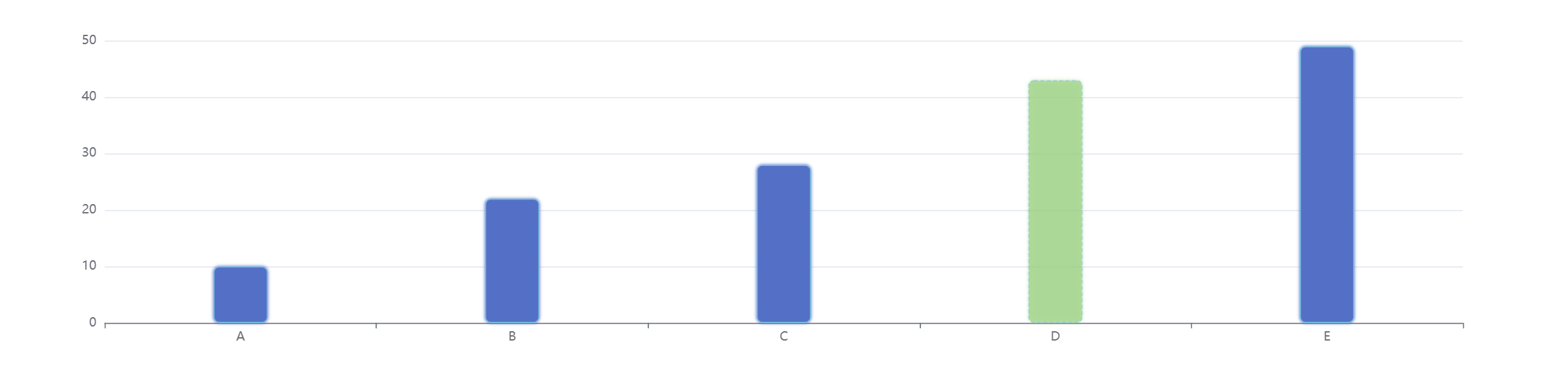
4. Histogram style setting
4.1 column bar style
The style of column bar can be through series Itemstyle settings, including:
- color of column bar;
- Width of column bar (barWidth);
- The stroke color, width and style of the column bar;
- Background color of column bar (showBackground)
- Radius of column fillet (barBorderRadius);
- Column transparency;
- Shadows (shadowBlur, shadowColor, shadowOffsetX, shadowOffsetY).
We can set the same style for the same series of columns, or set a specific style for a single column, as follows:
option = {
    xAxis: {
        data: ["A", "B", "C", "D", "E"]
    },
    yAxis: {},
    series: [
        {
            type: "bar",
            data: [
                10,
                22,
                28,
                {
                    value: 43,
                    // Style individual columns
                    itemStyle: {
                        color: "#91cc75",
                        shadowColor: "#91cc75",
                        borderType: "dashed",
                        opacity: 0.5
                    }
                },
                49
            ],
            barWidth: "20%", // The width of each column is 20% of the category width
            // Same series column style
            itemStyle: {
                barBorderRadius: 5,
                borderWidth: 1,
                borderType: "solid",
                borderColor: "#73c0de",
                shadowColor: "#5470c6",
                shadowBlur: 3
            }
        }
    ]
};
The effects are as follows:
4.2 column spacing
There are two kinds of column spacing: one is the distance barWidth of different series under the same category, and the other is the distance barCategoryGap between categories.
Examples are as follows:
option = {
    xAxis: {
        data: ["A", "B", "C", "D", "E"]
    },
    yAxis: {},
    series: [
        {
            type: "bar",
            data: [23, 24, 18, 25, 18],
            barGap: "0%", // The percentage of the distance between two columns relative to the width of the column strip;
            barCategoryGap: "40%" // The percentage of the free distance on each side relative to the width of the column strip
        },
        {
            type: "bar",
            data: [12, 14, 9, 9, 11]
        }
    ]
};
The above example is shown in the figure:
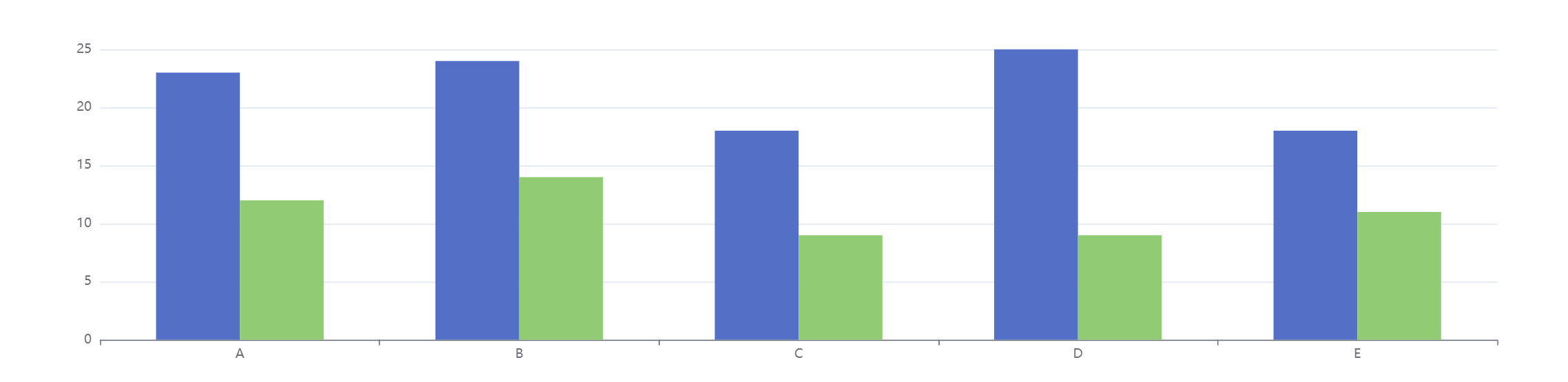
In this example, barGap is set to '0%', which means that the distance between the two columns under each category (such as A) is set to 0% relative to the percentage of column width, indicating that there is no gap between the two column jumps. barCategoryGap is' 40% ', which means the free distance on each side of the column bar, relative to the percentage of the column bar width.
Generally speaking, after setting barGap and barCategoryGap, you do not need to set barWidth. At this time, the width will be adjusted automatically. If necessary, you can set barMaxWidth as the upper limit of column width. When the chart width is large, the column width will not be too wide.
On the same coordinate system, this attribute will be shared by multiple histogram series. This property should be set on the last histogram Series in this coordinate system to take effect, and it takes effect on all histogram Series in this coordinate system.
The above effect vue codes are as follows:
<template>
  <div class="echart" id="mychart" :style="myChartStyle"></div>
</template>

<script>
import * as echarts from "echarts";

export default {
  data() {
    return {
      myChart: {},
      myChartStyle: { float: "left", width: "100%", height: "400px" }, //Chart style
    };
  },
  mounted() {
    this.initEcharts();
  },
  methods: {
    initEcharts() {
      // Style settings
      // const option = {
      //   xAxis: {
      //     data: ["A", "B", "C", "D", "E"]
      //   },
      //   yAxis: {},
      //   series: [
      //     {
      //       type: "bar",
      //       data: [
      //         10,
      //         22,
      //         28,
      //         {
      //           value: 43,
      //           //Style individual columns
      //           itemStyle: {
      //             color: "#91cc75",
      //             shadowColor: "#91cc75",
      //             borderType: "dashed",
      //             opacity: 0.5
      //           }
      //         },
      //         49
      //       ],
      //       barWidth: "20%", / / the width of each column is 20% of the category width
      //       //Same series column style
      //       itemStyle: {
      //         barBorderRadius: 5,
      //         borderWidth: 1,
      //         borderType: "solid",
      //         borderColor: "#73c0de",
      //         shadowColor: "#5470c6",
      //         shadowBlur: 3
      //       }
      //     }
      //   ]
      // };
      // Column spacing
      const option = {
        xAxis: {
          data: ["A", "B", "C", "D", "E"]
        },
        yAxis: {},
        series: [
          {
            type: "bar",
            data: [23, 24, 18, 25, 18],
            barGap: "0%", // The percentage of the distance between two columns relative to the width of the column strip;
            barCategoryGap: "40%" // The percentage of the free distance on each side relative to the width of the column strip
          },
          {
            type: "bar",
            data: [12, 14, 9, 9, 11]
          }
        ]
      };
      const myChart = echarts.init(document.getElementById("mychart"));
      myChart.setOption(option);
      //Adjust the chart with the screen size
      window.addEventListener("resize", () => {
        myChart.resize();
      });
    }
  }
};
</script>
5 dynamic sorting histogram
Dynamic sorting histogram is a chart that shows the change of data ranking over time. It has built-in support from ECharts 5.
The dynamic sorting histogram is usually a horizontal bar. If you want to use a vertical bar, just set the X axis and Y axis in this tutorial opposite.
The following attributes are required to implement the dynamic sorting histogram:
-
yAxis. Realtimeport is set to true to enable the dynamic sorting effect of Y-axis
-
yAxis. If reverse is set to true, it means that the Y axis is arranged from bottom to top from small to large
-
yAxis. The animation duration is recommended to be set to 300, indicating the duration of the first column sorting animation
-
yAxis. Animation durationupdate is recommended to be set to 300, indicating the duration of the first post bar sorting animation
-
If you want to display only the first n names, use yaxis Max is set to n - 1, otherwise all bars are displayed
-
xAxis.max is recommended to be set to 'dataMax', which means that the maximum value of data is used as the maximum value of X-axis, which has better visual effect
-
If you want to change the label in real time, you need to set series label. Valueanimation is set to true
-
If animation duration is set to 0, it means that the first data does not need to start animation from 0 (if you want to start from 0, set it to the same value as animation duration update)
-
It is recommended that the animation durationupdate be set to 3000 to indicate the duration of each animation update. This value should be the same as the frequency of calling setOption to change the data
-
Call setInterval with the frequency of animation durationupdate to update the data value and display the column sorting corresponding to the next time point
The results are as follows:
Above vue The complete code is as follows:

```js
<template>
  <div class="echart" id="mychart" :style="myChartStyle"></div>
</template>

<script>
import * as echarts from "echarts";

export default {
  data() {
    return {
      myChart: {},
      sortData: [], //Dynamic sorting data
      myChartStyle: { float: "left", width: "100%", height: "400px" }, //Chart style
      dynamicSortZZTOption: {
        xAxis: {
          max: "dataMax"
        },
        yAxis: {
          type: "category",
          data: ["A", "B", "C", "D", "E"],
          inverse: true,
          animationDuration: 300,
          animationDurationUpdate: 300,
          max: 4 // only the largest 3 bars will be displayed
        },
        series: [
          {
            realtimeSort: true,
            name: "Dynamic change",
            type: "bar",
            data: [],
            label: {
              show: true,
              position: "right",
              valueAnimation: true
            }
          }
        ],
        legend: {
          show: true
        },
        animationDuration: 3000,
        animationDurationUpdate: 3000,
        animationEasing: "linear",
        animationEasingUpdate: "linear"
      }
    };
  },
  mounted() {
    // Chart initialization
    this.myChart = echarts.init(document.getElementById("mychart"));
    // Data initialization
    for (let i = 0; i < 5; ++i) {
      this.sortData.push(Math.round(Math.random() * 200));
    }
    // Data Refresh
    setInterval(() => {
      this.pageUpdate();
    }, 3000);
  },
  methods: {
    // Data Refresh
    pageUpdate() {
      console.log(this.dynamicSortZZTOption.series[0].data);
      this.dynamicSortZZTOption.series[0].data = this.sortData;
      for (let i = 0; i < this.sortData.length; ++i) {
        if (Math.random() > 0.9) {
          this.sortData[i] += Math.round(Math.random() * 2000);
        } else {
          this.sortData[i] += Math.round(Math.random() * 200);
        }
      }
      this.myChart.setOption(this.dynamicSortZZTOption);
      //Adjust the chart with the screen size
      window.addEventListener("resize", () => {
        this.myChart.resize();
      });
    }
  }
};
</script>


```
6 Summary
The above lists vue the main ways of using Echarts to draw histogram. With the above basis, we can do some more complex scenes, such as the time change of national and regional GDP, statistical rendering of epidemic data, etc. Please look forward to the follow-up study of more complex scenes.