front
The first two parts of this article are about two CSS tips, and the rest are about the use of elastic boxes and the arrangement of internal elements;
content
The first is about the CSS part, which is used to set what style to use when the browser page width is less than a value or what style to use when the page width is greater than a value.
<style>
	@media (max-width: 100px){
		p{
			font-size:100px;
		}
	}
</style>
<p>Look at my different changes


The following effect is displayed when the maximum width exceeds 1000px, and the above effect is displayed when the maximum width is less than 1000px.
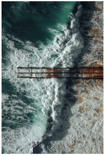
The next implementation is to make a picture change according to the page size.
Set the maximum width of the picture to 100% and the height to automatic.
<style>
	img{
	width: 600px;
	}
	.img-s{
	 max-width: 100%;
     height: auto;
	}
</style>
<img class="img-s" src="https://images.pexels.com/photos/8647586/pexels-photo-8647586.jpeg?auto=compress&cs=tinysrgb&dpr=2&h=650&w=940" alt="">
Here are several units vw (percentage width) vh (percentage height) vmax (the one with the larger browser width or height) vmin (the one with the smallest browser height or width)
<style>
	p{
	width:50vw;
	}
</style>
<p>This is a long long long long long long long long long long long long long long long long long long long long long long long long
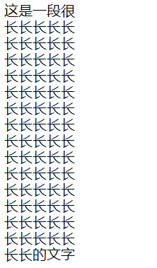
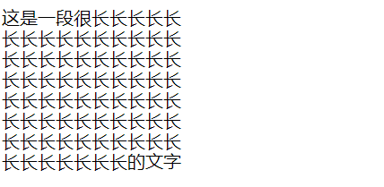
The next step is to create an elastic container to carry all its sub tags. For me, the elastic container is a div tag to put all div things into this container.
<style>
  #box-container {
    height: 500px;
    display:flex;
  }

  #box-1 {
    background-color: dodgerblue;
    width: 50%;
    height: 50%;
  }

  #box-2 {
    background-color: orangered;
    width: 50%;
    height: 50%;
  }
</style>
<div id="box-container">
  <div id="box-1"></div>
  <div id="box-2"></div>
</div>
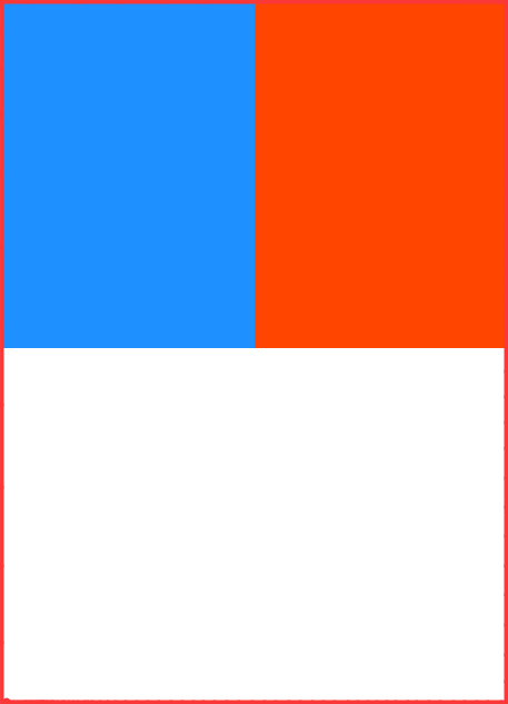
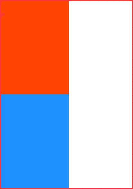
The elastic container is about as large as the red box. The two boxes account for half the height and half the width.
The next attribute is flex direction, which has two alternative values: row reverse and column reverse
The default is the first horizontal arrangement and the second vertical arrangement;
<style>
  #box-container {
    display: flex;
    height: 500px;
	flex-direction:column-reverse;
  }
  #box-1 {
    background-color: dodgerblue;
    width: 50%;
    height: 50%;
  }

  #box-2 {
    background-color: orangered;
    width: 50%;
    height: 50%;
  }
</style>

<div id="box-container">
  <div id="box-1"></div>
  <div id="box-2"></div>
</div>
The following attribute is justify content, which is used to control the layout of elements in the container. Alternative attributes are: center, flex start, flex end, space between, space around,
space-evenly;
The first: the middle layout along the horizontal line of the container;
The second type: start the layout from the beginning (left) of the horizontal line;
Third: layout from the end (right) of the horizontal line;
The fourth: the first and last pieces are placed in the middle of the edge to leave a layout;
The fifth method: evenly divided into blocks, each content occupies the same size layout;
Sixth: divide the parts evenly except the contents.
<style>
  .test-1 {
    background: gray;
    display: flex;
    height: 50px;
    justify-content:center;
  }
  .test-2 {
    background: gray;
    display: flex;
    height: 50px;
    justify-content:flex-start;
  }
  .test-3 {
    background: gray;
    display: flex;
    height: 50px;
    justify-content:flex-end;
  }
  .test-4 {
    background: gray;
    display: flex;
    height: 50px;
    justify-content:space-between;
  }
  .test-5 {
    background: gray;
    display: flex;
    height: 50px;
    justify-content:space-around;
  }
  .test-6 {
    background: gray;
    display: flex;
    height: 50px;
    justify-content:space-evenly;
  }
  #box-1 {
    background-color: dodgerblue;
    width: 25%;
    height: 100%;
  }

  #box-2 {
    background-color: orangered;
    width: 25%;
    height: 100%;
  }
</style>
<div class="test-1">
  <div id="box-1"></div>
  <div id="box-2"></div>
</div>
<br>
<div class="test-2">
  <div id="box-1"></div>
  <div id="box-2"></div>
</div>
<br>
<div class="test-3">
  <div id="box-1"></div>
  <div id="box-2"></div>
</div>
<br>
<div class="test-4">
  <div id="box-1"></div>
  <div id="box-2"></div>
</div>
<br>
<div class="test-5">
  <div id="box-1"></div>
  <div id="box-2"></div>
</div>
<br>
<div class="test-6">
  <div id="box-1"></div>
  <div id="box-2"></div>
</div>
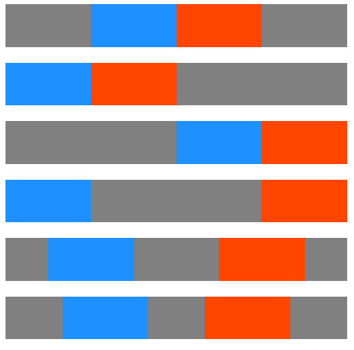
There are six lines in total, corresponding to six effects.
The above effect corresponds to the horizontal axis, and a similar layout can be realized for the vertical axis.
The attribute used is align items, which has the following alternative values: center, flex start,
flex-end,stretch,baseline.
The first: the middle layout along the vertical line of the container;
The second type: start the layout from the beginning (left) of the vertical line;
Third: start layout from the end (right) of the vertical line;
The fourth mode: Auto fit stretch, which is also the default mode
Fifth: align according to the horizontal line of the word.
<style>
  .test-1 {
    background: gray;
    display: flex;
    height: 100px;
    align-items:center;
  }
  .test-2 {
    background: gray;
    display: flex;
    height: 100px;
    align-items:flex-start;
  }
  .test-3 {
    background: gray;
    display: flex;
    height: 100px;
    align-items:flex-end;
  }
  .test-4 {
    background: gray;
    display: flex;
    height: 100px;
    align-items:stretch;
  }
  .test-5 {
    background: gray;
    display: flex;
    height: 100px;
    align-items:baseline;
  }
  .test-6 {
    background: gray;
    display: flex;
    height: 100px;
  }
  #box-1 {
    background-color: dodgerblue;
    width: 200px;
    font-size: 10px;
  }

  #box-2 {
    background-color: orangered;
    width: 200px;
    font-size: 15px;
  }
</style>

<div class="test-1">
  <div id="box-1"><p>Hello</p></div>
  <div id="box-2"><p>Goodbye</p></div>
</div>
<br>
<div class="test-2">
  <div id="box-1"><p>Hello</p></div>
  <div id="box-2"><p>Goodbye</p></div>
</div>
<br>
<div class="test-3">
  <div id="box-1"><p>Hello</p></div>
  <div id="box-2"><p>Goodbye</p></div>
</div>
<br>
<div class="test-4">
  <div id="box-1"><p>Hello</p></div>
  <div id="box-2"><p>Goodbye</p></div>
</div>
<br>
<div class="test-5">
  <div id="box-1"><p>Hello</p></div>
  <div id="box-2"><p>Goodbye</p></div>
</div>
<br>
<div class="test-6">
  <div id="box-1"><p>Hello</p></div>
  <div id="box-2"><p>Goodbye</p></div>
</div>
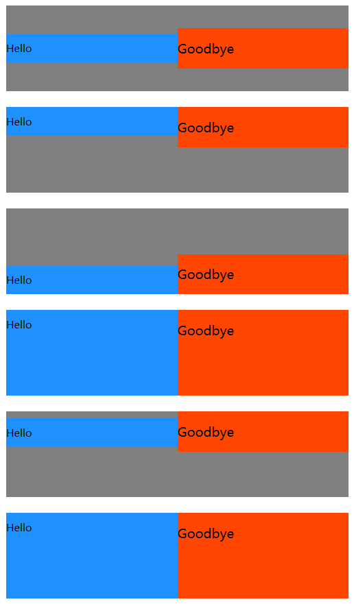
The sixth one does not set the attribute, but uses the default attribute.
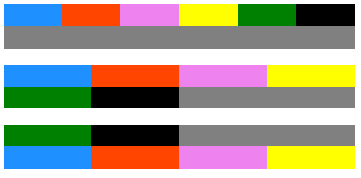
The next attribute is flex wrap, which has three options: no wrap, wrap, wrap reverse
The first is the default mode, which is placed silently in one row or column.
The second method: starting from the beginning, fill the whole line or cannot fill in the next element to wrap the line, and put it in another line.
Third: start from the bottom line, and the rest is the same as the one above.
<style>
  .test-1 {
    background: gray;
    display: flex;
    height: 50px;
    flex-wrap:nowrap;
  }
  .test-2 {
    background: gray;
    display: flex;
    height: 50px;
    flex-wrap:wrap;
  }
  .test-3 {
    background: gray;
    display: flex;
    height: 50px;
    flex-wrap:wrap-reverse;
  }
  #box-1 {
    background-color: dodgerblue;
    width: 25%;
    height: 50%;
  }

  #box-2 {
    background-color: orangered;
    width: 25%;
    height: 50%;
  }
  #box-3 {
    background-color: violet;
    width: 25%;
    height: 50%;
  }
  #box-4 {
    background-color: yellow;
    width: 25%;
    height: 50%;
  }
  #box-5 {
    background-color: green;
    width: 25%;
    height: 50%;
  }
  #box-6 {
    background-color: black;
    width: 25%;
    height: 50%;
  }
</style>

<div class="test-1">
  <div id="box-1"></div>
  <div id="box-2"></div>
  <div id="box-3"></div>
  <div id="box-4"></div>
  <div id="box-5"></div>
  <div id="box-6"></div>
</div>
<br>
<div class="test-2">
  <div id="box-1"></div>
  <div id="box-2"></div>
  <div id="box-3"></div>
  <div id="box-4"></div>
  <div id="box-5"></div>
  <div id="box-6"></div>
</div>
<br>
<div class="test-3">
  <div id="box-1"></div>
  <div id="box-2"></div>
  <div id="box-3"></div>
  <div id="box-4"></div>
  <div id="box-5"></div>
  <div id="box-6"></div>
</div>
The next attribute is flex shrink, which specifies the ratio between elements.
For example, when the width of the first element is 100% and the width of the second element is 100%, they each account for half in the same line. When the flex shrink of the second element is set to 2, the first element accounts for 66.6% and the second element accounts for 33.3%. If it is set to 3, the first one accounts for 75% and the second one accounts for 25%;
<style>
  #box-container {
    display: flex;
    height: 100px;
  }
  #box-1 {
    background-color: dodgerblue;
    width: 100%;
  }
  #box-2 {
    background-color: orangered;
    width: 100%;
    flex-shrink:2;
  }
</style>
<div id="box-container">
  <div id="box-1"></div>
  <div id="box-2"></div>
</div>

The next attribute is flex growth, which is opposite to the above attribute. The larger the value, the larger the area.
<style>
  #box-container {
    display: flex;
    height: 100px;
  }

  #box-1 {
    background-color: dodgerblue;
    flex-grow:1;
  }

  #box-2 {
    background-color: orangered;
    flex-grow:2;
  }
</style>

<div id="box-container">
  <div id="box-1"></div>
  <div id="box-2"></div>
</div>

The previous one has a default value of 1. This one has no default value and needs to be set by yourself.
The next attribute is used to set the length along the axis of the elastic container: Flex basis;
<style>
  #box-container {
    display: flex;
    height: 500px;
  }

  #box-1 {
    background-color: dodgerblue;
    height: 200px;
    flex-basis:10%;
  }

  #box-2 {
    background-color: orangered;
    height: 200px;
    flex-basis:50%;
  }
</style>

<div id="box-container">
  <div id="box-1"></div>
  <div id="box-2"></div>
</div>
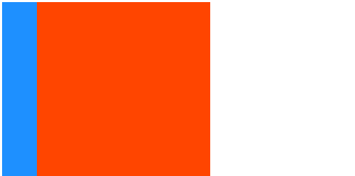
As we said before, the padding and margin attributes have four values, which can be set quickly. The above three attributes can also be set quickly. The first is flex growth; The second is flex shrink; The third is
flex-basis;
<style>
  #box-container {
    display: flex;
    height: 500px;
  }
  #box-1 {
    background-color: dodgerblue;
    flex:1 2 150px;
    height: 200px;
  }
  #box-2 {
    background-color: orangered;
    flex:2 1 150px;
    height: 200px;
  }
</style>
<div id="box-container">
  <div id="box-1"></div>
  <div id="box-2"></div>
</div>
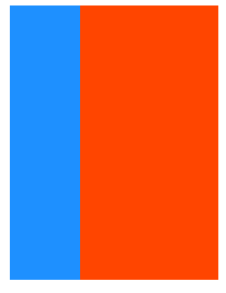
All the above sub elements are displayed in the order in which they appear. They can also be assigned a certain number of levels to control the display. The order attribute is used;
<style>
  #box-container {
    display: flex;
    height: 500px;
  }
  #box-1 {
    background-color: dodgerblue;
	order:2;
    height: 200px;
    width: 200px;
  }
  #box-2 {
    background-color: orangered;
	order:1;
    height: 200px;
    width: 200px;
  }
</style>
<div id="box-container">
  <div id="box-1"></div>
  <div id="box-2"></div>
</div>
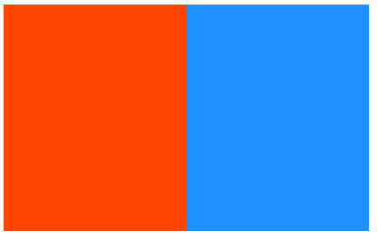
Previously, when learning CSS, you can eliminate some attributes of the parent tag by overwriting. You can also add align self in the sub style sheet in the elastic box; Its optional values are the same as flex items;
<style>
  #box-container {
    display: flex;
    height: 500px;
  }
  #box-1 {
    background-color: dodgerblue;
    align-self:center;
    height: 200px;
    width: 200px;
  }
  #box-2 {
    background-color: orangered;
    height: 200px;
    width: 200px;
  }
</style>
<div id="box-container">
  <div id="box-1"></div>
  <div id="box-2"></div>
</div>
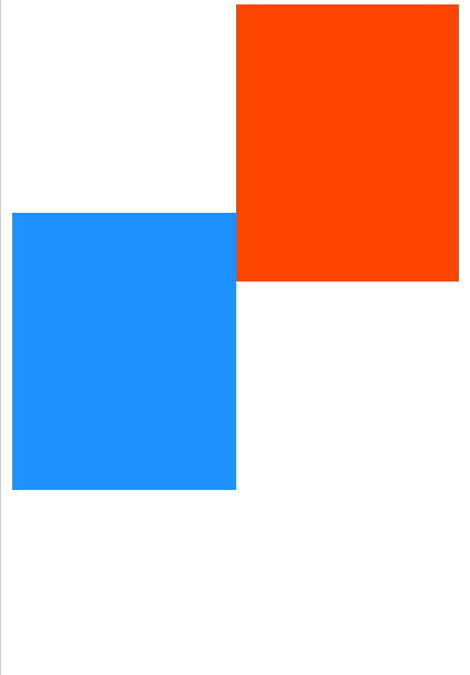
An elastic frame is attached here for understanding.
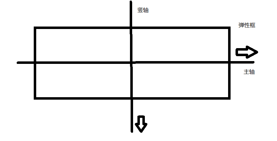
About flex grow and flex shrink; The former is the proportion of internal child elements when the parent element is greater than the width of child elements; In the latter case, when the width of the parent element is less than the sum of the child elements, how to allocate the internal child elements.
Flex basis and width are also used to display the width. If the current one appears, the latter will become invalid.
epilogue
The content of this article is over here. Finally, there is a part of the content. The content of freecodecamp on website design is over.
If there are any mistakes, we hope to correct them in the comments.