1. Polynomial Regression
If your data points are obviously unsuitable for linear regression (straight lines between data points), polynomial regression may be an ideal choice.
Like linear regression, polynomial regression uses the relationship between variables x and y to find the best way to plot data point lines.
2. Working principle
Python has several ways to find relationships between data points and draw polynomial regression lines. I'll show you how to use these methods instead of mathematical formulas.
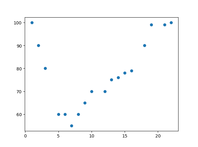
In the following example, we registered 18 cars passing through a specific toll station.
We have recorded the speed and the transit time (hours) of the car.
The x-axis represents the hours of the day, and the y-axis represents the speed:

import matplotlib.pyplot as plt

x = [1,2,3,5,6,7,8,9,10,12,13,14,15,16,18,19,21,22]
y = [100,90,80,60,60,55,60,65,70,70,75,76,78,79,90,99,99,100]

plt.scatter(x, y)
plt.show()
Clearly, linear regression is not possible
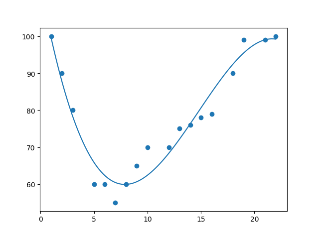
Import numpy and matplotlib and draw a polynomial regression line:
polyfit polynomial curve fittingimport numpy import matplotlib.pyplot as plt x = [1,2,3,5,6,7,8,9,10,12,13,14,15,16,18,19,21,22] y = [100,90,80,60,60,55,60,65,70,70,75,76,78,79,90,99,99,100] mymodel = numpy.poly1d(numpy.polyfit(x, y, 3)) myline = numpy.linspace(1, 22, 100) plt.scatter(x, y) plt.plot(myline, mymodel(myline)) plt.show()
polyval polynomial curve evaluation
Data: numpy-poly1d, polyfit, polyval polynomial use
The usage of these two functions can not be explained in detail due to the limitation of the author's work. Every reader can Baidu himself.
Result:

You can see that the fit is very good
- Code details:
Import the required modules:
import numpy
import matplotlib.pyplot as plt
Create an array of values representing the x- and y-axes:
NumPy has a way to model polynomials:x = [1,2,3,5,6,7,8,9,10,12,13,14,15,16,18,19,21,22] y = [100,90,80,60,60,55,60,65,70,70,75,76,78,79,90,99,99,100]
mymodel = numpy.poly1d(numpy.polyfit(x, y, 3))
Then specify how the row will be displayed, starting at position 1 and ending at position 22:
myline = numpy.linspace(1, 22, 100)
Draw the original scatterplot:
plt.scatter(x, y)
Draw a polynomial regression line:
plt.plot(myline, mymodel(myline))
Show charts:
plt.show()
3.R-Squared( R 2 R^2 R2)
What is? R 2 R^2 R2
Definition: A measure of the fitness of a model is a proportional expression with a scale interval of [0,1]. The closer to 1, the better the fitness of the model
mathematical formula
R 2 = 1 − ( view measure value − Pre measure value ) 2 ( view measure value − view measure value whole body Of flat all ) 2 R^2=1-\frac{(Observation-Prediction)^2}{(Observation-Average of All Observations)^2} R2=1(average of all observations_)2 (observation_predicted value)2
Algorithm implementation
Can be implemented using sklearn
It is worth noting that the closer R2 is to 1, the better the fit is.R2=sklearn.linear_model.score(x,y) print(R2)
4. There are several methods for polynomial regression
Note that there are some differences in the use of each method (some methods have limited scope, such as numpy cannot be used for multiple regression), which requires practice to familiarize yourself with
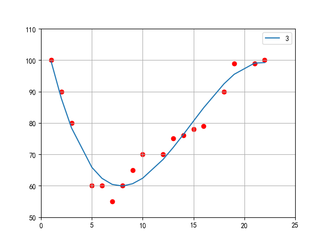
(1)numpy
Regression prediction using poly1d and polyfit functions from numpy Library
Data: numpy-poly1d, polyfit, polyval polynomial use
import matplotlib.pyplot as plt
from scipy import stats
import matplotlib
import numpy as np
matplotlib.rcParams['font.sans-serif'] = ['SimHei'] # Show Chinese in bold
x = [1,2,3,5,6,7,8,9,10,12,13,14,15,16,18,19,21,22]
y = [100,90,80,60,60,55,60,65,70,70,75,76,78,79,90,99,99,100]
slope, intercept, r, p, std_err = stats.linregress(x, y)
myline = np.linspace(1, 30, 100)
for i in [3]:
mymodel = np.poly1d(np.polyfit(x, y, i))
plt.xlim(0,25)
plt.ylim(50,110)
plt.plot(x, mymodel(x),label="{0}".format(i))
plt.scatter(x, y,color="r")
plt.legend()
plt.grid()
plt.show()

(2)sklearn
And that's the same data. Let's look at it using sklearn
Code: