Java Learning Notes: January 8, 2022
Summary: This day I learned the basic knowledge of HTML Hypertext Markup Language and CSS Cascading Style Sheets, which are used to render basic web pages.
1.HTML Language Basics
1. Introduction to HTML Language
HTML is fully known as Hypertext Markup Language. It is not a programming language, but a markup language for organizing information, marking up text. In short, it organizes discrete Web page information on the Internet so that they become relatively independent individuals and can be recognized by the human eye. In short, it is a rule for page layout. On Baidu Encyclopedia, the HTML language is defined as: the full name of HTML Hypertext Markup Language Is a Markup Language . It includes a series Label With these tags, you can use the File Unify formats so that they are dispersed Internet Resources are connected as a logical whole. HTML text is descriptive composed of HTML commands text HTML commands can explain Written words,Graphical,animation,voice,form,link Wait. Hypertext Is an organizational message mode , it passes through Hyperlink Method uses text, charts, and others in the text Information Media Relevance. These interrelated information media may be in the same text, other files, or geographical position Somewhere far away Computer Files on the. This way of organizing information connects information resources distributed in different locations in a random way to find information for people. retrieval Information is easy to provide.
What an obscure thing to remember for our beginners or users: HTML is not a programming language, but a markup language. It is not used for logical writing, but for typesetting at the front of web pages. It is a rule for page typesetting. We follow a rule when writing, and browsers interpret it accordingly so that we can parse and get the page layout we expect. The basic elements in HTML are tags. We use tags to format. Correspondingly, browsers interpret by tags and write corresponding tags where appropriate. The browser will parse the correct information when it parses, and we can get an expected page from the browser's black box as a mapping function between the label code and the front page.
2. Basic construction of HTML
The HTML language is a label language. Anything you want to control in the HTML language should be written in the label. If you want to control the font and color of a piece of text, you have to have a label in it. If it doesn't exist, the web page can really display it. But we can't use some rules to control their style.
In HTML, indentation is a very important way to help people understand code. Usually, we use indentation to represent containment relationships. An element tag that is contained often needs to be indented one more space than the element tag that contains it, as follows:
<div class="div1">
	<div class="div2">See</div>
	<div class="div2">You</div>
	<div class="div2">Cow</div>
	<div class="div2">boy</div>
	<div class="div2">Bebop</div>
</div>
We noticed that div2 is a class that they are siblings, and div1 contains them, which is an indentation relationship that should exist between them. Using this indentation relationship helps code to be readable because the inclusion relationships in the code and on the web page correspond to one another, so they are indented based on the inclusion relationship. It helps us understand the layout of the page in combination with the code, which is a very good habit.
The overall structure of HTML is as follows:
<!DOCTYPE html>
<html lang="en">
<head>
    <meta charset="UTF-8">
    <title>Title</title>
</head>
<body>

</body>
</html>
The first is the declaration about the file type, <! DOCTYPE html>declares that this file is an HTML-type file, followed by a large HTML-type label, which is the body of the entire file and what needs to be expressed on the web page must be written in the <body>label inside it to be recognized. In its <head>tag, there are some basic information, such as meta-information in the <mate>tag. There are some basic information declarations for browser engine in this tag, such as description of update frequency, and the encoding type of "UTF-8" here. < The title > tab allows you to customize the title you want for the pop-up window, which is the title in the small pop-up window on the page above your browser. Here, we can also write <style>tags, write internal styles, add <link>tags, and import external files to support the development and design of this page.
Before the <head>tag and <body>tag, we can also add some other tags, most commonly the <script>tag. < Script>can be inserted above and below the <body>tag, or you can write a separate Js file and import it. It is important to note that in HTML pages, compilation is also top-down, so when the <script>tag is on top and some component operations are performed, it is likely that an error will occur that the component cannot be found, because when the <script>tag is loaded and functioning, the lower tag has not been recognized and loaded, and the Js operation needs to be written in the document ready function. This function avoids these problems by ensuring that the underlying code is not executed until it identifies the load. In the future, I will focus on this knowledge point.
3. Summary
<! The DOCTYPE html>tag is used to declare a file type through which the browser can know the type of a file. We usually call it a document type declaration, and in the following image, it declares that the document type is html:

<mate>is called a meta-tag, also called a meta-element, meta-tag. It can be understood as a source in a sense, with some basic information in it. < Charset > is a character setting for encoding.
When writing HTML encoding, be sure to pay attention to indentation and write each level before writing other levels to avoid errors. We rarely use basic tools such as Notepad to write HTML files, because this markup language is very cumbersome and needs a lot of attention, so we usually use some tools to write HTML languages, such as Visual Studio Code, WebStorm, etc. Visual Studio Code is a free and useful code editor that can not only write HTML languages, You can also write projects in other languages, which is very useful, shortcut keys are very convenient and the key is free, so I will mainly use them for writing HTML languages. (It can add EVA themes, which are very nosy.)
Finally, indentation is a very important thing in HTML, but we need to be aware that the <html>tags and <body>tags and <script>tags are also containable in the framework section generated by the editor itself, but there is no indentation between them because they are all basic tags. After repeated experimentation, it has been found that indenting them makes little sense and makes the code look messier, so it doesn't indent.
2. Writing HTML
1. Box model
Box models are the most fundamental and important drawing principle on front-end pages drawn in HTML. It can be said that the layout of the entire front-end page is all built from one box by one. What is a box model? First, let's introduce two different boxes. In HTML, elements drawn with <div>tags will wrap lines when writing continuously, whereas elements drawn with <span>will not wrap lines in browsers. Why? This is because the box model corresponding to the <div>tag is a block-level box model, so this tag, or element, is also called a block-level tag or block-level element, while the <span>tag is an inline-level box model. This tag or element, also known as an inline-level tag or inline-level element, has two main classes in the HTML box model. They are block-level boxes and inline-level boxes.
1. Block-level box (elements, labels) features: exclusive row; Width, height support.
2. Inline level boxes (inline boxes, inline elements, labels) feature: not exclusive row, width height is not supported.
Unsupported refers to using cascading stylesheets to add height and width to them, rendering them without revealing both attributes at all, and browsers can't recognize them at all, let alone draw them. The so-called exclusive line is completely exclusive, leaving no room for the next element, because it can only be wrapped. This element completely occupies this line, block box exclusive line, regardless of its width, will completely exclusive line, leaving no space for the next element, so the next drawn element can only be drawn down. Next we'll experiment to see if this is really the case.
First we write the following HTML code:
<!DOCTYPE html>
<html lang="en">

<head>
    <meta charset="UTF-8">
    <meta http-equiv="X-UA-Compatible" content="IE=edge">
    <meta name="viewport" content="width=device-width, initial-scale=1.0">
    <title>Document</title>
</head>

<body>
    <div style="height: 100px;width: 100px;background-color: aqua;"></div>
    <div style="height: 100px;width: 100px;background-color: rgb(255, 72, 0);"></div>
</body>

</html>
We wrote two different div s, giving them the same size attribute but different color attributes, one light blue and one red, and we put them into a browser to parse:
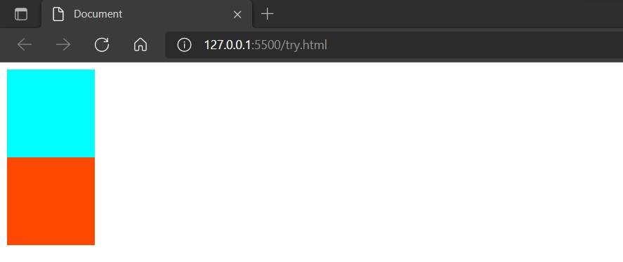
The result is a line break, as shown in the figure. Now let's explore the real reason. We'll delete the width setting and see what happens:
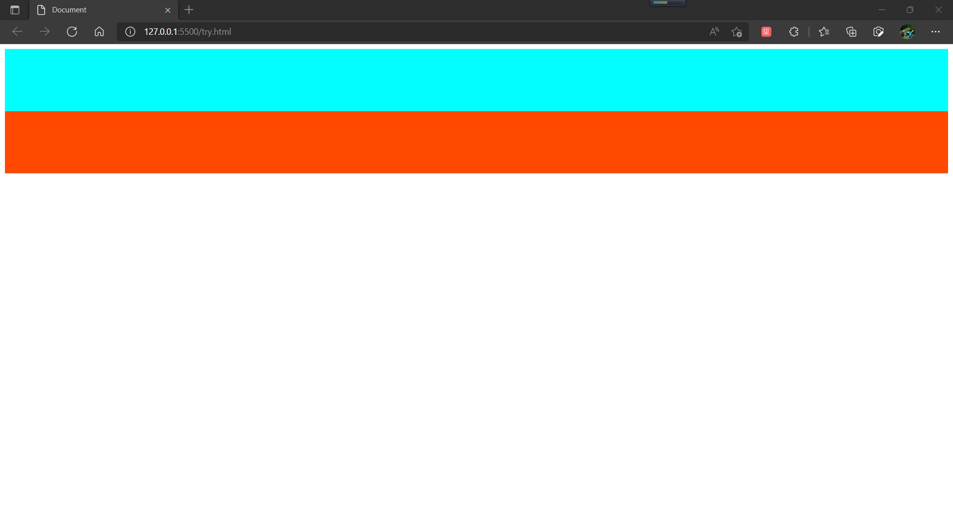
We found that when the width setting is removed, each div automatically stretches to take up the entire line space, so we concluded that the div label and some other block-level elements occupy the whole line by default. When the width is not set, it fills the whole line by default, and when the width is set, in order to preserve certain typesetting characteristics, It still takes up the entire line, but no longer renders pixels that are outside the width.
Next, let's try the space tag, and we write the code as follows:
<!DOCTYPE html>
<html lang="en">

<head>
    <meta charset="UTF-8">
    <meta http-equiv="X-UA-Compatible" content="IE=edge">
    <meta name="viewport" content="width=device-width, initial-scale=1.0">
    <title>Document</title>
</head>

<body>
    <span style="height: 100px;width: 100px;background-color: aqua;"></span>
    <span style="height: 100px;width: 100px;background-color: rgb(255, 72, 0);"></span>
</body>

</html>
So what does it show? That's true:
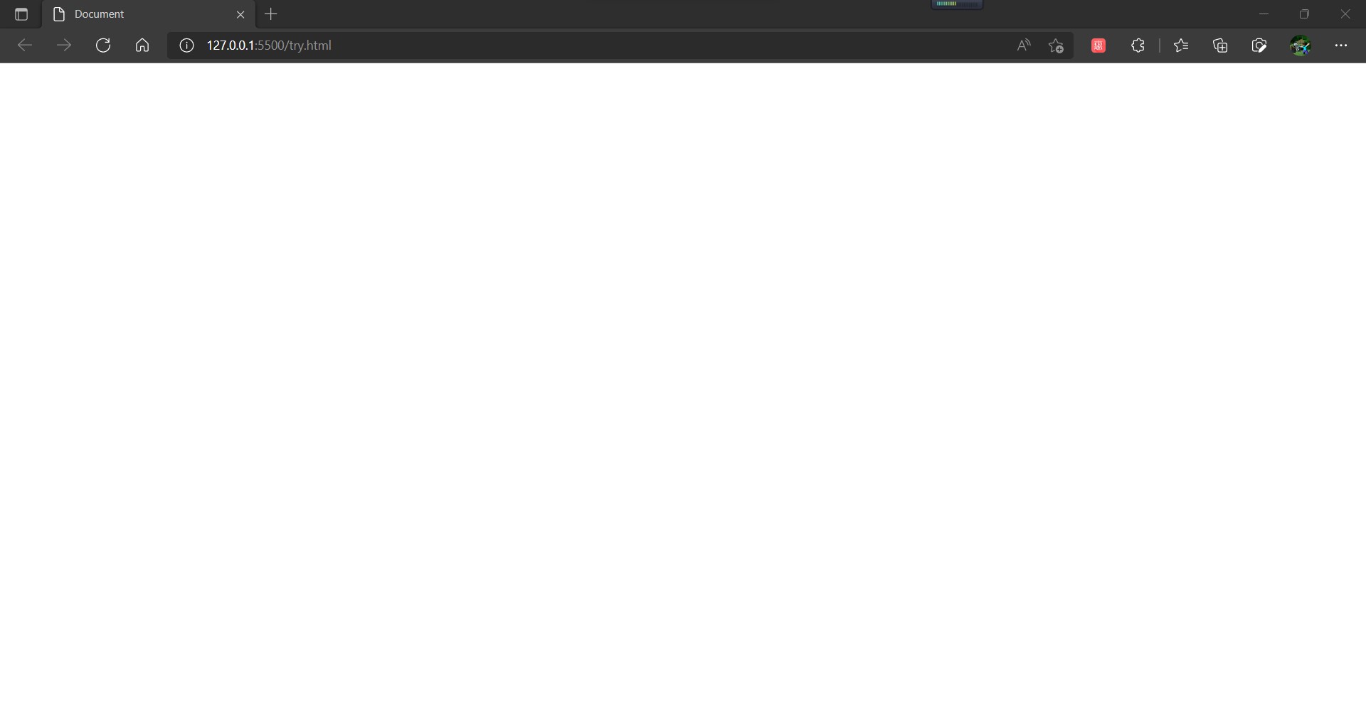
What we were surprised to find was that nothing happened at all, except that the vast white land was really clean. Why is that? What is it that the heigth and width properties we explicitly set do not work at all? This is because the height and width styles in the inline level elements are not recognizable at all. They don't support the width and height. The size of the space is entirely supported by the things inside, not what you think is set. Now let's write something inside.
<!DOCTYPE html>
<html lang="en">

<head>
    <meta charset="UTF-8">
    <meta http-equiv="X-UA-Compatible" content="IE=edge">
    <meta name="viewport" content="width=device-width, initial-scale=1.0">
    <title>Document</title>
</head>

<body>
    <span style="height: 100px;width: 100px;background-color: aqua;">See you!</span>
    <span style="height: 100px;width: 100px;background-color: rgb(255, 72, 0);">Cowboy Bebop!</span>
</body>

</html>
Next, the browser displays as follows:
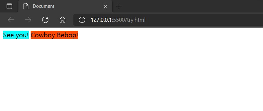
In this way, the whole element is unbound, and the property of background color is also shown.
Block-level elements can only really be one line, can't they be changed? Of course not, even block-level elements can be arranged side by side in a row like inline-level elements. How? Some people may think that just wrapping a block level element in an inline level element is good. Let's try the following:
<!DOCTYPE html>
<html lang="en">

<head>
    <meta charset="UTF-8">
    <meta http-equiv="X-UA-Compatible" content="IE=edge">
    <meta name="viewport" content="width=device-width, initial-scale=1.0">
    <title>Document</title>
</head>

<body>

    <span>
        <div  style="height: 100px;width: 100px;background-color: aqua;">See You!</div>
    </span>
    <span>
        <div style="height: 100px;width: 100px;background-color: rgb(255, 72, 0);">Cowboy Bebop!</div>
    </span>
</body>

</html>
Show as follows:
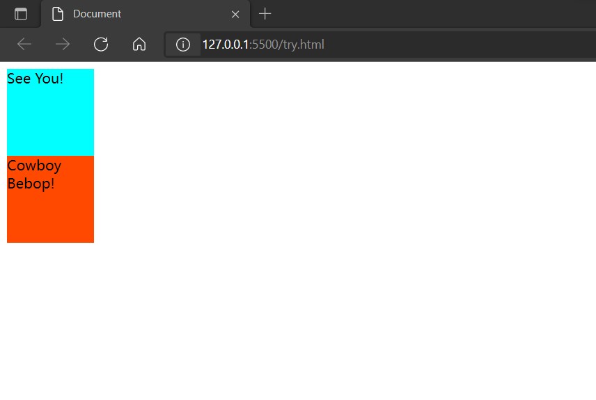
Obviously, the goal has not been achieved, so what exactly is the solution? There are three ways to choose from. One is the floating style. After adding the floating attribute to the style, you can set the floating direction so that the block-level elements can be arranged in the floating direction on top of the row, but this method has some drawbacks. Another method is called the elastic box model, which controls the arrangement of the upper rows of block-level elements by modifying the elastic direction and is safer than the floating style. As to how safe and how to use it, we will detail it in our later notes. The third way to compare hard cores is to have a displayattribute in each label's style. The displayattribute defines the element type, the block-level box has a display:block, and the inline has a display:inline. You can modify the types of different labels through the css language, but this will make the div essentially an inline element. span is fundamentally a block-level element and therefore loses some of the features that we usually need, so this is not particularly common, but it is also a flexible typesetting method. Let's start by knowing these three ways that block-level elements can be laid out on the same line, because now we have to start talking about box models.
2. What is a box model?
The box model can be understood as a rule of layout and layout. In front-end pages based on HTML language, all elements can be viewed as a box. There are many different components in this box. By controlling these components, we can control each element accordingly and complete the page layout. Note that the box model is essentially CSS-based, CSS is cascading stylesheet, and I will focus on CSS language later, here we start with the HTML language and how the front-end elements are represented.
Every HTML element can be viewed as a box. As the name implies, boxes are used to hold things. The box model on the inside is also a container. We put information into the container and then modify the style of the box so that we can indirectly modify what is inside the box. In HTML, the box for each element has the following sections:
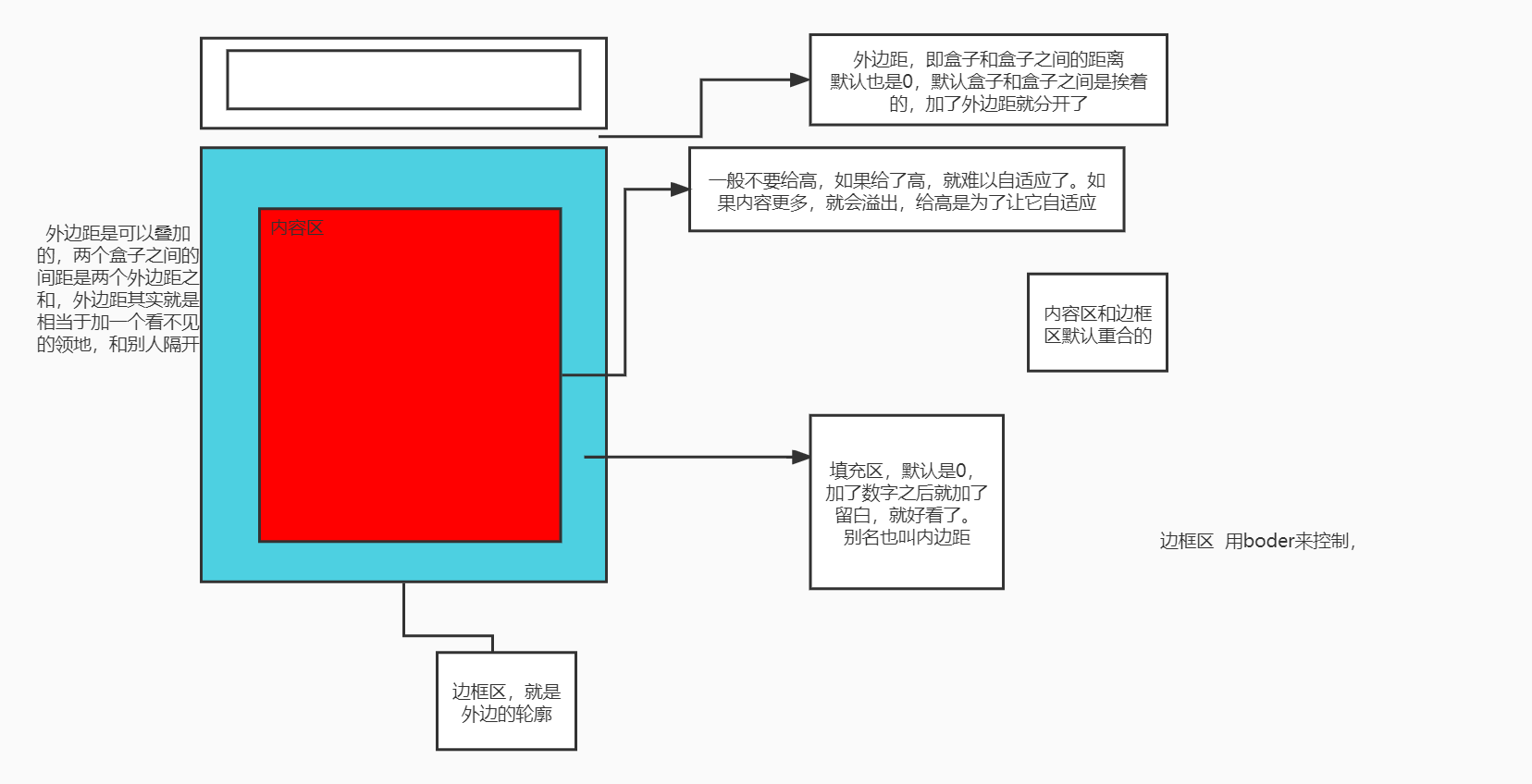
Each element is a box and consists of four main parts: the content area, the fill area, the border area, and the outer margin. In fact, the outer margin is hard to relate to a region. The outer margin is actually more in favor of an attribute. We can think of the outer margin as an area outside the box, but in fact, the outer margin is really a component, so for ease of understanding, some people also call the outer margin an outer area.
As shown in the figure, the content area is at the innermost part of the box model, and in fact, it is also at the innermost part of a label in encoding, such as the div label:
<div>
	Hello everyone!
</div>
Hello, this person is located between the double labels. After being parsed by the browser, it is in the content area of the image above.
The border area is the theoretical outermost box. It is the border of the display part of the whole element that can be seen by the human eye. The length and width of the whole element, the style and thickness of the border are all controlled by the border area. There is a property in CSS that modifies the style specifically for the border area: border. Using the border attribute to control, we can flexibly control the thickness and style of the entire element's border.
For the border attribute, we use more of its three aspects: border-style: the style of the border, border-width: the thickness of the border, border-color: the color of the border. Also, we need to keep in mind the four directions of the border attribute: border-top, border-right, border-bottom, border-left. ** Border is a compound property, and I'll analyze this in more detail after I've covered fill areas and outside areas. ** For a style of border, we can use the none value to cancel it. If we have already set the specific style of border-style, we can re-assign none to the style attribute below it in the style code or where it is updated, so that the style will disappear so that we can assign it a style first. Set the none property again to make this style disappear. This works wonderfully when designing dynamic pages.
The border attribute has another basic usage, that is, it directly uses the border attribute, which can be used to write three values together behind it, but unlike padding and margin, it can only control all edges, but it can control three attributes, width, type and color, as follows:
border:10px solid red;
It means: 10 pixels wide with a solid red border. It defines three attributes at once: width, style and color. This kind of writing can only control the top, bottom, left and right borders at one time, that is, all borders. Also, you don't need to define border-style above because it already exists inside.
The inner margin is the blue part of the content area and border area in the image above. As the name implies, the inner margin is the distance between the content area and the border area. When we want the text within an element to be a little larger than the inner surface of the border, we can adjust it by setting the pixel size of the inner margin. The interior margin also has an attribute to control, which is: padding, padding, which is different from border. It is not a fussy attribute, but a unique attribute, which is designed to control distance. It has its own control format.
Arrangement of parameters behind padding has its own parsing method, or parsing rule. The attribute value behind padding is distance. This distance value can be modified in a variety of units, usually in pixels (px). The padding attribute without any suffix can be followed by up to four attribute values, which can be separately parsed into: the distance on the top, The distance to the right, the distance to the bottom, and the distance to the left. That is, it starts from the top and rotates clockwise, specifically:
padding:Top Margin Right Margin Bottom Margin Left Margin;
padding: 10px 20px 30px 40px;
//This gives an element a box model with a top margin of 10 px, a right margin of 20 px, a bottom margin of 30 px, and a left margin of 40 PX
At the same time, if you fill in one to three values instead of four, it also has a unique way of parsing as follows:
padding:All directions;
padding:10px;
//When there is only one parameter behind the padding, the browser resolves it to margins in all directions, and the distance from the top, bottom, left, and right of the content area to the inner surface of the border area is controlled
That is, when there is only one attribute behind a padding, it controls the distance in four directions.
What happens when padding is followed by two values? The following:
padding:Up and down, left and right;
padding:20px 30px;
//These two values are rendered to the upper and lower margins, the left and right margins, respectively.
Because there are four directions, and the four directions can be divided into two pairs, the browser divides them into two pairs in order. The order of the two pairs and the rendering order of the first four attributes are different, changing to top, bottom, left and right. Note the change in order here. ** This format is commonly used when the top, bottom, and left margins need to be consistent. ** In fact, this recognition is also related to the top four values because its basic recognition is upper right lower left, so when there are only two values, it first recognizes upper and right, while the other two directions are undefined, so the other two directions default to be the same as their opposite direction, that is, upper and lower relative. Left and right are opposite.
When there are three attributes, the situation changes again, as follows:
padding:Top left and bottom;
padding:10px 30px 20px;
//The three attributes are rendered as top, left, and bottom.
This rendering rule is also actually related to the top basic rule, because the basic rendering rules are top, right, bottom, left, then we can recognize the top, right, bottom, and the last "left" is not recognized, so the browser renders the top, right and bottom first, while the left default is the same as its relative right.
Another thing we need to note is that the distance provided by the padding attribute is an extra increase. Setting different distances for it directly causes the entire element to become larger, regardless of the length and width set by the height s and widths attributes, such as:
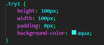
In this case, the browser looks like this:
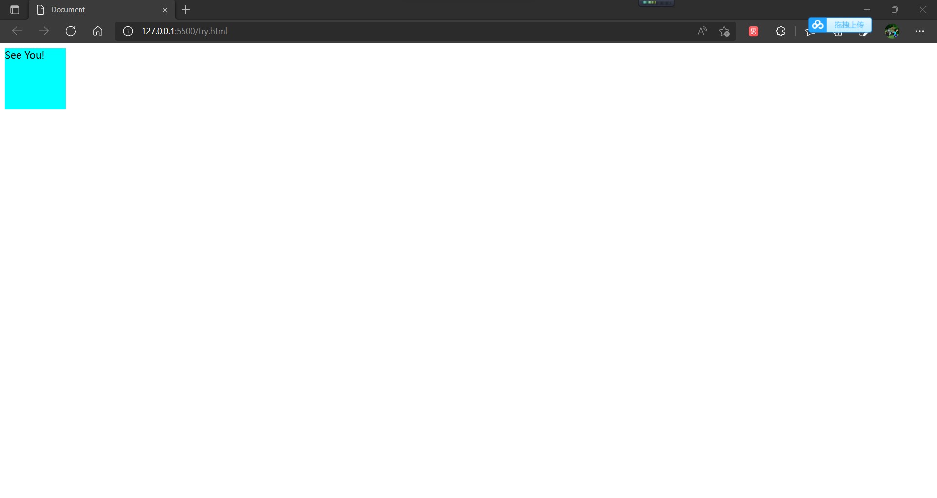
And when we increase the margin for it, this time:
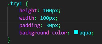
The browser reads as follows:
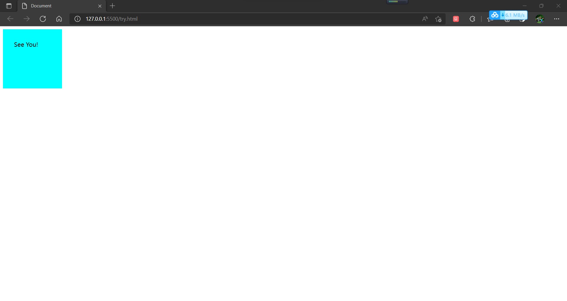
There was a noticeable change in size, and we explicitly set the width and length attribute in the attributes. Even if we put this padding property on the top, it won't be overridden by the width and length property. When we modify the length and width values, the size of the entire element changes again, so what's the principle here,** In fact, in CSS, width and height refer to the width and height of the content area. Increasing the margins inside, outside, and border will not affect the size of the content area, but will increase the total size of the element box. ** In other words, the width and height attributes are the size of the controlled content area, which defaults to zero when padding is not set, and the size of the content area directly affects the size of the entire component. When padding is set, both the padding area and the padding area will affect the size of the entire component, so we can know that the size of the component is affected by both the content area and the padding area. When no padding area is set, the content area and the padding area are coincident by default, or the padding area has no pixels at all.
The outer zone is also known as the outer margin, that is, the distance from the outside of the border zone to other components. Setting this property allows us to control the distance between components. In another way, we can understand that there is a transparent box at the distance from the outer border pixel of the border zone to the set pixel, which will not be rendered. However, its collisions add to the calculation, taking up space on the entire page and delimiting it from other components.
The attribute that controls the outside world is named margin. Similar to the padding attribute, the margin attribute is an attribute designed to control distance. At the same time, the margin attribute has four rendering attributes in the upper right and lower left directions, and its recognition rule is the same as that of padding. It is important to note that the margin attribute has an attribute called auto, which allows the component to automatically center. In a browser, a page has a width limit, but no height limit, so it has at least one width for a component to use this property value, because the center of the width direction needs to be calculated using its width.
Now let's look at the border attribute again. Now we can see that it's different from other attributes. The border attribute is a composite attribute that controls not only the thickness but also the color, style and other attributes. But correspondingly, It loses the way that margin and padding can be used to write several attributes that can be directly controlled in different directions. Border can only be used to control borders directly or in four directions. It can be combined in the part of the attribute name, for example:
border-left-color: red;
At the same time, we need to pay special attention to that border is a composite attribute whose style presentation requires division of labor and cooperation using multiple border attributes. The border-style attribute is the most important of the border-style attribute, which allows you to style a border. ** And if you want to set a border, you must have this attribute in the style. Without this attribute, the border cannot be rendered. ** For example:
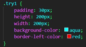
The browsers are as follows:
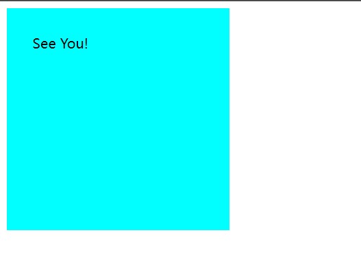
When we set border-style:solid before, for example:
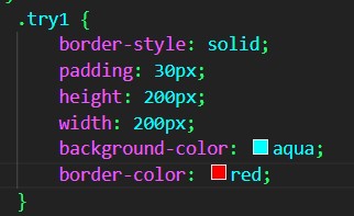
In the browser:
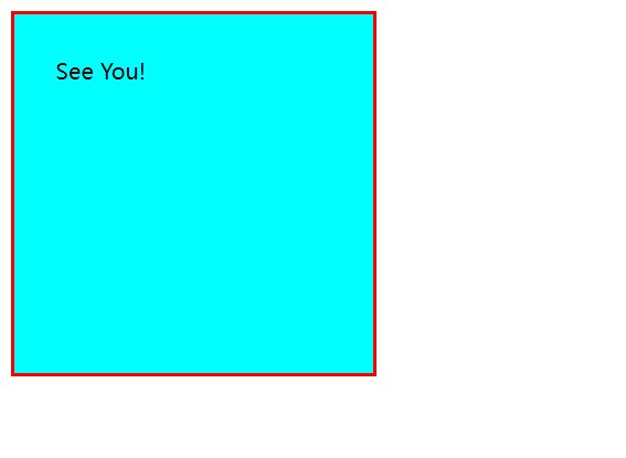
Visibly, without a border-style, the style of the border cannot be rendered. Add a border-style attribute before all the border-style attributes to display the border. The border-style attribute has many different values, solide, or solid, is just one of them. It also needs many other values, which are not discussed here. It is important to note that the thickness of the border also affects the overall size of the entire component, that is, the size of the entire component box depends on: ** The width and height of the content area, the length of the inner margin, and the thickness of the border. ** When there is only one component, its size is affected by these attributes. When there are multiple elements on the page, the size of the outer margin also affects the size of the component, and may cause the content container to squeeze. No further research will be done here for the time being.
As you can see from the above, the border and outer margin also change the width of the element. Width and height we use generally only work on content, but with the attribute value box-sizing:border-box added, we can make the width and height of the box including the border height control, which allows us to have more macro control.
3. Summary
The box model is divided into four main areas: content area, fill area, border area, outer margin. We arrange our pages by controlling these four properties. In browsers, margin and padding attributes are automatically added to the <body> tag for aesthetic purposes, so if we want to render it exactly in our style, we can start with the'*'selector, which is a regular expression in the class selector, to express the whole idea and make all the styles on the page clear as follows:
.*{
	margin:0;
    padding:0;
}
We use percentages to control distances rather than pixels for distance typesetting. This way, when the page zooms in and out as a whole, it ensures that the elements inside are not cluttered. It is a robust layout and is recommended.
3. About floating attributes
There is an attribute in a block-level element called float, written as float, and the floating-point type in Java is a letter, also translated as float. Floating types allow block-level elements to be arranged row by row, like inline elements, while changing the direction of the float. This is a bit like floating in water. The set direction of floating is the water surface, and the set element will actively float in the direction of the water surface. If there is already an element on top, it will be blocked, thus forming this effect of line by line. The code is as follows:
<!DOCTYPE html>
<html lang="en">

<head>
    <meta charset="UTF-8">
    <meta http-equiv="X-UA-Compatible" content="IE=edge">
    <meta name="viewport" content="width=device-width, initial-scale=1.0">
    <title>Document</title>
    <style>
        .try1 {
            padding: 30px;
            height: 200px;
            width: 200px;
            background-color: aqua;
            padding: 20px;
            float: left;
        }
    </style>
</head>

<body>
    <div class="try1">See You!</div>
    <div class="try1">Cow</div>
    <div class="try1">boy Bebop!</div>
</body>

</html>
The three block-level elements can be arranged side by side in rows as follows:
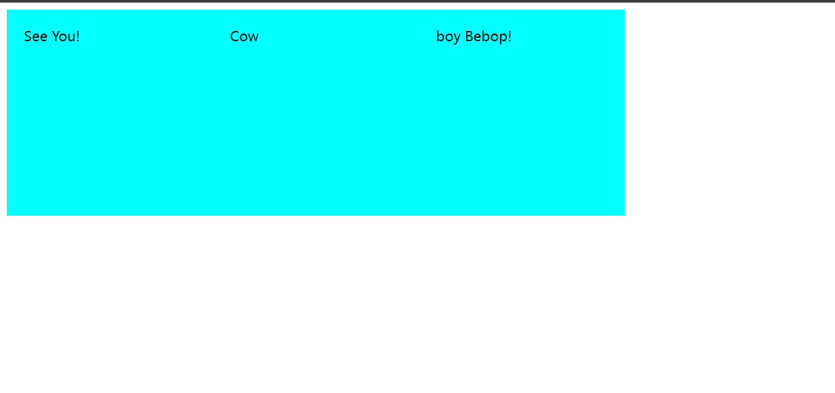
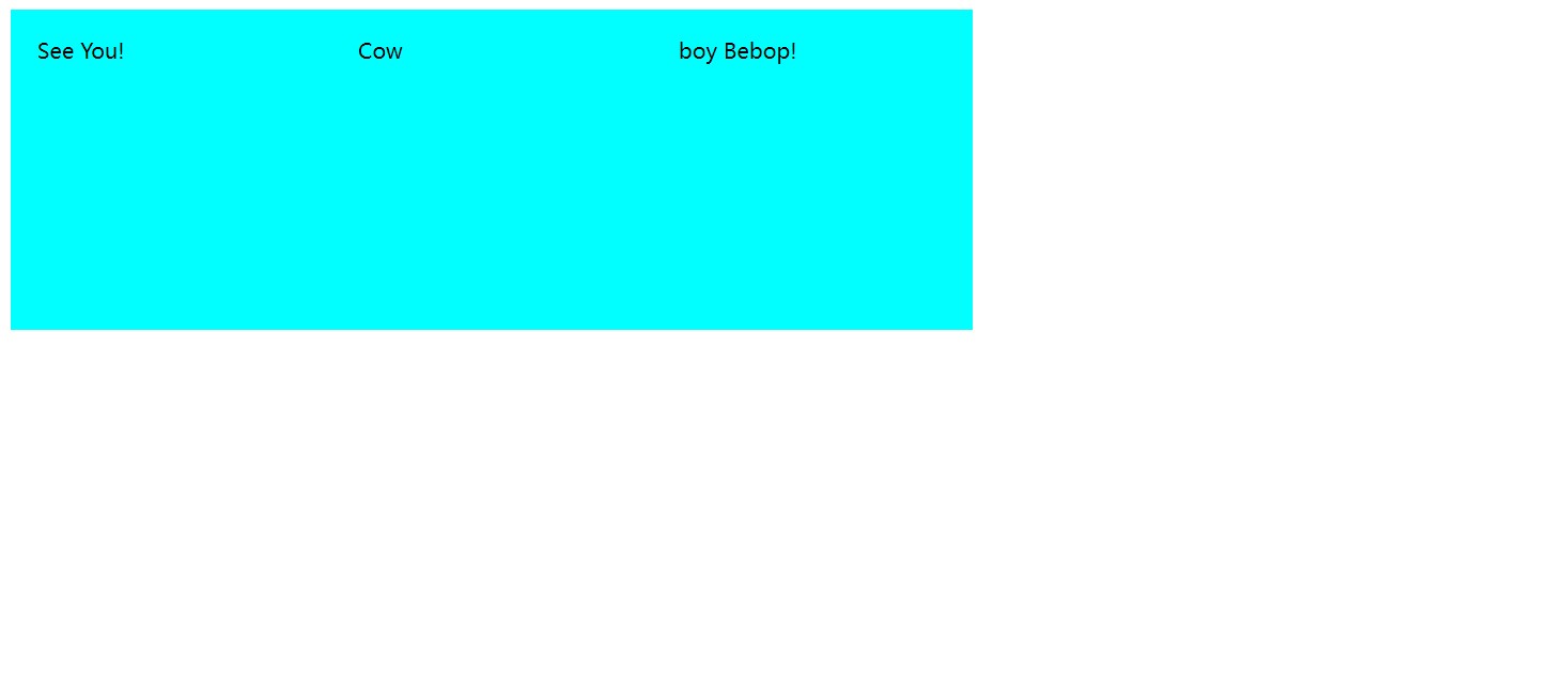
However, float s have drawbacks. When we use a parent element to hold these side-by-side block-level elements, when the height of the parent element is not set, the parent tag rendering disappears and the elements overlap, such as the following code:
<!DOCTYPE html>
<html lang="en">

<head>
    <meta charset="UTF-8">
    <meta http-equiv="X-UA-Compatible" content="IE=edge">
    <meta name="viewport" content="width=device-width, initial-scale=1.0">
    <title>Document</title>
    <style>
        .try1 {
            padding: 30px;
            height: 200px;
            width: 200px;
            background-color: aqua;
            padding: 20px;
            float: left;
        }

        .try {
            width: auto;
            background-color: blue;
        }
    </style>
</head>

<body>
    <div class="try">
        <div class="try1">See You!</div>
        <div class="try1">Cow</div>
        <div class="try1">boy Bebop!</div>
    </div>
</body>

</html>
In a web page, the parent element is completely invisible and the child element does not stretch the parent element:
Even if the height is set, when the height is smaller than the child element, the code is as follows:
<!DOCTYPE html>
<html lang="en">

<head>
    <meta charset="UTF-8">
    <meta http-equiv="X-UA-Compatible" content="IE=edge">
    <meta name="viewport" content="width=device-width, initial-scale=1.0">
    <title>Document</title>
    <style>
        .try1 {
            padding: 30px;
            height: 200px;
            width: 200px;
            background-color: aqua;
            padding: 20px;
            float: left;
        }

        .try {
            width: 900px;
            background-color: blue;
            height: 150px;
        }
    </style>
</head>

<body>
    <div class="try">
        <div class="try1">See You!</div>
        <div class="try1">Cow</div>
        <div class="try1">boy Bebop!</div>
    </div>
</body>

</html>
The following are also true:
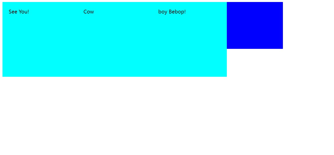
This is not good, so how can we solve this problem? CSS provides a more convenient way: overflow hiding. How do we use overflow hiding? Overflow hiding needs to be used within the parent element. We set an attribute for the parent element: overfloat and the attribute name to hidden, which can solve this problem. However, this method is flawed. Why is it flawed? Let's first see what happens when the height is not set. The code is as follows:
<!DOCTYPE html>
<html lang="en">

<head>
    <meta charset="UTF-8">
    <meta http-equiv="X-UA-Compatible" content="IE=edge">
    <meta name="viewport" content="width=device-width, initial-scale=1.0">
    <title>Document</title>
    <style>
        .try1 {
            padding: 30px;
            height: 200px;
            width: 200px;
            background-color: aqua;
            padding: 20px;
            float: left;
        }

        .try {
            width: 900px;
            background-color: blue;
            overflow: hidden;/*Overflow hiding without height solves this problem*/
        }
    </style>
</head>

<body>
    <div class="try">
        <div class="try1">See You!</div>
        <div class="try1">Cow</div>
        <div class="try1">boy Bebop!</div>
    </div>
</body>

</html>
The effect is as follows:
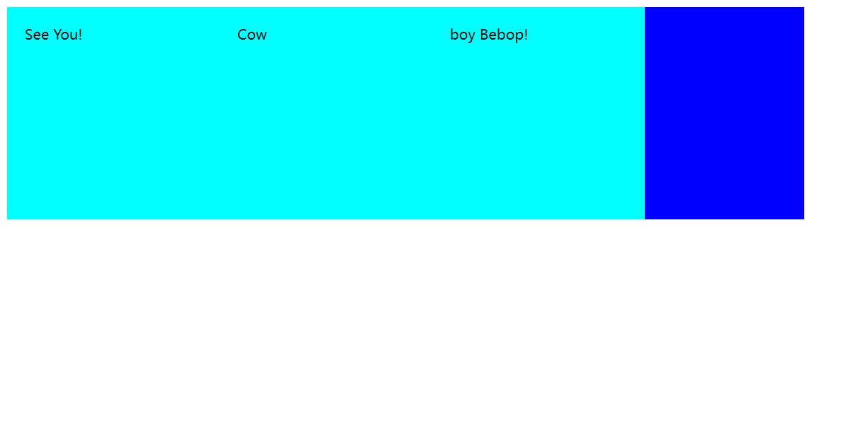
This solves the problem, which seems to be perfectly solved, but when we set the height for the parent element, let's see what happens. The code is as follows:
<!DOCTYPE html>
<html lang="en">

<head>
    <meta charset="UTF-8">
    <meta http-equiv="X-UA-Compatible" content="IE=edge">
    <meta name="viewport" content="width=device-width, initial-scale=1.0">
    <title>Document</title>
    <style>
        .try1 {
            padding: 30px;
            height: 200px;
            width: 200px;
            background-color: aqua;
            padding: 20px;
            float: left;
        }

        .try {
            width: 900px;
            background-color: blue;
            height: 150px;
            overflow: hidden;
            /* We set the parent element to a height less than the child element and added the overflow concealment property */
        }
    </style>
</head>

<body>
    <div class="try">
        <div class="try1">See You!</div>
        <div class="try1">Cow</div>
        <div class="try1">boy Bebop!</div>
    </div>
</body>

</html>
The following is the case:

We found that the situation has changed and that the height of the parent element is no longer dependent on the child element, but on itself. The height is rendered exactly according to the height of the parent element, and the extra child elements are truncated.
Highlighted, ** We need to note that overfloar:hidden is called overflow hiding and, if known, should be an attribute used to solve the overflow problem, not a floating problem attribute. In fact, overflow hiding solves the problem of parent elements not being rendered at no height, but is a feature of it, not its design purpose, which is designed to hide the overflow of child elements in the parent element. ** Therefore, it does not solve our problem perfectly. It solves the situation where the parent element does not render at no height, but it solves the overflow problem in which the parent element has a height of zero. In this special case, it causes the parent element to expand with the height of the child element, which disappears when the height of the parent element exists. Instead, show your capabilities directly, hiding overflows. So we know that when using float for block-level element row direction arrangement, the case where the parent element is not set high and the parent element does not render can be solved with overflow hiding, but the overflow hiding design is not intended to solve this problem, it just uses the overflow hiding feature to occasionally solve this problem, when the parent element is set high, Overflow hiding reveals its own authenticity, that is, to hide the part that overflows the parent element, but at this time our purpose is not to hide the overflow part, which can lead to page layout errors.
So when we solve this problem, we try not to overflow and hide, or float, but to use another, more efficient method: the Elastic Box model.
4. Elastic Box Model
The so-called elastic box is to make the box elastic and expand with the size of the child elements inside. At the same time, another feature of it is to make the child elements inside the parent element line up in line direction. So how do you use the elastic box model? We only need to add one attribute for the parent element: display: flex; Yes, as follows:
<!DOCTYPE html>
<html lang="en">

<head>
    <meta charset="UTF-8">
    <meta http-equiv="X-UA-Compatible" content="IE=edge">
    <meta name="viewport" content="width=device-width, initial-scale=1.0">
    <title>Document</title>
    <style>
        .try1 {
            padding: 30px;
            height: 200px;
            width: 200px;
            background-color: aqua;
            padding: 20px;
        }

        .try {
            width: 900px;
            background-color: blue;
            display: flex;
        }
    </style>
</head>

<body>
    <div class="try">
        <div class="try1">See You!</div>
        <div class="try1">Cow</div>
        <div class="try1">boy Bebop!</div>
    </div>
</body>

</html>
Then we can see that the pages are:
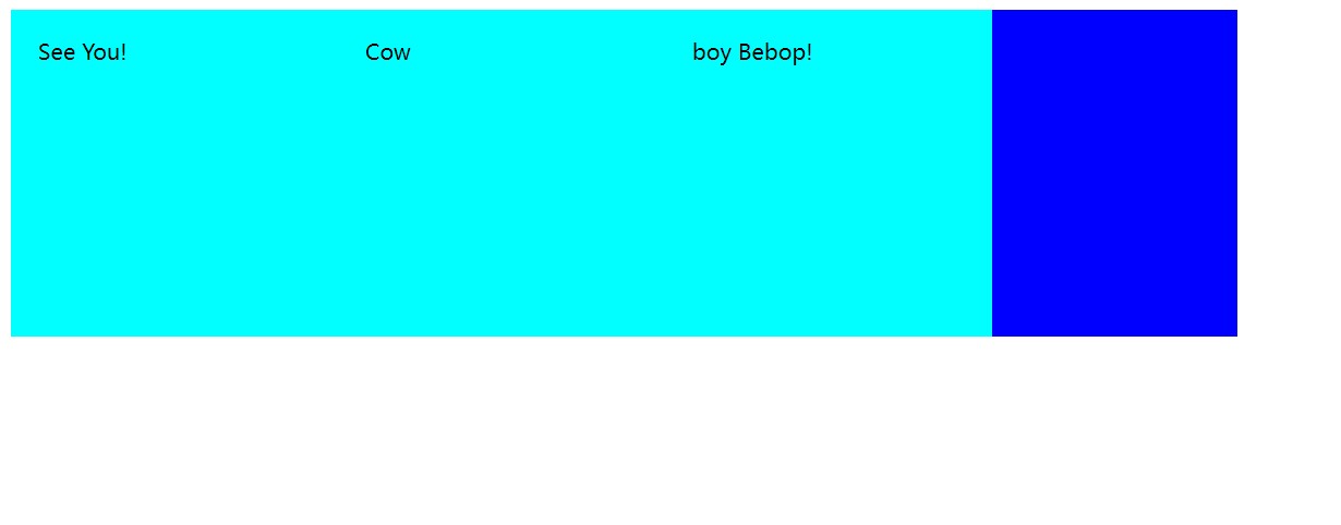
Overflow still occurs when we set the height of the parent element, but the use of the Elastic Box model does not result in child elements being intercepted because it was designed not to intercept but to actually solve this problem.
When we need to solve the problem of row direction arrangement, it is better to use the elastic box model instead of floating and clearing floating, because clearing floating is not really used to clear floating, it is used to hide the overflow, so it is easy to generate ambiguities and errors, and the best specialized method is used in a specific field.
5. Basic usage of elastic box models
When we don't want to use the horizontal layout but want to use the elastic box model, we can use flex-direction:colum-reverse; This method can change the orientation of the elastic box model so that it is arranged vertically instead of horizontally. This actually changes the alignment direction by a parameter, which seems to restore the properties of block-level elements, but actually changes the alignment from row-level to column-level.
If you want to be line-breaking, use flex-warp:warp. This property allows elements in the elastic box to be split if necessary, that is, when one line is no longer large enough to hold the element, the element is placed on a new line. This is actually a line break for a child element, and when the child element has a fixed length and width, it is very helpful to use this property so that the child element does not change and is presented in a designed way.
justify-content: The distribution of the layout direction, that is, to change the layout. Control the space that is not full. Attributes are: flex-start flex-end center space-between space-around
Another important property is the alignment of the vertical direction of the arrangement: align-item. It has some important attribute values:
1.flex-start; The default is this mode, with the start/top alignment, where the above border is aligned as the baseline
2.flex-end; Bottom alignment, with the following border aligned as the baseline
3.flex-center; Center aligned, centered
4.baselinr; Baseline alignment aligns with the bottom edge of the content, that is, the bottom edge of the child element content holder.
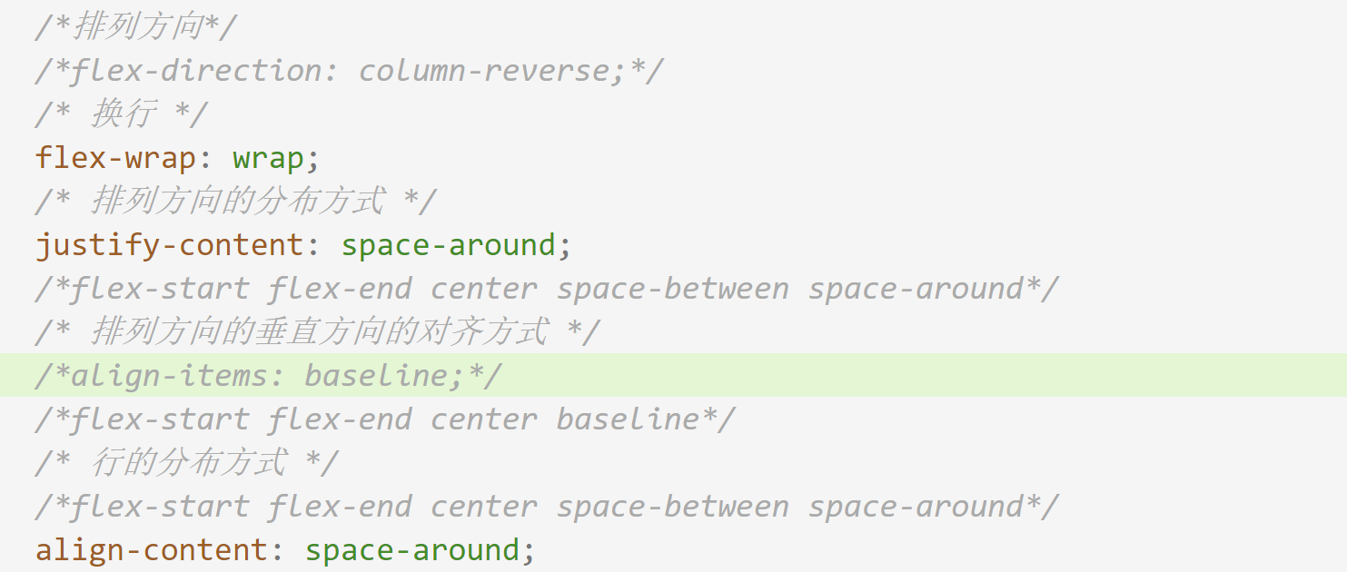
The above is the basic properties of the elastic box model and how to use it. In the future, I will summarize the use of the elastic box model in detail. This is just a note to learn about.
6. Styles and selectors
I've used a lot of style writing in the notes above. Now let's talk about style. Styles are essentially code sections written using CSS, cascading style sheets. Most of our styles are written in CSS and are divided into three types: **Inline, Internal, and External. ** The use of these three styles reflects the idea of code reuse. Now let's introduce each of these styles one by one.
1. In-line Styles
Inline Styles are the most basic way to write styles that are written within the style attribute of an element and can be used to style each element, or label, with the most accurate styling.
2. Internal Style
The internal style is written in the <style>tag inside the <head>tag of the html file, where we can see how CSS code is written, which is an internal style:
<head>
    <meta charset="UTF-8">
    <meta http-equiv="X-UA-Compatible" content="IE=edge">
    <meta name="viewport" content="width=device-width, initial-scale=1.0">
    <title>Document</title>
    <style>
        .try1 {
            padding: 30px;
            height: 200px;
            width: 200px;
            background-color: aqua;
            padding: 20px;
        }

        .try {
            width: 900px;
            background-color: blue;
            display: flex;
            /* We set the parent element to a height less than the child element and added the overflow concealment property */
        }
    </style>
</head>
You may have noticed something special about the try word inside, which is called a selector and will be explained later.
3. External Styles
External styles further enhance code reuse by separating CSS code from HTML code and forming a CSS-type file independently. HTML files need Link tags to be introduced before they can be used. The internal writing style is the same as the internal style, but they become a file independently. External styles are used in this HTML code:
<!DOCTYPE html>
<html lang="en">

<head>
    <meta charset="UTF-8">
    <meta http-equiv="X-UA-Compatible" content="IE=edge">
    <meta name="viewport" content="width=device-width, initial-scale=1.0">
    <link rel="stylesheet" href="css/index.css">
    <title>See you CowBoy Bebop 2022</title>
</head>

<body>
    <div class="container">
        <div class="content">
            <div class="title">
                <span class="bp">About Bebop</span>
                <span class="more">more+</span>
            </div>
            <ul class="main">
                <li>
                    <div class="imgfield">
                        <img src="images/3.png" alt="">
                    </div>
                    <h3>Spike Spiegel</h3>
                    <p>Once upon a time, in New York City in 1941...</p>
                    <p>At this club opens to all comers to play, Night after night,</p>
                    <p>At a club named "MINSTONS PLAY HOUSE" in Harlem,</p>
                    <p>they play jazz session competing with others.</p>
                </li>
                <li>
                    <div class="imgfield">
                        <img src="images/2.png" alt="">
                    </div>
                    <h3>Faye Valentine</h3>
                    <p>Young jazz men with new sense are gathering.</p>
                    <p>At last, they created a new genre itself.</p>
                    <p>They are sick and tired of conventional fixed style jazz.</p>
                    <p>They eager to play jazz more freely as they wish. then...in 2071 in the universe.</p>
                </li>
                <li>
                    <div class="imgfield">
                        <img src="images/4.png" alt="">
                    </div>
                    <h3>Jet Black</h3>
                    <p>The bounty hunters,who are gathering in spaceship "BEBOP",</p>
                    <p>will play freely without fear of risky things.</p>
                </li>
                <li>
                    <div class="imgfield">
                        <img src="images/5.png" alt="">
                    </div>
                    <h3>Edward</h3>
                    <p>They must create new dreams and films by breaking t raditional styles.</p>
                    <p>The work, which becomes a new genre itself, will be called... "COWBOY BEBOP"</p>
                </li>
            </ul>
        </div>
    </div>
</body>

</html>
In the header tag, the link tag is referenced: <link rel="stylesheet" href="css/index.css">. First, rel is used to declare the file type as a stylesheet file, so that the browser knows that the style was found from this file, and then its connection address, its path, allows external CSS files to be introduced. Note that browsers use proximity when rendering styles. When a component has its own inline style, inline style rendering is preferred. When no inline style exists, it is preferred to search from its own header label's style label. If no style label is available, The style sheet file introduced from the link tag is searched and rendered.
Another question, then, is that rendering with inline styles is understandable. If internal and external styles are used, the css code is not tagged at all. How does the browser recognize which style belongs to which tag? The answer is the selector just mentioned above.
4. Selector
A selector is a tool used to mark a style for a label or a class of labels. In html tags, we can specify class attributes, id attributes for tags. These attributes, in fact, are even one kind of identification for this tag. Class is the class identity, and id is the only identification. When we use internal or external styles to render a specified tag, we can use this kind of identifier selective rendering. The following:
.try{
    ellipsis
    Class selector
}
#div1{
    ellipsis
    id selector
}
div{
    ellipsis
    element selector
}
div,span,body{
    ellipsis
    Selector Combination
}
In a CSS file, the code for this format is a selector, usually in the form of a symbol label id {style}. This symbol is related to the tag identifier we use, prefix when we want to use the class attribute for selection, prefix when we want to use the id attribute for selection, prefix with #, followed by the corresponding attribute value defined in the tag. The four selectors are: **Class selector, id selector, element selector, selector combination. ** Selective rendering depends on class attribute, id attribute, element name, and element combination, respectively. The element selector is a special case of selector combinations. When there is only one element inside, it is what the element selector looks like. The element selector selects all elements on the page, and the selector combinations select all listed elements for rendering.
Of course, these are only the four most basic selectors, and there will be other types of selectors in the future.
7. Original Note
1.1 Month 8 Morning
	about html And so on
	html It is a hypertext markup language, and the inside label is its rule. It is a markup display language for multimedia.
	html Hierarchy is represented by indentation, but parsing is not used, and code is made clear by indentation
	The way of all benefits goes with the time.

	Document type declaration, which declares that the document type is html
	mate Meta element, Meta tag, Source. Put in some basic information
	charset Character settings for encoding.
	div>a You can think of it as the next one, which allows you to generate multilayered nested things at once
	Writing html When writing, you must finish each layer.
	Decoupling is about extracting what is common and improving reusability. Promote each element's relationship with itself and loosen it. The meaning of variable existence is decoupling.
	html,head,body It's very basic, close to the hierarchy, so they don't need to indent at all
	+Number can be generated side by side
	div and span div Will wrap automatically, span No, why is that? It's about materials, about box models: block boxes
	Block level box(Elements, Labels)  Features: Exclusive row; Width, height support
	Inline Level Box(In-line box, in-line elements, labels) Feature: Not exclusive, width and height not supported
	Inline level elements with width and height are useless, unrecognized, and not supported
	Notes ctrl + /
	The so-called exclusive line is completely exclusive, leaving no room for the next element, because it can only be wrapped. This element completely occupies the line.
	There will be a concept of elastic boxes in the future, instead flow Attribute What is this? Don't know, learn.
	display Attributes can define element types, and block-level boxes come with one display:block,Inline self-contained display:inline. adopt css Language can modify the type of different labels
	style Simple behind css Statement to control the appearance of an element, disply Attributes control whether they are block-level or inline-level attributes
	style The following statement is css Statement to control the use of attributes in different styles; Separate
	Box model one has four areas: content area, fill area, border area, outer margin
	width and height By default, only the content area is set.
	What is the fill area set up with? padding,use padding Set up
	padding: 10px Padding is an additional addition and an extension of the outer border. padding Is the distance between the content area and the border area, which defaults to 0, but if set, results in the entire div Getting bigger
		1.padding:10px
		2.padding:10px 20px//Up and down, left and right. Use this method when the top, bottom and left are different
		3.padding:10px 20px 30px
                 upper     right      lower        No left, so left and right symmetrical
	Above starts rotating clockwise, if not symmetrically
	padding Also available top,bottom,left,right Single-sided control, or four-parameter
	Margin margin This is also how this rule is set up
	One div The size of the block is controlled by the size of the content area and the fill area.
	boder Four Directions and Three Aspects
	Three aspects: border-style  The style of the border
	border-width Border thickness
	bodrer-color border color
	border Is a compound property, so don't think about it padding That way, the concatenation controls multiple edges, border Not set style Then it won't show up
	border Can be used none To cancel the edge drawing, draw first, then cancel
	margin Outer margin can be set
	margin You can add one auto Attribute value, can be left and right centered, no upper and lower centered, because the upper and lower are unlimited, left and right are limited, you can set automatic centering
	Centering makes sense only if the block is wide
	Browsers automatically add elements mardin,For beauty
	float Disadvantages: will cause parent label rendering disappear, if used improperly, will cause element overlap problems
	If the parent tag has no height, the parent tag rendering disappears, elements overlap, and the height setting resolves this problem. however div The height cannot be set because div Overflow problems occur when height is set.

	If layout is used float,To use overfloat Perform overflow hiding
	use%Label layout is easy
	The border and outer margin also change the width of the element. We use width and height Normally only works on content
	Add box-sizing: border-box
	After adding this sentence, the width and height Is to control the length and height of this box including the border
	Elastic boxes When the child elements exceed the father, they compress equally
	If you want to use a horizontal layout to have some elements laid out horizontally, you can add an elastic box layout, which is better than floating
	display: flex;
	Just add this to the father tag

2.Elastic Box Model
	When we don't want to use the horizontal layout, but we want to use the Elastic Box model
	We use flex-direction:colum-reverse;
	This method can change the orientation of the elastic box model so that it is arranged vertically instead of horizontally.
	If you want to be line-breaking, use flex-warp:warp
	justify-content:The distribution of the layout direction, that is, to change the layout. Control the space that is not full. Attributes are: flex-start flex-end  center space-		between space-around
	Alignment in the vertical direction of the arrangement direction: align-item:
	flex-start;The default is this mode, start/Top to Top
	flex-end;Align Bottom
	flex-center;Center Alignment
	baselinr;Align baselines to the bottom of the content
	There is also an alignment that you forget to watch the video later

	align-content: ;Row control, if you want to have a row, first generate the row, then the line break scenario

	Elastic box: picture archived

3.1 8 Months Afternoon

	class Aliases, classifications, aliases to find labels, for classification, this is a decoupling method, easy to manage.
	stay style The style block defined in the tag is called an internal style, which converts the inline style into an internal style, locates it through anchors, improves cohesion and reuse.
	and class Statistical properties, there is also a id Attributes, meaning the ID number, are used to uniquely identify a tag or thing.
	style Inline style
	class Category Alias
	id Unique Alias
	id Do not duplicate the values of attributes, use to accurately find a tag
	id and class They're all tagging tags, id use#Markup, class used.
	They all call selectors.
	In addition, there is an element selector, or label selector.
	id Selector is designed for precise positioning, do not repeat!
	Selector Combination
	div,span,body{
	}
	class Selector, id Selector, Element Selector, Combination Selector
	Third Style: External Style
	An external style is one that puts all the styles together outside and references them directly
	These styles have different lengths and cannot be substituted for each other. In-line styles have a higher priority
	Rendering priority: In-line>inside>external
	In project development, we generally do not change style packages written by others, but instead innovate on our own by writing internal or in-line styles directly on demand.
	Shortcut keys: div.hhh   class by hhh
	div#jjj id is jjj
	If you want to use live server To run as a service, you must create a folder and store it as a packaged file before you can discard the service with this plug-in and update it hot.