rem refers to the unit of font size relative to the root element (html), which can be used to achieve a powerful screen adaptation layout. The following main application is to adjust the font size of the root element based on js, so as to realize the adaptation of each size screen;
//Design width: the actual width value of the design draft, which needs to be set according to the actual situation
//maxWidth: the maximum width of the draft, which needs to be set according to the actual situation
//There are two parameters at the back of this js, one is the actual width of the design draft and the other is the maximum width of the production draft. For example, if the design draft is 750 and the maximum width is 750, then it is (750750)
;(function(designWidth, maxWidth) {
    var doc = document,
    win = window,
    docEl = doc.documentElement,
    remStyle = document.createElement("style"),
    tid;

    function refreshRem() {
        var width = docEl.getBoundingClientRect().width;
        maxWidth = maxWidth || 540;
        width>maxWidth && (width=maxWidth);
        var rem = width * 100 / designWidth;
        remStyle.innerHTML = 'html{font-size:' + rem + 'px;}';
    }

    if (docEl.firstElementChild) {
        docEl.firstElementChild.appendChild(remStyle);
    } else {
        var wrap = doc.createElement("div");
        wrap.appendChild(remStyle);
        doc.write(wrap.innerHTML);
        wrap = null;
    }
    //refreshRem can only be executed after the wiewport is set, otherwise refreshRem will be executed twice;
    refreshRem();

    win.addEventListener("resize", function() {
        clearTimeout(tid); //Prevent execution twice
        tid = setTimeout(refreshRem, 300);
    }, false);

    win.addEventListener("pageshow", function(e) {
        if (e.persisted) { // Recalculate when browser goes back
            clearTimeout(tid);
            tid = setTimeout(refreshRem, 300);
        }
    }, false);

    if (doc.readyState === "complete") {
        doc.body.style.fontSize = "16px";
    } else {
        doc.addEventListener("DOMContentLoaded", function(e) {
            doc.body.style.fontSize = "16px";
        }, false);
    }
})(750, 750);
usage method:
1. Copy the above code to the front of the script tag at the head of your page.
2. Adjust the last two parameter values according to the design draft size.
3. Use 1rem=100px to convert the pixels of your design draft. For example, if a block on the design draft is 100px300px, if it is converted to REM, it is 1rem3rem.
Note: HTML font size font size = equipment width / (design drawing size / 100);
Assuming the design draft provided is 750PX, then:
deviceWidth = 320,font-size = 320 / 7.5 = 42.6666px
deviceWidth = 375,font-size = 375 / 7.5= 50px
deviceWidth = 414,font-size = 414 / 7.5 = 55.2px
deviceWidth = 500,font-size = 500 / 7.5 = 66.6666px
Practical application: suppose there is a 750 design draft divided into three parts: upper (650 * 80), middle (left: 200 * 130, right: 420 * 130), and lower (650 * 200)
The implementation code is as follows:
<!DOCTYPE html>
<html>

<head>
    <meta charset="utf-8">
    <meta content="width=device-width,initial-scale=1.0,maximum-scale=1.0,user-scalable=no" name="viewport">
    <meta content="yes" name="apple-mobile-web-app-capable">
    <meta content="black" name="apple-mobile-web-app-status-bar-style">
    <meta content="telephone=no" name="format-detection">
    <meta content="email=no" name="format-detection">
    <meta name="keywords" content="" />
    <title>rem demo</title>
    <link rel="stylesheet" href="base.css">
    <script type="text/javascript">
        ;
        (function(designWidth, maxWidth) {
            var doc = document,
                win = window,
                docEl = doc.documentElement,
                remStyle = document.createElement("style"),
                tid;

            function refreshRem() {
                var width = docEl.getBoundingClientRect().width;
                maxWidth = maxWidth || 540;
                width > maxWidth && (width = maxWidth);
                var rem = width * 100 / designWidth;
                remStyle.innerHTML = 'html{font-size:' + rem + 'px;}';
            }

            if (docEl.firstElementChild) {
                docEl.firstElementChild.appendChild(remStyle);
            } else {
                var wrap = doc.createElement("div");
                wrap.appendChild(remStyle);
                doc.write(wrap.innerHTML);
                wrap = null;
            }
            //refreshRem can only be executed after the wiewport is set, otherwise refreshRem will be executed twice;
            refreshRem();

            win.addEventListener("resize", function() {
                clearTimeout(tid); //Prevent execution twice
                tid = setTimeout(refreshRem, 300);
            }, false);

            win.addEventListener("pageshow", function(e) {
                if (e.persisted) { // Recalculate when browser goes back
                    clearTimeout(tid);
                    tid = setTimeout(refreshRem, 300);
                }
            }, false);

            if (doc.readyState === "complete") {
                doc.body.style.fontSize = "16px";
            } else {
                doc.addEventListener("DOMContentLoaded", function(e) {
                    doc.body.style.fontSize = "16px";
                }, false);
            }
        })(750, 750);
    </script>
    <style media="screen">
        html,
        body {
            margin: 0;
            padding: 0;
        }

        .header {
            width: 6.5rem;
            height: 0.8rem;
            background: red;
            margin: 0 auto 0.2rem;
        }

        .body {
            width: 6.5rem;
            height: 3rem;
            background: blue;
            overflow: hidden;
            margin: 0 auto;
            margin-bottom: 0.2rem;
        }

        .body_left {
            width: 2rem;
            height: 3rem;
            background: #eb4509;
            float: left;
        }

        .body_right {
            width: 4.2rem;
            height: 3rem;
            background: green;
            margin-left: 0.3rem;
            float: left;
        }

        .footer {
            width: 6.5rem;
            height: 2rem;
            background: purple;
            margin: 0 auto;
        }
    </style>
</head>

<body>
    <!-- text -->
    <div class="container">
        <div class="header">

        </div>
        <div class="body">
            <div class="body_left">

            </div>
            <div class="body_right">

            </div>
        </div>
        <div class="footer">

        </div>
    </div>
</body>

</html>
The effect is as follows: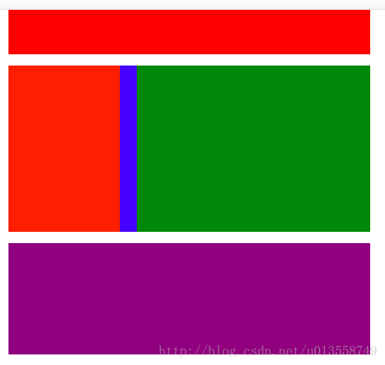
In this way, no matter how the size of our screen changes, the pages we draw can always be adjusted according to the fixed proportion;
Change from: https://blog.csdn.net/u013558749/article/details/78835980