What is seasonality?
As long as the average value of the series changes regularly and periodically, we say that the time series shows seasonality. Seasonal changes usually follow the clock and calendar - usually a repetition of a day, week, or year. Seasonality is usually driven by the cycle of nature in a few days and years or social behavior conventions around dates and times.
We will learn about two seasonal characteristics. The first, indicators, is most suitable for a seasonal cycle with a small number of observations. For example, find the seasonal cycle in weeks in the daily observations. The second, Fourier features, is most suitable for many observations in a seasonal cycle. For example, find the seasonality with a period of years in the daily observations.
Seasonal plots and seasonal indicators
Just as we use the moving average chart to find trends in the series, we can use the seasonal chart to find seasonality.
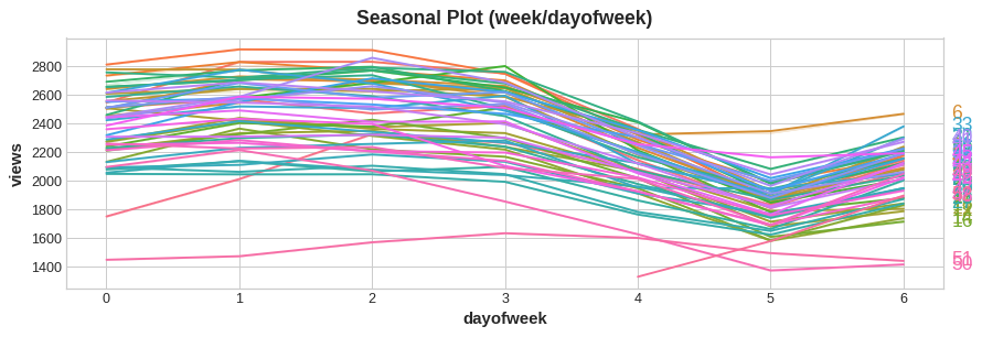
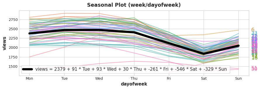
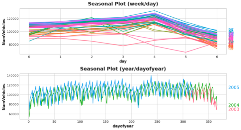
The seasonal chart shows time series segments drawn for a common period, which is the "season" you want to observe. This figure shows a seasonal chart of daily views of Wikipedia articles on trigonometry: the daily views of articles are drawn during a common weekly period.
Seasonal indicators
Seasonal indicators are binary features that represent seasonal differences in the level of a time series. If you treat the seasonal cycle as a classification feature and code it separately, you can get the seasonal indicator.
By coding each day of the week for unique heat, we get the seasonal indicator of the week. Creating a weekly seasonal indicator for the trigonometry series will provide us with six new "virtual" features.
(if one of the indicators is deleted, the linear regression effect will be better; so we chose to delete Monday in the table below.)
| Date | Tuesday | Wednesday | Thursday | Friday | Saturday | Sunday |
|---|---|---|---|---|---|---|
| 2016-01-04 | 0.0 | 0.0 | 0.0 | 0.0 | 0.0 | 0.0 |
| 2016-01-05 | 1.0 | 0.0 | 0.0 | 0.0 | 0.0 | 0.0 |
| 2016-01-06 | 0.0 | 1.0 | 0.0 | 0.0 | 0.0 | 0.0 |
| 2016-01-07 | 0.0 | 0.0 | 1.0 | 0.0 | 0.0 | 0.0 |
| 2016-01-08 | 0.0 | 0.0 | 0.0 | 1.0 | 0.0 | 0.0 |
| 2016-01-09 | 0.0 | 0.0 | 0.0 | 0.0 | 1.0 | 0.0 |
| 2016-01-10 | 0.0 | 0.0 | 0.0 | 0.0 | 0.0 | 1.0 |
| 2016-01-11 | 0.0 | 0.0 | 0.0 | 0.0 | 0.0 | 0.0 |
| ... | ... | ... | ... | ... | ... | ... |
Adding a seasonal indicator to the training data helps the model identify the average value in the seasonal cycle:
The indicator is like a switch. At most one of these indicators has a value of "1" (on) at any time. Linear regression learns a benchmark value of 2379 for Monday, and then adjusts the value according to which indicator is on that day; For the rest of the indicators, since the value is 0, the value will not be calculated.
Fourier Features and periodogram
The features we are discussing now are more suitable for long seasonal cycles with many observations. In this case, it is unwise to use indicators (recall our previous indicators with a cycle of weeks, there will be six more features in seven days a week, and if there are too many observations, there will be many more features!). Instead of creating one feature for each date, Fourier features try to use several features to capture the overall shape of the seasonal curve.
Let's take a look at the annual seasonal chart in trigonometry. Pay attention to the repetition of various frequencies: three long up and down exercises a year, 52 short week exercises a year, and maybe others.
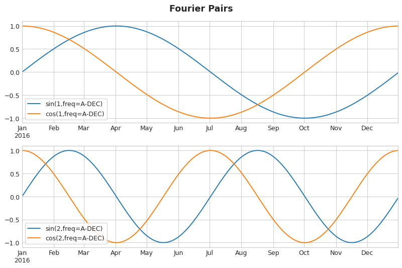
We try to use Fourier features to capture these frequencies in a season. The idea is to include in our training data periodic curves with the same frequency as the season we are trying to model. The curves we use are the sine and cosine curves of trigonometric functions.
Fourier features are paired sine and cosine curves, and each potential frequency corresponds to a pair from the longest season. Fourier pairs that model annual seasonality will have frequencies: once a year, twice a year, three times a year, and so on.
If we add a set of these sine / cosine curves to our training data, the linear regression algorithm will calculate the weight suitable for the seasonal component in the target sequence. This figure illustrates how linear regression uses four Fourier pairs to simulate the annual seasonality in the trigonometry series.
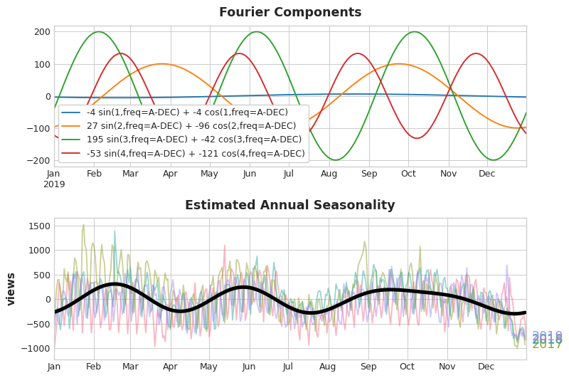
Note that we only need eight features (four sine / cosine pairs) to estimate the annual seasonality well. Compare with seasonal indicator methods that require hundreds of features (one per day of the year). By using only Fourier features to model the seasonal "main effect", fewer features are added to the training data, which means that the calculation time is reduced and the risk of over fitting is reduced.
Selecting Fourier features using periodogram
How many features should we actually include in the Fourier set? We can answer this question with a periodic graph. The periodogram tells you the intensity of the frequency in the time series. Specifically, the value on the y-axis of the graph is (a ** 2 + b ** 2) / 2, where a and B are the coefficients of sine and cosine at this frequency (as shown in the Fourier Components diagram above).
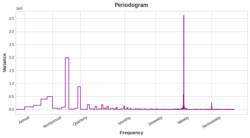
From left to right, the periodogram drops after Quarterly, four times a year. This is why we chose four Fourier pairs to simulate the annual season. We ignore the Weekly frequency because it is better modeled using seasonal indicators.
Calculate Fourier characteristics (optional)
Understanding how Fourier features are calculated is not essential for using them, but if you see the details, you can better understand it. The following cells illustrate how to export a set of Fourier features from the index of time series. (however, we will use library functions from statsmodels in our application.)
import numpy as np


def fourier_features(index, freq, order):
    time = np.arange(len(index), dtype=np.float32)
    k = 2 * np.pi * (1 / freq) * time
    features = {}
    for i in range(1, order + 1):
        features.update({
            f"sin_{freq}_{i}": np.sin(i * k),
            f"cos_{freq}_{i}": np.cos(i * k),
        })
    return pd.DataFrame(features, index=index)


# Compute Fourier features to the 4th order (8 new features) for a
# series y with daily observations and annual seasonality:
#
# fourier_features(y, freq=365.25, order=4)
Example - Tunnel Traffic
We will continue to use the Tunnel Traffic dataset. This hidden cell loads data and defines two functions: seasonal_plot and plot_periodogram.
from pathlib import Path
from warnings import simplefilter

import matplotlib.pyplot as plt
import pandas as pd
import seaborn as sns
from sklearn.linear_model import LinearRegression
from statsmodels.tsa.deterministic import CalendarFourier, DeterministicProcess

simplefilter("ignore")

# Set Matplotlib defaults
plt.style.use("seaborn-whitegrid")
plt.rc("figure", autolayout=True, figsize=(11, 5))
plt.rc(
    "axes",
    labelweight="bold",
    labelsize="large",
    titleweight="bold",
    titlesize=16,
    titlepad=10,
)
plot_params = dict(
    color="0.75",
    style=".-",
    markeredgecolor="0.25",
    markerfacecolor="0.25",
    legend=False,
)
%config InlineBackend.figure_format = 'retina'


# annotations: https://stackoverflow.com/a/49238256/5769929
def seasonal_plot(X, y, period, freq, ax=None):
    if ax is None:
        _, ax = plt.subplots()
    palette = sns.color_palette("husl", n_colors=X[period].nunique(),)
    ax = sns.lineplot(
        x=freq,
        y=y,
        hue=period,
        data=X,
        ci=False,
        ax=ax,
        palette=palette,
        legend=False,
    )
    ax.set_title(f"Seasonal Plot ({period}/{freq})")
    for line, name in zip(ax.lines, X[period].unique()):
        y_ = line.get_ydata()[-1]
        ax.annotate(
            name,
            xy=(1, y_),
            xytext=(6, 0),
            color=line.get_color(),
            xycoords=ax.get_yaxis_transform(),
            textcoords="offset points",
            size=14,
            va="center",
        )
    return ax


def plot_periodogram(ts, detrend='linear', ax=None):
    from scipy.signal import periodogram
    fs = pd.Timedelta("1Y") / pd.Timedelta("1D")
    freqencies, spectrum = periodogram(
        ts,
        fs=fs,
        detrend=detrend,
        window="boxcar",
        scaling='spectrum',
    )
    if ax is None:
        _, ax = plt.subplots()
    ax.step(freqencies, spectrum, color="purple")
    ax.set_xscale("log")
    ax.set_xticks([1, 2, 4, 6, 12, 26, 52, 104])
    ax.set_xticklabels(
        [
            "Annual (1)",
            "Semiannual (2)",
            "Quarterly (4)",
            "Bimonthly (6)",
            "Monthly (12)",
            "Biweekly (26)",
            "Weekly (52)",
            "Semiweekly (104)",
        ],
        rotation=30,
    )
    ax.ticklabel_format(axis="y", style="sci", scilimits=(0, 0))
    ax.set_ylabel("Variance")
    ax.set_title("Periodogram")
    return ax


data_dir = Path("../input/ts-course-data")
tunnel = pd.read_csv(data_dir / "tunnel.csv", parse_dates=["Day"])
tunnel = tunnel.set_index("Day").to_period("D")
Let's look at the seasonal chart of a week and a year.
X = tunnel.copy()

# days within a week
X["day"] = X.index.dayofweek  # the x-axis (freq)
X["week"] = X.index.week  # the seasonal period (period)

# days within a year
X["dayofyear"] = X.index.dayofyear
X["year"] = X.index.year
fig, (ax0, ax1) = plt.subplots(2, 1, figsize=(11, 6))
seasonal_plot(X, y="NumVehicles", period="week", freq="day", ax=ax0)
seasonal_plot(X, y="NumVehicles", period="year", freq="dayofyear", ax=ax1);
Now let's look at the periodic chart:
plot_periodogram(tunnel.NumVehicles);

The periodic chart is consistent with the seasonal chart above: the weekly seasonality is strong and the annual seasonality is weak. We will use indicators to model the weekly seasonality and Fourier characteristics to model the annual seasonality of each year. From right to left, the periodogram decreases between bimonthly (6) and monthly (12), so let's use 10 Fourier pairs.
We'll use DeterministicProcess to create our seasonal features, the same method we used in lesson 2 to create trend features. To use two seasonal periods (weekly and annual), we need to instantiate one of them as an "add-on":
from statsmodels.tsa.deterministic import CalendarFourier, DeterministicProcess

fourier = CalendarFourier(freq="A", order=10)  # 10 sin/cos pairs for "A"nnual seasonality

dp = DeterministicProcess(
    index=tunnel.index,
    constant=True,               # dummy feature for bias (y-intercept)
    order=1,                     # trend (order 1 means linear)
    seasonal=True,               # weekly seasonality (indicators)
    additional_terms=[fourier],  # annual seasonality (fourier)
    drop=True,                   # drop terms to avoid collinearity
)

X = dp.in_sample()  # create features for dates in tunnel.index
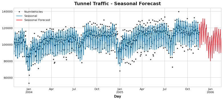
After creating the feature set, we can fit the model and predict it. We will add a 90 day prediction to understand how our model infers beyond the training data. The code here is the same as that in the previous course.
y = tunnel["NumVehicles"]

model = LinearRegression(fit_intercept=False)
_ = model.fit(X, y)

y_pred = pd.Series(model.predict(X), index=y.index)
X_fore = dp.out_of_sample(steps=90)
y_fore = pd.Series(model.predict(X_fore), index=X_fore.index)

ax = y.plot(color='0.25', style='.', title="Tunnel Traffic - Seasonal Forecast")
ax = y_pred.plot(ax=ax, label="Seasonal")
ax = y_fore.plot(ax=ax, label="Seasonal Forecast", color='C3')
_ = ax.legend()
In time series, we can do more to improve our prediction. In the next lesson, we will learn how to use the time series itself as a feature. Using time series as the input of prediction allows us to model another situation that often occurs in the series: cycle.
It's your turn
Create seasonal features for store sales And extend these techniques to capture holiday effects.