preface
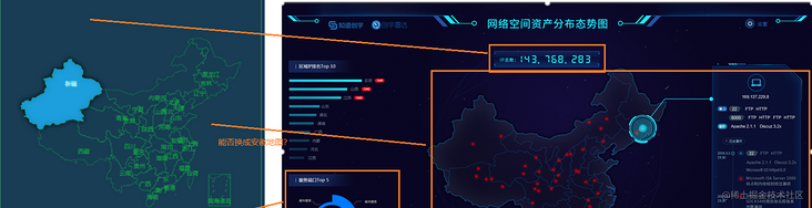
Some time ago, the leader of our company asked us to make a large screen display project. Due to our glorious tradition, we had no designers, and then the leader didn't know where to find a pile of large screen projects for me to refer to, so looking at the colorful large screen projects, the leader chose two of them and said to me, "just use this, but you have to change it" and "how to change it?", "Our main color calls this, changes the map of China in the middle to that of Anhui, and then makes it like this, adds a floating box to add this information", and the leader also kindly matched me with an explanatory diagram.
So finally, the large screen map is displayed as follows:

But that's all later. So I thought for a moment and decided, well, the original project was originally done by echarts. I also changed it with echarts. It should be OK. OK, just do it. I'm excited to download the official map package of echarts, and then

Ah, this.. However, it doesn't matter. Although the map download link of ecarts is gone, Alibaba cloud still provides the configuration of vector map download. I just need to get one from Anhui. This step is still very smooth, but new problems appear again. No sample of vector map can be found on the official website of ecarts. Ah, this. Without reference, how can I change magic? Although I didn't know there was a folk maintenance until the project was completed makepie There are examples to refer to, but this is also later.
At that time, I had mixed feelings. After investigating a lot of project schemes, I finally decided that they had their own visualization library, so I couldn't look at it, so I saw it L7Plot I know. I can use it to implement this scheme.
Open dry
L7plot is a project in Alibaba's Antv series. It is based on the Antv L7 library, and a layer of encapsulation is made on the basis of this library. This library is very convenient for developing some visualization related to maps.
Block map display
The introduction is also very clear. It can be introduced after installation. The next question is, how can I turn this map into a map with only outline lines and display it in Anhui? I see the official map An example , after I have studied it, I understand the operation idea. It can be said that the idea of l7plot is really interesting. There is a style attribute in its map configuration item. When it is changed to "blank", it can be displayed as a block map, but at this time, you can only see the outline of a map of China. How to make the window display in Anhui? You need to modify several places. First, you need to modify the value of center under the map attribute. This is an array. The two values in the array represent the coordinates displayed in the center after the map is loaded. This coordinate is the longitude and latitude in the bit display. If you need to display a Province in the center, just find the approximate central city of the province and replace this value, Hefei is just located in the center of Anhui Province, so just replace the longitude and latitude of Hefei. However, after the map is loaded, only the display position is changed, and Anhui will appear relatively small. At this time, it is necessary to modify minZoom to specify the minimum reduction range of a map.
map: {
  type: "mapbox",
  style: "blank",
  center: [117.30794, 31.79322],
  minZoom: 3,
  maxZoom: 7,
  zoom: 1,
  pitch: 0,
},
After completing the above operations, you can't see any effect, because there is still a key step. At this time, look at the official sample, and you will find that there is another attribute:
 plots: [
    {
      ...
      viewLevel: {
        level: 'country',
        adcode: '100000',
      },
Yes, there is a viewLevel in plots, that is, the display level. Here you can select country, province, city, district and county, and adcode is the corresponding label. This label is actually the zip code. If a province needs to find the zip code of the displayed City, you can find that Hefei is 340000. Just replace the attribute here.

It is basically successful to achieve this step, but how to achieve the transparent background color green edge of the final effect? That is, we are familiar with css at the front end. Set the background color to any transparent color, modify the style setting border with the style attribute, and so on.

Realization of urban points
Next is the problem of data. According to the effect of the reference figure, I hope to mark each city in Anhui with a point, and the size of the origin is the same. In the official example, it can be seen that points of random size are distributed in the capital cities of various provinces. Its code is as follows:
fetch(`https://gw.alipayobjects.com/os/alisis/geo-data-v0.1.1/administrative-data/area-list.json`)
  .then((response) => response.json())
  .then((list) => {
    const data = list
      .filter(({ level }) => level === 'province')
      .map((item) => Object.assign({}, item, { value: Math.random() * 5000 }));
Get the json of a region and judge the level in this json. If it is the provincial level of 'province', a circle of random size will be selected. Analyze this json Approximate format of
It can be found that the values of the city, district and county levels have a parent attribute, which indicates which province the location belongs to. My operation is very simple. I just need to judge that the parent value is 340000, which means that the city belongs to Anhui, and then give them the same dot.
 const data = list
      .filter(({ parent }) => parent === 340000)
      .map((item) => Object.assign({}, item, { value: 1500 }));
The rest is just to improve the details.
Modification of tooltip
The final effect is to move the mouse into a floating box to display a lot of information. Here, the official tooltip attribute is used, but the official attributes cannot achieve this effect

You need to modify it manually. After reading the official documents, you find that you can customize the tooltip:
tooltip: {
  offsets: [0, 100],
  anchor: "center",
  items: [
    { field: "name", alias: "name" },
    { field: "value", alias: "Random value" },
  ],
  customContent(e, data) {
    return domTooltip(data);
  },
Anchor is the location of the anchor point, that is, the location of the tooltip display. Generally, it is set to the middle. offsets is used to set the offset value of the tooltip from the anchor point. You can fine tune the position of the final tooltip display. For example, my display is relatively long, so it should be slightly upward. items is the data value to be displayed, which I haven't used yet. customContent is the key. Here, a function is returned. The function can be put into the display board defined by myself in the form of string splicing. I still have false data here:
const domTooltip = (items) => {
  return `
    <div class="corner-outer">
      <div class="corner-inner">
        <header class="header">
          <span><i class="fa fa-laptop" aria-hidden="true"></i></span>
          <strong>182.23.45.12</strong>
        </header>
        <section class="main">
          <div class="main-flex">
            <section><b class="title port">port</b></section>
            <section>
              <div class="relative-spans">
                <strong>22</strong>
                <span>FTP</span>
                <span>HTTP</span>
              </div>
              <div class="relative-spans">
                <strong>8000</strong>
                <span>FTP</span>
                <span>HTTP</span>
                <span>FTP</span>
                <span>HTTP</span>
              </div>
            </section>
          </div>
          <div class="main-flex">
            <section><b class="title operate">operation</b></section>
            <section>
              <div>
                <span>Apache 2.1.1</span>
                <span>Discuz 2.3x</span>
              </div>
            </section>
          </div>
        </section>
        <div class="timeline">
          <span class="btn up"><i class="fa fa-angle-up"></i> historical event</span>
          <ul>
            <li class='work'>
              <div class="relative">
                <span class='date'>2009 May</span>
                <span class='circle'></span>
              </div>
              <div class='content'>
                <section>
                  <em class="biao primary"><i class="fa fa-file"></i></em>
                </section>
                <section>
                  <div class="tags">
                    <strong>22</strong>
                    <span>FTP</span>
                    <span>HTTP</span>
                    <span>Apache 2.1.1</span>
                    <span>Discuz 2.3x</span>
                  </div>
                </section>
              </div>
            </li>
            <li class='work'>
              <div class="relative">
                <span class='date'>2010 April</span>
                <span class='circle'></span>
              </div>
              <div class='content'>
                <section>
                  <em class="biao info"><i class="fa fa-laptop"></i></em>
                </section>
                <section>
                  <p>Nine out of ten are worthless scholars</p>
                </section>
              </div>
            </li>
          </ul>
          <span class="btn down"><i class="fa fa-angle-down"></i> See more</span>
        </div>
      </div>
    </div>
  `;
};
Location of the tooltip
All functions are basically realized here, but if you move the mouse to the cities under the partial viewport of Huangshan, you will find that the tooltip display is incomplete. You need to drag the mouse to move the city up to display the whole.


This is obviously unreasonable. At this time, we need to use some events of L7plot. I continue to find a solution by consulting the documents. Using the official mousemove event, we can obtain the coordinates of the mouse in the viewport when the mouse moves in. This value can be obtained through the returned point attribute, and obtain the coordinates of the tooltip relative to the viewport, This coordinate value is in the official returned attribute plot plots[1]. tooltip. options. Offsets, in the offsets array, the first item represents the x-axis position, and the second item represents the y-axis position. Because my viewport width is fixed at 600px, as long as the x value of the mouse landing point is greater than 300, let the tooltip lean to the left, otherwise it will lean to the right.
plot.on("mousemove", (event) => {
    event.point.x > 300
      ? (plot.plots[1].tooltip.options.offsets[0] = -260)
      : (plot.plots[1].tooltip.options.offsets[0] = 20);
    plot.plots[1].tooltip.options.offsets[1] = event.point.y;
  });
Finally, a simple judgment can be realized.
deficiencies
When the page is loaded for the first time, because of the delay, Anhui map will be in a small position and can be displayed only after the full loading is completed. In this later stage, you can simply add a loading asynchronous or something.
Because it is in the form of a map, the border line will be displayed. This doubt does not affect the overall display. I haven't thought about how to remove it for the time being, and I don't know whether it can be removed.

Complete code
<template>
  <div id="anhui" style="height: 510px; justify-content: center; position: relative"></div>
</template>

<script setup>
import { onMounted, nextTick } from "vue";
import { L7Plot } from "@antv/l7plot";
import list from "../../assets/data/area-list.json";

const domTooltip = (items) => {
  let ps = ``;
  items.forEach((item) => {
    ps += `<p>${item.name}: ${item.value}</p>
      <li class='work'>
            <div class="relative">
              <span class='date'>2009 August</span>
              <span class='circle'></span>
            </div>
            <div class='content'>
              <section>
                <em class="biao danger"><i class="fa fa-exclamation-triangle"></i></em>
              </section>
              <section>
                <p>From a long-term perspective, the truly powerful force does not belong to the reactionaries, but to the people</p>
              </section>
            </div>
          </li>
    `;
  });
  return `
    <div class="corner-outer">
      <div class="corner-inner">
        <header class="header">
          <span><i class="fa fa-laptop" aria-hidden="true"></i></span>
          <strong>182.23.45.12</strong>
        </header>
        <section class="main">
          <div class="main-flex">
            <section><b class="title port">port</b></section>
            <section>
              <div class="relative-spans">
                <strong>22</strong>
                <span>FTP</span>
                <span>HTTP</span>
              </div>
              <div class="relative-spans">
                <strong>8000</strong>
                <span>FTP</span>
                <span>HTTP</span>
                <span>FTP</span>
                <span>HTTP</span>
              </div>
            </section>
          </div>
          <div class="main-flex">
            <section><b class="title operate">operation</b></section>
            <section>
              <div>
                <span>Apache 2.1.1</span>
                <span>Discuz 2.3x</span>
              </div>
            </section>
          </div>
        </section>
        <div class="timeline">
          <span class="btn up"><i class="fa fa-angle-up"></i> historical event</span>
          <ul>
            <li class='work'>
              <div class="relative">
                <span class='date'>2009 May</span>
                <span class='circle'></span>
              </div>
              <div class='content'>
                <section>
                  <em class="biao primary"><i class="fa fa-file"></i></em>
                </section>
                <section>
                  <div class="tags">
                    <strong>22</strong>
                    <span>FTP</span>
                    <span>HTTP</span>
                    <span>Apache 2.1.1</span>
                    <span>Discuz 2.3x</span>
                  </div>
                </section>
              </div>
            </li>
            <li class='work'>
              <div class="relative">
                <span class='date'>2010 April</span>
                <span class='circle'></span>
              </div>
              <div class='content'>
                <section>
                  <em class="biao info"><i class="fa fa-laptop"></i></em>
                </section>
                <section>
                  <p>Nine out of ten are worthless scholars</p>
                </section>
              </div>
            </li>
          </ul>
          <span class="btn down"><i class="fa fa-angle-down"></i> See more</span>
        </div>
      </div>
    </div>
  `;
};

let plot = null;
const initMap = async () => {
  const data = list
    .filter(({ parent }) => parent === 340000)
    .map((item) => Object.assign({}, item, { value: 1500 }));

  plot = new L7Plot("anhui", {
    map: {
      type: "mapbox",
      style: "blank",
      center: [117.30794, 31.79322],
      minZoom: 3,
      maxZoom: 7,
      zoom: 1,
      pitch: 0,
    },
    plots: [
      {
        type: "choropleth",
        zIndex: 1,
        source: {
          data: [],
          joinBy: {
            sourceField: "code",
            geoField: "adcode",
          },
        },
        viewLevel: {
          level: "province",
          adcode: "340000",
        },
        autoFit: true,
        color: "rgba(255,255,255,0)",
        style: {
          opacity: 1,
          stroke: "rgb(20,112,80)",
          lineWidth: 0.6,
          lineOpacity: 0.8,
        },
        label: {
          visible: true,
          field: "name",
          style: {
            // fill: "rgb(19,134,72)",
            opacity: 0.8,
            fontSize: 14,
            stroke: "rgb(19,134,72)",
            strokeWidth: 1,
            textAllowOverlap: false,
            padding: [5, 5],
            textOffset: [0, 40],
          },
        },
      },
      {
        type: "dot",
        zIndex: 2,
        source: {
          data: data,
          parser: { type: "json", x: "lng", y: "lat" },
        },
        color: "rgba(84, 229, 229, 0.9)",
        size: {
          field: "value",
          value: ({ value }) => value / 200,
        },
        style: {
          opacity: 0.7,
          stroke: "rgba(255,255,255,0.5)",
          strokeWidth: 1,
        },
        tooltip: {
          offsets: [0, 100],
          anchor: "center",
          items: [
            { field: "name", alias: "name" },
            { field: "value", alias: "Random value" },
          ],
          customContent(e, data) {
            return domTooltip(data);
          },
        },
      },
    ],
    layers: [],
  });

  await nextTick();
  document.querySelector(".l7-control-logo").remove();
};

onMounted(() => {
  initMap();

  plot.on("mousemove", (event) => {
    event.point.x > 300
      ? (plot.plots[1].tooltip.options.offsets[0] = -260)
      : (plot.plots[1].tooltip.options.offsets[0] = 20);
    plot.plots[1].tooltip.options.offsets[1] = event.point.y;
  });
});
</script>

<style lang="scss">
</style>