Layout management
1.1 box layout
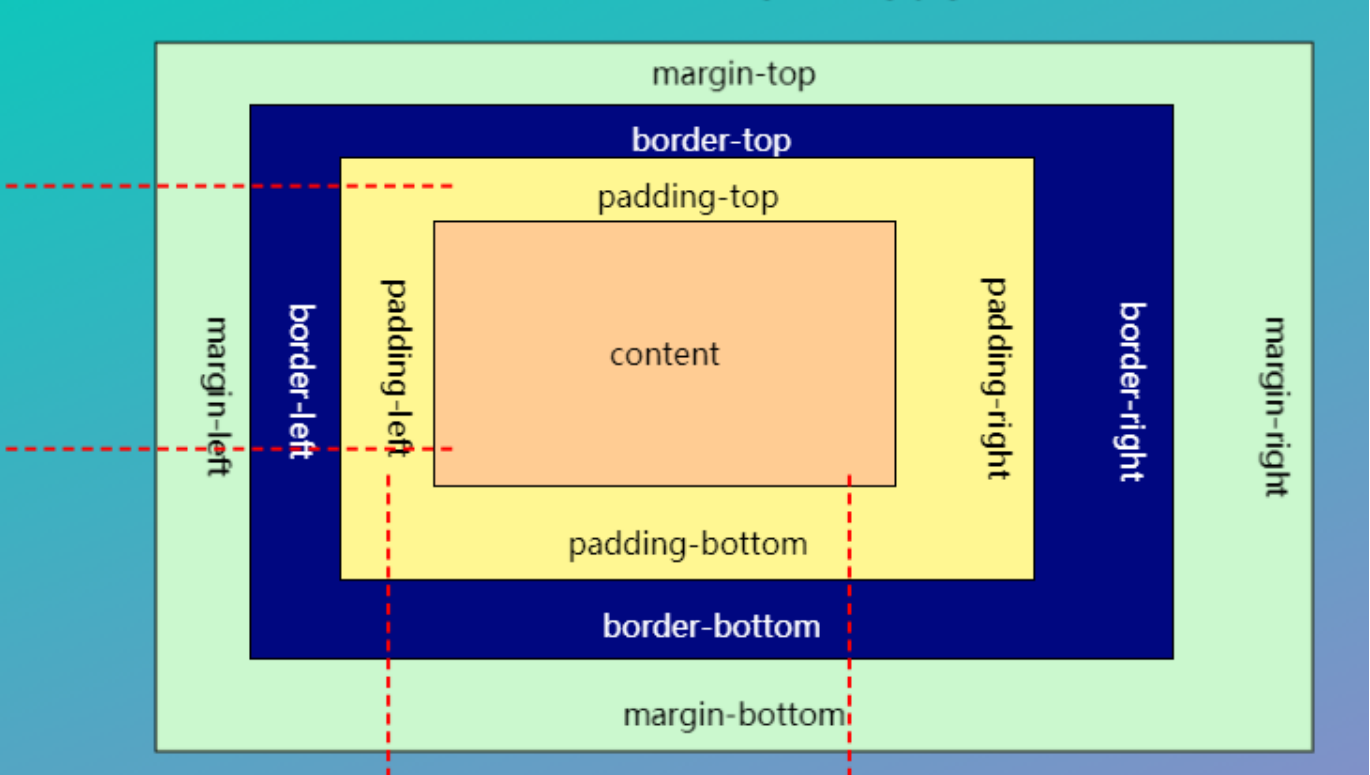
First understand the structure of the box
<!DOCTYPE html>
<html lang="en">
<head>
<meta charset="UTF-8">
<title>Document</title>
<style type="text/css">
*{ padding: 0; margin: 0; }
.box{width: 100px; height: 100px; border:1px solid black; background-color: red; }
</style>
</head>
<body>
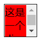
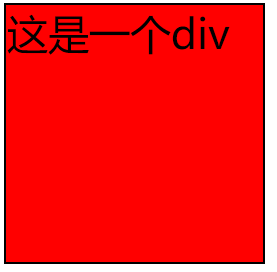
<div class="box"> This is a div </div>
</body>
</html>
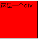
Note that: In the attributes set by box, width and height set the range of content, not the range of the whole box
<!DOCTYPE html>
<html lang="en">
<head>
<meta charset="UTF-8">
<title>Document</title>
<style type="text/css"> *{ padding: 0; margin: 0; }
.box{width: 100px; height: 100px; border:1px solid black; background-color: red; }
.box1{ width: 100px; height: 100px; border:1px solid black; background-color: blue; }
.box2{ width: 100px; height: 100px; border:1px solid black; background-color: green; }
a{ width: 200px; height: 200px; }</style>
</head>
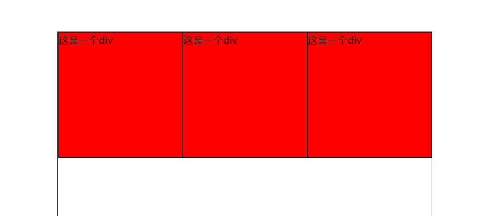
<body><div class="box"> This is a div </div>
<div class="box1"> Here are two div </div>
<div class="box2"> These are three div </div>
<a href="#"> this is the first a tag</a>
<a href="#"> this is the second a tag</a>
<a href="#"> this is the third a tag</a>
</body>
</html>
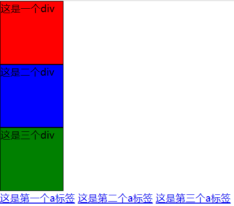
This is a simple distinction between block level elements and inline elements (block level elements occupy one line, inline elements do not affect, and block level elements can set width and height, while inline elements cannot set width and height)
But! Block level elements can be converted to and from inline elements
Convert through display
display:block is an inline element converted to a block level element
display:inline is a block level element converted to an inline element
display:none can hide elements
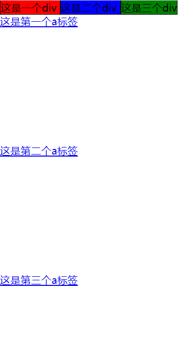
 .box{width: 100px; height: 100px; border:1px solid black; background-color: red; display: inline;}
 .box1{ width: 100px; height: 100px; border:1px solid black; background-color: blue;display: inline; }
 .box2{ width: 100px; height: 100px; border:1px solid black; background-color: green; display: inline;}
 a{ width: 200px; height: 200px; display: block;}
This is the effect after setting
1.2 floating layout
Layout by setting the float property
none -------- no floating
Left ---- floating left will affect the following elements
Right -- right floating
float:left;
<!DOCTYPE html>
 <html lang="en">
 <head>
 <meta charset="UTF-8">
 <title>Document</title>
 <style type="text/css"> *{ padding: 0; margin: 0; }
 .box{width: 100px; height: 100px; border:1px solid black; float: left;}
 .box1{ width: 100px; height: 100px; border:1px solid black; background-color: blue; float: left;}
 .box2{ width: 100px; height: 100px; border:1px solid black; background-color: green; }
 </style>
  </head>
  <body><div class="box"> This is a div </div>
  <div class="box1"> Here are two div </div>
  <div class="box2"> These are three div </div>
    </body>
    </html>
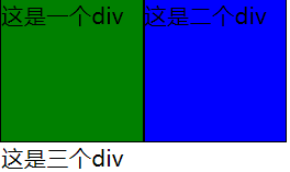
It is clear that the first div has no color, but the color is the color of the third Div
The text of the third div is below the first Div
The whole of the second div is to the right of the first Div
Floating can be understood as making a div element separate from the standard flow and float on the standard flow, which is not a level with the standard flow.
When floating layout, floating will cause the disorder of the layout of the following elements. How to solve this phenomenon?
Clear ---- clear floating
none ------ default value, floating on both sides is allowed
Left -------- floating on the left is not allowed (clear floating on the left)
Right -------- floating on the right is not allowed
Both ---------- floating on both sides is not allowed
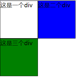
.box2{ width: 100px; height: 100px; border:1px solid black; background-color: green; clear:left;}
The effect is shown in the figure:
1.3 positioning layout
Attribute: position
Static (default) static positioning ---- according to the default value of each element
Absolute ----- absolute positioning: separate the object from the document flow by setting the top, left, right and bottom
The value of the direction is used for positioning (compared with the positioning of the parent). If there is no such parent, the default parent is body
Relative ---- relative positioning: the object is not separated from the document flow, and the four directions of top, left, right and bottom are set
Positioning (compared to its own positioning)
Note that the default parent of relative is body
<!DOCTYPE html> <html lang="en">
<head><meta charset="UTF-8">
<title>location</title>
<style type="text/css">
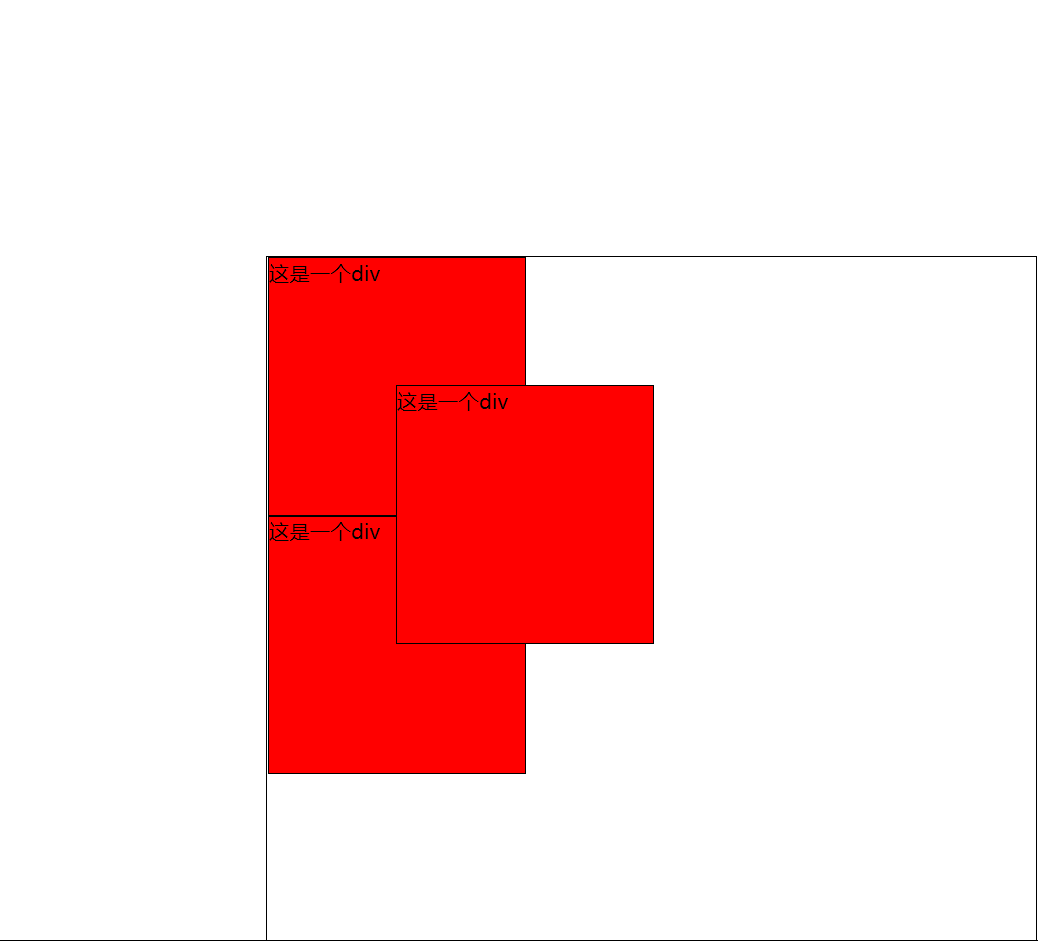
.main{ width: 600px; height: 600px; border: 1px solid black; margin: 200px; position: relative; }
.box{ width: 200px;height: 200px; border: 1px solid black; background-color: red; position: absolute; top: 100px; left: 100px; }
.box1{ width: 200px; height: 200px; border: 1px solid black; background-color: red; }
.box2{ width: 200px; height: 200px; border: 1px solid black; background-color: red; } </style>
</head>
<body>
<div class="main">
<div class="box">This is a div</div>
<div class="box1">This is a div</div>
<div class="box2">This is a div</div>
</div>
</body>
</html>
1.4 other attributes
1.4.1overflow
visible - default. Overflow is not clipped. The content is rendered outside the element box
hidden - overflow is clipped and the rest will not be visible
Scroll - overflow is clipped and a scroll bar is added to see the rest
auto - similar to scroll, but adds scroll bars only when necessary (always show scroll bars)
<!DOCTYPE html> <html lang="en">
 <head><meta charset="UTF-8">
 <title>location</title>
 <style type="text/css">
  .box{ width: 50px;height: 50px; border: 1px solid black; background-color: red;}</style>
  </head>
  <body>
  <div class="box">This is a div This is a div This is a div</div>
      </body>
     </html>
This is called text overflow. Setting overflow can solve this problem
.box{ width: 50px;height: 50px; border: 1px solid black; background-color: red; overflow: auto}
1.4.2 zoom attribute
zoom
Zoom: number percentage
.box{ width: 100px;height: 100px; border: 1px solid black; background-color: red; zoom:2;}
The entire box is scaled to twice its original size
1.5 elastic box
Set the box to flex
display: flex;
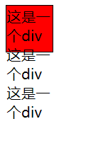
.main{ width: 600px; height: 600px; border: 1px solid black; margin: 200px; display: flex; }
.box{ width: 200px;height: 200px; border: 1px solid black; background-color: red;}
.box1{ width: 200px; height: 200px; border: 1px solid black; background-color: red; }
.box2{ width: 200px; height: 200px; border: 1px solid black; background-color: red; } </style>
</head>
<body>
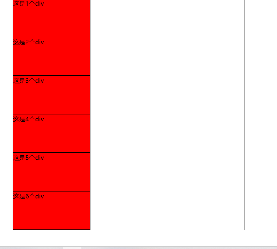
<div class="main">
<div class="box">This is a div</div>
<div class="box1">This is a div</div>
<div class="box2">This is a div</div>
flex-direction
Set direction
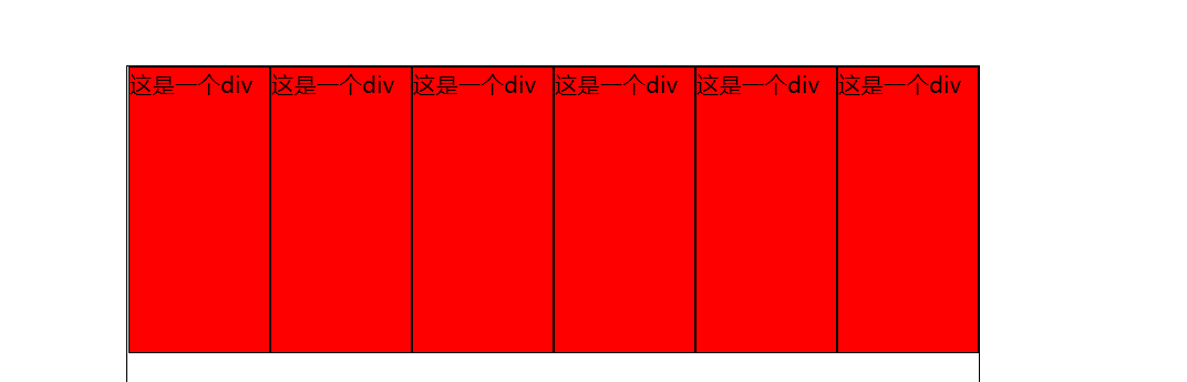
Row defaults. Displays elastic items horizontally as a row.
Row reverse and other peers, but in the opposite direction.
Column is used as a column to display elastic items vertically.
Column reverse is the same as column, but in the opposite direction.
.main{ width: 600px; height: 600px; border: 1px solid black; margin: 200px; display: flex; flex-direction: column;}
  .box{ width: 200px;height: 200px; border: 1px solid black; background-color: red;}
  .box1{ width: 200px; height: 200px; border: 1px solid black; background-color: red; }
  .box2{ width: 200px; height: 200px; border: 1px solid black; background-color: red; }
flex-wrap
The flex wrap attribute specifies whether elastic items should wrap.
nowrap defaults. Specifies that flexible items do not wrap.
Wrap specifies that elastic items wrap when needed.
Wrap reverse specifies that elastic items wrap lines when needed to reverse the direction.
.main{ width: 600px; height: 600px; border: 1px solid black; margin: 200px; display: flex; flex-wrap: nowrap;} .box{ width: 200px;height: 200px; border: 1px solid black; background-color: red;} .box1{ width: 200px; height: 200px; border: 1px solid black; background-color: red; } .box2{ width: 200px; height: 200px; border: 1px solid black; background-color: red; }
flex-flow
The flex flow attribute is a shorthand for the following attributes:
flex-direction
flex-wrap
justify-content
The center line is centered
Flex start default left justified
Flex end right justified
Space around there are spaces at the beginning and end of each box
Space between boxes
align-items
stretch default. The item is stretched to fit the container. (no height is set for the container)
The center project is located in the center of the container.
The flex start project is at the beginning of the container.
The flex end item is at the end of the container.
The baseline project is positioned to the baseline of the container.
align-content
stretch defaults. The row is stretched to take up the remaining space.
The center is packed in rows toward the center of the elastic container.
Flex start packages the lines toward the beginning of the elastic container.
Flex end packs the lines toward the end of the elastic container.
The space between rows are evenly distributed in the elastic container.
The space around rows are evenly distributed in the elastic container, with half at both ends.
Attributes of child elements
Order the order of the child elements
Flex growth specifies the proportion of an element
The shrinkage of flex shrink items relative to other elastic items.
The flex basis property specifies the initial length of the elastic item.
flex is a shorthand for the following attributes:
flex-grow
flex-shrink
flex-basis
Align self alignment with respect to the elastic box
auto default. Element inherits the align items attribute of its parent container. If there is no parent container, it is "stretch".
stretch locates the element to fit the container.
The center element is located in the center of the container.
The flex start element is at the beginning of the container.
The flex end element is at the end of the container.
The baseline element is positioned to the baseline of the container.