📓 Project introduction
First introduce yourself. I'm a back-end programmer who doesn't write the front-end, so I teach myself the front-end 🙇. In this project, I will work with you to learn the front-end from the zero foundation. From the perspective of back-end programmers, the front-end is limited by the author's level. This project will only be updated to the front-end framework VUE for the time being, and will not involve node js. The project is suitable for zero based Xiaobai or the back-end programmers who develop websites like me. No one writes the front-end, so they learn the front-end by themselves 😂.
The learning sequence of the project is summarized according to my own learning. I seriously understand each knowledge point. At the same time, I also checked a lot of materials. I put all the references at the end of the article. Respect open source and intellectual property rights. I wrote every case myself and put it on it only when I felt it was good. Every time I put the code and notes in the open source warehouse, please don't be stingy to give me a star. If you think this article is well written, remember to praise + pay attention. Your support is the driving force for me to stick to it 😃.
The new white ramie robe is tender and cool. Spring silkworms eat leaves and ring the corridor. Yumen has approved the peach blossom wave, and the moon hall receives the osmanthus fragrance first.
Peng Beihai, Feng Chaoyang. And carrying books and swords. On this day next year, Qingyun goes, but laughs that the world is busy raising children.
——Xin Qiji's "Partridge Sky - Autumn test of delivering outline"
YuQue address: https://www.yuque.com/beilayanmen
Github address: https://github.com/SuZui-cn/my-web
Gitee address: https://gitee.com/north_gate/my-web
Personal blog address: https://foollyone.cn/
⌨ Knowledge points of this paper
- HTML5 introduction
- New content HTML5
- Semantic label
- HTML5 form
- HTML5 form properties
- Multi-Media
- Drag and drop elements
- history
- Geographic location
- Web storage
- CSS3 introduction
- CSS3 new content
- selector
- attribute
The author's learning in HTML5+CSS3 is relatively weak, so he has referred to a large number of Rookie tutorial And the number one guy forever Open source project.
In practical work, HTML5+CSS3 is a key point, which needs to be mastered. However, it should be noted that browsers of IE8 and below do not support H5 and CSS3. Solution: introduce html5shiv JS file.
When importing, you need to make if judgment. The specific code is as follows:
    <!--  Conditional comments only ie Can identify-->
    <!--[if lte ie 8]>
        <script src="html5shiv.min.js"></script>
    <![endif]-->
The code above is a conditional comment: although it is a comment, it can be recognized by IE browser. Explain:
-
l: less
-
t: than
-
e: equal equals
-
g: great is bigger
Next, let's start with HTML5. Many of these cases contain js code. You can look back after learning js. I put all the code files in the warehouse. Students in need can get them by themselves. Don't forget to give them to star.
HTML5 introduction
HTML5 is the latest revision of HTML. The standard was formulated by the World Wide Web Consortium (W3C) in October 2014. HTML5 is designed to support multimedia on mobile devices.
HTML5 is the result of the cooperation between W3C and WHATWG, which refers to the Web Hypertext Application Technology Working Group. WHATWG focuses on web forms and applications, while W3C focuses on XHTML 2.0. In 2006, the two sides decided to cooperate to create a new version of HTML.
Some interesting new features in HTML5:
-
canvas element for painting
-
video and audio elements for media playback
-
Better support for local offline storage
-
New special content elements, such as article, footer, header, nav, section
-
New form controls, such as calendar, date, time, email, url, search
- rookie tutorial
HTML5 is not just the latest version of HTML markup language. More importantly, it has formulated a series of standards for Web application development and become the first HTML language to use the Web as an application development platform. HTML5 defines a series of new elements, such as new semantic tags, smart forms, multimedia tags, etc., which can help developers create rich Internet applications. It also provides some JavaScript APIs, such as geolocation, gravity sensing, hardware access, etc., which can realize class native applications in the browser. We can even combine Canvas to develop Web games.
Broad concept of HTML5: HTML5 represents a development stage of browser side technology. At this stage, the presentation technology of browser has been developed by leaps and bounds and widely supported. It includes a set of technology combinations including HTML5, CSS3 and Javascript API.
Summary: HTML5 is the overall solution for developing Web rich client applications of the new generation. A set of technology combinations including HTML5, CSS3 and Javascript API.
What's new in HTML5
Semantic label
When we wrote the layout before, we named div.
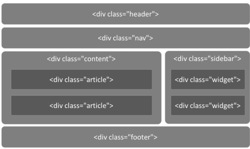
However, in HTML5, it can be replaced by tags directly defined by terms
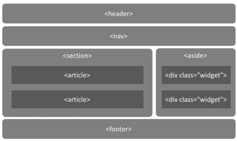
The code layout under HTML5 is as follows:
<!-- head -->
<header>
  <ul class="nav"></ul>
</header>

<!-- Main part -->
<div class="main">
  <!-- article -->
  <article></article>
  <!-- sidebar  -->
  <aside></aside>
</div>

<!-- bottom -->
<footer></footer>
Here are the new tags added to HTML5.
| label | describe |
|---|---|
| Define page independent content areas. | |
| Define the sidebar content of the page. | |
| Allows you to set a piece of text away from the text orientation setting of its parent element. | |
| Define command buttons, such as radio buttons, check boxes, or buttons | |
| Used to describe the details of a document or part of a document | |
| Define dialog boxes, such as prompt boxes | |
| The tag contains the title of the details element | |
| Specify independent streaming content (images, charts, photos, codes, etc.). | |
| definition The title of the element | |
| Defines the footer of a section or document. | |
| Defines the header area of the document | |
| Defines marked text. | |
| Define weights and measures. Only for measurements with known maximum and minimum values. | |
| Define the part of the navigation link. | |
| Define the progress of any type of task. | |
| Define ruby annotations (Chinese phonetics or characters). | |
| Define the interpretation or pronunciation of characters (Chinese phonetics or characters). | |
| Used in ruby annotations to define what is displayed in browsers that do not support ruby elements. | |
| Define sections (sections, sections) in the document. | |
| Define the date or time. | |
| Specifies where line breaks are appropriate in the text. |
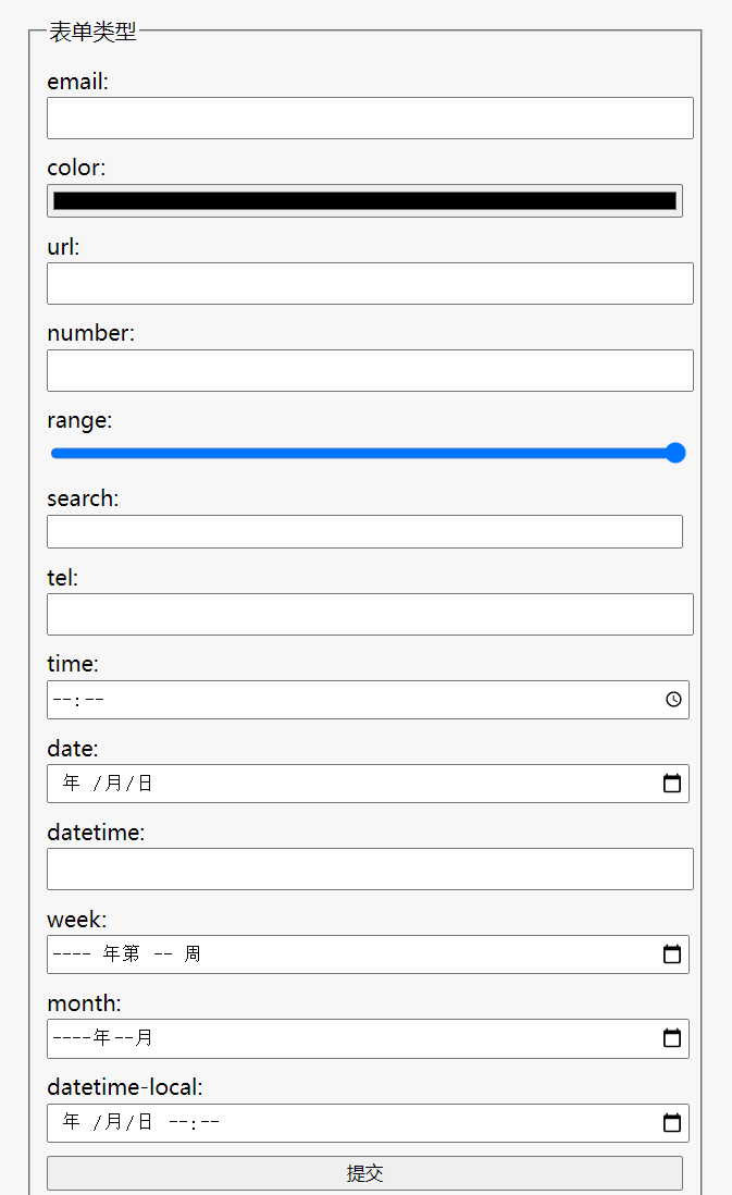
HTML5 form
Forms change a lot in HTML5, so let's focus on forms.
New expression types:
- Email can only enter email format. Automatic verification function.
- tel mobile number.
- url can only enter url format.
- number can only enter numbers.
- Search search box
- range slider
- color pickup
- Time time
- Date date
- datetime date
- Month month
- Week week
The following is a demonstration of the code:
<!DOCTYPE html>
<html lang="en">
  <head>
    <meta charset="UTF-8" />
    <meta
      name="viewport"
      content="width=device-width, initial-scale=1, user-scalable=no"
    />
    <title>form types </title>
    <style>
      body {
        margin: 0;
        padding: 0;
        background-color: #f7f7f7;
      }
      form {
        max-width: 500px;
        width: 100%;
        margin: 32px auto 0;
        font-size: 16px;
      }
      label {
        display: block;
        margin: 10px 0;
      }
      input {
        width: 100%;
        height: 25px;
        margin-top: 2px;
        display: block;
      }
    </style>
  </head>
  <body>
    <form action="">
      <!-- <fieldset>`Tags package the contents of the form to represent a group; and<legend> The label is fieldset The element in defines the title. -->
      <fieldset>
        <legend>form types </legend>
        <label for="">
          email: <input type="email" name="email" required />
        </label>
        <label for=""> color: <input type="color" name="color" /> </label>
        <label for=""> url: <input type="url" name="url" /> </label>
        <label for="">
          number: <input type="number" step="3" name="number" />
        </label>
        <label for="">
          range: <input type="range" name="range" value="100" />
        </label>
        <label for=""> search: <input type="search" name="search" /> </label>
        <label for=""> tel: <input type="tel" name="tel" /> </label>
        <label for=""> time: <input type="time" name="time" /> </label>
        <label for=""> date: <input type="date" name="date" /> </label>
        <label for=""> datetime: <input type="datetime" /> </label>
        <label for=""> week: <input type="week" name="month" /> </label>
        <label for=""> month: <input type="month" name="month" /> </label>
        <label for="">
          datetime-local: <input type="datetime-local" name="datetime-local" />
        </label>
        <input type="submit" />
      </fieldset>
    </form>
  </body>
</html>
design sketch:
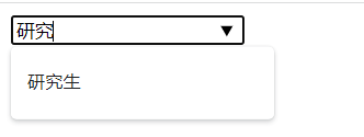
In HTML5, the list attribute in input is bound to datalist. Then it will be prompted automatically in the input box
<input type="text" list="myData">
<datalist id="myData">
    <option>undergraduate</option>
    <option>graduate student</option>
    <option>Unknown</option>
</datalist>
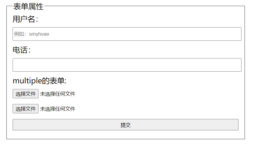
HTML5 form properties
-
placeholder (prompt text)
-
autofocus auto focus
-
Multiple file upload multiple or multiple email addresses
-
Autocomplete autocomplete (filled). On (default), off (cancel). It can be used for form elements or for the form itself (on/off)
-
Form specifies which form the form item belongs to, which is required when dealing with complex forms
-
novalidate turns off the default verification function (can only be added to the form)
-
Required indicates a required item
-
pattern customize the regular and verify the form. for example
Code example:
<!DOCTYPE html>
<html>
<head lang="en">
    <meta charset="UTF-8">
    <title></title>
    <style>
        form {
            width: 100%;
            /* Maximum width*/
            max-width: 640px;
            /* Minimum width*/
            min-width: 320px;
            margin: 0 auto;
            font-family: "Microsoft Yahei";
            font-size: 20px;
        }

        input {
            display: block;
            width: 100%;
            height: 30px;
            margin: 10px 0;
        }
    </style>
</head>
<body>

<form action="">
    <fieldset>
        <legend>form properties </legend>
        <label for="">
            user name:<input type="text" placeholder="For example: smyhvae" autofocus name="userName" autocomplete="on" required/>
        </label>

        <label for="">
            Telephone:<input type="tel" pattern="1\d{10}"/>
        </label>

        <label for="">
            multiple Form for: <input type="file" multiple>
        </label>

        <!-- Upload file-->
        <input type="file" name="file" multiple/>

        <input type="submit"/>
    </fieldset>
</form>

</body>
</html>
Multi-Media
When I was a child, the author liked to play 4455 Miniclip games. One day, when I opened the game on 4455, I found that I couldn't play anymore.
This is because the original game is based on flash player. However, due to the defects in the initial design of flash, with the expansion of features, the original problems become more and more serious, which eventually makes it difficult to maintain.
Adobe announced that it plans to gradually Flash Player by the end of 2020. Major Browser service providers have also successively announced that they will stop supporting Flash in 2020.
The real reason for giving up using Flash is that its number of vulnerabilities has exceeded the normal maintainability level. In the case of existing substitutes, developers should not spend too much on the maintenance of outdated products—— Know
The replacement of flash is HTML5 technology.
audio frequency
HTML5 solves the problem of audio playback through the < audio > tag.
<audio src="music/yinyue.mp3" autoplay controls> </audio>
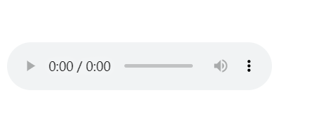
We can control audio playback more friendly through additional attributes, such as:
-
Autoplay plays automatically. It can be written as autoplay or autoplay = "".
-
controls control bar. (it is recommended to write this option, otherwise you can't see where the control is)
-
Loop loop playback.
-
preload this property is disabled when autoplay is set while preloading.
video
HTML5 solves the problem of video playback through the < video > tag.
<video src="video/movie.mp4" controls autoplay></video>
Simple video player case
<!DOCTYPE html>
<html>
  <head lang="en">
    <meta charset="UTF-8" />
    <title></title>
    <!-- File to import Font Icon-->
    <link rel="stylesheet" href="css/font-awesome.min.css" />
    <style>
      * {
        margin: 0;
        padding: 0;
      }
      /*Multimedia title*/
      figcaption {
        text-align: center;
        line-height: 150px;
        font-family: 'Microsoft Yahei';
        font-size: 24px;
      }

      /* player*/
      .palyer {
        width: 720px;
        height: 360px;
        margin: 10px auto;
        border: 1px solid #000;
        background: url(images/loading.gif) center no-repeat #000;
        background-size: auto 100%;
        position: relative;
        border-radius: 20px;
      }

      .palyer video {
        height: 100%;
        display: block;
        margin: 0 auto;
        /*display: none;*/
      }

      /* Control bar*/

      .controls {
        width: 700px;
        height: 40px;
        background-color: rgba(255, 255, 0, 0.3);
        position: absolute;
        bottom: 10px;
        left: 10px;
        border-radius: 10px;
      }
      /*switch*/
      .switch {
        position: absolute;
        width: 20px;
        height: 20px;
        left: 10px;
        top: 10px;

        text-align: center;
        line-height: 20px;
        color: yellow;
      }
      /*progress bar*/
      .progress {
        width: 432px;
        height: 10px;
        position: absolute;
        background-color: rgba(255, 255, 255, 0.4);
        left: 40px;
        top: 15px;
        border-radius: 4px;
        overflow: hidden;
      }
      /* Current progress*/
      .curr-progress {
        width: 50%;
        height: 10px;
        background-color: #fff;
      }
      /* Time module*/
      .time {
        width: 120px;
        height: 20px;
        text-align: center;
        line-height: 20px;
        color: #fff;
        position: absolute;
        left: 510px;
        top: 10px;
        font-size: 12px;
      }
      /*Full screen*/
      .extend {
        position: absolute;
        width: 20px;
        height: 20px;

        right: 20px;
        top: 10px;

        text-align: center;
        line-height: 20px;
        color: yellow;
      }
    </style>
  </head>
  <body>
    <!-- Multi-Media-->
    <figure>
      <!--  Multimedia title-->
      <figcaption>Video case</figcaption>
      <div class="palyer">
        <!-- there src Link address for playing video -->
        <video src=""></video>

        <!-- Control bar-->
        <div class="controls">
          <!-- Play pause-->
          <a href="#" class="switch icon-play"></a>
          <div class="progress">
            <!-- Current progress-->
            <div class="curr-progress"></div>
          </div>
          <!-- time-->
          <div class="time">
            <span class="curr-time">00:00:00</span>/<span class="total-time"
              >00:00:00</span
            >
          </div>
          <!-- Full screen-->
          <a href="#" class="extend icon-resize-full"></a>
        </div>
      </div>
    </figure>

    <script>
      // Idea:
      /*
       * 1,Click the button to pause playback and switch icons
       * 2,Calculate the total time of the video and display it
       * 3,When the video is played, the progress bar is synchronized and the current time is synchronized
       * 4,Click to achieve full screen
       */

      //        Get the required label
      var video = document.querySelector('video');
      //          Play button
      var playBtn = document.querySelector('.switch');
      //          Current progress bar
      var currProgress = document.querySelector('.curr-progress');
      //          current time
      var currTime = document.querySelector('.curr-time');
      //          Total time
      var totalTime = document.querySelector('.total-time');
      //          Full screen
      var extend = document.querySelector('.extend');

      var tTime = 0;

      //         1. Click the button to pause playback and switch icons

      playBtn.onclick = function () {
        //               Pause if the video is playing, and play if it is paused
        if (video.paused) {
          //                   play
          video.play();
          //Toggle Icon
          this.classList.remove('icon-play');
          this.classList.add('icon-pause');
        } else {
          //                   suspend
          video.pause();
          //                   Toggle Icon
          this.classList.remove('icon-pause');
          this.classList.add('icon-play');
        }
      };

      //        2. Calculate the total time of the video and display it
      //        When the event after loading is completed and the video can be played
      video.oncanplay = function () {
        //             Total duration of video acquisition
        tTime = video.duration;
        console.log(tTime);

        //          Format for converting total seconds to hours, minutes and seconds: 00:00:00
        //            hour
        var h = Math.floor(tTime / 3600);
        //            minute
        var m = Math.floor((tTime % 3600) / 60);
        //            second
        var s = Math.floor(tTime % 60);

        //            console.log(h);
        //            console.log(m);
        //            console.log(s);

        //            Convert the data format to 00:00:00
        h = h >= 10 ? h : '0' + h;
        m = m >= 10 ? m : '0' + m;
        s = s >= 10 ? s : '0' + s;

        console.log(h);
        console.log(m);
        console.log(s);
        //            Show
        totalTime.innerHTML = h + ':' + m + ':' + s;
      };
      //   *3. When the video is played, the progress bar is synchronized and the current time is synchronized
      //         Triggered when the current time is updated
      video.ontimeupdate = function () {
        //            Get the current playing time of the video
        //           console.log(video.currentTime);
        //            Current playback time
        var cTime = video.currentTime;
        //           Change the format to 00:00:00

        var h = Math.floor(cTime / 3600);
        //            minute
        var m = Math.floor((cTime % 3600) / 60);
        //            second
        var s = Math.floor(cTime % 60);

        //            Convert the data format to 00:00:00
        h = h >= 10 ? h : '0' + h;
        m = m >= 10 ? m : '0' + m;
        s = s >= 10 ? s : '0' + s;

        //            Displays the current time
        currTime.innerHTML = h + ':' + m + ':' + s;

        //            Change the width of the progress bar: current time / total time
        var value = cTime / tTime;

        currProgress.style.width = value * 100 + '%';
      };

      //        Full screen
      extend.onclick = function () {
        //            Full screen h5 code
        video.webkitRequestFullScreen();
      };
    </script>
  </body>
</html>
Drag and drop elements
Drag and drop can be set to "true" and "drag and drop" in the image specification. By default, we can add this element.
<!DOCTYPE html>
<html lang="en">
<head>
    <meta charset="UTF-8">
    <title>Title</title>
    <link rel="stylesheet" href="css/font-awesome.min.css">
    <style>
    .box1{
        width: 200px;
        height: 200px;
        background-color: green;

    }
    </style>
</head>
<body>
    <!--to box1 Add drag attribute-->
    <div class="box1" draggable="true"></div>
</body>
</html>
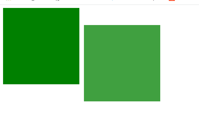
In the figure above, after adding the draggable="true" attribute to box1, we found that box1 can be dragged. But what do you do after dragging? This involves event monitoring.
Event monitoring involves javascript. You can go back to it after learning js.
Event listening of dragging elements: (applied to dragging elements)
- ondragstart is called when the drag starts
- ondragleave is called when the mouse leaves the drag element
- Ondragendcalled when the drag ends
- ondrag is called throughout the drag process
<!DOCTYPE html>
<html>
<head lang="en">
    <meta charset="UTF-8">
    <title></title>
    <style>
        .box {
            width: 200px;
            height: 200px;
            background-color: green;
        }
    </style>
</head>
<body>
<div class="box" draggable="true"></div>

<script>
    var box = document.querySelector('.box');

    //  Bind drag event

    //  Drag start
    box.ondragstart = function () {
        console.log('Drag start.');
    }

    //  Drag away: triggered when the mouse leaves the dragged element
    box.ondragleave = function () {
        console.log('Drag away..');
    }

    //  Drag end
    box.ondragend = function () {
        console.log('Drag end...');
        console.log("---------------");
    }

    box.ondrag = function () {
        console.log('Drag');
    }

</script>
</body>
</html>
Event listening for dragging elements
<!DOCTYPE html>
<html>
<head>
<meta charset="utf-8" />
<title>Rookie tutorial(runoob.com)</title>
<style type="text/css">
#div1 {
width: 350px;
height: 70px;
padding: 10px;
border: 1px solid #aaaaaa;
}
</style>
<script>
function allowDrop(ev) {
ev.preventDefault();
}
function drag(ev) {
ev.dataTransfer.setData('Text', ev.target.id);
}
function drop(ev) {
ev.preventDefault();
var data = ev.dataTransfer.getData('Text');
ev.target.appendChild(document.getElementById(data));
}
</script>
</head>
<body>
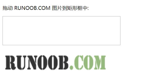
<p>drag RUNOOB.COM Picture into rectangle:</p>
<div id="div1" ondrop="drop(event)" ondragover="allowDrop(event)"></div>
<br />
<img
id="drag1"
src="https://gitee.com/north_gate/drawing-bed/raw/master/images/image-20220218234538140.png"
draggable="true"
ondragstart="drag(event)"
width="336"
height="69"
/>
</body>
</html>

history
All JS operations on the interface will not be remembered by the browser, so it cannot return to the previous state.
In HTML5, you can use window The history operation accesses the historical state, so that a page can have multiple historical states
window. The history object allows us to manage the history. It can be used for single page applications and single page applications. The content of web pages can be changed without refresh.
-
window.history.forward(); // forward
-
window.history.back(); // back off
-
window.history.go(); // Refresh
-
window.history.go(n); //n=1 means forward; n=-1 backward; n=0s refresh. If the moved position exceeds the boundary of access history, it will fail silently, but no error will be reported.
-
An access state can be added through JS
-
history.pushState; // Put the status data in the history and set the title (now the browser does not support changing the historical status)
Geographic location
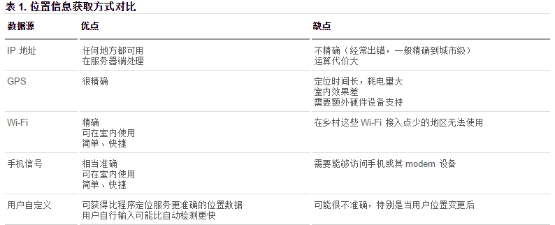
In the HTML specification, the API for obtaining users' geographic information is added, so that we can develop Internet applications based on users' location, that is, location base service (LBS).
How to obtain geographic information
1. IP address
2. Three dimensional coordinates
(1) GPS (Global Positioning System).
At present, the second generation global satellite navigation system (GNSS) in use or under construction in the world include:
-
1. American Global Positioning System (GPS);
-
2. Soviet / Russian GLOBAL NAVIGATION SATELLITE SYSTEM (GLONASS);
-
3. The European Union (Europe is an inaccurate statement, and many countries including China are also involved in it) Galileo satellite navigation system (GALILEO for short);
-
4. China Beidou navigation satellite system (BDS);
-
5. Japan's Quasi zenith satellite system (QZSS);
-
6. India Regional Navigation Satellite System (IRNSS).
The above six systems can be used in China.
(2) Wi Fi positioning: indoor only.
(3) Mobile signal positioning: positioning through the operator's signal tower.
3. User defined data
The advantages and disadvantages of different acquisition methods are compared. The browser will automatically obtain the user's geographic information in the best way:
Get location through Baidu API
<!DOCTYPE html>
<html>
<head>
    <meta charset="utf-8" />
    <title></title>
    <!--Introduction of Baidu API,"ak=" The last string of codes is the key. You'd better apply for it yourself-->
    <script type="text/javascript" src="https://api.map.baidu.com/api?v=2.0&ak=7a6QKaIilZftIMmKGAFLG7QT1GLfIncg"></script>
</head>
<body>
    <input type="button" onclick="getLocation()" value="confirm" />
    <div id="position"></div>
    <script type="text/javascript">
    var x = document.getElementById('position');
    function getLocation() {
        // Create Baidu geographic location instance instead of navigator geolocation
        var geolocation = new BMap.Geolocation();
        geolocation.getCurrentPosition(function(e) {
            if(this.getStatus() == BMAP_STATUS_SUCCESS){
                // Baidu geography has different longitude and latitude attributes. Here is point Lat instead of coords latitude
                x.innerHTML = 'Latitude:' + e.point.lat + '<br/>Longitude:' + e.point.lng;
            } else {
                x.innerHTML = 'failed' + this.getStatus();
            }
        });
    }
    </script>
</body>
</html>
Web storage
There are two storage methods in H5
Localstorage and sessionStorage
The two objects that the client stores data are:
- localStorage - used to save the data of the whole website for a long time. The saved data has no expiration time until it is manually removed.
- sessionStorage - used to temporarily save the data of the same window (or tab). These data will be deleted after closing the window or tab.
Both localStorage and sessionStorage can use the same API. The common APIs are as follows (take localStorage as an example):
- Save data: localstorage setItem(key,value);
- Read data: localstorage getItem(key);
- Delete single data: localstorage removeItem(key);
- Delete all data: localstorage clear();
- Get the key of an index: localstorage key(index);
Characteristics of Web storage
(1) Easy to set and read.
(2) The capacity is large, with sessionStorage of about 5M and localStorage of about 20M.
(3) Only strings can be stored, and the object can be JSON Store after encoding with stringify().
Case: remember user name and password
<!DOCTYPE html>
<html>
<head lang="en">
    <meta charset="UTF-8">
    <title></title>
</head>
<body>
<label for="">
    user name:<input type="text" class="userName"/>
</label>
<br/><br/>
<label for="">
    password:<input type="text" class="pwd"/>
</label>
<br/><br/>
<label for="">
    <input type="checkbox" class="check" id=""/>Remember the password
</label>
<br/><br/>
<button>Sign in</button>

<script>
    var userName = document.querySelector('.userName');
    var pwd = document.querySelector('.pwd');
    var chk = document.querySelector('.check');
    var btn = document.querySelector('button');

    //        When clicking login, if "remember password" is checked, the password will be stored; Otherwise, clear the password
    btn.onclick = function () {
        if (chk.checked) {
//                Remember data
            window.localStorage.setItem('userName', userName.value);
            window.localStorage.setItem('pwd', pwd.value);
        } else {
//                Clear data
            window.localStorage.removeItem('userName');
            window.localStorage.removeItem('pwd');
        }
    }
    //        When logging in next time, if there is data recorded, it will be filled in directly
    window.onload = function () {
        userName.value = window.localStorage.getItem('userName');
        pwd.value = window.localStorage.getItem('pwd');

    }
</script>
</body>
</html>
CSS3 introduction
On the basis of CSS2, CSS3 enhances or adds many features, makes up for many shortcomings of CSS2, and makes Web development more efficient and convenient.
CSS3 is split into "modules". The old specification has been broken down into small pieces and new ones have been added.
Some of the most important CSS3 modules are as follows:
- selector
- Box model
- Background and border
- Text Effect
- 2D/3D conversion
- animation
- Multi column layout
- user interface
CSS3 new content
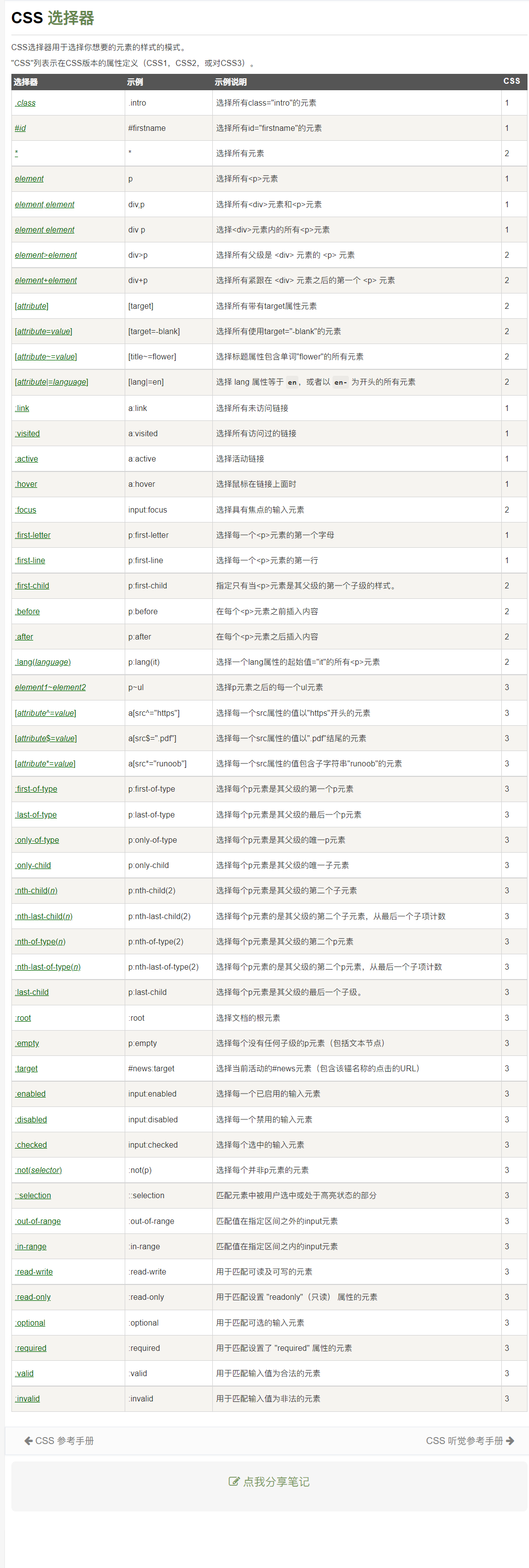
selector
Three selectors have been added to CSS3:
- attribute selectors
- Structure pseudo class selector
- Pseudo element selector
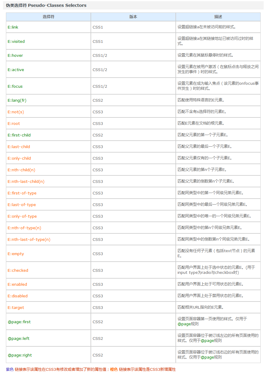
The following table is an overview of the rookie tutorial
attribute selectors
The hallmark of the attribute selector is [].
Matching meaning:
^: start $: ending *: contain
Format:
-
E[title] select the E element of the page, and the E has the title attribute.
-
E[title="abc"] select the E element of the page, and e needs to have the title attribute, and the attribute value is completely equal to abc.
-
E[attr~=val] select the word list with att attribute and attribute value: separated by spaces, including an e element equal to val.
-
E[attr|=val] indicates either a separate attribute value or the attribute value is separated by "-".
-
E[title^="abc"] select the E element of the page, and e needs to have the title attribute, and the attribute value starts with abc.
-
E[title$="abc"] select the E element of the page, and e needs to have the title attribute, and the attribute value ends with abc.
-
E[title*="abc"] select the E element of the page, and e needs to have the title attribute, and the attribute value contains abc anywhere.
Code case:
<!DOCTYPE html>
<html lang="en">
  <head>
    <meta charset="UTF-8" />
    <title>selector - attribute</title>
    <style>
      body {
        margin: 0;
        padding: 0;
        font-family: 'Microsoft YaHei ';
        background-color: #f7f7f7;
      }

      .wrapper {
        width: 1024px;
        margin: 0 auto;
      }

      .wrapper > section {
        min-height: 300px;
        margin-bottom: 30px;
        box-shadow: 1px 1px 4px #ddd;
        background-color: #fff;
      }

      .wrapper > header {
        text-align: center;
        line-height: 1;
        padding: 20px;
        margin-bottom: 10px;
        font-size: 30px;
      }

      .wrapper section > header {
        line-height: 1;
        padding: 10px;
        font-size: 22px;
        color: #333;
        background-color: #eee;
      }

      .wrapper .wrap-box {
        padding: 20px;
      }

      form {
        width: 300px;
        height: 300px;
        margin: 0 auto;
      }

      form input[type='text'] {
        width: 200px;
        height: 30px;
      }

      form input[type='password'] {
        width: 200px;
        height: 30px;
      }

      .attr1 {
      }

      .download {
      }

      .attr1 a[href='./a.rmvb'] {
        color: red;
      }

      .attr1 a[href='./b.rmvb'] {
        color: pink;
      }

      /*  E[attr~=val] Represents a separate property value that is separated by spaces*/
      .attr2 a[class~='download'] {
        color: red;
      }

      /*  E[attr|=val] Represents either a separate property value or the property value is separated by "-"*/
      .attr3 a[class|='download'] {
        color: red;
      }

      /*  E[attr*=val] The attribute value represented by contains the val character and is in "any" position */
      .attr4 a[class*='download'] {
        color: red;
      }

      /*  E[attr^=val] The attribute value represented by contains the val character and is in the "start" position */
      .attr5 a[class^='download'] {
        color: red;
      }

      /*  E[attr$=val] The value of the "val" attribute is contained in the "val" attribute */
      .attr6 a[class$='download'] {
        color: red;
      }
    </style>
  </head>
  <body>
    <div class="wrapper">
      <header>CSS3-attribute selectors </header>
      <section>
        <header>brief introduction</header>
        <div class="wrap-box">
          <form action="">
            <ul>
              <li>full name: <input type="text" /></li>
              <li>password: <input type="password" /></li>

              <li>Gender: <input type="radio" />male <input type="radio" /> female</li>
              <li>interest: <input type="checkbox" name="" id="" />Write code</li>
              <li>
                <input type="submit" value="Submit" />
              </li>
            </ul>
          </form>
        </div>
      </section>
      <section class="attr1">
        <header>E[attr]</header>
        <div class="wrap-box">
          <a href="./a.rmvb" class="download download-movie">download</a>
          <a href="./b.rmvb" class="download download-movie">download</a>
          <a href="./a.mp3" class="download download-music">download</a>
        </div>
      </section>
      <section class="attr2">
        <header>E[attr~=attr]</header>
        <div class="wrap-box">
          <a href="./a.rmvb" class="download download-movie">download</a>
          <a href="./b.rmvb" class="download download-movie">download</a>
          <a href="./a.mp3" class="download download-music">download</a>
        </div>
      </section>
      <section class="attr3">
        <header>E[attr|=attr]</header>
        <div class="wrap-box">
          <a href="./a.rmvb" class="download">download</a>
          <a href="./b.rmvb" class="download-movie">download</a>
          <a href="./a.mp3" class="download-music">download</a>
        </div>
      </section>
      <section class="attr4">
        <header>E[attr*=val]</header>
        <div class="wrap-box">
          <a href="./a.rmvb" class="download">download</a>
          <a href="./b.rmvb" class="moviedownload">download</a>
          <a href="./a.mp3" class="downloadmusic">download</a>
        </div>
      </section>
      <section class="attr5">
        <header>E[attr^=val]</header>
        <div class="wrap-box">
          <a href="./a.rmvb" class="download">download</a>
          <a href="./b.rmvb" class="moviedownload">download</a>
          <a href="./a.mp3" class="downloadmusic">download</a>
        </div>
      </section>
      <section class="attr6">
        <header>E[attr$=val]</header>
        <div class="wrap-box">
          <a href="./a.rmvb" class="download">download</a>
          <a href="./b.rmvb" class="moviedownload">download</a>
          <a href="./a.mp3" class="downloadmusic">download</a>
        </div>
      </section>
    </div>
  </body>
</html>
Structure pseudo class selector
There are some pseudo class selectors in CSS, such as: link,: active,: visited,: hover. These are dynamic pseudo class selectors.
CSS3 adds other pseudo class selectors. In this short paragraph, let's learn the structure pseudo class selector in CSS3: filtering through structure.
1. Format: (Part I)
-
E: First child matches the first child element E of the parent element.
-
E: Last child matches the last child element E of the parent element.
-
E: Nth child (n) matches the nth child element E of the parent element. Note that the number of boxes starts from 1, not 0.
-
E: Nth child (odd) matches an odd number
-
E: Nth child (even) matches an even number
-
E: Nth last child (n) matches the penultimate child element E of the parent element.
understand:
(1) Here we need to understand the meaning of the parent element. It refers to taking the parent element of element E as the reference.
(2) Note: the type of the element selected in the above selector must be the specified type E. if it is not selected, it will be invalid. This should be well understood. For details, see the example of E: nth child (n) in the CSS reference manual. We can understand it as: first find all the selected positions according to the selector. If a position is found to be not of type E, the position will be invalid.
(3) In addition, the E: nth child (n) attribute is also very interesting. For example, for the following set of tags:
    <ul>
        <li>1</li>
        <li>2</li>
        <li>3</li>
        <li>4</li>
        <li>5</li>
        <li>6</li>
        <li>7</li>
        <li>8</li>
        <li>9</li>
        <li>10</li>
    </ul>
In the code above:
-
If the selector is written as li: nth child (2), it represents the second li.
-
If the selector is written as li: nth child (n), it means all li. Because n at this time means 0,1,2,3,4,5,6,7,8... (it is invalid when n is less than 1, because n = 0 will not be selected)
-
If the selector is written as li: nth child (2n), it represents all even li.
-
If the selector is written as li: nth child (2n + 1), it represents all the odd li.
-
If the selector is written as Li: nth child (- N + 5), it represents the first five li.
-
If the selector is written as Li: nth last child (- N + 5), it represents the last five li.
-
If the selector is written as Li: nth child (7n), it means that a multiple of 7 is selected..
Among the selectors listed above, we just need to remember: n means 0,1,2,3,4,5,6,7,8... It's easy to understand.
2. Format: (Part II)
-
E: The first of type matches the first sibling element E of the same type.
-
E: Last of type matches the last sibling element E of the same type.
-
E: Nth of type (n) matches the nth sibling element E in the same type.
-
E: Nth last of type (n) matches the penultimate sibling element E in the same type.
Since the above selectors have type, we can understand it this way: first find all E types in the same level, and then match according to n.
3. Format: (Part III)
-
E:empty matches element E without any child nodes (including text nodes such as spaces).
-
E:target matches the E element pointed to by the relevant URL. It should be used with anchor points.
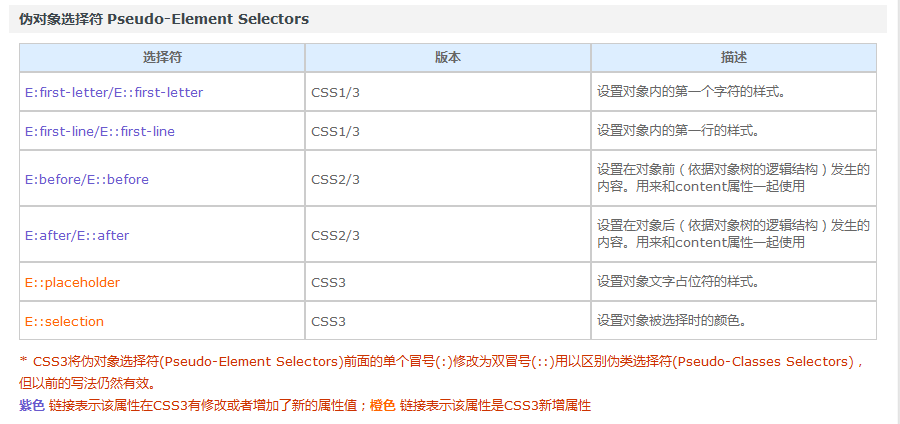
Pseudo element selector
1. Format: (Part I)
-
E::before sets the content in front of element E (according to the logical structure of the object tree), which is used together with the content attribute.
-
E::after sets the content behind element E (according to the logical structure of the object tree), which is used together with the content attribute.
E:after and E:before are pseudo classes in the old version and pseudo elements in the new version of CSS3. In the new version, E:after and E:before will be automatically recognized as E::after and E::before and treated as pseudo elements. The purpose of this is to do compatibility processing.
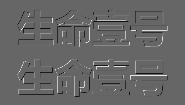
give an example:
<!DOCTYPE html>
<html>
<head lang="en">
    <meta charset="UTF-8">
    <title></title>
    <style>

        /*::before And:: after is the effect of html tags simulated through css*/
        span::before{
            content:"smyhvae";
            color:red;
            background-color: pink;
            width: 50px;
            height: 50px;
            display: inline-block;
        }

        span::after{
            content:"Never stop";
            color:yellowgreen;
        }

        /*Set a default attribute to the original span tag*/
        span{
            border: 1px solid #000;
        }
    </style>
</head>
<body>

<span>Life one</span>
</body>
</html>
The effect is as follows:
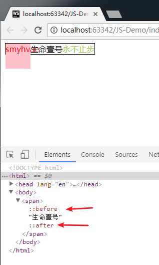
As can be seen from the above figure:
-
Through the pseudo element selector, you can add an effect similar to the span tag (remember to use it in combination with the content attribute).
-
The pseudo elements added through these two attributes are in-line elements, which need to be converted into block elements to set the width and height.
2. Format: (Part II)
-
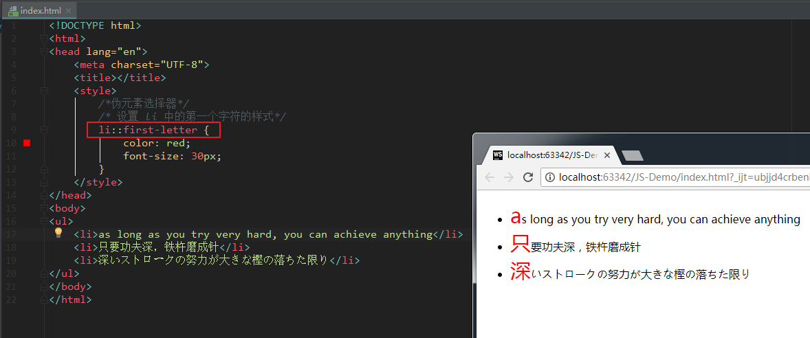
E: : first letter sets the style of the first character in element E.
-
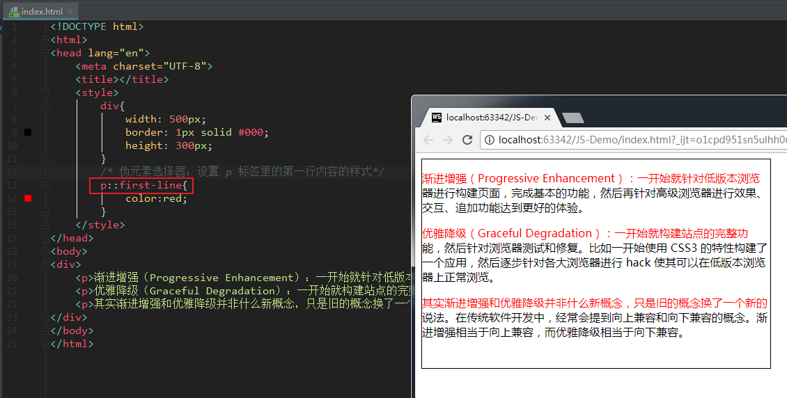
E: : first line sets the style of the first line in element E.
-
E::selection sets the style of the area selected by the mouse in element E (generally set the color and background color).
E: : example of first letter:
E: : example of first line:
Finally, here is a table:
attribute
text
Text shadow: sets the shadow of the text
Tiktok: This is used in the font of the vibrato style before.
<!DOCTYPE html>
<html>
  <head lang="en">
    <meta charset="UTF-8" />
    <title></title>
    <style>
      body {
        background-color: #666;
      }

      div {
        font-size: 100px;
        text-align: center;
        font-weight: bold;
        font-family: 'Microsoft Yahei';
        color: #666;
      }

      /* text-shadow You can set multiple shadows, each separated by a comma*/
      .tu {
        text-shadow: -1px -1px 1px #fff, 1px 1px 1px #000;
      }

      .ao {
        text-shadow: -1px -1px 1px #000, 1px 1px 1px #fff;
      }
    </style>
  </head>
  <body>
    <div class="ao">Life one</div>
    <div class="tu">Life one</div>
  </body>
</html>
frame
The border part can look back at the case of "beating heart"
Border fillet
<!DOCTYPE html>
<html>
  <head lang="en">
    <meta charset="UTF-8" />
    <title></title>
    <style>
      .parent {
        width: 400px;
      }
      .box {
        width: 100px;
        height: 100px;
        float: left;
        border: 1px solid rgb(144, 12, 63);
        margin: 20px;
        text-align: center;
        line-height: 100px;
        color: #fff;
        font-size: 50px;
        background-color: rgb(255, 141, 26);
      }

      /*Way to draw a circle*/
      .box:nth-child(1) {
        border-radius: 50px;
      }

      /*The second way to draw a circle*/
      .box:nth-child(2) {
        border-radius: 50%;
      }

      .box:nth-child(3) {
        border-radius: 100px 0 0 0;
      }

      .box:nth-child(4) {
        border-radius: 100px/50px;
      }

      .box:nth-child(5) {
        border-radius: 10%;
      }

      .box:nth-child(6) {
        border-radius: 0 100px;
      }
    </style>
  </head>
  <body>
    <div class="parent">
      <div class="box">1</div>
      <div class="box">2</div>
      <div class="box">3</div>
      <div class="box">4</div>
      <div class="box">5</div>
      <div class="box">6</div>
    </div>
  </body>
</html>
animation
Transition animation
Transition means transition in Chinese. Transition is a subversive feature in CSS3. It can realize the smooth transition between different states of elements (make-up animation), which is often used to make animation effects.
-
Make up animation: automatically complete the transition from the start state to the end state. Never mind the state in the middle.
-
Frame animation: play through frame by frame pictures in a fixed order and speed. Such as film.
Reference link: Fundamentals of patching animation
transition includes the following attributes:
-
transition-property: all; Use all if you want all attributes to transition.
-
transition-duration: 1s; The duration of the transition.
-
transition-timing-function: linear; Motion curve. Attribute values can be:
- linear
- ease deceleration
- Ease in acceleration
- Ease out deceleration
- Ease in out
-
transition-delay: 1s; Transition delay. How long will it take to execute this transition animation.
The above four attributes can also be written as comprehensive attributes:
	transition: Which attributes are allowed to make excessive transition duration motion curve delay time;

	transition: all 3s linear 0s;
Among them, the attribute transition property needs special attention. Different attribute values have different phenomena.
<!DOCTYPE html>
<html lang="en">
<head>
    <meta charset="UTF-8">
    <title>CSS transition</title>
    <style>
        body {
            margin: 0;
            padding: 0;
            background-color: #eeeeee;
        }

        .content {
            width: 800px;
            height: 320px;
            padding-left: 20px;
            margin: 80px auto;
        }

        .item {
            width: 230px;
            height: 300px;
            text-align: center;
            margin-right: 20px;
            background-color: #FFF;
            float: left;
            position: relative;
            top: 0;
            overflow: hidden; /* Hide the overflow content. It means to let the orange square below hide first */
            transition: all .5s; /* Transition from initial to mouse over */
        }

        .item img {
            margin-top: 30px;
        }

        .item .desc {
            position: absolute;
            left: 0;
            bottom: -80px;
            width: 100%;
            height: 80px;
            background-color: #ff6700;
            transition: all .5s;
        }

        /* When the mouse hovers, let the item move 5px up as a whole and add a shadow */
        .item:hover {
            top: -5px;
            box-shadow: 0 0 15px #AAA;
        }

        /* When the mouse hovers, let the orange square below appear */
        .item:hover .desc {
            bottom: 0;
        }
    </style>
</head>
<body>
<div class="content">
    <div class="item">
        <img src="./images/1.png" alt="">
    </div>

    <div class="item">
        <img src="./images/2.png" alt="">
        <span class="desc"></span>
    </div>
    <div class="item">
        <img src="./images/3.jpg" alt="">
        <span class="desc"></span>
    </div>
</div>
</body>
</html>
Displacement animation
Format:
	transform: translate(Horizontal displacement, vertical displacement);

	transform: translate(-50%, -50%);
Parameter interpretation:
- The parameter is a percentage that moves relative to itself.
- Positive values: right and down. Negative values: left and up. If only one value is written, it indicates horizontal movement.
case
<!DOCTYPE html>
<html>
<head lang="en">
    <meta charset="UTF-8">
    <title></title>
    <style>
        .box {
            width: 1000px;
            margin: 100px auto;
        }

        .box > div {
            width: 300px;
            height: 150px;
            border: 1px solid #000;
            background-color: red;
            float: left;
            margin-right: 30px;
        }

        div:nth-child(2) {
            background-color: pink;
            transition: all 1s;
        }

        /* translate:(Horizontal displacement (vertical displacement)*/
        div:nth-child(2):hover {
            transform: translate(-50%, -50%);
        }
    </style>

</head>
<body>
<div class="box">
    <div class="box1">1</div>
    <div class="box2">2</div>
    <div class="box3">3</div>
</div>

</body>
</html>
Rotate animation
Format:
	transform: rotate(angle);
	transform: rotate(45deg);
Parameter interpretation: positive value clockwise; Negative value: counterclockwise.
<!DOCTYPE html>
<html>
<head lang="en">
    <meta charset="UTF-8">
    <title></title>
    <style>
        .box {
            width: 200px;
            height: 200px;
            background-color: red;
            margin: 50px auto;
            color: #fff;
            font-size: 50px;
            transition: all 2s; /* Transition: let the box have a transition period when transform ing */
        }

        /* rotate((angle) rotation */
        .box:hover {
            transform: rotate(-405deg); /* Let the box rotate when the mouse hovers */
        }

    </style>
</head>
<body>
<div class="box">1</div>

</div>
</body>
</html>
3D conversion
1. Spin
3D coordinate system (left-handed coordinate system)
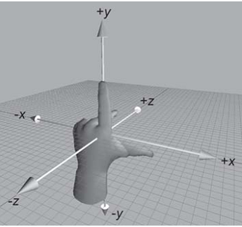
As shown in the figure above, stretch out your left hand, make your thumb and index finger in an "L" shape, your thumb to the right, your index finger to the up, and your middle finger to the front. The thumb, index finger and middle finger represent the positive directions of X, Y and Z axes respectively, so we have established a left-handed coordinate system.
The plane of the browser is the X-axis and Y-axis; The plane perpendicular to the browser is the Z axis.
Direction of rotation: (left hand rule)
Hold the rotation axis with your left hand and point your thumb to the positive direction of the rotation axis. The positive direction is the curling direction of the other fingers.
From the above sentence, we can also see that all 3d rotations, when viewed in the positive direction, are clockwise.
Format:
	transform: rotateX(360deg);    //Rotate 360 degrees around the X axis

	transform: rotateY(360deg);    //Rotate 360 degrees around the Y axis

	transform: rotateZ(360deg);    //Rotate 360 degrees around the Z axis
Case code:
<!DOCTYPE html>
<html>
  <head lang="en">
    <meta charset="UTF-8" />
    <title></title>
    <style>
      .rotateX {
        width: 300px;
        height: 226px;
        margin: 200px auto;

        /* Perspective: parent box added to transform*/
        /* Set the distance between the user's eyes and the plane*/
        /* Perspective effect is only a visual presentation, not a real 3d*/
        perspective: 110px;
      }

      img {
        /* transition*/
        transition: transform 2s;
      }

      /* All 3d rotations, looking in the right direction, are clockwise*/
      .rotateX:hover img {
        transform: rotateX(360deg);
      }
    </style>
  </head>
  <body>
    <div class="rotateX">
      <img
        src="https://gitee.com/north_gate/drawing-bed/raw/master/images/image-20220219002859863.png"
        alt=""
      />
    </div>
  </body>
</html>
2. Move
Format:
transform: translateX(100px);    //Move along the X axis

transform: translateY(360px);    //Move along Y axis

transform: translateZ(360px);    //Move along the Z axis
<!DOCTYPE html>
<html>
  <head lang="en">
    <meta charset="UTF-8" />
    <title></title>
    <style>
      .box {
        width: 200px;
        height: 200px;
        background: green;
        transition: all 1s;
      }

      .box:hover {
        transform: translateX(100px);
      }
    </style>
  </head>
  <body>
    <div class="box"></div>
  </body>
</html>
3. perspective: perspective
The computer display screen is a 2D plane. The reason why the image has a three-dimensional feeling (3D effect) is actually a visual presentation. This purpose can be achieved through perspective.
Perspective can transform a 2D plane into a 3d one in the process of transformation. But it is only a visual 3d effect, not a real 3d.
The format can be written in two ways:
-
As an attribute, it is set to the parent element and acts on the child elements of all 3D transformations
-
As a value of the transform attribute, it is used for the element itself.
Format example:
perspective: 500px;
4. 3D rendering (transform style)
3D element construction means that a graphic is composed of multiple elements. You can set transform style: preserve-3d to the parent element of these elements to make it become a real 3D graphic. Attribute values can be as follows:
	transform-style: preserve-3d;     /* Let the sub box be located in three-dimensional space */

	transform-style: flat;            /* Place the sub box in the plane of this element (the sub box is flattened) */
**Case: * * cube
<!DOCTYPE html>
<html>
<head lang="en">
    <meta charset="UTF-8">
    <title></title>
    <style>
        .box {
            width: 250px;
            height: 250px;
            border: 1px dashed red;
            margin: 100px auto;
            position: relative;
            border-radius: 50%;

            /* Keep the sub box 3d*/

            transform-style: preserve-3d;

            /*transform:rotateX(30deg) rotateY(-30deg);*/

            animation: gun 8s linear infinite;
        }

        .box > div {
            width: 100%;
            height: 100%;
            position: absolute;
            text-align: center;
            line-height: 250px;
            font-size: 60px;
            color: #daa520;
        }

        .left {
            background-color: rgba(255, 0, 0, 0.3);
            /* Transformation center*/
            transform-origin: left;
            /* Transform*/
            transform: rotateY(90deg) translateX(-125px);
        }

        .right {
            background: rgba(0, 0, 255, 0.3);
            transform-origin: right;
            /* Transform*/
            transform: rotateY(90deg) translateX(125px);
        }

        .forward {
            background: rgba(255, 255, 0, 0.3);
            transform: translateZ(125px);
        }

        .back {
            background: rgba(0, 255, 255, 0.3);
            transform: translateZ(-125px);
        }

        .up {
            background: rgba(255, 0, 255, 0.3);
            transform: rotateX(90deg) translateZ(125px);
        }

        .down {
            background: rgba(99, 66, 33, 0.3);
            transform: rotateX(-90deg) translateZ(125px);
        }

        @keyframes gun {
            0% {
                transform: rotateX(0deg) rotateY(0deg);
            }

            100% {
                transform: rotateX(360deg) rotateY(360deg);
            }
        }
    </style>
</head>
<body>
<div class="box">
    <div class="up">upper</div>
    <div class="down">lower</div>
    <div class="left">Left</div>
    <div class="right">right</div>
    <div class="forward">front</div>
    <div class="back">after</div>
</div>
</body>
</html>
Flex layout
The flex attribute in CSS3 has made great improvements in the layout, which makes us very flexible and adaptable to the layout arrangement between multiple elements. Its strong scalability and adaptability can play a great role in web page development.
flex first experience
Let's take a look at the following simplest layout:
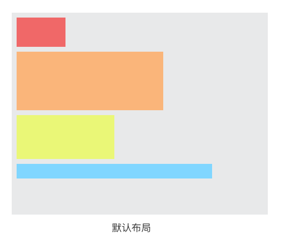
The layout in the above figure is familiar to us: in the default document flow, if multiple block level child elements are placed in a parent container, these child elements will be arranged from top to bottom by default.
On this basis, if I only add a display: flex attribute to the parent container, the layout of these child elements will change:
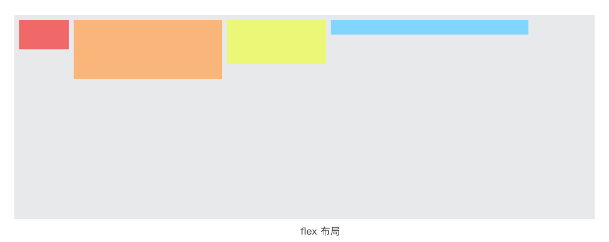
Yes, the sub elements will be arranged horizontally from left to right, which is so magical. So far, you've learned half about flex.
Advantages of flex layout
1. The child elements of flex layout will not be separated from the document flow, which well complies with the "characteristics of flow".
However, if you use float for layout, the elements of the float attribute will be separated from the document flow, and various BFC and floating clearing problems will be involved. Floating related questions are more troublesome, so they have become a classic question to ask in an interview. But with flex layout, these problems do not exist.
2. flex is a modern layout method. It is the first time that W3C provides a CSS specification for layout. flex provides rich attributes and flexibility, which makes the implementation of layout more diversified and easy to use.
The only disadvantage of flex is that it does not support lower versions of IE.
flex compatibility issues
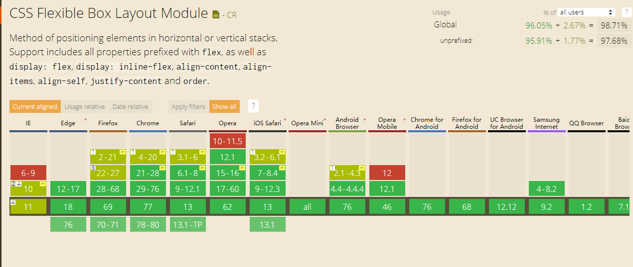
As can be seen from the above figure, the flex layout does not support IE9 and below; IE10 and above are only partially supported. If your page does not need to deal with the compatibility of IE browser, you can safely and boldly use flex layout.
However, large websites such as Netease News and Taobao are facing a large number of users. Even though the proportion of users using low version browsers is small, the absolute base is still very large. Therefore, in order to be compatible with the lower version of IE browser, these websites do not dare to try to use flex layout for the time being.
Concept: elastic box, sub element
Before talking about the knowledge of flex, we agree on two concepts in advance:
-
The parent container of flex: display or flex: display is used.
-
Child element / elastic element: refers to the child elements in the parent container (when the parent container is declared as a flex box).
Concept: main shaft and side shaft
In the above "first experience" example, we found that the sub elements in the elastic box are arranged from left to right by default. This direction represents the direction of the main axis.
As shown in the figure above:
-
Spindle: the spindle of the flex container. The default direction is horizontal, from left to right.
-
Side axis: the axis perpendicular to the main axis is called side axis. By default, it is vertical, from top to bottom.
PS: the main shaft and side shaft are not fixed. The direction can be changed through flex direction, which will be discussed later.
Elastic box
Declaration definition
Use display:flex or display: inline flex to declare a parent container as an elastic box. At this time, the child elements in the parent container will follow the elastic layout.
Note: the attribute display:flex is generally used. Display: inline flex is less used.
Flex direction property
Flex direction: used to set the arrangement direction of sub elements in the box. Attribute values can be:
| Attribute value | describe |
|---|---|
| row | Arrange child elements horizontally from left to right (default) |
| column | Arrange child elements vertically from top to bottom |
| row-reverse | List child elements from right to left |
| column-reverse | Arrange child elements vertically from bottom to top |
Note: if we do not write the attribute flex direction to the parent container, the child elements are arranged from left to right by default.
Code demonstration:
<!DOCTYPE html>
<html>
<head lang="en">
    <meta charset="UTF-8">
    <title></title>
    <style>
        *{
            margin: 0;
            padding: 0;
            list-style: none;
        }
       body{
           background-color: #eee;
           font-family: "Microsoft Yahei";
           font-size:22px;
       }

        h3{
            font-weight: normal;
        }
        section{
            width: 1000px;

            margin:40px auto;
        }

        ul{
            background-color: #fff;
            border: 1px solid #ccc;

        }

        ul li{
            width: 200px;
            height: 200px;
            background-color: pink;
            margin:10px;
        }
        section:nth-child(1) ul{
            overflow: hidden; /* Clear float */
        }
        section:nth-child(1) ul li{
            float: left;
        }
        /* Set telescopic box*/
        section:nth-child(2) ul{
            display: flex;
        }

        section:nth-child(3) ul{
            /* Set the telescopic layout*/
            display: flex;
            /* Set spindle direction*/
            flex-direction: row;
        }

        section:nth-child(4) ul{
            /* Set the telescopic layout*/
            display: flex;
            /* Set spindle direction: flip horizontally*/
            flex-direction: row-reverse;
        }

        section:nth-child(5) ul{
            /* Set the telescopic layout*/
            display: flex;
            /* Set spindle direction: vertical*/
            flex-direction: column;
        }

        section:nth-child(6) ul{
            /* Set the telescopic layout*/
            display: flex;
            /* Set spindle direction: vertical*/
            flex-direction: column-reverse;
        }
    </style>
</head>
<body>
    <section>
        <h3>Traditional layout</h3>
        <ul>
            <li>1</li>
            <li>2</li>
            <li>3</li>
        </ul>
    </section>

    <section>
        <h3>Telescopic layout display:flex</h3>
        <ul>
            <li>1</li>
            <li>2</li>
            <li>3</li>
        </ul>
    </section>

    <section>
        <h3>Spindle direction flex-direction:row</h3>
        <ul>
            <li>1</li>
            <li>2</li>
            <li>3</li>
        </ul>
    </section>

    <section>
        <h3>Spindle direction flex-direction:row-reverse</h3>
        <ul>
            <li>1</li>
            <li>2</li>
            <li>3</li>
        </ul>
    </section>

    <section>
        <h3>Spindle direction flex-direction:column</h3>
        <ul>
            <li>1</li>
            <li>2</li>
            <li>3</li>
        </ul>
    </section>

    <section>
        <h3>Spindle direction flex-direction:column-reverse</h3>
        <ul>
            <li>1</li>
            <li>2</li>
            <li>3</li>
        </ul>
    </section>
</body>
</html>
Flex wrap attribute
Flex Wrap: controls line feed processing when child elements overflow.
Justify content attribute
Justify content: controls the arrangement of child elements on the main axis.
Elastic element
Justify content attribute
- justify-content: flex-start; Sets the alignment of child elements on the spindle. Attribute values can be:
- Flex start aligns from the start of the spindle (default)
- Flex end is aligned from the end of the spindle
- center alignment
- Space around is divided equally in the parent box
- Space between
Code demonstration: (open it in the browser to see the effect)
<!DOCTYPE html>
<html>
<head lang="en">
    <meta charset="UTF-8">
    <title></title>
    <style>
        *{
            margin: 0;
            padding: 0;
            list-style:none;}
        body{
            background-color: #eee;
            font-family: "Microsoft Yahei";

        }
        section{
            width: 1000px;
            margin:50px auto;
        }
        section h3{
            font-size:22px;
            font-weight: normal;
        }

        ul{
            border: 1px solid #999;
            background-color: #fff;
            display: flex;

        }

        ul li{
            width: 200px;
            height: 200px;
            background: pink;
            margin:10px;

        }

        section:nth-child(1) ul{
            /* Spindle alignment: alignment in the direction starting from the spindle*/
            justify-content: flex-start;
        }

        section:nth-child(2) ul{
            /* Spindle alignment: align from the end of the spindle*/
            justify-content: flex-end;
        }

        section:nth-child(3) ul{
            /* Spindle alignment: center alignment*/
            justify-content: center;
        }

        section:nth-child(4) ul{
            /* Spindle alignment: bisect in parent box*/
            justify-content: space-around;

           }

        section:nth-child(5) ul{
            /* Spindle alignment: both ends are aligned and bisected*/
            justify-content: space-between;
        }
    </style>
</head>
<body>
    <section>
        <h3>Spindle alignment: justify-content:flex-start</h3>
        <ul>
            <li>1</li>
            <li>2</li>
            <li>3</li>
        </ul>
    </section>

    <section>
        <h3>Spindle alignment: justify-content:flex-end</h3>
        <ul>
            <li>1</li>
            <li>2</li>
            <li>3</li>
        </ul>
    </section>

    <section>
        <h3>Spindle alignment: justify-content:center</h3>
        <ul>
            <li>1</li>
            <li>2</li>
            <li>3</li>
        </ul>
    </section>

    <section>
        <h3>Spindle alignment: justify-content:space-round</h3>
        <ul>
            <li>1</li>
            <li>2</li>
            <li>3</li>
        </ul>
    </section>

    <section>
        <h3>Spindle alignment: justify-content:space-bettwen</h3>
        <ul>
            <li>1</li>
            <li>2</li>
            <li>3</li>
            <li>4</li>
        </ul>
    </section>
</body>
</html>
Align items property
Align items: sets the alignment of child elements on the side axis. Attribute values can be:
-Flex start is aligned from the side axis
-Flex end is aligned from the end of the side axis
-Baseline baseline is the same as flex start by default
-Center center alignment
-Stretch stretch
Code demonstration:
<!DOCTYPE html>
<html>
<head lang="en">
    <meta charset="UTF-8">
    <title></title>
    <style>
        *{
            margin: 0;
            padding: 0;
            list-style:none;
        }
        body{
            background-color: #eee;
            font-family: "Microsoft Yahei";

        }
        section{
            width: 1000px;
            margin:50px auto;
        }
        section h3{
            font-size:22px;
            font-weight: normal;
        }

        ul{
            border: 1px solid #999;
            background-color: #fff;
            display: flex;
            height:500px;

        }

        ul li{
            width: 200px;
            height: 200px;
            background: pink;
            margin:10px;

        }

        section:nth-child(1) ul{
            /* Side axis alignment: alignment from the side axis*/
            align-items:flex-start;
        }

        section:nth-child(2) ul{
            /* Side axis alignment: align from the end of the side axis*/
            align-items:flex-end;
        }

        section:nth-child(3) ul{
            /* Side axis alignment: Centered*/
            align-items:center;
        }

        section:nth-child(4) ul{
            /* Side axis alignment: the baseline is the same as flex start by default*/
            align-items:baseline;
        }

        section:nth-child(5) ul{
            /* Side axis alignment: Stretch*/
            align-items:stretch;

        }

        section:nth-child(5) ul li{
            height:auto;
        }


    </style>
</head>
<body>
<section>
    <h3>Alignment of side axis:align-items : flex-start</h3>
    <ul>
        <li>1</li>
        <li>2</li>
        <li>3</li>
    </ul>
</section>

<section>
    <h3>Alignment of side axis: align-items:flex-end</h3>
    <ul>
        <li>1</li>
        <li>2</li>
        <li>3</li>
    </ul>
</section>

<section>
    <h3>Alignment of side axis: align-items:center</h3>
    <ul>
        <li>1</li>
        <li>2</li>
        <li>3</li>
    </ul>
</section>

<section>
    <h3>Alignment of side axis: align-itmes:baseline</h3>
    <ul>
        <li>1</li>
        <li>2</li>
        <li>3</li>
    </ul>
</section>

<section>
    <h3>Alignment of side axis: align-itmes: stretch</h3>
    <ul>
        <li>1</li>
        <li>2</li>
        <li>3</li>
    </ul>
</section>
</body>
</html>
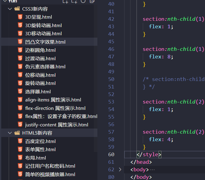
flex attribute: sets the weight of the sub box
Code demonstration:
<!DOCTYPE html>
<html>
<head lang="en">
    <meta charset="UTF-8">
    <title></title>
    <style>
        *{
            margin: 0;
            padding: 0;
            list-style:none;
        }
        body{
            background-color: #eee;
            font-family: "Microsoft Yahei";

        }
        section{
            width: 1000px;
            margin:50px auto;
        }
        section h3{
            font-size:22px;
            font-weight: normal;
        }

        ul{
            border: 1px solid #999;
            background-color: #fff;
            display: flex;

        }

        ul li{
            width: 200px;
            height: 200px;
            background: pink;
            margin:10px;

        }

        section:nth-child(1) ul li:nth-child(1){
            flex:1;
        }

        section:nth-child(1) ul li:nth-child(2){
            flex:1;
        }

        section:nth-child(1) ul li:nth-child(3){
            flex:8;
        }

        section:nth-child(2) ul li:nth-child(1){

        }

        section:nth-child(2) ul li:nth-child(2){
            flex:1;
        }

        section:nth-child(2) ul li:nth-child(3){
           flex:4;
        }


    </style>
</head>
<body>
<section>
    <h3>Expansion ratio:flex</h3>
    <ul>
        <li>1</li>
        <li>2</li>
        <li>3</li>
    </ul>
</section>

<section>
    <h3>Expansion ratio:flex</h3>
    <ul>
        <li>1</li>
        <li>2</li>
        <li>3</li>
    </ul>
</section>


</body>
</html>