Program developers use the third-party UI library more for convenience and convenience. They implant the control into the project without studying the implementation details of the UI control. At the same time, there are basic attribute settings to change its style. In this way, the project can be developed faster and save a lot of time.
Newbeecoder.UI control library is also developed based on this architecture concept. It has natural advantages to develop projects with wpf on Windows platform.
This article is mainly divided into two parts to introduce the third-party newbeecoder UI library. The first part introduces the usage of UI library, and the second part briefly introduces the framework and code structure of open source control library.
In order to facilitate users to understand the software functions, the control library interface and program framework are briefly demonstrated in the video.
1, Newbeecoder There are four types of buttons in the UI control library: basic Button (NbButton), repeat Button (NbRepeatButton), multiple selection Button (NbToggleButton) and radio Button (NbRadioButton).
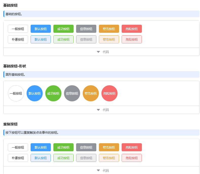
Call the ordinary button style in the wpf interface. If you want to change it to a duplicate button or a multi button, you just need to replace the name NbRepeatButton with the Style name unchanged.
<NbButton Style="{DynamicResource NormalButtonStyle}" Margin="5" Content="General button"/>
<NbButton Style="{DynamicResource DefaultButtonStyle}" Margin="5" Content="Default button"/>
<NbButton Style="{DynamicResource SuccessButtonStyle}" Margin="5" Content="Success button"/>
<NbButton Style="{DynamicResource InfoButtonStyle}" Margin="5" Content="Information button"/>
<NbButton Style="{DynamicResource WarningButtonStyle}" Margin="5" Content="Warning button"/>
<NbButton Style="{DynamicResource DangerButtonStyle}" Margin="5" Content="Danger button"/>
2, Newbeecoder The option box in the UI is also very convenient to use. There are three types of option boxes in the UI Library: square radio box, circular radio box and multi box.
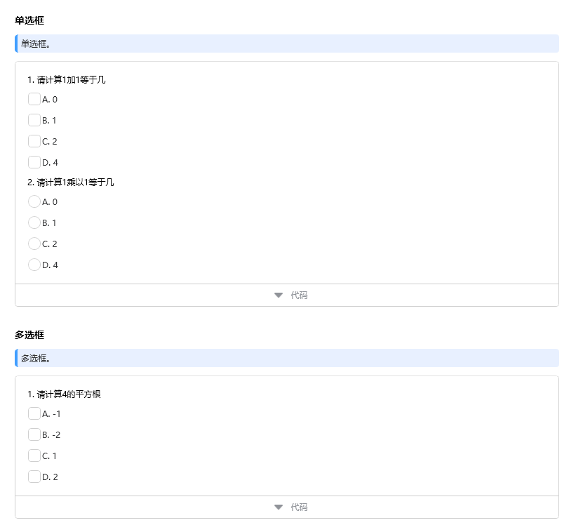
The radio box calls the style code. Note that you need to set the GroupName to the same name.
<NbRadioBox Style="{DynamicResource DefaultRadioBoxStyle}" Margin="5" Content="A. 0" GroupName="Ans1"/>
<NbRadioBox Style="{DynamicResource DefaultRadioBoxStyle}" Margin="5" Content="B. 1" GroupName="Ans1"/>
<NbRadioBox Style="{DynamicResource DefaultRadioBoxStyle}" Margin="5" Content="C. 2" GroupName="Ans1"/>
<NbRadioBox Style="{DynamicResource DefaultRadioBoxStyle}" Margin="5" Content="D. 4" GroupName="Ans1"/>
Call check box style code:
<NbCheckBox Style="{DynamicResource DefaultCheckBoxStyle}" Margin="5" Content="A. -1"/>
<NbCheckBox Style="{DynamicResource DefaultCheckBoxStyle}" Margin="5" Content="B. -2"/>
<NbCheckBox Style="{DynamicResource DefaultCheckBoxStyle}" Margin="5" Content="C. 1"/>
<NbCheckBox Style="{DynamicResource DefaultCheckBoxStyle}" Margin="5" Content="D. 2"/>
3, There are many input box styles, and all input box styles use one style by default.
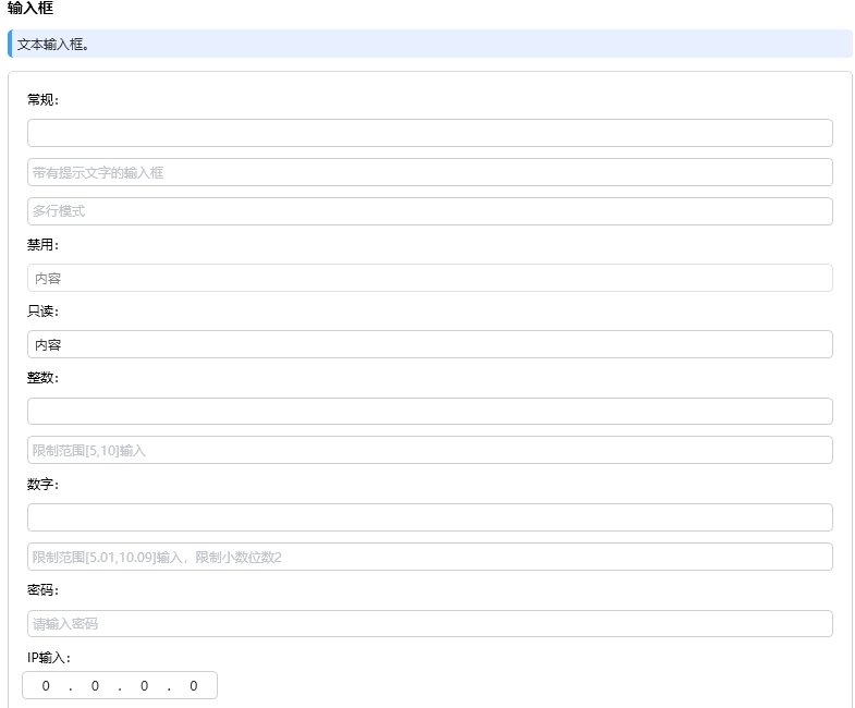
According to the development requirements, the input box parameter settings can be used flexibly in use. Call examples are as follows:
<TextBlock Text="General:" Margin="5"/>
<NbTextBox Style="{DynamicResource DefaultTextBoxStyle}" Margin="5"/>
<NbTextBox Style="{DynamicResource DefaultTextBoxStyle}" Margin="5" Placeholder="Input box with prompt text"/>
<NbTextBox Style="{DynamicResource DefaultTextBoxStyle}" Margin="5" Placeholder="Multiline mode" AcceptsReturn="True"/>
<TextBlock Text="Disable:" Margin="5"/>
<NbTextBox Style="{DynamicResource DefaultTextBoxStyle}" Margin="5" Text="content" IsEnabled="False"/>
<TextBlock Text="Read only:" Margin="5"/>
<NbTextBox Style="{DynamicResource DefaultTextBoxStyle}" Margin="5" Text="content" IsReadOnly="True"/>
<TextBlock Text="Integer:" Margin="5"/>
<NbTextBox Style="{DynamicResource DefaultTextBoxStyle}" Margin="5" InputMode="Int"/>
<NbTextBox Style="{DynamicResource DefaultTextBoxStyle}" Margin="5" InputMode="Int" MinInt="5" MaxInt="10" Placeholder="Limit scope[5,10]input"/>
<TextBlock Text="Number:" Margin="5"/>
<NbTextBox Style="{DynamicResource DefaultTextBoxStyle}" Margin="5" InputMode="Number"/>
<NbTextBox Style="{DynamicResource DefaultTextBoxStyle}" Margin="5" InputMode="Number" MinNumber="5.01" MaxNumber="10.09" NumberDecimals="2" Placeholder="Limit scope[5.01,10.09]Enter, limit scale 2"/>
<TextBlock Text="password:" Margin="5"/>
<NbTextBox Style="{DynamicResource DefaultTextBoxStyle}" Margin="5" InputMode="Password" Placeholder="Please input a password"/>
<TextBlock Text="IP Input:" Margin="5"/>
<NbIpBox Width="180" HorizontalAlignment="Left"/>
4, The drop-down box of VS can meet the basic requirements, but the drop-down box has no search and clearing functions, so it is in newbeecoder These two functions are added to the UI.
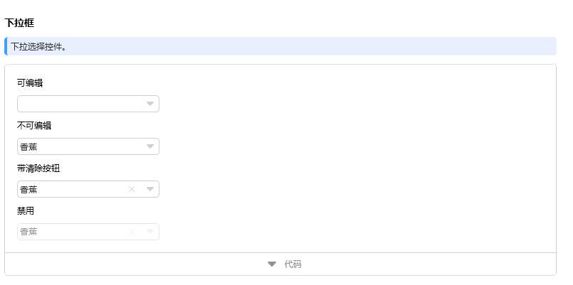
<TextBlock Text="Editable" Margin="5"/>
<NbComboBox Style="{DynamicResource DefaultComboBoxStyle}" Margin="5" IsEditable="True" EnabledSearchItems="True" EnabledSearchIgnoreCase="True" ShowClearButton="False">
    <NbComboBoxItem Content="a mandarin orange"/>
    <NbComboBoxItem Content="Apple"/>
    <NbComboBoxItem Content="Banana"/>
    <NbComboBoxItem Content="strawberry"/>
    <NbComboBoxItem Content="Pear"/>
</NbComboBox>
<TextBlock Text="Non editable" Margin="5"/>
<NbComboBox Style="{DynamicResource DefaultComboBoxStyle}" Margin="5" IsEditable="False" EnabledSearchItems="True" EnabledSearchIgnoreCase="True" ShowClearButton="False">
    <NbComboBoxItem Content="a mandarin orange"/>
    <NbComboBoxItem Content="Apple"/>
    <NbComboBoxItem Content="Banana" IsSelected="True"/>
    <NbComboBoxItem Content="strawberry"/>
    <NbComboBoxItem Content="Pear"/>
</NbComboBox>
<TextBlock Text="With clear button" Margin="5"/>
<NbComboBox Style="{DynamicResource DefaultComboBoxStyle}" Margin="5" IsEditable="False" EnabledSearchItems="True" EnabledSearchIgnoreCase="True" ShowClearButton="True">
    <NbComboBoxItem Content="a mandarin orange"/>
    <NbComboBoxItem Content="Apple"/>
    <NbComboBoxItem Content="Banana" IsSelected="True"/>
    <NbComboBoxItem Content="strawberry"/>
    <NbComboBoxItem Content="Pear"/>
</NbComboBox>
<TextBlock Text="Disable" Margin="5"/>
<NbComboBox Style="{DynamicResource DefaultComboBoxStyle}" Margin="5" IsEditable="False" EnabledSearchItems="True" EnabledSearchIgnoreCase="True" ShowClearButton="True" IsEnabled="False">
    <NbComboBoxItem Content="a mandarin orange"/>
    <NbComboBoxItem Content="Apple"/>
    <NbComboBoxItem Content="Banana" IsSelected="True"/>
    <NbComboBoxItem Content="strawberry"/>
    <NbComboBoxItem Content="Pear"/>
</NbComboBox>
5, The date time control can only select a date in WPF without the function of selecting a time. In order to meet user needs, select date + time is added to the date control
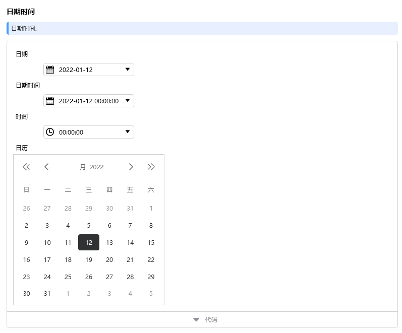
Set DateTimePickerMode in the date time control. For example, to display date + time, set DateTimePickerMode="DateTime"
 <TextBlock Text="date" Margin="5"/>
<NbDateTimePicker Style="{DynamicResource DefaultDateTimePickerStyle}" Margin="5" DateTimePickerMode="Date" Width="180" MaxDate="{Binding Source={x:Static sys:DateTime.Now}, StringFormat='{}{0:dd/MM/yyyy}'}"/>
<TextBlock Text="Date time" Margin="5"/>
<NbDateTimePicker Style="{DynamicResource DefaultDateTimePickerStyle}" Margin="5" DateTimePickerMode="DateTime" Width="180" MaxDate="{Binding Source={x:Static sys:DateTime.Now}, StringFormat='{}{0:dd/MM/yyyy}'}"/>
<TextBlock Text="time" Margin="5"/>
<NbDateTimePicker Style="{DynamicResource DefaultDateTimePickerStyle}" Margin="5" DateTimePickerMode="Time" Width="180"/>
<TextBlock Text="calendar" Margin="5"/>
<NbCalendar BorderBrush="{Binding Path=Color.Brush_Border1, Source={x:Static NbTheme.Current}}" BorderThickness="1" Height="300" Width="300"/>
Newbeecoder. There are more functions in the UI control library, which are not described in detail. I will directly give the download website:
https://download.csdn.net/download/liaohaiyin/63234875
The second part introduces the open source control library framework and code structure. It mainly includes decorator class, custom feature, control class, custom control, converter, core class, event class, resource style, theme style and control parameters.
1, The decorator class adds a mask layer to the control.
2, Custom properties
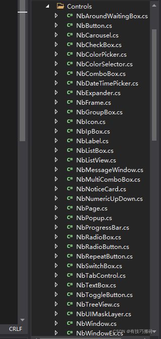
3, The control extension class starts with Nb. The extension class has rich comments to facilitate users to quickly understand the code implementation.
4, Custom controls define certain control styles
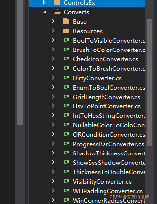
5, The converter integrates various conversion classes.
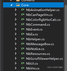
6, The core extension classes are mainly algorithms, logic, and extension methods. Easy for developers to use and expand.
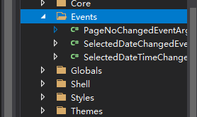
7, Event classes are mainly custom events
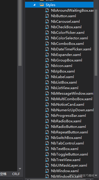
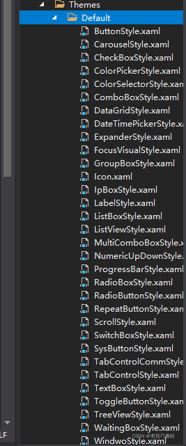
8, Control style encapsulates the control style in the resource file. When developers need to reconstruct the style, they can modify it in the style. Control style starts with Nb.
9, Theme styles are extended controls with more styles. Users can add controls with different styles and add the required control styles in the specified resource file.
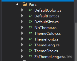
10, System parameters are the properties required for color, font and control size in the control library.
There are more controls that have not been described in detail. They are using newbeecoder If the UI control library needs technology, you can confide in me.