What does BEM mean first?
BEM means block, element and modifier. It is a front-end naming methodology proposed by Yandex team and a CSS naming specification.
Let's take an example.
zfbui-tabbar__item
From this name, we can decipher the interface of Alipay.
Then the corresponding structures between them can be read out.
- Naming gives them more meaning and reflects their relationship.
---> This just makes your code friendlier and easier to maintain.
- In addition, as the naming becomes longer, his naming becomes more specific, more stable in context, and does not interfere with the style of other components.
That is to say, it improves the independence of components.
- And you can find class names directly when writing CSS styles.
Here's a more detailed introduction to BEM
B(blcok): That's the concept of blocks. It can also be called components, modules.
Pages are composed of multiple components, which are independent of each other and do not interfere with each other. In Modern Development
Most of the projects are made up of common components.
E(element): element
His responsibilities in the block (the unique name) are not simply paternity.
For example: zfbui-tabbar__item_on_here we should pay attention to two underscores__
M(modifier): modifier
That is the modification of the state. It can't be used alone. It must depend on blocks or elements.
For example: _item_on (an underscore)
Let's analyze the TarBar of Alipay interface.
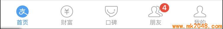
Obviously, this tabbar is a block. It clearly distinguishes five items. It can be found that each item is composed of three elements.
So we can give them independent names first.
Item_item
Icon_icon
label
_Little Red Point_badge
Now that we've finished naming, let's sort out their structure again.
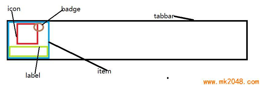
In the figure above, we can see their structure clearly. So we can construct a BEM tree:

At this time, use BEM to standardize them:
zfbui-tabbar__item
zfbui-tabbar__icon
zfbui-tabbar__label
_zfbui-badge (simplified because this badge is not used in other components of the page and is relatively special)
- When an item is selected, we find that it is blue unlike other items. In the BEM specification, we can modify the state of elements with zfbui-tabbar__item_on, which is a real scene using Modifier.
After building their framework and naming with BEM, you must have a clear understanding of Alipay's tabbar structure.
Nice, let's start making a tabbar component ourselves.
- First, we complete the HTML structure.
   <!-- BEM Naming specification -->
    <!-- tabbar Modular Block
      tabbar__item Two underscores for child elements  -->
    <div class="zfbui-tabbar">
        <a href="#" class="zfbui-tabbar__item zfbui-tabbar__item_on">
            <span>
                    <svg class="zfbui-tabbar__icon" aria-hidden="true">
                            <use xlink:href="#icon-rectangle390"></use>
                          </svg>
                <span class="zfbui-badge">8</span>
            </span>
            <p class="zfbui-tabbar__label">home page</p>
        </a>
        <a href="#" class="zfbui-tabbar__item">
            <span>
                    <svg class="zfbui-tabbar__icon" aria-hidden="true">
                            <use xlink:href="#icon-yiban"></use>
                          </svg>
                <span class="zfbui-badge">-</span>
            </span>
            <p class="zfbui-tabbar__label">wealth</p>
        </a>
        <a href="#" class="zfbui-tabbar__item">
            <span>
                    <svg class="zfbui-tabbar__icon" aria-hidden="true">
                            <use xlink:href="#icon-tansuoa"></use>
                          </svg>
                <span class="zfbui-badge">-</span>
            </span>
            <p class="zfbui-tabbar__label">Word of mouth</p>
        </a>
        <a href="#" class="zfbui-tabbar__item">
            <span>
                    <svg class="zfbui-tabbar__icon" aria-hidden="true">
                            <use xlink:href="#icon-shejiao"></use>
                          </svg>
                <span class="zfbui-badge">-</span>
            </span>
            <p class="zfbui-tabbar__label">Friend</p>
        </a>
        <a href="#" class="zfbui-tabbar__item">
            <span>
                    <svg class="zfbui-tabbar__icon" aria-hidden="true">
                            <use xlink:href="#icon-wode"></use>
                          </svg>
                <span class="zfbui-badge">-</span>
            </span>
            <p class="zfbui-tabbar__label">My</p>
        </a>
    </div>
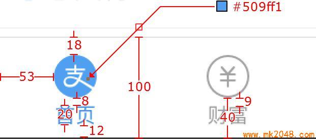
- Measure length and color well Note that all the lengths here need to be halved when they are actually used!
 3. Adding CSS structure
*{
    margin: 0;
    padding: 0;
}

a:link {
    color: #a2a2a2;
}
a:vistied{
    color: #a2a2a2;
}
a:hover {
    color: #509ff1;
}
a:active {
    color: #509ff1;
}

.zfbui-tabbar {
    display: flex;
    position: absolute;
    bottom: 0;
    width: 100%;
    z-index: 500;
    background-color: #ffffff;
    border-top: 1px solid #dddddd;
}
.zfbui-tabbar__item {
    flex: 1;                         /*Child element flex set to equal scale 1:1:1*/
    text-align: center;             /*Quickly Centralize Horizontal Content*/
    padding: 8.5px 6px 6px ;               /*Clockwise, upper right, lower left, missing one, that is, upper left and lower left*/
    font-size: 0;
    color: #a2a2a2;
    text-decoration: none;
}
.zfbui-tabbar__item > span {
    display: inline-block;
    position: relative;                        /*Convenient badge for absolute positioning*/
}
.zfbui-tabbar__icon {
    display: inline-block;                    /*In-line elements cannot be set to inline-block to set width and height*/
    width: 22px;
    height: 22px;
    fill: currentColor;
    overflow: hidden;
    margin-bottom: 3.5px;
}
.zfbui-badge {
    position: absolute;
    top: -2px;
    right: -13px;
    min-width: 8px;
    display: inline-block;
    padding: .15em .4em;                        /* Up and down. 15 or so.4*/
    font-size: 12px;
    line-height: 12px;
    background-color: #F43539;
    border-radius: 18px;                        /*The rounded corner of a box, if it is longer and wider than the box, will become a circle.*/
    color: white;
}
.zfbui-tabbar__label {
    font-size: 10px;
    text-align: center;
    line-height: 10px;

}
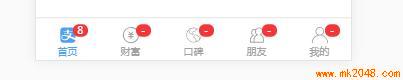
- The final results are as follows:
Plus: The above icons are from the Ali icon library: http://www.iconfont.cn/
The method is symbol ic reference:
It is a more recommendable use, supporting multi-color icons, no longer subject to monochrome restrictions.
Through some techniques, support font-size,color to adjust style like font.