linear regression
Linear regression, also known as ordinary least square method, is the simplest and most classic regression method for regression problems
1. Use numpy linear regression
(1) Function: p = polyfit(x,y,n)
x is the abscissa of the known discrete data point, y is the ordinate of the known discrete data point,
n is the highest power of the polynomial to be fitted, which is given by us, and different polynomials are used for fitting
p = polyfit(x,y,n) return value p is the coefficient of polynomial p(x) from high degree to low degree from left to right, and the length is n+1
p(x)=p1xn+p2xn−1+...+pnx+p(n+1)
(2) Function: NP poly1d()
The return value of this function is a polynomial equation you sum up
(3) Function: y=polyval(p,x);
The value of the dependent variable y corresponding to x is obtained according to the fitted function
Determination of order of polynomial n:
1.1 fitting straight line
First, let's simulate the data scatter:
import numpy as np
import matplotlib.pyplot as plt

Xi=np.array([6.19,2.51,7.29,7.01,5.7,2.66,3.98,2.5,9.1,4.2])
Yi=np.array([5.25,2.83,6.41,6.71,5.1,4.23,5.05,1.98,10.5,6.3])
Draw a scatter image:
import numpy as np
import matplotlib.pyplot as plt

Xi=np.array([6.19,2.51,7.29,7.01,5.7,2.66,3.98,2.5,9.1,4.2])
Yi=np.array([5.25,2.83,6.41,6.71,5.1,4.23,5.05,1.98,10.5,6.3])
plt.scatter(Xi,Yi)
plt.show()
Output result:

Next, we use the three functions just mentioned to fit the straight line
import numpy as np
import matplotlib.pyplot as plt
# Deal with garbled code
matplotlib.rcParams['font.sans-serif'] = ['SimHei']  # Display Chinese in bold
#Analog data
Xi=np.array([6.19,2.51,7.29,7.01,5.7,2.66,3.98,2.5,9.1,4.2])
Yi=np.array([5.25,2.83,6.41,6.71,5.1,4.23,5.05,1.98,10.5,6.3])

X=np.linspace(1,10,100)
yi_fit=np.polyfit(Xi,Yi,1)#The coefficients of the polynomial are calculated by the least square method, and the highest power of the polynomial is 1

yi_1d=np.poly1d(yi_fit)##Fit the equation according to the calculated coefficient

yi_hat=yi_1d(X)#Substitute the abscissa and calculate the fitted y coordinate
plt.scatter(Xi,Yi)
plt.plot(X,yi_hat,c='red')#Draw the fitted line image
plt.show()
Output result:

Let's output these two items:
print("yi_fit:",yi_fit)
yi_1d=np.poly1d(yi_fit)
print("yi_1d",yi_1d)
yi_hat=yi_1d(X)
Output result:
yi_fit: [0.90045842 0.83105566]
yi_1d :
0.9005 x + 0.8311
 The process has ended with exit code 0
1.2 high order polynomial fitting curve
Firstly, we use trigonometric function to simulate data scatter and draw the image
import numpy as np
import matplotlib.pyplot as plt

#Analog data
def f(x):
    return 2 * np.sin(x) + 3
# X and Y
x = np.linspace(0, 4 * np.pi)
y = f(x) + 0.2 * np.random.randn(len(x))  # add noise

plt.scatter(x,y)
plt.show()
Output result:

Next, we use the three functions just now and use higher-order polynomials to fit the curve
import numpy as np
import matplotlib.pyplot as plt

#Analog data
def f(x):
    return 2 * np.sin(x) + 3
# X and Y
x = np.linspace(0, 2 * np.pi)#Set the definition field of trigonometric function
y = f(x) + 0.2 * np.random.randn(len(x))  # add noise

y_fit = np.polyfit(x, y, 3)#The coefficients of the polynomial are calculated by the least square method. At this time, the highest power of the polynomial = 3
print('y_fit:', y_fit)

y_fit_1d = np.poly1d(y_fit)#Fit the equation according to the calculated coefficient
print('y_fit_1d:\n', y_fit_1d)

y_hat = np.polyval(y_fit, x)#Substitute the data and calculate the fitting y coordinate
# This form can also be: y_hat = y_fit_1d(x)
print('y_hat:', y_hat)

print('Correlation coefficients:')#correlation coefficient
print(np.corrcoef(y_hat, y))

plt.figure(dpi=200)
plot1 = plt.plot(x, y, 'o', label='Original Values')
plot3 = plt.plot(x, f(x), 'g', label='Original Curve')
plot2 = plt.plot(x, y_hat, 'r', label='Fitting Curve')
plt.xlabel('x')
plt.ylabel('y')
plt.legend()
plt.title('Polyfitting')
plt.show()
Output result:

If we change the simulated data definition domain to (0~4np.pi) without changing the highest power of the polynomial, see what the fitted curve is like:
import numpy as np
import matplotlib.pyplot as plt

#Analog data
def f(x):
    return 2 * np.sin(x) + 3
# X and Y
x = np.linspace(0, 4 * np.pi)#Set the definition field of trigonometric function
y = f(x) + 0.2 * np.random.randn(len(x))  # add noise

y_fit = np.polyfit(x, y, 3)#The coefficients of the polynomial are calculated by the least square method. At this time, the highest power of the polynomial = 3
print('y_fit:', y_fit)

y_fit_1d = np.poly1d(y_fit)#Fit the equation according to the calculated coefficient
print('y_fit_1d:\n', y_fit_1d)

y_hat = np.polyval(y_fit, x)#Substitute the data and calculate the fitting y coordinate
# This form can also be: y_hat = y_fit_1d(x)
print('y_hat:', y_hat)

print('Correlation coefficients:')#correlation coefficient
print(np.corrcoef(y_hat, y))

plt.figure(dpi=200)
plot1 = plt.plot(x, y, 'o', label='Original Values')
plot3 = plt.plot(x, f(x), 'g', label='Original Curve')
plot2 = plt.plot(x, y_hat, 'r', label='Fitting Curve')
plt.xlabel('x')
plt.ylabel('y')
plt.legend()
plt.title('Polyfitting')
plt.show()
Output:
Correlation coefficients:
[[1. 0.49067649]
[0.49067649 1. ]]

Obviously, the fitting is not very accurate, so we need to change the highest power to an appropriate number
y_fit = np.polyfit(x, y, 7)
.
Output:
Correlation coefficients:
[[1. 0.99209803]
[0.99209803 1. ]]

If the correlation coefficient is close to 1, it means that the fitting is very accurate
2. Use sklearn for regression
When using sklearn for regression, the data needs to be in two-dimensional form
2.1 fitting straight line
from sklearn import linear_model
import numpy as np
import matplotlib.pyplot as plt
##Sample data (Xi,Yi) needs to be converted into array (list) form
Xi=np.array([6.19,2.51,7.29,7.01,5.7,2.66,3.98,2.5,9.1,4.2]).reshape(-1,1)
Yi=np.array([5.25,2.83,6.41,6.71,5.1,4.23,5.05,1.98,10.5,6.3]).reshape(-1,1)
##Set model
model = linear_model.LinearRegression()
##Training data
model.fit(Xi, Yi)
##Using the trained model to predict the data
y_plot = model.predict(Xi)
##Print weights for linear equations
print(model.coef_) ## 0.90045842
##mapping
plt.scatter(Xi, Yi, color='red',label="ynagben",linewidth=2)
plt.plot(Xi, y_plot, color='green',label="nihe",linewidth=2)
plt.legend(loc='best')
plt.show()
Output:

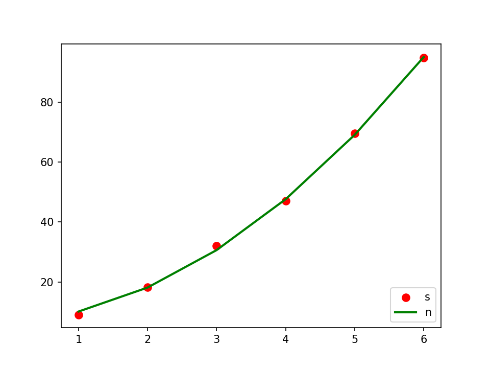
Fitting curve
from sklearn.preprocessing import PolynomialFeatures
from sklearn.pipeline import make_pipeline
import numpy as np
import matplotlib.pyplot as plt
from sklearn.linear_model import Ridge
##Sample data (Xi,Yi) needs to be converted into array (list) form
Xi=np.array([1,2,3,4,5,6]).reshape(-1,1)
#Yi=np.array([9,18,31,48,69,94])
Yi=np.array([9.1,18.3,32,47,69.5,94.8]).reshape(-1,1)
##Ridge regression is specified here as the basis function
model = make_pipeline(PolynomialFeatures(2), Ridge())
model.fit(Xi, Yi)
##According to the prediction results of the model
y_plot = model.predict(Xi)
##mapping
plt.scatter(Xi, Yi, color='red',label="s",linewidth=2)
plt.plot(Xi, y_plot, color='green',label="n",linewidth=2)
plt.legend(loc='lower right')
plt.show()
Output:
