Machine learning project (I): survival probability analysis of Titanic passengers
Project background:
In 1912, the Titanic, then the world's largest passenger ship with the most luxurious internal facilities, with the reputation of "unsinkable", hit an iceberg and sank 3700 meters below the bottom of the Atlantic Ocean during her maiden voyage, killing more than 1500 people on board. In 1985, a joint search team of the United States and France found the wreckage of the Titanic.
In 1997, James Cameron directed the American film Titanic, which restored the whole thrilling process in the form of film for the first time.
Suppose that if there is such a thing as crossing, suddenly one day your soul crosses a passenger on the sailing Titanic, and you find that you are in a cabin on a certain floor, called Mr/Miss by your companions, and you have only modern memory. Suddenly there was a loud noise and the ship shook violently. People were panic stricken. What are the chances of you surviving at this moment? Next, I will tell you what characteristics will affect your survival probability through data analysis.
Purpose of the project:
In 1912, the Titanic, then the world's largest passenger ship with the most luxurious internal facilities, with the reputation of "unsinkable", hit an iceberg and sank 3700 meters below the bottom of the Atlantic Ocean during her maiden voyage, killing more than 1500 people on board. In 1985, a joint search team of the United States and France found the wreckage of the Titanic.
In 1997, James Cameron directed the American film Titanic, which restored the whole thrilling process in the form of film for the first time.
Suppose that if there is such a thing as crossing, suddenly one day your soul crosses a passenger on the sailing Titanic, and you find that you are in a cabin on a certain floor, called Mr/Miss by your companions, and you have only modern memory. Suddenly there was a loud noise and the ship shook violently. People were panic stricken. What are the chances of you surviving at this moment? Next, I will tell you what characteristics will affect your survival probability through data analysis.
Dataset:
train.csv ,genderclassmodel.csv ,gendermodel.csv ,test.csv
Meaning of each column name in the file:
Passengerld: unique number of a passenger
Survived: whether the passenger has been rescued. 0 means he has not been rescued, and 1 means he has been rescued successfully
Pclass: cabin class, 0 indicates class, and so on
Name: name
Sex: Gender
Age: age
SibSp: elderly; Parch: children
Embarked: boarding place S: indicates S Wharf, C: indicates C Wharf
Read data:
import numpy as np
import pandas as pd
import matplotlib.pyplot as plt
import seaborn as sns
plt.style.use('fivethirtyeight')
import warnings
warnings.filterwarnings('ignore')
%matplotlib inline
Import data:
data = pd.read_csv('./train.csv')
data.head(10)
Check for missing values
data.isnull().sum() #Check for missing values
View data size
data.describe() #View data size
View the rescued proportion
f,ax=plt.subplots(1,2,figsize=(18,8))
data['Survived'].value_counts().plot.pie(explode=[0,0.1],autopct='%1.1f%%',ax=ax[0],shadow=True)
ax[0].set_title('Survived')
ax[0].set_ylabel('')
sns.countplot('Survived',data=data,ax=ax[1])
ax[1].set_title('Survived')
plt.show()
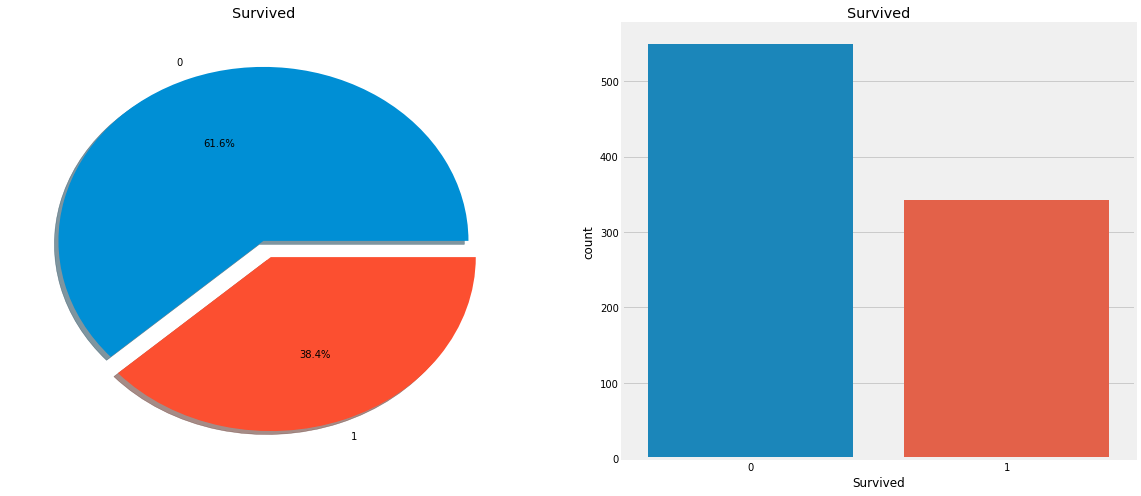 Obviously, not many passengers survived the accident. Of the 891 passengers in the training set, only about 350 survived, and only 38.4% of the crew survived the air crash. We need to mine more information from the data to see which categories of passengers survived and which did not. We will try to use different characteristics of the dataset to check survival. For example, gender, age, boarding place, etc., but first we have to understand the characteristics in the data!
Analyze data characteristics
Data feature classification
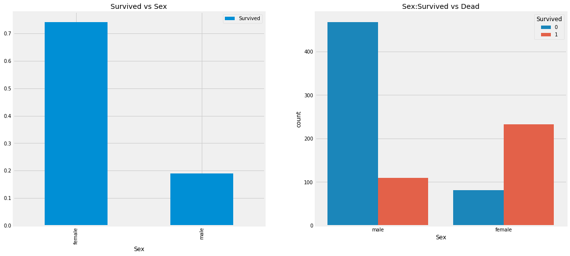
Check the relationship between gender and rescued persons
data.groupby(['Sex','Survived'])['Survived'].count()
f,ax=plt.subplots(1,2,figsize=(18,8))  # Draw 1 * 2 sub images with a size of 18 * 8
data[['Sex','Survived']].groupby(['Sex']).mean().plot.bar(ax=ax[0])
ax[0].set_title('Survived vs Sex')
sns.countplot('Sex',hue='Survived',data=data,ax=ax[1])
ax[1].set_title('Sex:Survived vs Dead')
plt.show()
Check the relationship between cabin level and rescue
pd.crosstab(data.Pclass,data.Survived,margins=True).style.background_gradient(cmap='summer_r')
We can see from the table that there were 216 people in the first class cabin, and 136 people were rescued, accounting for more than 50%; There were 184 people in the second class cabin, and 87 people were rescued, accounting for about 50%; There were 491 people in the third class cabin, and only 119 people were rescued, accounting for the lowest proportion. Although we say that life is neither high nor low, the reality is still cruel. The chance of the rich being saved is much higher than that of the poor.
Bar chart of cabin class, gender and survival rate
f,ax=plt.subplots(1,2,figsize=(18,8))   # Draw 1 * 2 sub images with a size of 18 * 8
data['Pclass'].value_counts().plot.bar(color=['#CD7F32','#FFDF00','#D3D3D3'],ax=ax[0])
ax[0].set_title('Number Of Passengers By Pclass')
ax[0].set_ylabel('Count')
sns.countplot('Pclass',hue='Survived',data=data,ax=ax[1])
ax[1].set_title('Pclass:Survived vs Dead')
plt.show()
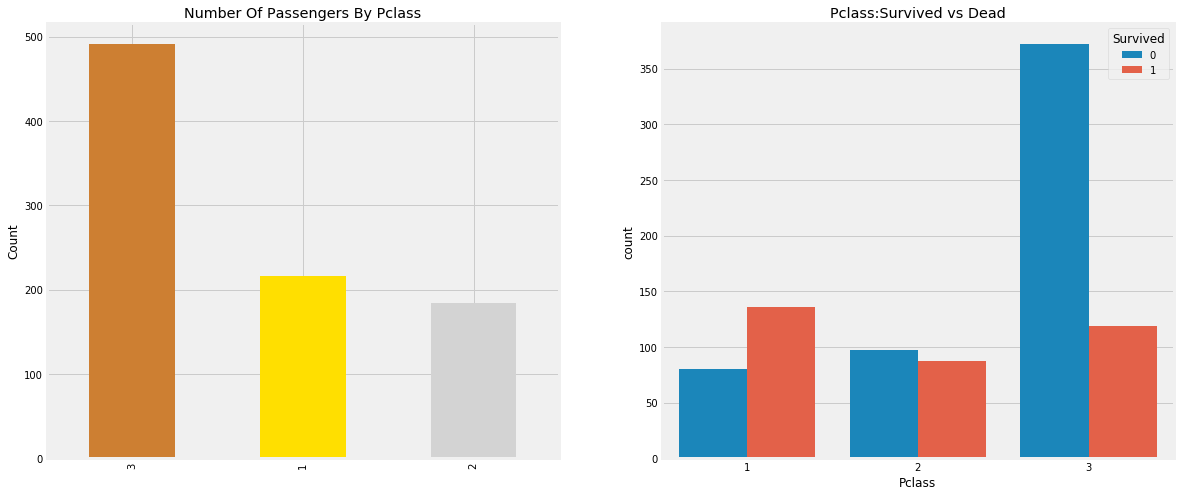 People say money can't buy everything. However, we can clearly see that those with cabin class 1 are given high priority for rescue. Although the number of surviving passengers in pClass3 is much higher, the number of surviving passengers is still very low, about 25%.
Does this have anything to do with gender? Next, let's look at the impact of cabin class and gender on the results.
Check the impact of cabin class and gender on the results
pd.crosstab([data.Sex,data.Survived],data.Pclass,margins=True).style.background_gradient(cmap='summer_r')
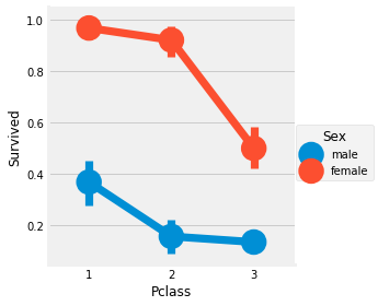
It can be seen from the above table that in the first class cabin, the proportion of women rescued is very high. There are 94 women and 91 women were rescued.
Broken line chart of cabin class, gender and survival rate
sns.factorplot('Pclass','Survived',hue='Sex',data=data)
plt.show()
Influence of continuous value characteristics on results
print('Oldest Passenger was of:',data['Age'].max(),'Years')
print('Youngest Passenger was of:',data['Age'].min(),'Years')
print('Average Age on the ship:',data['Age'].mean(),'Years')
f,ax=plt.subplots(1,2,figsize=(18,8))
sns.violinplot("Pclass","Age", hue="Survived", data=data,split=True,ax=ax[0])
ax[0].set_title('Pclass and Age vs Survived')
ax[0].set_yticks(range(0,110,10))
sns.violinplot("Sex","Age", hue="Survived", data=data,split=True,ax=ax[1])
ax[1].set_title('Sex and Age vs Survived')
ax[1].set_yticks(range(0,110,10))
plt.show()
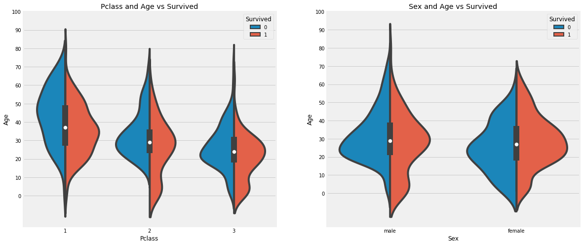
- The survival rate of children under 10 years old increased with the number of cabin classes.
- Survival is 20-50 years old, and the probability of being rescued is higher.
- For men, survival decreases with age.
Data cleaning and preprocessing
As we saw earlier, the age feature has 177 null values. To replace these missing values, we can assign them the average age of the data set.
But the problem is that there are many people of different ages. The best way is to find a suitable age group!!
We can check the name characteristics. According to this feature, we can see that names have names like Mr. or Mrs. so that we can assign the average values of Mr. and Mrs. to their respective groups.
Missing value fill
Extract information
data['Initial']=0
for i in data:
    data['Initial']=data.Name.str.extract('([A-Za-z]+)\.')
pd.crosstab(data.Initial,data.Sex).T.style.background_gradient(cmap='summer_r') #Check the initial value of gender
Fill in missing values
data['Initial'].replace(['Mlle','Mme','Ms','Dr','Major','Lady','Countess','Jonkheer','Col','Rev','Capt','Sir','Don'],['Miss','Miss','Miss','Mr','Mr','Mrs','Mrs','Other','Other','Other','Mr','Mr','Mr'],inplace=True)
## Fill with the mean of each group
data.loc[(data.Age.isnull())&(data.Initial=='Mr'),'Age']=33
data.loc[(data.Age.isnull())&(data.Initial=='Mrs'),'Age']=36
data.loc[(data.Age.isnull())&(data.Initial=='Master'),'Age']=5
data.loc[(data.Age.isnull())&(data.Initial=='Miss'),'Age']=22
data.loc[(data.Age.isnull())&(data.Initial=='Other'),'Age']=46
Screening valuable features
Observe the characteristics of age groups
f,ax=plt.subplots(1,2,figsize=(20,10))
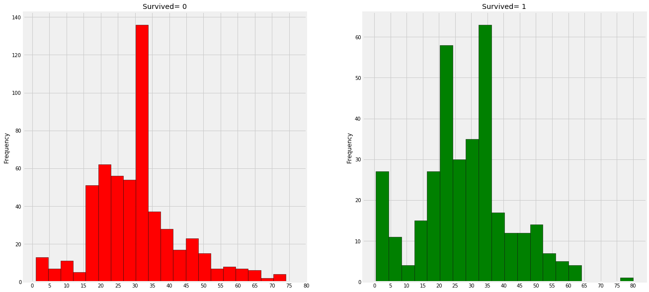
data[data['Survived']==0].Age.plot.hist(ax=ax[0],bins=20,edgecolor='black',color='red')
ax[0].set_title('Survived= 0')
x1=list(range(0,85,5))
ax[0].set_xticks(x1)
data[data['Survived']==1].Age.plot.hist(ax=ax[1],color='green',bins=20,edgecolor='black')
ax[1].set_title('Survived= 1')
x2=list(range(0,85,5))
ax[1].set_xticks(x2)
plt.show()
Observation:
1) A large number of young children (under the age of 5) were rescued (women and children priority policy).
2) The oldest passenger saved (80 years old)
3) The highest number of deaths was in the 30-40 age group.
The effects of age on the results were compared
sns.factorplot('Pclass','Survived',col='Initial',data=data)
plt.show()

Effect of boarding location on results
pd.crosstab([data.Embarked,data.Pclass],[data.Sex,data.Survived],margins=True).style.background_gradient(cmap='summer_r')
sns.factorplot('Embarked','Survived',data=data)
fig=plt.gcf()
fig.set_size_inches(5,3)
plt.show()
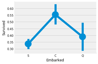
The survival probability of port C is the highest, about 0.55, while the survival rate of port S is the lowest.
The survival rates of different cabin classes were compared
f,ax=plt.subplots(2,2,figsize=(20,15))
sns.countplot('Embarked',data=data,ax=ax[0,0])
ax[0,0].set_title('No. Of Passengers Boarded')
sns.countplot('Embarked',hue='Sex',data=data,ax=ax[0,1])
ax[0,1].set_title('Male-Female Split for Embarked')
sns.countplot('Embarked',hue='Survived',data=data,ax=ax[1,0])
ax[1,0].set_title('Embarked vs Survived')
sns.countplot('Embarked',hue='Pclass',data=data,ax=ax[1,1])
ax[1,1].set_title('Embarked vs Pclass')
plt.subplots_adjust(wspace=0.2,hspace=0.5)
plt.show()
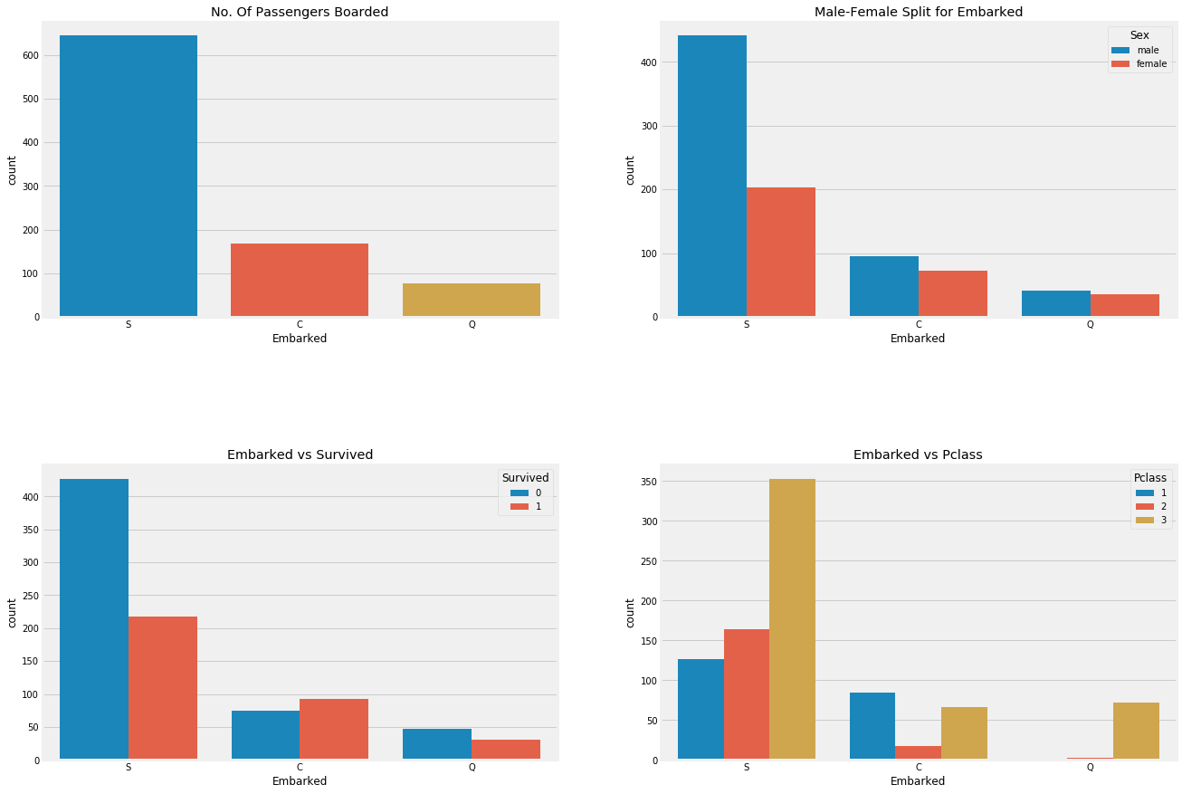
Observation:
- Most people's cabin class is 3.
- C's passengers seemed lucky that some of them survived.
- There are many rich people in port S. The chances of survival are still low.
- Almost 95% of the passengers in port Q are poor.
Relationship between cabin class, survival rate, gender, boarding place and survival rate
sns.factorplot('Pclass','Survived',hue='Sex',col='Embarked',data=data)
plt.show()

Observation:
- The probability of survival is almost 1 for women in pclass1 and pclass2.
- The survival rate of male and female passengers in pclass3 is very low.
- Port Q is unfortunate because it is full of third-class passengers.
There are also missing values in the port. I filled them with mode here, because S has the most boarders
data['Embarked'].fillna('S',inplace=True)
data.Embarked.isnull().any()
Relationship between the number of brothers and sisters and survival rate
pd.crosstab([data.SibSp],data.Survived).style.background_gradient(cmap='summer_r')
f,ax=plt.subplots(1,2,figsize=(20,8))
sns.barplot('SibSp','Survived',data=data,ax=ax[0])
ax[0].set_title('SibSp vs Survived')
sns.pointplot('SibSp','Survived',data=data,ax=ax[1])
ax[1].set_title('SibSp vs Survived')
plt.close(2)
plt.show()
pd.crosstab(data.SibSp,data.Pclass).style.background_gradient(cmap='summer_r')
Observation:
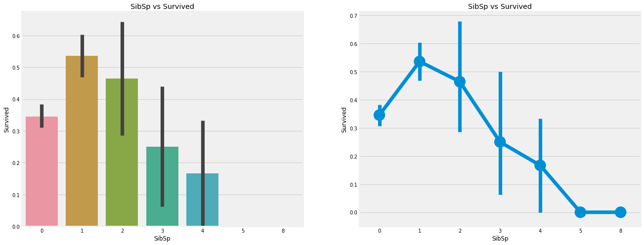
barplot and factorplot show that if the passenger is lonely and there are no brothers and sisters on the ship, he has a 35% survival rate. If the number of brothers and sisters increases, the survival rate of the figure roughly decreases. In other words, if there is a family on the ship, we will try our best to save them instead of saving ourselves first. But surprisingly, the survival rate of families with 5-8 members is 0%. The reason may be that they are in the cabin of pclass3.
Relationship between the number of parents and children and survival rate
pd.crosstab(data.Parch,data.Pclass).style.background_gradient(cmap='summer_r')
Compare the relationship between passengers with parents and survival
f,ax=plt.subplots(1,2,figsize=(20,8))
sns.barplot('Parch','Survived',data=data,ax=ax[0])
ax[0].set_title('Parch vs Survived')
sns.pointplot('Parch','Survived',data=data,ax=ax[1])
ax[1].set_title('Parch vs Survived')
plt.close(2)
plt.show()
Observation:
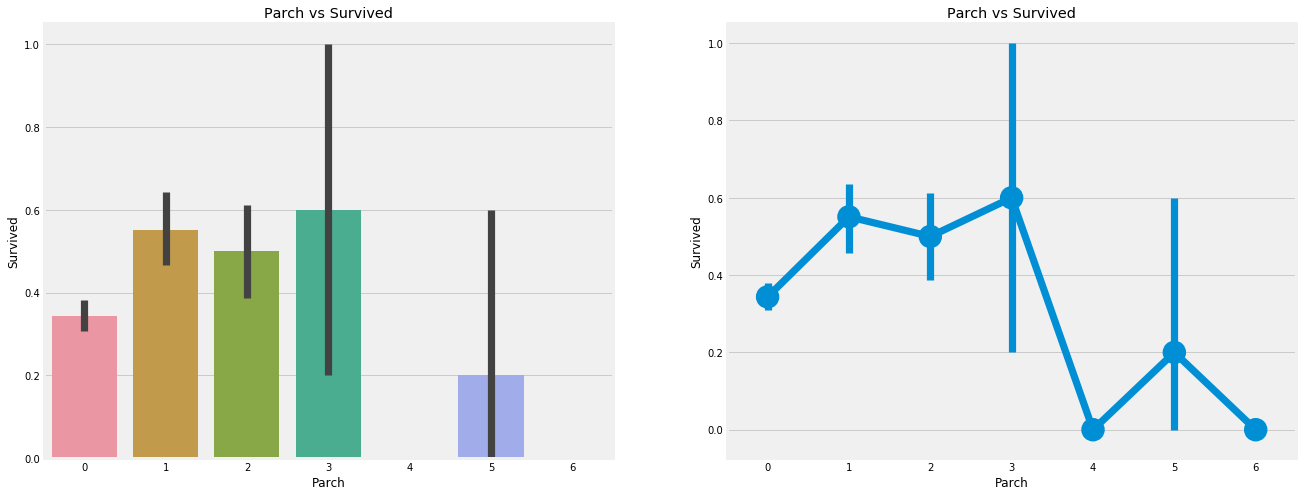
The results here are also very similar. Passengers with parents have a greater chance of survival. However, it decreases as the number increases.
People with 1-3 parents on board have a good chance of survival. Being alone has also proved fatal. When there are four parents on board, the chance of survival will be reduced.
The price of the ticket
Because the ticket is also continuous, we need to convert it to a numerical value.
print('Highest Fare was:',data['Fare'].max())
print('Lowest Fare was:',data['Fare'].min())
print('Average Fare was:',data['Fare'].mean())
Relationship between passenger cabin class and consumption
f,ax=plt.subplots(1,3,figsize=(20,8))
sns.distplot(data[data['Pclass']==1].Fare,ax=ax[0])
ax[0].set_title('Fares in Pclass 1')
sns.distplot(data[data['Pclass']==2].Fare,ax=ax[1])
ax[1].set_title('Fares in Pclass 2')
sns.distplot(data[data['Pclass']==3].Fare,ax=ax[2])
ax[2].set_title('Fares in Pclass 3')
plt.show()
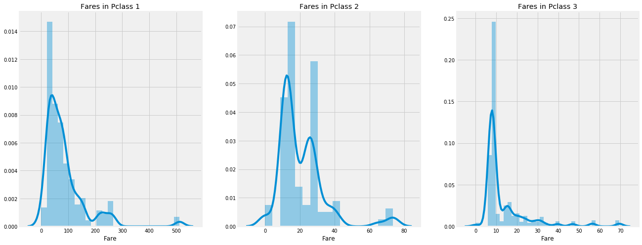
Pclass: Yes, there is an obvious trend that the first class passengers give you a better chance of survival. For pclass3, the survival rate is very low. For women, the chance of survival from pclass1 is almost.
Age: children younger than 5-10 years old have a high survival rate. Passengers between the ages of 15 and 35 die a lot.
Port: there are also different cabin classes on board, and the mortality rate is also very high!
Family: if you have 1-2 siblings, spouses or parents, you have a greater chance of survival than if you travel alone or with a large family.
Correlation between features
#Related heat map
sns.heatmap(data.corr(),annot=True,cmap='RdYlGn',linewidths=0.2) #data.corr()-->correlation matrix
fig=plt.gcf()
fig.set_size_inches(10,8)
plt.show()
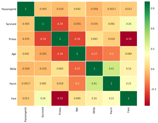
Heat map of characteristic correlation
The first thing to note is that only numerical features are compared
Positive correlation: if the increase of feature a leads to the increase of feature b, they are positively correlated. A value of 1 indicates a fully positive correlation.
Negative correlation: if the increase of feature a leads to the decrease of feature b, it is negative correlation. A value of - 1 indicates a complete negative correlation.
Now let's say that the two features are highly or completely related, so an increase in one leads to an increase in the other. This means that both features contain highly similar information, and the information is little or no change. Such characteristics are of no value to us!
So do you think we should use them at the same time?. When making or training models, we should minimize redundancy because it reduces training time and many advantages.
Now, from the figure above, we can see that the features are not significantly correlated.
Feature Engineering and data cleaning
When we get a dataset with features, are all the features important? There may be many redundant features that should be eliminated. We can also obtain or add new features by observing or extracting information from other features.
Age characteristics
As I mentioned earlier, age is a continuous characteristic, and there is a problem of continuous variables in machine learning model.
If I say that sports are organized or arranged by sex, we can easily divide them into men and women.
What would you do if I said to group them by their age? If there are 30 people, there may be 30 age values.
We need to discretize continuous values to group.
OK, the maximum age of passengers is 80. So we will range from 0-80 to 5 cases. So 80 / 5 = 16.
data['Age_band']=0
data.loc[data['Age']<=16,'Age_band']=0
data.loc[(data['Age']>16)&(data['Age']<=32),'Age_band']=1
data.loc[(data['Age']>32)&(data['Age']<=48),'Age_band']=2
data.loc[(data['Age']>48)&(data['Age']<=64),'Age_band']=3
data.loc[data['Age']>64,'Age_band']=4
data.head(2)
data['Age_band'].value_counts().to_frame().style.background_gradient(cmap='summer')   # Check the age of the passengers
Relationship between age, cabin class and survival rate
sns.factorplot('Age_band','Survived',data=data,col='Pclass')
plt.show()

Family_size: total number of families
Just looking at brothers and sisters, the elderly and children is not very direct. We look directly at the number of the whole family
data['Family_Size']=0
data['Family_Size']=data['Parch']+data['SibSp']#family size
data['Alone']=0
data.loc[data.Family_Size==0,'Alone']=1#Alone
f,ax=plt.subplots(1,2,figsize=(18,6))
sns.pointplot('Family_Size','Survived',data=data,ax=ax[0])
ax[0].set_title('Family_Size vs Survived')
sns.pointplot('Alone','Survived',data=data,ax=ax[1])
ax[1].set_title('Alone vs Survived')
plt.close(2)
plt.show()

Relationship between passenger loneliness, cabin class, gender and survival rate
sns.factorplot('Alone','Survived',data=data,hue='Sex',col='Pclass')
plt.show()

Ticket price
data['Fare_Range']=pd.qcut(data['Fare'],4)
data.groupby(['Fare_Range'])['Survived'].mean().to_frame().style.background_gradient(cmap='summer_r')
data['Fare_cat']=0
data.loc[data['Fare']<=7.91,'Fare_cat']=0
data.loc[(data['Fare']>7.91)&(data['Fare']<=14.454),'Fare_cat']=1
data.loc[(data['Fare']>14.454)&(data['Fare']<=31),'Fare_cat']=2
data.loc[(data['Fare']>31)&(data['Fare']<=513),'Fare_cat']=3
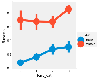
Relationship between ticket price, gender and survival rate
sns.factorplot('Fare_cat','Survived',data=data,hue='Sex')
plt.show()
Converts a string type to a numeric data type
data['Sex'].replace(['male','female'],[0,1],inplace=True)
data['Embarked'].replace(['S','C','Q'],[0,1,2],inplace=True)
data['Initial'].replace(['Mr','Mrs','Miss','Master','Other'],[0,1,2,3,4],inplace=True)
Remove unnecessary features
Name > we don't need the name attribute because it can't be converted to any classification value
Age - > we have age_band feature, so this is not required
Ticket number – > this is an arbitrary string and cannot be classified
Fare - > we have fare_cat feature, so it is not required
Warehouse No. - > meaningless
Passengerid -- > cannot be classified
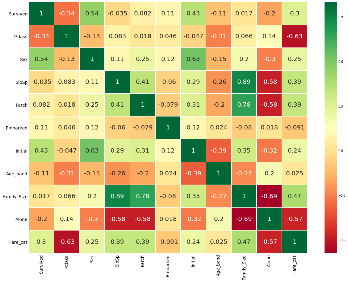
Heat map after data type conversion
data.drop(['Name','Age','Ticket','Fare','Cabin','Fare_Range','PassengerId'],axis=1,inplace=True)
sns.heatmap(data.corr(),annot=True,cmap='RdYlGn',linewidths=0.2,annot_kws={'size':20})
fig=plt.gcf()
fig.set_size_inches(18,15)
plt.xticks(fontsize=14)
plt.yticks(fontsize=14)
plt.show()
Machine learning modeling
Import all ML packages
#importing all the required ML packages
from sklearn.linear_model import LogisticRegression  #logistic regression
from sklearn import svm   #support vector Machine
from sklearn.ensemble import RandomForestClassifier  #Random Forest
from sklearn.neighbors import KNeighborsClassifier  #KNN
from sklearn.naive_bayes import GaussianNB  #Naive bayes
from sklearn.tree import DecisionTreeClassifier  #Decision Tree
from sklearn.model_selection import train_test_split   #training and testing data split
from sklearn import metrics   #accuracy measure
from sklearn.metrics import confusion_matrix   #for confusion matrix
train,test=train_test_split(data,test_size=0.3,random_state=0,stratify=data['Survived'])
train_X=train[train.columns[1:]]
train_Y=train[train.columns[:1]]
test_X=test[test.columns[1:]]
test_Y=test[test.columns[:1]]
X=data[data.columns[1:]]
Y=data['Survived']
algorithm
Support vector machine
Radial support vector machine
model=svm.SVC(kernel='rbf',C=1,gamma=0.1)
model.fit(train_X,train_Y)
prediction1=model.predict(test_X)
print('Accuracy for rbf SVM is ',metrics.accuracy_score(prediction1,test_Y))
Program running results:
Accuracy for rbf SVM is 0.835820895522388
Linear support vector machine
model=svm.SVC(kernel='linear',C=0.1,gamma=0.1)
model.fit(train_X,train_Y)
prediction2=model.predict(test_X)
print('Accuracy for linear SVM is',metrics.accuracy_score(prediction2,test_Y))
Program running results:
Accuracy for linear SVM is 0.8171641791044776
logistic regression
model = LogisticRegression()
model.fit(train_X,train_Y)
prediction3=model.predict(test_X)
print('The accuracy of the Logistic Regression is',metrics.accuracy_score(prediction3,test_Y))
Program running results:
The accuracy of the Logistic Regression is 0.8134328358208955
Decision tree
model=DecisionTreeClassifier()
model.fit(train_X,train_Y)
prediction4=model.predict(test_X)
print('The accuracy of the Decision Tree is',metrics.accuracy_score(prediction4,test_Y))
Program running results:
The accuracy of the Decision Tree is 0.8097014925373134
K-nearest neighbor algorithm
model=KNeighborsClassifier()
model.fit(train_X,train_Y)
prediction5=model.predict(test_X)
print('The accuracy of the KNN is',metrics.accuracy_score(prediction5,test_Y))
Program running results:
The accuracy of the KNN is 0.832089552238806
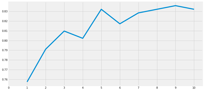
Modify the accuracy of the check
a_index=list(range(1,11))
a=pd.Series()
x=[0,1,2,3,4,5,6,7,8,9,10]
for i in list(range(1,11)):
    model=KNeighborsClassifier(n_neighbors=i)
    model.fit(train_X,train_Y)
    prediction=model.predict(test_X)
    a=a.append(pd.Series(metrics.accuracy_score(prediction,test_Y)))
plt.plot(a_index, a)
plt.xticks(x)
fig=plt.gcf()
fig.set_size_inches(12,6)
plt.show()
print('Accuracies for different values of n are:',a.values,'with the max value as ',a.values.max())
Program running results:
Naive Bayes
model=GaussianNB()
model.fit(train_X,train_Y)
prediction6=model.predict(test_X)
print('The accuracy of the NaiveBayes is',metrics.accuracy_score(prediction6,test_Y))
Program running results:
The accuracy of the NaiveBayes is 0.8134328358208955
Random forest algorithm
model=RandomForestClassifier(n_estimators=100)
model.fit(train_X,train_Y)
prediction7=model.predict(test_X)
print('The accuracy of the Random Forests is',metrics.accuracy_score(prediction7,test_Y))
Program running results:
The accuracy of the Random Forests is 0.8059701492537313
The accuracy of the model is not the only factor that determines the effect of the classifier. Suppose that the classifier is trained on the training data and needs to be tested on the test set to be effective. Now the accuracy of this classifier is very high, but can we confirm that all new test sets are 90%? The answer is no, because we can't determine the results of the classifier on different data sources. When the training and test data change, the accuracy will also change, which may increase or decrease,
To overcome this, we obtain a generalized model using cross validation.
Cross validation of neural networks
A test set doesn't seem to be enough. Multiple rounds of averaging is a good strategy!
- The working principle of cross validation is to first divide the data set into k-subsets.
- Suppose we divide the data set into (k=5) parts, we reserve one part for testing, and train these four parts.
- We continue this process by changing the test part in each iteration and training the algorithm in other parts. Then the average value of the measurement results is obtained to obtain the average accuracy of the algorithm.
- This is called cross validation.
Verification process
from sklearn.model_selection import KFold #for K-fold cross validation
from sklearn.model_selection import cross_val_score #score evaluation
from sklearn.model_selection import cross_val_predict #prediction
kfold = KFold(n_splits=10) # k=10, split the data into 10 equal parts
xyz=[]
accuracy=[]
std=[]
classifiers=['Linear Svm','Radial Svm','Logistic Regression','KNN','Decision Tree','Naive Bayes','Random Forest']
models=[svm.SVC(kernel='linear'),svm.SVC(kernel='rbf'),LogisticRegression(),KNeighborsClassifier(n_neighbors=9),DecisionTreeClassifier(),GaussianNB(),RandomForestClassifier(n_estimators=100)]
for i in models:
    model = i
    cv_result = cross_val_score(model,X,Y, cv = kfold,scoring = "accuracy")
    cv_result=cv_result
    xyz.append(cv_result.mean())
    std.append(cv_result.std())
    accuracy.append(cv_result)
new_models_dataframe2=pd.DataFrame({'CV Mean':xyz,'Std':std},index=classifiers)
new_models_dataframe2
Program running results:

plots box diagram
plt.subplots(figsize=(12,6))
box=pd.DataFrame(accuracy,index=[classifiers])
box.T.boxplot()
Program running results:
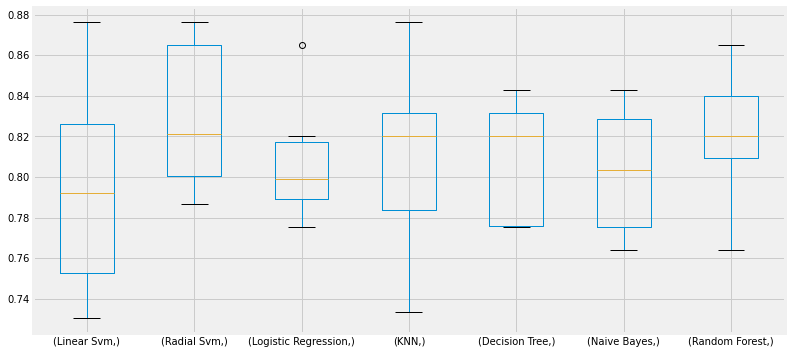
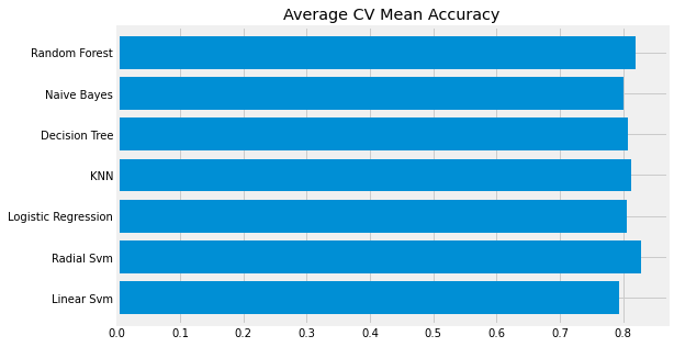
CV Mean bar chart
new_models_dataframe2['CV Mean'].plot.barh(width=0.8)
plt.title('Average CV Mean Accuracy')
fig=plt.gcf()
fig.set_size_inches(8,5)
plt.show()
Program running results:
Confusion matrix
It gives the number of correct and incorrect classifiers.
f,ax=plt.subplots(3,3,figsize=(12,10))
y_pred = cross_val_predict(svm.SVC(kernel='rbf'),X,Y,cv=10)
sns.heatmap(confusion_matrix(Y,y_pred),ax=ax[0,0],annot=True,fmt='2.0f')
ax[0,0].set_title('Matrix for rbf-SVM')
y_pred = cross_val_predict(svm.SVC(kernel='linear'),X,Y,cv=10)
sns.heatmap(confusion_matrix(Y,y_pred),ax=ax[0,1],annot=True,fmt='2.0f')
ax[0,1].set_title('Matrix for Linear-SVM')
y_pred = cross_val_predict(KNeighborsClassifier(n_neighbors=9),X,Y,cv=10)
sns.heatmap(confusion_matrix(Y,y_pred),ax=ax[0,2],annot=True,fmt='2.0f')
ax[0,2].set_title('Matrix for KNN')
y_pred = cross_val_predict(RandomForestClassifier(n_estimators=100),X,Y,cv=10)
sns.heatmap(confusion_matrix(Y,y_pred),ax=ax[1,0],annot=True,fmt='2.0f')
ax[1,0].set_title('Matrix for Random-Forests')
y_pred = cross_val_predict(LogisticRegression(),X,Y,cv=10)
sns.heatmap(confusion_matrix(Y,y_pred),ax=ax[1,1],annot=True,fmt='2.0f')
ax[1,1].set_title('Matrix for Logistic Regression')
y_pred = cross_val_predict(DecisionTreeClassifier(),X,Y,cv=10)
sns.heatmap(confusion_matrix(Y,y_pred),ax=ax[1,2],annot=True,fmt='2.0f')
ax[1,2].set_title('Matrix for Decision Tree')
y_pred = cross_val_predict(GaussianNB(),X,Y,cv=10)
sns.heatmap(confusion_matrix(Y,y_pred),ax=ax[2,0],annot=True,fmt='2.0f')
ax[2,0].set_title('Matrix for Naive Bayes')
plt.subplots_adjust(hspace=0.2,wspace=0.2)
plt.show()
Program running results:
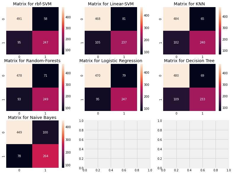
Explain the confusion matrix: look at the first figure
1) The accuracy of prediction was 491 (death) + 247 (survival), and the average CV accuracy was (491 + 247) / 891 = 82.8%.
2) 58 and 95 are all our mistakes.
Super parameter setting
The machine learning model is like a black box. This black box has some default parameter values that we can adjust or change to get a better model. For example, C and y in the support vector machine model, which we call hyperparameters, may have a great impact on the results.
Random forest
from sklearn.model_selection import GridSearchCV
C=[0.05,0.1,0.2,0.3,0.25,0.4,0.5,0.6,0.7,0.8,0.9,1]
gamma=[0.1,0.2,0.3,0.4,0.5,0.6,0.7,0.8,0.9,1.0]
kernel=['rbf','linear']
hyper={'kernel':kernel,'C':C,'gamma':gamma}
gd=GridSearchCV(estimator=svm.SVC(),param_grid=hyper,verbose=True)
gd.fit(X,Y)
print(gd.best_score_)
print(gd.best_estimator_)
Program running results:
Fitting 5 folds for each of 240 candidates, totalling 1200 fits
0.8282593685267716
SVC(C=0.4, gamma=0.3)
RBF support vector machine
n_estimators=range(100,1000,100)
hyper={'n_estimators':n_estimators}
gd=GridSearchCV(estimator=RandomForestClassifier(random_state=0),param_grid=hyper,verbose=True)
gd.fit(X,Y)
print(gd.best_score_)
print(gd.best_estimator_)
Program running results:
Fitting 5 folds for each of 9 candidates, totalling 45 fits
0.819327098110602
RandomForestClassifier(n_estimators=300, random_state=0)
integrate
Integration is a good way to improve the accuracy and performance of the model. Simply put, it is the combination of various simple models that creates a powerful model.
1) Random forest type, parallel integration
2) Promotion type
3) Stack type
Voting classifier
This is the simplest way to combine the pre of many different simple machine learning models. It gives an average prediction result based on the prediction of each sub model.
from sklearn.ensemble import VotingClassifier
ensemble_lin_rbf=VotingClassifier(estimators=[('KNN',KNeighborsClassifier(n_neighbors=10)),
                                              ('RBF',svm.SVC(probability=True,kernel='rbf',C=0.5,gamma=0.1)),
                                              ('RFor',RandomForestClassifier(n_estimators=500,random_state=0)),
                                              ('LR',LogisticRegression(C=0.05)),
                                              ('DT',DecisionTreeClassifier(random_state=0)),
                                              ('NB',GaussianNB()),
                                              ('svm',svm.SVC(kernel='linear',probability=True))
                                             ],
                       voting='soft').fit(train_X,train_Y)
print('The accuracy for ensembled model is:',ensemble_lin_rbf.score(test_X,test_Y))
cross=cross_val_score(ensemble_lin_rbf,X,Y, cv = 10,scoring = "accuracy")
print('The cross validated score is',cross.mean())
Program running results:
The accuracy for ensembled model is: 0.8246268656716418
The cross validated score is 0.8237952559300874
Bagged decision tree
from sklearn.ensemble import BaggingClassifier
model=BaggingClassifier(base_estimator=KNeighborsClassifier(n_neighbors=3),random_state=0,n_estimators=700)
model.fit(train_X,train_Y)
prediction=model.predict(test_X)
print('The accuracy for bagged KNN is:',metrics.accuracy_score(prediction,test_Y))
result=cross_val_score(model,X,Y,cv=10,scoring='accuracy')
print('The cross validated score for bagged KNN is:',result.mean())
Program running results:
The accuracy for bagged KNN is: 0.835820895522388
The cross validated score for bagged KNN is: 0.8160424469413232
#Bagged DecisionTree
model=BaggingClassifier(base_estimator=DecisionTreeClassifier(),random_state=0,n_estimators=100)
model.fit(train_X,train_Y)
prediction=model.predict(test_X)
print('The accuracy for bagged Decision Tree is:',metrics.accuracy_score(prediction,test_Y))
result=cross_val_score(model,X,Y,cv=10,scoring='accuracy')
print('The cross validated score for bagged Decision Tree is:',result.mean())
Program running results:
The accuracy for bagged Decision Tree is: 0.8208955223880597
The cross validated score for bagged Decision Tree is: 0.8171410736579275
Lifting is a gradually enhanced weak model: first, the complete data set is trained. Now the model will get some instances and some errors. Now, in the next iteration, learners will pay more attention to the instance of misprediction or give it more weight.
AdaBoost (adaptive enhancement)
In this case, weak learning or estimation is a decision tree. However, we can change the choice of any algorithm in the default base estimator.
from sklearn.ensemble import AdaBoostClassifier
ada=AdaBoostClassifier(n_estimators=200,random_state=0,learning_rate=0.1)
result=cross_val_score(ada,X,Y,cv=10,scoring='accuracy')
print('The cross validated score for AdaBoost is:',result.mean())
Program running results:
The cross validated score for AdaBoost is: 0.8249188514357055
Maximum accuracy enhancement
from sklearn.ensemble import GradientBoostingClassifier
grad=GradientBoostingClassifier(n_estimators=500,random_state=0,learning_rate=0.1)
result=cross_val_score(grad,X,Y,cv=10,scoring='accuracy')
print('The cross validated score for Gradient Boosting is:',result.mean())
Program running results:
The cross validated score for Gradient Boosting is: 0.8115230961298376
Use super parameters to increase accuracy
n_estimators=list(range(100,1100,100))
learn_rate=[0.05,0.1,0.2,0.3,0.25,0.4,0.5,0.6,0.7,0.8,0.9,1]
hyper={'n_estimators':n_estimators,'learning_rate':learn_rate}
gd=GridSearchCV(estimator=AdaBoostClassifier(),param_grid=hyper,verbose=True)
gd.fit(X,Y)
print(gd.best_score_)
print(gd.best_estimator_)
Program running results:
Fitting 5 folds for each of 120 candidates, totalling 600 fits
0.8293892411022534
AdaBoostClassifier(learning_rate=0.1, n_estimators=100)
Confusion matrix
ada=AdaBoostClassifier(n_estimators=200,random_state=0,learning_rate=0.05)
result=cross_val_predict(ada,X,Y,cv=10)
sns.heatmap(confusion_matrix(Y,result),cmap='winter',annot=True,fmt='2.0f')
plt.show()
Program running results:
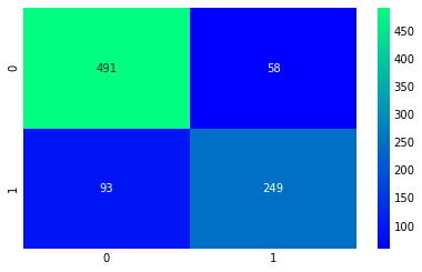
The highest accuracy we can get from AdaBoost is 83.16%, n_estimators = 200 and learning_rate = 0.05
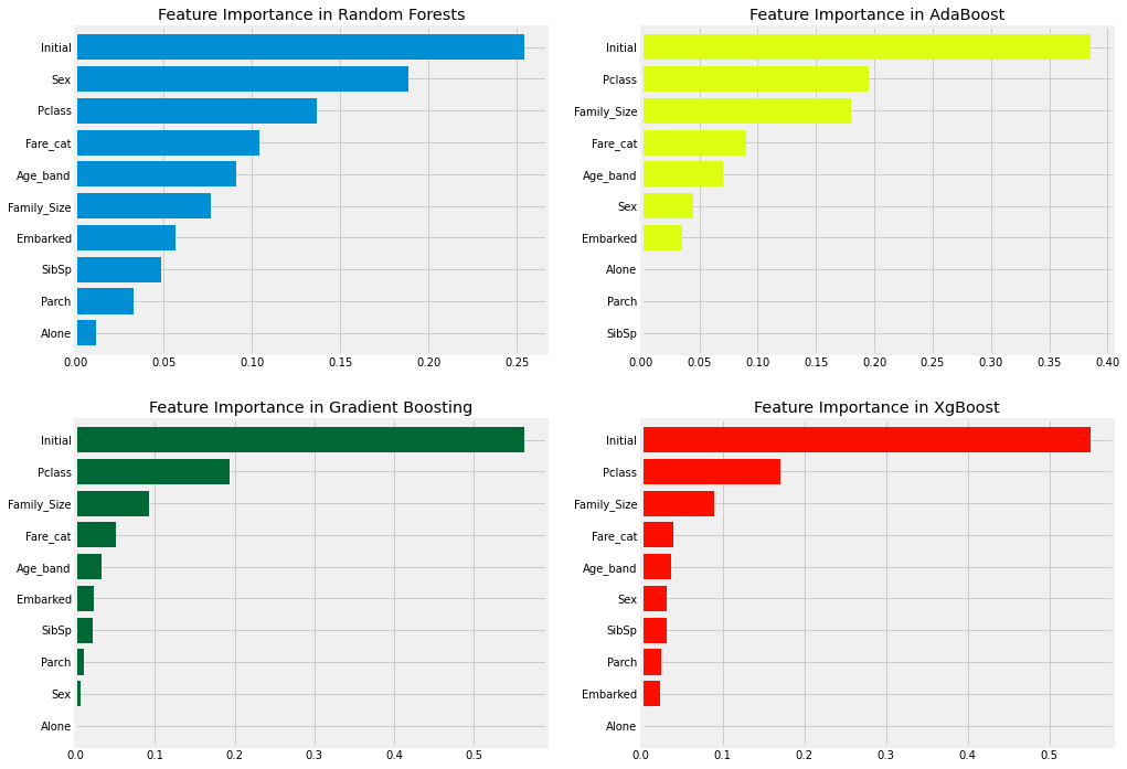
Characteristic importance
import xgboost as xg
f,ax=plt.subplots(2,2,figsize=(15,12))
model=RandomForestClassifier(n_estimators=500,random_state=0)
model.fit(X,Y)
pd.Series(model.feature_importances_,X.columns).sort_values(ascending=True).plot.barh(width=0.8,ax=ax[0,0])
ax[0,0].set_title('Feature Importance in Random Forests')
model=AdaBoostClassifier(n_estimators=200,learning_rate=0.05,random_state=0)
model.fit(X,Y)
pd.Series(model.feature_importances_,X.columns).sort_values(ascending=True).plot.barh(width=0.8,ax=ax[0,1],color='#ddff11')
ax[0,1].set_title('Feature Importance in AdaBoost')
model=GradientBoostingClassifier(n_estimators=500,learning_rate=0.1,random_state=0)
model.fit(X,Y)
pd.Series(model.feature_importances_,X.columns).sort_values(ascending=True).plot.barh(width=0.8,ax=ax[1,0],cmap='RdYlGn_r')
ax[1,0].set_title('Feature Importance in Gradient Boosting')
model=xg.XGBClassifier(n_estimators=900,learning_rate=0.1)
model.fit(X,Y)
pd.Series(model.feature_importances_,X.columns).sort_values(ascending=True).plot.barh(width=0.8,ax=ax[1,1],color='#FD0F00')
ax[1,1].set_title('Feature Importance in XgBoost')
plt.show()
Program running results:
