background
One day, the group members asked such a question in the group, how to use CSS to realize the following layout:

In the CSS world, it is very easy to achieve only the following effects:

Once the fillet or wave effect is involved, the difficulty will increase a lot.
In fact, it is troublesome to realize this continuous and smooth curve. Of course, there is no way at all. In this article, we will take a look at some possible ways to use CSS to achieve the above concave smooth fillet effect.
Using the connection of circles
The first method is stupid. We can use the connection of multiple circles.
First, we will implement a rectangle with a rectangle inside:
<div></div>
The core CSS code is as follows:
div {
    height: 200px;
    background:
        linear-gradient(90deg, #9c27b0, #9c27b0 110px, transparent 110px, transparent 190px, #9c27b0 190px),
        linear-gradient(90deg, #9c27b0, #9c27b0);
    background-size: 100% 20px, 100% 100%;
    background-position: 0 0, 0 20px;
    background-repeat: no-repeat;
}
Get such a graph (there are many ways to achieve it, here I use gradient):

Next, three circles are superimposed through pseudo elements, which is roughly as follows:

div {
    ...
    &::before {
        position: absolute;
        content: "";
        width: 40px;
        height: 40px;
        border-radius: 50%;
        background: #000;
        left: 90px;
        box-shadow: 40px 0 0 #000, 80px 0 0 #000;
    }
}
By slightly modifying the colors of the three circles, we can get the following effects:

It can be seen that the effect achieved through the superposition of three circles is not very good. It can only be said that it is reluctantly restored. If the background color is not a solid color, it will be worn:

The complete code you can stamp here: CodePen Demo - Smooth concave rounded corners
Implemented by filter
The following is the focus of this paper, which will introduce a way to achieve this effect by using filters.
You might be surprised to hear the filter, huh? This effect doesn't seem to have anything to do with the filter, does it?
Here is the moment to witness miracles.
First, we only need to implement such a graph:
<div class="g-container">
    <div class="g-content">
        <div class="g-filter"></div>
    </div>
</div>
.g-container {
position: relative;
width: 300px;
height: 100px;
.g-content {
height: 100px;
.g-filter {
height: 100px;
background: radial-gradient(circle at 50% -10px, transparent 0, transparent 39px, #000 40px, #000);
}
}
}Get such a simple figure:

When you see this, you must wonder why this figure needs to be nested with three levels of div? Isn't a div enough?
Because we have to use the magical combination of filter: contrast() and filter: blur().
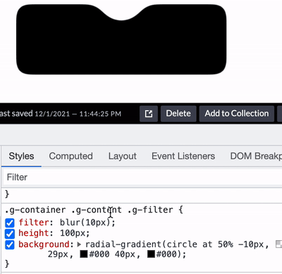
Let's simply modify the above code and carefully observe the similarities and differences with the above CSS:
.g-container {
    position: relative;
    width: 300px;
    height: 100px;

    .g-content {
        height: 100px;
        filter: contrast(20);
        background-color: white;
        overflow: hidden;

        .g-filter {
            filter: blur(10px);
            height: 100px;
            background: radial-gradient(circle at 50% -10px, transparent 0, transparent 29px, #000 40px, #000);
        }
    }
}
We'll give it to you filter: contrast(20) and background color: white are added to g-content g-filter adds filter: blur(10px).
Something magical happened and we got this effect:

The blurred edges of Gaussian blur are removed through the contrast filter, and the original right angles are turned into rounded corners.
More intuitive feeling through a Gif diagram:
Here are a few details to note:
- . g-content layer needs to set background and overflow: hidden (you can try to remove it yourself to see the effect)
- The outer right angle also becomes a fillet
Based on the second point above, the right angle on the outside also becomes a fillet. If you want this fillet to be a right angle, there is In the g-container layer, we can add a pseudo element in this layer to cover the four corners into right angles:
.g-container {
    &::before {
        content: "";
        position: absolute;
        top: 0;
        left: 0;
        bottom: 0;
        right: 0;
        z-index: 1;
        background: radial-gradient(circle at 50% -10px, transparent 0, transparent 60px, #000 60px, #000 0);
    }
}
We can get the effect that only the middle part is concave fillet and the other four corners are right angles:

The complete code you can stamp here: CodePen Demo - Smooth concave rounded corners By filter
Of course, due to the application of fuzzy filter, DOM is not recommended to be placed inside the smooth concave fillet. It is best to use it as a background, and the internal content can be superimposed on it in other ways.
You can learn more about the magical fusion effect of filter: contrast() and filter: blur()-- CSS filter tips and details you don't know
last
There are several other ways to realize the smooth fillet of the concave in this paper. The essence is similar to the first way in this paper. They are all superimposed masking methods, which are not listed one by one. The core purpose of this paper is to introduce the way of the second filter.
Well, this article ends here. I hope this article will help you:)
If you want Get to get the most interesting CSS information, don't miss my official account -- iCSS front end interesting news. 😄
More wonderful CSS technical articles are summarized in my Github -- iCSS , continuously updated. Welcome to a star subscription collection.
If you have any questions or suggestions, you can communicate more. The original articles have limited writing style and shallow talents. If there is anything wrong in the article, please let me know.