Sketch
Material Design, introduced from Android 5.0, is a brand new design language called "Raw Material Design", which is a design style, concept and principle advocated by Google. Combining the imitation design and flat design style, some scientific and technological concepts are integrated.
For further information, check out this wiki: Material Design Chinese Version
* Note: Using the controls described below, we need to introduce v7 package support into the project. As mentioned above, Material Design has been introduced since Android 5.0, so there are no such controls in the lower version of the system.
For example, using Android Studio, you can write in dependencies of gradle:
compile 'com.android.support:appcompat-v7:25.3.0'
Eclipse, please Baidu, after all, even if you import v7 packages, if the compiled version and the version of v7 packages have new and old problems, v7 packages project itself will be wrong, there are other details to be noted, this will not be introduced.
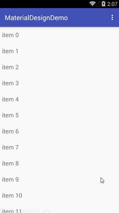
I. Swipe Refresh Layout
1. Use
Swipe RefreshLayout is a drop-down refresh control launched by Google. It conforms to the MD design and is easy to use. The size, color and refresh distance from the top suspension of the control can be set by the method provided by Swipe RefreshLayout. The specific use of Swipe RefreshLayout is as follows:
//Set the size of SwipeRefreshLayout
mSrl.setSize(SwipeRefreshLayout.LARGE);
//Set up color switching when SwipeRefreshLayout refreshes (there can be countless kinds)
mSrl.setColorSchemeColors(Color.RED, Color.YELLOW, Color.GREEN);
//Setting the background of Swipe Refresh Layout
mSrl.setBackgroundColor(Color.GRAY);
//Set the drop-down distance of SwipeRefreshLayout
mSrl.setDistanceToTriggerSync(100);
//Setting SwipeRefreshLayout is refreshing listeners
mSrl.setOnRefreshListener(new SwipeRefreshLayout.OnRefreshListener() {
    @Override
    public void onRefresh() {
        ...
        //Refresh data source
        ...
    }
});
//Stop refreshing manually
mSrl.setRefreshing(false);
2. Effect Preview:
ListPopupWindow
As we all know, popup Windows is a pop-up menu in Android, and ListPopup Windows, as its name implies, is a pop-up menu of list type. With this control, it can achieve similar functions as drop-down menu, but not limited to that.
1. Use
mListPopupWindow = new ListPopupWindow(this);
//Setting up the data adapter for ListPopup Windows
mListPopupWindow.setAdapter(mAdapter);
//Set the display location of ListPopup Window (below the specified control)
mListPopupWindow.setAnchorView(view);
//Set the width of ListPopup Window
mListPopupWindow.setWidth(200);
//Set the height of ListPopup Window
mListPopupWindow.setHeight(500);
//Setting the ListPopup Window entry click event (must be set before the show method, otherwise invalid)
mListPopupWindow.setOnItemClickListener(new AdapterView.OnItemClickListener() {
    @Override
    public void onItemClick(AdapterView<?> parent, View view, int position, long id) {
        Toast.makeText(getApplicationContext(), mItemArr[position], Toast.LENGTH_SHORT).show();
        mListPopupWindow.dismiss();
    }
});
mListPopupWindow.show();
2. Effect Preview:
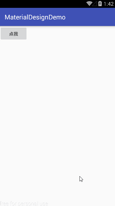
Popup Menu
PopupMenu represents a pop-up menu, which pops up PopupMenu on a specified component. By default, PopupMenu is displayed below or above the component. The difference from ListPopup Windows is that ListPopup Windows uses adapters to fill entries, while Popup Menu uses a menu layout to fill entries.
1. Use
PopupMenu popupMenu = new PopupMenu(this, view);
//Set up the display menu item of PopupMenu
popupMenu.inflate(R.menu.main);
// PopupMenu. getMenuInflater (). inflate (R. menu. main, popupMenu. getMenu (); // No different from a row

//The default PopupMenu does not display the entry icon and can be forced to display icon by reflection.
Field field = popupMenu.getClass().getDeclaredField("mPopup");
field.setAccessible(true);
MenuPopupHelper mHelper = (MenuPopupHelper) field.get(popupMenu);
mHelper.setForceShowIcon(true);

//Setting PopupMenu's entry click event (automatically dismiss ed after clicking)
popupMenu.setOnMenuItemClickListener(new PopupMenu.OnMenuItemClickListener() {
    @Override
    public boolean onMenuItemClick(MenuItem item) {
        Toast.makeText(getApplicationContext(), item.getTitle(), Toast.LENGTH_SHORT).show();
        return false;
    }
});
//Display PopupMenu
popupMenu.show();
2. Effect Preview:
Linear Layout Compat
Linear Layout Compat is an extension of Linear Layout to add dividers between sub-views in this layout. You can specify the style of the partition line by customizing the attribute divider and the display position of the partition line by customizing the attribute showDividers.
1. Use
<android.support.v7.widget.LinearLayoutCompat
    android:id="@+id/llc"
    android:layout_width="match_parent"
    android:layout_height="match_parent"
    android:layout_gravity="center"
    android:orientation="vertical"
    app:divider="@drawable/line"
    app:showDividers="beginning">
        ...
        //Subcontrol
        ...
</android.support.v7.widget.LinearLayoutCompat>
2. Effect Preview:
V. Recycler View
RecyclerView is one of the most important and commonly used controls in v7 package. It can achieve the effect of linear list, grid list and waterfall flow list, but it has the advantages of high decoupling and performance optimization. It can be said that it is an enhanced version of ListView and GridView.
1. Use
Recycler Viewr is generally used in two steps:
- Setting up Adapter adapter
- Setting up Layout Manager
1) Setting the Adapter adapter
The adapter used by RecyclerView must inherit RecyclerView.Adapter, specify RecyclerView.ViewHolder, create a custom RecyclerView.ViewHolder in onCreateViewHolder(), and set the entries in onBindViewHolder(), which is relatively simple to understand. The code is as follows:
public class MyAdapter extends RecyclerView.Adapter<MyAdapter.MyViewHolder> {

    private List<String> mData;

    public MyAdapter(List<String> data) {
        mData = data;
    }

    @Override
    public MyViewHolder onCreateViewHolder(ViewGroup parent, int viewType) {
        View itemView = View.inflate(parent.getContext(), android.R.layout.simple_list_item_1, null);
        return new MyViewHolder(itemView);
    }

    @Override
    public void onBindViewHolder(MyViewHolder holder, int position) {
        holder.mTv.setText(mData.get(position));
    }

    @Override
    public int getItemCount() {
        return mData.size();
    }

    class MyViewHolder extends RecyclerView.ViewHolder {

        TextView mTv;

        public MyViewHolder(View itemView) {
            super(itemView);
            mTv = (TextView) itemView.findViewById(android.R.id.text1);
        }
    }

}
2) Setting up Layout Manager
RecyclerView can use layout managers in three ways:
- Linear Layout Manager: Linear List
- GridLayout Manager: Grid List
- Staggered Grid Layout Manager: Waterfall Stream List
Take Linear Layout Manager as an example:
LinearLayoutManager(Context context, int orientation, boolean reverseLayout)
When creating Linear Layout Management, you can specify the direction of the list by parameter 2 and whether the data is reversed by parameter 3 (the original data is filled from top to bottom, and when reverseLayout is true, the data is filled from bottom to top). The use of GridLayout Manager and Staggered GridLayout Manager is also included. Almost.
Call setLayoutManager() of RecyclerView to set up the layout manager
mRv.setLayoutManager(new LinearLayoutManager(this));
2. Effect Preview: