Introduction to TextInput Layout
TextInput Layout is a text input layout based on the Material Design style of Google. The main feature is that in style, the first sentence of the official introduction is when the input text is displayed or hidden, EditText shows the layout of floating labels.
Look at the style first.
Styles actually have animation effects. 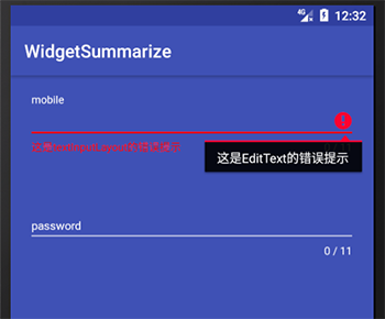
Usage method
Introducing a package environment
Since this control is under the android.support.design.widget package, check to see if it has been introduced:
compile 'com.android.support:design:22.2.0'
compile 'com.android.support:appcompat-v7:22.2.0'
Version can be adjusted on demand
Add code to the layout
<android.support.design.widget.TextInputLayout
         android:layout_width="match_parent"
         android:layout_height="wrap_content">

     <android.support.design.widget.TextInputEditText
             android:layout_width="match_parent"
             android:layout_height="wrap_content"
             android:hint="@string/form_username"/>

 </android.support.design.widget.TextInputLayout>
Style modification
Add the following attributes to the default AppTheme body
<item name="android:textColorHint">@colorcommonTextColorWhite</item>
<item name="colorControlNormal">@colorcommonTextColorWhite</item>
<item name="colorControlActivated">@colorcommonTextColorWhite</item>
<item name="colorControlHighlight">@colorcommonTextColorWhite</item>
Explanation:
| attribute | Meaning |
|---|---|
| android:textColorHint | The color of the prompt font |
| colorControlNormal | Underlines do not get the focus, which is the default color. |
| colorControlActivated | The color of the underline when clicked |
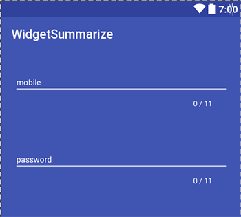
Counter function
Use
TextInputLayout also realizes the function of recording the number of input characters at the time of input, which can be achieved by setting parameters and importing the following environment
xmlns:app="http://schemas.android.com/apk/res-auto"Add the following attributes
app:counterEnabled="true"
app:counterMaxLength="11"
app:counterTextAppearance="@style/text_style"| attribute | Meaning |
|---|---|
| app:counterEnabled | Whether to turn on this function |
| app:counterMaxLength | Maximum limit of counter |
| app:counterTextAppearance | Font Style of Counter |
Error prompt function
TextInputLayout also has an error prompt function that can be used directly through the api.
Add the following code
app:errorEnabled="true"
app:errorTextAppearance="@style/error_text_style"
Setting up in java code
textInputLayout.setError("This is textInputLayout Error Tips");
mobile.setError("This is EditText Error Tips");
Password Visualization Function
After setting the type of inputType to password, you can set the following properties. And the default effects support Material Design effects and default animations, which are also cool.
app:passwordToggleEnabled="true"
app:passwordToggleTint="@color/colorAccent"| attribute | Meaning |
|---|---|
| app: passwordToggleEnabled | Whether to turn on password visibility |
| app: passwordToggleTint | Modify the color of the prompt Icon |
summary
Following Android 5.0, google has developed a series of Material Design style controls, which have also led to the stylization of Material Design on some web and Android sides. Personally, I think it is also a better design language. If used well, it will benefit the interaction of APP.