matplotlib
Drawing function
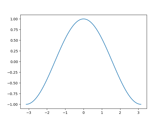
plot
plot: draw a two-dimensional graph to connect the points of the plane
import numpy as np
import matplotlib.pyplot as plt

x = np.linspace(-np.pi, np.pi, 256,endpoint=True)
plt.plot(x,np.cos(x)) # x-axis y-axis
plt.show() # Finally, enter this
# If the x-axis is not specified, it will be 0,1,2 n-1
scatter
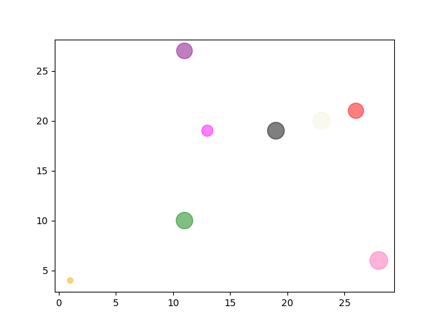
Scatter: scatter plot
x = np.random.randint(1,30,(1,8))
y = np.random.randint(1,30,(1,8))
Size = np.random.randint(10,500,(1,8))
Color = np.array(["red","green","black","orange","purple","beige","hotpink","magenta"])
# Colors can be represented by RGB codes
# A graph similar to clustering can be drawn twice, changing one color each time
plt.scatter(x,y,s=Size,c=Color,alpha=0.5) # alpha is transparency. It should look better when set
plt.show()
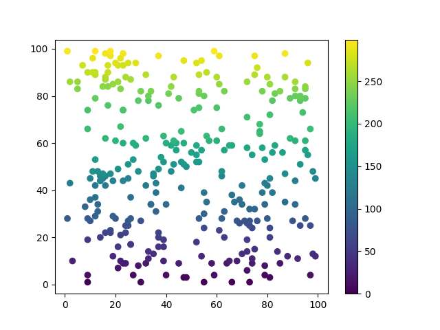
x = np.random.randint(1,100,(1,300))
y = np.random.randint(1,100,(1,300))
y.sort() # Order first or not
colors = np.arange(300) # The number must correspond to the above. You can set the color yourself, which can be understood as the final normalization to determine the color

plt.scatter(x, y, c=colors, cmap='viridis') # camp is the name of the color bar
plt.colorbar() # Display color bar
plt.show()
Optional parameters More colors
| cool | winter | viridis | rainbow | twilight | terrain | spring |
|---|---|---|---|---|---|---|
| prism | plasma | pink | ocean | jet | flag | Blues |
bar , barh
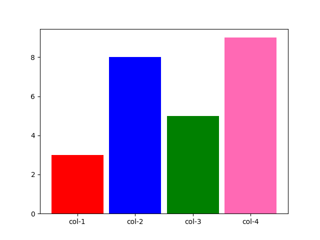
bar: draw histogram
barh: a horizontal bar chart. The usage is the same as bar
x = np.array(['col-1','col-2','col-3','col-4'])
y = np.array([3,8,5,9])
Color = np.array(['red','blue','green','hotpink'])
plt.bar(x,y,color=Color,width=0.9) # width is [0,1]
# If it's barh, it's height
plt.show()
pie
Pie: draw pie chart
| parameter | explain | Value |
|---|---|---|
| x | Value of each sector | list |
| lables | Name of each sector | list |
| explod | Spacing of each sector | List, representing the distance between each sector and other sectors (0.1 is appropriate) |
| colors | colour | List, color of sectors |
| autopct | Fan display percentage | Integer '% d%%', decimal '% 0.1f', decimal percentage '% 0.1f%%' |
| labeldistance | Distance from label to sector | The default is 1.1, and less than 1 is in the sector |
| pctdistance | Position of sector percentage | Default 0.6 |
y = np.array([35, 25, 25, 15])
plt.pie(y,
        labels=['A','B','C','D'],
        colors=["red", "lightblue", "green", "hotpink"],
        explode=[0.1,0,0,0],
        autopct='%d%%',
       )
plt.show()
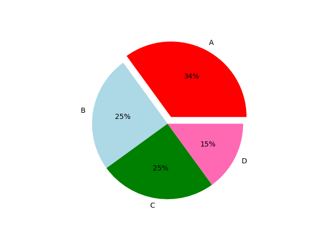
Image parameters and annotations
figure
figure: adjust the size of the picture
plt.figure(figsize=(8,5),dpi=80)
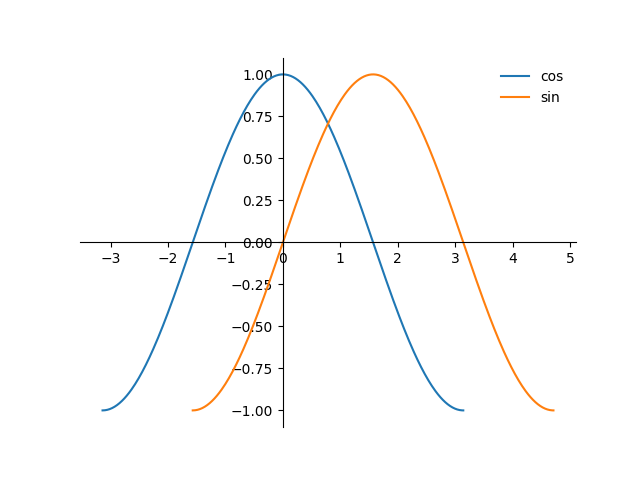
legend
legend: when there are multiple functions in one diagram, each function can be labeled with a name
plot(x1,y1,label='cos') # Drawing name
plot(x2,y2,label='sin')
plt.legend(loc='upper left',frameon = False)
# Mark the place and whether a small border is required
import matplotlib.pyplot as plt
import numpy as np

ax = plt.subplot()
ax.spines['right'].set_color('none')
ax.spines['top'].set_color('none')
ax.spines['bottom'].set_position(('data',0))
ax.spines['left'].set_position(('data',0))

x1 = np.linspace(-np.pi,np.pi,300)
x2 = np.linspace(-np.pi/2,np.pi*3/2,300)
y1 = np.cos(x1)
y2 = np.sin(x2)

plt.plot(x1,y1,label="cos")
plt.plot(x2,y2,label='sin')
plt.legend(loc='best',frameon = False)
plt.show()
The position is the arrangement and combination of the following words (left, right at the end)
| best | right | lower |
|---|---|---|
| center | left | upper |
annotate
annotate: mark points on the image
# Label content of latex
# xy: position of dimension point
# xytext: annotation content location coordinates
# fontsize: font size
# Xycoords, textcoords and arrowprops basically need not be adjusted
pointx,pointy = 1,2
plt.plot([pointx,pointx],[0,pointy],linestyle="--")
plt.scatter([pointx],[pointy], 50,)
# Add a guide by the way, z
plt.annotate(r'$this point$',
             xy=(pointx,pointy),
             xytext=(-90, -50),
             xycoords='data',
             textcoords='offset points',
             fontsize=16,
             arrowprops=dict(arrowstyle="->", connectionstyle="arc3,rad=.2")
            )
Line parameters
| colour | character | Line type | character | sign | character |
|---|---|---|---|---|---|
| blue | b | Solid line | - | Point marker | . |
| gules | r | Broken broken line | – | Pixel marker | , |
| yellow | y | Dotted line | -. | Solid ring | o |
| black | k | Dotted line | : | Inverted triangle | v |
| green | g | Upper triangle | ^ | ||
| white | w | stars | * |
See for more shapes Drawing mark Drawing line
Coordinate axis
spines
spines: set the relevant parameters of the coordinate axis
ax = plt.subplot()
ax.spines['right'].set_color('none')
ax.spines['top'].set_color('none')
ax.spines['bottom'].set_position(('data',0))
ax.spines['left'].set_position(('data',0))
xticks , yticks
xticks: sets the number displayed on the x-axis
yticks: sets the number displayed on the y-axis
x = np.linspace(-np.pi, np.pi, 256,endpoint=True)
plt.plot(x,np.cos(x))
plt.xticks(np.linspace(-np.pi,np.pi,9))
plt.yticks(np.linspace(-2,2,9))
plt.show()
It also supports latex, one by one
x = np.linspace(-np.pi, np.pi, 256,endpoint=True)
plt.plot(x,np.cos(x))
plt.xticks([-np.pi, -np.pi/2, 0, np.pi/2, np.pi],['$-\pi$','$-\pi/2$','$0$','$+\pi/2$','$+\pi$'])
plt.show()
Prevent blocking the number of xy axis
for label in ax.get_xticklabels() + ax.get_yticklabels():
    label.set_fontsize(16)
    label.set_bbox(dict(facecolor='white', edgecolor='None', alpha=0.65 ))
However, before using it, you should first set the zorder in the plot, that is, the occlusion priority. You also need to generate an ax with subplot
ax = plt.subplot(111)
ax.spines['right'].set_color('none')
ax.spines['top'].set_color('none')
ax.spines['bottom'].set_position(('data',0))
ax.spines['left'].set_position(('data',0))

X = np.linspace(-np.pi, np.pi, 256,endpoint=True)
C,S = np.cos(X), np.sin(X)

plt.plot(X, C,zorder=-1)
plt.plot(X, S,zorder=-2)

for label in ax.get_xticklabels() + ax.get_yticklabels():
    label.set_fontsize(16)
    label.set_bbox(dict(facecolor='white', edgecolor='None', alpha=0.65 ))
plt.show()
xlim , ylim
xlim: sets the upper and lower limits of the x-axis
ylim: set the upper and lower limits of y-axis
plt.xlim(x.min()*1.1,x.max()*1.1) # 1.1 is the default
# Lower and upper limit
# ylim same
Chinese settings
Method 1
Font download [yxqu]
Local path "C:\chinese.otf"
This method does not change the global font
chinese = matplotlib.font_manager.FontProperties(fname="C:\\chinese.otf")
# set up path
plt.title("cosine function",fontproperties=chinese) # usage method
plt.xlabel("x axis",fontproperties=chinese)
Method 2
This method will change the global font, so you can use Chinese
plt.rcParams['font.sans-serif']=['SimHei']
| Song style | Blackbody | Microsoft YaHei | NSimSun | Regular script |
|---|---|---|---|---|
| SimSun | SimHei | Microsoft YaHei | NSimSun | KaiTi |
label
xlable , ylable
Xlable: X-axis label
Ylable: Y-axis label
You can add fontdict, size and LOC parameters
plt.xlabel("x axis", fontproperties=zhfont1,fontdict={'color':'red'},size=10)
plt.ylabel("y")
title
Title: add a title
plt.title("x-cos(x)") # You can add the size parameter to make the title bigger
Using the loc position parameters of title, xlable and ylable
| function | parameter | parameter | Default parameters |
|---|---|---|---|
| xlable | left | right | center |
| ylable | bottom | top | center |
| title | left | right | center |
plt.xlable("x_lable",loc="left")
Grid line
grid
Grid: add a grid line. See "line parameters" for specific parameters
plt.grid(color = 'r', linestyle = '--', linewidth = 0.5,axis = 'x')
Multi graph drawing
subplot
subplot: drawing by dividing areas
subplot(1,2,1) # subplot No. 1 of 1 * 2
# ....plot....
subplot(1,2,2) # subplot No. 2 of 1 * 2
# ....plot....
suptitle
Subtitle: draw a big title for the multi graph
plt.suptitle("subplot Test")
subplots
subplots: draw multiple graphs, which has more functions than subplot s
import matplotlib.pyplot as plt
import numpy as np

x1 = np.arange(12)
y1 = x1**2+x1-2
x2 = np.linspace(-np.pi,np.pi,256)
y2 = 7*np.cos(x2)

[fig,area] = plt.subplots(2,2)
area[0,0].plot(x1,y1)
area[1,1].plot(x2,y2)
plt.show()
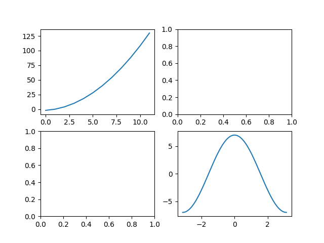
plt.subplots(2, 2, sharey='all') # Shared y-axis
plt.subplots(2, 2, sharex='all') # Shared x-axis
# The sharing effect of both is not very good