1. Analyze the relationship between the characteristics of population data from 1996 to 2015.
The population data has a total of six characteristics, namely, year-end population, male population, female population, urban population, rural population and year. Looking at the changes of various characteristics over time, we can analyze the proportion of male and female population and the change direction of urban and rural population in the future.
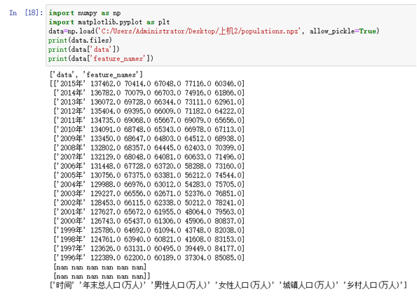
(1) Use the NumPy library to read populations NZP population data.
(2) Create a canvas and add a subgraph.
(3) The scatter chart and line chart are drawn on the two subgraphs respectively.
(4) Save, display picture
(5) Analyze the future population change trend.
source program
import numpy as np
import matplotlib.pyplot as plt
data=np.load('C:/Users/Administrator/Desktop/Computer 2/populations.npz', allow_pickle=True)
print(data.files)
print(data['data'])
print(data['feature_names'])

plt.rcParams['font.sans-serif']='SimHei' #Set Chinese display
name=data['feature_names']
values=data['data']
p1=plt.figure(figsize=(15,15))
pip1=p1.add_subplot(2,1,1)#Create a subgraph with 2 rows and 1 column and start drawing the first one
plt.scatter(values[0:20,0],values[0:20,1],marker='+',color='pink')
plt.scatter(values[0:20,0],values[0:20,2],marker='o',color='yellow')
plt.scatter(values[0:20,0],values[0:20,3],marker='D',color='green')
plt.scatter(values[0:20,0],values[0:20,4],marker='P',color='red')
plt.scatter(values[0:20,0],values[0:20,5],marker='s',color='blue')
plt.xlabel('time');plt.ylabel('total population(ten thousand people)')
plt.xticks(values[0:20,0])
plt.title("1996~2015 Scatter chart between characteristics of annual population data")
plt.legend(['end of the year','Male','female sex','town','rural'])
plt.savefig("C:/Users/Administrator/Desktop/Computer 2/1996~2015 Scatter chart between characteristics of annual population data.png")
plt.show()

p1=plt.figure(figsize=(15,15))
pip1=p1.add_subplot(2,1,2)#Create a subgraph with 2 rows and 1 column and start drawing the first one
plt.plot(values[0:20,0],values[0:20,1],'r-')
plt.plot(values[0:20,0],values[0:20,2],'b-')
plt.plot(values[0:20,0],values[0:20,3],'y--')
plt.plot(values[0:20,0],values[0:20,4],'k--')
plt.plot(values[0:20,0],values[0:20,5],'r:')
plt.xlabel('time');plt.ylabel('total population(ten thousand people)')
plt.xticks(values[0:20,0])
plt.title("1996~2015 Broken line chart between characteristics of annual population data")
plt.legend(['end of the year','Male','female sex','town','rural'])
plt.savefig("C:/Users/Administrator/Desktop/Computer 2/1996~2015 Broken line chart between characteristics of annual population data.png")
plt.show()
Result screenshot
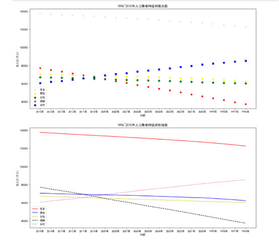
Analyze future population trends:
According to the changes of various characteristics over time, it can be analyzed that the proportion of male and female population will gradually become balanced in the future, and the change direction of urban and rural population will gradually urbanization.
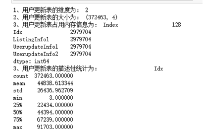
2. Read and view the basic information of the user information update table.
(1) Use ndim, shape, memory_ The usage attribute is used to view dimension, size, and memory usage information.
(2) Descriptive statistics were performed using the describe method.
source program
import pandas as pd
Userupdate=pd.read_csv('C:/Users/Administrator/Desktop/Computer 2/Training_Userupdate.csv',encoding='gbk')
print("1,The dimension of the user update table is:",Userupdate.ndim)
print("2,The size of the user update table is:",Userupdate.shape)
print("3,The memory occupied by the user to update the table is:",Userupdate.memory_usage().head())
print("3,The descriptive statistics of the user update table are:",Userupdate.describe())
Result screenshot
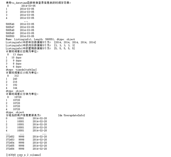
3. Extract the time information of the login information table.
(1) Use to_ The datetime function converts the time string of the login information table.
(2) Use year, month, week and other methods to extract the time information in the login information table.
(3) Calculate the difference between the two times in the login information table, calculated in days, disappearances and minutes respectively.
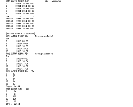
(4) Use the group by method to group the login information table.
(5) Use the agg method to calculate the earliest and latest login time after grouping.
(6) Use the size method to calculate the login times of the grouped data.
source code
import pandas as pd
LogInfo=pd.read_csv('C:/Users/Administrator/Desktop/Computer 2/Training_LogInfo.csv',encoding='gbk')
print("use to_datetime Function to convert the time string of the login information table:\n",LogInfo['Listinginfo1'])
Userupdate["ListingInfo1"]=pd.to_datetime(Userupdate["ListingInfo1"])
Userupdate["UserupdateInfo2"]=pd.to_datetime(Userupdate["UserupdateInfo2"])
LogInfo["Listinginfo1"]=pd.to_datetime(LogInfo["Listinginfo1"])
LogInfo["LogInfo3"]=pd.to_datetime(LogInfo["LogInfo3"])
year=[i.year for i in LogInfo['Listinginfo1']]
print("Listinginfo1 The first five years of data in are:",year[:5])
month=[i.month for i in LogInfo['Listinginfo1']]
print("Listinginfo1 The first 5 months of data in are:",month[:5])
week=[i.day for i in LogInfo['Listinginfo1']]
print("Listinginfo1 The first five weeks in the data are:",week[:5])
timeDelta=LogInfo['Listinginfo1']-LogInfo['LogInfo3']
print("The calculation time difference is in date:\n",timeDelta.head())

def TransformDayIntoHour(data):
    for i in range(0,len(data)):
        data[i]=data[i].total_seconds()/3600
    return data
print("The calculation time difference is in hours:\n",TransformDayIntoHour(timeDelta).head())

def TransformDayIntoMinute(data):
    for i in range(0,len(data)):
        data[i]=data[i].total_seconds()/60
    return data
timeDelta=Userupdate["ListingInfo1"]-Userupdate["UserupdateInfo2"]
print("The calculation time difference is in minutes:\n",TransformDayIntoMinute(timeDelta).head())
UserupdateGroup=Userupdate[["Idx","UserupdateInfo2"]].groupby(by="Idx")
LogInfoGroup=LogInfo[["Idx","LogInfo3"]].groupby(by="Idx")
print('The user information update table after grouping is:',UserupdateGroup.head())
print('The login information table after grouping is:',LogInfoGroup.head())
print("Earliest update time after grouping:",UserupdateGroup.agg(np.min).head())
print("Latest update time after grouping:",UserupdateGroup.agg(np.max).head())
print("Number of information updates after grouping:",UserupdateGroup.size().head())
print("Login times after grouping:",LogInfoGroup.size().head())
Running screenshot
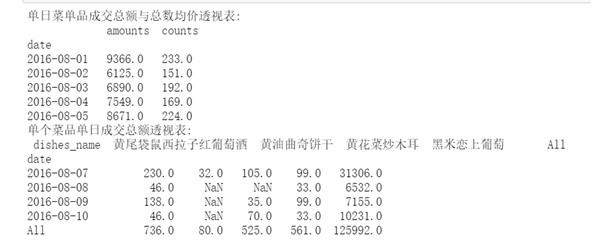
4. Read the database meal_order_detail1.sql data, using PivotTable and crosstab for analysis.
(1) Create a pivot table of the total transaction amount and total average price of menu items in a single day.
(2) Create a pivot table of the total transaction amount of a single dish in a single day.
source code
import pandas as pd
import numpy as np
from sqlalchemy import create_engine
engine=create_engine('mysql+pymysql://root:1234@localhost:3306/testdb?charset=utf8')
detail=pd.read_sql_table('meal_order_detail1',con=engine)
detail['place_order_time']=pd.to_datetime(detail['place_order_time'])
detail['date']=[i.date() for i in detail['place_order_time']]
PivotDetail=pd.pivot_table(detail[['date','dishes_name','counts','amounts']],
index='date',aggfunc=np.sum,margins=True)
print('Pivot table of total transaction amount and average price of menu products in a single day:\n',PivotDetail.head())
CrossDetail=pd.crosstab(index=detail['date'],columns=detail ['dishes_name'],values=detail['amounts'],aggfunc=np.sum,margins=True)
print('Pivot table of total transaction amount of a single dish in a single day:\n',CrossDetail.iloc[-5:,-5:])
Running screenshot