Histogram
Use the bar () function provided by Matplotlib to draw a histogram
Similar to the plot() function described earlier, every time the program calls the bar() function, a set of histogram will be generated. If you want to generate multiple sets of histogram, you can call the bar() function multiple times to achieve this
bar()
bar(x, height, width=0.8, bottom=None, *, align='center', data=None, **kwargs)
Main parameters:
- x: Include a list of subscripts for all columns
- Height: the numerical sequence of y-axis is also the height of histogram, which is generally the data we need to show
- Width: the width of the histogram. Generally, this is 0.8
- align: the column alignment has two optional values: cneter and edge. Center indicates that each column is odd according to the subscript, edge indicates that each column starts from the following table, and then displays to the right of the subscript. If this parameter is not specified, the default is center
Optional parameters:
- Color: the color of each column. You can specify a fixed value or a list
- edgecolor: the color of each column frame
- linewidth: the border width of each column. If this parameter is not set, there is no border by default
- Tick? Label: the label displayed on each column, no label by default
- xerr: length of line segment at the top of each column in the direction of transverse axis
- yerr: length of line segment at the top of each column in the longitudinal direction
- ecolor: set the line color of xerr and yerr. You can specify a fixed value or a list
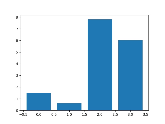
Using matplotlib to draw a simple histogram
import matplotlib.pyplot as plt

num_list = [1.5,0.6,7.8,6]
plt.bar(range(len(num_list)),num_list)
plt.show()
Set the column color:
import matplotlib.pyplot as plt

num_list = [1.5,0.6,7.8,6]
plt.bar(range(len(num_list)),num_list,color = 'rgbc') #Red, green, blue and green
plt.show()

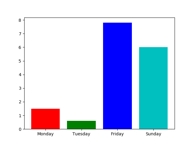
Setting labels
import matplotlib.pyplot as plt

name_list = ['Monday','Tuesday','Friday','Sunday']
num_list = [1.5,0.6,7.8,6]
plt.bar(range(len(num_list)),num_list,color = 'rgbc',tick_label = name_list)
plt.show()
stacked column chart
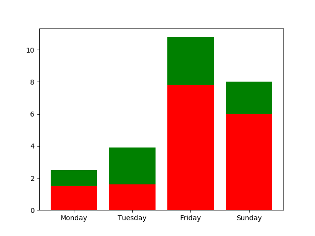
import matplotlib.pyplot as plt

name_list = ['Monday','Tuesday','Friday','Sunday']
num_list = [1.5,1.6,7.8,6]
num_list2 = [1,2.3,3,2]
plt.bar(range(len(num_list)),num_list, color = 'r',tick_label = name_list)
plt.bar(range(len(num_list2)),num_list2, color = 'g',tick_label = name_list, bottom=num_list)
plt.show()
Add legend
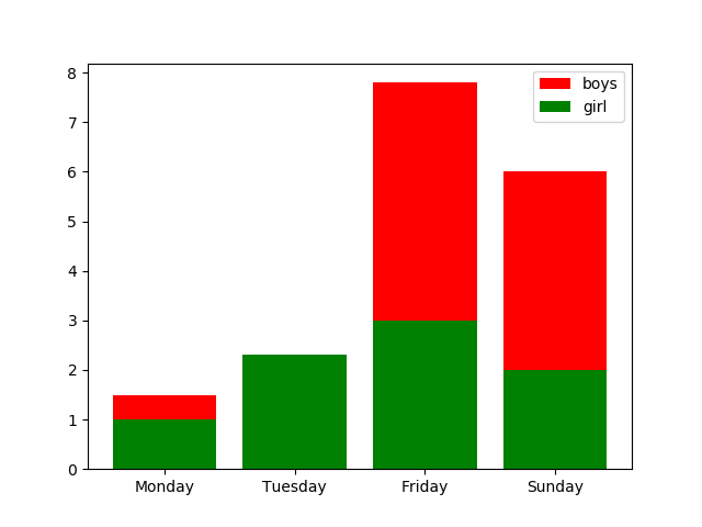
legend
import matplotlib.pyplot as plt

name_list = ['Monday','Tuesday','Friday','Sunday']
num_list = [1.5,1.6,7.8,6]
num_list2 = [1,2.3,3,2]
plt.bar(range(len(num_list)),num_list, color = 'r',tick_label = name_list, label = 'boys')
plt.bar(range(len(num_list2)),num_list2, color = 'g',tick_label = name_list, label = 'girl')
plt.legend(loc='best')
plt.show()
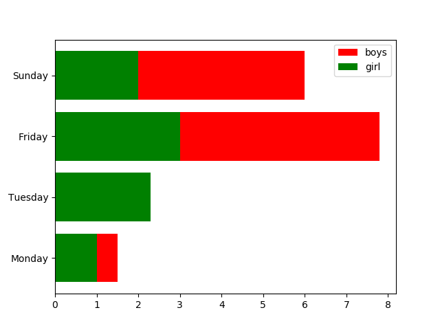
Horizontal bar chart
Change bar to barh
import matplotlib.pyplot as plt

name_list = ['Monday','Tuesday','Friday','Sunday']
num_list = [1.5,1.6,7.8,6]
num_list2 = [1,2.3,3,2]
plt.barh(range(len(num_list)),num_list, color = 'r',tick_label = name_list, label = 'boys')
plt.barh(range(len(num_list2)),num_list2, color = 'g',tick_label = name_list, label = 'girl')
plt.legend(loc='best')
plt.show()
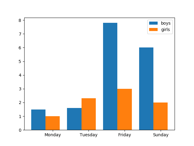
Parallel histogram
Note that the x starting point of the second histogram is the original base plus the corresponding width
import matplotlib.pyplot as plt

name_list = ['Monday','Tuesday','Friday','Sunday']
num_list = [1.5,1.6,7.8,6]
num_list2 = [1,2.3,3,2]
x = list(range(len(num_list)))
total_width = 0.8
n=2
width = total_width / n
plt.bar(x ,num_list ,width = width, label='boys')
for i in range(len(x)):
    x[i] = x[i] + width
plt.bar(x ,num_list2 ,width = width, label='girls',tick_label = name_list)
plt.legend(loc='best')
plt.show()
Pie chart
Concept:
A pie chart shows the ratio of the size of items in a series to the sum of the total items
Pie chart can automatically draw pie according to the percentage of data
Basic syntax for drawing pie charts:
Create a pie chart of array X. the area of each seven stars is determined by x/sum(x);
If sun (x) < 1, the X array will not be standardized, and the x value is the area proportion of the wedge area. Note: this situation will result in an empty wedge of 1-sum(x).
If sum (x) is more than 1, then x[i]/sum(x) calculates the proportion of each wedge, and the 360 ° area of pie chart is filled.
pie
pie(x, explode=None, labels=None, colors=None, autopct=None, pctdistance=0.6, shadow=False, labeldistance=1.1, startangle=None, radius=None, counterclock=True, wedgeprops=None, textprops=None, center=(0, 0), frame=False, rotatelabels=False, *, data=None)
Parameter details:
x: If sum (x) > 1, sum (x) will be normalized
Expand: distance from each block to the center, a list or array
labels: list, optional, default, None; label each wedge
Color: array like, optional, default, None; if not, use the color in current, active cycle.
autopct: controls the percentage setting in pie chart. You can use format string or format function: integer ('% d%%'), floating point ('% 1.3f%%'), string ('% s%%'), function
label distance: float, optional, default: 1.1; the scale of label mark relative to radius is 1.1 by default, if less than 1, it will be drawn on the inside of pie chart;
pctdistance: float, optional, default: 0.6; similar to label distance specifying the position scale of autopct, the default is 0.6;
shadow: bool, optional, default: False; True
startangle: float, optional, default: None; the default drawing angle is from the positive direction of x-axis to the counterclockwise direction, such as setting = 90, from the positive direction of y-axis
Radius:float, optional, default:None; the radius of the pie chart. If it is None, the default is 1
Counter clock: float, optional, default: None; specify fraction direction, counter clockwise (True) or clockwise
Wedgeprops: dict,optional,default:None; describes the width value of the wedge boundary line. The parameter form 'wedgeprops = {' linewidth ': 3}' the width of the wedge boundary line is 3
textprops: dict,optional,default:None; dictionary parameters passed to text objects
Center: list of float,optional,default:(0,0); the center of the icon is, default (0,0), or two scalar sequences (sequence of 2 scalars)
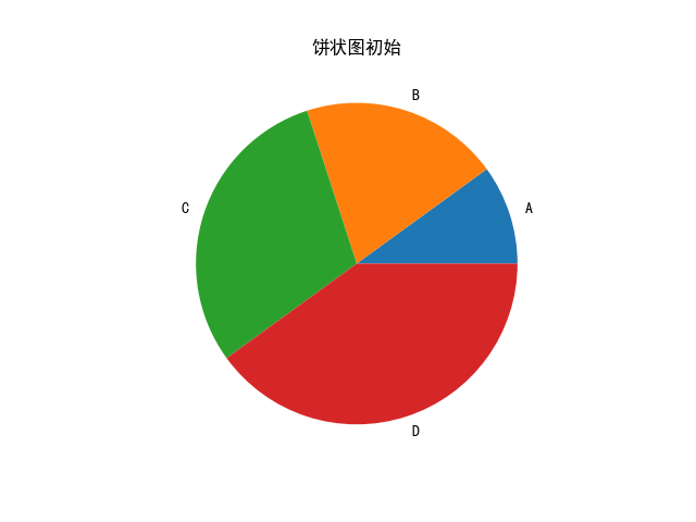
Pie chart practice
import matplotlib.pyplot as plt

plt.rcParams['font.sans-serif'] = ['SimHei']  # Used to display Chinese labels normally

labels = 'A','B','C','D'
sizes = [10,20,30,40]

plt.pie(sizes,labels = labels)
plt.title('Pie initial')
plt.show()
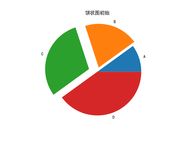
Expand parameter: distance from pie chart to center, default is 0
import matplotlib.pyplot as plt

plt.rcParams['font.sans-serif'] = ['SimHei']  # Used to display Chinese labels normally

labels = 'A','B','C','D'
sizes = [10,20,30,40]
explode = (0,0.1,0.2,0)
plt.pie(sizes,labels = labels,explode = explode)
plt.title('Pie initial')
plt.show()
Color: array, optional parameter, default: None; used to mark the sequence of matplotlib color parameters of each pie chart.
import matplotlib.pyplot as plt

plt.rcParams['font.sans-serif'] = ['SimHei']  # Used to display Chinese labels normally

labels = 'A','B','C','D'
sizes = [10,20,30,40]
explode = (0,0.1,0.2,0)
color = ['r','g','b','y']
plt.pie(sizes,labels = labels,explode = explode,colors=color)
plt.title('Pie initial')
plt.show()

autopct: controls the setting of percentage in pie chart. You can use format string or format function;
import matplotlib.pyplot as plt

plt.rcParams['font.sans-serif'] = ['SimHei']  # Used to display Chinese labels normally

labels = 'A','B','C','D'
sizes = [10,20,30,40]
explode = (0,0.1,0.2,0)
color = ['r','g','b','y']
# plt.pie(sizes,labels = labels,explode = explode,colors=color,autopct = '%1.1f') # Percentage not present
plt.pie(sizes,labels = labels,explode = explode,colors=color,autopct = '%1.1f%%') # Percentage of occurrence
plt.title('Pie initial')
plt.show()
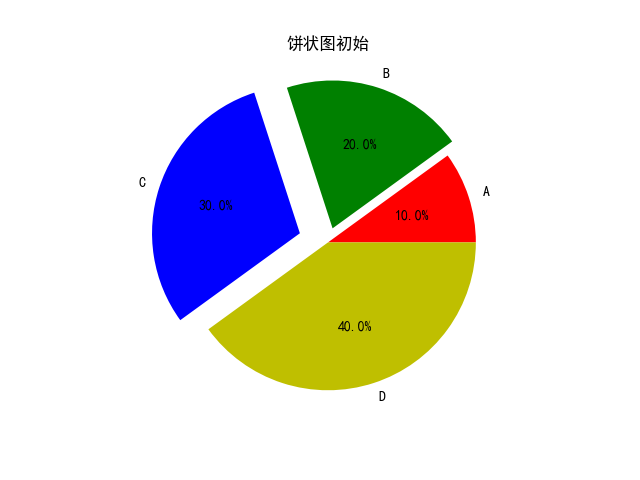
x: The proportion of each pie chart is required. If sum (x) > 1, the extra part will be evenly divided
import matplotlib.pyplot as plt

plt.rcParams['font.sans-serif'] = ['SimHei']  # Used to display Chinese labels normally

labels = 'A','B','C','D'
sizes = [0.1,0.2,0.3,0.2]
explode = (0,0.1,0.2,0)
color = ['r','g','b','y']
plt.pie(sizes,labels = labels,explode = explode,colors=color,autopct = '%1.1f%%')
plt.title('Pie initial')
plt.show()
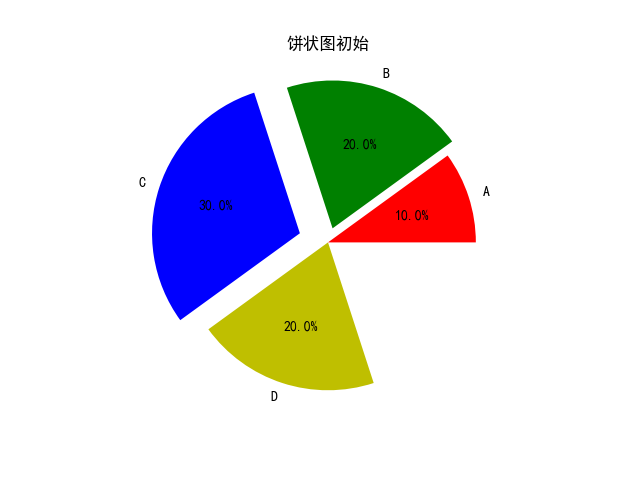
import matplotlib.pyplot as plt

plt.rcParams['font.sans-serif'] = ['SimHei']  # Used to display Chinese labels normally

labels = 'A','B','C','D'
sizes = [0.1,0.2,0.3,0.7]
explode = (0,0.1,0.2,0)
color = ['r','g','b','y']
plt.pie(sizes,labels = labels,explode = explode,colors=color,autopct = '%1.1f%%')
plt.title('Pie initial')
plt.show()
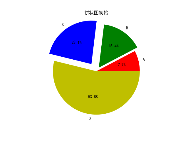
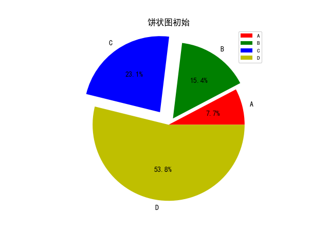
Add legend: plt.legend()
import matplotlib.pyplot as plt

plt.rcParams['font.sans-serif'] = ['SimHei']  # Used to display Chinese labels normally

labels = 'A','B','C','D'
sizes = [0.1,0.2,0.3,0.7]
explode = (0,0.1,0.2,0)
color = ['r','g','b','y']
plt.pie(sizes,labels = labels,explode = explode,colors=color,autopct = '%1.1f%%')
plt.title('Pie initial')
plt.legend(loc='best')
plt.show()
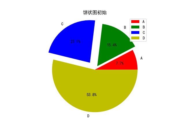
Beautify:
import matplotlib.pyplot as plt

plt.rcParams['font.sans-serif'] = ['SimHei']  # Used to display Chinese labels normally

labels = 'A','B','C','D'
sizes = [0.1,0.2,0.3,0.7]
explode = (0,0.1,0.2,0)
color = ['r','g','b','y']
plt.pie(sizes,labels = labels,explode = explode,colors=color,autopct = '%1.1f%%')
plt.title('Pie initial')
plt.legend(loc='upper right',fontsize=8,borderaxespad=0.3)
plt.show()
If you want to get more information about python, and want to play the python applet, you can focus on the WeChat public address (dreamspy). Let's use Python to change the world and create dreams together.

