Media Query
- If you've used the bootstrap framework, you should be familiar with media queries!(Link to bootstrap: bootstrap Chinese Network)
- Volume queries are CSS styles that can be set based on the characteristics of the device's display (viewport width, screen scale, device orientation - horizontal or vertical, etc.)
- Why does responsive design require media queries?Because there is no media query module for CSS3, specific CSS styles cannot be set for device characteristics, especially viewport width.
    }
/* Apply parentheses when screen size is greater than or equal to 480 */
    @media screen and (min-width: 480px) {
        body {
            background-color: lightgreen;
        }
        .header{
            display: block;
        }
    }
    /* Maximum
        When less than or equal to 900
     */
    @media screen and (max-width:900px){
        body{
            background-color: skyblue;
        }
    }
- Media queries are in the last few lines of bootstrap's css style, in short, to accommodate different screen sizes, consider using media queries.
- Points of Attention
- Spaces are required between keywords and keywords, at least one, and many.
- If the grammar in the two media query blocks overlaps, the bottom one overrides the top one.
- If you want your own handwritten media queries to complete the page layout, you can imagine writing a lot of css.
Left Fixed Width-Right Adaptive Layout
- When making mobile pages, especially for subscription apps, we often see a layout with a fixed navigation bar on the left and a content bar sliding up and down on the right, which is also the most common layout. Let's not think about that complexity for now. First, think about how we can achieve this layout?
Mode 1: padding + positioning on the leftmost side
<!DOCTYPE html>
<html lang="en">
<head>
    <meta charset="UTF-8">
    <title>Document</title>
    <style type="text/css">
        .container{
            border: 1px solid #0094ff;
            padding-left: 100px;
            position: relative;
            width: 100%;

            box-sizing: border-box;
        }
        .left{
            width: 100px;
            height: 100px;
            border: 1px solid green;
            position: absolute;

            /* Position to the far left */
            left: 0px;
            top: 0px;
        }
        .right{
            border: 1px solid red;
        }
    </style>
</head>
<body>
<h1>padding Method implementation</h1>
    <div class="container">
        <div class='left'></div>
        <div class="right">Lorem ipsum dolor sit amet, consectetur adipisicing elit, sed do eiusmod
        tempor incididunt ut labore et dolore magna aliqua. Ut enim ad minim veniam,
        quis nostrud exercitation ullamco laboris nisi ut aliquip ex ea commodo
        consequat. Duis aute irure dolor in reprehenderit in voluptate velit esse
        cillum dolore eu fugiat nulla pariatur. Excepteur sint occaecat cupidatat non
        proident, sunt in culpa qui officia deserunt mollit anim id est laborum.</div>
    </div>
</body>
</html>
Mode 2: Floating
<!DOCTYPE html>
<html lang="en">
<head>
    <meta charset="UTF-8">
    <title>Document</title>
    <style type="text/css">
        .container{
            border: 1px solid #0094ff;
        }
        .left{
            width: 100px;
            height: 100px;
            border: 1px solid #0094ff;
            float: left;
        }
        .right{
            overflow: hidden;
        }
    </style>
</head>
<body>
<h1>Layout by floating</h1>
    <div class="container">
        <div class="left"></div>
        <div class="right">Lorem ipsum dolor sit amet, consectetur adipisicing elit, sed do eiusmod
        tempor incididunt ut labore et dolore magna aliqua. Ut enim ad minim veniam,
        quis nostrud exercitation ullamco laboris nisi ut aliquip ex ea commodo
        consequat. Duis aute irure dolor in reprehenderit in voluptate velit esse
        cillum dolore eu fugiat nulla pariatur. Excepteur sint occaecat cupidatat non
        proident, sunt in culpa qui officia deserunt mollit anim id est laborum.</div>
    </div>
</body>
</html>
Other ways
In fact, there are many ways (flex, etc.) to achieve this, we will not introduce them here, you can see here: Other ways to achieve left-fixed-width-right adaptive layout
Introduction to zepto
- zepto.js covers basic functions, such as css, chain programming, and so on. The syntax is basically the same as jq.
- event.js needs to import this module if you want to bind events.
- The principle that fx.js can be added to use the animate method is to encapsulate transitions.
- Use Note: The syntax is highly similar to jq, and different packages need to be imported as required.
Points to note at the moving end
Design Draft
- Usually after you get the design draft, it will be divided into 640 and 750 folders, each of which will be artificially divided into 10/20/30, and so on.
- eg: Calculate rem scale value and font-size of html to set:
- For example, 20 folders in a 640 folder have a ratio of 640/20=30px; font-size in the set html is 32px; if you want to set the height of a container to 128px, the scale calculation is 128px/32px=4, then height:4rem (rem in this case is font-size font in html)Size value).
- This takes a screen width of 640, and if it's 320 (or 20, for example), what you need to change is html font-size: custom media query: @media screen and (width:320px){html{font-size:16px;}}
- 640 Design Draft: To facilitate calculating the font size of the rem top node, the screen is generally divided into equal parts, such as 10 copies, 640/10=64 copies;
- Design draft set html font size: 64px; then 120px container height in 640 design draft: 120px/64rem.
Font Icon
- Artists usually give us good icons (svg format), and we need to convert them into font icons.Convert font icons: Font icon conversion
- Custom font icon:
<!DOCTYPE html>
<html lang="en">
<head>
    <meta charset="UTF-8">
    <title>Document</title>
    <style type="text/css">
        @font-face {
              font-family: 'icomoon';
              src:  url('fonts/icomoon.eot?152edk');
              src:  url('fonts/icomoon.eot?152edk#iefix') format('embedded-opentype'),
                url('fonts/icomoon.ttf?152edk') format('truetype'),
                url('fonts/icomoon.woff?152edk') format('woff'),
                url('fonts/icomoon.svg?152edk#icomoon') format('svg');
              font-weight: normal;
              font-style: normal;
            }

            [class^="icon-"], [class*=" icon-"] {
              /* use !important to prevent issues with browser extensions that change fonts */
              font-family: 'icomoon' !important;
              speak: none;
              font-style: normal;
              font-weight: normal;
              font-variant: normal;
              text-transform: none;
              line-height: 1;

              /* Better Font Rendering =========== */
              -webkit-font-smoothing: antialiased;
              -moz-osx-font-smoothing: grayscale;
            }

            .icon-add-test:before {
              content: "\e900";
            }
            .icon-cancle-heima:before {
              content: "\e901";
            }
            .icon-Hello:before {
              content: "\e902";
            }
            .icon-edit:before {
              content: "\e903";
            }
            .icon-preview:before {
              content: "\e904";
            }
            .icon-share:before {
              content: "\e905";
            }
            .icon-time:before {
              content: "\e906";
            }

            span{
              display: block;
              width:10px;
              height:10px;
            }

    </style>
</head>
<body>
    <span class='icon-add-test'></span>
    <div class='icon-Hello'></div>
</body>
</html>
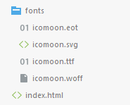
- The directory structure of the generated custom icons is as follows: (The fonts folder should also be brought to see it)
import keyword in less
- Multiple less files can be merged using import.
- Introduced in index.less: @import 'base.less';@import 'fon t.css'; so there are styles in base.css and fon t.css in index.css.
- More popular base.css files:
gitbook export book
- Install node.js
- Install gitbook using the command line
- windows+r input cmd carriage return
- npm install -g gitbook -cli
- Then you see some messy pages, normal
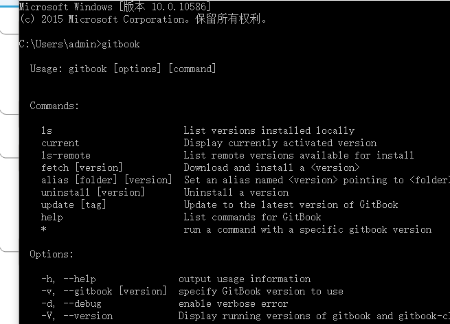
- After installation, type gitbook on the command line and see the following page to indicate that the installation was successful.
- Start exporting command line commands as follows
- cd to the folder of the book (just pull the folder in)
- The gitbook build is ready to export, and the exported files are in _book under the book directory
- Note: If you have the latest gitbook installed, you can't jump if the url uses file:xxx (you can install an older version of gitbook to solve this problem)
- Install older version: View version number - gitbook ls-remote, gitbook fetch version number, after installation you can view the installed version through gitbook LS
- Specify the version number when exporting: gitbook build --gitbook=version number
I don't know anything after reading it. Welcome to leave a message for consultation.