I. Mobile End Foundation
0x1 Viewport
1, introduction
viewport on mobile devices refers to the screen of the device that can be used to display the network.
In general, viewport s on mobile devices are larger than browsing pages.
Visual area of the device.
2, usage
<meta name="viewport" content="width=device-width,
initial-scale=1.0, maximum-scale=1.0, user-scalable=0">
//attribute
width : Set up layout viewport Width, value is a positive integer, or string"width-device"
height: Set up layout viewport Height, which is rarely used
initial-scale: Set the page initial zoom value, which is a number, can be decimal
minimum-scale : Set the minimum page zoom value, which is a number, can be decimal
maximum-scale : Set the maximum page zoom value, which is a number, can be decimal
user-scalable : Whether the user is allowed to zoom, the value is"no"or"yes"
0x2 CSS Metric Unit
| Company | Explain | Compatibility |
|---|---|---|
| em | A unit of relative length that varies according to the size of the parent element relative to the font size of the text in the current object | good |
| rem | The relative length unit, relative to the multiple of font-size of the following element (html element), is not affected by its parent element. | IE9+, Firefox 3.6+, Safari 5.0+ |
| vw | Relative to the width of the viewport, the viewport is divided into 100 units of vw | High version browsers are supported |
| vh | Relative to the width of the viewport, the viewport is divided into 100 units of vh | High version browsers are supported |
Details move here Click to view
2. Responsive Layout
0x1 Responsive Layout (@media)
Advantage:
- Set different styles for different screen sizes
- Responsive Layout Solves the Problem of Different Screen Sizes of Mobile Devices
- Flexibility for different resolution devices
- It can quickly solve the problem of multi-device display adaptation.
Disadvantages:
- Compatible with all kinds of equipment, heavy workload and low efficiency
- Code burdensome, there will be hidden useless elements, longer loading time
- It is a compromise design solution, which is influenced by many factors and can not achieve the best results.
0x2 Media Query
Writing:
@media mediatype and|not|only  (media feature) {
    //and not only
    CSS-Code;
}

//Different stylesheets can also be used for different media:
<link rel="stylesheet" media="mediatype and|not|only (media feature)"
href="mystylesheet.css">
Understanding: Media query is one of the methods of responsive layout, which extends the Media attribute.
Function: Make web pages suitable for various devices (provide different styles for different devices).
Core: When the screen changes to a certain size, the module style settings in the page change.
media feature:
- max-width: Defines the maximum visible area width of the page in the output device.
- min-width: Defines the minimum visible area width of the page in the output device.
0x3 Practical @media Case
Design sketch: 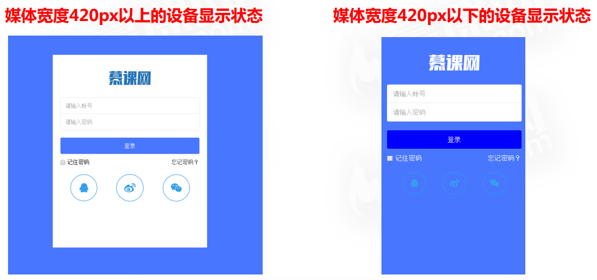
Demo
//CSS style
body,html{
background: #4876FF;
}
#wrapper{
width: 400px;
height: 500px;
position: absolute;
top: 50%;
left: 50%;
margin-left: -200px;
margin-top: -250px;
background: white;
overflow: hidden;
}
header{
width: 100%;
height: 91px;
display: -webkit-box;
-webkit-box-pack: center;
}
header img{
position: relative;
top: -30px;
}
.count{
width: 100%;
margin-top: 20px;
}
.count form{
width: 90%;
display: -webkit-box;
-webkit-box-orient: vertical;
margin: 0 auto;
}
.count form input{
display: block;
padding: 13px;
border: 0;
box-shadow: 0 0 1px #999999;
}
.count form input:first-child{
border-radius: 3px 3px 0 0;
}
.count form input:nth-child(2){
border-radius: 0 0 3px 3px;
}
.count form input:nth-child(3){
margin-top: 20px;
background: #4876FF;
color: white;
border-radius: 3px;
}
.count div{
width: 90%;
margin: 10px auto;
display: -webkit-box;
-webkit-box-pack: justify;
}
.count div span{
display: block;
color: black;
}
footer{
width: 100%;
}
footer ul{
width: 100%;
display: -webkit-box;
-webkit-box-pack: center;
}
footer ul li{
display: -webkit-box;
}
footer ul li a{
display: block;
}
footer ul li a img{
display: block;
width: 60%;
margin: 10px auto;
}
@media screen and (max-width:420px ){
#wrapper{
width: 100%;
height: 100%;
position: absolute;
top: 0;
left: 0;
margin: 0;
background: #4876FF;
overflow: hidden;
}
header{
width: 100%;
height: 91px;
display: -webkit-box;
-webkit-box-pack: center;
overflow: hidden;
}
header img{
position: relative;
top: 31px;
}
.count form input:nth-child(3){
margin-top: 20px;
background:blue;
color: white;
border-radius: 3px;
}
.count div span{
display: block;
color: white;
}
.count div span a{
color: white;
}
footer{
width: 90%;
margin:auto;
}
footer ul{
width: 100%;
display: -webkit-box;
-webkit-box-pack: center;
}
footer ul li{
display: -webkit-box;
width:30%;
}
}
//HTML
<body>
<div id="wrapper">
<header><img src="img/1a.png" /></header>
<article class="count">
<form>
<input type="text" placeholder="Please enter your account number" />
<input type="password" placeholder="Please input a password" />
<input type="submit" value="Sign in"/>
</form>
<div>
<span>
<label>
<input type="checkbox" /> Remember password
</label>
</span>
<span>
<a href="#">Forget the password?</a>
</span>
</div>
</article>
<footer>
<ul>
<li><a href="#"><img src="img/2.png"/></a></li>
<li><a href="#"><img src="img/3.png"/></a></li>
<li><a href="#"><img src="img/4.png"/></a></li>
</ul>
</footer>
</div>
</body>A more comprehensive reset.css is attached below.
/**
 * Eric Meyer's Reset CSS v2.0 (http://meyerweb.com/eric/tools/css/reset/)
 * http://cssreset.com
 */
html, body, div, span, applet, object, iframe,
h1, h2, h3, h4, h5, h6, p, blockquote, pre,
a, abbr, acronym, address, big, cite, code,
del, dfn, em, img, ins, kbd, q, s, samp,
small, strike, strong, sub, sup, tt, var,
b, u, i, center,
dl, dt, dd, ol, ul, li,
fieldset, form, label, legend,
table, caption, tbody, tfoot, thead, tr, th, td,
article, aside, canvas, details, embed,
figure, figcaption, footer, header, hgroup,
menu, nav, output, ruby, section, summary,
time, mark, audio, video {
    margin: 0;
    padding: 0;
    border: 0;
    font-size: 100%;
    font: inherit;
    vertical-align: baseline;
}
/* HTML5 display-role reset for older browsers */
article, aside, details, figcaption, figure,
footer, header, hgroup, menu, nav, section {
    display: block;
}
html {
    height:100% !important;
    min-height:100% !important;
}
body {
    margin:0;
    padding:0;
    height:100%;
    min-height:100%;
    width:100%;
    background: #FFFFFF;
    font: 14px/22px "ralewayregular", Helvetica Neue, Helvetica, Arial, sans-serif;
    color: #888888;
    -webkit-font-smoothing: antialiased; /* Fix for webkit rendering */
    -webkit-text-size-adjust: 100%;
    letter-spacing:0.5px;
}

ol, ul {
    list-style: none;
}
nav ul {
    list-style:none;
}
li{
    list-style:none;
}
blockquote, q {
    quotes: none;
}
blockquote:before, blockquote:after,
q:before, q:after {
    content: '';
    content: none;
}
a {
    margin:0;
    padding:0;
    font-size:100%;
    vertical-align:baseline;
    background:transparent;
    text-decoration:none;
    outline:none;
    color: #333;
}
a:hover{
    cursor:pointer;
}

/* change colours to suit your needs */
mark {
    background-color:#ff9;
    color:#000;
    font-style:italic;
    font-weight:bold;
}

del {
    text-decoration: line-through;
}

abbr[title], dfn[title] {
    border-bottom:1px dotted;
    cursor:help;
}

table {
    border-collapse:collapse;
    border-spacing:0;
}

/* change border colour to suit your needs */
hr {
    display:block;
    height:1px;
    border:0;
    border-top:1px solid #cccccc;
    margin:1em 0;
    padding:0;
}


button,
input,
select,
textarea {
  margin: 0;
  font-size: 100%;
  vertical-align: middle;
}

button,
input {
  *overflow: visible;
  line-height: normal;
}

button::-moz-focus-inner,
input::-moz-focus-inner {
  padding: 0;
  border: 0;
}

button,
html input[type="button"],
input[type="reset"],
input[type="submit"] {
  cursor: pointer;
  -webkit-appearance: button;
}

label,
select,
button,
input[type="button"],
input[type="reset"],
input[type="submit"],
input[type="radio"],
input[type="checkbox"] {
  cursor: pointer;
}

input[type="search"] {
  -webkit-box-sizing: content-box;
     -moz-box-sizing: content-box;
          box-sizing: content-box;
  -webkit-appearance: textfield;
}

input[type="search"]::-webkit-search-decoration,
input[type="search"]::-webkit-search-cancel-button {
  -webkit-appearance: none;
}

textarea {
  overflow: auto;
  vertical-align: top;
}
.outline[type=text]:focus,.outline[type=submit]:focus,
.outline[type=radio]:focus,.outline[type=checkbox]:focus,.outline[type=password]:focus,button:focus{
    outline:none;
}

input[type=text]:focus,input[type=submit]:focus,
input[type=radio]:focus,input[type=checkbox]:focus,input[type=password]:focus{
    outline:none;
}
button[type=button]:focus,button[type=submit]:focus,
input[type=reset]:focus{
    outline:none;
}
.ch{display: none;}