rem unit:
rem (root em) is a relative unit, similar to em, which is the font size of the parent element.
The difference is that the benchmark of rem is the font size relative to html elements.
For example, if the root element (html) is set to font size = 12px and the non root element is set to width: 2rem, it will be converted to PX, which means 24px.
Media query
Using @ media query, you can define different styles for different media types
@media can set different styles for different screen sizes
When you resize the browser, the page will also be re rendered according to the width and height of the browser
At present, many apple phones, Android phones and flat light devices are used for multimedia query
The syntax is as follows:

Media query type
Dividing different terminal devices into different types is called media query
| value | interpretative statement |
|---|---|
| all | For all equipment |
| For printer and print preview | |
| scree | Used for computer screen, tablet, smartphone, etc |
grammatical norm
Keyword connects media types or multiple media properties together as a condition for media query
and: multiple media features can be connected together as conditions for media query
Not: excludes a media type, which means "not" and can be omitted
only: specifies a specific media type, which can be omitted
Note: in order to prevent confusion, we should write media queries from small to large or from large to small, but it is recommended to use from small to large, so that the code can be more concise
Introduce resources
When there are many styles, you can use different style sheets for different media
The original is to directly judge the size of the device in link, and then introduce different css files
Suggestion: introduce from small to large

Dynamically set the font size of html tag
- Assume that the design draft is 750px;
- Suppose we divide the whole screen into 15 equal parts (the division standard is different, it can be 20 or 10);
- Each copy is taken as the html font size, here is 50px (750 / 15);
- In the case of a 320px device, the font size of 320 / 15 is 21.33px;
- Dividing the size of our page elements by different html font sizes will find that their proportion is still the same;
- For example, we take 750px as the standard design draft;
- A page of 100100 pixels on the 750 screen, that is, 100 / 50 is converted to rem, and the ratio of rem to rem is 1:1;
- On screen 320, if the html font size is 21.33, then 2rem = 42.66px. At this time, the width and height are 42.66, but the width height ratio is still 1:1;
- Therefore, under different screens, the page element box can be scaled equally;
✨✨✨ Summary: page element rem calculation formula: (px / html font size of page element) ✨✨✨
💛💛💛 common.less here are some common device screen widths 💛💛💛
	//Take 750 design draft as an example

	html{
		font-size: 50px;
	    min-width:280px;
	    max-width: 750px;
	    margin: 0 auto;
	}

	//Divide the page into 15 equal parts
	@count:15;

	//Division requires parentheses
	@media screen and (min-width:280px) {
	    html{
	        font-size: (280px / @count);
	    }
	}
	@media screen and (min-width:320px) {
	    html{
	        font-size: (320px / @count);
	    }
	}
	@media screen and (min-width:360px) {
	    html{
	        font-size: (360px / @count);
	    }
	}
	@media screen and (min-width:375px) {
	    html{
	        font-size: (375px / @count);
	    }
	}
	@media screen and (min-width:384px) {
	    html{
	        font-size: (384px / @count);
	    }
	}
	@media screen and (min-width:400px) {
	    html{
	        font-size: (400px / @count);
	    }
	}
	@media screen and (min-width:414px) {
	    html{
	        font-size: (414px / @count);
	    }
	}
	@media screen and (min-width:424px) {
	    html{
	        font-size: (424px / @count);
	    }
	}
	@media screen and (min-width:480px) {
	    html{
	        font-size: (480px / @count);
	    }
	}
	@media screen and (min-width:540px) {
	    html{
	        font-size: (540px / @count);
	    }
	}
	@media screen and (min-width:720px) {
	    html{
	        font-size: (720px / @count);
	    }
	}
	@media screen and (min-width:750px) {
	    html{
	        font-size: (750px / @count);
	    }
	}
💛💛💛 home.less 💛💛💛
@import "./common.css";

// Calculation formula of page element rem: (px / html font size of page element)

@baseFont:50;  //The default font size is 50 (the default font size on the PC side is 50px, and the maximum page width is 750px)
.wrap-item {
    font-size: 1.25rem;
    height: (100rem / @baseFont);
    background: pink;
    text-align: center;
    color: #ffffff;
}
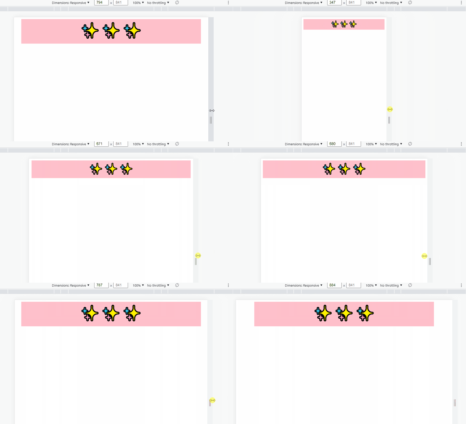
The demo is as follows:
