Layout! Layout! Layout! This article is still layout!!! The traditional layout method should be basically completed, and the basic use of elastic layout elements in CSS3 is also written. Although elastic layout is powerful, it is still a one-dimensional layout. Next, this paper will write a more powerful two-dimensional layout method.
Multi column layout
column-count
The column count attribute specifies the number of columns an element should be divided into.
If there is a long text, it is easy to achieve newspaper typesetting through this attribute.
<!DOCTYPE html>
<html>
<head>
    <meta charset="UTF-8">
    <title>Nostalgic newspaper typesetting</title>
    <style>
        .newspaper
        {
            -moz-column-count:4; /* Firefox */
            -webkit-column-count:4; /* Safari and Chrome */
            column-count:4;
        }
    </style>
</head>
<body>
    <div class="newspaper">
         When I jumped the queue, I fed pigs and let cattle go. If no one is in charge, the two animals know exactly how to live. They will wander freely, eat when hungry, drink when thirsty, and talk about love when spring comes; As a result, their living level is very low and completely lacking. When people came, they made arrangements for their lives: every cow and every pig had a theme. For most of them, this theme of life is very tragic: the former's theme is work, and the latter's theme is long meat. I don't think there was anything to complain about, because my life was not much richer at that time, and there was no entertainment except eight model plays. There are very few pigs and cattle, and their lives are arranged differently. Take pigs as an example. Breeding pigs and sows have other things to do besides eating. As far as I can see, they don't like these arrangements very much. The task of breeding pigs is to mate. In other words, our policy allows it to be a playboy. However, the tired breeding pigs often assume the posture of an upright man just like the pigs (the pigs are castrated) and refuse to jump onto the sow's back. Sow's task is to give birth, but some sows eat their piglets. Generally speaking, human arrangement makes pigs miserable. But they accepted: pigs are always pigs.
          It is one's unique character to make various settings for life. Not only set animals, but also set themselves. We know that there was a Spartan in ancient Greece, where life was set to be boring. Its purpose was to make men become desperate soldiers and women become reproductive machines. The former was like cockfighting and the latter was like sows. These two kinds of animals are very special, but I think they certainly don't like their life. But what if you don't like it? Neither man nor animal can change their fate.
          The pig mentioned below is somewhat different. When I fed the pig, it was four or five years old. In terms of rank, it was a meat pig, but it was black and thin with bright eyes. This guy is as agile as a goat. He can jump over a one meter high pigsty; It can also jump on the roof of the pigsty, which is like a cat - so it always wanders around and doesn't stay in the pigsty at all. All educated youth who have fed pigs treat them as pets, and they are also my pets - because they are only good to educated youth and allow them to walk within three meters. If anyone else, they would have run away. It's public. It should have been removed. But try it. Even if you hide the pig knife behind you, it can smell it, stare at you and roar. I always feed it with porridge made of fine rice bran. After it has had enough, I feed the bran to other pigs in the weeds. The other pigs looked jealous and shouted together. At this time, the whole pig farm was crying and howling, but he and I didn't care. When he is full, he jumps on the roof to bask in the sun or imitate all kinds of sounds. It can learn the sound of cars and tractors; Sometimes it can't be seen all day. I guess it went to the nearby village to find a sow. We also have sows here. They are all locked up in pens. They are deformed by excessive fertility. They are dirty and smelly. They are not interested in them; The sows in the village look better. It has many wonderful deeds, but I didn't write it because I had a short time feeding pigs and had limited knowledge. In a word, all educated youth who have fed pigs like it, like its maverick style, and say that it lives naturally. But the villagers are not so romantic. They say the pig is not serious. Leaders hate it, which will be discussed later. I don't just like it - I respect it. I often call it "brother pig" regardless of the reality that I have grown up into a teenager. As mentioned earlier, the pig can imitate all kinds of sounds. I think it has also learned to speak, but it has not learned - if it has learned, we can talk to each other. But it's not to blame. The timbre of people and pigs is too different.
          Later, brother pig learned to whistle, which brought him trouble. We have a sugar factory there. We have to whistle once at noon to change the shift of workers. When our team was working in the field, we heard the whistle and came back from work. At ten o'clock every morning, my brother pig always jumps to the room to go to school. The people in the field come back when they hear it - an hour and a half earlier than the whistle of the sugar factory. Frankly speaking, it's not all brother pig's fault. After all, it's not a boiler. It's still different from the whistle, but the villagers insist that they can't hear it. Therefore, the leadership held a meeting to identify it as a bad element undermining spring ploughing and to adopt dictatorship against it - I already know the spirit of the meeting, but I am not worried about it - because if dictatorship refers to ropes and pig killers, there is no door at all. Previous leaders have not tried, and a hundred people can't stop it. The dog is useless: brother pig runs like a torpedo and can hit the dog a foot away. Who knows, this time it was serious. The instructor took more than 20 people with 54 pistols; The Deputy instructor took more than a dozen people, armed with guns to watch the green, and chased it in the open space outside the pig farm in two ways. This makes me fall into an inner contradiction: according to my friendship with him, I should dance two pig knives and rush out to fight with him, but I think it's too shocking - he's a pig after all; There is another reason why I dare not confront leaders. I suspect that is the problem. Anyway, I'm watching. I admire brother pig's calmness: he calmly hides in the connection between pistol and musket, and allows people to shout and dog bite without leaving that line. In this way, the person with the pistol will shoot the person with the pistol, and vice versa; Fire on both ends at the same time, and both ends will be killed. As for it, because the goal is small, it's probably all right. After several rounds, it found a loophole and bumped out; Run very freely. Later, I saw it once in the sugarcane field. It grew tusks and knew me, but I was no longer allowed to come near. This indifference hurts me, but I also agree that it keeps a distance from people with evil intentions.
          I'm 40 years old. I've never seen anyone dare to ignore the settings of life except this pig. On the contrary, I have met many people who want to set up other people's lives, as well as those who are comfortable with the set life. For this reason, I always miss this maverick pig.
    </div>
</body>
</html>
The effect is:
column-rule
The column rule property sets the width, style, and color between columns.
Syntax:
column-rule: column-rule-width column-rule-style column-rule-color;
Add to the above code:
column-rule:15px solid lightgray;
The effect is
column-fill
The column fill attribute specifies how to fill the column. It has two values: balance and auto
- balance: the height of all columns is unified by the highest column
- auto, column height adaptive content.
Waterfall flow layout
<!DOCTYPE html>
<html lang="en">

<head>
    <meta charset="UTF-8">
    <title>Waterfall flow layout</title>
    <style type="text/css">
    </style>
</head>

<body>
    <div id="page">
        <div class="col">
            <div class="pic">
                <img src="img/1.png">
                <p>Eiffel Tower (French: La Tour Eiffel)The design is novel and unique. It is a technical masterpiece in the history of world architecture. Therefore, it has become an important scenic spot and prominent symbol in France and Paris.</p>
            </div>
            <div class="pic">
                <img src="img/2.png">
                <p>The Forbidden City in Beijing is the imperial palace of China's Ming and Qing Dynasties. Formerly known as the Forbidden City, it is known as the first of the five palaces in the world.</p>
            </div>
            <div class="pic">
                <img src="img/3.png">
                <p>The Forbidden City in Beijing is the imperial palace of China's Ming and Qing Dynasties. Formerly known as the Forbidden City, it is known as the first of the five palaces in the world.</p>
            </div>
            <div class="pic">
                <img src="img/4.png">
                <p>The Forbidden City in Beijing is the imperial palace of China's Ming and Qing Dynasties. Formerly known as the Forbidden City, it is known as the first of the five palaces in the world.</p>
            </div>
            <div class="pic">
                <img src="img/5.png">
                <p>The Forbidden City in Beijing is the imperial palace of China's Ming and Qing Dynasties. Formerly known as the Forbidden City, it is known as the first of the five palaces in the world.</p>
            </div>
            <div class="pic">
                <img src="img/6.png">
                <p>The Forbidden City in Beijing is the imperial palace of China's Ming and Qing Dynasties. Formerly known as the Forbidden City, it is known as the first of the five palaces in the world.</p>
            </div>
            <div class="pic">
                <img src="img/7.png">
                <p>The Forbidden City in Beijing is the imperial palace of China's Ming and Qing Dynasties. Formerly known as the Forbidden City, it is known as the first of the five palaces in the world.</p>
            </div>
            <div class="pic">
                <img src="img/8.png">
                <p>The Forbidden City in Beijing is the imperial palace of China's Ming and Qing Dynasties. Formerly known as the Forbidden City, it is known as the first of the five palaces in the world.</p>
            </div>
            <div class="pic">
                <img src="img/9.png">
                <p>The Forbidden City in Beijing is the imperial palace of China's Ming and Qing Dynasties. Formerly known as the Forbidden City, it is known as the first of the five palaces in the world.</p>
            </div>
            <div class="pic">
                <img src="img/10.png">
                <p>The Forbidden City in Beijing is the imperial palace of China's Ming and Qing Dynasties. Formerly known as the Forbidden City, it is known as the first of the five palaces in the world.</p>
            </div>

        </div>
    </div>
    </div>
</body>

</html>
The initial effect is:
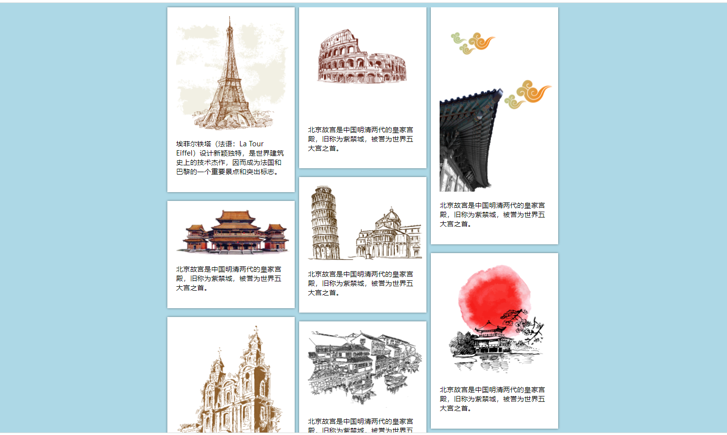
Next, add CSS styles:
        /*Add background color to body*/
        body {
            background-color: lightblue;
            margin: 10px;
        }

        /*Set width and center style for outer layer*/
        #page {
            width: 888px;
            margin: 0 auto;
        }

        /*Three column setting*/
        .col {
            column-count: 3;
            column-gap: 13px;
            column-fill: auto;
        }

        /* Border settings*/
        .pic {
            box-sizing: border-box;
            width: 290px;
            background: #FFF;
            padding: 20px;
            box-shadow: 0 0 5px rgba(0, 0, 0, .5);
            margin-bottom: 20px;
            display: inline-block;
        }
		/*Picture size adaptation*/
        .pic img {
            width: 260px;
        }
The final effect is:
grid layout
Grid layout is also called grid layout. Elastic box layout is a linear one-dimensional layout, while grid layout is a two-dimensional layout.
The following are the terms for grid layout:
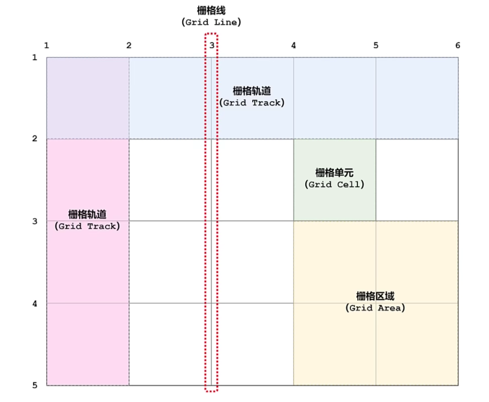
Setting the grid container is the same as setting the layout of the elastic box. When the display attribute of a block element is set to grid or inline grid, a grid container is created, and the elements in it are grid elements.
Grid template columns and grid template rows
The grid template columns property specifies the number (and width) of columns in the grid layout.
Grid template rows specifies the number of rows (and height) in the grid layout.
Initial code demonstration:
<!DOCTYPE html>
<html lang="en">
<head>
<meta charset="UTF-8">
<meta http-equiv="X-UA-Compatible" content="IE=edge">
<meta name="viewport" content="width=device-width, initial-scale=1.0">
<title>demonstration</title>
<style>
.grid-container{
display: grid;
padding: 10px;
height: 600px;
background-color: lightblue;
}
.grid-container > div{
text-align: center;
padding: 10px;
border: 1px solid white;
background-color: pink;
}
</style>
</head>
<body>
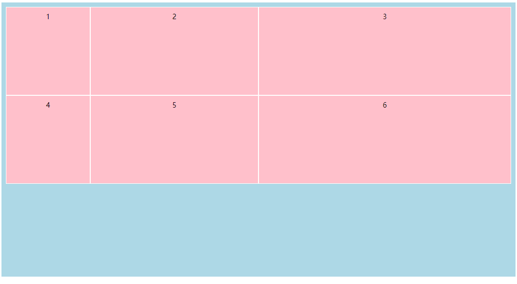
<div class="grid-container">
<div>1</div>
<div>2</div>
<div>3</div>
<div>4</div>
<div>5</div>
<div>6</div>
</div>
</body>
</html>
effect:
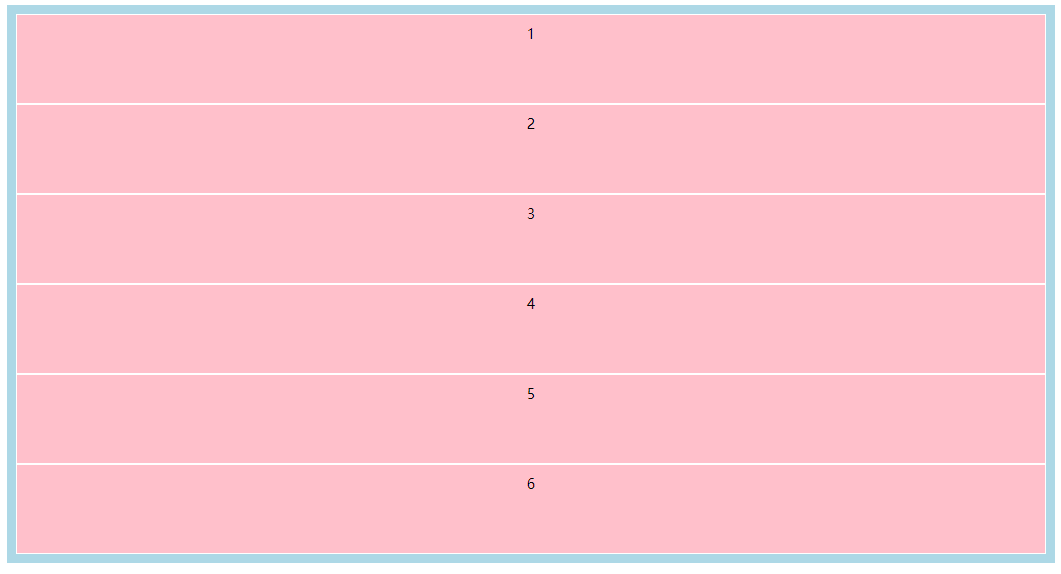
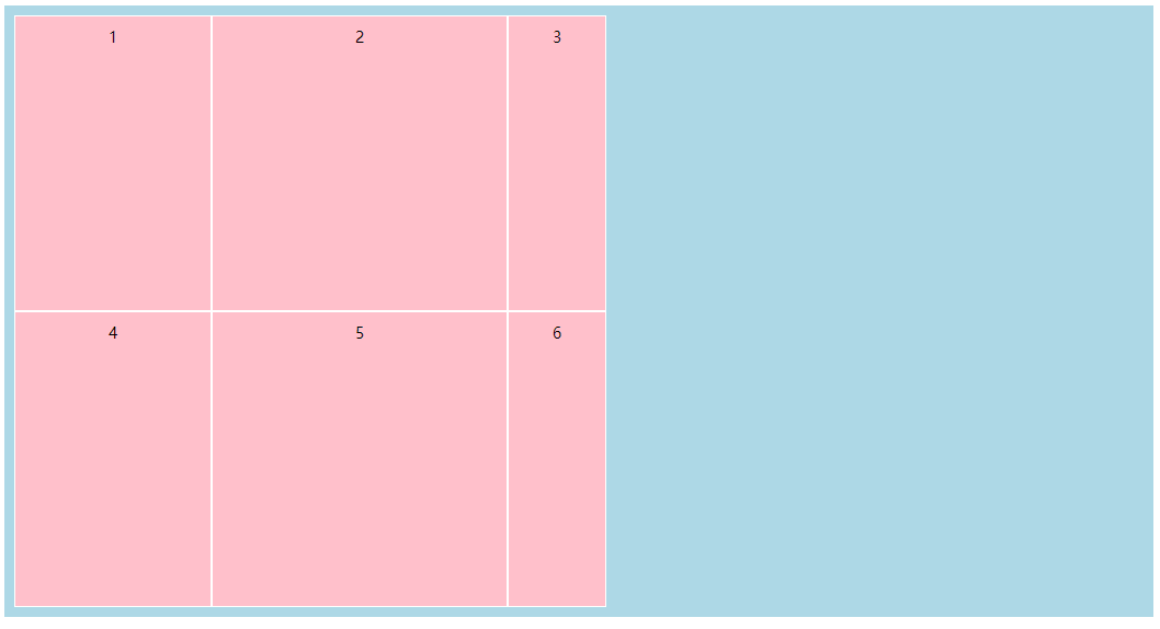
Next, add code to the parent box grid container:
grid-template-columns: 200px 300px 100px;
The effect is:
If you want to divide equally and adaptively fill the parent box, you can set it through the fr keyword learned earlier:
grid-template-columns: 1fr 2fr 3fr;
The effect is:
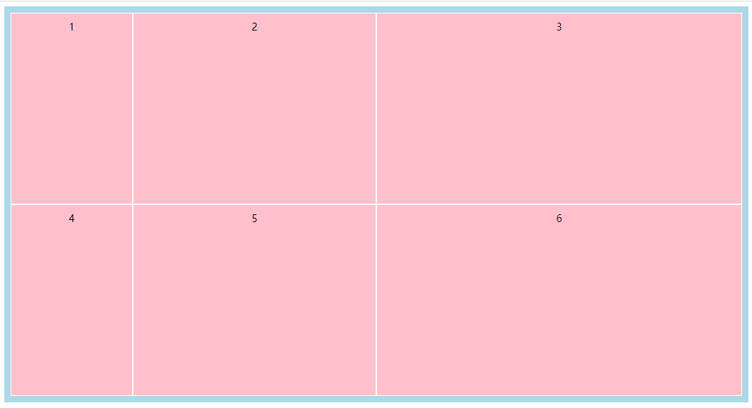
grid-template-rows: 1fr 1fr 1fr;
If there is no content, it will be displayed in the color of the parent box.
grid-template-areas
Here comes the awesome place!!!!
The grid layout not only allows you to define templates for rows and columns separately, but also define templates according to area units.
The grid template areas attribute needs to be used in conjunction with the grid area attribute of grid elements. First, use the grid area attribute to name different categories of elements, and then use the grid template areas attribute to make a layout as a whole.
For example:
<style>
    .item1{ grid-area: header; }
    .item2{ grid-area: nav; }
    .item3{ grid-area: main; }
    .item4{ grid-area: aside; }
    .item5{ grid-area: footer; }
    .grid-container {
        display: grid;
        grid-template-areas:
            'header header   header  header   header   header'
            'nav    main     main    main     main     aside'
            'nav    footer   footer  footer   footer   footer';
        grid-gap: 10px;
        padding: 10px;
        background-color: lightblue;
    }

    .grid-container>* {
        background-color: pink;
        text-align: center;
        padding: 20px 0;
        font-size: 30px;
    }
</style>

<body>
  <div class="grid-container">
    <header class="item1">Header</header>
    <nav class="item2">Nav</nav>
    <mian class="item3">
      <section>Section 1</section>
      <section>Section 2</section>
      <section>Section 3</section>
      <section>Section 4</section>
      <section>Section 5</section>
    </mian>
    <aside class="item4">Aside</aside>
    <footer class="item5">Footer</footer>
  </div>
</body>
The effect is:
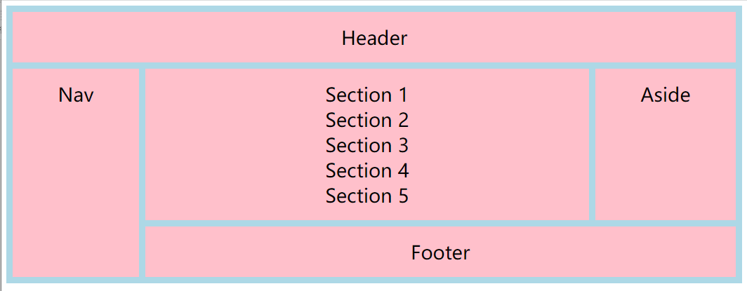
Isn't it amazing!
There are two points to note when using grid template areas:
- Each row in the grid needs to be defined by a single string. It can't be said that multiple strings are combined into one.
For example:
           grid-template-areas:
               'header header header header header header
                nav main main main main aside
                nav footer footer footer footer footer';
- After setting the cell name, the browser will merge adjacent cells with the same name into a region. The shape of the region must be rectangular at present
antic
If you want to leave an area blank, you can use one or more point numbers. For example:
 grid-template-areas:
                'nav  header header header header aside'
                'nav  ...   main    main    ...   aside'
                'nav  footer footer  footer  ...  aside';
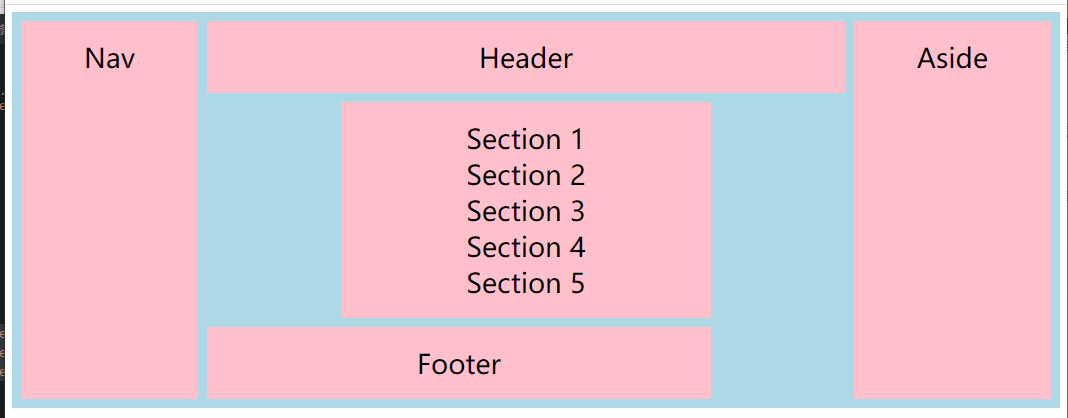
grid-template
Grid template is the abbreviation of grid template areas, grid template columns and grid template rows;
            grid-template:
               'header header header header aside' 80px
               'nav    main   main   main   aside' 250px
               'nav    footer footer footer aside' 300px
               /200px  1fr    1fr    1fr    100px;
The effect is: 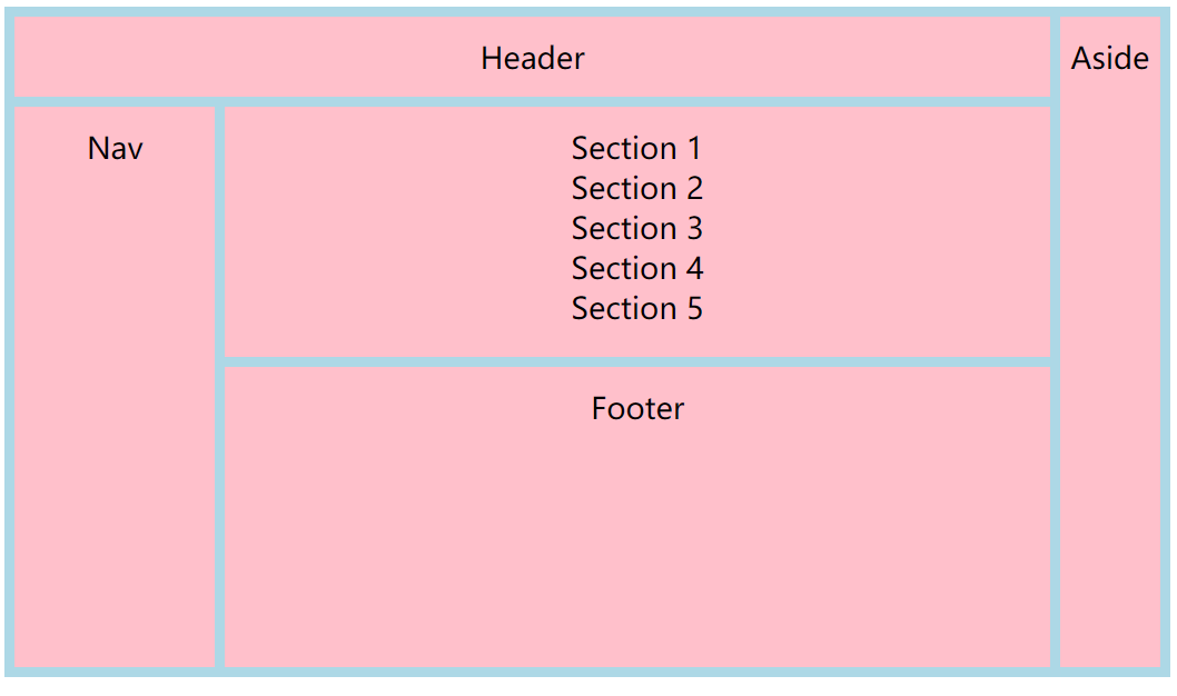
grid-gap
Grid gap is a combination of grid column gap and grid row gap attributes.
- The grid column gap attribute specifies the spacing between columns;
- The grid row gap property specifies the spacing between rows.
grid-gap: 10px 20px;
The first value is the spacing of rows, and the second value is the spacing of columns.
Grid layout alignment
In grid layout, alignment also uses the attributes in elastic box layout. The distribution is justify content, justify items, justify self, align content, align items and align self.
justify-content
Justify content specifies the horizontal alignment of grid elements in the grid layout
align-content
Align content specifies the vertical alignment of grid layout. You need to set a height for grid layout settings to see obvious effects.
align-items
The align items attribute is the same as the justify items attribute, except that the direction of the align items attribute changes from horizontal to vertical.
Justify self and align self
Justify items and align items set the contents of a single grid element.
Place content, place items, and place self
- The place content attribute is equivalent to setting the align content and justify content attributes at the same time.
- The place items attribute is to set the align items and justify items attributes at the same time.
- The place self attribute is to set the align self and jusitfy self attributes at the same time.