preface
Some time ago, various samples were clustered, and it was found that there were many dimensions, which were difficult to express clearly in binary graphics visualization. Therefore, some commonly used visualization methods are summarized, that is to reduce the dimension of data and depict the characteristics of each sample in a two-dimensional graph.
case
Background:
A game company collects the behavior data and attributes of each player. After processing, the data set is as follows:
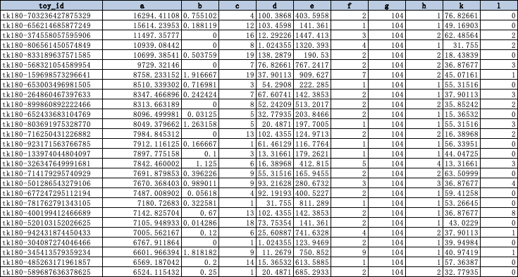
toy_id is the unique identification id of each player user, and a-l is the characteristic information processed to represent the player's attributes.
We use statistical chart analysis + unsupervised learning to divide the N players into x clusters.
By the way, share the code of DBSCN model and k-protocols to facilitate clustering in the future 😄
*Note that continuous variables should eliminate dimensional effects
k-prototypes:
Continuous variable + classified variable (Euclidean distance + Hamming distance)
"""
k-prototypes
"""
from IPython.core.interactiveshell import InteractiveShell
InteractiveShell.ast_node_interactivity = "all"
%matplotlib inline
import pandas as pd
import numpy as np
from sklearn import preprocessing
from sklearn.cluster import KMeans
from sklearn.cluster import MiniBatchKMeans
from yellowbrick.cluster import KElbowVisualizer
from yellowbrick.cluster import SilhouetteVisualizer
from yellowbrick.cluster import InterclusterDistance
from yellowbrick.model_selection import LearningCurve
import matplotlib.pyplot as plt
import seaborn as sns
sns.set_style("whitegrid")
sns.set_context("notebook")
import numpy as np
import pandas as pd
from kmodes.kprototypes import KPrototypes
%matplotlib inline
import matplotlib.pyplot as plt
import seaborn as sns


"""
Normalization is used to deal with problems with different dimensions. This case is not applicable
"""
def minmax(calc_case):
    min_max_scaler = MinMaxScaler()
    x_scaled = min_max_scaler.fit_transform(calc_case)
    X_scaled = pd.DataFrame(x_scaled,columns=calc_case.columns)
    return X_scaled

def data_clean(data, key=None, strlist=None, numlist=None):
    data = data.fillna(0)
    for s in strlist:
        data[s] = data[s].astype(str)
    temp = data[[key]+strlist]
    temp2 = data[numlist]
    clean = pd.concat([temp,minmax(temp2)],axis=1)
    return clean


def elbow_method(X,k=None,categorical=None):
    X2 = X[X.columns.values[1:]]
    X_matrix = X2.values
    cost = []
    for num_clusters in list(range(1,k)):
        kproto = KPrototypes(n_clusters=num_clusters, init='Cao')
        kproto.fit_predict(X_matrix, categorical=categorical)
        tl = []
        tl.append(num_clusters)
        tl.append(kproto.cost_)
        cost.append(tl)
    cost = pd.DataFrame(cost,columns=['num_clusters','MSE'])
    beauty_plot(cost, 'MSE', date='num_clusters', marker='*',name='elbow_method-MSE',color=['navy'])
#     pd.DataFrame(cost)

def beauty_plot(para, *value, date=None, marker=None,name=None,color=None):
    plt.figure(figsize=(16,9))
#     plt.ylim(0,2000000)
    plt.xticks(fontsize=14)
    plt.yticks(fontsize=14)
    #y-axis canceling scientific counting method
    x_formatter = matplotlib.ticker.ScalarFormatter(useOffset=False)
    x_formatter.set_scientific(False)
    plt.gca().yaxis.set_major_formatter(x_formatter)
    temp = para.sort_values(by=date)
    x = temp[date]
    y1 = temp[value[0]]
#     y2 = temp[value[1]]
#     y3 = temp[value[2]]
#     y2 = temp[value[1]]
    plt.xlabel(date)
    plt.ylabel(name)
    plt.title(name)
    plt.xticks(rotation=45)
#     plt.annotate('max', xy=(a, b), xytext=(a+relativedelta(days=2), b*1.1),arrowprops=dict(facecolor='black', shrink=0.05))
    # plt.plot(x_pron, y_porn, color="y", linestyle="--", marker="^", linewidth=1.0)
    plt.plot(x, y1, color=color[0], linestyle="--", marker=marker, linewidth=2.0,label=value[0])
#     plt.plot(x, y2, color=color[1], linestyle="--", marker=marker, linewidth=2.0,label=value[1])
#     plt.plot(x, y3, color=color[2], linestyle="--", marker=marker, linewidth=2.0,label=value[2])
#     plt.plot(x, y2, color='navy', linestyle="--", marker=marker, linewidth=1.0,label=value[1])
#     plt.plot(x, y3, color='navy', linestyle="--", marker=marker, linewidth=1.0,label=value[2])
    plt.legend() # Show Legend
    plt.grid(color="k", linestyle=":")
    plt.show()

def run_k_prototypes(X, k=None,categorical=None,key=None,strlist=None,numlist=None):
    X2 = data_clean(X, key=key,strlist=strlist,numlist=numlist)
    X2 = X2[X2.columns.values[1:]]
    X_matrix = X2.values
    kproto = KPrototypes(n_clusters=k, init='Cao')
    clusters = kproto.fit_predict(X_matrix, categorical=categorical)
    print('====== Centriods ======')
    print(kproto.cluster_centroids_)
    print('====== Cost ======')
    print(kproto.cost_)
    X['cluster'] = clusters
    # We can observe the clustering effect from the above figure, but it will be very troublesome to observe when there is a large amount of data or many indicators.
#     from sklearn import metrics
#     # The following function can calculate the contour coefficient (sklearn is really a powerful package)
#     score = metrics.silhouette_score(X_matrix,clusters,metric="precomputed")
#     print('====== Silhouette Coefficient ======')
#     print(score)
    return X

if __name__ == "__main___":
	data_clean(test_kpro,key='toy_id',strlist=['c','e','f','h'],numlist=['a','b','d','g','i','j','k','l'])
    elbow_method(test_kpro2,k=20,categorical=[0,1,2,3,4])
    test_kpro3 = run_k_prototypes(test_kpro, k=10,categorical=[0,1,2,3,4],key='toy_id',strlist=['c','e','f','h'],numlist=['a','b','d','g','i','j','k','l'])
DBSCAN:
Density-based spatial clustering of applications with noise
"""
DBSCAN
"""
from sklearn import datasets
import numpy as np
import random
import matplotlib.pyplot as plt
import time
import copy


def find_neighbor(j, x, eps):
    N = list()
    for i in range(x.shape[0]):
        temp = np.sqrt(np.sum(np.square(x[j]-x[i])))  # Calculate Euclidean distance
        if temp <= eps:
            N.append(i)
    return set(N)


def DBSCAN(X, eps, min_Pts):
    k = -1
    neighbor_list = []  # The neighborhood used to store each data
    omega_list = []  # Core object collection
    gama = set([x for x in range(len(X))])  # Initially mark all points as not accessed
    cluster = [-1 for _ in range(len(X))]  # clustering
    for i in range(len(X)):
        neighbor_list.append(find_neighbor(i, X, eps))
        if len(neighbor_list[-1]) >= min_Pts:
            omega_list.append(i)  # Add samples to the core object collection
    omega_list = set(omega_list)  # Convert to set for easy operation
    while len(omega_list) > 0:
        gama_old = copy.deepcopy(gama)
        j = random.choice(list(omega_list))  # Select a core object at random
        k = k + 1
        Q = list()
        Q.append(j)
        gama.remove(j)
        while len(Q) > 0:
            q = Q[0]
            Q.remove(q)
            if len(neighbor_list[q]) >= min_Pts:
                delta = neighbor_list[q] & gama
                deltalist = list(delta)
                for i in range(len(delta)):
                    Q.append(deltalist[i])
                    gama = gama - delta
        Ck = gama_old - gama
        Cklist = list(Ck)
        for i in range(len(Ck)):
            cluster[Cklist[i]] = k
        omega_list = omega_list - Ck
    return cluster

if __name__ == "__main___":
	eps = 0.1
	min_Pts = 10
	C = DBSCAN(X, eps, min_Pts)
	test['cluster'] = C
	"""
	Contour coefficient sihouette
	"""
	from sklearn import metrics
	score = metrics.silhouette_score(test2.iloc[:,1:-1],test2.iloc[:,-1])
	print(score)
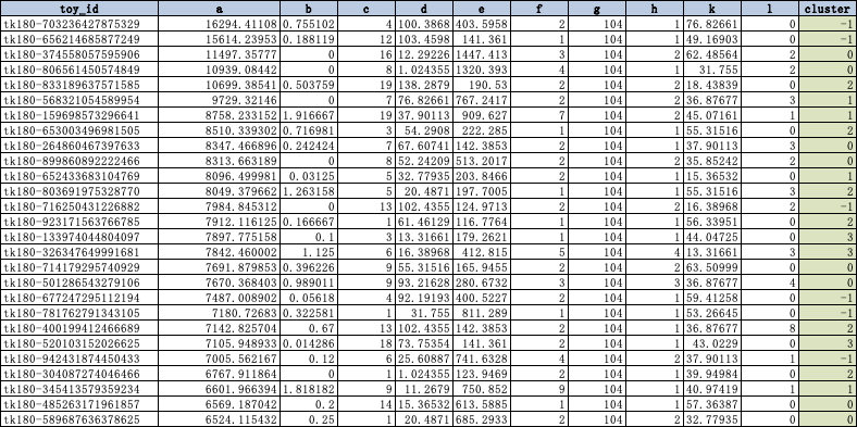
Data set after clustering:
Traditional 2D \ 3D
Explicit variable array x, Y or X, Y, Z. We can draw the actual situation.
Adjust it according to specific needs~
Two dimensional diagram
Example:
def plotshow2(para, *value, date=None, marker=None,name=None,color=None):
    plt.figure(figsize=(22,10))
#     plt.ylim(0,2000000)
    plt.xticks(fontsize=14)
    plt.yticks(fontsize=14)
    #y-axis canceling scientific counting method
    x_formatter = matplotlib.ticker.ScalarFormatter(useOffset=False)
    x_formatter.set_scientific(False)
    plt.gca().yaxis.set_major_formatter(x_formatter)
    temp = para.sort_values(by=date)
    x = temp[date]
    y1 = temp[value[0]]
    y2 = temp[value[1]]
#     y2 = temp[value[1]]
    plt.xlabel(date)
    plt.ylabel(name)
    plt.title(name)
    plt.xticks(rotation=45)
#     plt.annotate('max', xy=(a, b), xytext=(a+relativedelta(days=2), b*1.1),arrowprops=dict(facecolor='black', shrink=0.05))
    # plt.plot(x_pron, y_porn, color="y", linestyle="--", marker="^", linewidth=1.0)
    plt.plot(x, y1, color=color[0], linestyle="--", marker=marker, linewidth=2.0,label=value[0])
    plt.plot(x, y2, color=color[1], linestyle="--", marker=marker, linewidth=2.0,label=value[1])
    plt.legend() # Show Legend
    plt.grid(color="k", linestyle=":")
    plt.show()
Three dimensional drawing
Example:
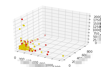
"""
3D space map
"""
data_int = data.copy()
for item in list(data_int.columns)[1:]:
    data_int[item] = data_int[item].apply(lambda x: round(x))

import numpy as np
import matplotlib.pyplot as plt
from mpl_toolkits.mplot3d import Axes3D

data = np.random.randint(0, 255, size=[40, 40, 40])

x, y, z = np.array(data_int['aaaa']), np.array(data_int['bbb']), np.array(data_int['cccc'])
ax = plt.subplot(111, projection='3d')  # Create a 3D drawing project
#  Divide the data points into three parts and draw them with color discrimination
ax.scatter(x[:177], y[:177], z[:177], c='y')  # Draw data points
ax.scatter(x[177:354], y[177:354], z[177:354], c='r')
ax.scatter(x[354:532], y[354:532], z[354:532], c='g')

ax.set_zlabel('aaaa')  # Coordinate axis
ax.set_ylabel('bbb')
ax.set_xlabel('cccc')
plt.show()
N-dimensional graph
In fact, in a word, we need to take out the label alone and reduce the dimension of all the remaining features, so that we can see it with the naked eye... (poor three-dimensional creature o(﹏╥) O ~ ~)
Here are some common dimensionality reduction methods:
pairplot
pairplot is very easy to use, especially in machine learning. It is often used to observe the distribution of features. At the same time, you can also set the clustering results through the hue parameter. Very intuitive ~!
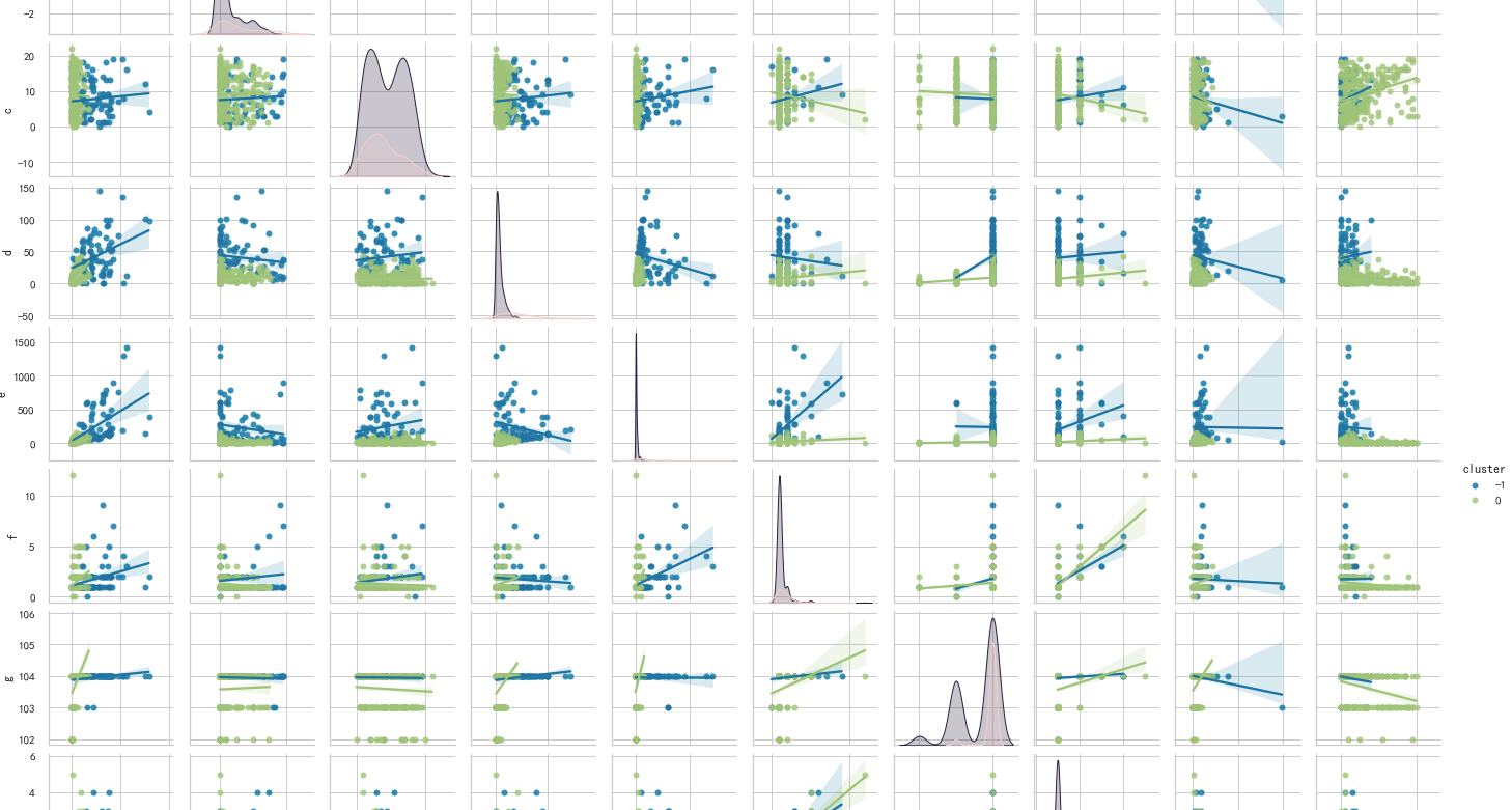
import numpy as np
import matplotlib.pyplot as plt
import seaborn as sns
sns.pairplot(pair, hue='cluster',size=2, kind='reg')
PCA principal component analysis
The original features are transformed into linear independent features by orthogonal transformation, and the transformed features are called main components. Principal component analysis can reduce the original dimension to n dimensions. One special case is to reduce the dimension to 2 dimensions through principal component analysis. In this way, multidimensional data can be transformed into points in the plane to achieve the purpose of multidimensional data visualization.
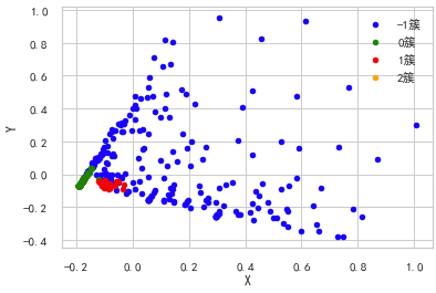
"""
Principal component analysis( PCA)
"""
from sklearn import decomposition

pca = decomposition.PCA(n_components=2)

X = pca.fit_transform(test2.iloc[:,1:-1].values)

pos=pd.DataFrame()
pos['X'] =X[:, 0]
pos['Y'] =X[:, 1]
pos['cluster'] = test2['cluster']

ax = pos[pos['cluster']==-1].plot(kind='scatter', x='X', y='Y', color='blue', label='-1 cluster')
pos[pos['cluster']==0].plot(kind='scatter', x='X', y='Y', color='green', label='0 cluster', ax=ax)
pos[pos['cluster']==1].plot(kind='scatter', x='X', y='Y', color='red', label='1 cluster', ax=ax)
pos[pos['cluster']==2].plot(kind='scatter', x='X', y='Y', color='orange', label='2 cluster', ax=ax)
Multi dimensional scaling (MDS)
The multidimensional scale attempts to find a good low dimensional representation of the distance of the original high-dimensional spatial data. In short, the multidimensional scale is used for the similarity of data. It attempts to use the distance in geometric space to model the similarity of data. Frankly, it is to use the distance in two-dimensional space to represent the relationship in high-dimensional space. Data can be the similarity between objects and the interaction between molecules Frequency or inter country transaction index. This is different from the previous method. The input of the previous method is raw data, while in the example of multi-dimensional ruler, the input is a distance matrix based on Euclidean distance. The multi-dimensional ruler algorithm is a continuous iterative process. Therefore, max_iter needs to be used to specify the maximum number of iterations, and the calculation time is also the above algorithm The largest one in.
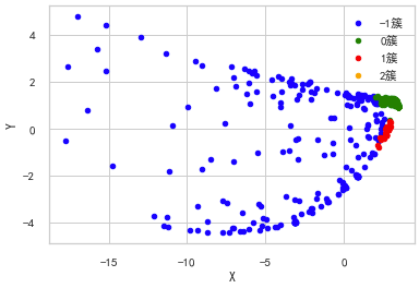
"""
Multidimensional ruler( Multi-dimensional scaling, MDS)
"""
from sklearn import manifold

from sklearn.metrics import euclidean_distances

similarities = euclidean_distances(test2.iloc[:,1:-1].values)
# mds = manifold.MDS(n_components=2, max_iter=3000, eps=1e-9, dissimilarity="precomputed", n_jobs=1)
mds = manifold.MDS(n_components=2, max_iter=3000, eps=1e-9, dissimilarity="euclidean", n_jobs=1)
X = mds.fit(similarities).embedding_

pos=pd.DataFrame(X, columns=['X', 'Y'])
pos['cluster'] = test2['cluster']

ax = pos[pos['cluster']==-1].plot(kind='scatter', x='X', y='Y', color='blue', label='-1 cluster')
pos[pos['cluster']==0].plot(kind='scatter', x='X', y='Y', color='green', label='0 cluster', ax=ax)
pos[pos['cluster']==1].plot(kind='scatter', x='X', y='Y', color='red', label='1 cluster', ax=ax)
pos[pos['cluster']==2].plot(kind='scatter', x='X', y='Y', color='orange', label='2 cluster', ax=ax)
TSNE(t-distributed Stochastic Neighbor Embedding)
t-SNE(t-distribution random neighborhood embedding) It is a nonlinear dimensionality reduction algorithm for exploring high-dimensional data. It finds patterns in data by identifying observed clusters based on the similarity of data points with multiple features, and maps multidimensional data to two or more dimensions suitable for human observation. It is essentially a dimensionality reduction visualization technology. The best way to use this algorithm is to use it for exploratory data analysis .
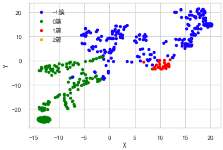
"""
TSNE(t-distributed Stochastic Neighbor Embedding
"""
from sklearn.manifold import TSNE

iris_embedded = TSNE(n_components=2).fit_transform(test2.iloc[:,1:-1].values)

pos = pd.DataFrame(iris_embedded, columns=['X','Y'])
pos['cluster'] = test2['cluster']

ax = pos[pos['cluster']==-1].plot(kind='scatter', x='X', y='Y', color='blue', label='-1 cluster')
pos[pos['cluster']==0].plot(kind='scatter', x='X', y='Y', color='green', label='0 cluster', ax=ax)
pos[pos['cluster']==1].plot(kind='scatter', x='X', y='Y', color='red', label='1 cluster', ax=ax)
pos[pos['cluster']==2].plot(kind='scatter', x='X', y='Y', color='orange', label='2 cluster', ax=ax)