Click "programmer Xiaole" at the top to pay attention, and grow together with star standard or top
At 00:00 a.m. every day, I make an appointment with you at the first time
Daily English
Nothing in this world no wounds people can really heal yourself,only yourself.
There is no one in this world who is not hurt. The only one who can really heal himself is himself.
Daily heart to heart talk
Look at the world with a pure heart and live a happy life. Treat the people and things around with an indifferent heart, write life with peace, and comb the most ordinary days into poetic scenery.
From: Zhang Xinxu editor: lele
Link: zhangxinxu com/wordpress/2019/08/css-flex-last-align/

Programmer Xiaole (ID:study_tech) tweeted for the 700th time, and the pictures came from the network
Past review: Netease responded to the violent layoffs and apologized!Two consecutive statements:The performance of the parties is really unqualified Liu qiangdong said this and accidentally went on a hot search
Text
1, Justify content alignment problem description
In the CSS flex layout, the justify content attribute can control the horizontal alignment of the list. For example, the space between value can align both ends.
However, if the number of lists in the last row is not enough, there will be a problem that the last row is not fully vertically aligned.
The following code:
.container { display: flex; justify-content: space-between; flex-wrap: wrap;}.list { width: 24%; height: 100px; background-color: skyblue; margin-top: 15px;}
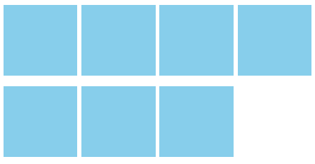
Then the number of lists is no more, no less, exactly 7:
<div class="container"> <div class="list"></div> <div class="list"></div> <div class="list"></div> <div class="list"></div> <div class="list"></div> <div class="list"></div> <div class="list"></div></div>
At this time, the arrangement of the small squares in the last row is very embarrassing:

You can click here hard: the last line of flex list is not aligned with the demo
At this time, the last row should be aligned to the left, which is the effect we want. How to achieve it?
In fact, the implementation idea is the same as the alignment of both ends of display: inline block.
2, If the number of rows and columns is fixed
If the number of rows and columns is fixed, the following two methods can realize the left alignment of the last row.
Method 1: simulate space between and gap
That is, we do not use the justify content: space between declaration to simulate the alignment effect of both ends. The gap gap in the middle is controlled by margin.
For example:
.container { display: flex; flex-wrap: wrap;}.list { width: 24%; height: 100px; background-color: skyblue; margin-top: 15px;}.list:not(:nth-child(4n)) { margin-right: calc(4% / 3);}
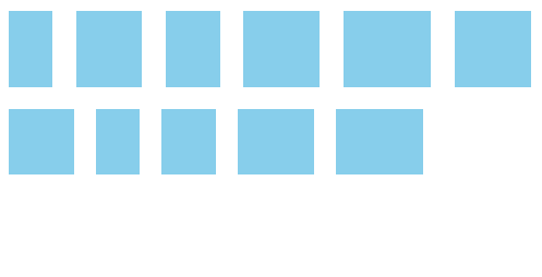
At this point, the layout effect is as follows:
Method 2: dynamic margin according to the last element of the number
Since the number of each column is fixed, we can calculate the margin value of different number lists to ensure complete left alignment.
For example, if there are 4 elements in each row and there are only 3 elements in the last row, then the margin right size of the last element is "list width + gap size", then the last 3 elements can also be perfectly left aligned.
Then, with the help of the tree structure pseudo class number matching technology (the layout skills in this article "the number of pseudo class matching lists to realize the CSS layout of wechat group avatars" are realized with this technology), we can know that there are several elements in the last line.
For example:
. list: last child: nth child (4N - 1) describes the last line, either 3 elements or 7 elements
. list: last child: nth child (4N - 2) describes the last line, either 2 elements or 6 elements
In this example, there are four elements in a row. Therefore, we can have the following CSS settings:
.container { display: flex; /* Align both ends */ justify-content: space-between; flex-wrap: wrap;}.list { width: 24%; height: 100px; background-color: skyblue; margin-top: 15px;}/* If the last line is 3 elements */.list:last-child:nth-child(4n - 1) { margin-right: calc(24% + 4% / 3);}/* If the last line is 2 elements */.list:last-child:nth-child(4n - 2) { margin-right: calc(48% + 8% / 3);}
The effect is as shown in GIF below. After deleting the list, the layout is still stably aligned to the left.

Seeing is believing. You can click here: dynamically match the number to realize the left alignment demo of flex sub items
3, If the width of each sub item is not fixed
Sometimes, the width of each flex sub item is not fixed. At this time, how to realize the left alignment of the last line?
Since the gap size is not fixed and the alignment is not strict at this time, we can directly align the last line to the left. There are two specific methods:
Method 1: the last item is margin right: Auto
The CSS code is as follows:
.container { display: flex; justify-content: space-between; flex-wrap: wrap;}.list { background-color: skyblue; margin: 10px;}/* The last item is margin right: Auto */.list:last-child { margin-right: auto;}
The final effect is as follows GIF:
Method 2: create a pseudo element and set flex:auto or flex:1
CSS code is as follows:
.container { display: flex; justify-content: space-between; flex-wrap: wrap;}.list { background-color: skyblue; margin: 10px;}/* Use pseudo elements to aid left alignment */.container::after { content: ''; flex: auto; /* Or flex: 1 */}
The final effect is as follows GIF:
These two methods are combined into a demo page. You can click here: the width of flex sub elements is not fixed, and the last line is left aligned demo
4, If the number of rows and columns is not fixed
If the number of columns in each row is not fixed, the above methods are not applicable, and other techniques need to be used to realize the left alignment of the last row.
This method is actually very simple and easy to understand, that is, use enough blank labels to fill the space. The specific number of space is determined by the maximum number of columns. For example, if the layout has up to 7 columns, we can use 7 blank labels to fill the space, and up to 10 columns, then we need to use 10 blank labels.
As shown in the following HTML:
<div class="container"> <div class="list"></div> <div class="list"></div> <div class="list"></div> <div class="list"></div> <div class="list"></div> <div class="list"></div> <div class="list"></div> <i></i><i></i><i></i><i></i><i></i></div>
The related CSS is as follows. The key to implementation is to set the width of < I > elements and the size of margin List is the same as the list element, and other styles do not need to be written.
.container { display: flex; justify-content: space-between; flex-wrap: wrap; margin-right: -10px;}.list { width: 100px; height:100px; background-color: skyblue; margin: 15px 10px 0 0;}/* The same width and margin value as the list */.container > i { width: 100px; margin-right: 10px;}
Since the < I > element height is 0, it does not affect the layout rendering in the vertical direction.
The final effect is as shown in GIF:

You can click here hard: use blank element space to align the last row of flex layout to the left of demo
5, If the number of columns is not fixed, HTML cannot be adjusted
However, sometimes, due to objective reasons, the front-end refactorers have no way to adjust the html structure, and the number of layout lists is not fixed. At this time, how to achieve the left alignment effect of our last line?
We might as well try using the Grid layout.
The Grid layout naturally has gap gaps and natural Grid alignment. Therefore, it can be considered as a natural effect to realize the left alignment of the last row.
The CSS code is as follows:
.container { display: grid; justify-content: space-between; grid-template-columns: repeat(auto-fill, 100px); grid-gap: 10px;}.list { width: 100px; height:100px; background-color: skyblue; margin-top: 5px;}
You can see that the CSS code is very concise.
HTML code is a very regular and common code fragment:
<div class="container"> <div class="list"></div> <div class="list"></div> <div class="list"></div> <div class="list"></div> <div class="list"></div> <div class="list"></div> <div class="list"></div></div>
The final effect is as follows GIF:
You can click here: CSS grid layout to align the last line to the left of the demo
6, Comments on these implementation methods
First, the layout that needs left alignment in the last line is more suitable for CSS grid layout implementation. However, there are some requirements for the compatibility of repeat() function, which is not supported by IE browser. If the project needs to be ie compatible, this method needs to be considered.
Then, the most widely applicable method is to use empty elements for placeholder. This method is not only applicable to scenes with a fixed number of lists, but also applicable to scenes with a fixed number of lists. However, some people are obsessed with code cleanliness and dislike this empty occupied html tag. They can try the first two methods: one is to dynamically calculate the margin to simulate the alignment of both ends, and the other is to dynamically control the margin value of the last list element to achieve left alignment according to the number of lists.
There are 6 methods in total, each with its own advantages and disadvantages. We choose the appropriate method according to the actual scene of our project.
If you have other better implementation, you are also welcome to feedback and exchange. I will update it in time.
Thank you for reading. If you think the content of this article is good, welcome to share it with your friends!

Welcome to leave your views in the message area and discuss improvement together. If today's article gives you new inspiration and new understanding on the improvement of learning ability, please forward it and share it with more people.
Welcome readers to join programmer Xiaole Technology Group In the background of official account, Additive group ”Or“ study ”Just.
Guess you still want to see it
A collection of the latest interview questions from Ali, Tencent, Baidu, Huawei and JD
106 page Chinese version of advanced Python (with download)
Recommend 33 best IDEA configurations to make your IDEA feel like flying!

follow「Programmer Xiaole」,Watch more
Hey, are you watching?