Original address: Netease cloud music iOS14 widget practical manual
preface
Apple released a widget kit on this year's WWDC20, which supports the display of dynamic information and personalized content on iOS and iPad OS home screens. With the addition of iOS system application drawer, Apple has always been conservative about the home screen, resulting in users' great expectations for small components. However, there are many restrictions on the operation of small components. How to do a good user experience on the limited mechanism has become a challenge to be completed.
Brief description of small components
Small components can realize content display and function jump on the main screen.
The system will obtain the timeline from the widget and display the data on the timeline according to the current time. Click the visual element being displayed to jump to the APP and realize the corresponding functions.
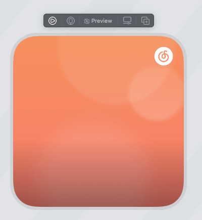
The effect of cloud music widget is as follows:

Discussion on development ideas
First of all, it should be clear that the widget is independent of the App environment (i.e. App Extension), and the life cycle / storage space / running process of the widget is different from that of the App. Therefore, we need to introduce some infrastructure in this environment, such as network communication framework, image caching framework, data persistence framework and so on.
The life cycle of the widget itself is an interesting point. Frankly speaking, the life cycle of small components is consistent with the desktop process, but this does not mean that small components can execute code and complete business at any time. We can only use the snapshot and gettimeline components to refresh the data when we create the snapshot. Generally speaking, the network data is obtained when the Timeline is refreshed, and the appropriate view is rendered when the snapshot is created.
In most cases, you need to use data to drive the view presentation. This data can be obtained through network request or from App by using the sharing mechanism of App Groups.
After the data is obtained when refreshing the Time Line, the timeline can be synthesized according to the business requirements. Timeline is an array with timelinentry as the element. TimelineEntry contains a date time object to tell the system when to use this object to create a snapshot of the widget. You can also inherit timelinentry and add the data model or other information required by the business.
In order to make the widget display the view, SwiftUI needs to be used to complete the layout and style building of the widget. How to implement layout and style will be described below.
After the user clicks the widget, the App will be opened and the openURL: method of AppDelegate will be called. We need to handle this event in openURL: so that the user can directly jump to the required page or call a function.
Finally, if you need custom options for widgets that are open to users, use the Intents framework to define the data structure in advance, and provide data in the user editing widget. The system will draw the interface according to the data. The user-defined data selected by the user will be provided in the form of parameters when refreshing Time Line (getTimeline) and creating snapshot (getSnapshot), and then different business logic can be executed according to different user-defined data.
App Extension
If you have experience in developing App Extension, you can skip this chapter.
According to apple, App Extension can extend custom functions and content beyond the application and provide it to users when they interact with other applications or systems. For example, your application can be displayed as a widget on the home screen. In other words, a widget is an App Extension, and the development of widgets is basically in the environment of App Extension.
What is the relationship between App and App Extension?
It is essentially two independent programs. Your main program can neither access the code of App Extension nor its storage space, which is completely two processes and two programs. App Extension relies on your app ontology as a carrier. If you uninstall the app, the App Extension will not exist in the system. Moreover, the life cycle of App Extension mostly acts on specific fields and is managed by the system control according to the events triggered by users.
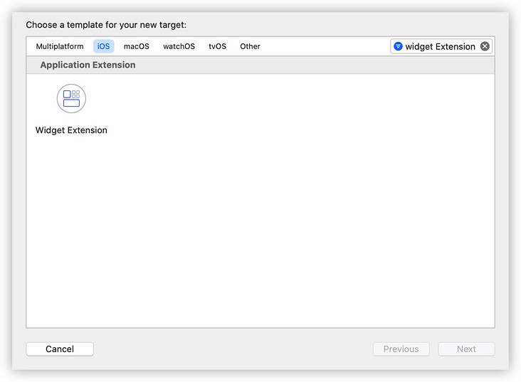
Create app extensions and profiles
The following is a brief description of how to create the App Extension of the widget and configure the certificate environment.
Add a Widget Extension in Xcode (the path is as follows: file new target IOS tab Widget Extension). If you need the custom function of the widget, don't forget to check Include Configuration Intent.
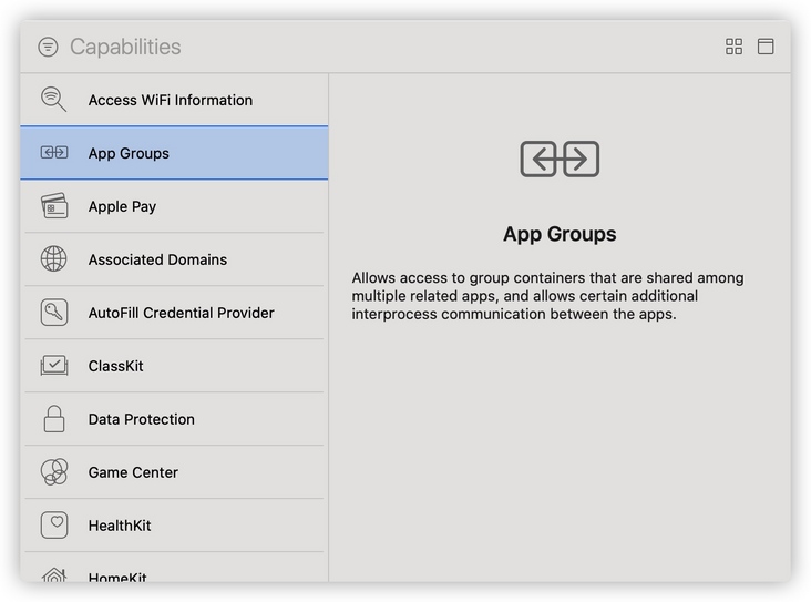
Add App Groups in the Target of Widget Extension and keep the same App Group ID as the main program. If there are no App Groups in the main program, you need to add the App Groups of the main App and define the Group ID at this time.
If your developer account is logged in to Xcode, the configuration files and app IDs of the application will be correct at this time. If you don't log in to Xcode, you need to go to the Apple Developer Center and manually create the App ID and profile of the App Extension. Don't forget to configure App Groups in App ID at this time.
App Groups data communication
Because app and App Extension cannot communicate directly, when sharing information, you need to use App Groups for communication. App Groups have two ways to share data, NSUserDefaults and NSFileManager.
NSUserDefaults shared data
Initialize the instance using initWithSuiteName: of NSUserDefaults. suitename passes in the previously defined App GroupID.
- (instancetype)initWithSuiteName:(NSString *)suitename;
Then you can use the access method of the instance of NSUserDefaults to store and obtain the shared data. For example, if we need to share the current user information with the widget, we can do the following.
//Initialize an NSUserDefaults object for App Groups using Groups ID
NSUserDefaults *userDefaults = [[NSUserDefaults alloc] initWithSuiteName:@"group.company.appGroupName"];
//Write data
[userDefaults setValue:@"123456789" forKey:@"userID"];
//Read data
NSString *userIDStr = [userDefaults valueForKey:@"userID"];
NSFileManager shared data
Use containerURLForSecurityApplicationGroupIdentifier of NSFileManager: obtain the storage space address shared by App Group to access files.
- (NSURL *)containerURLForSecurityApplicationGroupIdentifier:(NSString *)groupIdentifier;
SwiftUI build component
It should be based on considerations such as power consumption. Apple requires that small components can only use SwiftUI, and can not be used by bridging UIKit through UIViewRepresentable.
The interaction mode of small components is simple, only click, and the view is small. The SwiftUI knowledge required for development is relatively simple. It is enough to reasonably build a small component view. Generally speaking, it will not involve operations such as data binding.
This chapter mainly introduces how to use SwiftUI to build small components. I will assume that readers already have the basic knowledge of SwiftUI. If you are still unfamiliar with SwiftUI, you can improve your understanding through two video tutorials in resources( [15 minutes to understand SwiftUI] layout/[15 minutes to understand SwiftUI] style ). You can also consult the development documents or relevant topics of WWDC19/20 to obtain more knowledge of SwiftUI.
Using SwiftUI to complete the widget view
Here is a simple development example to help you develop widget views using SwiftUI.
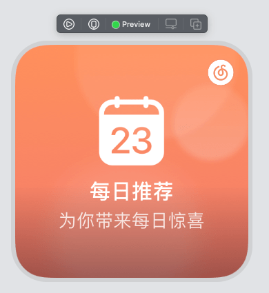
First look at the visual draft of the widget:
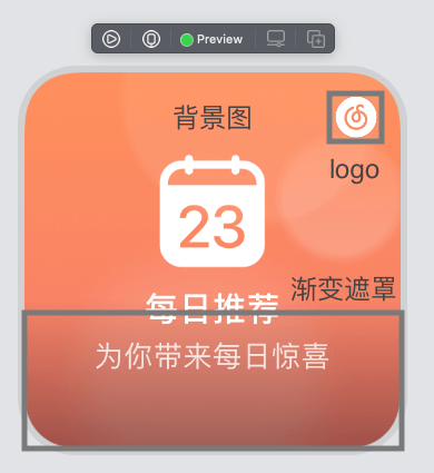
Briefly analyze the view elements in the visual manuscript:
- Full background image
- Black gradient from bottom to top
- Cloud music Logo(Image) in the upper right corner
- Calendar icon (Image) in the middle of widget
- Two lines of text below the calendar icon
Through analysis, it is not difficult to find that in order to achieve the effect of visual manuscript, three components: Text, Image and LinearGradient can be used.
Classify 1 / 2 / 3 of visual elements as background view to facilitate reuse of other components. Then, 4 / 5 related to component content types are classified as foreground view.
Let's implement the background view first:
struct WidgetSmallBackgroundView: View {

    // The proportion of the bottom mask is 40% of the overall height
    var contianerRatio : CGFloat = 0.4

    // Background picture
    var backgroundImage : Image = Image("backgroundImageName")

    // Gradient color from top to bottom
    let gradientTopColor = Color(hex:0x000000, alpha: 0)
    let gradientBottomColor = Color(hex:0x000000, alpha: 0.35)

    // Simple encapsulation of mask view makes the code more intuitive
    func gradientView() -> LinearGradient {
        return LinearGradient(gradient: Gradient(colors: [gradientTopColor, gradientBottomColor]), startPoint: .top, endPoint: .bottom)
    }

    var body: some View {
        // Use GeometryReader to get the size of the widget
        GeometryReader{ geo in
            // Use ZStack to stack logo icons and bottom masks
            ZStack{
                // Build a logo icon, use frame to determine the size of the icon, and use position to locate the icon position
                Image("icon_logo")
                    .resizable()
                    .scaledToFill()
                    .frame(width: 20, height: 20)
                    .position(x: geo.size.width - (20/2) - 10 , y : (20/2) + 10)
                    .ignoresSafeArea(.all)
                // Build a mask view, use frame to determine the mask size, and use position to locate the mask position
                gradientView()
                    .frame(width: geo.size.width, height: geo.size.height * CGFloat(contianerRatio))
                    .position(x: geo.size.width / 2.0, y: geo.size.height * (1 - CGFloat(contianerRatio / 2.0)))
            }
            .frame(width: geo.size.width, height: geo.size.height)
            // Add a background picture on the bottom of the overlay
            .background(backgroundImage
                            .resizable()
                            .scaledToFill()
            )
        }
    }
}
The effect of background view is as follows:
Next, the background view is placed in the view of the widget, and the middle icon and copy view are realized, so the visual construction process of the whole component is completed:
struct WidgetSmallView : View {

    // Set the width and height of the large icon to 40% of the height of the small part
    func bigIconWidgetHeight(viewHeight:CGFloat) -> CGFloat {
        return viewHeight * 0.4
    }

    var body: some View {

        GeometryReader{ geo in
            VStack(alignment: .center, spacing : 2){
                Image("iconImageName")
                    .resizable()
                    .scaledToFill()
                    .frame(width: bigIconWidgetHeight(viewHeight: geo.size.height), height: bigIconWidgetHeight(viewHeight: geo.size.height))

                Text("Daily recommendation")
                    .foregroundColor(.white)
                    .font(.system(size: 15))
                    .fontWeight(.medium)
                    .lineLimit(1)
                    .frame(height: 21)

                Text("Bring you daily surprises")
                    .foregroundColor(.white)
                    .font(.system(size: 13))
                    .fontWeight(.regular)
                    .opacity(0.8)
                    .lineLimit(1)
                    .frame(height: 18)
            }
            // Add padding so that if the Text is too long, it will not touch the frame of the widget
            .padding(EdgeInsets(top: 0, leading: 14, bottom: 0, trailing: 14))
            .frame(width: geo.size.width, height: geo.size.height, alignment: .center)
            // Set background view
            .background(WidgetSmallBackgroundView())
        }
    }
}
Through the above simple example, it can be found that in the conventional flow layout, the layout effect can be achieved by using VStack and HStack. If you want to achieve the effect of the logo icon in the example, you need to use position/offset to change the positioning coordinates to achieve the goal.
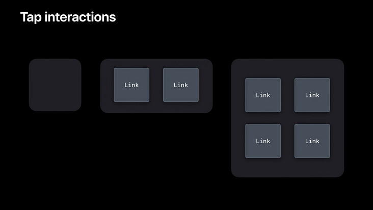
A supplement to Link view
Link is a clickable view. If possible, it will open in the associated application, otherwise it will open in the user's default Web browser. Small components of medium / large size can use it to set different jump parameters for the click area. Because the above example is a small component, you can't use link to distinguish jumps, so I'll add it here.
Link("View Our Terms of Service", destination: URL(string: "https://www.example.com/TOS.html")!)
get data
Network request
URLSession can be used in the widget, so the network request is basically the same as that in the App, so I won't repeat it here.
Points needing attention:
- Using a third-party framework requires the introduction of the Target where the widget is located.
- The network request is invoked when the Timeline is refreshed.
- If you need to share information with App, you need to access it through App Group.
Loading cache of pictures
The picture cache is different from that in App. At present, the Image view in SwiftUI does not support incoming URL to load network pictures. You can't use the method of asynchronously obtaining the Data of network pictures to complete the loading of network pictures.
You can only refresh the Timeline, call the network request, and then obtain the data of all network pictures on the Timeline.
 func getTimeline(for configuration: Intent, in context: Context, completion: @escaping (Timeline<Entry>) -> ()) {
    // Initiate network request
    widgetManager.requestAPI(family : context.family, configuration: configuration) { widgetResponse, date in
        // Generate Timeline entry in interface callback
        let entry = WidgetEntry(date: Date(), configuration: configuration, response: widgetResponse, family : context.family)
        // Parse the network image required by Timeline entry
        let urls = entry.urlsNeedDownload()
        // Query local cache and download network pictures
        WidgetImageManager().getImages(urls: urls) {
            let entries = [entry]
            let timeline = Timeline(entries: entries, policy: .after(date))
            completion(timeline)
        }
    }
}
In the getImages method, we need to maintain a queue to query the local cache and download network images when the cache misses.
 public func getImages(urls : [String] , complition : @escaping () -> ()){

    // Create directory
    WidgetImageManager.createImageSaveDirIfNeeded()

    // duplicate removal
    let urlSet = Set(urls)
    let urlArr = Array(urlSet)

    self.complition = complition

    self.queue = OperationQueue.main
    self.queue?.maxConcurrentOperationCount = 2
    let finishBlock = BlockOperation {
        self.complition?()
    }

    for url in urlArr {
        let op = SwiftOperation { finish in
            self.getImage(url: url) {
                finish(true)
            }
        }

        finishBlock.addDependency(op)
        self.queue?.addOperation(op)
    }

    self.queue?.addOperation(finishBlock)
}

public func getImage(url : String , complition : @escaping () -> ()) -> Void {
    let path = WidgetImageManager.pathFromUrl(url: url)
    if FileManager.default.fileExists(atPath: path) {
        complition()
        return
    }

    let safeUrl = WidgetImageManager.filterUrl(url: url)
    WidgetHttpClient.shareInstance.download(url: safeUrl, dstPath: path) { (result) in
        complition()
    }
}
Data acquisition in preview status
When you add a widget, you will see the widget view in the preview interface. At this time, the system will trigger the placeholder method of the widget. We need to return a Timeline in this method to render the preview view.
In order to ensure the user's experience, it is necessary to prepare a local bottom data for the interface call to ensure that the user can see the real view in the preview interface, and try not to display the skeleton screen without data.
TimeLine
The content changes of widgets depend on Timeline. Widgets are essentially a series of static views driven by Timeline.
Understanding TimeLine
As mentioned earlier, Timeline is an array with TimelineEntry as the element. TimelineEntry contains a date time object to tell the system when to use this object to create a snapshot of the widget. You can also inherit timelinentry and add the data model or other information required by the business.
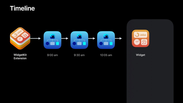
Before generating a new Timeline, the system will always use the last generated Timeline to display data.
If there is only one entry in the Timeline array, the view will remain unchanged. If the widget needs to change over time, you can generate multiple entries in the Timeline and give them an appropriate time, and the system will use the entry to drive the view at the specified time.
Reload
The so-called widget refresh actually refreshes the Timeline, resulting in changes in the widget view driven by Timeline data.
There are two refresh methods:
- System reloads
- App-driven reloads
System reloads
System initiated Timeline refresh. The system determines the frequency of System Reloads for each different Timeline. Refresh requests that exceed the frequency will not take effect. Small components used in high frequency can obtain more refresh frequencies.
ReloadPolicy:
When generating a Timeline, we can define a ReloadPolicy to tell the system when to update the Timeline. ReloadPolicy has three forms:
- atEnd
- Refresh after all entries provided by the Timeline are displayed, that is, as long as there are entries that are not displayed, the current Timeline will not be refreshed
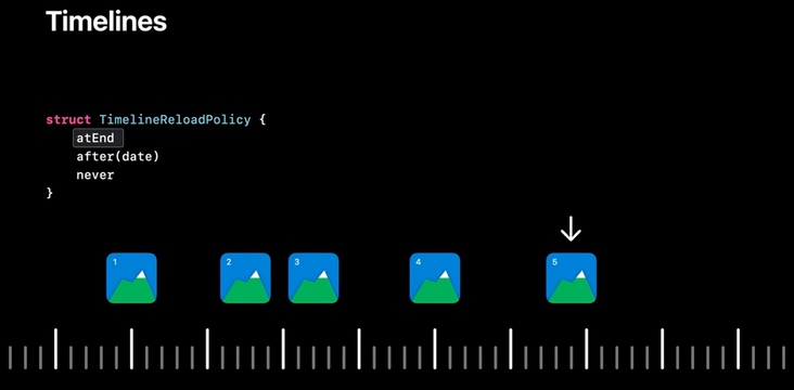
- after(date)
- date is the specified time for the next refresh. The system will refresh the Timeline at this time.
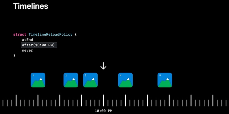
- never
- ReloadPolicy will never refresh the Timeline. After the last entry is displayed, the widget will always maintain the display content of that entry
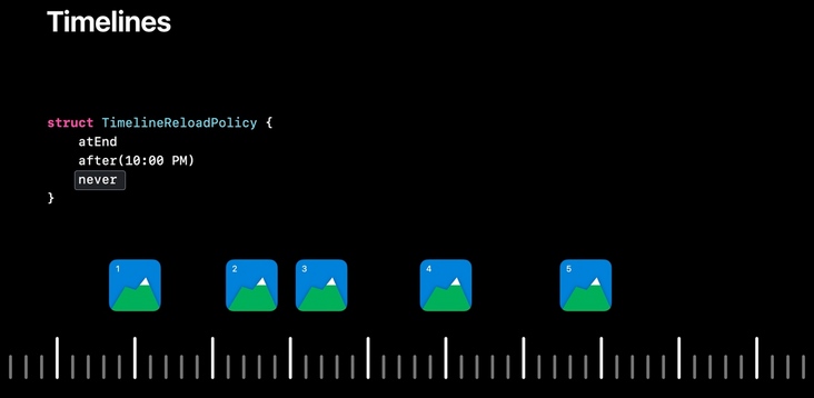
The timing of Timeline Reload is uniformly controlled by the system. In order to ensure performance, the system will decide whether to refresh the Timeline at a certain time according to the refresh timing required by the APP according to the importance level of each Reload request. Therefore, if you request to refresh the Timeline too frequently, it is likely to be limited by the system and can not achieve the ideal refresh effect. In other words, the time to refresh the Timeline defined in atend and after (date) above can be regarded as the earliest time to refresh the Timeline, and these times may be delayed according to the arrangement of the system.
App-driven reloads
The App triggers the refresh of the widget Timeline. When the App is in the background, the background push can trigger reload; When the App is in the foreground, reload can be triggered actively through WidgetCenter.
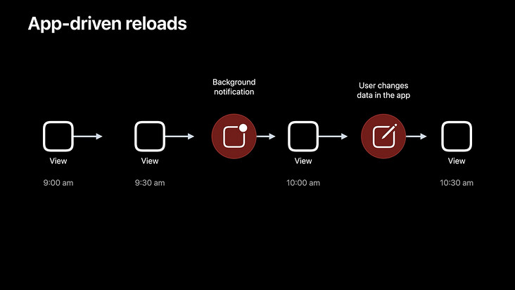
Calling WidgetCenter can refresh some widgets or all widgets according to the kind identifier.
/// Reloads the timelines for all widgets of a particular kind.
/// - Parameter kind: A string that identifies the widget and matches the
///   value you used when you created the widget's configuration.
public func reloadTimelines(ofKind kind: String)
/// Reloads the timelines for all configured widgets belonging to the
/// containing app.
public func reloadAllTimelines()
Click landing
When the user clicks the content or function entry on the widget, he needs to correctly respond to the user's needs after opening the App and present the corresponding content or function to the user.
This needs to be done in two parts. First, define different parameters for different click areas in the widget, and then present different interfaces according to different parameters in the openURL: of the App.
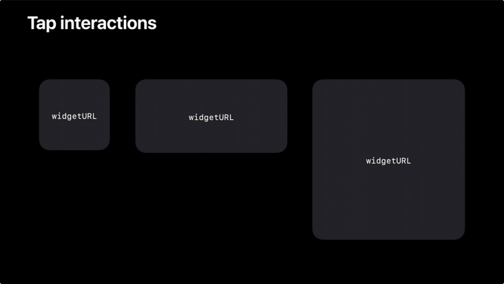
Distinguish different click areas
You need to use different URL and widlink parameters.
widgetURL
The scope of widget URL is the whole widget, and there can only be one widget URL on a widget. Adding more widget URL parameters will not take effect.
The code is as follows:
struct WidgetLargeView : View {
    var body: some View {
        GeometryReader{ geo in
            WidgetLargeTopView()
            ...
        }
        .widgetURL(URL(string: "jump://Large")!)
    }
}
Link
Link scope is the actual size of the link component. Multiple links can be added, and there is no limit on the number. It should be noted that the Link API cannot be used under the systemSmall type of widget.
The code is as follows:
struct WidgetLargeView : View {
    var body: some View {
        GeometryReader{ geo in
            WidgetLargeTopView()
            Link(destination: URL(string: "Custom Scheme://Unit")!) {
                WidgetLargeUnitView()
            }
            ...
        }
        .widgetURL(URL(string: "Custom Scheme://Large")!)
    }
}
URL Schemes
URL Schemes is a bridge for small pieces to jump to apps, and also a channel for apps to jump to each other. The average developer should not be unfamiliar with it.
Registering a custom URL Scheme is very simple through info Plist -- > URL types -- > item0 -- > URL schemes -- > Custom Scheme.
After that, in the widget, you can open your own App through the URL object spliced by the custom Scheme: / / and add parameters to indicate the required functions or contents in the following: / / section.
Note: when adding parameters, the Chinese that appears should be escaped. Here, you can use NSURLComponents and NSURLQueryItem to splice jump URL strings. It has its own escape effect and the operation URL is more standardized.
NSURLComponents *components = [NSURLComponents componentsWithString:@"Custom Scheme://"];
NSMutableArray<NSURLQueryItem *> *queryItems = @[].mutableCopy;
NSURLQueryItem *aItem = [NSURLQueryItem queryItemWithName:@"a" value:@"parameter a"];
[queryItems addObject:aItem];
NSURLQueryItem *bItem = [NSURLQueryItem queryItemWithName:@"b" value:@"parameter b"];
[queryItems addObject:bItem];
components.queryItems = queryItems;
NSURL *url = components.URL;
Handling after landing App
Clicking the widget to jump to App will trigger the openURL method of AppDelegate.
- (BOOL)application:(UIApplication *)app openURL:(NSURL *)url options:(NSDictionary<UIApplicationOpenURLOptionsKey,id> *)options
In the openURL method, by analyzing the url parameters, the function jump or content display required by the user is clarified, and then the corresponding implementation is carried out. This puts forward certain requirements for the routing capability of the project, which is not related to the development of small components and will not be described in detail.
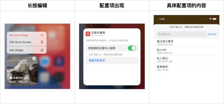
Dynamic configuration widget
The widget supports users to configure user-defined data without opening the application. Using the Intents framework, you can define the configuration page that users see when editing the widget.
The definition of the word used here rather than drawing is because the configuration data can only be generated through Intents, and the system will build the configuration page according to the generated data.
Build a simple custom function
Building a simple custom function requires two steps:
- Creating and configuring IntentDefinition files
- Modifying the relevant parameters of the Widget supports ConfigurationIntent.
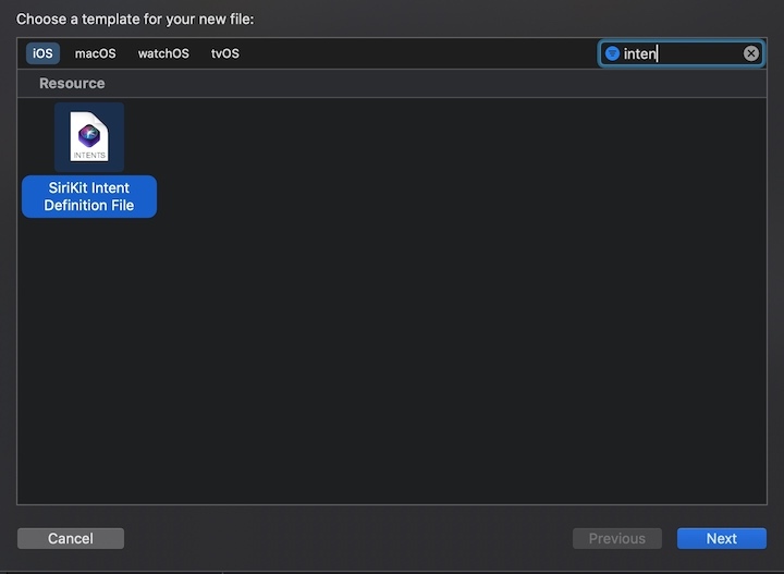
1. Create and configure IntentDefinition files
If you check Include Configuration Intent when creating a widget Target, Xcode will automatically generate an IntentDefinition file.
If the Include Configuration Intent option is not checked, you need to add the IntentDefinition file manually.
Menu file - > New - > file, then find Siri Intent Definition File and add it to widget Target.
After creating the file, open it intentdefinition file.
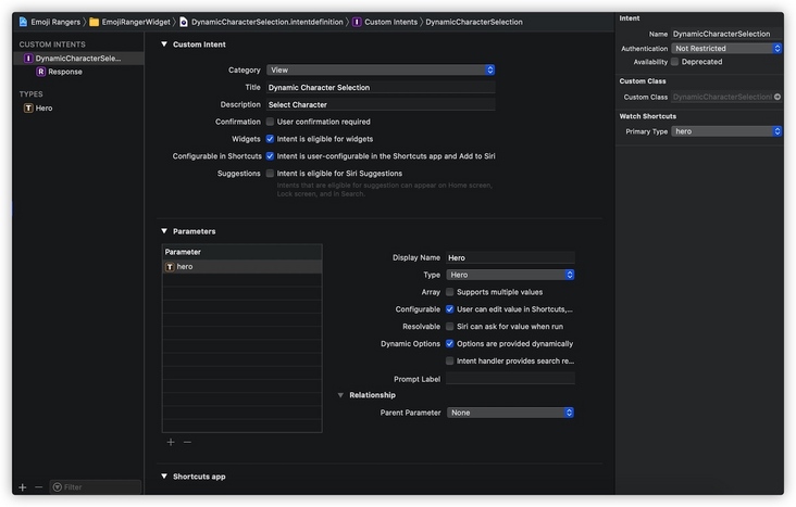
First, remember the class name in the Custom Class on the left. Xcode will automatically generate a ConfigurationIntent class according to this name after compilation, which stores user configuration information. Of course, you can also fill in a class name you specify here. Note that this class will not be generated until the project is compiled.
Then we need to create a custom Parameter template. Click the + sign under Parameter to create a Parameter.
After that, you can define the Type of the created Parameter. In addition to the relatively intuitive system Type, there are two difficult to understand columns Enums and Types.
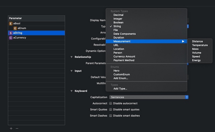
System type
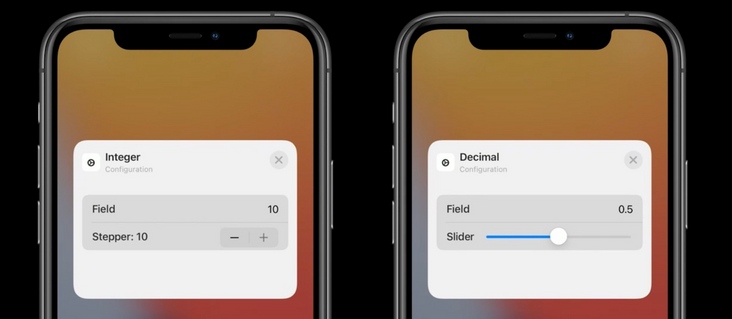
Specific types have further customization options to customize the input UI. For example, for Decimal type, you can choose to use Number Field input or Slider input, and you can customize the upper and lower limits of input; Duration type can customize the unit of input value as second, minute or hour; Date Components can specify whether to enter a date or time, specify the format of the date, and so on.
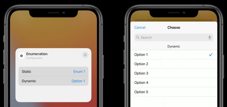
Enum
The simple understanding is that Enums is written to die in The static configuration in the intentdefinition file can only be updated after the release.
Type
Types are much more flexible and can be generated dynamically at runtime. Generally speaking, we use types as custom options.
Multiple values are supported
Most types of parameters support entering multiple values, that is, an array. At the same time, it supports limiting the fixed length of the array according to different Widget sizes.
Controls the display conditions of configuration items
A configuration item can be controlled and displayed only when another configuration item contains any / specific value. As shown in the figure below, the Up Next Widget of the calendar App displays the Calendars configuration item only when the Mirror Calendar App option is not selected.
In the Intent definition file, set A parameter A as the Parent Parameter of another parameter B. in this way, the display of parameter B depends on the value of parameter A.
For example, in the following figure, the calendar parameter is displayed only when the value of the mirrorCalendarApp parameter is false:
2. Modify the relevant parameters of the Widget to support ConfigurationIntent
Replace StaticConfiguration in Widget class with IntentConfiguration
Old:
@main
struct MyWidget: Widget {
    let kind: String = "MyWidget"
    var body: some WidgetConfiguration {
        StaticConfiguration(kind: kind, provider: Provider()) { entry in
            MyWidgetEntryView(entry: entry)
        }
    }
}
New:
@main
struct MyWidget: Widget {
    let kind: String = "MyWidget"
    var body: some WidgetConfiguration {
        IntentConfiguration(kind: kind, intent: WidgetConfiguratIntent.self, provider: Provider()) { entry in
            MyWidgetEntryView(entry: entry)
        }
    }
}
Add the ConfigurationIntent parameter in the Timeline Entry class
The code is as follows:
struct SimpleEntry: TimelineEntry {
 		let date: Date
		let configuration: WidgetConfiguratIntent
}
Modify inheritance of intenttimelinprovider
The inheritance of Provider is changed to intenttimelinprovider, and the type alias of Intent is added.
Old:
struct Provider: TimelineProvider {
 		...
}
New:
struct Provider: IntentTimelineProvider {
 		typealias Intent = WidgetConfiguratIntent
 		...
}
Modify the input parameters of getSnapshot / getTimeline in turn to increase the support for customization. And when creating a Timeline Entry, pass in configuration.
Building custom portals using interface data
In the Intent Target, find the IntentHandler file and follow the ConfiguratIntentHandling protocol in the ConfigurationIntent generation class.
Implement the providemadoroptionscollectionforconfiguration: withcompletion: method required by the protocol.
In this method, we can call the interface to obtain custom data and generate the data source input parameters required by the completion block.
- (void)provideModeArrOptionsCollectionForConfiguration:(WidgetConfiguratIntent *)intent withCompletion:(void (^)(INObjectCollection<NMWidgetModel *> * _Nullable modeArrOptionsCollection, NSError * _Nullable error))completion {

 [self apiRequest:(NSDictionary *result){
 // Process the acquired data
 ....
 NSMutableArray *allModelArr = ....;
 // Generate data required for configuration
 INObjectCollection *collection = [[INObjectCollection alloc] initWithItems:allModeArr];
 completion(collection,nil);
 }];
}
Widget get custom parameters
When the widget generates the view according to the Timeline Entry, read the configuration attribute of the Entry to obtain whether the user has customized the attribute and the detailed value of the customized attribute.
summary
Advantages and disadvantages coexist
Small components have obvious advantages and disadvantages. It is really convenient to click and use on the desktop, but the lack of interaction and the inability to update data in real time are very big defects. As apple said, "widgets are not Mini apps". Don't use the thinking of developing apps to make small components. Small components are just static views driven by a series of data.
Advantages:
- Permanent desktop, greatly increasing the exposure of products.
- Using network interface and data sharing, personalized content related to users can be displayed.
- Shorten the access path of functions. One click allows the user to touch the required function.
- It can be added repeatedly, combined with custom and recommendation algorithms, and multiple widgets can be added with different styles and data.
- Custom configuration is simple.
- A variety of sizes, large size can carry high complexity content display.
Disadvantages:
- Data cannot be updated in real time.
- Only click interaction.
- Transparent effect cannot be set on the background of widget.
- Dynamic images (video / motion pictures) cannot be displayed.
tail
The development practice of small components has come to an end. It can be seen that although the components are small, they still need a lot of knowledge. Including frameworks and concepts that are difficult to reach in peacetime development, such as Timeline, Intents and SwiftUI, need to be understood and learned.
The weak interaction ability and data refresh mechanism of small components are its hard wounds. Apple is very restrained about the ability of small components. In the development, many ideas and requirements are limited by the framework capability and cannot be realized. I hope apple can open up new capabilities in subsequent iterations. For example, the support part does not need to start the interactive form of the App.
It is the size of the components that users prefer, but it is the size of the components they want to develop that will not hide the advantages of the current components.