The sound of firecrackers in the new year rang again. When I opened the curtains, it was still dark outside. Well, I woke up anyway. Let's get up for the time being. It's a little cold in a few degrees below zero. Just get dressed and wake up first. Just thinking about what to write, I suddenly thought of a recently developed uni app background management system template. Let's share it.
Project introduction
uni-uadmin A mobile terminal background management platform project based on uniapp+uviewui.
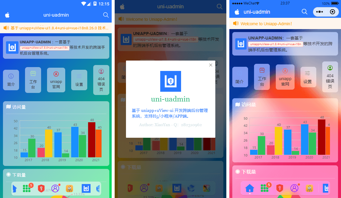
New ground glass UI effect is enabled. The inner page of each module realizes the function of matte background blur.
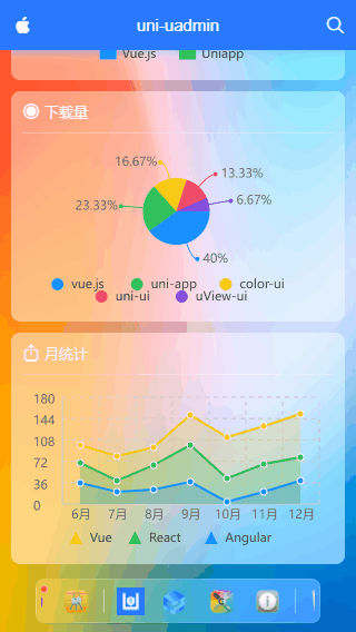
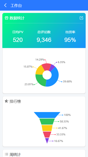
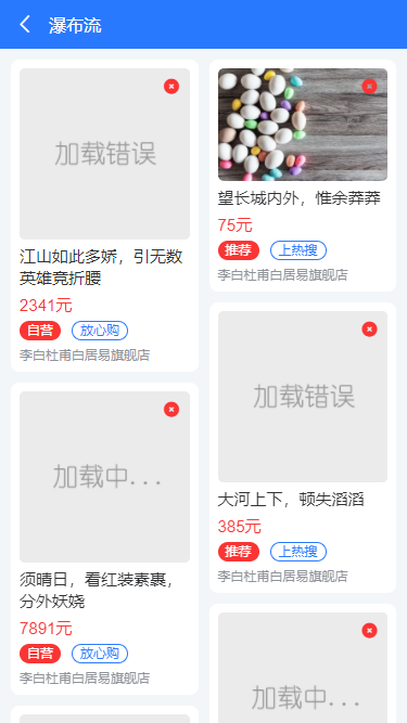
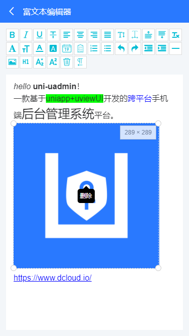
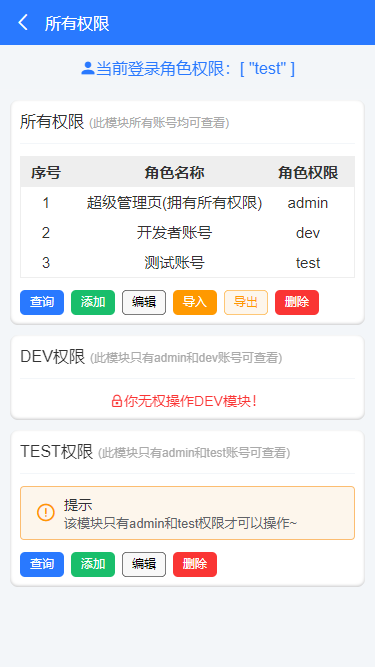
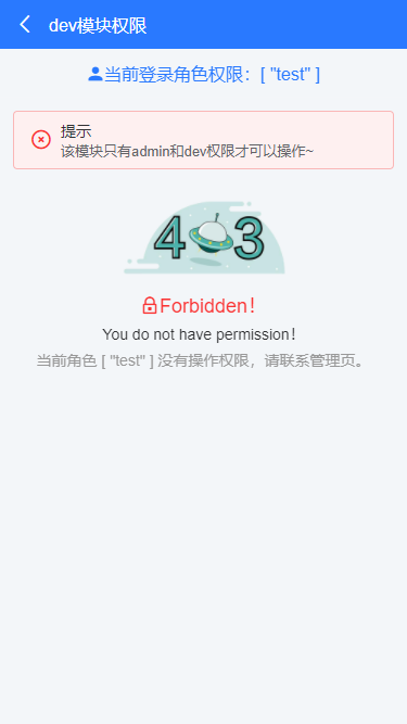
It includes business modules such as charts, custom tables, forms, waterfall flow and uniapp rich text editor, dynamic permission management, error page processing, and supports compiling to APP+H5 + applet.
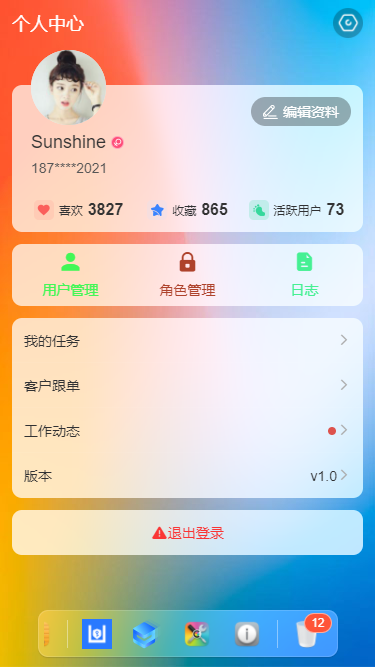
The dock fixed menu at the bottom replaces the traditional tabbar, but the function of switching pages is still realized through switchTab.
The UA dock menu supports left and right sliding, customized icons and title text + red dot prompt, click options to return to the index, customized background color and adaptive width.

<template>
    <view class="ua__dockbar">
        <scroll-view class="ua__dock-scroll ua__filter" :class="platform" scroll-x :style="{'background': bgcolor}">
            <view class="ua__dock-wrap">
                <!-- Tab menu item -->
                <block v-for="(item, index) in menu" :key="index">
                    <view v-if="item.type == 'divider'" class="ua__dock-divider"></view>
                    <view v-else class="ua__dock-item" :class="currentTabIndex == index ? 'cur' : ''" @click="switchTab(index, item)">
                        <text v-if="item.icon" class="iconfont nvuefont" :class="item.icon">{{item.icon}}</text>
                        <image v-if="item.img" :src="item.img" class="iconimg" :style="{'font-size': item.iconSize}" />
                        <text v-if="item.badge" class="ua__badge ua__dock-badge">{{item.badge}}</text>
                        <text v-if="item.dot" class="ua__badge-dot ua__dock-badgeDot"></text>
                    </view>
                </block>
            </view>
        </scroll-view>
    </view>
</template>
The function of horizontal scrolling is realized through scroll view.
props: {
// Current index
current: { type: [Number, String], default: 0 },
// Background color
bgcolor: { type: String, default: null },
/**
* [ [menu options]
type Menu type: 'tab' supports Uni Switchtab switch type: 'divider' split line
path Menu page address
icon Menu icon iconfont Icon
img Menu picture
color Menu icon color
title title
badge Dot number
dot Little red dot
*/
menu: {
type: Array,
default: () => [
/* Tab menu */
{
type: 'tab',
path: '/pages/index/index',
icon: `\ue619`,
color: '#2979ff',
title: 'home page',
},
{
type: 'tab',
path: '/pages/component/index',
icon: 'icon-component',
color: '#17c956',
title: 'assembly',
badge: 5,
},
{
type: 'tab',
path: '/pages/permission/index',
icon: 'icon-auth',
color: '#f44336',
title: 'Authority management',
},
{
type: 'tab',
path: '/pages/setting/index',
icon: 'icon-wo',
color: '#8d1cff',
title: 'set up',
dot: true,
},
{
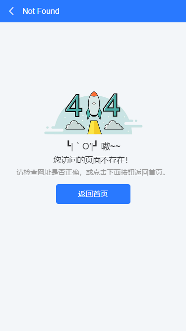
path: '/pages/error/404',
img: require('@/static/mac/keychain.png'),
title: 'Error page',
},
{ type: 'divider' },
/* Nav menu */
{
img: require('@/static/logo.png'),
title: 'github',
},
{
img: 'https://www.uviewui.com/common/logo.png',
title: 'gitee',
},
{
img: require('@/static/mac/colorsync.png'),
title: 'skin',
},
{
img: require('@/static/mac/info.png'),
title: 'about',
},
{ type: 'divider' },
{
img: require('@/static/mac/bin.png'),
title: 'recycle bin',
badge: 12,
},
]
},
},
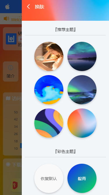
Uni uadmin public template
The public template is divided into bottom custom navigation + main container content area + bottom dock + public skin changing module. In addition, it supports the global skin change function.
<template>
<view class="ua__pageview flexbox flex-col" :style="{'--SKIN': $store.state.skin, 'background': bgcolor, 'color': color}">
<slot name="header" />
<!-- //Main container -- >
<view class="ua__scrollview flex1">
<slot />
</view>
<!-- //Bottom -- >
<slot name="footer" />
<!-- //dock menu -- >
<ua-dock v-if="dock && dock != 'false'" @click="handleDockClick" />
<!-- //Functional pop-up -- >
<ua-popup ref="uapopup" />
<!-- //Skin changing bullet frame template -- >
<ua-popup v-model="isVisibleSkin" position="right">
<Skin />
</ua-popup>
</view>
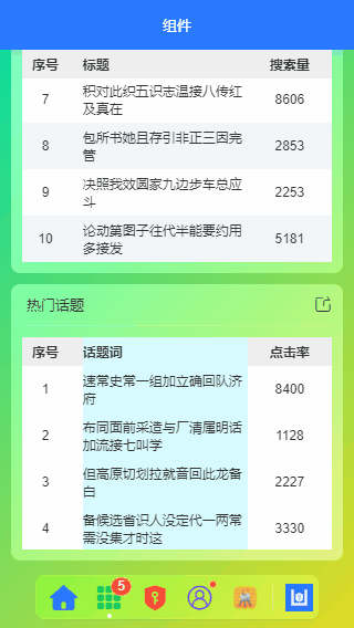
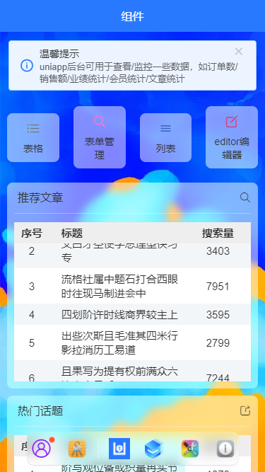
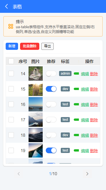
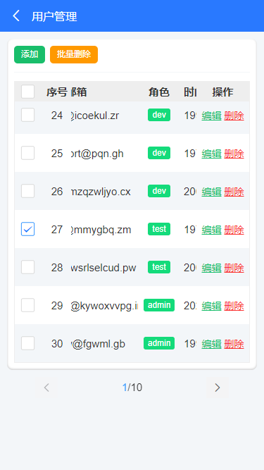
</template>One of the highlights of the project is the table component. This function has been debugged for a long time. Due to the uniapp and applet mechanism, the content of custom slot has been difficult to be compatible. Finally, we can only adopt a balanced way to be compatible with app+h5 + applets.
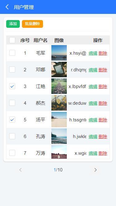
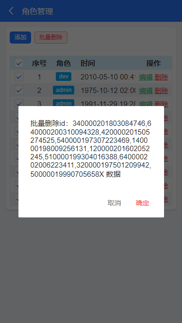
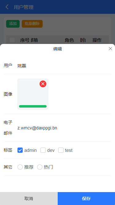
UA table comes with this project. It supports all selection, single selection, column width / center, sliding left and right, up and down to fix the header and column, clicking on a row to return row data, returning single selection and multiple selection row and column data, and customizing dynamic slot and other functions.
<ua-table
    :columns="columns"
    headerBgColor="#eee"
    :headerBold="true"
    stripe
    padding="5px 0"
    :data="data.list"
    height="450rpx"
>
</ua-table>

<script>
import Mock from 'mockjs'

export default {
    data() {
        return {
            columns: [
                {type: 'index', align: 'center', width: 100, fixed: true}, // Index ordinal
                {prop: 'title', label: 'title', align: 'left', width: '350'},
                {prop: 'num', label: 'Search volume', align: 'center', width: 120},
            ],
            data: Mock.mock({
                total: 100,
                page: 1,
                pagesize: 10,
                'list|10': [
                    {
                        id: '@id()',
                        title: '@ctitle(10, 20)',
                        num: '@integer(1000,10000)'
                    }
                ]
            }),
        }
    }
}
</script>
The function can be called quickly through the above method. If you want to customize the slot to enrich the table content, you can customize the slot field.
<ua-table
    :columns="columns"
    headerBgColor="#eee"
    :headerBold="true"
    :stripe="true"
    :data="data.list"
    @row-click="handleRowClick"
    @select="handleCheck"
    height="750rpx"
    style="border:1px solid #eee"
>
    <template #default="{row, col, index}">
        <block v-if="col.slot == 'image'">
            <u-image :src="row.image" :lazy-load="true" height="100rpx" width="100rpx" @click="previewImage(row.image)" />
        </block>
        <block v-if="col.slot == 'switch'">
            <u-switch v-model="row.switch" inactive-color="#fff" :size="36"></u-switch>
        </block>
        <block v-if="col.slot == 'tags'">
            <u-tag :text="row.tags" bg-color="#607d8b" color="#fff" mode="dark" size="mini" />
        </block>
        <block v-if="col.slot == 'progress'">
            <u-line-progress active-color="#1fb925" :percent="row.progress" :show-percent="false" :height="16"></u-line-progress>
        </block>
        <block v-if="col.slot == 'btns'">
            <view class="ua__link success" @click.stop="handleFormEdit(row)">edit</view>
            <view class="ua__link error" @click.stop="handleDel(row, index)">delete</view>
        </block>
    </template>
</ua-table>

<script>
import Mock from 'mockjs'

export default {
    data() {
        return {
            columns: [
                {type: 'selection', align: 'center', width: 80, fixed: true}, // Multiple choice
                {type: 'index', align: 'center', width: 80, fixed: true}, // Index ordinal
                {prop: 'author', label: 'author', align: 'center', width: 120},
                {prop: 'title', label: 'title', align: 'left', width: 350},
                {slot: 'image', label: 'picture', align: 'center', width: 120},
                {slot: 'switch', label: 'recommend', align: 'center', width: 100},
                {slot: 'tags', label: 'label', align: 'center', width: 100},
                {slot: 'progress', label: 'degree of heat', align: 'center', width: 150},
                {prop: 'date', label: 'Release time', align: 'left', width: 300}, // time
                {slot: 'btns', label: 'operation', align: 'center', width: 150, fixed: 'right'}, // operation
            ],
            data: Mock.mock({
                total: 100,
                page: 1,
                pagesize: 10,
                'list|30': [
                    {
                        id: '@id()',
                        author: '@cname()',
                        title: '@ctitle(10, 20)',
                        image: 'https://picsum.photos/400/400?random=' + '@guid()',
                        switch: '@boolean()',
                        'tags|1': ['admin', 'test', 'dev'],
                        progress: '@integer(30, 90)',
                        date: '@datetime()'
                    }
                ]
            }),
        }
    }
}
</script>
How about it? Isn't it very simple? Ha ha, it's a function that has been debugged for a long time, especially the small program v-for to realize custom slot. It's really hard to say
Oh, that's all for today's sharing. The sound of firecrackers outside has become a lot. I'm going to get up and eat.