When it comes to data analysis, it must be inseparable from data visualization. After all, charts are more intuitive than cold numbers. Bosses can see trends and conclusions at a glance.
https://pyecharts.org/#/zh-cn/quickstart

Today, let's talk about some common charts in pyecharts.
Installation of pyecarts
pip install pyecharts

Interested partners can also take a look at my previous visualization cases
How fierce is Gu Tianle's Lv Bu? Python crawler visualization tells you!
Python actual combat | what are you doing for Tencent recruitment? Python visualization tells you
Crawler + data visualization, college, primary school girls call Niu X
Import module
The relevant libraries used are as follows:
from pyecharts.charts import Bar
from pyecharts.charts import Pie
from pyecharts.charts import Line
from pyecharts import options as opts
from pyecharts.charts import EffectScatter
from pyecharts.globals import SymbolType
from pyecharts.charts import Grid
from pyecharts.charts import WordCloud
from pyecharts.charts import Map
Here we take the previous ranking data of melon seeds used cars and colleges and universities as an example. Interested partners can refer to:
Crawler + data visualization, college, primary school girls call Niu X
Let's use pandas to import data. For the skills of pandas, please refer to:
People can not refuse the pandas skills, simple but easy to use!
Histogram
Data preparation
pd_data = pd.read_excel('Melon seed used car.xlsx')
pd.set_option('display.max_columns', None)   #Show complete columns
pd.set_option('display.max_rows', None)  #Show complete rows
pd.set_option('display.expand_frame_repr', False)  #Set no collapse data
print(pd_data.head())

#Statistics # transfer classification # and corresponding times
trans_count = pd_data['Transfer of ownership'].value_counts()
#Classification of ownership transfer
x_data = trans_count.index.tolist()
#Statistics of data in each group after classification
y_data = trans_count.tolist()

print(x_data)
print(y_data)

'''
['1 Secondary transfer', '0 Secondary transfer', '3 Secondary transfer']
[10, 8, 1]
'''
mapping
#Histogram
bar = Bar()
bar.add_xaxis(x_data)
bar.add_yaxis("Transfer times", y_data)
bar.set_global_opts(title_opts=opts.TitleOpts(title="Bar - Used car transfer display"))
bar.render('Used car transfer display.shtml')
Exhibition

Of course, sometimes you can add multiple y-axis records to a histogram to realize multiple columnar comparison. You only need to call add one more time_ Yaxis.
Of course, pyecharts also supports chain calling, and the functions are the same. The code is as follows:
#Histogram
z_data = [22, 12, 18]
bar = (
    Bar()
    .add_xaxis(x_data)
    .add_yaxis("20 Annual transfer times", y_data)
    .add_yaxis("21 Annual transfer times", z_data)
    .set_global_opts(title_opts=opts.TitleOpts(title="Bar - Comparison of used car ownership transfer"))
    )
bar.render('Comparison and transfer of used cars.shtml')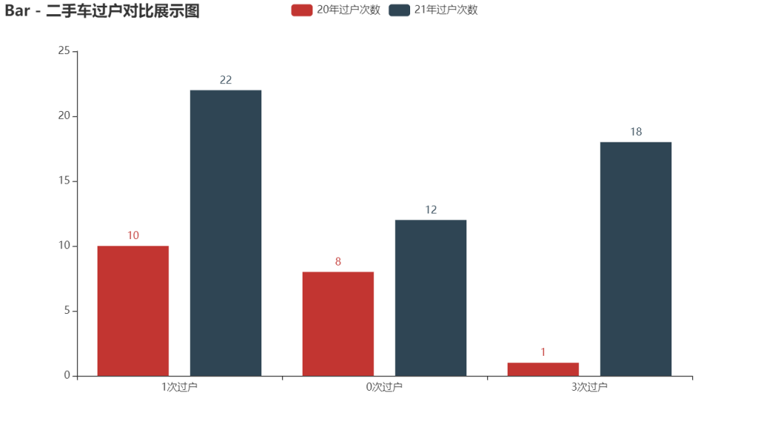
Sometimes, the histogram is too high to see. We can also exchange the x-axis and y-axis to generate a horizontal histogram. The multi histogram and xy axis are interchangeable without conflict and can be superimposed.
#Histogram
z_data = [22, 12, 18]
bar = (
    Bar()
    .add_xaxis(x_data)
    .add_yaxis("20 Annual transfer times", y_data)
    .add_yaxis("21 Annual transfer times", z_data)
    .reversal_axis()
    .set_global_opts(title_opts=opts.TitleOpts(title="Bar - Horizontal comparison display of used car transfer"))
    )
bar.render('Display of horizontal comparison and transfer of used cars.shtml')
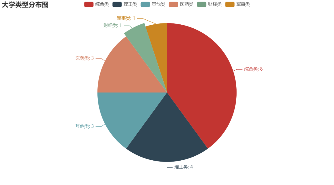
Pie chart
Pie chart is also one of the most frequently used charts, especially for the percentage chart, which can intuitively see the proportion of the overall share of each category.
Data preparation
pd_data = pd.read_excel('National University data.xlsx')
pd.set_option('display.max_columns', None)   #Show complete columns
pd.set_option('display.max_rows', None)  #Show complete rows
pd.set_option('display.expand_frame_repr', False)  #Set no collapse data

type_name = pd_data['type_name'].value_counts()
type_name1 = type_name.index.tolist()  #University type distribution map
type_name2 = type_name.tolist()  #Number of University types
mapping
#Draw pie chart
c = (
    Pie()
    .add("", [list(z) for z in zip(type_name1, type_name2)])
    .set_global_opts(title_opts=opts.TitleOpts(title="University type distribution map"))
    .set_series_opts(label_opts=opts.LabelOpts(formatter="{b}: {c}"))
    .render("University type.shtml")
)
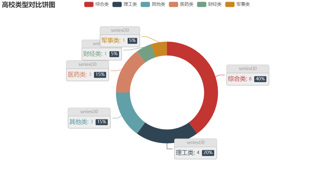
Circular pie chart
c = (
    Pie()
    .add(
        "",
        [list(z) for z in zip(type_name1, type_name2)],
        radius=["40%", "55%"],
        label_opts=opts.LabelOpts(
            position="outside",
            formatter="{a|{a}}{abg|}\n{hr|}\n {b|{b}: }{c}  {per|{d}%}  ",
            background_color="#eee",
            border_color="#aaa",
            border_width=1,
            border_radius=4,
            rich={
                "a": {"color": "#999", "lineHeight": 22, "align": "center"},
                "abg": {
                    "backgroundColor": "#e3e3e3",
                    "width": "100%",
                    "align": "right",
                    "height": 22,
                    "borderRadius": [4, 4, 0, 0],
                },
                "hr": {
                    "borderColor": "#aaa",
                    "width": "100%",
                    "borderWidth": 0.5,
                    "height": 0,
                },
                "b": {"fontSize": 16, "lineHeight": 33},
                "per": {
                    "color": "#eee",
                    "backgroundColor": "#334455",
                    "padding": [2, 4],
                    "borderRadius": 2,
                },
            },
        ),
    )
    .set_global_opts(title_opts=opts.TitleOpts(title="Comparison pie chart of University types"))
    .render("Comparison pie chart of University types.shtml")
)
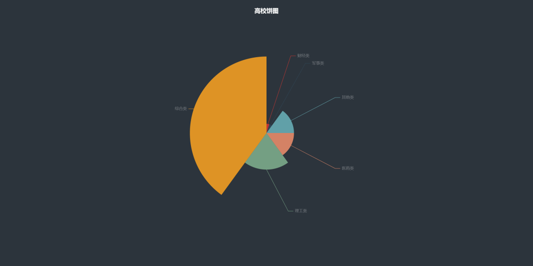
Pie chart 2
data_pair = [list(z) for z in zip(type_name1, type_name2)]
data_pair.sort(key=lambda x: x[1])

(
    Pie(init_opts=opts.InitOpts(width="1600px", height="800px", bg_color="#2c343c"))
    .add(
        series_name="Access source",
        data_pair=data_pair,
        rosetype="radius",
        radius="55%",
        center=["50%", "50%"],
        label_opts=opts.LabelOpts(is_show=False, position="center"),
    )
    .set_global_opts(
        title_opts=opts.TitleOpts(
            title="College pie chart",
            pos_left="center",
            pos_top="20",
            title_textstyle_opts=opts.TextStyleOpts(color="#fff"),
        ),
        legend_opts=opts.LegendOpts(is_show=False),
    )
    .set_series_opts(
        tooltip_opts=opts.TooltipOpts(
            trigger="item", formatter="{a} <br/>{b}: {c} ({d}%)"
        ),
        label_opts=opts.LabelOpts(color="rgba(255, 255, 255, 0.3)"),
    )
    .render("College pie chart.html")
)
Line chart
The line chart is usually used to show the trend of data in different time periods. For example, the classic stock market K-line chart is one of the line charts.
pd_data = pd.read_excel('National University data.xlsx')
type_name = pd_data['type_name'].value_counts()
type_name1 = type_name.index.tolist()  #Science and technology vs. comprehensive
type_name2 = type_name.tolist()  #Science and technology} vs. comprehensive corresponding quantity
print(type_name1)
print(type_name2)
mapping
#Line chart
line = (
    Line()
    .add_xaxis(type_name1)
    .add_yaxis('china', type_name2)
    .set_global_opts(title_opts=opts.TitleOpts(title="Popularity value of colleges and Universities"))
)
line.render('Popularity value of colleges and Universities.shtml')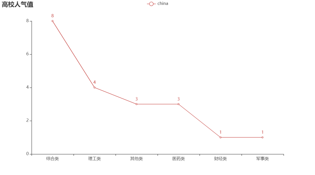
Similarly, like a bar chart, a line chart can add multiple y-axis records to a chart.
line = (
    Line()
    .add_xaxis(type_name1)
    .add_yaxis('2020', type_name2)
    .add_yaxis('2021', z_data)
    .set_global_opts(title_opts=opts.TitleOpts(title="Double line chart"))
)
line.render('Double line chart of popularity value of colleges and Universities.shtml')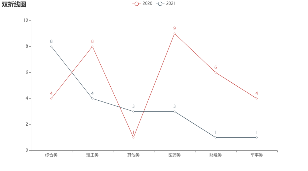
Of course, there is also a ladder line chart, which can also be realized
line = (
    Line()
    .add_xaxis(type_name1)
    .add_yaxis('2020', type_name2, is_step=True)
    .add_yaxis('2021', z_data, is_step=True)
    .set_global_opts(title_opts=opts.TitleOpts(title="Step line chart"))
)
line.render('Ladder diagram of popularity value of colleges and Universities.shtml')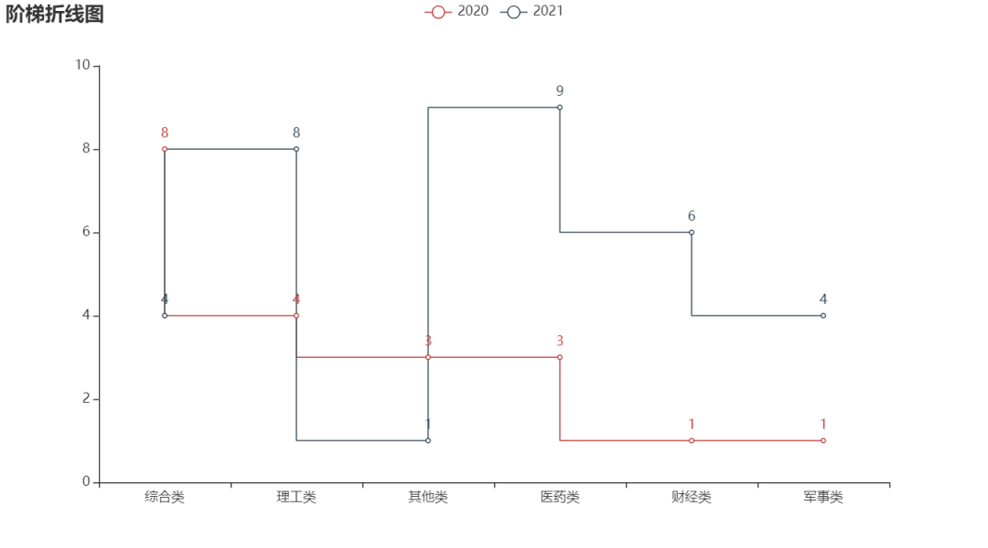
Map
Sometimes we want to display the data on the map, such as the national epidemic situation, the population data of various provinces, the distribution of wechat friends in various provinces, etc.
Data preparation
pd_data = pd.read_excel('National University data.xlsx')
school_num = pd_data.province_name.value_counts().sort_values()

school_num1 = school_num.index.tolist()
school_num2 = school_num.values.tolist()

print(school_num1)
print(school_num2)
mapping
map = (
    Map()
    .add("", [list(z) for z in zip(school_num1, school_num2)], "china")
    .set_global_opts(
        title_opts=opts.TitleOpts(title="China map example"),
        visualmap_opts=opts.VisualMapOpts(max_=5, is_piecewise=True),
    )

)
map.render('National University distribution map.shtml')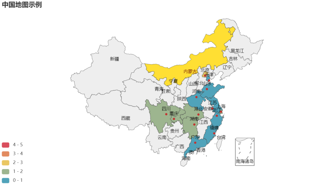

Funnel diagram
Data preparation
pd_data = pd.read_excel('./National University data.xlsx')
#Remove 'w'‘
pd_data.loc[:, 'view_total1'] = pd_data['view_total'].str.replace('w', '').astype('float64')
#Price range Division
pd_data['view_total section'] = pd.cut(pd_data['view_total1'], [0, 500, 1000, 1500, 2000, 2500, 3000, 3500],
                                 labels=['0-500', '500-1000', '1000-1500', '1500-2000', '2000-2500', '2500-3000',
                                         '>3000'])
#Statistical quantity
popular = pd_data['view_total section'].value_counts()
popular1 = popular.index.tolist()  #Popularity value classification
popular2 = popular.tolist()  #Corresponding quantity '' of popularity value classification
print(popular1)
print(popular2)
mapping
c = (
    Funnel()
    .add(
        "colleges and universities",
        [list(z) for z in zip(popular1, popular2)],
        label_opts=opts.LabelOpts(position="inside"),
    )
    .set_global_opts(title_opts=opts.TitleOpts(title="Popularity funnel"))
    .render("Popularity funnel.shtml")
)
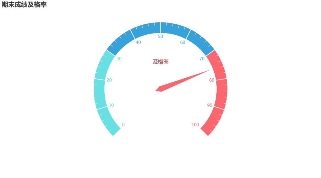
Dashboard
c = (
    Gauge()
    .add(
        "Pass index",
        [("pass rate", 75.5)],
        axisline_opts=opts.AxisLineOpts(
            linestyle_opts=opts.LineStyleOpts(
                color=[(0.3, "#67e0e3"), (0.7, "#37a2da"), (1, "#fd666d")], width=30
            )
        ),
    )
    .set_global_opts(
        title_opts=opts.TitleOpts(title="Passing rate of final grade"),
        legend_opts=opts.LegendOpts(is_show=False),
    )
    .render("Grade pass rate.html")
)
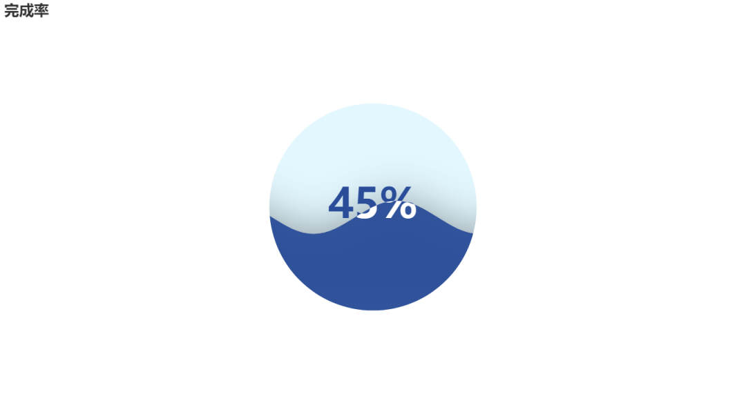
Water drop diagram
c = (
    Liquid()
    .add("lq", [0.45], is_outline_show=False)
    .set_global_opts(title_opts=opts.TitleOpts(title="Completion rate"))
    .render("liquid_without_outline.html")
)