The following is the contribution of the apprentice in November
The single-cell transcriptome data set (GSE48192) introduced this time has not been published yet. The summary is: chip SEQ is used to detect the active enhancer histone markers H3K27ac and RUNX1, and then its impact on gene expression is analyzed by single-cell rna sequencing.
- Link: https://www.ncbi.nlm.nih.gov/geo/query/acc.cgi?acc=GSE148192
The sample information of the data is shown in the figure: at present, we only look at the single cell data:
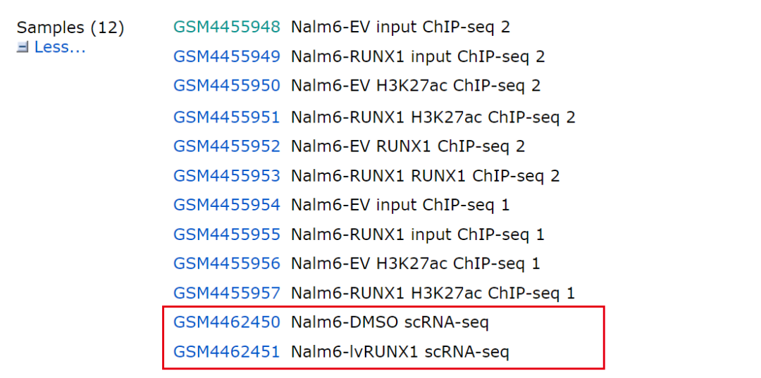
image-20210904225559157
As for the data of two single cell samples and standard 10x instrument, let's begin to reproduce:
Step 1: data download and reading

image-20210904231127546
Click custom to select the data we want to download:
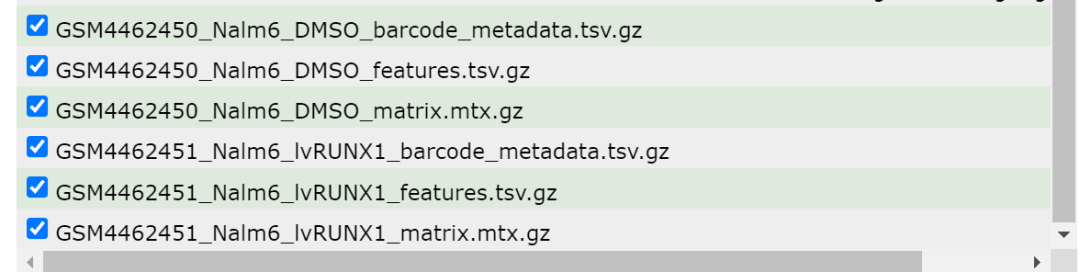
image-20210904231347539
After downloading the data, we will get the following files:

image-20210904231650429
Next, you can read them. Interestingly, each sample needs to read three files independently and merge them into a single-cell Seurat object. The operation skills are full!
# Import data to build Seurat objects----------------------------------------------------------
suppressPackageStartupMessages(library(Seurat))
suppressPackageStartupMessages(library(ggplot2))
suppressPackageStartupMessages(library(clustree))
suppressPackageStartupMessages(library(cowplot))
suppressPackageStartupMessages(library(dplyr))
suppressPackageStartupMessages(library(data.table))
suppressPackageStartupMessages(library(stringr) )
suppressPackageStartupMessages(library(patchwork))
library(Seurat)
# https://hbctraining.github.io/scRNA-seq/lessons/readMM_loadData.html
library(Matrix)
library(data.table)
mtx=readMM('../data/GSM4462450_Nalm6_DMSO_matrix.mtx.gz')
mtx
dim(mtx)
cl=fread('../data/GSM4462450_Nalm6_DMSO_barcodes.tsv.gz',
         header = T,data.table = F )
head(cl)
rl=fread('../data/GSM4462450_Nalm6_DMSO_features.tsv.gz',
         header = T,data.table = F )
head(cl)
head(rl)
dim(mtx)
colnames(mtx) <- rl$V1
rownames(mtx) <- cl$V1
DMSO=CreateSeuratObject(counts = t(mtx),
                        pro='DMSO')
head(DMSO@meta.data)
mtx=readMM('../data/GSM4462451_Nalm6_lvRUNX1_matrix.mtx.gz')
mtx
dim(mtx)
cl=fread('../data/GSM4462451_Nalm6_lvRUNX1_barcodes.tsv.gz',
         header = T,data.table = F )
head(cl)
rl=fread('../data/GSM4462451_Nalm6_lvRUNX1_features.tsv.gz',
         header = T,data.table = F )
head(cl)
head(rl)
dim(mtx)
colnames(mtx) <- rl$V1
rownames(mtx) <- cl$V1
RUNX1=CreateSeuratObject(counts = t(mtx),
                         pro='RUNX1')
head(RUNX1@meta.data)

sceList=list(
  DMSO=DMSO,
  RUNX1=RUNX1
)
save(sceList,file = 'sceList.Rdata')
Setp2: data quality control filtering
There's nothing to say about this place. It's standard code. Just copy and paste it:
sce.all <- merge(sceList[[1]],sceList[[-1]],,add.cell.ids = c("DMSO","RUNX1"),merge.data = T)
# Quality control and filtration-------------------------------------------------------------------
#Mitochondrial gene ratio was calculated
# The genetic names of humans and mice are slightly different
mito_genes=rownames(sce.all)[grep("^MT-", rownames(sce.all))]
mito_genes #13 mitochondrial genes
sce.all=PercentageFeatureSet(sce.all, "^MT-", col.name = "percent_mito")
fivenum(sce.all@meta.data$percent_mito)
#Calculate the proportion of ribosomal genes
ribo_genes=rownames(sce.all)[grep("^RP[sl]", rownames(sce.all),ignore.case = T)]
ribo_genes
sce.all=PercentageFeatureSet(sce.all, "^RP[SL]", col.name = "percent_ribo")
fivenum(sce.all@meta.data$percent_ribo)
#Calculate the red blood cell gene ratio
hb_genes <- rownames(sce.all)[grep("^HB[^(p)]", rownames(sce.all),ignore.case = T)]
hb_genes
sce.all=PercentageFeatureSet(sce.all, "^HB[^(P)]", col.name = "percent_hb")
fivenum(sce.all@meta.data$percent_hb)

#Visualize the above proportion of cells
Idents(sce.all)
feats <- c("nFeature_RNA", "nCount_RNA")
p1=VlnPlot(sce.all, group.by = "orig.ident", features = feats, pt.size = 0.01, ncol = 2) + NoLegend()
p1
ggsave(filename="../picture/1_QC/Vlnplot1.png",plot=p1)

feats <- c("percent_mito", "percent_ribo", "percent_hb")
p2=VlnPlot(sce.all, group.by = "orig.ident", features = feats, pt.size = 0.01, ncol = 3, same.y.lims=T) +
  scale_y_continuous(breaks=seq(0, 100, 5)) +
  NoLegend()
p2
ggsave(filename="../picture/1_QC/Vlnplot2.png",plot=p2)

p3=FeatureScatter(sce.all, "nCount_RNA", "nFeature_RNA", group.by = "orig.ident", pt.size = 0.5)
p3
ggsave(filename="../picture/1_QC/Scatterplot.pdf",plot=p3)

# First filter (no article adopts default parameters)-------------------------------------------------------------------
#Low quality cells / genes were filtered according to the above indicators
#Filtration index 1: cells expressing the least number of genes & genes expressing the least number of cells
selected_c <- WhichCells(sce.all, expression = nFeature_RNA >300) # Gene expression > 300 in each cell
selected_f <- rownames(sce.all)[Matrix::rowSums(sce.all@assays$RNA@counts > 0 ) > 3] # Expressed in at least 3 cells
sce.all.filt <- subset(sce.all, features = selected_f, cells = selected_c)
dim(sce.all)
# [1] 57905 11564
dim(sce.all.filt)
# [1] 22302 11465
table(sce.all$orig.ident)
# DMSO RUNX1
# 6073  5491
table(sce.all.filt$orig.ident)
# DMSO RUNX1
# 6022  5443
# Second filtration-------------------------------------------------------------------
#Filtration index 2: mitochondrial / ribosomal gene ratio (according to the violin diagram above)
dim(sce.all.filt)
selected_mito <- WhichCells(sce.all.filt, expression = percent_mito < 15)
selected_ribo <- WhichCells(sce.all.filt, expression = percent_ribo > 1)
# If there are too many red blood cells, relax the threshold appropriately. Here, set the threshold to 5
selected_hb <- WhichCells(sce.all.filt, expression = percent_hb < 0.05)
length(selected_hb)
length(selected_ribo)
length(selected_mito)

sce.all.filt <- subset(sce.all.filt, cells = selected_mito)
sce.all.filt <- subset(sce.all.filt, cells = selected_ribo)
sce.all.filt <- subset(sce.all.filt, cells = selected_hb)
dim(sce.all.filt)
# [1] 22302  9765
table(sce.all$orig.ident)
# DMSO RUNX1
# 6073  5491
table(sce.all.filt$orig.ident)
# DMSO RUNX1
# 5911  3854
# Save the filtered Seurat object (sce.all.filt)--------------------------------------------
save(sce.all.filt,file = "../data/sce.all.filt.Rdata")
Step 3: Dimension Reduction Clustering
Dimensionality reduction analysis (check batch effect)
# Dimension reduction cluster analysis------------------------------------------------------------------
rm(list=ls())
load("../data/sce.all.filt.Rdata")
#Check data
dim(sce.all.filt)
# [1] 22302  9765
table(sce.all.filt$orig.ident)
# DMSO RUNX1
# 5911  3854
sce <- sce.all.filt
#Data preprocessing
sce <- NormalizeData(sce)
sce = ScaleData(sce,
                features = rownames(sce),
                # vars.to.regress = c("nFeature_RNA", "percent_mito")
)  #Run so slow after adding the vars.to.address parameter!!!
# Dimension reduction processing
sce <- FindVariableFeatures(sce, nfeatures = 3000)
sce <- RunPCA(sce, npcs = 30)
sce <- RunTSNE(sce, dims = 1:30)
sce <- RunUMAP(sce, dims = 1:30)

# Check batch effect------------------------------------------------------------------

colnames(sce@meta.data)
# [1] "orig.ident"   "nCount_RNA"   "nFeature_RNA"
# [4] "percent_mito" "percent_ribo" "percent_hb"
p1.compare=plot_grid(ncol = 3,
                     DimPlot(sce, reduction = "pca", group.by = "orig.ident")+NoAxes()+ggtitle("PCA"),
                     DimPlot(sce, reduction = "tsne", group.by = "orig.ident")+NoAxes()+ggtitle("tSNE"),
                     DimPlot(sce, reduction = "umap", group.by = "orig.ident")+NoAxes()+ggtitle("UMAP")
)
p1.compare
ggsave(plot=p1.compare,filename="../picture/2_PCA_UMAP_TSNE/Before_inter_1.pdf")
DimPlot(sce,
        reduction = "umap", # pca, umap, tsne
        group.by = "orig.ident",
        label = F)
ggsave("../picture/2_PCA_UMAP_TSNE/Dimplot_before_1.pdf",units = "cm", width = 20,height = 18)
save(sce,file = "../subdata/before_sce.Rdata")
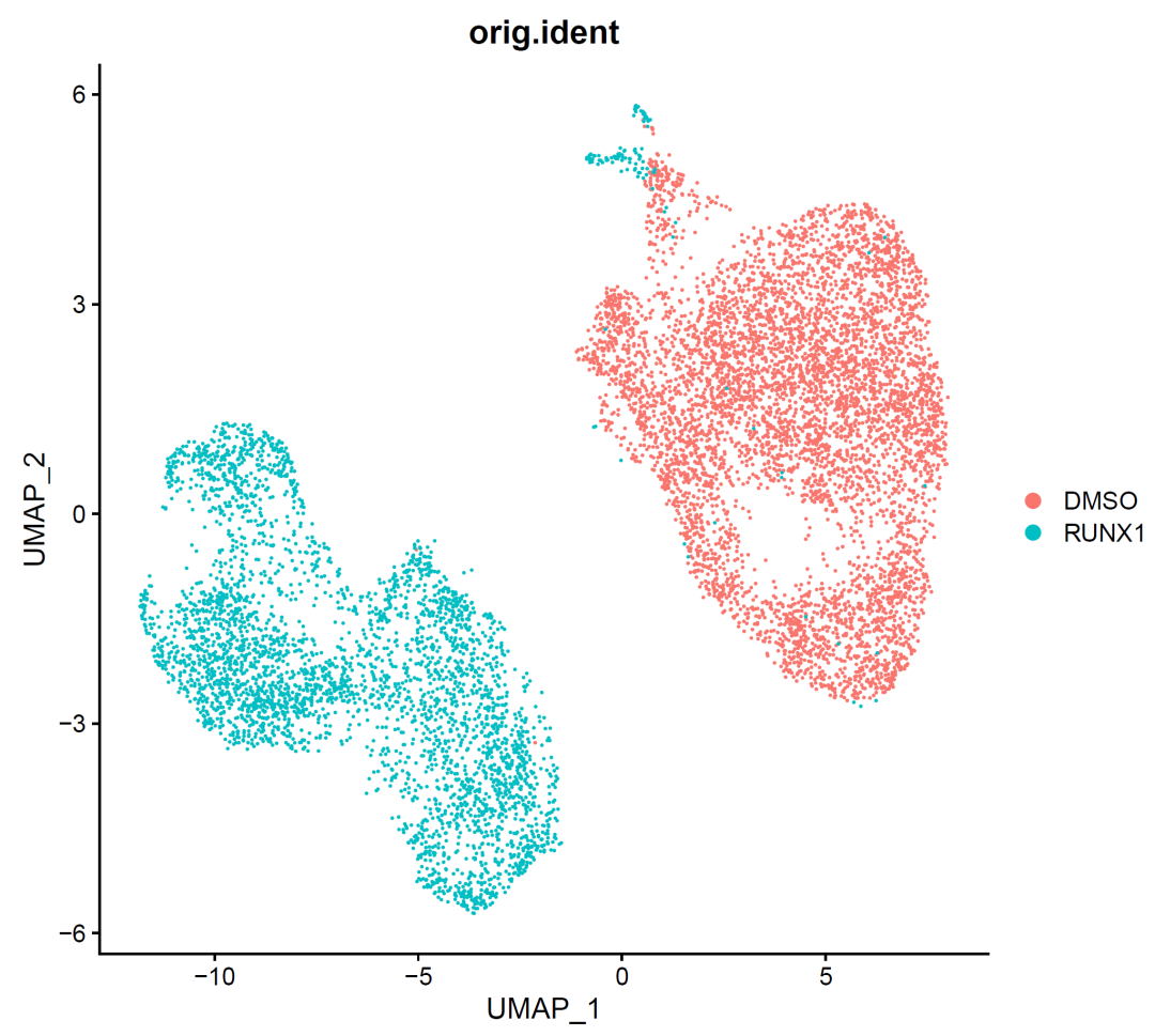
image-20210905002232251
It can be seen from the figure that there is an obvious batch effect. In fact, it is also mixed with the sample difference. However, generally, we think that the sample difference should not be that the two samples do not have any single cell subsets of the same type at all. They are too clear-cut, so it is imperative to remove this difference at this time!
CCA removes batch effect
At present, CCA is the mainstream method, and we also use it!
sce.all=sce
sce.all
# An object of class Seurat
# 22302 features across 9765 samples within 1 assay
# Active assay: RNA (22302 features, 3000 variable features)
# 3 dimensional reductions calculated: pca, tsne, umap

#Split into multiple seurat sub objects
sce.all.list <- SplitObject(sce.all, split.by = "orig.ident")
sce.all.list
for (i in 1:length(sce.all.list)) {
  print(i)
  sce.all.list[[i]] <- NormalizeData(sce.all.list[[i]], verbose = FALSE)
  sce.all.list[[i]] <- FindVariableFeatures(sce.all.list[[i]], selection.method = "vst",
                                            nfeatures = 2000, verbose = FALSE)
}
# Look at computer performance
alldata.anchors <- FindIntegrationAnchors(object.list = sce.all.list, dims = 1:30,
                                          reduction = "cca")
sce.all.int <- IntegrateData(anchorset = alldata.anchors, dims = 1:30, new.assay.name = "CCA")
names(sce.all.int@assays)
#[1] "RNA" "CCA"
sce.all.int@active.assay
#[1] "CCA"
sce.all.int=ScaleData(sce.all.int)
sce.all.int=RunPCA(sce.all.int, npcs = 30)
sce.all.int=RunTSNE(sce.all.int, dims = 1:30)
sce.all.int=RunUMAP(sce.all.int, dims = 1:30)
names(sce.all.int@reductions)
# Check batch effect----
p2.compare=plot_grid(ncol = 3,
                     DimPlot(sce.all.int, reduction = "pca", group.by = "orig.ident")+NoAxes()+ggtitle("PCA"),
                     DimPlot(sce.all.int, reduction = "tsne", group.by = "orig.ident")+NoAxes()+ggtitle("tSNE"),
                     DimPlot(sce.all.int, reduction = "umap", group.by = "orig.ident")+NoAxes()+ggtitle("UMAP")
)
p2.compare
ggsave(plot=p2.compare,filename="../picture/2_PCA_UMAP_TSNE/Before_inter_CCA_2.pdf")

# CCA comparison before and after removal of batches--------------------------------------------------------
p5.compare=plot_grid(ncol = 3,
                     DimPlot(sce, reduction = "pca", group.by = "orig.ident")+NoAxes()+ggtitle("PCA"),
                     DimPlot(sce, reduction = "tsne", group.by = "orig.ident")+NoAxes()+ggtitle("tSNE"),
                     DimPlot(sce, reduction = "umap", group.by = "orig.ident")+NoAxes()+ggtitle("UMAP"),

                     DimPlot(sce.all.int, reduction = "pca", group.by = "orig.ident")+NoAxes()+ggtitle("PCA"),
                     DimPlot(sce.all.int, reduction = "tsne", group.by = "orig.ident")+NoAxes()+ggtitle("tSNE"),
                     DimPlot(sce.all.int, reduction = "umap", group.by = "orig.ident")+NoAxes()+ggtitle("UMAP")
)
p5.compare
ggsave(plot=p5.compare,filename="../picture/2_PCA_UMAP_TSNE/umap_by_har_before_after.pdf",units = "cm", width = 40,height = 18)

save(sce.all.int,file = "../data/sce.all.int_by_cca.Rdata")
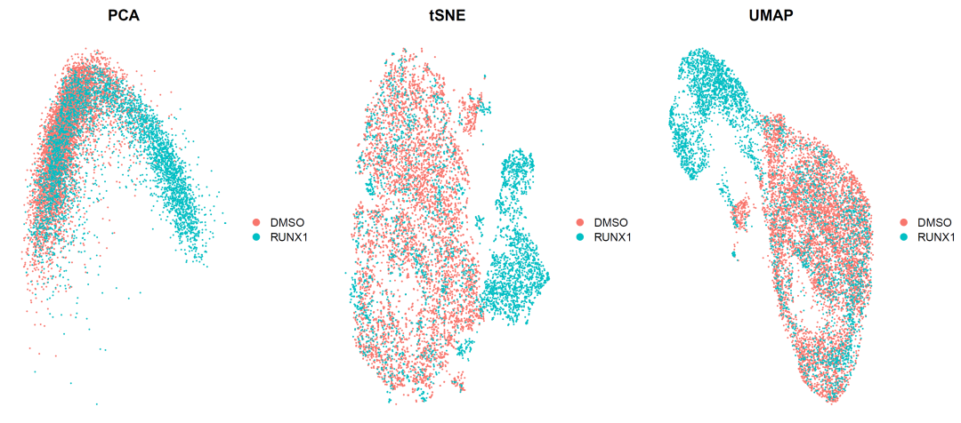
image-20210905004618475
It can be seen that the differences between the two samples still exist, but they begin to have the intersection of single-cell subsets, which is very good. It shows that our batch effect has been corrected and the sample differences have been retained.
Step 3: clustering
# CCA cluster analysis------------------------------------------------------------------
rm(list = ls())
load("../data/sce.all.int_by_cca.Rdata")
sce <- sce.all.int
sce <- FindNeighbors(sce, dims = 1:30)
for (res in c(0.01, 0.05, 0.1, 0.2, 0.3, 0.5,0.8,1)) {
  # res=0.01
  print(res)
  sce <- FindClusters(sce, graph.name = "CCA_snn", resolution = res, algorithm = 1)
}
ls <- apply(sce@meta.data[,grep("CCA_snn_res",colnames(sce@meta.data))],2,table)
ls
# CCA clustering data----
save(sce,file = '../subdata/first_sce_by_CCA.Rdata')

#Cluster tree visualization
colors <- c('#e41a1c','#377eb8','#4daf4a','#984ea3','#ff7f00','#ffff33','#a65628','#f781bf')
names(colors) <- unique(colnames(sce@meta.data)[grep("CCA_snn_res", colnames(sce@meta.data))])

p2_tree <- clustree(sce@meta.data, prefix = "CCA_snn_res.")
p2_tree
ggsave(p2_tree, filename = "../picture/2_PCA_UMAP_TSNE/cluster_tree_by_CCA.pdf", width = 10, height = 8)

#umap visualization
cluster_umap <- plot_grid(ncol = 4,
                          DimPlot(sce, reduction = "umap", group.by = "CCA_snn_res.0.01", label = T) & NoAxes(),
                          DimPlot(sce, reduction = "umap", group.by = "CCA_snn_res.0.05", label = T)& NoAxes(),
                          DimPlot(sce, reduction = "umap", group.by = "CCA_snn_res.0.1", label = T) & NoAxes(),
                          DimPlot(sce, reduction = "umap", group.by = "CCA_snn_res.0.2", label = T)& NoAxes(),
                          DimPlot(sce, reduction = "umap", group.by = "CCA_snn_res.0.3", label = T)& NoAxes(),
                          DimPlot(sce, reduction = "umap", group.by = "CCA_snn_res.0.5", label = T) & NoAxes(),
                          DimPlot(sce, reduction = "umap", group.by = "CCA_snn_res.0.8", label = T) & NoAxes(),
                          DimPlot(sce, reduction = "umap", group.by = "CCA_snn_res.1", label = T) & NoAxes()
)
ggsave(cluster_umap, filename = "../picture/2_PCA_UMAP_TSNE/cluster_umap_all_res_by_CCA.pdf", width = 16, height = 8)

#Save data
saveRDS(sce, file = "../subdata/sce_all_by_CCA.Rds")
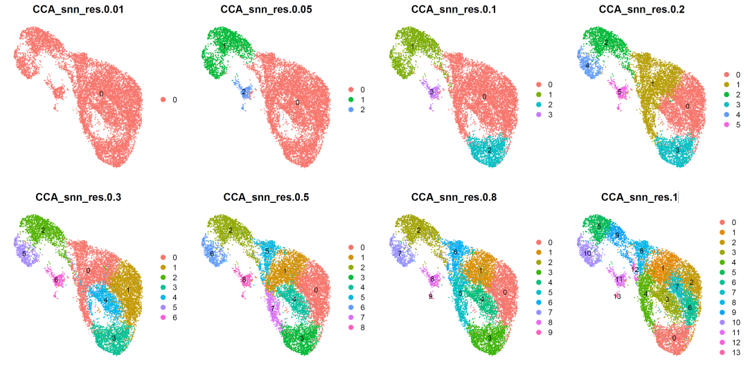
image-20210905005904358
According to the clustering results, we selected resolution=0.5 for cell subgroup annotation.
Setp4: cell subpopulation annotation
# Prevent the original data from being changed and renamed
sce.all <- sce
Idents(sce.all) <- "CCA_snn_res.0.5"
# all markergenes -----------------------------------------------------------
p_umap=DimPlot(sce.all, reduction = "umap",
               group.by = "CCA_snn_res.0.5",label = T,label.size = 4)
p_umap
# paper -------------------------------------------------------------------
genes_to_check = c("MS4A1","IGHD","CD27","NEIL1","MZB1","CD38","TOP2A","MKI67" )
# The gene name (case conversion)----
genes_to_check=str_to_upper(genes_to_check)
genes_to_check
p_all_markers <- DotPlot(sce.all, features = genes_to_check,
                         group.by = "CCA_snn_res.0.5",assay='RNA'  )  + coord_flip()

p_all_markers
ggsave(plot=p_all_markers, filename="../picture/Annotation/check_all_marker_by_CCA_res_0.8.pdf")

p1 <- plot_grid(p_all_markers,p_umap,rel_widths = c(1.5,1))

ggsave(p1,filename = '../picture/Annotation/all_markers_umap_by_CCA_res.0.5.pdf',units = "cm",width = 35,height = 18)
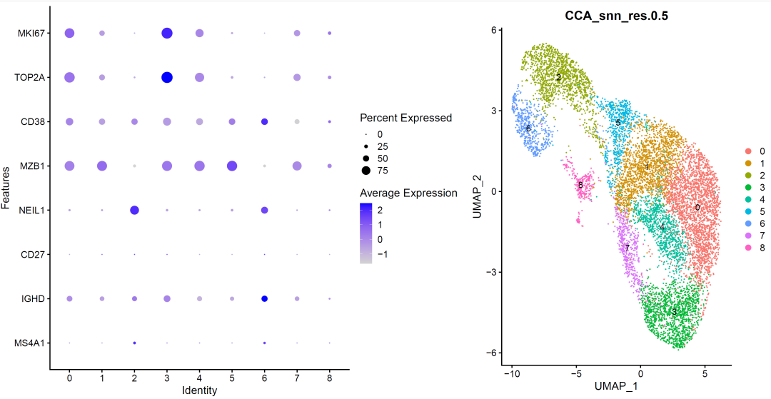
image-20210905010832453
According to marker gene, we annotated the cell subsets:
# Annotated cell subsets------------------------------------------------------------------
###### step6: Cell type notes (according to marker gene) ######
celltype=data.frame(ClusterID=0:8,
                    celltype='NA')
celltype[celltype$ClusterID %in% c( 6 ),2]='Naive B'
celltype[celltype$ClusterID %in% c( 2 ),2]='Germinal center B'
celltype[celltype$ClusterID %in% c( 5 ),2]='Plasma B'
celltype[celltype$ClusterID %in% c( 0,1,3,4,7,8 ),2]='Dividing Plasma B'
head(celltype)
celltype
table(celltype$celltype)
sce.all@meta.data$celltype = "NA"
for(i in 1:nrow(celltype)){
  sce.all@meta.data[which(sce.all@meta.data$CCA_snn_res.0.5 == celltype$ClusterID[i]),'celltype'] <- celltype$celltype[i]}
table(sce.all@meta.data$celltype)
# umap_by_celltype --------------------------------------------------------

th=theme(axis.text.x = element_text(angle = 45,
                                    vjust = 0.5, hjust=0.5))
p_all_markers=DotPlot(sce.all, features = genes_to_check,
                      group.by = "celltype",assay='RNA'  )  + coord_flip()+th

color <- c('#e41a1c','#377eb8','#4daf4a','#984ea3','#ff7f00','#ffff33','#a65628','#f781bf','#999999')
p_umap<- DimPlot(sce.all, reduction = "umap", group.by = "celltype",label = T)
p_umap
ps <- plot_grid(p_all_markers,p_umap,rel_widths = c(1.5,1))
ps
ggsave(ps,filename = "../picture/Annotation/our_markers_dotplot_by_celltype.pdf",units = "cm",width = 40,height = 15)

p_celltype<- DimPlot(sce.all, reduction = "tsne",group.by = "celltype",label = T)
p_celltype
ggsave(p_celltype,filename = '../picture/Annotation/tsne_by_celltype.pdf',width = 20,height = 16,units = "cm")
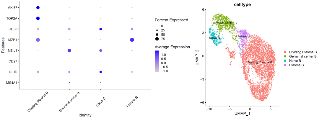
image-20210905011351678
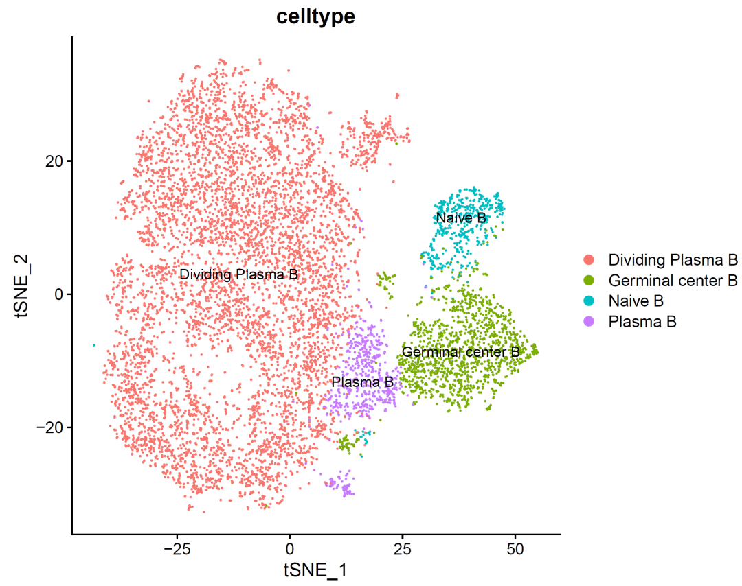
image-20210905011251128
It can be seen that there are a little more B cells in the cell cycle, which may be the characteristic of this cancer?
There should still be many biological stories behind this. Unfortunately, we only learned single-cell data analysis and did not learn single-cell data understanding. There is a long way to go!
Although the above codes can be run by copying and pasting, if you want to better complete the above diagram, you usually need to master five R packages: scanner, monocle, Seurat, scran and m3drop. You need to master their objects: Some single-cell transcriptome R-package objects And the analysis process is similar:
- step1: create object
- Step 2: quality control
- Step 3: standardization and normalization of expression
- step4: remove interference factors (integration of multiple samples)
- step5: judge important genes
- step6: multiple dimensionality reduction algorithms
- step7: visual dimension reduction results
- step8: multiple clustering algorithms
- step9: find the marker gene of each cell subgroup after clustering
- step10: continue classification
The standard dimensionality reduction clustering of single cell transcriptome data analysis and the results after biological annotation. Please refer to the previous examples: Single cell clustering and clustering annotation that everyone can learn , we demonstrate the first level of clustering.