Introduction to rem and vw
1. rem
rem is a unit of relative length, which is a multiple of font-size relative to the root element (html element).
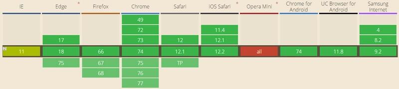
Browser support: Caniuse

Example
- If the root element font-size is 12 PX
html {
    font-size: 12px;
}
h1 {
    font-size: 2rem;  /* 2 × 12px = 24px */
}
p {
    font-size: 1.5rem;   /* 1.5 × 12px = 18px */
}
div {
    width: 10rem;  /* 10 × 12px = 120px */
}
- If the root element font-size is 16px
html {
    font-size: 16px;
}
h1 {
    font-size: 2rem;  /* 2 × 16px = 32px */
}
p {
    font-size: 1.5rem;   /* 1.5 × 16px = 24px */
}
div {
    width: 10rem;  /* 10 × 16px = 160px */
}
web Front-end development learning Q-q-u-n:  767273102 ,Share learning methods and small details that need attention, and keep updating the latest teaching and learning methods (detailed front-end project teaching video)
2. vw
VW is a unit of relative length. Compared with the width of browser window, the width of browser window is divided into 100 units of vw.
Browser support: Caniuse
- Opera Mini does not support this attribute
Example
- When the browser window width is 320px, 1vw = 3.2px
p {
    font-size: 5vw;   /* 5 × 3.2px = 16px */
}
div {
    width: 20vw;  /* 20 × 3.2px = 64px*/
}
- When the browser window width is 375 px, 1vw = 3.75 PX
p {
    font-size: 5vw;   /* 5 × 3.75px = 18.75px */
}
div {
    width: 20vw;  /* 20 × 3.75px = 75px*/
}
Small partners who are interested in web front-end technology can join our learning circle. They have been working for the sixth year. They can share some learning methods and details of practical development. 767-273-102 autumn skirt. How to learn the front-end from the zero foundation? They are all people with dreams. We may be in different cities, but we will travel together. Front end, front end, front end
2. Combining rem and vw to realize equal-scale scaling and self-adaptation of WEB pages
1. Select the base window width and
Examples:
The screen width of the iPhone 6/7/8/X is 375 PX as the reference window width.
Font-size, the basic length of rem unit, is the font-size of the most html element of 15px.
html {
    font-size: 15px;
}
h1 {
    font-size: 2rem;  /* 2 × 15px = 30px */
}
p {
    font-size: 1.2rem;   /* 1.2 × 15px = 18px */
}
div {
    width: 10rem;  /* 10 × 15px = 150px*/
}
Note: font-size of html elements should not be too large or too small.
When font-size is too large, the rem value based on font-size will lose its accuracy and cause larger errors.
When font-size is too small, because many mainstream browsers font-size can not be less than 12px, when font-size is less than 12px, it will be displayed as 12px. At this point, rem units will be calculated on the basis of 12px, and the page will be deviated as a whole.
2. Replace font-size of html elements with vw representation
Window width: 375px

=> 1vw  = 3.75px
=> 15px = ( 15 / 3.75 )vw = 4vw
Therefore, font-size of html elements can be replaced by 4vw
html {
    font-size: 4vw;
}
h1 {
    font-size: 2rem;  /* 2 × 4vw × 3.75px = 30px */
}
p {
    font-size: 1.2rem;   /* 1.2 × 4vw × 3.75px = 18px */
}
div {
    width: 10rem;  /* 10 × 4vw × 3.75px = 150px*/
}
When the window width is adjusted to 320px
1vw = 3.2px
4vw = 4 × 3.2px = 12.8px
html {
    font-size: 4vw;
}
h1 {
    font-size: 2rem;  /* 2 × 4vw × 3.2px = 25.6px */
}
p {
    font-size: 1.2rem;   /* 1.2 × 4vw × 3.2px = 15.36px */
}
div {
    width: 10rem;  /* 10 × 4vw × 3.2px = 128px*/
}
Visible, at this time, all rem-based font sizes and lengths will be scaled equally as the screen width enlarges and decreases.
Say the important thing for the second time
Note: font-size of html elements should not be too large or too small.
When font-size is too large, the rem value based on font-size will lose its accuracy and cause larger errors.
When font-size is too small, because many mainstream browsers font-size can not be less than 12px, when font-size is less than 12px, it will be displayed as 12px. At this point, rem units will be calculated on the basis of 12px, and the page will be deviated as a whole.
3. Set maximum width and minimum width for pages
When the page is less than 300 px, it will no longer be scaled up in equal proportion. When the page is larger than 500 px, it will no longer be scaled up in equal proportion.
When the window width is 300 PX
1vw  = 3px
4vw = 4 × 3px = 12px
When the window width is 500px
1vw  = 5px
4vw = 4 × 5px = 20px
@media screen and (max-width: 300px) {
    html {
        width: 300px;
        font-size: 12px;
    }
}

@media screen and (min-width: 500px) {
    html {
        width: 500px;
        font-size: 20px;
        margin: 0 auto;  /* Let the window be displayed horizontally in the middle */
    }
}
3. Switch PC and WAP pages according to browser width
1. When the width of the page is larger than the threshold, automatically switch to PC page, when less than the threshold, switch back to WAP page.
WAP Page
<!DOCTYPE html>
<html lang="en">
<head>
    <title>WAP page</title>
    <meta name="viewport" content="width=device-width, initial-scale=1, maximum-scale=1, user-scalable=no">
</head>
<body id="wap">
    //I'm WAP page.
<script src="https://mat1.gtimg.com/libs/jquery2/2.2.0/jquery.js"></script>
<script>
function adapt() {
    var agent;
    var clientWidth = document.body.clientWidth;
    console.log(clientWidth);
    if (clientWidth < 800) {
        agent = 'wap';
    } else {
        agent = 'pc'
    }

    if ($('body').attr('id') !== agent) {
        location.href = 'pc.html';
    }
}
adapt();
window.onresize = function(){
    adapt();
};
</script>
</body>
</html>
PC Page
<!DOCTYPE html>
<html lang="en">
<head>
    <title>I am PC page</title>
    <meta name="viewport" content="width=device-width, initial-scale=1, maximum-scale=1, user-scalable=no">
</head>
<body id="pc">
    //I'm a PC page.
<script src="https://mat1.gtimg.com/libs/jquery2/2.2.0/jquery.js"></script>
<script>
function adapt() {
    var agent;
    var clientWidth = document.body.clientWidth;
    console.log(clientWidth);
    if (clientWidth < 800) {
        agent = 'wap';
    } else {
        agent = 'pc'
    }

    if ($('body').attr('id') !== agent) {
        location.href = 'wap.html';
    }
}
adapt();
window.onresize = function(){
    adapt();
};
</script>
</body>
</html>
web Front-end development learning Q-q-u-n:  767273102 ,Share learning methods and small details that need attention, and keep updating the latest teaching and learning methods (detailed front-end project teaching video)