catalogue
1. Color picker set text
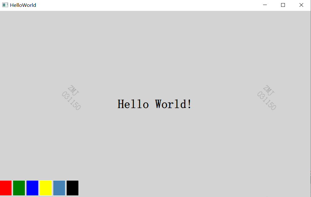
example:

As can be seen from the above figure, there are six cells with different colors in the lower left corner. Click the Cell to set the color of the text. However, in order to avoid reusing code for each Cell, we will introduce a new Cell component again.
2. Component definition
- Component is a method that defines a new type and can be reused in other QML files.
- QML components are similar to black boxes. They interact with the external world through attributes, signals and functions. They are usually defined in QML files.
- The file name of the component must begin with an uppercase letter.
3,Cell.qml code of QML
import QtQuick 2.0

Item {
    id: container
    property alias cellColor: rectangle.color
    signal clicked(color cellColor)

    width: 40
    height: 50

    Rectangle {
        id:rectangle
        border.color: "white"
        anchors.fill: parent
    }

    MouseArea {
        anchors.fill: parent
        onClicked: container.clicked(container.cellColor)
    }
}
- The root element of the component is an Item with id named container;
- Item is the most basic visual element and is often used as a container for other elements;
Declare a cellColor attribute, which is accessed from outside the component and allows us to instantiate cells with different colors.
property alias cellColor: rectangle.color
The cellColor property of this component needs a click signal of color type, which will be used to change the text color through the main QML file.
signal clicked(color cellColor)
Set the colorization matrix:
Rectangle {
        id:rectangle
        border.color: "white"
        anchors.fill: parent     //The same size as the parent
}
To click a cell to change the color of the text, we create a MouseArea element. Defines a Clicked signal. When this signal is triggered; We emit a click signal using color as a parameter.
MouseArea {
        anchors.fill: parent
        onClicked: container.clicked(container.cellColor)
}
4. Master QML file
import QtQuick 2.9
import QtQuick.Window 2.2

Window {
    visible: true
    width: 1000
    height: 600
    color: "lightgray"

    Text {
        id: helloText
        text: "Hello World!"
        anchors.centerIn: parent
        font.pointSize: 24
        font.bold: true
    }

    Grid {
        id: colorPicker
        anchors.bottom: parent.bottom
        anchors.bottomMargin: 4
        rows: 1
        columns: 6
        spacing: 3

        Cell {cellColor: "red"; onClicked: helloText.color = cellColor}
        Cell {cellColor: "green"; onClicked: helloText.color = cellColor}
        Cell {cellColor: "blue"; onClicked: helloText.color = cellColor}
        Cell {cellColor: "yellow"; onClicked: helloText.color = cellColor}
        Cell {cellColor: "steelblue"; onClicked: helloText.color = cellColor}
        Cell {cellColor: "black"; onClicked: helloText.color = cellColor}
    }
}
Whether the parent is visible, height, width and color settings:
visible: true
    width: 1000
    height: 600
    color: "lightgray"
Text id, text, position, font size and whether to add black settings:
Text {
        id: helloText               //id name
        text: "Hello World!"        //text
        anchors.centerIn: parent    //Parent center location
        font.pointSize: 24          //font size
        font.bold: true             //Set black
}
Then put six cells in the grid and use different color pickers.
Cell {cellColor: "red"; onClicked: helloText.color = cellColor}When the clicked signal of our cell is triggered, we need to pass the cellColor parameter to set the color of the text. Through an attribute
'onSignalName' is named to cope with any signal of the component.