As you can see in the last blog CSS3 3D photo album, the key to achieving this 3D effect is:
- Change the position of each element with transform
- Use transition to increase dynamic effects
- Using perspective Attribute to Change perspective
The two attributes of transform ation and transition are well understood, but the perspective perspective perspective is not detailed in the previous blog, so let's introduce the perspective and perspective-origin attributes today.
1 perspective
perspective refers to the distance between Z plane and users. Browsers use this distance to calculate the viewing angle of users, so as to create near-large and far-small 3D effects. When the z-index of an element is greater than 0 or the element moves forward on the Z-axis, the size of the element will exceed the actual size; similarly, when the z-index of an element is less than 0 or when the Z-axis moves backwards, the size of the element will be smaller than the actual size.
Next let's look at a practical example:
<html>
  <head>
            <style>
            .pers250 {
                perspective: 250px;
            }

            /* Define the container div, the cube div, and a generic face */
            .container {
                width: 100px;
                height: 100px;
                margin: 50px auto;
                border: none;
            }

            .cube {
                width: 100%;
                height: 100%;
                backface-visibility: visible;
                transform-style: preserve-3d;
            }

            .face {
                display: block;
                position: absolute;
                width: 100px;
                height: 100px;
                border: none;
                line-height: 100px;
                font-family: sans-serif;
                font-size: 60px;
                color: white;
                text-align: center;
            }

            /* Define each face based on direction */
            .front {
                background: rgba(0, 0, 0, 0.3);
                transform: translateZ(50px);
            }

            .back {
                background: rgba(0, 255, 0, 1);
                color: black;
                transform: rotateY(180deg) translateZ(50px);
            }

            .right {
                background: rgba(196, 0, 0, 0.7);
                transform: rotateY(90deg) translateZ(50px);
            }

            .left {
                background: rgba(0, 0, 196, 0.7);
                transform: rotateY(-90deg) translateZ(50px);
            }

            .top {
                background: rgba(196, 196, 0, 0.7);
                transform: rotateX(90deg) translateZ(50px);
            }

            .bottom {
                background: rgba(196, 0, 196, 0.7);
                transform: rotateX(-90deg) translateZ(50px);
            }
        </style>
  </head>
  <body>
    <div class="container">
      <div class="cube pers250">
        <div class="face front">1</div>
        <div class="face back">2</div>
        <div class="face right">3</div>
        <div class="face left">4</div>
        <div class="face top">5</div>
        <div class="face bottom">6</div>
      </div>
    </div>
  </body>
</html>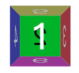
As you can see:
-
The front element is larger than the set size (100px) because it moves in the positive direction of the Z axis.
-
The back element moves in the opposite direction of the Z axis, so its size is smaller than the set size.
Other side elements have near, far and small effects.
Next, let's change the size of perspectives and see what happens under different perspectives.
Let's first add two new elements: pers350 and pers500
<style>
  .pers350 {
    perspective: 350px;
  }

  .pers500 {
    perspective: 500px;
  }
</style>

<html>
  <div class="container">
    <div class="cube pers250">
      <div class="face front">1</div>
      <div class="face back">2</div>
      <div class="face right">3</div>
      <div class="face left">4</div>
      <div class="face top">5</div>
      <div class="face bottom">6</div>
    </div>
  </div>

  <div class="container">
    <div class="cube pers350">
      <div class="face front">1</div>
      <div class="face back">2</div>
      <div class="face right">3</div>
      <div class="face left">4</div>
      <div class="face top">5</div>
      <div class="face bottom">6</div>
    </div>
  </div>

  <div class="container">
    <div class="cube pers500">
      <div class="face front">1</div>
      <div class="face back">2</div>
      <div class="face right">3</div>
      <div class="face left">4</div>
      <div class="face top">5</div>
      <div class="face bottom">6</div>
    </div>
  </div>
</html>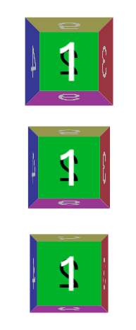
As you can see, as the value of perspective s increases, the page elements become smaller: this is not difficult to understand, which is equivalent to the user's eyes farther away from the screen, and of course the elements become smaller.
2 perspective-origin
Now that we have a clear idea of perspective, let's look at the perspective-origin attribute:
The perspective-origin CSS property determines the position at which the viewer is looking. It is used as the vanishing point by the perspective property.Perspective-origin defines the position of the viewer's perspective relative to the display element. Usually, we use this attribute to define the vanishing point of sight, that is, the position where the line of sight disappears. In the example above, we did not specify the perspective-origin attribute, so we used the default perspective-origin: the element's central location, so each element looks symmetrical as if we were right at them.
Using perspective-origin attributes, we can simulate the effect of observing objects from different locations:
<div style="margin: 50px;">
  <div class="container" style="margin:50px; display:inline-block; ">
    <div class="cube pers250" style="perspective-origin:left top;">
      <div class="face front">1</div>
      <div class="face back">2</div>
      <div class="face right">3</div>
      <div class="face left">4</div>
      <div class="face top">5</div>
      <div class="face bottom">6</div>
    </div>
  </div>

  <div class="container" style=" margin:50px; display:inline-block;">
    <div class="cube pers250" style="perspective-origin:right bottom;">
      <div class="face front">1</div>
      <div class="face back">2</div>
      <div class="face right">3</div>
      <div class="face left">4</div>
      <div class="face top">5</div>
      <div class="face bottom">6</div>
    </div>
  </div>
</div>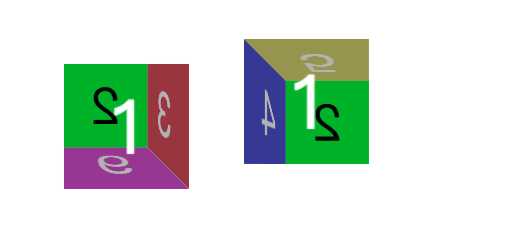
As you can see, after setting the perspective-origin attribute, the two elements have completely different effects:
- The perspective-origin value of the left element is perspective-origin:left top; that is, the vanishing point of the line of sight is the upper left corner, so the effect is similar to that observed from the lower right corner of the element.
- The perspective-origin value of the element on the right side is right bottom, that is, the vanishing point of the line of sight is the lower right corner, so the effect is similar to that observed from the upper left corner of the element.
The meaning of these perspective-origin s is clear.
The perspective-origin values are as follows:
- x-axis
- left
- center
- right
- length
- %
- y-axis
- top
- center
- bottom
- length
- %