The following is the sharing of last year's interns
author: "ylchen"
ggplot2 is the most popular third-party extension package for R language. It is the work of Hadley Wickham, chief scientist of RStudio, during his doctoral study. According to its drawing concept, the drawing is composed of the following modules:
In short:
A statistical graph is a mapping from data to geom etric attribute (aes). In addition, the graph may also contain statistical transformation (stats) of data, which is finally drawn in a specific coordinate system (coordinate), while facet s can be used to generate graphs of different subsets of data.
Next, open ggplot2 basic learning series. The first step starts with reproducing the article.
Source of the article: "predictive immune landscape predisposes adverse outcomes in hepatocellular cancer patients with liver transplantation" (2021, npj precision Oncology). All data and codes are disclosed in https://github.com/sangho1130/KOR_HCC .
Let's first reproduce fig.1a (pie chart & Rose chart), showing the number of different tissues with a pie chart
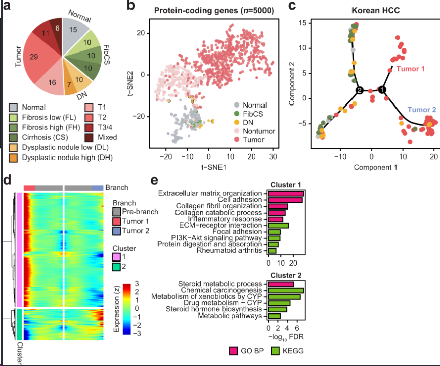
Fig.1
1, Data loading
  library(ggplot2)
  library(scales)
  library(RColorBrewer)
  #Building data frame structure
  data <- data.frame(
    group = c('Normal', 'FL', 'FH', 'CS', 'DL', 'DH', 'T1', 'T2', 'T3', 'Mixed'),
    value = c(16, 10, 10, 10, 10, 7, 17, 30, 11, 7)
  )
  Colors <- c('#bebdbd', '#bbe165', '#6e8a3c', '#546a2e',
  '#f1c055', '#eb8919', '#f69693', '#f7474e', '#aa0c0b', '#570a08')
  #The classification data is converted into factor variables. If the order needs to be adjusted, the level parameter can be added
  data$group <- factor(data$group)
  head(data)
2, First, a histogram is generated
Start selecting the appropriate geometric object, that is, what kind of picture to intuitively represent our data. Among them, the histogram is geom_bar function. In addition, ggplot2 provides many geometric objects geom_xyz() is for you to choose. The complete geometric objects can be downloaded from ggplot2 cheetsheet summarized by RStudio company.
ggplot(data,                         #input data
       aes(x="",                     #Set x-axis variable
       y=value,                      #Set y-axis variable
       fill=factor(group))) +        #Setting drawing fill variables
       geom_bar(width = 1,           #geom_ The bar() function draws a bar chart. Width: the width of the bar chart
               stat = "identity")+ #stat="count" indicates that the height of the bar is the number of y variables
  #stat="identity" indicates that the height of the bar is the value of the y variable
  scale_fill_manual(values = Colors)     #Sets the color of the fill
3, Convert to pie chart
- coord_polar turns a circle into a polar coordinate
ggplot(data,                         #input data
       aes(x="",                     #Set x-axis variable
           y=value,                      #Set y-axis variable
           fill=factor(group))) +        #Setting drawing fill variables
  geom_bar(width = 1,           #geom_ The bar() function draws a bar chart. Width: the width of the bar chart
           color = "white",
           stat = "identity")+   #stat="count" indicates that the height of the bar is the number of y variables
  #stat="identity" indicates that the height of the bar is the value of the y variable
  scale_fill_manual(values = Colors) +    #Sets the color of the fill                                                               #coord_polar polar coordinate conversion can be used to make pie chart, rose chart or radar chart
  coord_polar(theta = "y",         #theta can choose x or y to represent the coordinates of the extension
              direction = -1) +    #Direction indicates the data direction. 1 is clockwise and - 1 is counterclockwise
  theme_void() +                   #theme_void(): set a completely blank theme
  #ggtitle("I'm a titile")+        #Add title
  theme(plot.title = element_text(hjust = 1), #hjust adjust the horizontal distance,
        #element_text() sets the text-based component
        legend.title = element_blank())+       #Do not display legend title
  geom_text(aes(label = value),
          position = position_stack(vjust = 0.5),size=5) #vjust=0.5 add text in the middle of the stacked column
4, Rose chart
- However, when our data does not represent the percentage of individuals in the total, but emphasizes the comparison of data size, we can use the rose chart to show it and make simple modifications according to the above code.
- In fact, it is to modify the parameter: coord_polar(theta = 'x',start = 0,direction = 1)
ggplot(data,
       aes(x=group,y=value,
       fill=factor(group))) +
       geom_bar(
              width = 1,
              stat = "identity") +
       scale_fill_manual(values = Colors) +
       coord_polar(theta = 'x',start = 0,direction = 1)+
       theme_void() +
       theme(plot.title = element_text(hjust = 0.5),
             legend.title = element_blank())
5, Get to the point!
Function function
The purpose of learning code is to save our drawing time. We can build a function function, which can be used directly after inputting our own data next time without adjusting the parameters.
Review the writing of function function. The definition of function function is as follows
function_name <- function(arg1,arg2,....){
       functionBody
}
#function_name function name
#arg1,arg2,.... Parameters of function
#functionBody function body, which defines the function of the function
# Build a drawing function
drPiechart <- function(columnNames, Values, Colors){
  library(ggplot2)
  library(scales)
  library(RColorBrewer)
  #Building data frame structure
  data <- data.frame(
    group = columnNames,
    value = Values
  )
  data$group <- factor(data$group, columnNames) #Convert to factor variable
#mapping
ggplot(data,                         #input data
       aes(x="",                     #Set x-axis variable
       y=value,                      #Set y-axis variable
       fill=factor(group))) +        #Setting drawing fill variables
       geom_bar(width = 1,           #geom_ The bar() function draws a bar chart. Width: the width of the bar chart
               stat = "identity")+   #stat="count" indicates that the height of the bar is the number of y variables
                                     #stat="identity" indicates that the height of the bar is the value of the y variable
       scale_fill_manual(values = Colors) +    #Sets the color of the fill                                                               #coord_polar polar coordinate conversion can be used to make pie chart, rose chart or radar chart
    coord_polar(theta = "y",         #theta can choose x or y to represent the coordinates of the extension
                direction = -1) +    #Direction indicates the data direction. 1 is clockwise and - 1 is counterclockwise
    theme_void() +                   #theme_void(): set a completely blank theme
    theme(plot.title = element_text(hjust = 1), #hjust adjust the horizontal distance,
                                                #element_text() sets the text-based component
          legend.title = element_blank())+       #Do not display legend title
  geom_text(aes(label = value),
          position = position_stack(vjust = 0.5),size=5) #vjust=0.5 add text in the middle of the stacked column
}
Enter your own data to draw
#Fill in your own data according to columnnames, values and columns
drPiechart(c('Normal', 'FL', 'FH', 'CS', 'DL', 'DH', 'T1', 'T2', 'T3', 'Mixed'),
           c(16, 10, 10, 10, 10, 7, 17, 30, 11, 7),
           c('#bebdbd', '#bbe165', '#6e8a3c', '#546a2e',
             '#f1c055', '#eb8919', '#f69693', '#f7474e', '#aa0c0b', '#570a08'))
6, Advanced pie chart
- If you need to show two classification forms, you can combine pie chart and ring chart
- reference resources: https://rpubs.com/cardiomoon/398623
# if(!require(devtools)) install.packages("devtools")
# devtools::install_github("cardiomoon/moonBook")
# devtools::install_github("cardiomoon/webr")
library(ggplot2)
library(moonBook)
library(webr)
The package moonBook contains the demographic and laboratory data of 857 patients with acute coronary syndrome (acs), which shows the distribution of smoking status
head(acs)
# labelposition=0.1%, the percentage is less than 10%, and the label is located on the outside
# Rationbygroup = false calculate percentage by different groups
PieDonut(acs,aes(pies=Dx,donuts=smoking),
         ratioByGroup=FALSE,labelposition=0.1,
         title="Distribution of Smoking Status by Diagnosis")
Label location
If you want to put all the labels inside, you need to set the labelposition parameter to 0. Set the labelposition parameter to 1 outside
PieDonut(acs,aes(Dx,smoking),selected=1,labelposition=0,title="labelposition=0")
PieDonut(acs,aes(Dx,smoking),selected=1,labelposition=1,title="labelposition=1")
Highlight display
If you want to highlight a certain part, this parameter is very convenient
Parameter: extrude the inner ring; Protrusion of selected outer ring
PieDonut(acs,aes(Dx,smoking),explode=1)
PieDonut(acs,aes(Dx,smoking),explode=1,explodeDonut=TRUE)
# Protrusion of expand inner ring
# Protrusion of selected outer ring
PieDonut(acs,aes(Dx,smoking),explode=1,selected=c(3,6,9),explodeDonut=TRUE)
Angle adjustment
PieDonut(acs,aes(Dx,smoking),start=3*pi/2,explode=1,selected=c(3,6,9),explodeDonut=TRUE)
Radius setting
If you don't want the center point in the middle, you can set it through r0 and showPieName
In addition, r1 and r2 can adjust the radius of the inner and outer rings respectively
PieDonut(acs,aes(Dx,smoking),r0=0,showPieName=FALSE)
# r1 and r2 can adjust the radius of inner and outer rings respectively
PieDonut(acs,aes(Dx,smoking),r0=0.2,r1=0.8,r2=1.4,explode=1,start=pi/2,explodeDonut=TRUE)